What is CERN Collision?
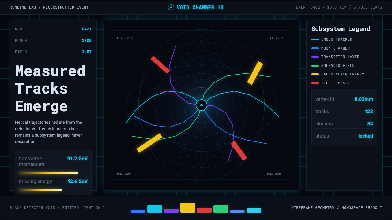
At CERN, a particle collision becomes a picture: glowing tracks spiraling out of a black detector void, where every color is a literal legend and nothing is drawn for drama.
CERN Collision in brief
CERN Collision is a design language drawn from the 'event display' — the visualization software particle physicists use to render what happened inside a detector after two beams of protons collide. These displays exist first for verification and analysis, not entertainment: a physicist inspecting one is checking whether a detector behaved correctly and whether a pattern of tracks matches a known or hoped-for particle signature. The visual style this system captures is what that working tool looks like, not a science-fiction reinterpretation of it.
The signature composition is a near-black canvas — standing in for the physical void inside a detector — from which luminous, cyan-leaning tracks curve and spiral outward from the single point where the collision occurred. Around those tracks sits translucent wireframe geometry: concentric rings and cylindrical shells that trace the actual layered structure of a real detector, drawn as line work rather than solid shaded volumes, so the geometry reads as instrumentation rather than illustration.
The defining discipline of the style is that color is never decorative. Each hue maps literally to a specific detector subsystem or particle type, the same way a legend on a map assigns a color to a category — change the color and you change the meaning of the image. Small monospace numeric readouts sit in the corners of the frame, echoing an instrument panel: event numbers, energy values, timestamps, the residue of a system built to be audited, not admired.
Where does CERN Collision come from?
CERN, the European Organization for Nuclear Research, sits on the Franco-Swiss border near Geneva and operates the Large Hadron Collider (LHC) — a roughly 27-kilometer circular tunnel in which beams of protons are accelerated to nearly the speed of light and steered into head-on collisions. Since the LHC's Run 1 began in 2010, giant detectors positioned around the ring have recorded the aftermath of these collisions at an almost unmanageable volume and rate, and event-display software was built specifically to render individual collisions into a form a human could actually inspect.
Two of the largest detectors, ATLAS and CMS, are independent, multi-story cylindrical instruments built in concentric layers — an inner tracking system, layers of calorimeters, and an outer muon system — surrounding the point where beams collide. The two experiments were designed by separate international collaborations specifically so that a result claimed by one could be independently checked by the other. That rivalry-by-design culminated in July 2012, when both collaborations jointly announced the discovery of the Higgs boson, and the event displays showing candidate collision events from that announcement — tracks converging in telltale patterns — became some of the most widely reproduced scientific images of the decade.
For years, physicists relied on desktop analysis tools to step through individual collision events frame by frame, built for specialists rather than public audiences. As interest in the Higgs search grew beyond the physics community, teams built browser-friendly viewers meant for wider use: CMS's iSpy let anyone explore real recorded collision data rather than a simulation, continuing a lineage of earlier detector-specific viewers such as ATLAS's Atlantis. Later, the HEP Software Foundation (HSF) — a collaboration spanning multiple experiments — developed Phoenix, a modern web-based event display designed to replace aging, experiment-specific desktop tools with a shared, browser-based standard usable across the field.
Underpinning all of this is CERN's open-data program, which releases real recorded collision datasets for public and educational use rather than keeping them inside the collaborations. Event-display tools became the visual bridge between that raw, formally structured physics data and a general audience — turning an intensely technical dataset into a legible image while insisting, as a matter of scientific integrity, that the image stay literal rather than be stylized for visual drama.
What defines the CERN Collision look?
Void Canvas
The background is a near-black field standing in for the physical void inside a detector — the empty cylindrical space through which particles actually travel between the collision point and the outer instrumentation. This darkness is not a mood choice; it represents real, empty space, which is why the style never lightens it into a soft dark gray.
Track Glow
Particle paths appear as luminous, cyan-leaning lines curving and spiraling outward from the single point where the collision occurred, their brightness suggesting energy the way a real detector's reconstruction highlights a track's significance. The curvature itself is meaningful — it traces how a charged particle bends under the detector's magnetic field, not an arbitrary decorative arc.
Wireframe Geometry
Detector structure is drawn as translucent wireframe — concentric rings and cylindrical shells rather than solid rendered volumes — echoing the actual layered construction of a real detector's inner tracker, calorimeters, and muon system. The transparency matters: a solid render would hide the tracks the geometry exists to contextualize.
Color-as-Legend
Every color used maps literally to a specific detector subsystem or particle category, functioning exactly like a legend on a technical diagram rather than an aesthetic choice. This is the style's central rule: a palette that looks striking is only correct if it is also accurate, and any hue that cannot be tied to a real category has no place in the system.
Monospace Readouts
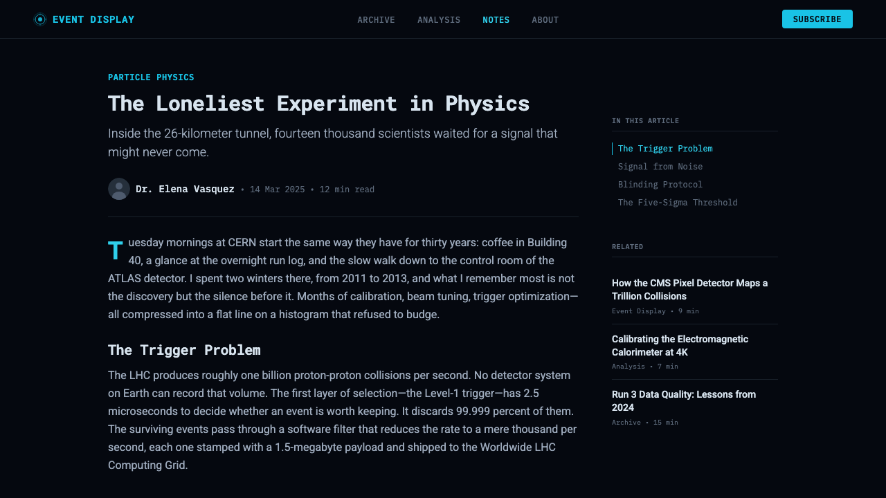
Small numeric labels — event numbers, energy values, timestamps — sit in the corners of the frame in a monospace, instrument-panel register, the kind of typography associated with logs and technical readouts rather than headlines. These labels ground the image as a record of something specific rather than a generic illustration.
Sobriety
The style deliberately refuses science-fiction spectacle: no dramatized lens flares, no invented glow beyond what represents real reconstructed data, no exaggerated motion blur for effect. Every visual element has to be traceable to something a real event display would actually show, which is what keeps the aesthetic reading as scientific rather than cinematic.
Who shaped CERN Collision?
The international team behind ATLAS, one of the two largest general-purpose detectors at the LHC, independently designed so its findings could cross-check those of CMS. Together with CMS, ATLAS jointly announced the discovery of the Higgs boson in 2012, and its candidate event displays remain some of the most reproduced images to come out of the style's source material.
The international team behind CMS, ATLAS's counterpart detector at the LHC, built independently to provide an unbiased cross-check on shared physics results. CMS produced the iSpy viewer, one of the earliest tools to let a general audience explore real recorded collision data rather than a simulation.
A working group within the HEP Software Foundation, a collaboration spanning multiple LHC experiments, that built Phoenix — a modern, browser-based event display meant to replace aging, experiment-specific desktop tools with a shared standard usable across the field. Phoenix represents the style's move from specialist desktop software toward something publicly shareable.
The teams behind two influential detector-specific event-display tools — CMS's iSpy and ATLAS's Atlantis — built to let physicists and, increasingly, the public step through individual collision events. Their design choices, particularly the literal color-to-subsystem mapping and the instrument-panel data overlays, established the visual conventions this style preserves.
How do you use CERN Collision today?
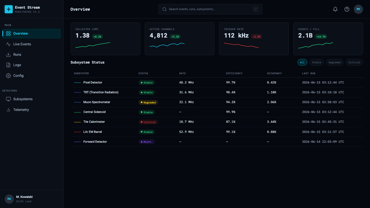
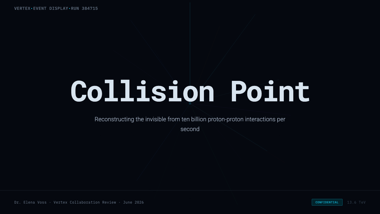
On a presentation cover, this style projects rigor and scale: a near-black field with a single luminous track pattern spiraling from an off-center point, title text set in a clean, technical typeface rather than a display font. Content slides should treat every visual element as if it needs a legend — a diagram, a highlighted flow, a piece of architecture — rendered as glowing lines against black rather than solid shapes. Data slides are this style's most natural home: metrics rendered as radiating tracks or concentric rings, with color assigned consistently to categories the way a detector subsystem gets one color throughout, and small monospace labels doing the job that captions usually do.
For web interfaces, the style suits technical dashboards, observability tools, and network or systems-monitoring products where the underlying message is 'real data, precisely labeled' — a dark canvas, glowing accent lines for live values, and a strict rule that a given color always means the same category across every screen. Pricing pages are a harder fit but can borrow the instrument-panel restraint: plan tiers as clean labeled blocks against black, with a single accent color reserved for the recommended plan rather than a decorative gradient.
In editorial and marketing contexts, the style works well for science communication, deep-tech product storytelling, and any brand built on precision and engineering credibility — research publications, developer tools, infrastructure companies. A hero section can use the radiating-track motif as a literal or abstracted background, provided it stays restrained enough to read as instrumentation rather than a stock-photo nebula.
The style also suits any interface that visualizes a network, a signal, or a system of interconnected parts — the concentric wireframe and radiating-line vocabulary map naturally onto graphs, topologies, and flow diagrams, not only physics data.
The most common mistake is treating this as generic 'sci-fi UI' — dropping in arbitrary neon glows, futuristic typefaces, or decorative particle effects without any underlying logic to what each color or line represents. The discipline that makes this style work is that a viewer familiar with the system should be able to read the colors as a legend; strip that literalism out and the result is a video-game loading screen, not this style.
CERN Collision — FAQ
Is this style meant to look like science fiction?
No, and that distinction is the whole point. It is drawn from real working software physicists use to verify detector data, not from a designer's idea of futuristic UI. Every glowing track and wireframe shell in the source material corresponds to something a physicist would actually check, which is why the style stays deliberately sober rather than cinematic.
Why is cyan the dominant accent rather than another color?
In the source material, brightness and hue are assigned to make particle tracks maximally legible against a black detector void, and a cool, high-visibility tone does that job well against near-black. The underlying rule matters more than the specific hue: whatever accent is used, it should be assigned consistently to one category and read clearly against dark space, the way it does in a real event display.
Can this style be used with a light background instead of black?
Not without losing what makes it recognizable. The near-black canvas represents actual empty space inside a detector, and the glowing quality of the tracks only reads as glowing in contrast to real darkness. On a light background, the tracks would need heavy outlines to stay visible, which changes the whole visual logic from 'light emitted in a void' to 'ink drawn on paper' — a fundamentally different metaphor.
Does using this style require real data, or can values be illustrative?
The style itself is a visual language and does not require literal physics data to apply it elsewhere — a dashboard or diagram can use the same composition with its own metrics. What should carry over from the source discipline is the principle behind it: colors and readouts should mean something specific and consistent, not be scattered decoratively, even when the underlying values are illustrative rather than real collision data.
What kind of product or content does this style struggle with?
It struggles with anything that needs to feel warm, casual, or human-scale — consumer lifestyle brands, food and hospitality products, children's content — since its entire vocabulary is built around instrumentation and precision rather than approachability. It can also feel excessive on simple content that has too few real categories to justify a full color-as-legend system.
Related design styles
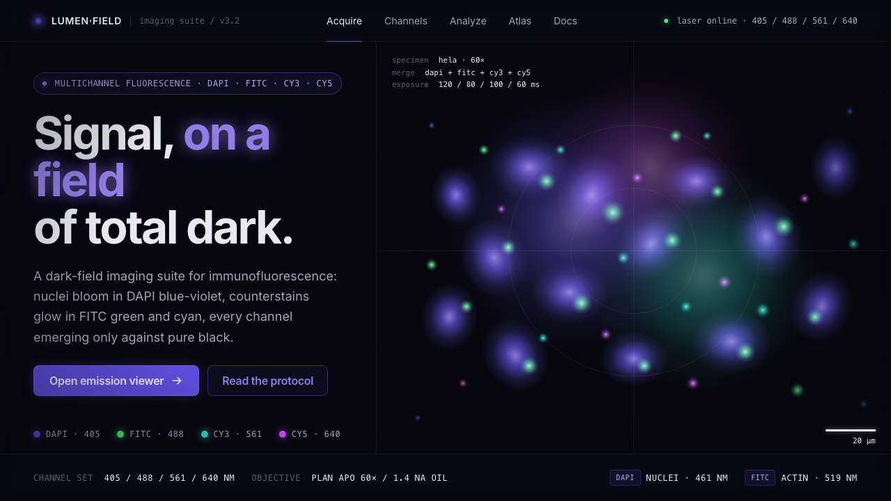 Cell MicroscopySignal on total dark. DAPI blue-violet and FITC green bloom as soft point-emi…
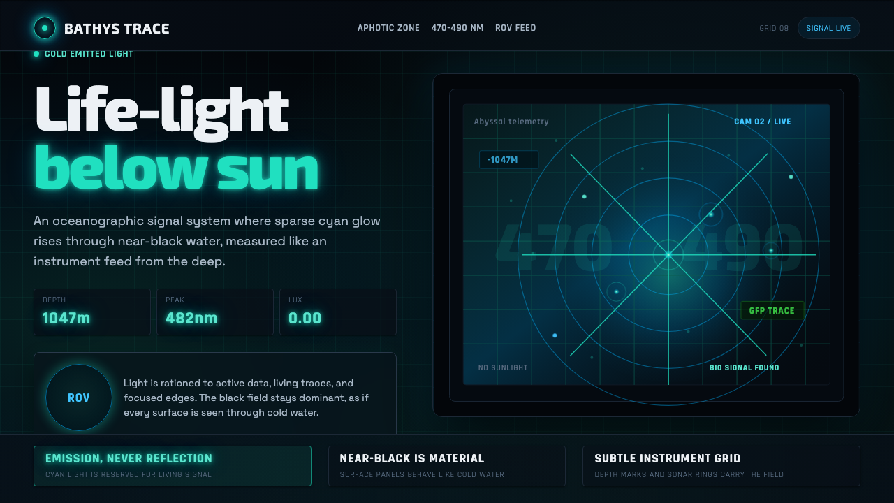 Abyssal BioluminescenceDark carries the signal. Electric cyan pins and Exo 2 readouts surface from a…
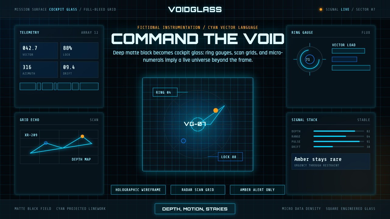 FUI Sci-Fi HUDBlack until it glows. Cyan wireframes, ring gauges, and radar grids sell live…
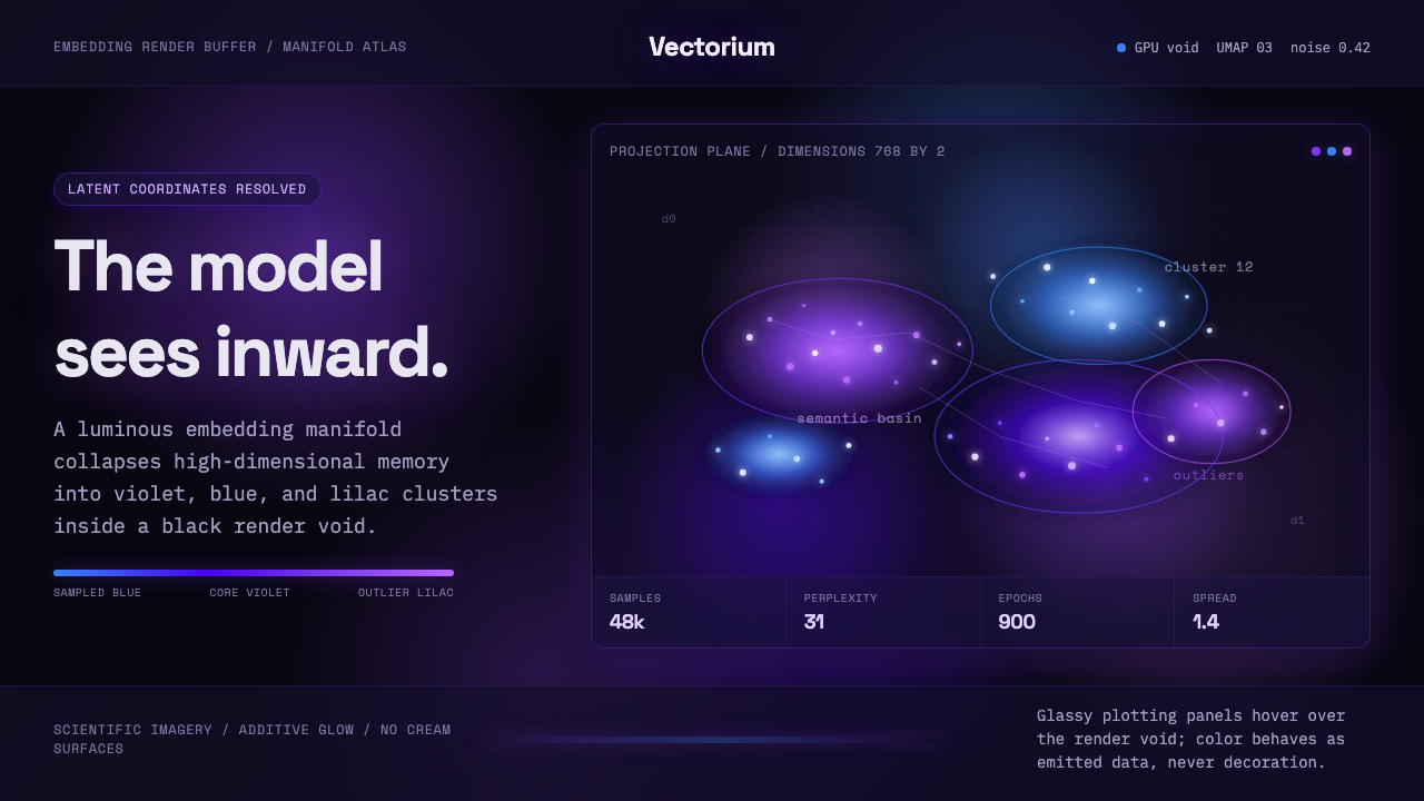 Latent SpaceSees the model from inside. Violet-blue point clouds glow on a black GPU void.
 Lunar Regolith SettlementMoonlight without the myth. Regolith gray, hard terminators, and a strict tec…
 Nanopunk Grey GooColdness self-replicates. Chrome gradients and hex lattices spread across a b…