What is Cell Microscopy?
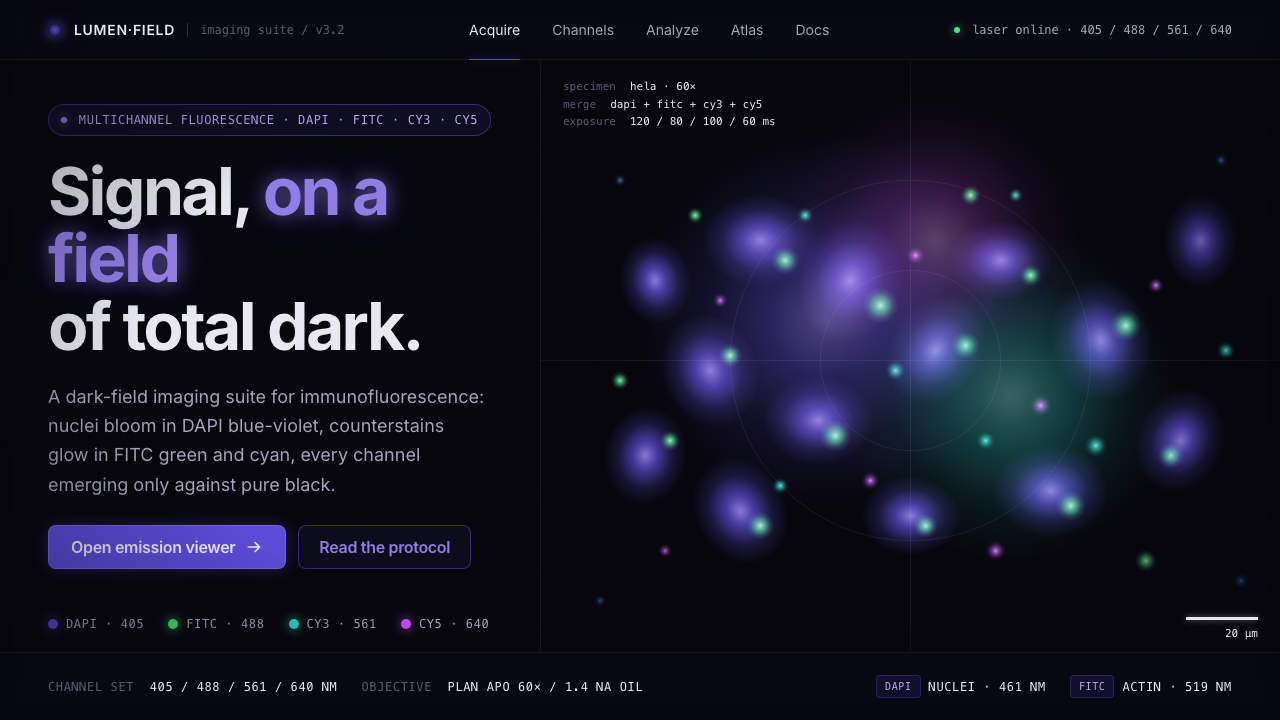
Cell Microscopy turns immunofluorescence into an interface language: blue-violet, green, cyan, and magenta signals suspended in a field where darkness makes every trace legible.
Cell Microscopy in brief
Cell Microscopy distills the visual logic of contemporary biomedical immunofluorescence imaging. Its defining scene is a pure-black fluorescence-microscope field in which DAPI-stained nuclei appear as blue-violet light, joined by FITC and Alexa green counterstains. Cyan and magenta enter when channels are merged, creating an image that reads less like illustration than observed signal. Light is not a decorative overlay here; it is the subject that identifies structure.
The style is a dark-field system built from absence and emission. Black occupies nearly the entire composition, while saturated fluorophore color arrives as soft points, clusters, halos, and sparse cellular contours. Because the field contains so little visual noise, even a small luminous mark carries weight. The result is clinical but not cold: it has the concentrated, searching atmosphere of a microscope view in which a hidden pattern has just become visible.
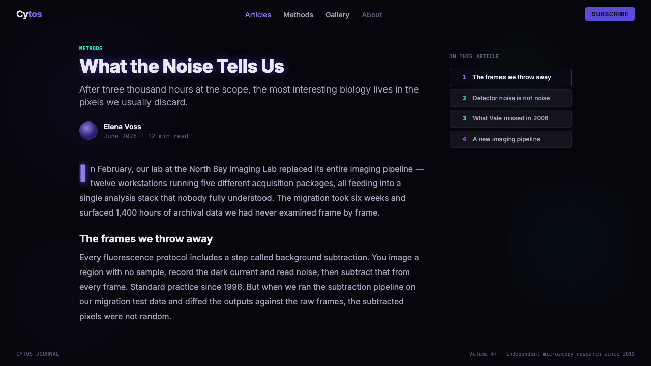
Its typography belongs to scientific annotation rather than brand ornament. Plain sans-serif labels, restrained captions, and scale-bar-like markers provide orientation without competing with the image. Information should feel measured and observational. A Cell Microscopy composition succeeds when the viewer first sees the signal, then understands the annotation, and never loses the sense that darkness is performing an essential analytical role.
Where does Cell Microscopy come from?
Cell Microscopy belongs to the contemporary era of biomedical immunofluorescence imaging, spanning 2010 to the present. Its reference world is not a single school, poster tradition, or named studio, but the shared visual culture of research laboratories in Western Europe and around the world. The aesthetic begins with a practical image condition: a fluorescence microscope makes labeled cellular structures visible as colored light against a dark field.
DAPI dye chemistry supplies the style's characteristic blue-violet nuclear signal. FITC fluorescein and the Alexa Fluor dye series extend the visible vocabulary with green counterstains, while multichannel visualization introduces cyan and magenta relationships. In the source image, these colors are not selected to decorate a composition. They distinguish signals that must remain visually separable even when they occupy the same black field.
That scientific condition is what makes the style transferable. When adapted for editorial, interface, or presentation work, it should retain the hierarchy of immunofluorescence visualization: an obscured field, sparse luminous evidence, and quiet annotation. Fluorescence microscope vendors are part of this visual ecosystem because the microscope view is the system's primary reference. The useful abstraction is not laboratory imitation; it is the idea that data becomes meaningful when signal is isolated from noise.
What defines the Cell Microscopy look?
Dark Field
Pure black is the active foundation, not an empty backdrop. It suppresses competing detail and gives each fluorescent mark an immediate boundary. Large light surfaces, decorative panels, and ambient texture weaken the premise because they make darkness merely one color among others. In this system, black is everything that has not been identified as signal.
Fluorophore Color
Blue-violet, green, cyan, and magenta function as distinct channels of attention. DAPI blue-violet suggests nuclei; FITC and Alexa green carry counterstain associations; cyan and magenta evoke merged channels. Use color as evidence with separate roles, not as a broad decorative spectrum. A restrained field with a few clear signals is more convincing than a rainbow of equally bright accents.
Soft Point Emission
Light appears as soft point-emission rather than hard vector geometry. Dots may bloom into halos, gather into clusters, or imply cellular boundaries without becoming literal illustration. The softness should feel optical and concentrated, as though light is passing through an instrument. It is not the misty softness of a dreamy gradient; it is a localized glow with an identifiable source.
Sparse Structure
Composition is organized through separation rather than framing. Isolated signal groups, open black intervals, and partial contours create hierarchy without boxes or ornamental dividers. The eye should move between discoveries across the field. Filling every region with glowing detail destroys the microscope-like tension and turns an analytical image into generic dark decoration.
Scientific Annotation
Labels are plain, small in presence, and visibly subordinate to the image. Scientific sans-serif text, channel names, captions, and scale-bar-like cues should clarify what is being viewed without adopting a theatrical laboratory aesthetic. Annotation works best at edges and quiet zones, where it can orient the reader while preserving the central field for signal.
Channel Merge
Cyan and magenta are especially useful when the composition needs to communicate simultaneous observation. Their role is relational: they make separate color signals feel like parts of one multichannel view. Avoid blending all hues into a single atmospheric wash. A merge should preserve the intelligibility of each source while allowing their proximity to suggest a more complex cellular picture.
Who shaped Cell Microscopy?
DAPI dye chemistry is the source material's anchor for the blue-violet nuclear signal. Within the Cell Microscopy vocabulary, it establishes the most recognizable contrast between luminous nuclei and the black fluorescence field. Its importance is visual as much as scientific: it gives the system a stable focal color and a clear structural motif.
FITC fluorescein contributes the green counterstain association named in the source material. In a dark-field composition, this green acts as a second signal family beside blue-violet nuclei. It is most useful when it remains clearly differentiated, allowing the image to feel observed and multichannel rather than merely colorized.
The Alexa Fluor dye series expands the source material's green counterstain vocabulary. For the style, it reinforces the principle that fluorescence color has an informational role. Green should read as a selected channel of evidence, carried by visible emissions and contours, rather than as a general-purpose accent applied across the layout.
Fluorescence microscope vendors are listed because the microscope field is the visual environment from which the style is abstracted. Their relevance is not a branded look but an imaging condition: signals become visible against total dark, then acquire meaning through labeled observation and multichannel comparison.
How do you use Cell Microscopy today?
For presentation covers, treat the slide as a single microscope field. Use an almost entirely black ground, one concentrated blue-violet or green signal cluster, and a restrained title placed in a quiet edge zone. Content slides should preserve that hierarchy: a dark field first, then a few separated information groups, then plain annotations. Do not turn every slide into a glowing background image; the contrast between dense signal and empty field is what creates focus.
Data slides can use the style to make selected findings feel like channels under observation. Keep charts, legends, and labels sparse and let cyan, magenta, blue-violet, or green distinguish categories that genuinely need comparison. The most useful move is to reveal a signal against silence, not to recolor every series. Where a chart is dense, use the scientific annotation language to preserve orientation and prevent the screen from becoming visually fluorescent everywhere.
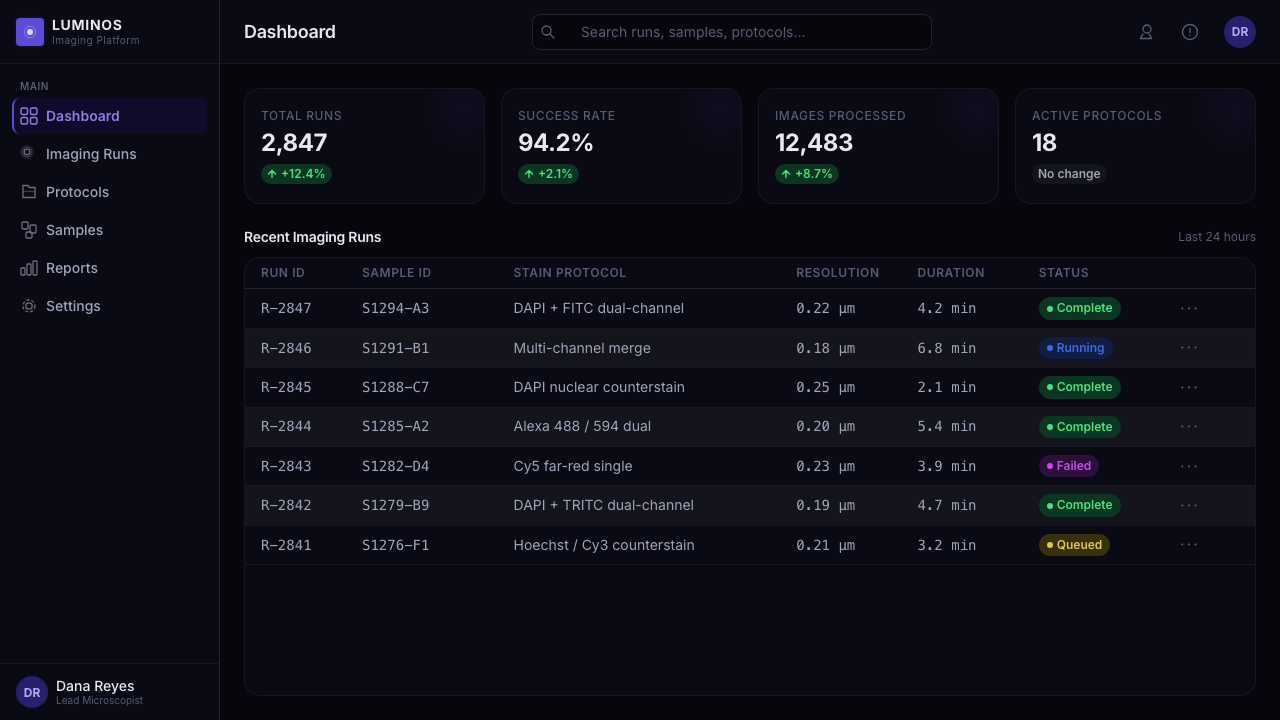
For web interfaces, Cell Microscopy suits research dashboards, analytical tools, scientific archives, and pricing pages for products that want to communicate precision, detection, or technical focus. Cards should feel like bounded observation windows rather than soft consumer panels. Reserve luminous color for active status, selected data, meaningful alerts, and channel identity. Navigation, supporting copy, and inactive controls should recede into the dark field so that the interface has a clear signal-to-noise hierarchy.
In editorial and marketing work, the style is strongest when a story concerns discovery, measurement, evidence, or hidden systems. Use cropped signal fields as feature imagery, concise captions as connective tissue, and black intervals to separate sections. The common mistake is equating Cell Microscopy with neon-on-black decoration. If every headline glows, every button uses saturated color, and every region contains particles, the scientific premise disappears. Preserve restraint: color must identify, annotation must orient, and darkness must remain dominant.

Cell Microscopy — FAQ
Is Cell Microscopy simply a neon-on-black style?
No. Its reference is immunofluorescence visualization, where colored light represents separated cellular signals in a dark microscope field. The key distinction is purpose: color identifies a channel, a point, or a contour, while black removes distraction. Neon decoration may borrow the palette, but it loses the style when every element is equally luminous.
Which colors are essential to the style?
Blue-violet DAPI nuclei and green FITC or Alexa counterstains form the central vocabulary. Cyan and magenta belong to multichannel merges and are useful when several observations need to coexist. The palette should remain signal-led: select only the colors needed to express distinct information, rather than treating all available fluorescent hues as mandatory.
Can the style work on a light background?
A light version can borrow individual colors, but it no longer carries the defining dark-field relationship. Cell Microscopy depends on total darkness making emission visible and sparse. If a light background is required, retain large quiet areas and sharply limit color, but expect the result to read as a related scientific graphic rather than the full Cell Microscopy system.
How should labels and scale-bar annotations be handled?
Use plain scientific sans-serif annotation with a deliberately quiet presence. Labels should explain channels, findings, or image context without becoming a second visual subject. Place them where the field is already calm, keep their contrast controlled, and let the luminous signal remain the first thing the viewer reads.
Related design styles
 Seasteading Floating CityA city at sea, made buildable. Night navy, timber warmth and charted hexagona…
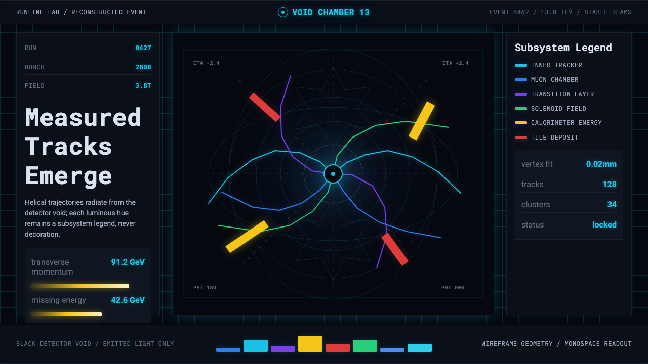 CERN CollisionData, not spectacle. Cyan tracks on black wireframes make every subsystem col…
 Lunar Base 2030Hardware built to survive the lunar night. Regolith gray, ANSI hazard orange,…
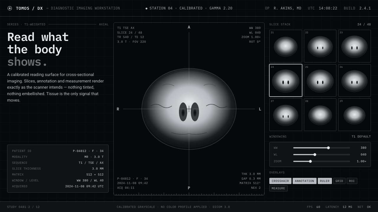 MRI ScanReads like a radiology viewport. Tissue-gray tomograms on pure black, IBM Ple…
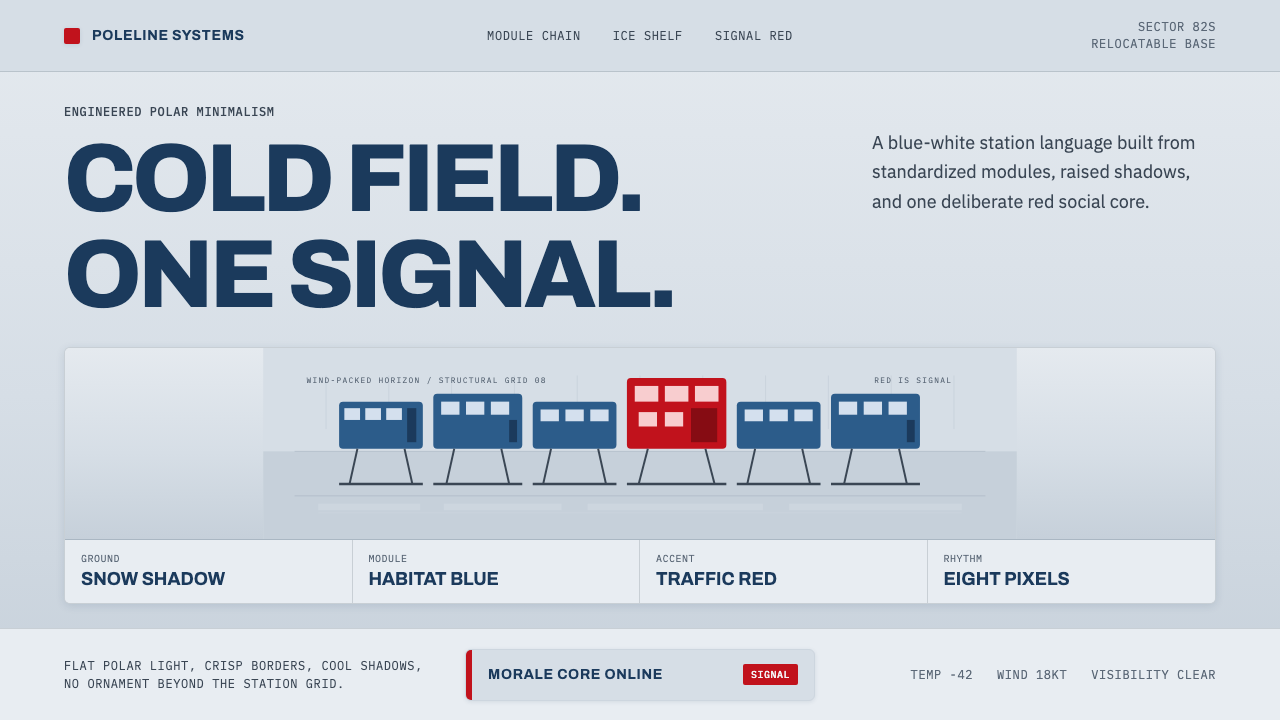 Antarctic StationCold precision, one red signal. Archivo modules ride a blue-white horizon gri…
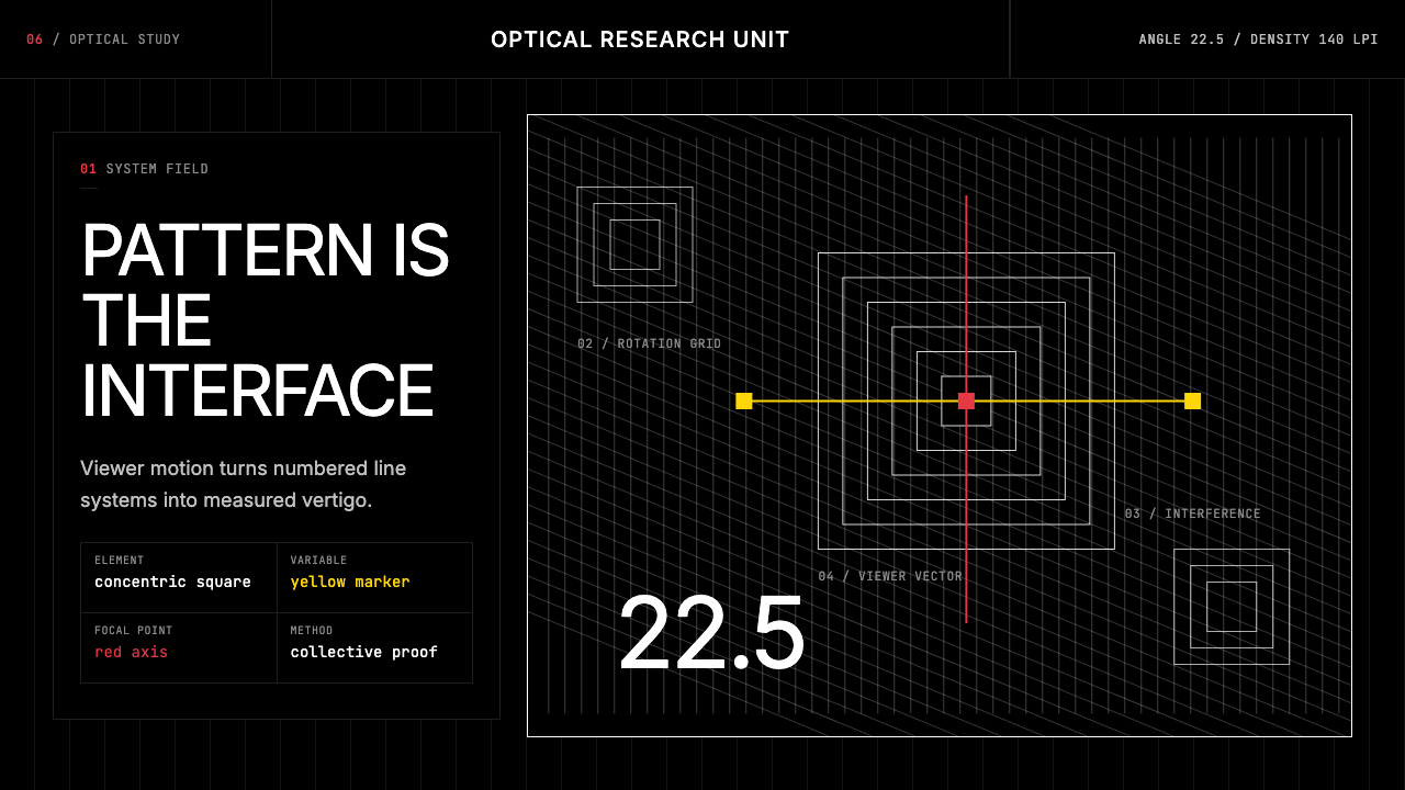 GRAV Op-Kinetic (1960)Vertigo by calculation. White line fields on black, with red and yellow as co…