What is Seasteading Floating City?
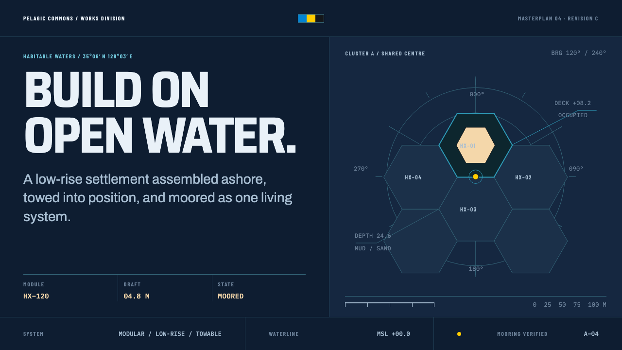
Seasteading Floating City treats the ocean as a buildable grid rather than a backdrop — an unlit navy sea, one warm timber value for everything hands touch, and chart lines doing the structural work a border normally would.
Seasteading Floating City in brief
Seasteading Floating City is drawn from the only two teams that have actually published a concrete design for a floating city: OCEANIX Busan, developed by the architecture firm BIG together with SAMOO and UN-Habitat, and the Floating City Project pursued by the Seasteading Institute in French Polynesia. Despite coming from different organizations with different mandates, both proposals converged on the same basic unit — a hexagonal platform, built and assembled on shore, then towed out to a permanent mooring at sea.
What is notable about both projects' published renderings is how restrained they are. Neither depicts glowing neon towers or glass megastructures; both show grey-teal Pacific water, timber decking underfoot, woven rattan screens for shade and privacy, and biorock — a mineral accretion that slowly builds up on submerged structure — forming naturally on the hulls below the waterline. The aesthetic is closer to a working harbor than a science-fiction skyline.
This system takes that restraint at face value rather than exaggerating it into spectacle. The base field is an unlit night-sea ground — dark, navy, and undramatic — and exactly one warm value, standing in for timber, is reserved for anything a person would actually touch: decking, rails, seating, doorframes. Everything else that organizes the composition is handled not by color but by chart-annotation conventions: scale bars, bearing marks, depth figures, and module numbering doing the work a decorative border would do in a less disciplined system. The effect is closer to reading a well-kept nautical chart than to looking at a rendered skyline — information is dense but never loud, and every mark on the page justifies its own presence.
Where does Seasteading Floating City come from?
Floating-city thinking in its modern, publicly documented form runs from 2008 to the present, spanning a period that includes the founding of the Seasteading Institute and its subsequent French Polynesia proposal, as well as the later, separately developed OCEANIX effort. The Oceanix City concept was presented in 2019, and its most fully realized version, OCEANIX Busan, reached prototype form in 2022 in partnership with the city of Busan, South Korea — giving the movement a concrete, built reference point rather than only speculative renderings.
The geography behind both projects is the Pacific: French Polynesia for the Seasteading Institute's proposal, Busan for the OCEANIX prototype, and the open ocean itself as the shared operating environment for the broader idea. This is named in the source material as Floating Urbanism and Modular Marine Architecture — a design and engineering discipline built specifically around structures assembled on land and then floated, moored, and expanded at sea, rather than conventional architecture adapted after the fact for a marine site.
Bjarke Ingels, whose firm BIG co-designed OCEANIX Busan alongside SAMOO and UN-Habitat, brought an architectural practice already known for bold geometric massing to bear on the hexagonal-module system that both projects ultimately share. On the Seasteading Institute side, Patri Friedman and Joe Quirk were central to articulating the floating-city idea as a movement in its own right, while Marc Collins Chen and Itai Madamombe were involved in carrying the concept from proposal into the more concrete, partnership-driven territory that produced the Busan prototype.
The third named influence on this system, the International Code of Signals, is not an architectural movement at all but a maritime communication standard — the system of flags, shapes, and abbreviated notations ships use to communicate at sea. Its presence in the source material explains where the system's chart-annotation logic comes from: bearing marks, scale bars, and coded module numbers are not decorative borrowings from nautical maps in general, but a direct reference to a real, standardized visual language that already governs how structures and vessels are marked and read at sea. Folding a working communication standard into an architectural style is itself unusual, and it is what gives this system its documentary, rather than illustrative, character.
What defines the Seasteading Floating City look?
Night-Sea Ground
The base field is a dark, unlit navy, treated as open ocean seen at night rather than as a generic dark theme background. It carries no glow or gradient — it is simply deep and undramatic.
One Warm Value
A single warm, timber-like tone is reserved exclusively for surfaces a person would physically touch — decking, rails, seating. It never appears as a background or a large field; it marks contact points only.
Grey-Teal Water
Where water itself is depicted, it takes a muted grey-teal rather than a saturated tropical blue. This keeps the system's palette closer to a documented Pacific harbor than to a resort brochure.
Hexagonal Modularity
The hexagon is the system's basic structural unit, chosen independently by both source projects because hexagonal platforms tile and expand without leaving gaps. Composition should read as assemblable modules, not a single fixed shape.
Chart-Annotation Rules
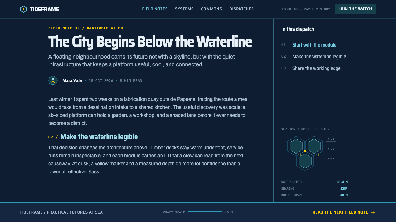
Structure and hierarchy come from nautical chart conventions — scale bars, bearing marks, depth figures, module numbers — rather than from decorative rules or borders. These marks are drawn from the real International Code of Signals rather than invented for effect.
Woven Rattan Texture
Screens and shade elements take on a woven, fibrous texture rather than a solid panel or a glass surface, reflecting the actual material used for shade and privacy in both source projects.
Biorock Accretion
Where a submerged or underwater surface is shown, it should carry an accreted, mineral-built texture rather than a clean painted hull, reflecting the way biorock naturally forms on structure left in the water over time.
Who shaped Seasteading Floating City?
Bjarke Ingels leads BIG, the architecture firm that co-designed OCEANIX Busan alongside SAMOO and UN-Habitat, reaching prototype form in 2022. His involvement brought the hexagonal-module concept into a fully realized, partnership-backed built project rather than leaving it as a purely speculative proposal.
Patri Friedman is a central figure behind the Seasteading Institute and its Floating City Project in French Polynesia, one of the two source proposals this system draws its hexagonal-module logic from. His work helped establish floating urbanism as a distinct movement rather than a one-off speculative rendering.
Joe Quirk worked alongside Patri Friedman in articulating and popularizing the Seasteading Institute's floating-city vision. His role in shaping the movement's public presentation helps explain why the published renderings favor a restrained, documentary quality over speculative science-fiction spectacle.
Marc Collins Chen was involved in advancing the floating-city concept in French Polynesia, part of the same Pacific geography that later produced the OCEANIX Busan prototype. His work sits at the intersection of the two source projects this system draws from.
Itai Madamombe was involved in carrying the floating-city concept toward the more concrete, partnership-driven territory that produced OCEANIX Busan in 2022. Her work sits alongside Bjarke Ingels's architectural contribution in turning the hexagonal-module idea into a built prototype.
How do you use Seasteading Floating City today?
Seasteading Floating City transfers well anywhere a design needs to feel buildable, precise, and grounded in real logistics rather than futuristic fantasy — but the discipline depends on keeping the navy field dark and undramatic while letting chart annotation, not color, carry structural weight.
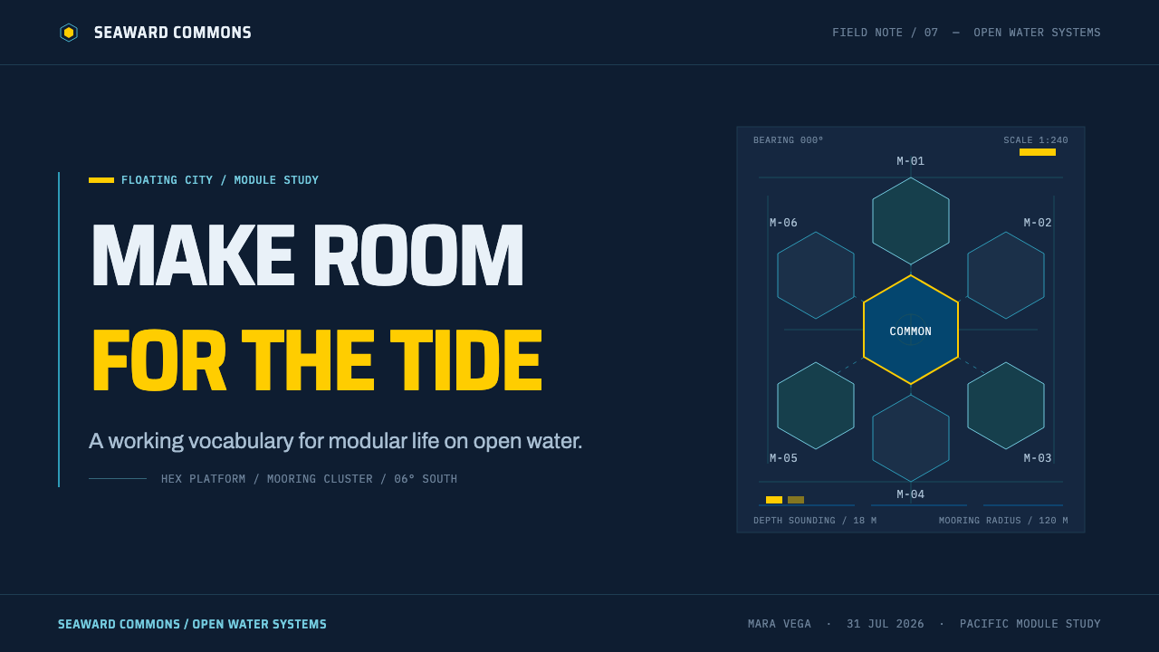
For presentation slides, a cover page should hold to a dark navy field with a single hexagonal module diagram placed off-center, annotated with restrained chart-style marks — a scale bar, a bearing line — rather than glowing effects. Content slides should treat data callouts the way a chart treats a depth sounding: small, precise, numeric, and set against the dark field rather than boxed in bright color panels.
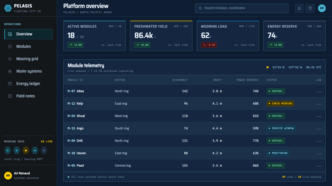
For web interfaces, the palette suits products that want to feel like real infrastructure rather than a speculative concept — logistics dashboards, engineering or planning tools, or any product foregrounding modularity and expansion. A dark navy base, warm timber-toned accents reserved strictly for interactive touch points such as buttons, and thin chart-style rules for section dividers together produce an interface that reads as engineered rather than decorated.
For editorial and marketing layouts, the style supports a masthead built around a dark navy field, a single hexagonal motif as a recurring structural device, and chart-style captions — bearing, scale, module number — used as a design element in their own right rather than hidden in fine print. Photography or illustration should favor the muted grey-teal water tone over saturated tropical blue.
A common mistake is treating this as generic 'futuristic ocean city' science fiction and reaching for glowing neon, glass towers, or saturated cyan water. Both source projects deliberately avoided that vocabulary in favor of timber, rattan, and biorock-textured restraint; a design that adds glow and spectacle back in contradicts the exact quality — buildability — that makes this system distinct from generic sci-fi cityscapes. A second, subtler mistake is over-explaining the chart annotations with lengthy captions; the marks should function the way real nautical notation does, compact and legible to those who know the convention, rather than being expanded into tutorial-style labels.
Seasteading Floating City — FAQ
Is this the same as generic 'futuristic ocean city' sci-fi design?
No. Generic sci-fi ocean cities lean on glowing neon, glass megastructures, and saturated tropical color to signal the future. This system is drawn from two teams that actually published concrete floating-city designs, and both chose restraint instead: dark unlit water, timber decking, woven rattan, and biorock texture. The system is buildable-looking on purpose, not spectacular.
Why is the hexagon the system's core shape instead of a circle or square?
Because both source projects — OCEANIX Busan and the Seasteading Institute's French Polynesia proposal — independently arrived at the hexagon as their basic platform unit, since hexagonal modules can tile edge to edge and expand without leaving gaps, unlike circles. Using any other shape as the primary structural motif would contradict the one design decision both real proposals actually share.
How much warm color should appear in a design using this system?
Very little, and only at points of physical contact. The warm timber tone is not a secondary background color or an accent gradient — it marks decking, rails, seating, and similar touch points only, staying rare enough that the dark navy field remains dominant throughout the composition.
Does the chart-annotation element need to be technically accurate?
It should at least follow the visual logic of the real International Code of Signals and standard nautical charting — bearing marks, scale bars, depth figures, and module numbering — rather than inventing a decorative pseudo-technical alphabet. The marks do not need to be navigationally functional, but they should look like they could be, since their credibility as structural elements depends on reading as real maritime convention.
What kind of products or contexts does this style not suit?
It struggles in contexts that want to feel warm, cozy, or consumer-playful throughout — hospitality apps, children's products, or anything where a dominant dark field would feel cold or uninviting. The system's authority comes precisely from its restraint and its rationed warmth; spreading the timber tone across large areas to make the product feel friendlier removes the exact discipline that makes it read as engineered rather than decorated.
Related design styles
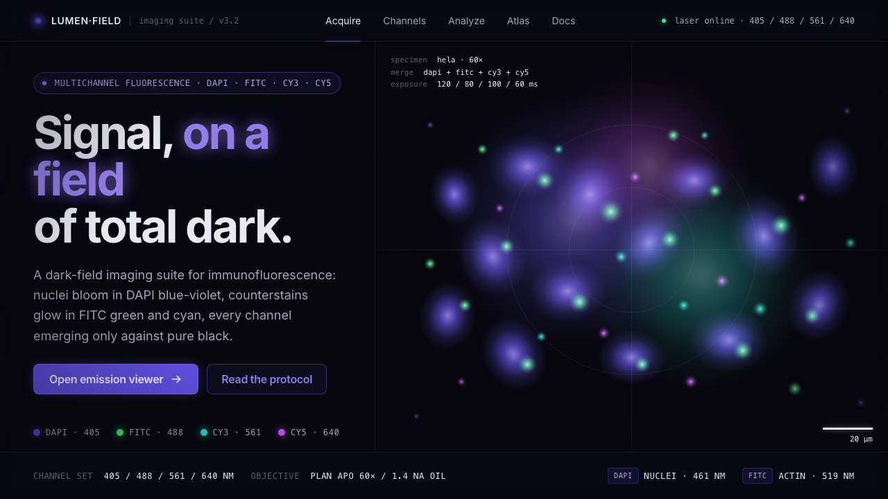 Cell MicroscopySignal on total dark. DAPI blue-violet and FITC green bloom as soft point-emi…
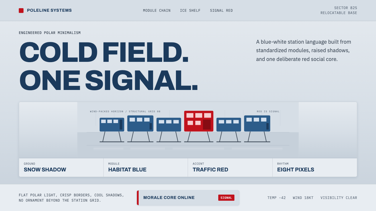 Antarctic StationCold precision, one red signal. Archivo modules ride a blue-white horizon gri…
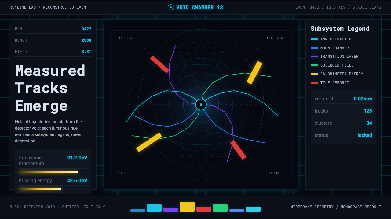 CERN CollisionData, not spectacle. Cyan tracks on black wireframes make every subsystem col…
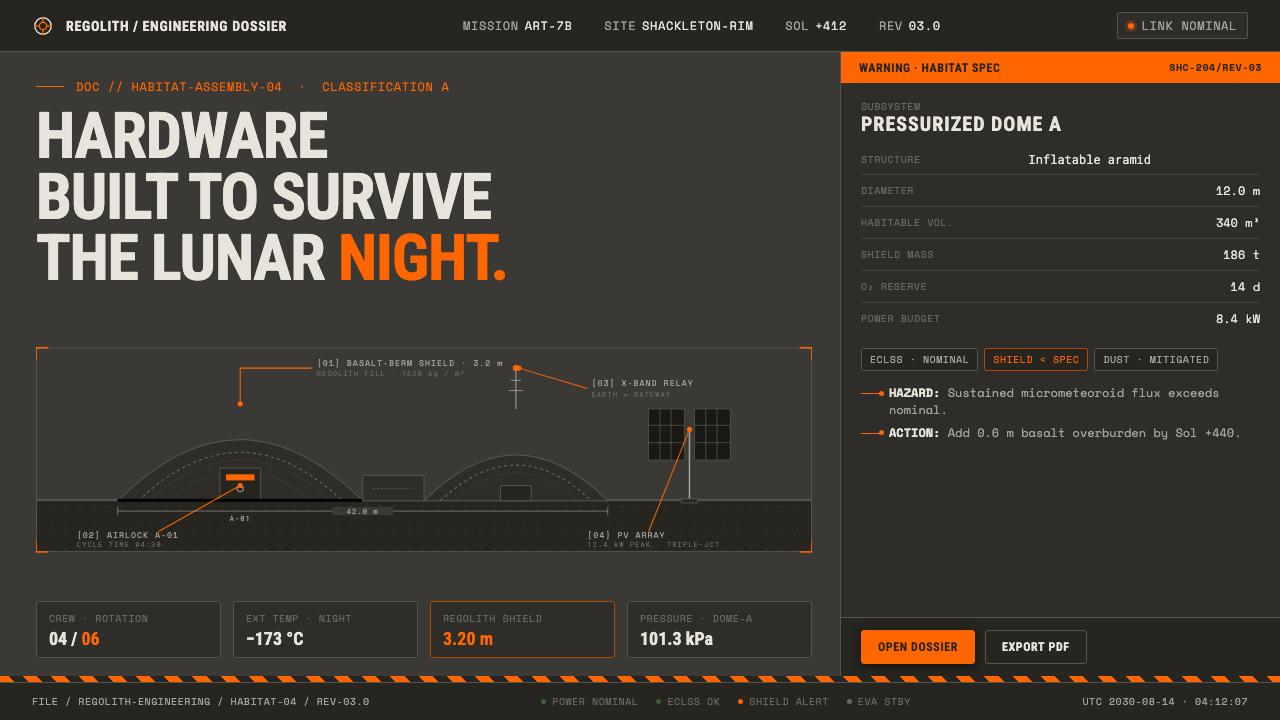 Lunar Base 2030Hardware built to survive the lunar night. Regolith gray, ANSI hazard orange,…
 MRI ScanReads like a radiology viewport. Tissue-gray tomograms on pure black, IBM Ple…
 Metabolism Tokyo (1960)Cities become diagrams. Blueprint blue, mono labels, and capsule red mark mod…