What is Minority Report Gestural UI?
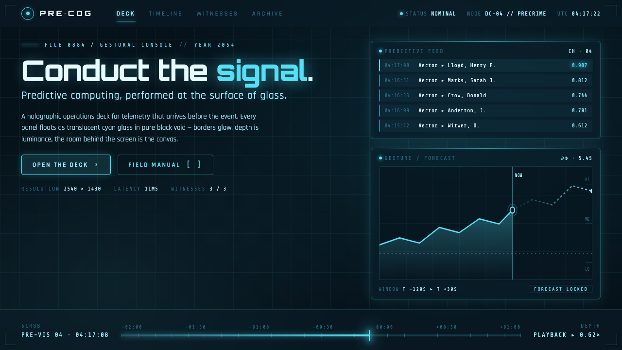
Minority Report Gestural UI imagines predictive computing as choreography on glass: luminous cyan evidence, suspended in a black void and moved by the body.
Minority Report Gestural UI in brief
Minority Report Gestural UI is the cinematic interface language associated with Minority Report, released in 2002 and set in a meticulously researched 2054. Its defining image is John Anderton standing before floor-to-ceiling transparent screens, wearing white gloves and conducting PreCrime footage with broad, deliberate gestures. Computing is not tucked inside a device; it occupies the room, surrounds the operator, and turns search, review, and prediction into visible performance.
The visual system is built from semi-transparent cyan-aqua panels floating against pure black. Ghosted text, faint blue grids, image fragments, video-scrub frames, and translucent layers appear to exist at different depths without ever becoming materially heavy. The darkness does not function as a neutral backdrop. It creates the impression that the interface has no enclosing monitor, desk, or wall: information emerges from an otherwise empty field and can be rearranged in space.
This is a predictive, holographic form of diegetic UI: the interface belongs to the world of the film and communicates its institutional logic at the same time. Every panel suggests that the system is already watching, correlating, and anticipating. Its cool cyan-on-black language contains no warmth, domesticity, or playful decoration. The result is sleek and compelling, but also clinical: a visual promise that data can become legible enough to guide consequential action.
Where does Minority Report Gestural UI come from?
The style originates in Minority Report, a North American Hollywood film from 2002 whose PreCrime setting is in Washington, D.C. Although the film belongs to its release moment, its interface depicts a researched future rather than a generic science-fiction future. The imagined year, 2054, matters because the screens do not present technology as novelty. They present it as an established civic instrument for finding, reviewing, and acting upon predictive information.
Alex McDowell's exhaustive 2054 bible gave the setting an art-directed coherence. That coherence is visible in the restraint of the interface: the same cool cyan-aqua light returns across glass surfaces, grids, text, and moving imagery, while black removes competing environmental detail. The visual language feels designed as a whole world rather than as an isolated screen graphic, which is why a single floating panel can imply a wider computational environment.
Steven Spielberg, Alex McDowell, John Underkoffler, and Imaginary Forces are the key figures named in the source material for this visual world. Their association is important because the style is not reducible to a color treatment or a gesture metaphor. It is a collaborative screen-language in which performance, transparent display surfaces, predictive imagery, and motion through information all reinforce one another.
The style sits at the intersection of speculative-design futurism, the diegetic UI and FUI canon, and holographic interface design. Its later design influence comes from the clarity of that synthesis. It offered a durable visual shorthand for advanced computation: data as luminous layers, the body as a direct controller, and the surrounding dark as proof that the system can extend beyond the limits of an ordinary screen.
What defines the Minority Report Gestural UI look?
Cyan on Black
Cool cyan-aqua is the sole emotional climate. It illuminates text, grids, frames, and glass while pure black absorbs everything outside the active information field. The absence of warm color is essential: amber, red, skin-toned glow, and decorative multicolor accents would pull the interface toward entertainment or consumer software. Here, cyan reads as signal, analysis, and controlled visibility.
Transparent Glass Planes
Panels read as large transparent glass surfaces rather than opaque windows. Their content is visible without becoming fully solid, so information can overlap, recede, and remain legible as a layered field. Borders should feel faint and structural, if present at all. The effect depends on preserving the sensation that the user is looking through data as well as at it.
Spatial Layering
The interface is arranged in depth, not merely in stacked rectangles. A grid can sit behind a moving image, a small annotation can hover over a larger evidence frame, and a ghosted trace can remain visible after an action has passed. These layers create holographic suggestion without requiring literal volumetric realism. The composition should feel suspended, not boxed in.
Gesture as Navigation
Interaction is theatrical because the operator's body is part of the interface image. Broad movement suggests browsing across a field; pinching, pulling, separating, or scrubbing suggests selecting and examining evidence. Even in a non-gestural implementation, controls should preserve this logic: actions should feel like moving, isolating, or bringing forward information, not like clicking through dense administration.
Evidence Frames and Scrubbing
Video-scrub frames and image fragments make prediction appear inspectable. Rather than presenting a single finished answer, the interface exposes a trail of visual material that can be pulled apart and revisited. This gives the system an investigative quality. Information is shown as something being examined in time, not simply announced as an abstract result.
Ghosted Typography and Grid
Typography is luminous but restrained, often appearing as if it has been projected onto glass rather than printed on a surface. Faint blue grid structure supplies orientation without becoming a decorative background. Text, lines, and markers should remain secondary to the information they organize. Their job is to make a large, dark field navigable while retaining the atmosphere of a living signal.
Who shaped Minority Report Gestural UI?
Spielberg is named among the key figures behind the 2002 film. The lasting importance of the interface lies in how fully it serves the film's dramatic world: the act of manipulating data is visible, physical, and suspenseful. The style became memorable because it made computational analysis readable as screen action rather than leaving it hidden inside conventional controls.
McDowell is identified as the art director whose exhaustive 2054 bible shaped the look. That world-building discipline explains the style's consistency: transparent glass, cyan illumination, ghosted information, and black space work as one environmental language. The interface does not merely decorate the future setting; it helps define how that future is perceived.
Underkoffler is listed as a key figure in the source material. His place in the story of this style underscores that Minority Report Gestural UI is inseparable from interaction thinking. The screen language depends on actions with spatial consequence: material is brought closer, spread apart, passed through, and reviewed as though the operator is handling evidence directly.
Imaginary Forces is named among the key contributors to the visual world. Its inclusion emphasizes that this was a designed information language, not an incidental science-fiction texture. The enduring vocabulary of faint grids, luminous frames, transparent panels, and moving data traces works because each element supports the same impression of predictive computing conducted in open space.
How do you use Minority Report Gestural UI today?
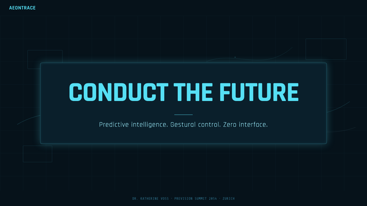
For presentation covers, use a nearly empty black field with one dominant translucent evidence panel or cropped moving-image fragment. Let the title enter as cool luminous type, supported by a faint grid or a small cluster of metadata-like marks. The cover should feel like a system has surfaced one urgent finding, not like a technology-themed poster. On content slides, maintain the same dark field but reduce spectacle: organize claims as transparent layers, keep explanatory text concise, and use cyan lines only to connect, separate, or locate information.
Data slides suit the style when the data can be read as a temporal or investigative trace. Use sequential frames, thin cyan paths, translucent comparison planes, and clearly isolated annotations to show progression, correlation, or review. Avoid turning every chart into a glowing ornament. The valuable quality is evidence under examination: the audience should be able to follow what was found, what changed, and which visual layer carries the conclusion.
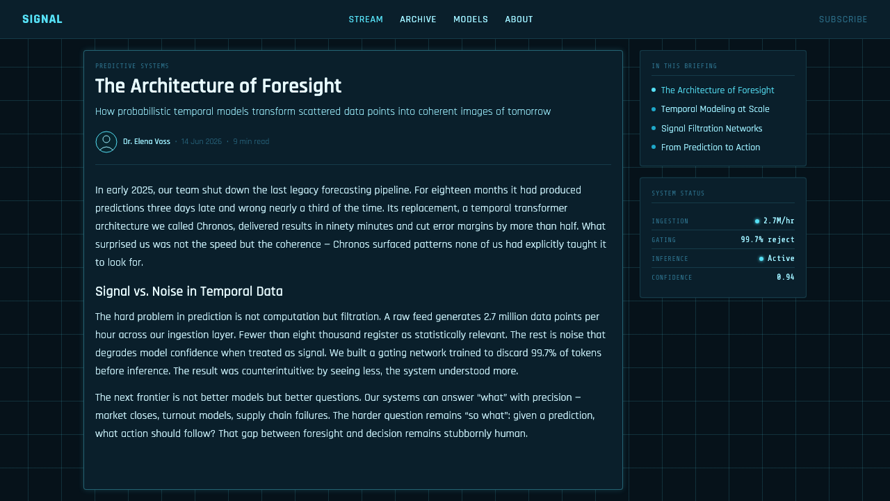
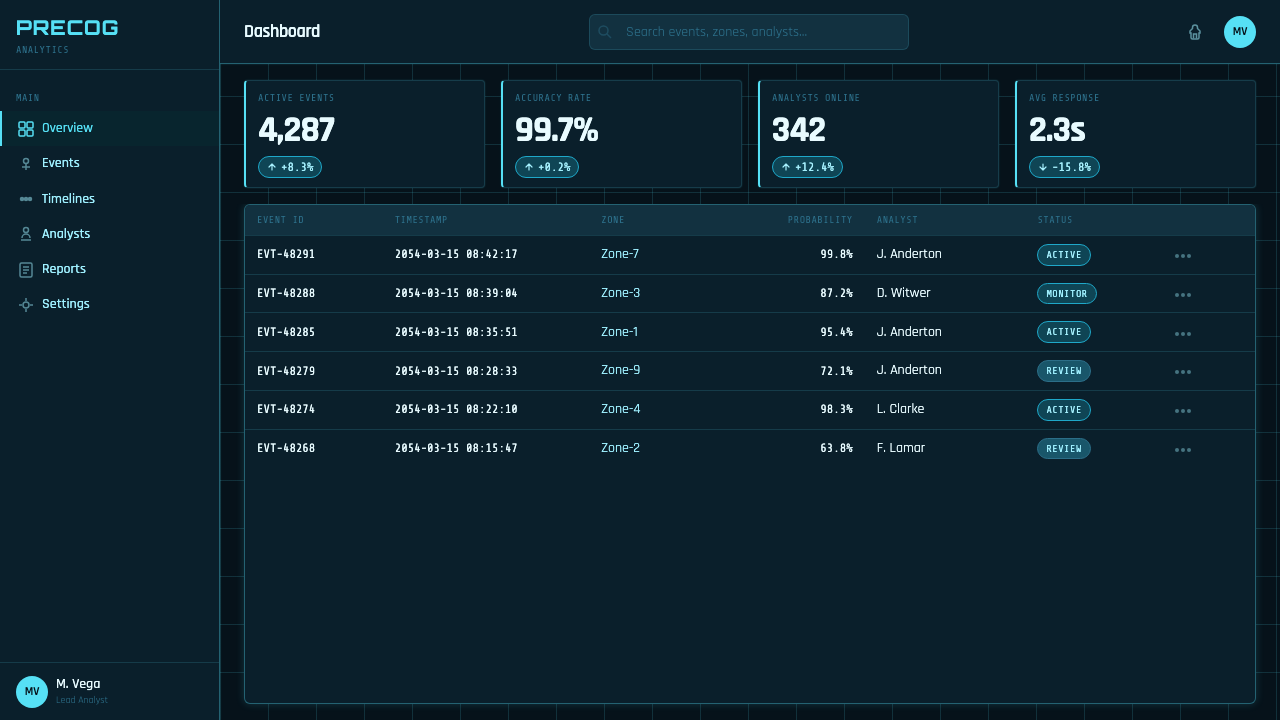
For web UI, the style is strongest in dashboards, monitoring tools, search systems, analytical review surfaces, and other products where users move through large bodies of information. A dark canvas can establish focus while transparent panels allow related views to coexist. Use cool luminous color for active data, selection, and orientation; let inactive information recede into restrained blue-gray presence. Interaction should reveal relationships through expansion, isolation, comparison, and timeline review rather than through a collection of decorative cards.
For editorial and marketing work, use the language to frame a story about research, intelligence, investigation, or future-facing systems. A large black field can carry a single floating image fragment, while translucent labels and grid traces create a controlled sense of depth. Marketing pages benefit when the interface language is used to demonstrate a product's information flow rather than merely borrowing a science-fiction surface. The most persuasive applications show the user what can be examined or predicted, then let the visual system make that process feel immediate.
The common mistake is to treat Minority Report Gestural UI as an excuse for indiscriminate neon, glass effects, and decorative motion. Its force comes from restriction: black space, cyan signal, sparse structure, and a visible relationship between gesture and information. Adding warm accents, dense rainbow color, opaque card stacks, or busy control chrome breaks the cinematic logic. Likewise, copying the floating-panel look for a simple task list can make ordinary actions feel falsely consequential; use the style where spatial analysis and evidence genuinely matter.
Minority Report Gestural UI — FAQ
Is Minority Report Gestural UI simply a glassmorphism variant?
No. Transparency is shared, but the purpose is different. Glassmorphism often uses translucent surfaces to create soft consumer-interface depth. Minority Report Gestural UI uses transparent planes to make information appear spatial, inspectable, and manipulable in an otherwise black void. Its central idea is not material softness; it is predictive data being conducted across space.
Why must the palette remain so cool?
Because the cyan-on-black relationship carries the style's meaning. It makes the interface read as signal and analysis rather than comfort or personality. Warm accents immediately compete with that reading and weaken the impression of a controlled institutional system. Variation can come from transparency, depth, density, and intensity instead of introducing unrelated hues.
Does a product need literal hand tracking to use the style?
No. Literal hand tracking is only one expression of the interaction metaphor. A mouse, touch surface, or conventional control can still reflect the style if the interface lets users pull information apart, bring evidence forward, compare layers, and scrub through a visual record. The important part is that navigation feels spatial and investigative rather than bureaucratic.
Where does this style work poorly?
It is a weak fit for products that need warmth, intimacy, calm reassurance, or broad everyday readability. A dark, luminous evidence field can make simple consumer tasks feel severe and overengineered. It also struggles when large amounts of long-form text must be read continuously. Use it when a product benefits from a sense of monitoring, investigation, analysis, or future-facing control.
How can a design reference the film without becoming a costume?
Borrow the system, not every surface detail. Keep the dark field, cool signal color, transparent hierarchy, and evidence-oriented interaction, then adapt the content to a real task. Do not add floating panels merely because the reference has them. When each layer answers a user question or exposes a useful relationship, the result carries the spirit of the style without pretending that every product is a PreCrime command room.
Related design styles
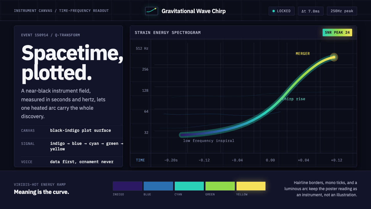 Gravitational Wave ChirpData makes the drama. Near-black grid, mono Hz ticks, and a viridis-hot chirp…
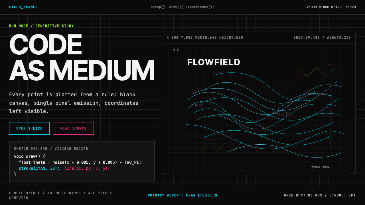 Processing / GenerativeCode becomes image. Cyan hairlines trace black-grid flowfields with mono coor…
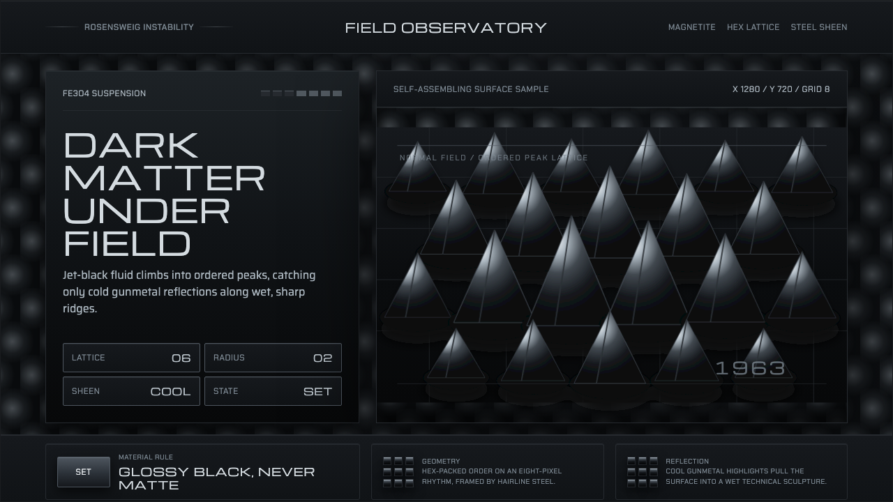 Ferrofluid Spike FieldPhysics turns sculptural. Jet black peaks, steel sheen, hex order.
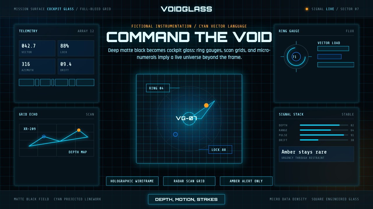 FUI Sci-Fi HUDBlack until it glows. Cyan wireframes, ring gauges, and radar grids sell live…
 Cassini Saturn ImagingDeep space feels exact. Butterscotch Saturn floats in black with fine tan rin…
 DNA Gel ElectrophoresisLab output becomes light. Green fluorescent bands stack down a near-black gel…