What is Interplanetary Internet Relay?
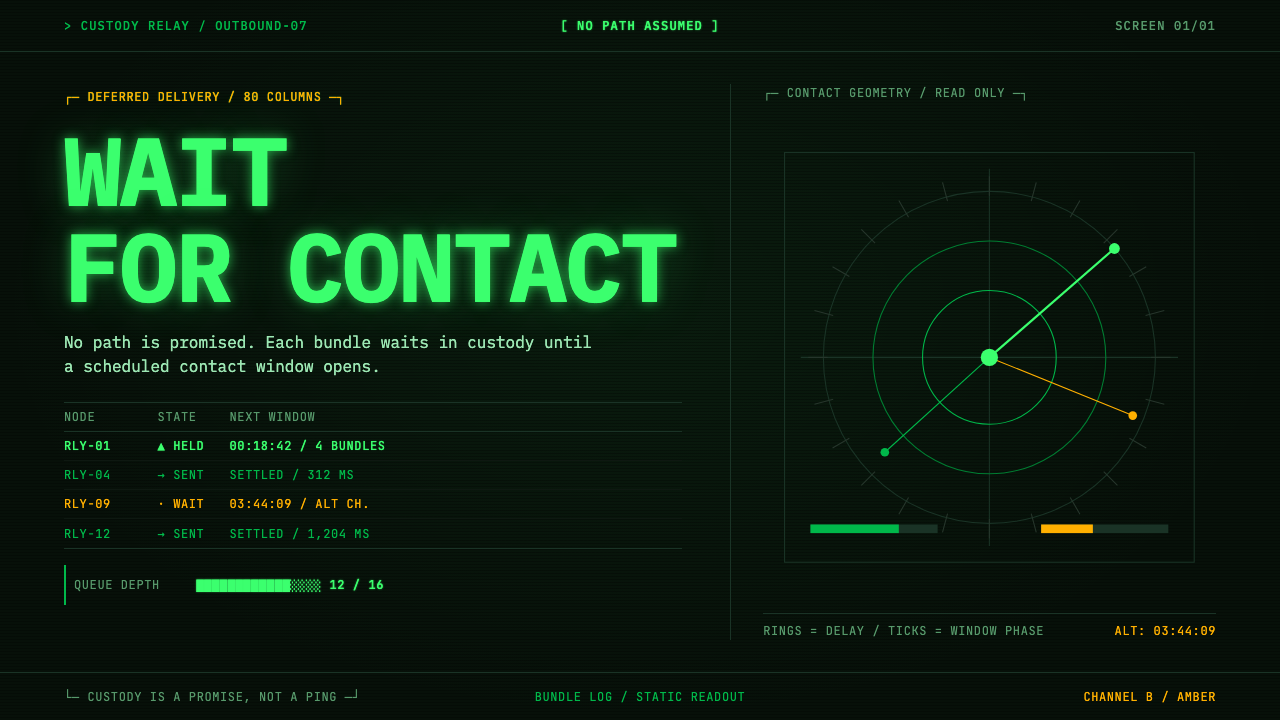
The interplanetary internet assumes the link will fail, and its visual language is a green-on-black console that makes waiting legible instead of hiding it.
Interplanetary Internet Relay in brief
Interplanetary Internet Relay is a design style drawn from delay- and disruption-tolerant networking, the family of ideas that grew out of NASA's Jet Propulsion Laboratory studies of an internet for deep space, beginning in 1998. Its visual language is a monochrome operator console: bundle logs, custody states, contact-window ribbons and one-way delay tables, all snapped to an eighty-column character grid and rendered as emissive green glyphs on near-black glass, with amber reserved for the secondary channel.
The premise is what makes the style distinct. On the terrestrial internet, a packet that meets a dead link is simply dropped and the sender tries again. In deep space the link is dead most of the time: planets rotate, spacecraft slip behind bodies, and distance stretches a signal across minutes before it arrives. Bundle Protocol answers by parking a message, called a bundle, at the nearest node and holding it until the next contact window opens, which may be hours away. The design treats that parked time as its subject. Queues, custody and scheduled contact are the content; throughput is not.
Visually, the style is a refusal of urgency. Nothing animates merely to look busy. Text scrolls the way a log scrolls, because a log is the honest representation of a system that records what has happened and what is scheduled to happen. The effect on a viewer is closer to reading a ship's logbook than watching a live dashboard: calm, dense, and oriented toward time rather than speed.

Where does Interplanetary Internet Relay come from?
The idea starts in 1998, when the Jet Propulsion Laboratory in Pasadena began a study of what an internet for the solar system would need. Vint Cerf and Adrian Hooke are the two names the project record attaches to that effort. The question was never how to make the existing internet faster. It was how to accept that the internet's central assumption, that an end-to-end path exists for the whole duration of a conversation, simply does not hold between planets.
The technical answer came to be called delay- and disruption-tolerant networking. Instead of insisting on a continuous route, each node stores what it receives and forwards it when a link becomes available, and custody of a bundle passes from node to node so that someone is always responsible for it. NASA's own implementation of the approach is the Interplanetary Overlay Network, known as ION, which runs these ideas as a layer over whatever links happen to exist. Everything the style draws, from custody states to contact ribbons to delay tables, is a piece of that machinery made visible.
The look comes from a different decade and a different department. The glowing character display belongs to the 1970s and 1980s, when the P1 and P3 phosphor terminals of the DEC VT-series era were how people talked to machines. P1 phosphor is the willemite green of early terminals and scopes: it burns brightly, bleeds slightly at the edges of a glyph, and leaves an afterglow when the picture changes. Deep-space network operations in Pasadena inherited that culture of watching text scroll across a dark screen, and this style marries that display language to a networking idea from 1998 onward.
The marriage is not arbitrary. Both halves belong to the same engineering temperament: systems built to be monitored by people who cannot be physically present and who must trust what they see. A console that shows custody states and contact ribbons is a descendant of the operator's terminal in a control room, where the screen is the only window onto hardware millions of kilometres away. The style therefore reads as documentary rather than nostalgic. It borrows an authentic look for an authentic purpose.
What defines the Interplanetary Internet Relay look?
Unlit glass ground
The ground is the face of a tube that has not yet been lit: near-black, with a faint green cast rather than a neutral grey or a blue-black. It reads as depth behind glass, not as a flat fill, and it stays uniform. There are no panels in contrasting tones and no cards lifted on shadows; regions are separated by ruled lines and by spacing in the character grid. Because the darkness is the medium, anything that appears lighter than the glass has to be something that emits, never something that sits on top.
Emissive green glyphs
Every character is the willemite green of P1 phosphor, burning rather than printed. Brightness varies in only a few steps: a full-strength tone for the active line, a dimmer one for history and labels, and little else. The edges of glyphs bleed slightly into the dark, giving a soft halo that is part of the identity, and fast scrolling leaves a short afterglow trail. The glow is treated as physics rather than decoration: it appears on text and rules because those are the things being excited, and nowhere else.
Amber as secondary channel
Amber is the only other hue, and it has a job. It marks the secondary channel and the lines belonging to the backup screen, which is to say the things an operator needs to see as different in kind rather than different in importance. It never signals error, success or emphasis in the traffic-light sense. Because the palette has just two voices, the eye learns the rule quickly: green is the primary stream, amber is the alternate path.
Eighty-column grid
Layout is a character grid of eighty columns, inherited from the terminals the display language comes from. Text is monospaced, aligned to columns, and set in a single typeface family at a single size. Tables are drawn with ruled characters, numbers are right-aligned so that delays and counts can be compared down a column, and nothing is centred. Hierarchy comes from position, brightness and the occasional all-capital label, never from changes of size.
Logs, ribbons and delay tables
The content types are specific to the subject. A bundle log lists each message with its state; a custody view shows which node currently holds responsibility for a bundle; a contact ribbon draws the spans of time during which a link will be up as bars along a time axis; a one-way delay table lists how long a signal takes to cross each hop. These components are the style's vocabulary in the way cards and buttons are the vocabulary of a consumer interface, and they carry the premise visually: time is laid out as something you can read.
Stillness
Motion is minimal and honest. A new log line appears at the bottom and older lines move up, as in a real log; a cursor may blink where input is expected. Nothing pulses, bounces or counts up to look alive. The refusal is explicit in the system's own description: the substance is queued time, not throughput, and animation that suggests speed would tell the opposite story. When a long wait is the reality, the interface lets it be long.

Who shaped Interplanetary Internet Relay?
Vint Cerf is one of the two people the project record names as key figures of the interplanetary internet effort that began at JPL in 1998. He is better known as a co-designer of the protocols behind the terrestrial internet, which gives the deep-space work its narrative shape: a person who helped define how packets cross a connected network lending his name to the question of what happens when no connection can be assumed.
Adrian Hooke is the second figure the record attaches to the interplanetary internet, working from the NASA and JPL side of the problem, where spacecraft communication is a daily operational matter rather than a thought experiment. His presence in the story reflects the practical origin of the style's themes: contact windows, custody and delay are operations vocabulary before they are design vocabulary.
The laboratory in Pasadena, California, is both the institutional origin of the 1998 study and the home of deep-space network operations, the daily practice of talking to distant spacecraft. The style's console look is the look of that practice: an operator's screen onto hardware that cannot be touched, where the only evidence of the world is what the display chooses to show.
ION is NASA's implementation of the delay- and disruption-tolerant approach, listed in the project record among the movements behind the style. As software it explains the style's insistence on state: whatever an ION node knows about bundles, custody and contacts is exactly the kind of information that an operator's screen exists to show.
How do you use Interplanetary Internet Relay today?
Interplanetary Internet Relay is a specialist style, and it works best when the product genuinely has something in common with the premise: systems that queue, schedule, retry, replicate or wait. Applying it correctly means committing to the console as a whole, not borrowing green text as a skin.
For presentation slides, the cover works as a terminal boot screen: a single identifying line near the top left, a few lines of log-like metadata, and a lot of unlit glass. Content slides should behave like a log that has been paused, with a short left-aligned column of statements and a dimmer column of annotations. Data slides are where the style is strongest: contact ribbons become timelines, delay tables become comparison tables, and a bar of block characters replaces a chart, all in the same two colours.
For web interfaces, the natural homes are operations dashboards, job queues, status pages, observability tools, and developer consoles. A dashboard becomes a set of aligned log panes and tables rather than tiles with rounded corners. Pricing pages can be set as a plain table in the character grid, with plans as rows and limits as right-aligned columns, and the call to action written as a command prompt. Navigation is textual, with brackets or capital letters marking the active item and no icon decoration.
For editorial and marketing work, the style suits engineering writing, changelogs, technical reports, space and infrastructure stories, and launch pages for tools that deal with reliability. Long-form text should be kept to a modest line length in a single monospaced face, with section breaks drawn as ruled lines and timestamps used as quiet metadata.
A common mistake is treating the look as a generic hacker or science-fiction terminal and piling on effects: heavy glow, scanlines across every surface, flickering, text typing itself out on every load, and several neon colours in competition. The style has two hues and a deliberate stillness, and the halo is subtle. Another mistake is applying it to products that promise instant results, where a visual language about patience undermines the message. A third is setting body text in a proportional face, which breaks the column logic the whole system depends on.

Interplanetary Internet Relay — FAQ
What is Bundle Protocol, in plain language?
It is a way of sending data when you cannot count on a connection existing from end to end. Instead of a stream of packets that fails if any link drops, a message is packaged as a bundle and handed from node to node. Each node stores it until the next hop is available, and custody passes along so that some node always owns responsibility for delivery. The delay can be hours, and the design accepts that rather than pretending otherwise.
Is this just the usual hacker or Matrix terminal look?
It shares the green-on-black surface, but the logic underneath differs. The generic hacker look is about theatre: cascading characters, constant motion, a sense of speed. This style is about records: logs, custody states, contact schedules and delay tables, drawn with a deliberate stillness and only two hues. Its content is derived from a real networking idea, and its display language from real phosphor terminals. If an interface moves constantly to look busy, it has left the style behind.
Can it work on a light background?
Not without losing its identity. The style is built around emission: characters glow against unlit glass, and the darkness is the medium. A light inversion turns the glow into ordinary dark text on a pale page, which is a different and much more common look. If you need a print-friendly variant, keep the monospaced grid, the ruled tables and the two-voice logic, but accept that it becomes a document in the spirit of the style rather than a faithful rendering of it.
How much glow, scanline or CRT effect is right?
Less than most people expect. The reference is the way real phosphor behaves: a soft halo around glyph edges, a short afterglow on fast scrolling, and an unlit ground with a faint green cast. Those are enough to say 'phosphor'. Curvature, heavy flicker, chromatic fringes and noise layers turn a record into a costume, and they cost legibility. A good test is whether the text remains comfortable to read for a long stretch.
Which products is it a poor fit for?
Anything built on warmth, play or instant gratification: consumer lifestyle brands, children's products, checkout flows that must feel effortless. A visual language about queued time and monitored state sends the wrong signal there, and its density and monochrome palette can feel austere or exclusionary to people who are not used to consoles. It is strongest where the audience already trusts logs and tables and where being honest about delay is a feature.
Related design styles
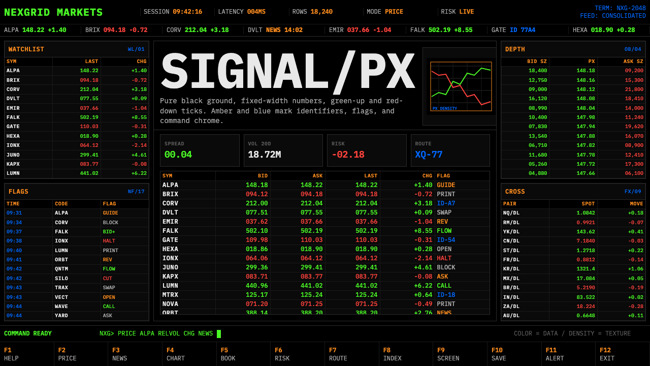 Financial Terminal MonoMaximum signal per pixel. Pure black, IBM Plex Mono, green-red ticks, amber-b…
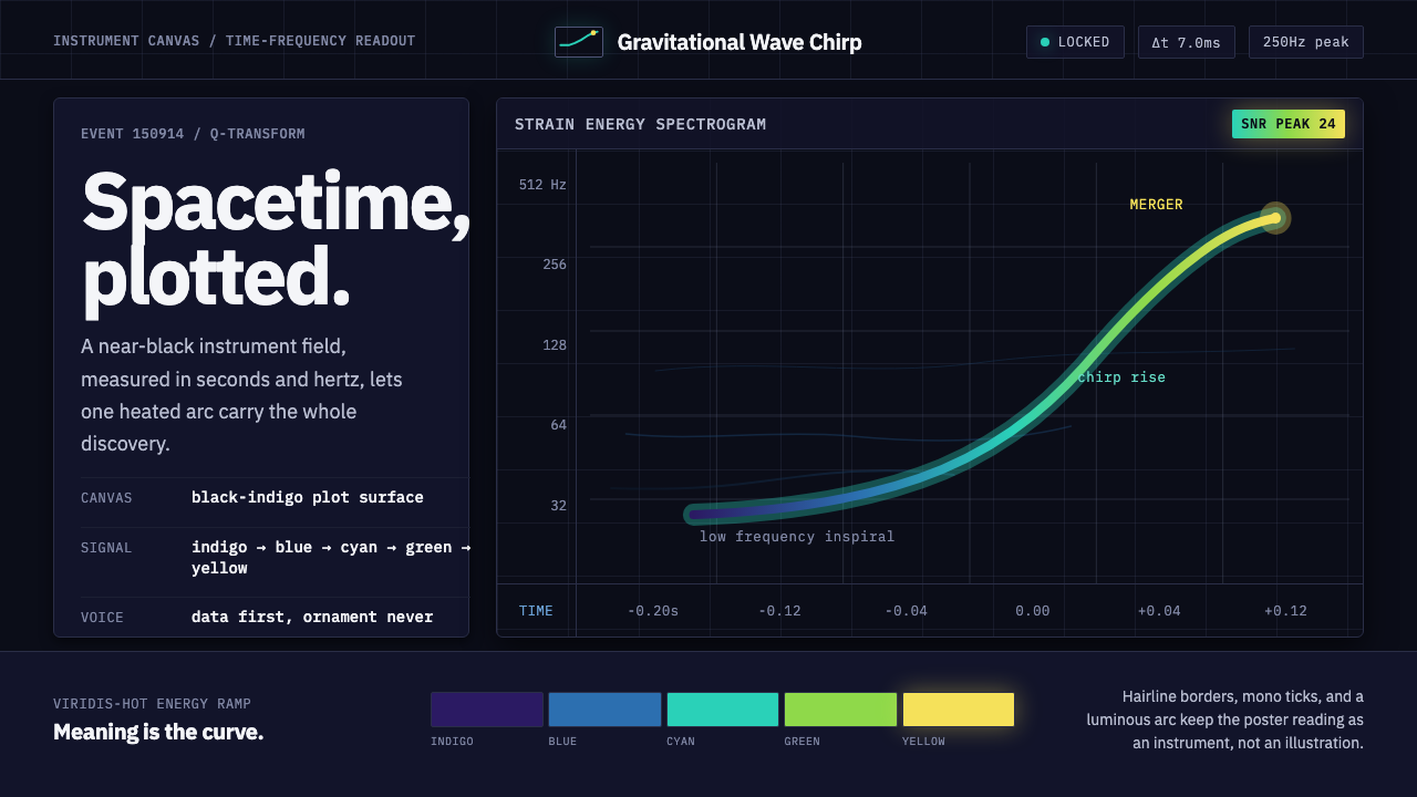 Gravitational Wave ChirpData makes the drama. Near-black grid, mono Hz ticks, and a viridis-hot chirp…
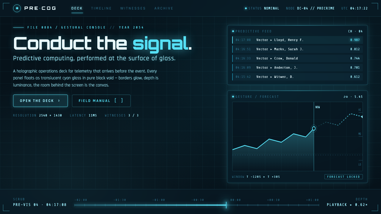 Minority Report Gestural UIPredictive computing, conducted on glass. Luminous cyan panels floating in pu…
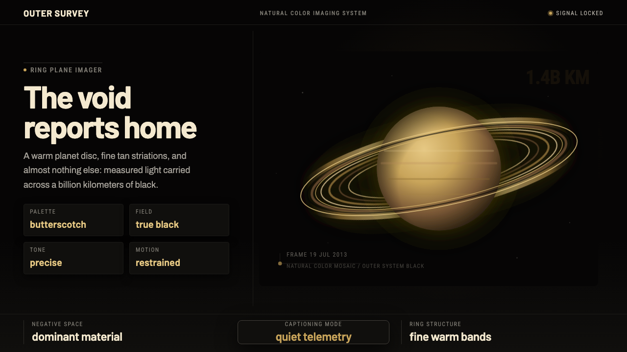 Cassini Saturn ImagingDeep space feels exact. Butterscotch Saturn floats in black with fine tan rin…
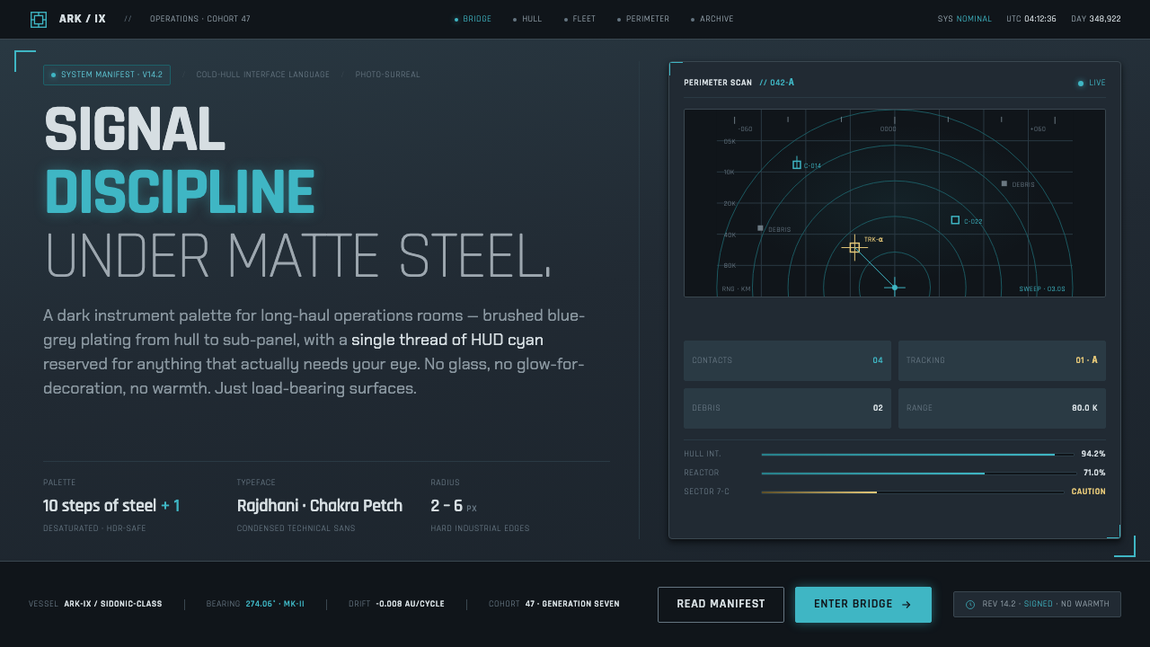 Knights of SidoniaSignal discipline under matte steel. Blue-grey hull, condensed Rajdhani, one…
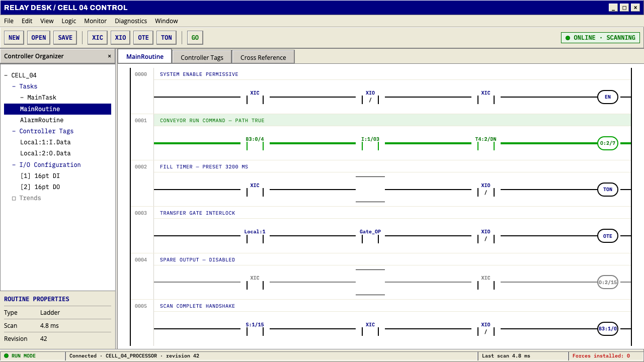 PLC Ladder LogicLogic made visible. Black rails and navy mnemonics turn green wherever the ci…