What is Knights of Sidonia?
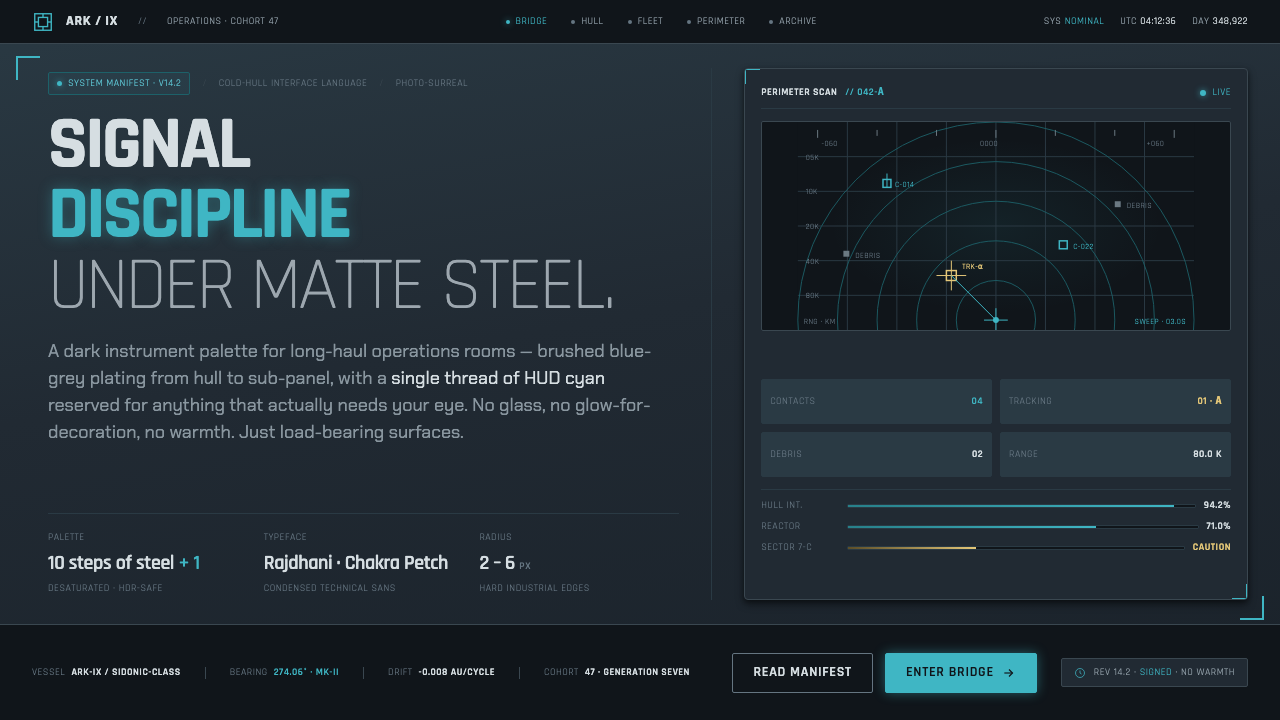
Knights of Sidonia turns survival into a visual system: matte steel, disciplined signals, and a single cyan thread cutting through the dark.
Knights of Sidonia in brief
Knights of Sidonia is a 2014 Japanese CG mecha anime whose design language emerges from a generation ship fleeing a dead Earth. Its world is nearly colorless: brushed steel corridors, scuffed hull plating, blue-grey metal, and flat utilitarian illumination establish an environment where survival has displaced comfort. The ship feels less like a home than a sealed machine that must continue operating.
The visual identity is built on subtraction. Warm color, decorative surface treatment, and atmospheric softness are largely absent. What remains is a controlled field of matte metal and hard-edged geometry, punctuated by the thin cyan glow of HUD readouts and Gauna-tracking interfaces. Cyan does not decorate the scene; it reports status, marks attention, and makes information visible inside an otherwise cold structure.
This is the logic of Photo-Surreal rendering: a world close enough to industrial reality to feel physical, yet estranged enough to make scale and isolation oppressive. Hulls appear worn rather than polished, corridors feel functional rather than inviting, and light behaves as a tool of orientation. The resulting aesthetic belongs to hard science fiction, industrial mecha, and space-survival design, but its deeper subject is disciplined attention under pressure.

Where does Knights of Sidonia come from?
The style belongs to Japan in the 2010s, at a moment when CG mecha anime could pursue a different relationship between animation and material reality. Knights of Sidonia places its drama inside a seed ship: a vast vessel carrying the remnants of human life away from a destroyed Earth. That premise gives the aesthetic its central condition. Every corridor, hull surface, and interface exists within a closed system whose resources and safety cannot be assumed.
Polygon Pictures rendered this setting through a Photo-Surreal CG approach. The term describes a productive tension: surfaces are observed with the seriousness of photography, while the world around them remains strange, immense, and emotionally displaced. Brushed metal and damaged plating provide tactile credibility, but the nearly colorless palette prevents that credibility from becoming cozy realism. Material detail is present to reinforce isolation, not to provide luxury.
The visual movement can be understood as the convergence of photo-surreal CG anime, hard-science-fiction industrial mecha, and a desaturated space-survival aesthetic. These influences meet in a system where form follows operational need. Structural lines guide the eye, surfaces communicate use and wear, and luminous interfaces separate readable information from the surrounding mass. The style feels futuristic because it is controlled, not because it is overloaded with technology.
Tsutomu Nihei, Kōbun Shizuno, and Polygon Pictures form the named creative constellation around this expression of the world. Their association matters because the look is not a detachable surface treatment. It binds setting, scale, material, and information into a coherent atmosphere. The ship is frightening because it is enormous, cold, and necessary; the interface is convincing because its light appears rationed. Together, those decisions turn production design into narrative pressure.
What defines the Knights of Sidonia look?
Matte Steel
Metal is never presented as pristine luxury. Surfaces are brushed, dulled, scuffed, and slightly weathered, allowing the ship to feel inhabited and continuously maintained. The finish absorbs attention instead of reflecting it, keeping the eye on structure, movement, and operational detail.
Desaturated Blue-Grey
The dominant field is a restrained blue-grey metal range, close to colorlessness but never visually empty. It produces coldness without theatrical blackness and gives the ship a coherent atmospheric identity. Contrast comes from surface value, silhouette, and illumination rather than a broad spectrum of hues.
Signal Cyan
Cyan is the sanctioned exception to the muted palette. It appears as a narrow glow around readouts, tracking systems, and other moments of machine-readable information. Because it is scarce, it acquires authority: the eye learns that cyan means status, focus, or imminent relevance.
Hard Geometry
Edges are firm and purposeful. Panels, corridors, hull sections, and interface frames rely on clear planes and mechanical alignment. Depth is built through overlapping structures and controlled perspective, not through soft atmospheric effects. The composition therefore feels engineered even when it becomes visually immense.
Condensed Information Type
Condensed Rajdhani carries the interface voice. Its narrow, technological rhythm allows labels and readouts to sit inside crowded mechanical compositions without becoming ornamental display type. Typography behaves like equipment: legible, compact, and subordinate to the information it delivers.
Light as Information
Illumination is flat, utilitarian, and emotionally cool. Light clarifies a corridor, exposes a surface, or marks an active interface; it rarely exists to flatter a subject. This makes every luminous accent feel consequential. The absence of warm atmospheric light keeps the world focused on function and survival.

Who shaped Knights of Sidonia?
Nihei belongs to the named creative core of the Knights of Sidonia world. In this design language, his presence is felt through the commitment to overwhelming architecture, compressed living space, and the idea that human life is small when measured against the systems keeping it alive. The result is a visual environment where scale is never neutral: steel mass becomes psychological pressure.
Shizuno is part of the creative constellation associated with this controlled expression of the setting. The style connected to his name depends on maintaining tension between spectacle and restraint: the ship can feel immense and cinematic, yet its surfaces and signals remain disciplined. That balance prevents science-fiction scale from dissolving into visual noise.
Polygon Pictures provides the production identity most directly associated with the Photo-Surreal CG treatment. Its contribution is visible in the meeting of photographic material credibility and estranged digital scale. Metal feels touchable, but the total environment remains uncanny; that contradiction is the foundation of the aesthetic rather than a side effect.
How do you use Knights of Sidonia today?
For presentation slides, use the aesthetic as a system of operational hierarchy. A cover can place a large dark hull-like field behind a condensed title, with a thin cyan line or indicator providing the only bright interruption. Content slides should resemble mission displays: matte blue-grey panels, hard divisions, short labels, and restrained type contrast. Data slides work best when charts are treated as instruments rather than illustrations, with cyan reserved for the active series, warning, or selected state.
For web interfaces, the style suits dashboards, monitoring tools, and pricing pages that need to feel precise, technical, and controlled. Use a dark blue-grey foundation, quiet metallic surfaces, and a clear typographic hierarchy built around condensed Rajdhani. Cyan should identify interaction, live status, or meaningful change. Cards should feel like modules within a larger vessel, while borders and alignment do the structural work that decorative effects would normally perform.
For editorial and marketing work, Knights of Sidonia offers a strong language for stories about infrastructure, engineering, logistics, survival, and systems under pressure. Editorial pages can use wide dark fields, narrow information columns, worn surface imagery, and cyan annotations that behave like technical callouts. Marketing compositions should let the ship-like structure carry the message: a severe headline, a controlled image crop, and one luminous accent are usually stronger than a crowded futuristic collage.
The style can also organize product explainers and technical documentation. Separate primary information from supporting metadata through contrast, spacing, and containment rather than many colors. Use panel groupings to suggest a larger mechanical system, and let each cyan mark answer a question: what is active, what is changing, or where should attention move next? The result should feel authored by a functioning environment, not decorated by a science-fiction filter.
The common mistake is treating the aesthetic as permission to add neon everywhere. Too much cyan destroys its information value, while glossy metal, lens effects, and ornamental circuitry turn disciplined industrial design into generic cyberpunk. Another mistake is using condensed type without providing hierarchy or breathing room. The style works when scarcity is deliberate: muted surfaces establish the world, hard geometry establishes order, and the single bright signal earns attention.

Knights of Sidonia — FAQ
Is Knights of Sidonia the same as cyberpunk?
Not exactly. It shares cyberpunk's interest in technology, artificial environments, and visual density, but its governing mood is different. Knights of Sidonia is colder, more industrial, and more concerned with survival inside a closed mechanical system. Its palette is nearly colorless, its cyan is rationed, and its surfaces are matte rather than glossy. The style is better understood as photo-surreal hard science fiction with industrial mecha discipline than as a general neon-futurist look.
Can the style work on a light background?
It can, but the atmosphere changes. The original language depends heavily on dark blue-grey metal, matte surfaces, and the contrast of cyan against darkness. A light version should preserve the other principles: restrained color, hard geometry, condensed information type, and light used as a signal. If the background becomes bright and clean while the cyan remains abundant, the design will lose its sense of sealed machinery and controlled scarcity.
Why is cyan used so sparingly?
Because cyan is not merely a brand accent; it is part of the information architecture. Against a desaturated field, a small cyan signal immediately establishes priority and machine activity. If every label, border, and decorative detail glows, the eye can no longer distinguish status from atmosphere. Scarcity gives the accent authority and allows light to behave as information rather than warmth or ornament.
Does the style require realistic metal textures?
No. Material credibility matters more than literal texture. A flat blue-grey surface with controlled variation can communicate the same industrial restraint if its edges, grouping, and lighting behave consistently. Realistic scratches and brushed grain are useful only when they support the sense of use, maintenance, and enclosed infrastructure. Texture added for spectacle weakens the system, especially when it competes with the cyan signals or obscures typography.
Related design styles
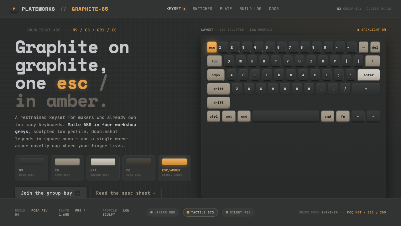 Mechanical KeyboardGraphite on graphite, one key in amber. Doubleshot ABS in GMK greys with mono…
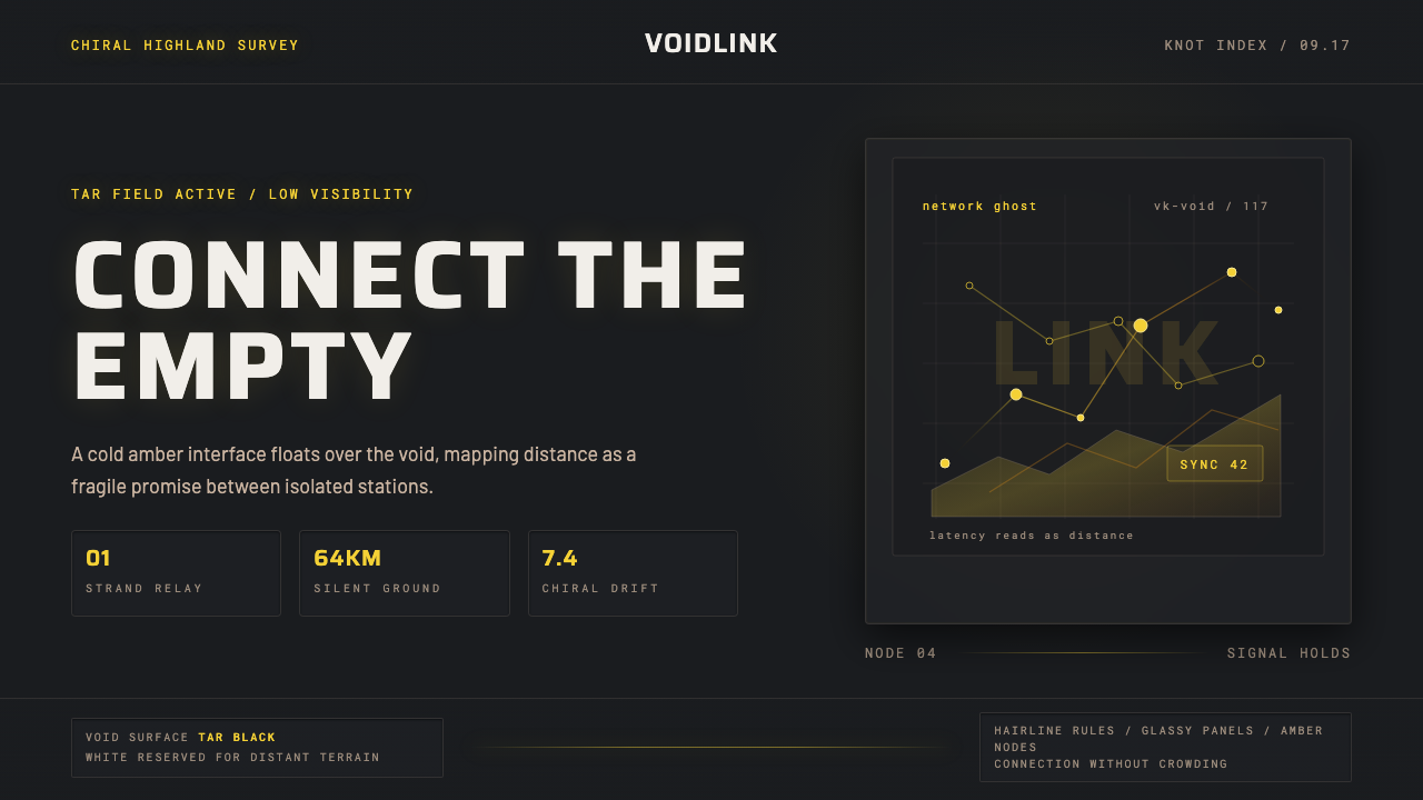 Death StrandingLonely connection, made visible. Amber HUD lines hover over a tar-black void.
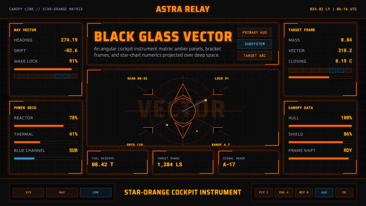 Elite DangerousOne amber instrument. Star-orange wireframes, mono numerics, and black-glass…
 Gravitational Wave ChirpData makes the drama. Near-black grid, mono Hz ticks, and a viridis-hot chirp…
 Halo (Forerunner UI)Hard light on the void. Cyan shield bars and concentric glyph rings glow on a…
 Minority Report Gestural UIPredictive computing, conducted on glass. Luminous cyan panels floating in pu…