What is Halo (Forerunner UI)?

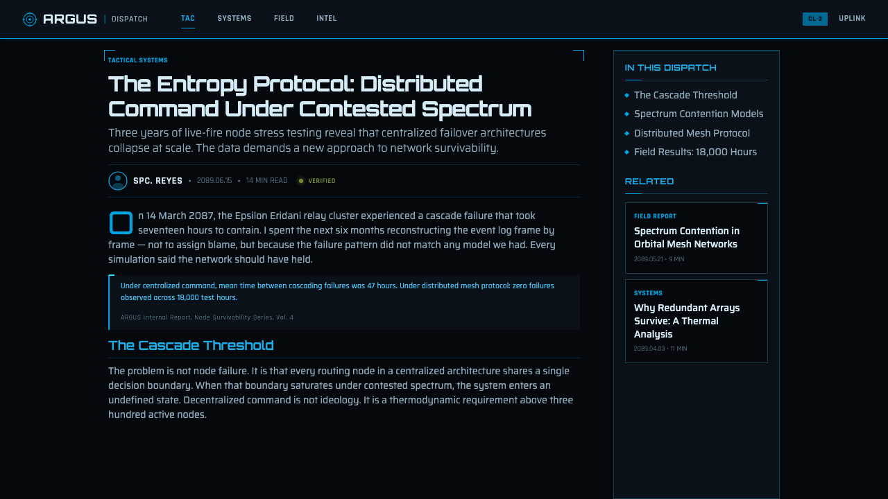
Halo Forerunner UI turns the screen into a helmet visor — cyan shields, angular glyph rings, and indigo data structures burning with hard light against a military-black void.
Halo (Forerunner UI) in brief
Halo Forerunner UI is a dark military-science-fiction interface language derived from the MJOLNIR helmet HUD and the wider Forerunner and Cortana visual vocabulary of the Halo franchise. Its defining image is hard cyan light suspended over a nearly black visor field: shield bars remain immediately legible, concentric glyph rings imply computation or scanning, and indigo data lattices suggest an intelligent system operating beneath the visible interface.
The style joins two related technologies. The UNSC side is operational and military: compact status information, hard-edged frames, olive indicators, amber cautions, and red warnings. The Forerunner and Cortana side is more abstract: rotating ring structures, angular symbols, layered geometric fields, and luminous information that appears almost architectural. Together they create an interface that feels engineered for combat yet connected to an older, more enigmatic machine intelligence.
This is not a soft futuristic aesthetic. Rounded cards, friendly illustrations, pastel surfaces, and decorative warmth contradict its character. Forms are clipped, segmented, and sharply bounded. Light is concentrated rather than atmospheric, while darkness is treated as active negative space. Every visible element should look as though it identifies a system state, protects a boundary, tracks a signal, or reveals a controlled layer of data.
Where does Halo (Forerunner UI) come from?
The visual language begins with Halo, the North American science-fiction franchise introduced by Bungie in 2001. Its foundational interface image is the view through a Spartan's MJOLNIR helmet: information does not sit on an ordinary application page but occupies a visor between the wearer and a dangerous external world. That premise gives the HUD its discipline. Readability, threat recognition, and shield status belong to the fiction of the equipment rather than appearing as detached graphic decoration.
Bungie's contribution established the durable military frame of the language. The black visor field creates isolation and focus, while luminous status elements suggest hardware designed to remain readable in hostile conditions. Cyan shield information becomes the principal visual anchor. Olive, amber, and red operate as secondary signals associated with ordinary military status, caution, and danger. The resulting palette feels controlled because its colors behave like coded instruments rather than expressive surface treatment.
After stewardship of the franchise passed to 343 Industries, the Forerunner and Cortana vocabulary became especially prominent across the period from roughly 2012 to 2024. Concentric glyph rings, angular geometry, and floating indigo lattices expanded the interface beyond the practical language of a soldier's display. Information could now resemble an alien mechanism or a spatial data structure: ordered and precise, but not fully explained by familiar human engineering.
The contemporary Halo Forerunner design style is therefore a translation rather than a literal reproduction of a game screen. It extracts recurring principles from the franchise — cyan hard light, visor-like darkness, segmented frames, rotating ring motifs, technical geometry, and coded military accents — and adapts them to slides, websites, dashboards, and editorial systems. The strongest applications preserve the original relationship between information and equipment: the interface should feel functional first, cinematic because of that function, and never futuristic merely through added decoration.
What defines the Halo (Forerunner UI) look?
Color and Signal
Cyan is the dominant operational color, recalling the shield display and documented Cortana blue. Indigo belongs to deeper data structures and intelligent-system layers. UNSC olive supports routine status, amber introduces caution, and red is reserved for genuine warning. These hues should never compete evenly; the hierarchy must make normal operation, analytical depth, and danger distinguishable before the text is read.
Visor Black
The background is not merely dark mode. It behaves as the interior void of a sealed visor: deep, quiet, and expansive enough for luminous information to feel suspended rather than printed. Large areas may remain almost empty. This darkness creates tactical focus and allows a small amount of cyan or indigo light to carry disproportionate visual authority.
Angular Frames
Panels and boundaries use clipped corners, interrupted strokes, and segmented construction. A frame may appear to lock onto content rather than simply contain it. Curves are appropriate primarily within rings or targeting forms; general containers remain hard-edged. The geometry should communicate engineered assembly, with each break or angle appearing intentional and structurally related to nearby information.
Concentric Glyph Rings
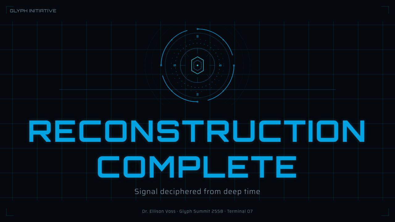
Concentric rings are the signature Forerunner motif. They may be divided into arcs, interrupted by angular marks, or layered behind a central datum. Their purpose is to imply scanning, alignment, calculation, or an unfamiliar machine language. Rings work best as focal instruments and transitional structures; repeated everywhere, they lose mystery and become generic science-fiction ornament.
Technical Typography
Typography is geometric, narrow in attitude, and free of rounded friendliness. Headings resemble system identifiers or equipment labels, while body text remains restrained enough for extended reading. Capitals, compact metadata, and widely separated labels can reinforce the military-instrument character, but excessive coding conventions make the design theatrical. The type should feel issued by a system, not dressed for a costume.
Hard Light and Depth
Glow is concentrated at active edges, shield segments, glyph marks, and important data. It should clarify energy and hierarchy rather than wash the entire screen in haze. Depth comes from overlapping transparent-looking lattices, foreground indicators, and receding ring structures, yet edges remain crisp. The result is spatial without becoming soft, smoky, or atmospheric.
Operational Density
The interface may appear information-rich, but its density is organized around priority. Shield state, warning status, or a central reading receives immediate prominence; supporting labels occupy quieter peripheral zones. Empty visor space is essential because it separates signal from noise. Authentic complexity comes from layered relationships between indicators, not from filling every gap with decorative telemetry.
Who shaped Halo (Forerunner UI)?
Bungie introduced Halo in 2001 and established the franchise's foundational military-science-fiction interface frame. The MJOLNIR visor premise, luminous shield information, and disciplined contrast between a black field and coded status colors created the durable operational core from which later Forerunner interpretations could develop.
343 Industries continued the franchise and developed the Forerunner and Cortana visual language across the period associated with 2012–2024. Under its stewardship, angular concentric geometry and floating data lattices became central expressions of intelligence, alien technology, and layered information within the broader Halo interface identity.
The MJOLNIR helmet HUD is the conceptual foundation of the style. It places information inside a protective visor and makes every graphic part of an operational relationship between wearer, armor, and environment. Shield bars, status indicators, and warnings consequently read as equipment functions rather than conventional application widgets.
Cortana supplies the blue-to-indigo intelligence layer of the visual system. Floating lattices and luminous data structures distinguish this presence from the more utilitarian UNSC frame, suggesting information that is active, analytical, and spatial. In contemporary adaptations, this layer is most effective when used selectively around high-level computation or guidance.
How do you use Halo (Forerunner UI) today?
For presentation covers, treat the slide as a visor coming online. Let darkness dominate, place the title as a compact technical identifier, and use one strong cyan shield segment or incomplete glyph ring as the visual anchor. Content slides should retain that restraint: hard-edged information frames, clear text hierarchy, and generous black space between modules. A ring motif can mark a section change, but it should not sit behind every heading.
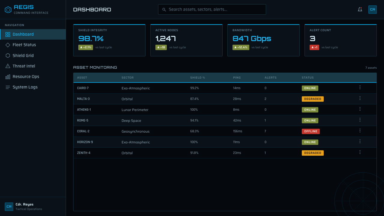
Data slides benefit from the style's distinction between operation, analysis, caution, and danger. Use cyan for the primary series or active state, indigo for deeper comparative information, olive for stable supporting conditions, and reserve amber and red for exceptions. Charts should resemble precise instruments through segmented marks and crisp boundaries, yet labels must remain readable. Cinematic surface treatment cannot compensate for ambiguous scales or poorly organized evidence.
For web interfaces, Halo Forerunner UI is especially effective on dashboards, monitoring systems, analytical tools, and pricing pages that need a strong technological identity. Dashboard modules can behave like visor readouts, with a dominant system state surrounded by quieter supporting telemetry. Pricing tiers may be differentiated through framed geometry and coded light rather than rounded promotional cards. Interactive states should intensify or reveal existing structure instead of introducing unrelated effects.
Editorial and marketing layouts should borrow the system's hierarchy without pretending every paragraph is combat telemetry. Use dark fields, sharp rules, technical labels, and occasional ring diagrams to frame a narrative. Feature sections can alternate between sparse visor-like compositions and denser indigo data fields. Product claims or calls to action deserve concentrated cyan emphasis, while amber and red should retain their warning meaning rather than becoming casual campaign colors.
The common mistake is to equate futuristic design with maximum glow, constant animation, and symbols scattered into every empty area. That produces visual noise and erases the military precision of the source. Begin with the black visor, establish a clear operational hierarchy, and add only the light needed to expose it. Concentric rings should imply a particular process; warning colors should correspond to real states; clipped corners should organize content rather than decorate every container.
Halo (Forerunner UI) — FAQ
Is Halo Forerunner UI simply a generic science-fiction HUD?
No. Generic science-fiction interfaces often combine arbitrary neon lines, transparent panels, and decorative telemetry. This style has a more specific structure: the MJOLNIR visor provides the operational military layer, cyan shield information supplies the primary signal, UNSC colors encode status, and Forerunner rings with Cortana lattices introduce the alien-intelligence layer. Removing those relationships leaves only an unspecific futuristic surface.
How much glow should the interface use?
Enough to identify active energy, hierarchy, and critical boundaries, but not enough to soften the whole composition. The cyan shield bar may glow clearly, while body copy and inactive framing remain comparatively quiet. Indigo lattices can create depth behind a focal element. When every line emits equal light, status distinctions disappear and the interface stops feeling like disciplined equipment.
Can the style be used for ordinary content-heavy products?
Yes, if the cinematic layer is confined to navigation, status, section framing, and major transitions. Long-form text still needs calm typography and uninterrupted reading space. The style is strongest when it establishes an outer instrument panel around ordinary information, not when every sentence becomes a label and every paragraph is enclosed by a glowing angular frame.
What separates Forerunner geometry from ordinary circular decoration?
Forerunner rings feel constructed and computational. They are concentric but rarely passive: arcs are segmented, angular glyphs interrupt the circumference, and layers align around a meaningful center. Ordinary circular decoration merely fills space. A convincing ring should imply scanning, orientation, calculation, or access to a deeper system, even when its exact fictional mechanism remains unexplained.
When is Halo Forerunner UI a poor fit?
It struggles when a product depends on softness, domestic warmth, playfulness, or emotional reassurance. The black visor, warning colors, clipped geometry, and technical typography naturally communicate distance, vigilance, and controlled power. Those qualities suit monitoring, gaming, security, analytical, and technology-oriented experiences, but they can make intimate services or relaxed lifestyle content feel unnecessarily severe.
Related design styles
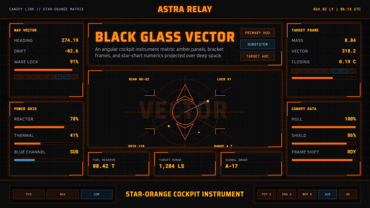 Elite DangerousOne amber instrument. Star-orange wireframes, mono numerics, and black-glass…
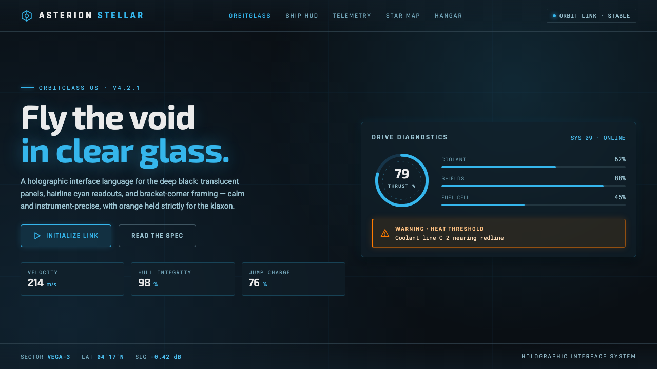 Star CitizenDisciplined holographic HUD. Cyan readouts on glass over a black void, orange…
 Bitcoin Maximalist OrangeOnly signal, zero spectacle. Orange mono data grids on terminal black enforce…
 Cash App 2024Fintech that talks like a record label. Pure black, dollar-bill green, type a…
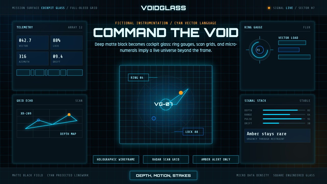 FUI Sci-Fi HUDBlack until it glows. Cyan wireframes, ring gauges, and radar grids sell live…
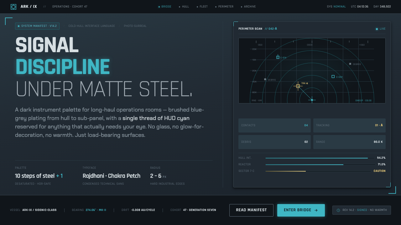 Knights of SidoniaSignal discipline under matte steel. Blue-grey hull, condensed Rajdhani, one…