What is Star Citizen?
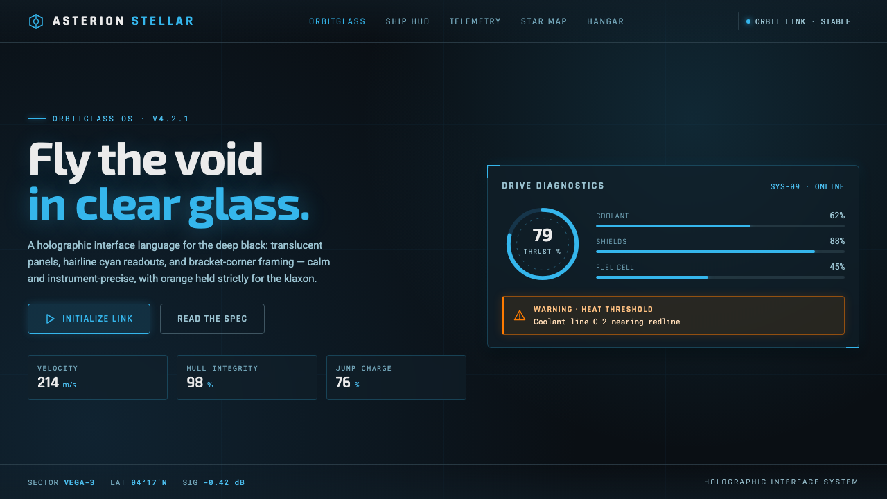
Star Citizen turns the cockpit HUD into disciplined holographic architecture: cyan information over glass and black space, with orange reserved for danger.
Star Citizen in brief
Star Citizen is Chris Roberts’ crowdfunded space simulation, and its interface language is expressed through the in-fiction mobiGlas personal terminal and ship HUD. The visual system treats information as a floating aerospace instrument: translucent panels hover over a deep-black field, while cyan readouts, cool light-cyan text, and dark panel blues establish a calm technological atmosphere.
Its drama comes from restraint rather than spectacle. Thin geometric sans-serif lettering, angular glass frames, bracket-shaped corners, and compact status chips give every element the character of an instrument designed for use under pressure. The interface feels holographic because layers appear to occupy space, but the visual hierarchy remains flat, deliberate, and highly legible.
Color is assigned a strict operational role. Cyan carries ordinary information and system presence; lighter cyan supports secondary readouts and fine detail; dark blues define panel surfaces and depth. Orange is held back for alerts and warnings, so it immediately interrupts the cool palette without turning the entire interface into a permanent emergency state.
Where does Star Citizen come from?
Star Citizen belongs to contemporary future-fiction and emerged from the 2010s onward through Cloud Imperium Games and Roberts Space Industries in North America. Its interface is not presented as an abstract visual exercise; it is part of the world, embedded in personal devices and spacecraft instrumentation. That fictional function gives the style its central discipline: every luminous mark should feel like information with a reason to exist.
The aesthetic draws on the lineage of Wing Commander and Privateer, both associated with Chris Roberts, while aligning with the broader language of modern AAA holographic HUD design. It combines the fantasy of information floating in open air with the practical visual codes of aerospace instrumentation: compact readouts, structural framing, cool technical color, and warning states that remain visually distinct.
The current mobiGlas direction is associated with the visual period around 2019–2024. In that phase, the system’s identity is defined less by retro-futurist ornament than by a controlled relationship between transparency, geometry, and contrast. The interface suggests advanced projection technology, but its restraint keeps it credible as a tool rather than turning it into decorative science fiction.
The result is a style that sits between product interface and diegetic equipment. It must look advanced enough to belong to a future society, yet organized enough to support navigation, status awareness, and decisions inside a spacecraft. That tension explains the visual balance: glass suggests depth, cyan preserves continuity, angular frames imply precision, and orange marks the moments when attention must change.
What defines the Star Citizen look?
Holographic Glass
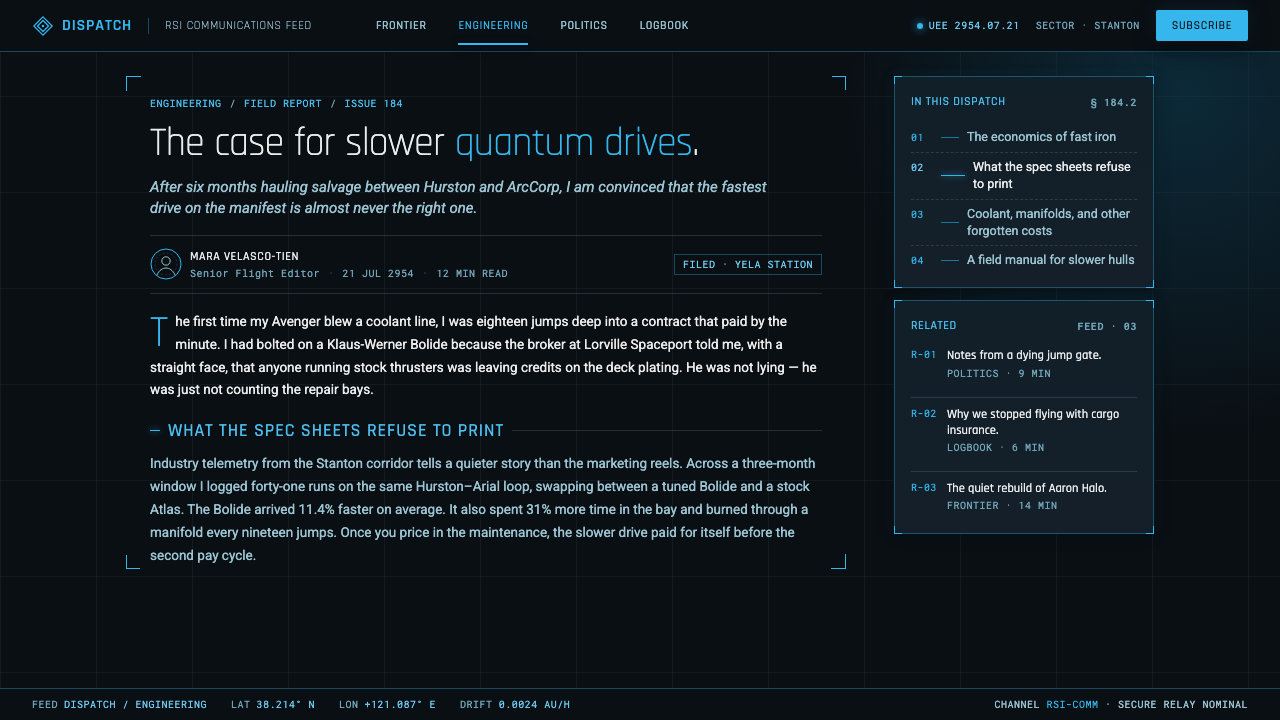
Panels appear translucent and layered, floating above the black field rather than sitting on an opaque canvas. Glass is used to suggest spatial depth and advanced projection, but it remains quiet: the panel supports information instead of becoming a reflective spectacle.
Cyan Information
Holographic cyan is the dominant informational color, with cooler light-cyan tones supporting secondary readouts and fine detail. The palette creates a continuous electronic glow without relying on constant spectacle. Cyan feels active, precise, and native to the instrument.
Black Void
The deep-black background is not merely a dark theme; it is the environmental condition that makes the HUD visible. Against it, cyan remains luminous and panel blues establish quiet layers. The void gives the interface room to breathe and keeps every bright mark consequential.
Angular Framing
Geometric sans-serif type works with angular frames, bracket corners, and clean directional edges. These shapes make panels feel engineered rather than ornamental. The repeated framing vocabulary also allows separate screens and instruments to belong to one coherent shipboard system.
Operational Orange
Orange is deliberately scarce. It marks alerts and warnings rather than serving as a general accent, so its appearance changes the emotional temperature of the interface. The contrast is strongest because the surrounding system remains cool, dark, and controlled.
Instrument Hierarchy
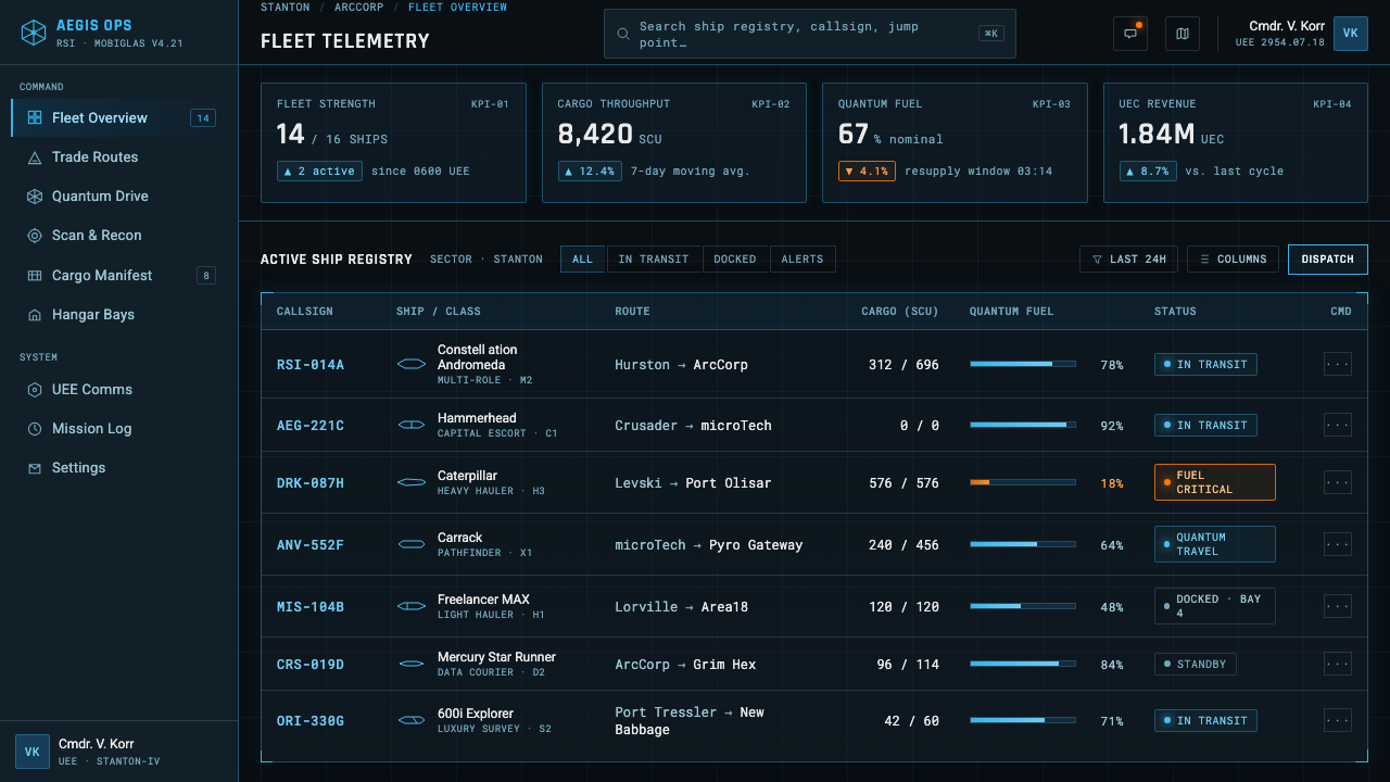
Status chips, readouts, panel divisions, and luminous edges create hierarchy through position, contrast, and role. The system feels dense enough for a spacecraft but avoids visual noise by keeping each element tied to a recognizable informational function.
Who shaped Star Citizen?
Chris Roberts is the creator associated with Star Citizen and the creative lineage connecting it to Wing Commander and Privateer. His role places the interface within a larger tradition of authored space simulation, where the HUD is not a neutral overlay but part of the imagined future and its equipment culture.
The RSI and Cloud Imperium Games UI team represents the production context behind the system. Its work gives the fictional mobiGlas and ship HUD a shared visual language of cyan readouts, glass panels, angular framing, and reserved warning color across the Star Citizen universe.
The mobiGlas design team is associated with the personal-terminal side of the aesthetic. Its contribution is the translation of holographic and aerospace ideas into a device that feels worn, accessed, and used inside the fiction, rather than merely displayed for the audience.
How do you use Star Citizen today?
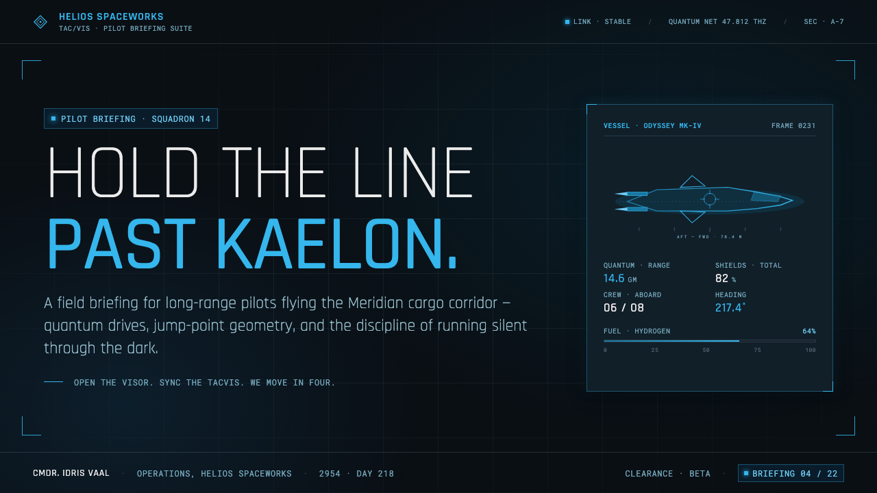
For presentation slides, use the style as a controlled instrument panel. A cover can place a sparse cyan readout or angular glass frame against a black field, leaving generous darkness around the title. Content slides should organize information into translucent modules with clear status labels and restrained luminous edges. Data slides benefit from diagrammatic treatment: charts, metrics, and system states should read as instruments, while orange appears only when the data itself represents an alert or warning.
For web interfaces, the aesthetic suits dashboards, monitoring tools, control centers, and pricing pages that want to communicate technical confidence. Use a near-black environment, dark translucent surfaces, cool cyan for primary interaction and information, and lighter cyan for secondary detail. Panels should feel layered but remain legible. Pricing tiers can use restrained status chips and structural framing, while orange should identify risk, limitation, or an exceptional state rather than mark every call to action.
For editorial and marketing work, Star Citizen’s visual language works best when the page behaves like a field instrument. Articles can pair a dark reading surface with cyan metadata, bracketed section markers, and glass-like callout panels. Marketing pages can frame a product or service as advanced equipment by using sparse readouts, angular borders, and carefully isolated highlights. The effect is strongest when the composition preserves large areas of quiet darkness instead of filling every region with glow.
The common mistake is treating holographic design as permission to add blur, neon, transparency, and multiple warning colors everywhere. That creates a generic cyberpunk surface rather than the disciplined Star Citizen character. The system depends on hierarchy: cyan is informational, panel blues are structural, black is environmental, and orange is exceptional. Remove any effect that does not clarify function, depth, or state.
Star Citizen — FAQ
Is Star Citizen’s interface simply a cyberpunk neon style?
No. It shares cyberpunk’s attraction to luminous color and dark surroundings, but its defining quality is operational discipline. The palette is narrow, the geometry is aerospace-oriented, and orange is reserved for alerts. If every element glows or every color competes for attention, the design loses the instrument-like calm that makes the style distinctive.
Why is orange used so sparingly?
Orange functions as a warning signal because the rest of the interface remains cool and controlled. When it appears, users understand that the state has changed or that attention is required. Using orange for ordinary buttons, decoration, or general emphasis weakens that signal and makes true alerts harder to recognize.
Can this style work on a page that is not a game HUD?
Yes, especially when the product involves monitoring, control, data, or technical equipment. Dashboards, control centers, analytical tools, and technical pricing pages can benefit from its clear state language. It is less suitable when the experience depends on warmth, softness, or organic richness, because the style naturally communicates precision and engineered distance.
How can glass panels remain readable?
Treat glass as a structural layer, not as an effect applied to every surface. Keep the surrounding field dark, maintain clear contrast between cyan text and panel blue, and use transparency to separate levels of information. Angular framing and status labels should reinforce the hierarchy so that depth never obscures the message.
What is the biggest mistake when adapting Star Citizen’s visual language?
The biggest mistake is confusing density with sophistication. Adding more panels, more glow, and more colors does not make a system feel more advanced. The style works because each layer has a role, the black field provides rest, cyan carries information, and orange interrupts the system only when necessary.
Related design styles
 Feather MicroscopyPhysics glows in the dark. Cyan filaments and mono scale bars cut a black ima…
 Halo (Forerunner UI)Hard light on the void. Cyan shield bars and concentric glyph rings glow on a…
 Cursor IDEAI-first code editor. Pure dark surfaces, off-white text, electric blue reser…
 Elite DangerousOne amber instrument. Star-orange wireframes, mono numerics, and black-glass…
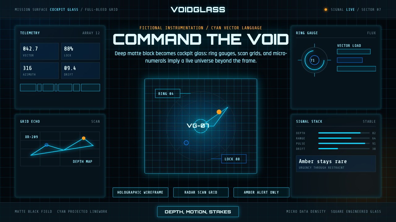 FUI Sci-Fi HUDBlack until it glows. Cyan wireframes, ring gauges, and radar grids sell live…
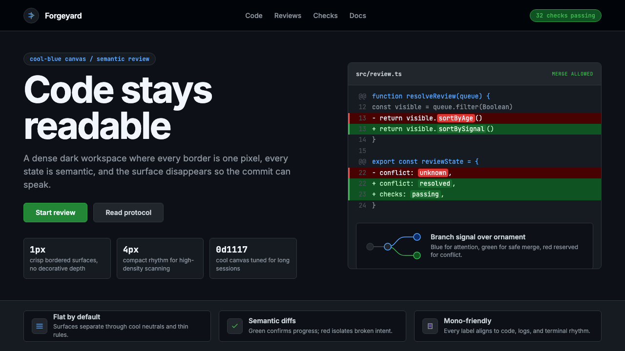 GitHub DarkCode-first darkness. Cool-blue canvas, 1px borders, green/red diff lines.