What is Elite Dangerous (Cobra HUD)?
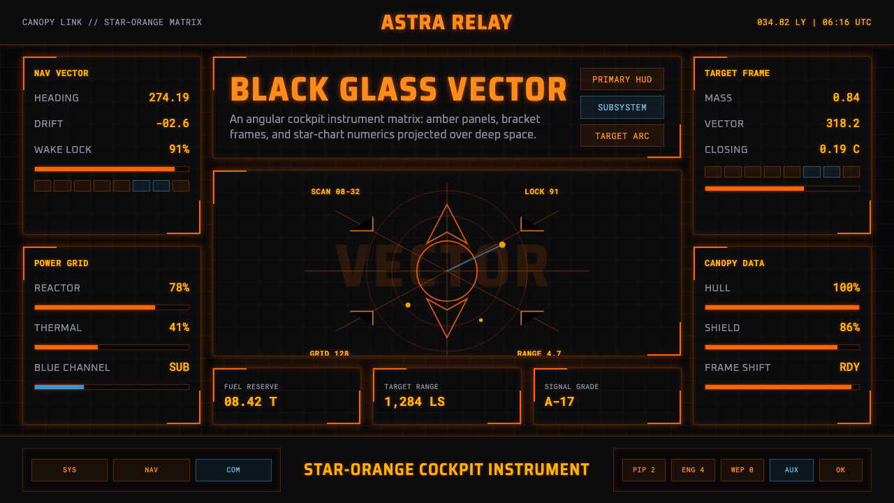
Elite Dangerous turns the starship cockpit into one amber instrument — a field of angular light where every bracket, numeral, and radar trace serves the work of flight.
Elite Dangerous (Cobra HUD) in brief
Elite Dangerous Cobra HUD is a dark interface style derived from the cockpit language of the space simulation released in 2014. Its defining image is star-orange information projected across the near-black glass of a spacecraft canopy: angular holographic panels, segmented bracket frames, monospaced numerics, and a circular radar display assembled into one continuous flight instrument.
The system is governed by a strict chromatic hierarchy. Amber-orange is the default voice of navigation, targeting, status, and command, while cool blue is reserved for subsystems and secondary tabs. Blue may clarify a change of mode, but it never becomes a competing primary. Darkness is equally essential: the interface belongs against black glass, not a pale page, because luminous contrast is part of its identity rather than an optional presentation effect.
Visually, the Cobra HUD combines British space-simulation heritage with a contemporary future-fiction vocabulary. Information appears engineered rather than decorated: panels resemble wireframe projections, corners become directional brackets, and numbers carry the disciplined rhythm of star-chart notation. The result is theatrical but functional — not a generic neon interface, but the impression of a machine designed to help a pilot read danger, orientation, and system state at a glance.
Where does Elite Dangerous (Cobra HUD) come from?
The style belongs to the lineage of Elite, which began in 1984 and became a defining strand of British space-simulation design. David Braben and Ian Bell are the central figures named in that early lineage. Its lasting premise placed the player inside a spacecraft and made navigation, commerce, risk, and exploration legible through instruments rather than through an external cinematic viewpoint. The interface therefore developed from the imagined needs of a pilot, not from the conventions of a conventional document or desktop.
That lineage continued through Frontier: Elite II and into Elite Dangerous, released in 2014 by Frontier Developments in Cambridge, United Kingdom. The contemporary game reframed the inherited space-sim cockpit through a holographic HUD vocabulary. Instead of presenting information as separate flat windows, it projected angular panels, brackets, radar geometry, and numerical readouts into the pilot's visual field, allowing the cockpit and the surrounding darkness of space to read as one environment.
The confirmed default star-orange HUD became the visual center of this environment. Its amber tone evokes an instrument glow without abandoning the fiction of projected data, while the near-black canopy provides the depth and silence against which that information becomes readable. Cool blue occupies a deliberately subordinate role in subsystem areas and secondary tabs. This unequal relationship is fundamental: orange expresses the ship's primary operational language; blue marks a secondary layer within it.
The Frontier UI and HUD design teams carried this inherited vocabulary into a coherent contemporary system. The result connects the Elite and Frontier lineage to modern holographic cockpit design without dissolving into undifferentiated science-fiction decoration. Wireframes, monospaced numerics, bracketed containers, and the radar disc all belong to the same instrumental argument: a complex spacecraft can feel intelligible when its many states are organized as luminous geometry.
What defines the Elite Dangerous (Cobra HUD) look?
Instrument Color
Star-orange dominates the interface as a warm amber signal against black glass. It carries primary navigation, targeting, status, and command information, so repetition strengthens meaning rather than creating monotony. Cool blue is confined to subsystem and secondary-tab roles. The palette succeeds through inequality: one color speaks for the ship, while the other identifies a supporting operational layer.
Black-Glass Ground
The background is near-black and reads as canopy glass opening onto space. It is not merely a dark theme applied to ordinary components; it supplies the void from which projected information appears. Large areas remain quiet, allowing orange structures to feel suspended rather than boxed into a page. Pale, creamy, or paper-like grounds break the cockpit illusion and weaken the instrument glow.
Monospaced Numerics
Numerals and compact labels follow a monospaced, star-chart rhythm. Repeated character widths make changing values feel measurable and mechanically stable, while short labels resemble coded flight notation. Typography should remain crisp and restrained rather than expressive. Hierarchy comes from brightness, grouping, placement, and contrast between terse readouts and larger operational headings.
Angular Wireframes
Panels are drawn as luminous frameworks rather than opaque cards. Chamfered corners, segmented edges, open brackets, and directional notches imply holographic construction and keep the dark field visible through the interface. These shapes should communicate containment or direction. When every corner receives arbitrary science-fiction detailing, the disciplined cockpit language turns into visual noise.
Radar Geometry
The radar disc is the system's strongest spatial motif. Circular rings, axes, traces, and directional marks contrast with the angular panels surrounding them, making position and movement feel central to the interface. Similar circular structures can organize maps or data relationships, but they should retain an operational purpose. A decorative circle without orientation or state lacks the authority of an instrument.
Projected Hierarchy
Depth is suggested through overlapping frames, controlled glow, and the apparent placement of information within the pilot's field of view. The style does not need naturalistic surfaces or elaborate material simulation. Primary alerts appear immediate and luminous; secondary systems recede through cooler color and quieter emphasis. The hierarchy should feel like layers of projected information, not a stack of physical cards.
Who shaped Elite Dangerous (Cobra HUD)?
David Braben is a key figure in the Elite lineage that began in 1984. Within the history supplied for this style, his importance lies in the continuity between the early British space-simulation tradition and the contemporary world of Elite Dangerous. That continuity gives the Cobra HUD more weight than a standalone science-fiction skin: it belongs to a long-running conception of the spacecraft as a place understood through instruments.
Ian Bell is named alongside Braben as a central figure in the original Elite lineage. His place in that lineage anchors the Cobra HUD in a history reaching back to 1984 rather than only to the 2014 game. For designers, that context matters because the style inherits the logic of the space simulator — information, orientation, and agency inside a cockpit — rather than borrowing futuristic imagery without an operational foundation.
Frontier's UI and HUD design teams shaped the contemporary Cobra cockpit language for Elite Dangerous. Their system unifies star-orange wireframes, monospaced readouts, bracket structures, subsystem blue, and radar geometry against a black-glass field. The achievement is coherence: separate displays read as parts of one shipwide instrument, and a dense collection of states retains a recognizable order without losing the drama of holographic projection.
How do you use Elite Dangerous (Cobra HUD) today?
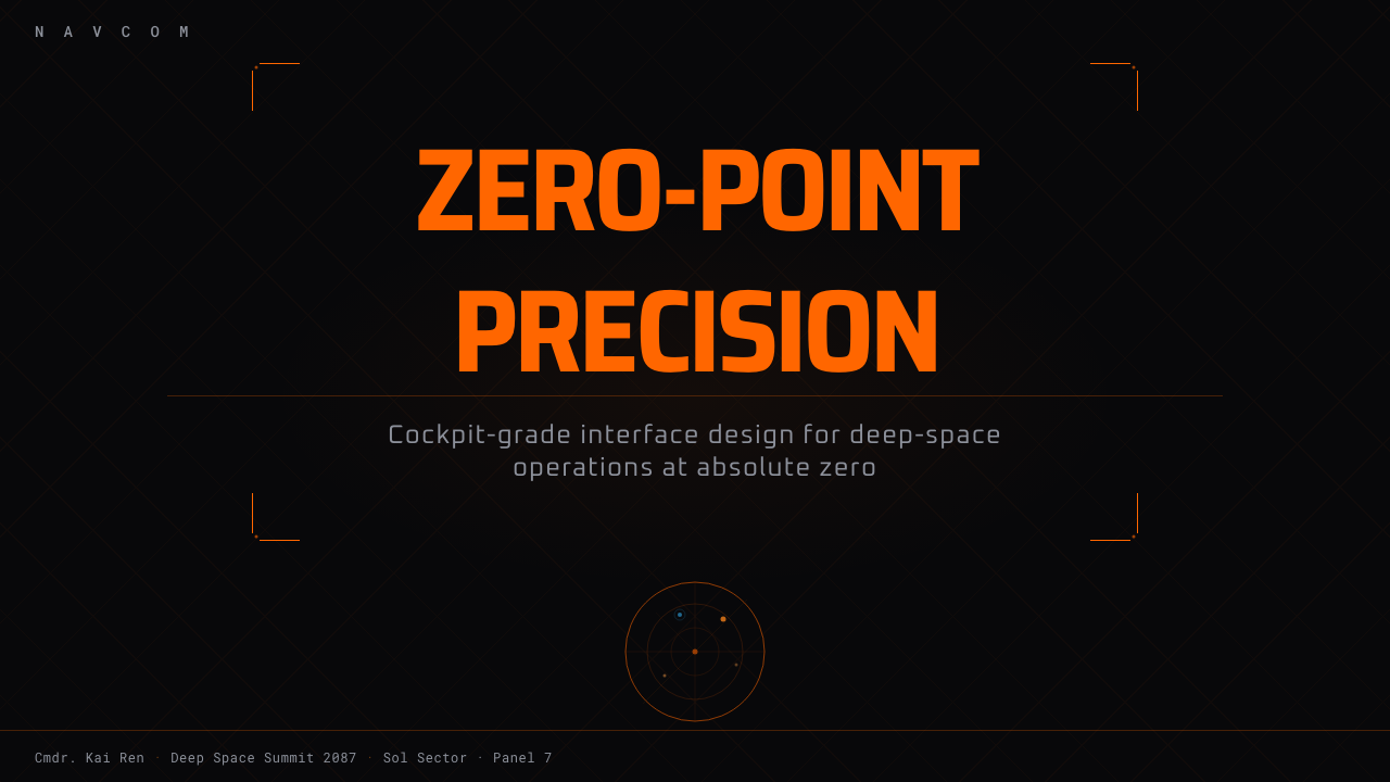
For presentation covers, use the cockpit as a compositional idea rather than reproducing a game screen. Let the title occupy a dark visual field, held by an angular bracket or partial wireframe panel, with one amber focal signal establishing direction. Content slides should organize text as instrument groups: concise headings, aligned monospaced metadata, generous black space, and a small number of luminous frames that explain relationships rather than decorate empty areas.
Data slides are a particularly natural fit. A radar-like circular plot can express position, comparison, or movement, while linear readouts and segmented frames can organize supporting measures. Keep the main data in amber-orange and reserve cool blue for a true secondary category or subsystem view. Charts should feel calibrated and purposeful; ornamental traces that resemble data but communicate nothing undermine the credibility of the instrument language.
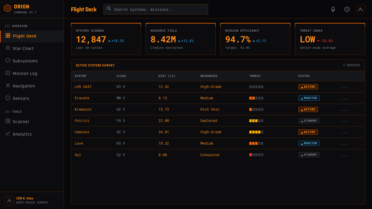
For web interfaces, the style works best on dashboards, monitoring surfaces, analytical tools, and pricing pages that benefit from strong operational hierarchy. Build the page as a continuous black-glass field with wireframe regions rather than a collection of unrelated glowing cards. Primary actions and active states belong to amber-orange. Blue should identify secondary navigation, subsystem detail, or an alternate mode without competing with the main call to action.
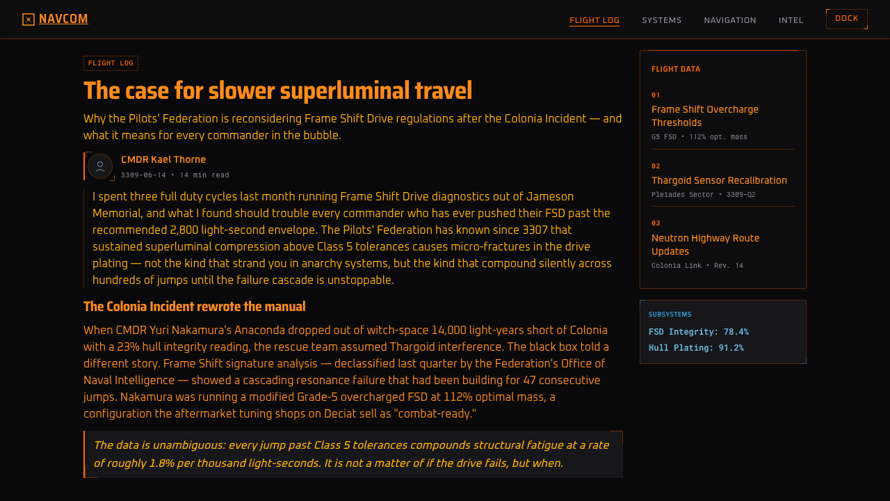
Editorial and marketing applications should borrow the style's sense of navigation. An article can use bracketed section markers, monospaced captions, radar-derived diagrams, and dark pauses between dense passages. A marketing page can treat features as ship systems and lead readers from overview to detail through directional frames. The metaphor should remain intelligible: every luminous element ought to identify a destination, status, category, or action.
The most common mistake is confusing Cobra HUD with a generic neon science-fiction theme. Adding many luminous colors, excessive bloom, random technical markings, or pale content surfaces destroys its hierarchy. Another error is allowing blue to become a second primary. Authentic application depends on restraint: one amber instrument voice, one subordinate cool signal, disciplined wireframes, readable numerics, and enough darkness for the information to appear projected rather than merely outlined.
Elite Dangerous (Cobra HUD) — FAQ
Is the Cobra HUD simply an orange version of a generic science-fiction interface?
No. Its identity comes from a complete cockpit system: star-orange as the dominant operational color, black glass as the environmental ground, monospaced numerics, angular holographic frames, and a radar disc that centers orientation and movement. Generic science-fiction interfaces often mix many neon colors and decorative technical marks. Cobra HUD is narrower and more disciplined, with every visible structure expected to resemble part of a working flight instrument.
Why must cool blue remain secondary?
Because the system depends on a single dominant instrument voice. Star-orange identifies the ship's primary navigation, targeting, status, and command layer. Cool blue separates subsystem or secondary-tab information without fragmenting that voice. If both colors carry equal visual authority, the cockpit stops reading as one amber instrument and becomes a divided two-color interface with an unclear hierarchy.
Can this style be adapted to a light background?
A light adaptation would lose a defining part of the style. The near-black field is not neutral packaging; it represents canopy glass and the darkness of space, while making the orange geometry appear projected. Pale or paper-like backgrounds turn luminous frames into ordinary colored outlines. Designers needing a light interface may borrow the angular grouping or monospaced notation, but the result should be treated as a distant derivative rather than a faithful Cobra HUD application.
How much glow should the interface use?
Enough to imply projected light, but not enough to obscure the underlying geometry. Brackets, numerics, radar marks, and panel edges must remain crisp because they carry operational meaning. A controlled halo can unite them with the black-glass environment; broad bloom makes small labels difficult to read and erases the engineered character of the wireframes. The light should support information, not become the information.
What kinds of products suit the Cobra HUD language?
It suits experiences centered on monitoring, navigation, system state, technical comparison, or simulated command: analytical dashboards, operational displays, data presentations, and interfaces that deliberately evoke a spacecraft cockpit. It is less suitable when warmth, softness, or casual familiarity is the main goal. The style carries an atmosphere of concentration and readiness, so it works best when the product's information genuinely benefits from feeling precise, active, and instrument-like.
Related design styles
 Halo (Forerunner UI)Hard light on the void. Cyan shield bars and concentric glyph rings glow on a…
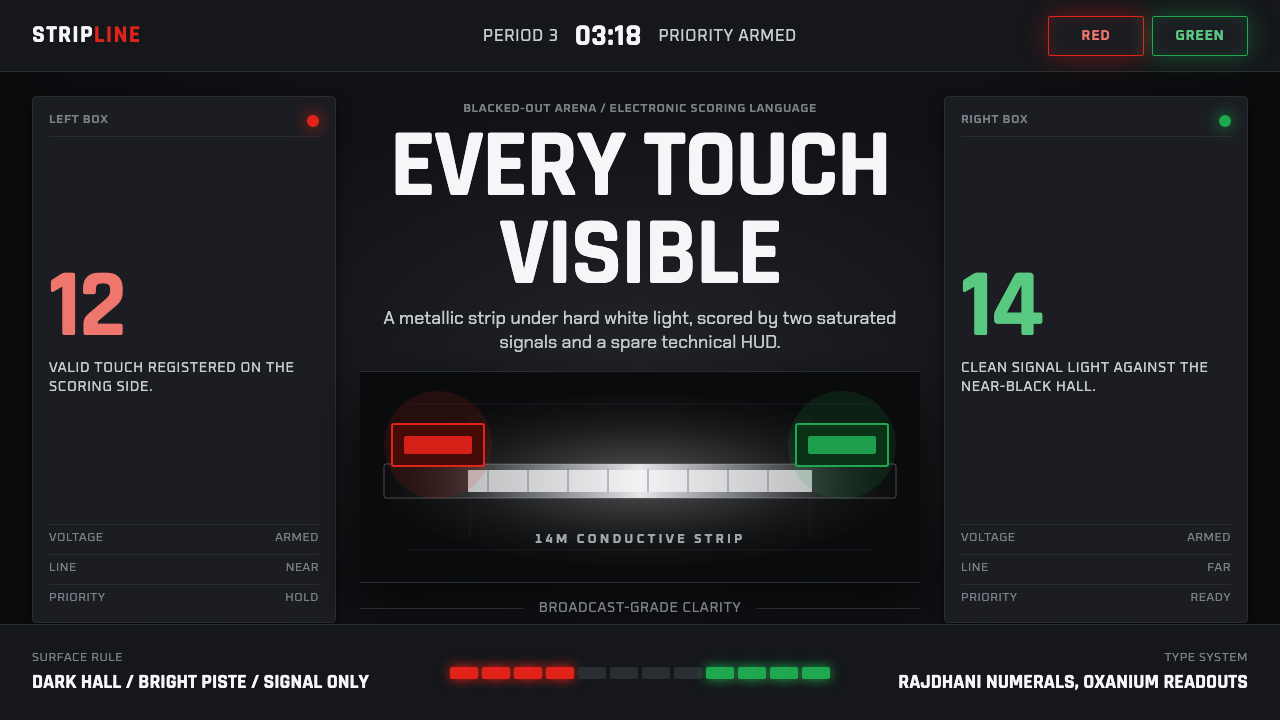 Fencing PisteTurns darkness into signal. Rajdhani HUD type frames a white piste and red-gr…
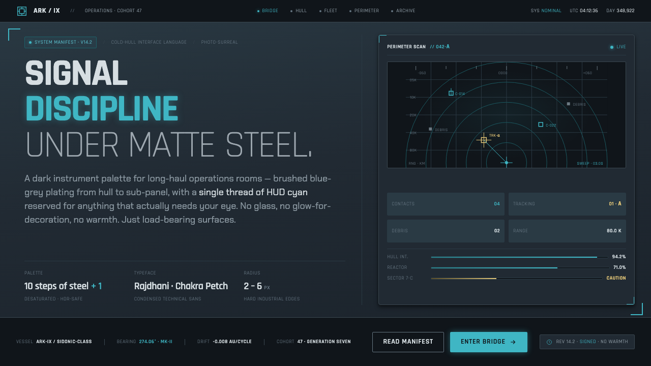 Knights of SidoniaSignal discipline under matte steel. Blue-grey hull, condensed Rajdhani, one…
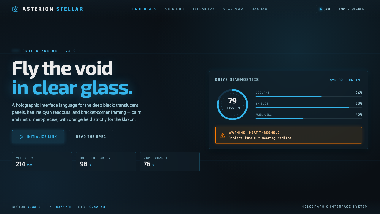 Star CitizenDisciplined holographic HUD. Cyan readouts on glass over a black void, orange…
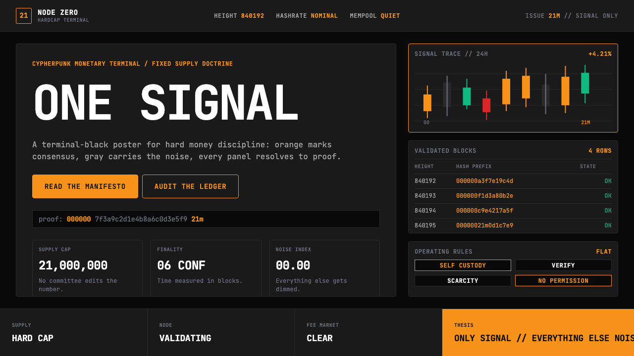 Bitcoin Maximalist OrangeOnly signal, zero spectacle. Orange mono data grids on terminal black enforce…
 Cash App 2024Fintech that talks like a record label. Pure black, dollar-bill green, type a…