What is Mechanical Keyboard Keycaps?
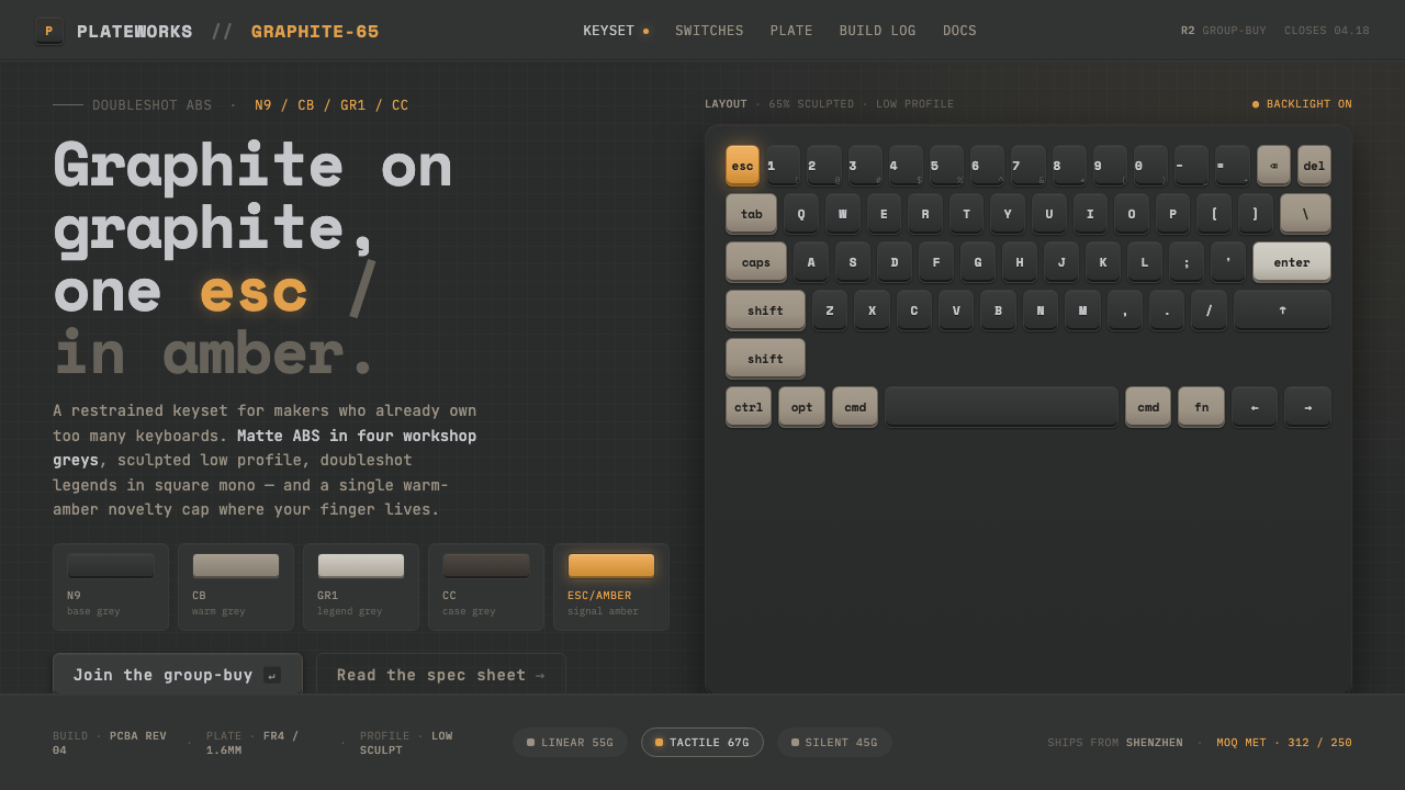
Mechanical Keyboard Keycaps turns the interface into a quiet workshop: graphite surfaces, sculpted keycap grids, monospace legends, and one amber Esc key make technical restraint feel tactile.
Mechanical Keyboard Keycaps in brief
Mechanical Keyboard Keycaps is a visual language drawn from the custom mechanical keyboard hobby and its enthusiast hardware culture. Its imagined desk is dark and deliberate: a graphite mat, a CNC case, and rows of doubleshot ABS keycaps in charcoal and medium grey. The result is not a glowing cyberpunk fantasy, but a controlled field of manufactured surfaces, repeated units, and quiet precision.
The system treats the keycap as both object and layout module. Sculpted profiles create subtle changes across each row, while crisp monospace legends make every unit feel labeled, functional, and ready for use. The palette stays almost entirely within graphite, with a warm amber Esc key providing the single permitted interruption. A faint backlight glow gives the system presence without turning the surface into spectacle.
Its natural territory is technical work: maker tools, terminals, dashboards, configuration interfaces, and products that want to feel built rather than decorated. The aesthetic communicates care through material and repetition. Every surface suggests a component; every label suggests an operation; every accent suggests a deliberate command.
Where does Mechanical Keyboard Keycaps come from?
The source places this style within the custom mechanical keyboard and keycap group-buy era from 2010 to now, with East Asia identified as its regional center of manufacturing and community. That setting matters because the aesthetic is inseparable from a culture that pays close attention to the physical keyboard as an object: its case, its keycap profile, its materials, its legends, and the way the whole set occupies a desk.
The movement grows from enthusiast hardware aesthetics rather than from a formal school or historical art manifesto. Its vocabulary is assembled from recognizable workshop signals: CNC construction, matte graphite surfaces, ABS keycaps, disciplined grey palettes, and a sense that the object should remain visibly engineered. The keyboard is not hidden behind an abstract interface; its parts become the interface's visual grammar.
Doubleshot ABS keycap craft gives the system its strongest material anchor. GMK's color codes function as the de-facto industry standard for the grey families that define many restrained keysets, while group-buy keyset designers use palette, profile, and legend treatment to give each set its identity. The design language therefore balances standardization with small, highly intentional deviations.
Terminal and monospace culture supplies the typographic and behavioral layer. Crisp equal-width lettering makes labels feel operational, while the isolated amber escape key turns a familiar hardware gesture into a visual signature. This system distills those sources into a dark interface vocabulary for makers, terminals, and tooling: less an illustration of a keyboard than a translation of its discipline.
What defines the Mechanical Keyboard Keycaps look?
Graphite Palette
The dominant palette is graphite on graphite: charcoal, medium grey, and near-black surfaces create depth through proximity rather than loud contrast. The grey field should feel material and matte, like a desk mat or case, while text and borders remain crisp enough to preserve function. Warm amber is reserved for the escape key or an equivalent focal action.
Matte Materiality
Surface treatment is dry, dense, and tactile. Matte graphite suggests a physical workbench, while CNC construction and ABS keycaps imply a product assembled from real parts. Avoid making the darkness glossy or decorative. The appeal comes from controlled finish, repeated surfaces, and the sense that every panel could be touched.
Sculpted Grid
The keycap grid is structural, not ornamental. Repeated rectangular units establish rhythm, while sculpted profiles introduce subtle variation between rows. Interfaces can borrow this logic through modular panels, segmented controls, and aligned fields. The grid should feel assembled and serviceable, with every module clearly belonging to a larger machine.
Monospace Legends
Typography is concise, technical, and label-like. Monospace lettering recalls terminal culture and gives every character an equal mechanical presence. Use it for headings, controls, metadata, and short operational instructions, pairing scale and weight contrast carefully so the interface remains readable rather than becoming a wall of code.
Faint Backlight
Light is atmospheric but restrained. A faint backlight glow can separate legends from the graphite field and suggest the keyboard's powered state, yet it should remain subordinate to the surfaces and grid. Glow is a trace of operation, not the main decoration. The interface should still read clearly when the light is barely noticed.
Single Warm Accent
The amber escape key is powerful because it is exceptional. It establishes a rule for emphasis: reserve the warm accent for escape, warning, active interruption, or the primary action that needs immediate recognition. If every control receives amber, the system loses its hardware-like hierarchy and becomes an undifferentiated dark theme.
Who shaped Mechanical Keyboard Keycaps?
GMK is the central reference point for the system's keycap language. Its grey color codes are treated as the de-facto industry standard within the custom keycap world, and its doubleshot ABS keycaps provide the material image this style distills: dense, matte, repeatable, and precise. In the interface translation, GMK stands for disciplined color families and manufactured consistency.
NovelKeys is named among the key figures of the enthusiast keyboard and keycap ecosystem. Here, the name marks the wider culture around custom hardware: a community that treats keysets, cases, materials, and tooling as objects worthy of close attention. Its relevance to the style is therefore ecological, connecting the visual language to the active world of makers and keyboard enthusiasts.
Group-buy keyset designers give the system its authored variation. Working within the shared language of sculpted grids, doubleshot ABS craft, grey families, and crisp legends, they decide where a set remains restrained and where a single accent is allowed to speak. Their work explains why the style can feel standardized without becoming anonymous.
How do you use Mechanical Keyboard Keycaps today?
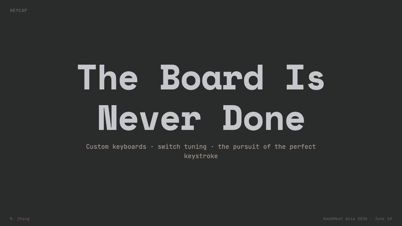
For presentation slides, use the style as a complete visual environment. A cover can place a concise monospace title on a broad graphite field, with a sculpted keycap-like module or amber accent establishing the subject. Content slides should behave like organized control surfaces: aligned panels, clear labels, and restrained grey contrast. Data slides can turn bars, rows, or status blocks into repeated keycap-like modules, using amber only for the decisive value, exception, or selected state.
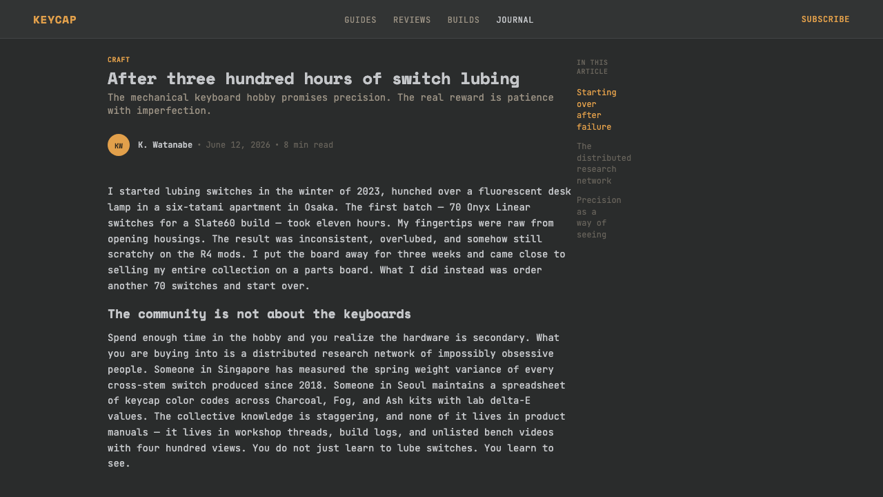
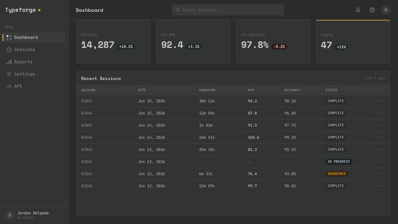
For web interfaces, the language suits dashboards, developer tools, terminal-adjacent products, and pricing pages that need to feel precise and dependable. Use dark graphite for the main field, slightly differentiated grey surfaces for panels, and monospace type for labels and operational metadata. Pricing tiers can read as carefully assembled keycap groups, while the strongest action or interruption receives the amber treatment. Keep the backlight suggestion faint so the information remains primary.
For editorial and marketing work, Mechanical Keyboard Keycaps is strongest when the page feels like a documented object or a workshop bench. Product stories can organize sections as aligned modules, pairing close material description with compact technical labels. Marketing pages can use repeated grey blocks to create rhythm, then introduce the amber accent at the moment of invitation or action. The tone should be confident and specific, communicating craft through order rather than through decorative richness.
The common mistake is to translate the style into a generic neon technology theme. Too much glow, too many bright accents, glossy surfaces, or aggressive contrast erase the quiet material character that makes the system distinctive. Another mistake is to draw literal keyboard keys everywhere, turning a structural reference into a costume. Preserve the graphite field, the modular discipline, the monospace clarity, and the exceptional amber note; let those principles carry the identity.
Mechanical Keyboard Keycaps — FAQ
What distinguishes this style from a generic dark technology interface?
Its identity comes from the combination of graphite-on-graphite surfaces, sculpted keycap-grid logic, doubleshot ABS references, crisp monospace legends, and a single amber escape key. A generic dark technology interface often relies on glow and contrast alone. This system relies on material restraint, repeated modules, and the suggestion of a physical object built for use.
Why is the amber accent reserved for the Esc key?
The custom keycap reference allows a restrained set to contain one warm note without losing its grey discipline. Esc also carries a clear operational meaning: exit, interrupt, or step away. Translating that role into an interface gives the accent both visual and functional purpose. It should remain exceptional so that users notice it when it matters.
How important are GMK color codes to the style?
They are important as a cultural reference and standardizing force, not as a requirement to expose technical codes in every interface. GMK greys give the style a shared vocabulary of charcoal and medium-grey relationships. A faithful application can describe those relationships qualitatively while preserving the deeper principle: the palette is controlled, material, and deliberately narrow.
Why does the system use monospace typography?
Monospace lettering connects the visual language to terminal culture and makes labels feel operational. Equal-width characters also reinforce the repeated-unit logic of a keycap grid. The type should remain crisp and economical, with hierarchy created through scale, spacing, and weight rather than through decorative letterforms or competing type families.
Can this style be used outside keyboard or developer products?
Yes, provided the product benefits from a sense of craft, structure, and technical focus. It can support maker tools, operational dashboards, hardware documentation, and products that want to present themselves as carefully built. It is less suitable when the central promise depends on softness, organic richness, or abundant color. The key question is whether the product's values align with the style's quiet precision.
Related design styles
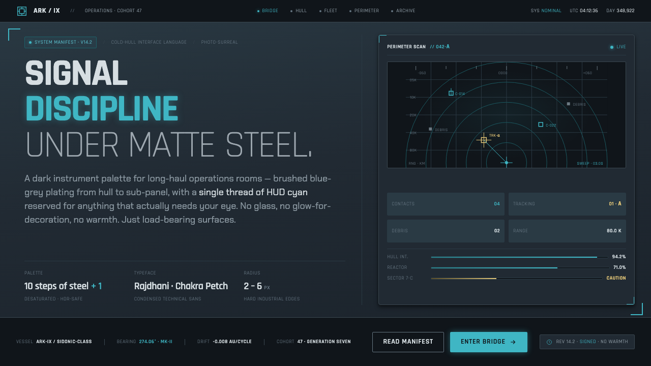 Knights of SidoniaSignal discipline under matte steel. Blue-grey hull, condensed Rajdhani, one…
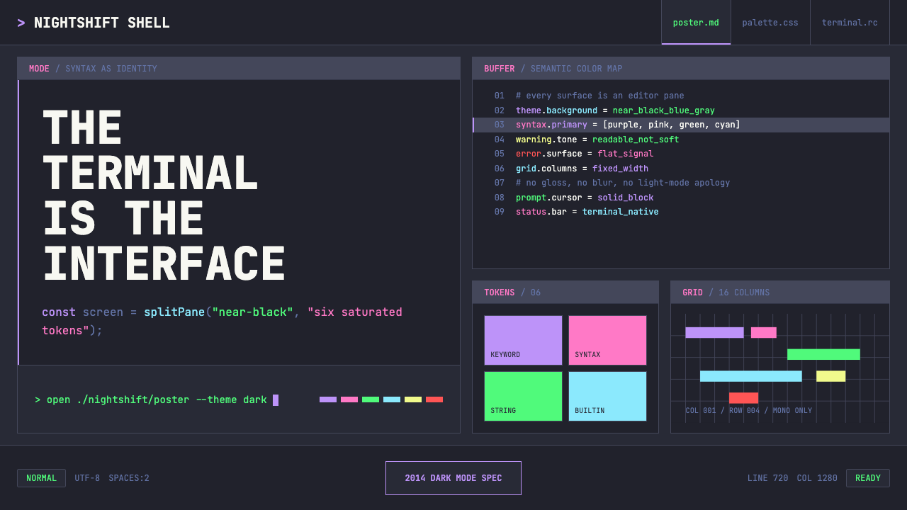 Terminal Vim Dracula (2014)Terminal-native darkness. Near-black panes carry six saturated syntax colors…
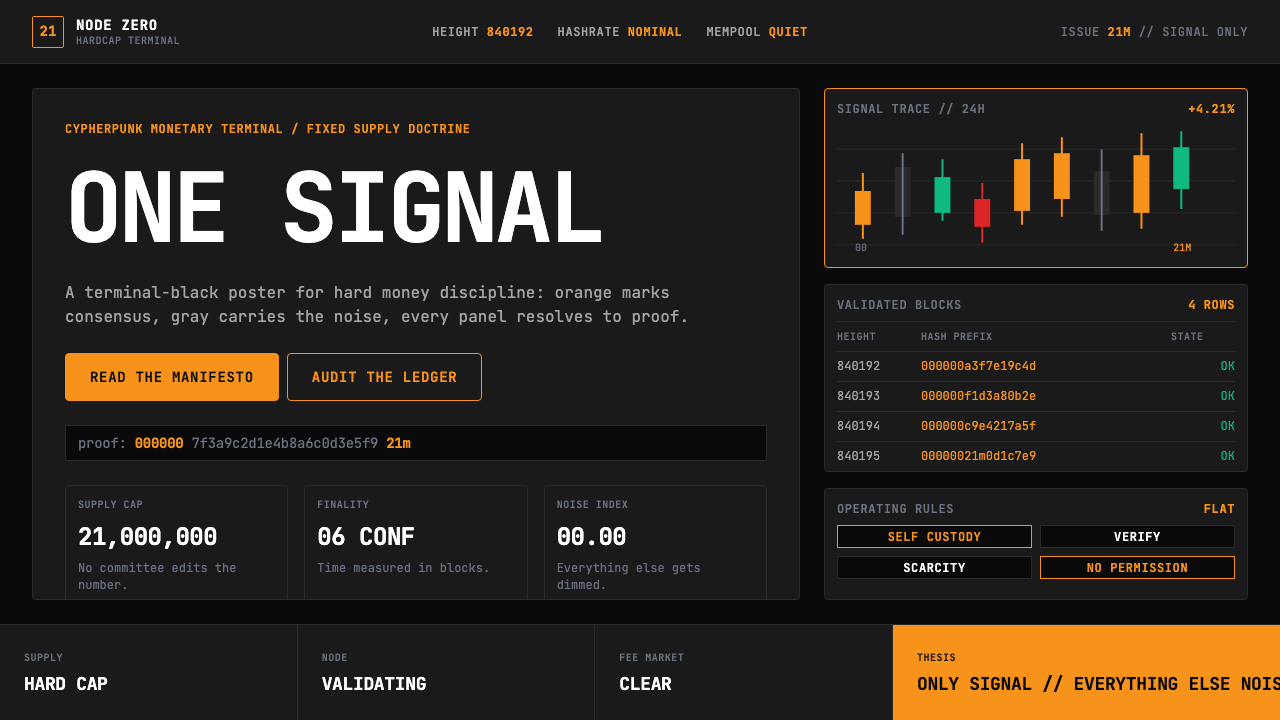 Bitcoin Maximalist OrangeOnly signal, zero spectacle. Orange mono data grids on terminal black enforce…
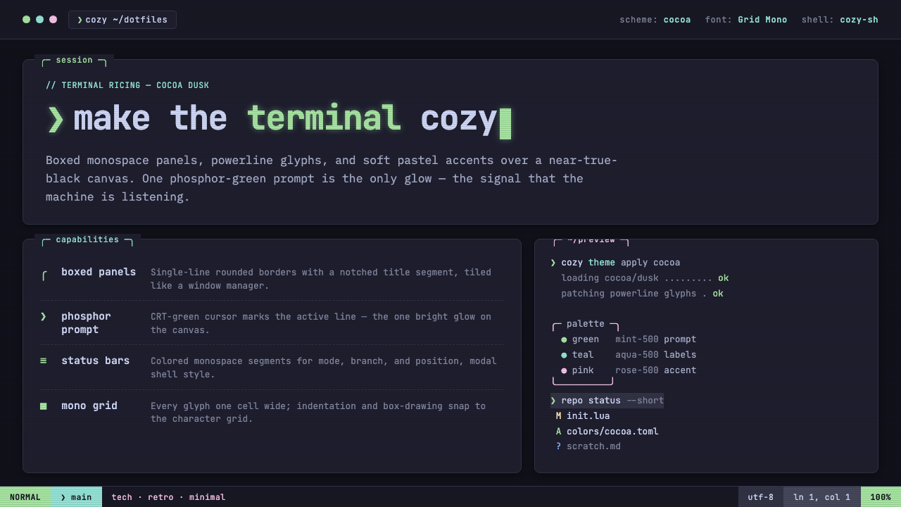 Cozy Terminal TUI RevivalMake the terminal cozy. Boxed mono panels in Catppuccin Mocha, lit by one pho…
 Breaking Bad (2008)Precision turns dangerous. Hazmat yellow and element tiles cut through asphal…
 CLI Hacker Phosphor Green (1985)Pure terminal myth. Black glass, P1 green mono type, scanlines, and rigid 80-…