What is Cozy Terminal TUI Revival?
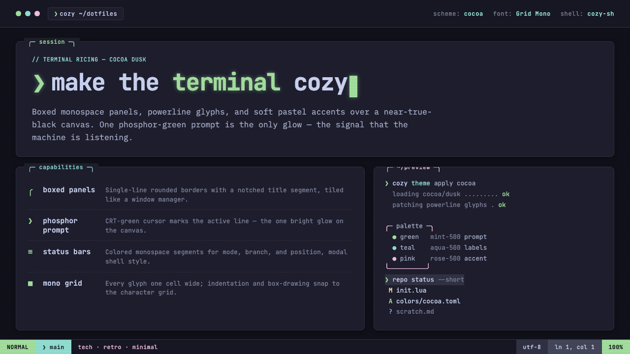
Cozy Terminal TUI Revival turns the black command line into a small, habitable room: boxed monospace panels, pastel-dark color, and a single phosphor-green prompt glowing like a familiar machine.
Cozy Terminal TUI Revival in brief
Cozy Terminal TUI Revival is the modern ricing aesthetic associated with tools such as lazygit and gum. It combines boxed monospace panels, Nerd Font glyphs, status bars, cursor blocks, and selection highlights on a near-true-black terminal canvas. The visual language is dark, gridded, and text-driven, but its soft pastel accents make the environment feel composed rather than severe.
The system is built on Catppuccin Mocha: a near-black ground carrying restrained pastel color, with a phosphor-green prompt as its signature light source. Panels are outlined with single-line borders, text aligns into deliberate grids, and interface states are expressed through blocks, highlights, and changes in emphasis rather than decorative illustration.
Its coziness comes from the balance between density and softness. The terminal remains dark and unmistakably technical, while the pastel palette, familiar prompt glow, and carefully enclosed information create a sense of order and shelter. It is not a cream-colored reinterpretation of a terminal and not a neon cyberpunk scene; its warmth is quiet, local, and controlled.
Where does Cozy Terminal TUI Revival come from?
The style belongs to the modern TUI revival that developed through the global internet, open-source command-line culture, and the dotfiles community. Its active period runs from the 2010s into the present, when terminal interfaces became a field for deliberate visual customization rather than a purely utilitarian surface.
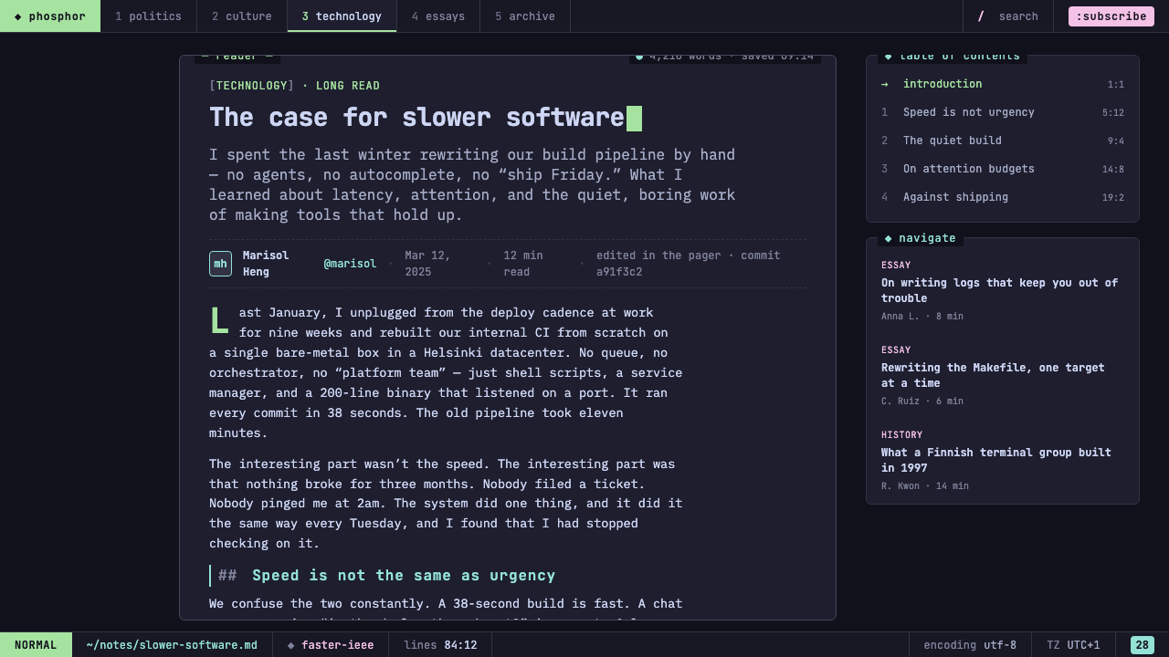
Terminal ricing gave this revival its personal and architectural character. Users treated the command line as a designed environment, shaping its colors, glyphs, panels, and prompt into a coherent everyday workspace. The result was not a single canonical interface but a shared vocabulary of gridded text, boxed regions, and carefully chosen accents.
Catppuccin emerged in 2021 and supplied the pastel-dark foundation that made the cozy variant recognizable. Catppuccin Mocha keeps the terminal grounded in near-black while allowing soft colors to separate states and regions. The palette provides warmth without turning the terminal into a light interface, while the phosphor-green prompt preserves the older P1 CRT-green lineage.
Charm, the maintainers associated with lazygit and gum, helped make this visual language visible through contemporary command-line tools. The Catppuccin theme community developed and sustained the pastel-dark color direction, while the Nerd Fonts project made expressive glyphs available as part of the textual interface. Together, these contributions connect TUI revival, ricing, pastel-dark theming, and CRT phosphor heritage.
What defines the Cozy Terminal TUI Revival look?
Near-Black Ground
The canvas is true-black or close to it, creating the visual depth of a terminal without becoming glossy or theatrical. The dark ground is not empty space; it is the quiet field that lets panels, text, and the prompt remain legible.
Pastel-Dark Color
Catppuccin Mocha supplies soft pastel accents against the dark ground. Color separates information and adds companionship to the interface, but it stays muted enough that the terminal never becomes a field of competing neon lights.
Monospace Texture
Monospace type gives every panel a measured rhythm. Nerd Font glyphs extend that vocabulary with symbols that remain part of the text surface, so icons, labels, and status marks feel integrated rather than pasted on.
Boxed Grid
Single-line borders divide the interface into compact rooms of information. Panels, status bars, and text align to a shared grid, making a dense terminal feel navigable and giving every block a clear place in the composition.
Phosphor Prompt
The prompt is the signature accent: a phosphor green point of attention with clear P1 CRT-green heritage. Its glow is selective and meaningful, keeping the prompt recognizable without bathing the entire interface in green.
Textual States
Interaction is shown through cursor blocks, selection highlights, and status bars. These elements make state visible while preserving the terminal's essential rule: information should remain textual, aligned, and structurally legible.
Quiet Coziness
The style creates comfort through enclosure and restraint rather than decoration. Dark space, soft accents, and orderly panels make the interface feel inhabited, while the refusal of cream backgrounds and excessive glow keeps its terminal identity intact.
Who shaped Cozy Terminal TUI Revival?
Charm is associated with the maintainers of lazygit and gum, two tools that make the modern TUI revival tangible. Their work represents the style at its most practical: boxed information, expressive terminal glyphs, and a command-line environment designed to be used repeatedly rather than merely admired.
The Catppuccin theme community provides the pastel-dark foundation behind the cozy variant. Its Mocha direction gives near-black terminals a soft but disciplined range of accents, allowing color to organize information without weakening the dark technical character of the interface.
The Nerd Fonts project supplies the glyph vocabulary that lets terminal interfaces carry symbols as naturally as letters. Its presence supports the style's commitment to text-driven composition, where icons, markers, and labels belong to the same gridded surface.
How do you use Cozy Terminal TUI Revival today?
Cozy Terminal TUI Revival works best when its structural rules remain visible. Begin with a near-black canvas, establish boxed monospace regions, and let a restrained pastel-dark palette separate information. Use the phosphor-green prompt as a deliberate signature rather than treating it as one accent among many. The result should feel like a coherent terminal environment, not a generic dark theme.
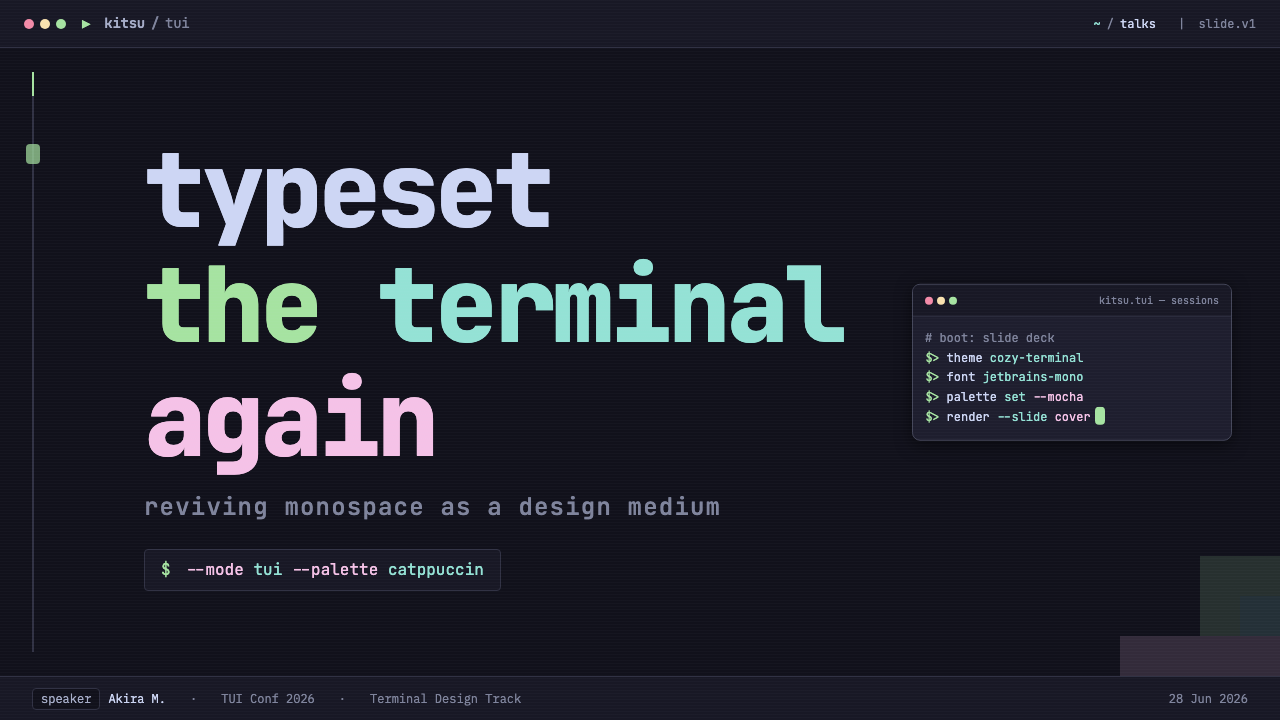
For presentation slides, the cover can use a near-black field, a large framed panel, and a clearly isolated green prompt or cursor block as the visual entry point. Content slides should organize text into compact terminal-like panels with single-line borders and strong alignment. Data slides can translate figures into status bars, highlighted rows, and compact information blocks, preserving the style's textual and gridded character.
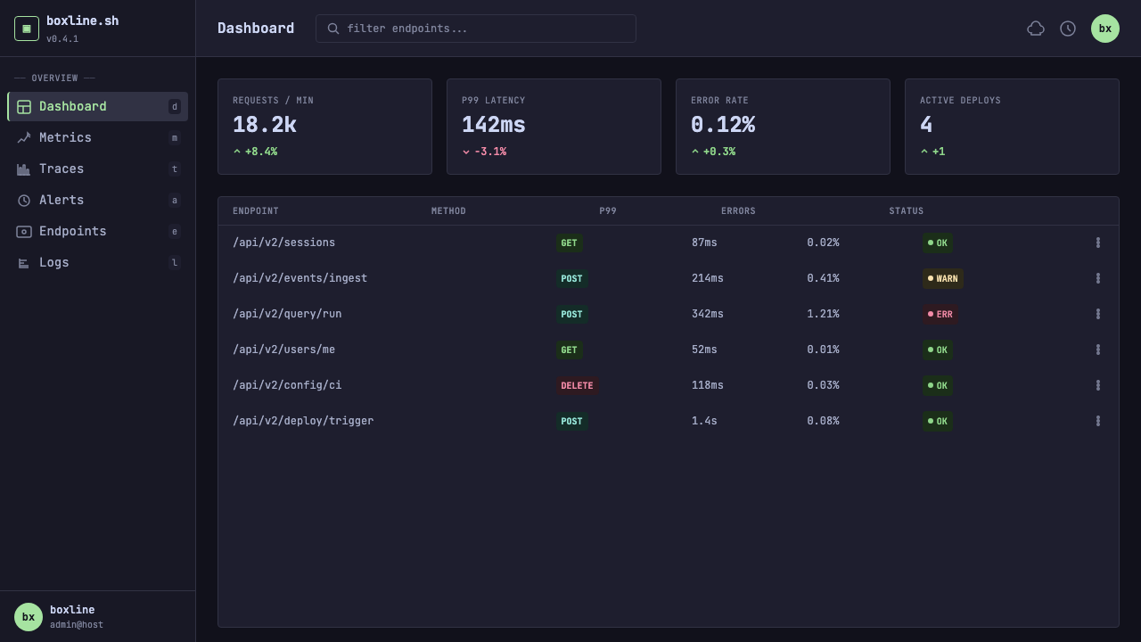
For web interfaces, the style suits dashboards and pricing pages that benefit from visible grouping and a technical atmosphere. Use dark framed panels for categories, plans, or system states; use soft pastel accents to distinguish levels or conditions; and reserve phosphor green for the primary prompt-like action or the most important active state. Avoid turning every control into a glowing object, because the signature depends on selective emphasis.
For editorial and marketing work, the style can make an article or campaign feel like a carefully curated command-line workspace. Headings can sit inside compact panels, metadata can behave like a status bar, and feature comparisons can use aligned rows with cursor-like selection marks. Marketing pages should keep the palette narrow and let the boxed structure carry the personality, especially when the subject involves tools, open-source culture, or technical craft.
The common mistake is to confuse cozy terminal design with unrestricted neon styling. Too many bright accents, continuous green glow, cream backgrounds, decorative illustration, or irregular panel shapes weaken the system. Another mistake is using terminal symbols without a real grid: the glyphs become costume rather than structure. Keep the ground near-black, the pastel color quiet, the prompt distinct, and every border tied to a readable information block.
Cozy Terminal TUI Revival — FAQ
Is Cozy Terminal TUI Revival just a generic dark theme?
No. Its identity comes from the combination of a near-black terminal canvas, boxed monospace panels, Nerd Font glyphs, a shared text grid, and a selective phosphor-green prompt. Remove the grid, panel logic, or signature prompt and the result may remain dark, but it no longer belongs to this specific visual language.
Why is the phosphor-green prompt so important?
It carries the P1 CRT-green heritage and acts as the style's signature glow. Catppuccin Mocha supplies the broader pastel-dark environment, but the prompt provides a precise point of recognition. Its power comes from restraint: it should feel like a signal, not a green wash over the entire interface.
Can the style use a cream or light background?
A faithful version should remain dark. The source style is defined by a true-black or near-true-black terminal ground, and its coziness comes from soft pastel accents within that darkness. A light adaptation may borrow the panels and typography, but it would change the central atmosphere and lose the terminal-specific tension between black space and phosphor light.
What makes the interface feel cozy rather than cold?
The comfort comes from organized enclosure, quiet pastel color, and the familiarity of the glowing prompt. Panels give information a place to belong, while the dark ground prevents the accents from becoming noisy. Coziness here is not softness everywhere; it is the feeling that a technical space has been arranged with care.
Can it be applied outside terminal tools?
Yes, provided the translation preserves its core behavior. Slides, web dashboards, pricing pages, editorial layouts, and marketing pages can all use dark framed regions, monospace hierarchy, text-like status elements, and a selective green prompt. The medium may change, but the style should remain gridded, boxed, restrained, and unmistakably text-driven.
Related design styles
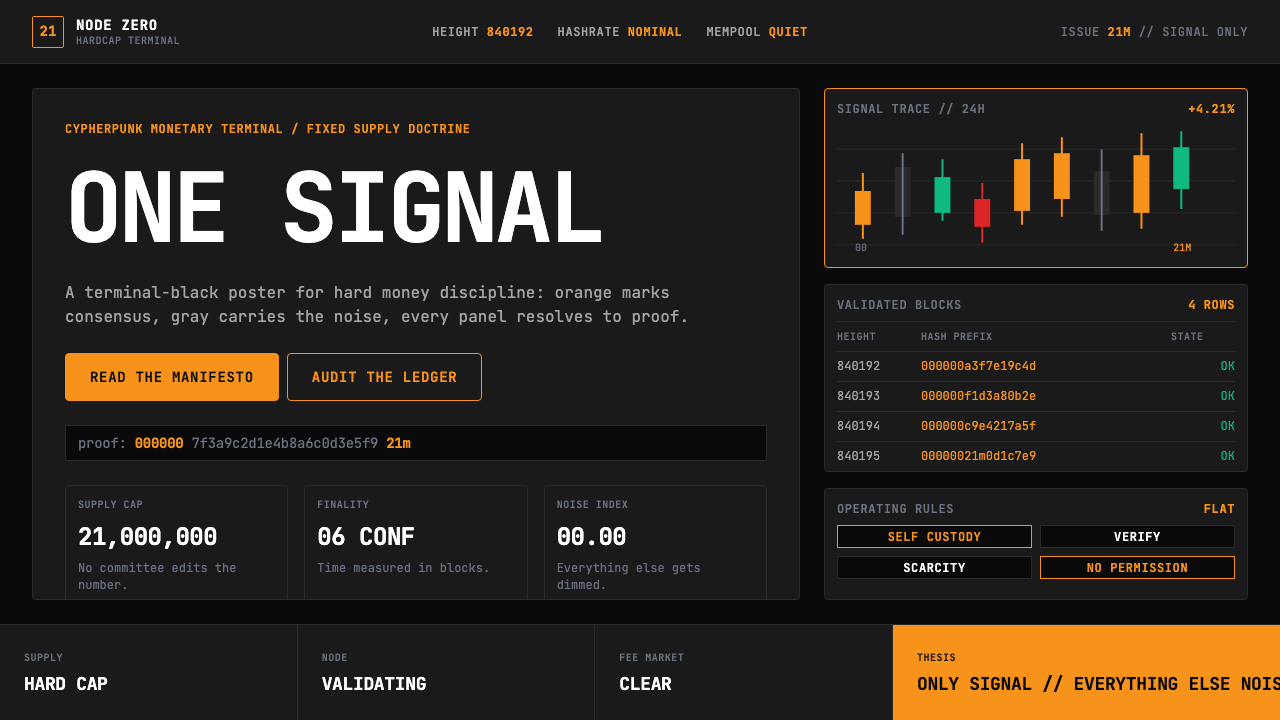 Bitcoin Maximalist OrangeOnly signal, zero spectacle. Orange mono data grids on terminal black enforce…
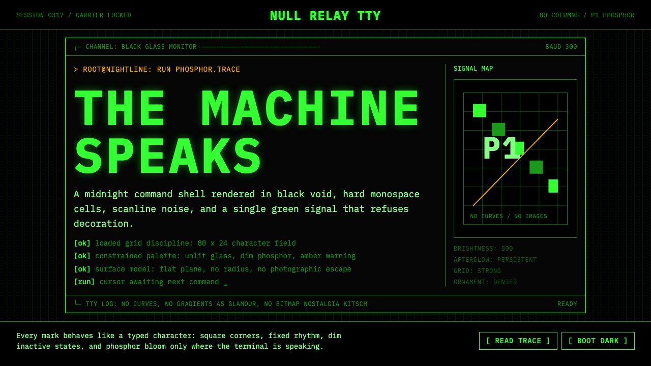 CLI Hacker Phosphor Green (1985)Pure terminal myth. Black glass, P1 green mono type, scanlines, and rigid 80-…
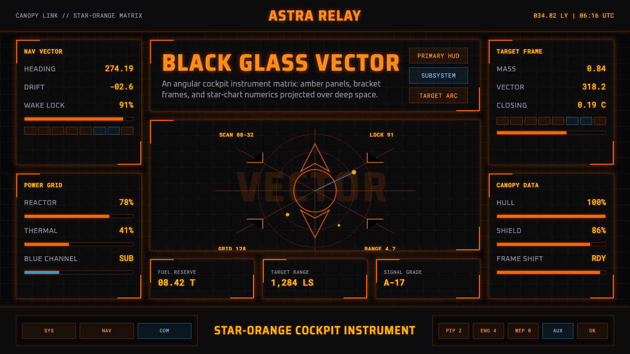 Elite DangerousOne amber instrument. Star-orange wireframes, mono numerics, and black-glass…
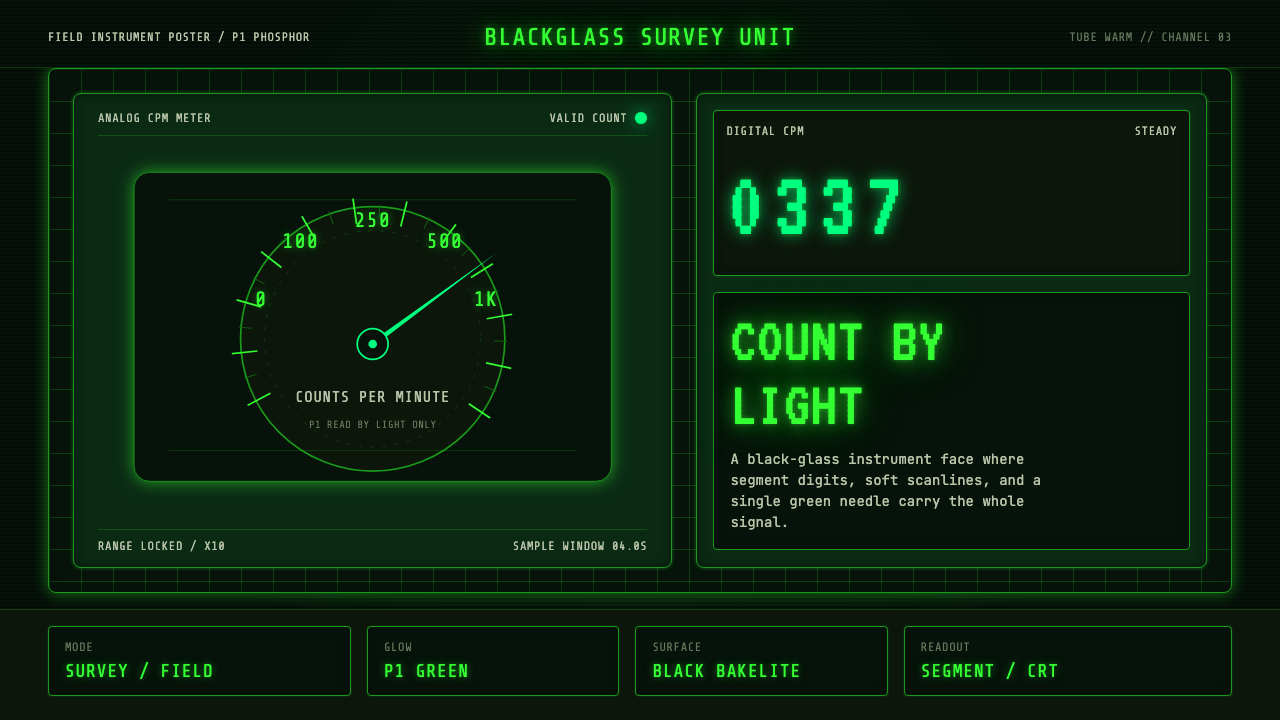 Geiger Counter Green ReadoutReads by glow. P1 green digits, scanlines, and a bordered black instrument gr…
 Halo (Forerunner UI)Hard light on the void. Cyan shield bars and concentric glyph rings glow on a…
 Alien: IsolationLo-fi dread glows. Amber phosphor and terminal green pulse through bordered C…