Design style guide设计风格指南
What is CLI Hacker Phosphor Green (1985)?什么是 CLI Hacker Phosphor Green (1985)?
When computing meant staring into a glowing green void at three in the morning, the phosphor-green terminal became the visual language of those who built the digital world.当计算意味着在凌晨三点凝视发光的绿色虚空时,磷光绿终端成为了构建数字世界之人的视觉语言。
CLI Hacker Phosphor Green (1985) in briefCLI Hacker Phosphor Green (1985) 速览
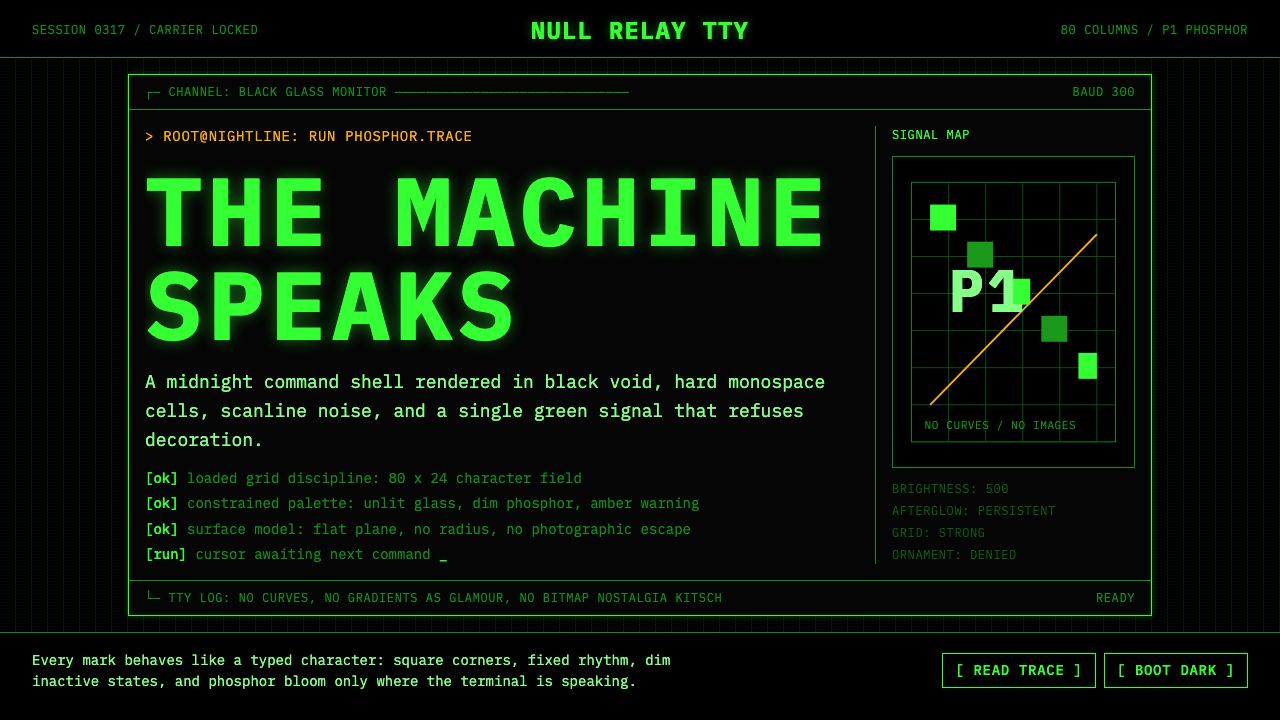
CLI Hacker Phosphor Green (1985) is a design system rooted in the visual grammar of the cathode-ray tube terminal at its cultural peak. It reproduces the aesthetic of a late-night session on a monochrome VT220 or similar machine: an absolute black ground, a single color of phosphor-warm monospace text, the faint horizontal banding of scanlines, and the strict eighty-column grid that imposed discipline on every character displayed. There are no images, no curves, no decoration — only text, structured space, and light.CLI Hacker Phosphor Green(1985)是一套扎根于阴极射线管终端全盛时期视觉语法的设计系统。它复现了深夜在单色VT220或同类机器上工作的美学:绝对黑色的底面,一种磷光暖调的等宽字体色彩,扫描线的隐约水平条纹,以及对显示器上每个字符施加纪律约束的严格八十列网格。没有图像,没有曲线,没有装饰——只有文字、结构化空间与光。
The '1985' designation pins the system to a specific moment: the mid-decade when the personal computer had arrived but the graphical interface had not yet conquered the working environment. Power users, systems administrators, network engineers, and the nascent hacker subculture all lived inside command-line interfaces. The terminal was not a fallback or a legacy relic — it was the primary surface of professional computing. The aesthetic that emerged from that environment carries the authority and discipline of a tool that was genuinely used to build consequential things.「1985」这个年份将系统定位于一个特定时刻:个人计算机已经普及、但图形界面尚未征服工作环境的那个年代中段。高级用户、系统管理员、网络工程师以及初生的黑客亚文化,都生活在命令行界面之中。终端不是后备选项或历史遗存——它是职业计算的主要界面。从那个环境中生长出来的美学,承载着一种确实被用于构建重要事物的工具的权威与纪律。
Unlike many revival aesthetics that borrow surface characteristics without understanding their function, phosphor-green terminal design has an unusually coherent internal logic. Every visual decision — the monospace grid, the absence of imagery, the reliance on ASCII-art borders and block characters for structure — derives directly from the constraints of hardware that rendered only text, in only one color, at only one weight. Applying this system means accepting those constraints as design decisions, not as limitations to work around.与许多借用表面特征却不理解其功能的复古美学不同,磷光绿终端设计拥有异乎寻常的内在逻辑一致性。每一个视觉决策——等宽网格、图像的缺席、依赖ASCII艺术边框和块状字符来构建结构——都直接源于只能以单色、单一字重渲染文本的硬件约束。应用这套系统意味着将这些约束接受为设计决策,而非需要绕过的局限。
See the CLI Hacker Phosphor Green (1985) design system →查看 CLI Hacker Phosphor Green (1985) 完整设计系统 →
Where does CLI Hacker Phosphor Green (1985) come from?CLI Hacker Phosphor Green (1985) 从何而来?
The story of the phosphor-green terminal begins not with design intent but with physics. Early cathode-ray tubes used phosphor coatings that glowed when struck by an electron beam. The P1 phosphor compound, chosen for its brightness and persistence characteristics, produced a distinctive yellow-green emission that became synonymous with computer output through the 1970s and into the 1980s. Engineers chose P1 for practical reasons — it was bright enough to read in a normally lit room and its persistence reduced flicker — but the color became so culturally embedded that later alternatives like the amber P3 phosphor or white-phosphor displays were often perceived as less authentically 'computerly.'磷光绿终端的故事始于物理而非设计意图。早期阴极射线管使用磷光涂层,在电子束轰击时发光。P1磷光化合物因其亮度与余辉特性而被选用,产生了一种独特的黄绿色发射光,从1970年代到1980年代成为计算机输出的代名词。工程师选择P1出于实用原因——在普通照明房间中亮度足够,且其余辉特性减少了闪烁——但这种颜色深深嵌入文化之中,以至于后来的替代品如琥珀色P3磷光或白磷光显示器,常被认为缺乏那种「计算机感」。
Digital Equipment Corporation's VT100, introduced in 1978 and manufactured in Maynard, Massachusetts, established the canonical form. It defined the ANSI escape code standard still used in terminal emulators today, fixed the eighty-column display as the default for professional computing, and shipped with a keyboard whose physical layout — the sculpted keycaps, the arrangement of control keys — became a touchstone for an entire generation of systems programmers. The VT220, introduced in 1983, refined the form further. Together, these machines defined what a terminal looked and felt like at the critical moment when the hacker subculture was consolidating its identity.数字设备公司于1978年在马萨诸塞州梅纳德推出的VT100确立了这种经典形态。它定义了至今仍在终端模拟器中使用的ANSI转义码标准,将八十列显示固定为职业计算的默认值,其键盘的物理布局——雕塑感按键帽、控制键排列——成为整整一代系统程序员的参照基准。1983年推出的VT220进一步完善了这一形态。这两台机器共同定义了终端在黑客亚文化凝聚其身份认同的关键时刻的视觉与手感。
Bell Labs in Murray Hill and later Holmdel, New Jersey, contributed the intellectual environment that shaped how the terminal was used. The UNIX operating system, developed by Ken Thompson and Dennis Ritchie at Bell Labs in the late 1960s and 1970s, established the philosophy that programs should do one thing well and communicate through text streams. This philosophy meant that the terminal's text-only constraint was not merely a hardware accident but an ideological position: text was the universal medium, and the command line was the most direct route between human intention and machine execution. Richard Stallman at MIT's Artificial Intelligence Laboratory, and later the Free Software Foundation, extended this into an ethical framework — the terminal and its associated tools were not just efficient but morally preferable to opaque graphical systems.新泽西州贝尔实验室从默里山到后来的霍尔姆德尔,提供了塑造终端使用方式的智识环境。肯·汤普森和丹尼斯·里奇于1960年代末至1970年代在贝尔实验室开发的UNIX操作系统,确立了「程序应当专注做好一件事并通过文本流通信」的哲学。这一哲学意味着终端的纯文本约束不仅仅是硬件偶然,更是一种意识形态立场:文本是通用媒介,命令行是人类意图与机器执行之间最直接的通道。麻省理工学院人工智能实验室的理查德·斯托曼,以及后来的自由软件基金会,将其延伸为一套伦理框架——终端及其相关工具不仅高效,而且在道德上优于不透明的图形系统。
The years between approximately 1983 and 1992 represent the peak cultural moment for the phosphor-green aesthetic. The 1983 film WarGames introduced the terminal-as-thriller-prop to a mass audience. Steven Levy's 1984 book Hackers: Heroes of the Computer Revolution documented the subculture and its visual environment in the same year that the Macintosh arrived to begin displacing it. The Terminal and the GUI coexisted through the late 1980s in an uneasy tension, and the hacker culture's attachment to the command line was increasingly an aesthetic and ideological choice as much as a practical one. By 1995, when the film Hackers appeared and The Matrix's production design team began conceiving their visual approach, the phosphor-green terminal had completed its transformation from working tool to cultural symbol — a transformation the 1999 film made permanent by rendering falling green glyphs as the literal appearance of a simulated reality.大约从1983年到1992年,是磷光绿美学文化影响力的巅峰时期。1983年的电影《战争游戏》将终端作为惊悚道具带入大众视野。史蒂文·利维1984年的著作《黑客:计算机革命的英雄》在同年记录了这一亚文化及其视觉环境——那一年,麦金塔电脑正开始取代它。在整个1980年代后期,终端与图形界面在不安的张力中共存,黑客文化对命令行的执着越来越既是美学与意识形态的选择,也是实践上的需要。到1995年电影《黑客》上映、《黑客帝国》制作设计团队开始构思其视觉方案之时,磷光绿终端已完成了从工作工具到文化符号的蜕变——1999年的电影通过将飘落的绿色字符渲染为模拟现实的字面外观,使这一蜕变永久化。
What defines the CLI Hacker Phosphor Green (1985) look?CLI Hacker Phosphor Green (1985) 的视觉特征是什么?
Monochrome Palette单色调色板
The entire system operates in a single color: the warm, slightly yellowish green of P1 phosphor on absolute black. There are no secondary colors, no accent hues, no grays used to soften contrast. Hierarchy and emphasis are communicated entirely through brightness variation — brighter text for active elements, dimmer text for secondary information — and through the spatial logic of the grid itself. The color is not decorative; it is the only available medium, and that constraint gives it a visual weight that polychromatic systems rarely achieve.整个系统在单一颜色中运作:P1磷光的暖调略带黄绿色,映衬于绝对黑色之上。没有辅助色,没有强调色调,没有用于柔化对比的灰色。层级与强调完全通过亮度变化来传达——更亮的文字用于活跃元素,更暗的文字用于次要信息——以及通过网格本身的空间逻辑来传达。这种颜色不是装饰性的;它是唯一可用的媒介,而这一约束赋予了它多色系统难以企及的视觉分量。
Strict Monospace Grid严格等宽网格
Every element occupies a fixed cell in a character grid. Text does not flow freely — it is placed at specific column-and-row coordinates. This constraint, inherited from the hardware that could only address individual character positions, produces an unusually rigid but also unusually precise compositional system. Alignment is absolute rather than approximate; spacing is measured in characters rather than in abstract units. The grid imposes a discipline that makes every layout decision legible as a decision rather than a convenience.每个元素占据字符网格中固定的单元格。文字不自由流动——它被放置在特定的列行坐标上。这一约束继承自只能寻址单个字符位置的硬件,产生了一种异常刚性却也异常精确的构图系统。对齐是绝对的而非近似的;间距以字符而非抽象单位来衡量。网格施加的纪律使每个版面决策都清晰可读为一个决策,而非一种便利。
Scanline Texture扫描线纹理
The CRT display refreshed its image by scanning an electron beam horizontally across the screen in rapid succession, producing faint horizontal banding visible between rows of characters. This scanline texture is not a flaw to be corrected but a material signature — the evidence of how the image was physically produced. In the design system, scanlines serve as a reminder that the surface is a display, not a page; that the light is emitted rather than reflected; that what appears to be solid is in fact a persistent flicker. The texture adds depth without introducing any new color.CRT显示器通过快速连续地将电子束水平扫过屏幕来刷新图像,在字符行之间产生隐约可见的水平条纹。这种扫描线纹理不是需要纠正的缺陷,而是材料签名——关于图像如何被物理产生的证据。在设计系统中,扫描线提醒人们:这个表面是一块显示器,而非一张页面;光是发射的而非反射的;看似实心的东西实际上是持续的闪烁。纹理在不引入任何新色彩的情况下增添了深度。
ASCII Structure and Box DrawingASCII结构与制表符绘图
Without access to images or drawn lines, terminal interfaces developed a vocabulary of box-drawing characters — horizontal and vertical bars, corners, intersections — to create visual structure. These characters, originally encoded in IBM's CP437 and later standardized, allowed operators to build tables, panels, menus, and dialogs entirely from typographic elements. The result is a design vocabulary that is simultaneously primitive and rigorous: borders are exactly one character wide, corners are precise, and the relationship between structure and content is always explicit.没有图像或绘制线条的情况下,终端界面发展出一套制表符绘图字符词汇——水平与垂直线条、角落字符、交叉点——来创建视觉结构。这些字符最初在IBM的CP437中编码,后来标准化,允许操作员完全用排版元素构建表格、面板、菜单和对话框。结果是一种既原始又严谨的设计词汇:边框正好一个字符宽,角落精确,结构与内容之间的关系始终清晰可见。
Cursor and Blink光标与闪烁
The blinking block cursor is one of the most recognized elements of the terminal aesthetic, and one of the most functionally precise: it marks exactly where the next input will appear. There is no ambiguity about focus, no subtle highlight or shadow to suggest interactivity. The cursor blinks because the refresh cycle of the phosphor creates a natural periodicity; the blink became a standard affordance, a clear signal of liveness. In the design system, the cursor metaphor — hard-edged, unambiguous, blinking — stands for precision and attention.闪烁的块状光标是终端美学中最被认知的元素之一,也是功能最为精确的之一:它精确标记下一个输入将出现的位置。关于焦点没有歧义,没有微妙的高亮或阴影来暗示交互性。光标闪烁是因为磷光的刷新周期产生了自然的周期性;闪烁成为标准的交互线索,一个清晰的活跃信号。在设计系统中,光标隐喻——硬边、明确、闪烁——代表精确与专注。
Typographic Hierarchy Through Case and Density通过大小写与密度建立字体层级
Without multiple typefaces or weights, the terminal interface communicated hierarchy through other means: uppercase text for system messages and prompts, lowercase for user input; sparse lines for headings, dense columns for data; indentation to indicate nesting and dependency. These conventions were not arbitrary — they evolved through use to solve real legibility problems under tight constraints. Applied deliberately, they produce a typographic system of considerable sophistication that relies on rhythm and whitespace rather than on typographic decoration.在没有多种字体或字重的情况下,终端界面通过其他方式传达层级:系统消息和提示用大写,用户输入用小写;标题用稀疏行,数据用密集列;缩进表示嵌套与依赖关系。这些惯例并非任意而为——它们在严格约束下通过使用演化出来,解决真实的可读性问题。有意应用时,它们产生一种相当精妙的排版系统,依赖节奏与空白而非排版装饰。
Phosphor Glow and Bloom磷光辉光与光晕
Phosphor at the peak of its excitation produces a slight halo around bright characters — a bloom effect where the light overshoots the precise boundaries of the character cell and bleeds into adjacent space. This glow is not sharp; it is soft at the edges while the character itself remains crisp. The effect gives the terminal image its characteristic sense of luminosity rather than mere brightness: the screen appears to emit light rather than to display it. Restrained use of glow in the design system evokes the material quality of the original hardware without becoming a cheap atmospheric effect.处于激发峰值的磷光在明亮字符周围产生轻微的光晕——一种光晕效果,光线超出字符单元格的精确边界并渗入相邻空间。这种辉光并不锐利;它在边缘柔和,而字符本身保持清晰。这种效果赋予终端图像其特有的发光感而非单纯亮度:屏幕看起来是在发射光而非显示光。在设计系统中克制地使用辉光,能唤起原始硬件的材料质感,而不会沦为廉价的氛围特效。
See the CLI Hacker Phosphor Green (1985) design system →查看 CLI Hacker Phosphor Green (1985) 完整设计系统 →
Who shaped CLI Hacker Phosphor Green (1985)?谁塑造了 CLI Hacker Phosphor Green (1985)?
Thompson is the co-creator of UNIX and the C programming language, developed at Bell Labs in the late 1960s and 1970s. More than any other individual, Thompson defined the philosophical environment in which the terminal was used: a world of small, composable tools, text streams as the universal data format, and the command line as the primary site of human-computer interaction. His design decisions about UNIX — the file system, the shell, the pipeline — are the reason the terminal aesthetic is not merely visual but also procedural and epistemic. Thompson's work established that computing is fundamentally about text and transformation.汤普森是UNIX和C编程语言的共同创造者,于1960年代末至1970年代在贝尔实验室开发。比任何其他个人都更多地,汤普森定义了使用终端的哲学环境:一个由小型可组合工具构成的世界,文本流作为通用数据格式,命令行作为人机交互的主要场所。他关于UNIX的设计决策——文件系统、shell、管道——是终端美学不仅仅是视觉性的,还是程序性和认识论性的原因。汤普森的工作确立了计算从根本上关乎文本与转换的信念。
Ritchie co-created UNIX with Thompson and designed the C programming language, which became the dominant language for systems software through the 1980s. Ritchie's contribution to the terminal aesthetic was less visible but foundational: by creating a language that could express operating system logic in readable text, he ensured that the terminal environment was self-documenting. Source code, configuration files, and system logs were all legible text, readable with the same tools used to write programs. This integration of writing and computing — everything is text — is the deepest philosophical root of the hacker terminal aesthetic.里奇与汤普森共同创造了UNIX并设计了C编程语言,C语言在整个1980年代成为系统软件的主导语言。里奇对终端美学的贡献不那么显眼却是根本性的:通过创建一种能以可读文本表达操作系统逻辑的语言,他确保了终端环境是自文档化的。源代码、配置文件和系统日志都是可读文本,可以用写程序的同一工具来阅读。这种写作与计算的整合——一切皆是文本——是黑客终端美学最深刻的哲学根源。
Stallman began his career at MIT's Artificial Intelligence Laboratory in the 1970s, where he worked in a culture that treated shared source code and terminal access as communal goods. When commercial interests began restricting software access in the early 1980s, Stallman's response was to found the GNU Project in 1983 and the Free Software Foundation in 1985, and to articulate a moral framework — the four freedoms — in which the right to read, modify, and share software was treated as a fundamental value. For the design system, Stallman's significance is cultural rather than visual: he gave the phosphor-green terminal its ethical weight, transforming it from a tool into a statement about the proper relationship between people and technology.斯托曼的职业生涯始于1970年代麻省理工学院人工智能实验室,在那里他工作于一种将共享源代码和终端访问视为公共财产的文化中。当商业利益在1980年代初开始限制软件访问时,斯托曼的回应是于1983年创立GNU项目、1985年创立自由软件基金会,并阐明一套道德框架——四项自由——其中阅读、修改和分享软件的权利被视为基本价值。对于设计系统而言,斯托曼的意义是文化性的而非视觉性的:他赋予磷光绿终端以伦理重量,将其从工具转变为关于人与技术之间适当关系的宣言。
Raymond is the author of The Cathedral and the Bazaar and the primary editor of the Jargon File, both published in the 1990s. Together, these works served as the first systematic documentation of the hacker subculture — its values, its aesthetic sensibilities, its social structures. Raymond did not create the culture but he codified it at the moment when it was transitioning from an oral tradition to a written one, and in doing so, he fixed the visual vocabulary of the terminal as part of the hacker identity rather than merely as a technical circumstance. His writing made it possible for later generations to consciously choose the terminal aesthetic as a form of cultural identification.雷蒙德是《大教堂与集市》的作者以及《行话文件》的主要编辑,两者均于1990年代出版。这些作品共同构成了黑客亚文化的第一次系统性文献记录——其价值观、美学感知、社会结构。雷蒙德并非创造了这种文化,但他在文化从口头传统向书面传统过渡的时刻将其成文化,并由此将终端的视觉词汇固定为黑客身份的一部分,而非仅仅是一种技术环境。他的写作使后代人可以有意识地选择终端美学作为一种文化认同形式。
Bell was the chief architect of DEC's PDP and VAX series and the technical lead whose decisions shaped the hardware that hosted the phosphor-green terminal culture. Working at DEC's Maynard, Massachusetts facility from the 1960s through the 1980s, Bell designed the minicomputer systems that gave universities, research labs, and corporate computing centers their first experience of interactive computing. The VT100's heritage traces directly to the interactive terminal interfaces developed for Bell's VAX architecture. He later led the establishment of the Computer History Museum in Silicon Valley, ensuring that the physical artifacts of the terminal era were preserved as cultural heritage rather than discarded as obsolete technology.贝尔是DEC的PDP和VAX系列的首席架构师,其决策塑造了承载磷光绿终端文化的硬件。从1960年代到1980年代在DEC梅纳德马萨诸塞州工厂工作期间,贝尔设计了让大学、研究实验室和企业计算中心第一次体验交互式计算的小型计算机系统。VT100的传承直接追溯到为贝尔的VAX架构开发的交互式终端界面。他后来主导在硅谷建立计算机历史博物馆,确保终端时代的实物档案作为文化遗产被保存下来,而非作为过时技术被丢弃。
How do you use CLI Hacker Phosphor Green (1985) today?今天怎么用 CLI Hacker Phosphor Green (1985)?
The phosphor-green terminal aesthetic is among the most contextually specific design systems available — it carries strong cultural associations with technical competence, late-night focus, and the principled austerity of early computing culture. Applied with understanding, it produces work that reads as authoritative and precise. Applied carelessly, it produces nostalgia theater. The difference lies in whether the constraints are treated as the design or as a costume placed over a different design.磷光绿终端美学是现有最具语境特异性的设计系统之一——它承载着与技术能力、深夜专注以及早期计算机文化的原则性朴素相关的强烈文化联想。有理解地应用,它产生的作品读起来权威而精确。漫不经心地应用,它产生怀旧剧场。区别在于:这些约束是被当作设计本身,还是被当作套在另一种设计之上的服装。
For presentation slides, the system works best for technical subjects where the content itself has the density and precision the aesthetic implies. A cover slide benefits from the stark contrast of a single large monospace command or identifier against absolute black, with a cursor marking the end of the line. Content slides should maintain the grid discipline: text aligned to a consistent left margin, hierarchy communicated through indentation and case rather than through decorative typography. Data slides translate well into the terminal idiom — tabular data displayed as if rendered by a command-line reporting tool, with column headers in a brighter value and data rows in a slightly dimmer one. Avoid using the aesthetic for sales or consumer-facing presentations where warmth and approachability matter more than authority.对于演示文稿,这套系统在内容本身具有美学所暗示的密度与精度的技术主题上效果最佳。封面幻灯片受益于绝对黑色背景上单个大型等宽命令或标识符的强烈对比,光标标记在行末。内容幻灯片应保持网格纪律:文字对齐到一致的左边距,层级通过缩进和大小写而非装饰性排版来传达。数据幻灯片很好地转译为终端风格——以命令行报告工具渲染的方式显示表格数据,列标题用较亮的色调,数据行用略暗的色调。避免将这种美学用于温暖感和亲近感比权威感更重要的销售或面向消费者的演示。
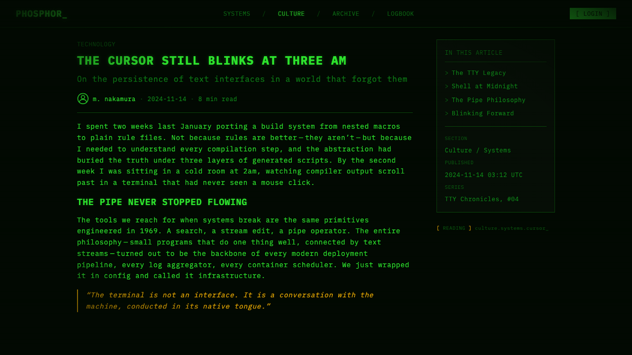
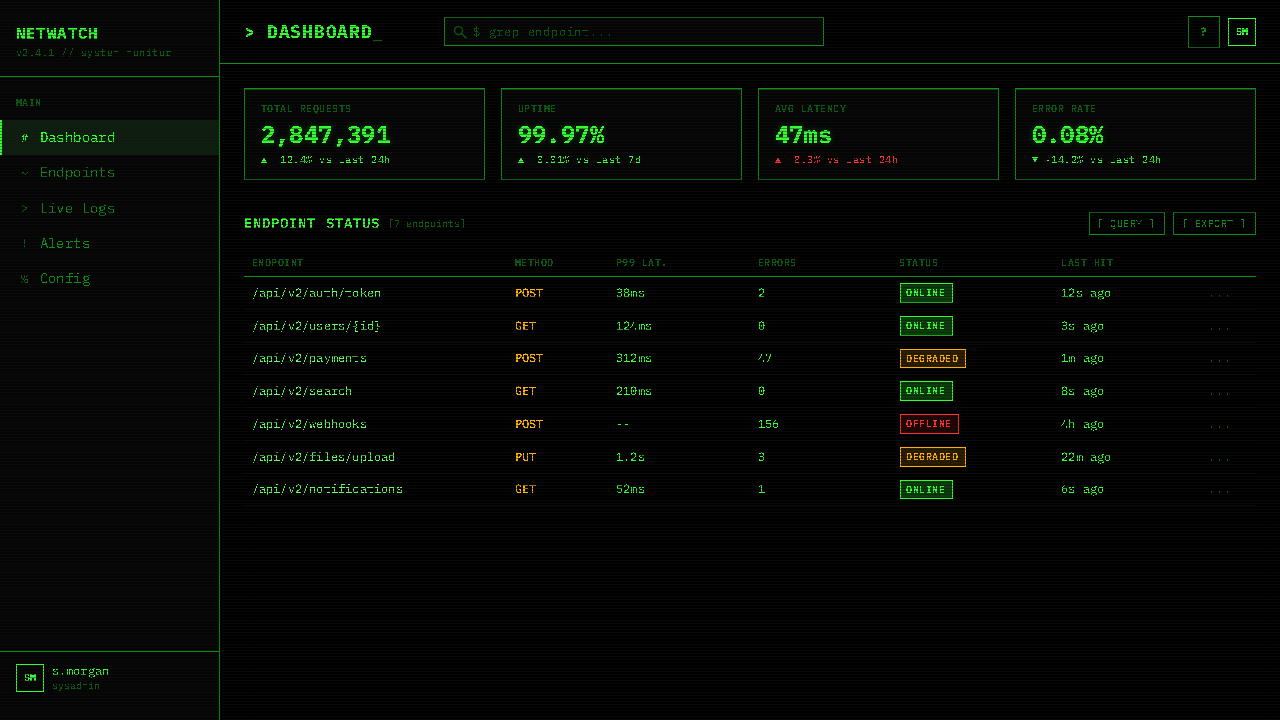
For web interfaces, the style is most effective for developer tools, technical documentation, system monitoring dashboards, and command-line-adjacent products where the user is expected to be comfortable with density and precision. The approach: set the base background to the deepest possible black, use a single monospace typeface family throughout, restrict interactive highlights to the single phosphor color, and build spatial structure through consistent character-width spacing rather than through decorative borders or card shadows. Status indicators, log viewers, and progress outputs all benefit from the terminal idiom's established vocabulary. Avoid using this system for general-purpose web products or for interfaces where the primary user interaction is browsing rather than commanding.对于网页界面,这种风格在开发者工具、技术文档、系统监控仪表板以及命令行相邻产品上最为有效——用户被预期对密度和精度感到舒适。方法:将基础背景设为尽可能深的黑色,全程使用单一等宽字体家族,将交互高亮限制在单一磷光色,并通过一致的字符宽度间距而非装饰性边框或卡片阴影来构建空间结构。状态指示器、日志查看器和进度输出都受益于终端风格已建立的词汇。避免将此系统用于通用网页产品或主要用户交互是浏览而非命令的界面。
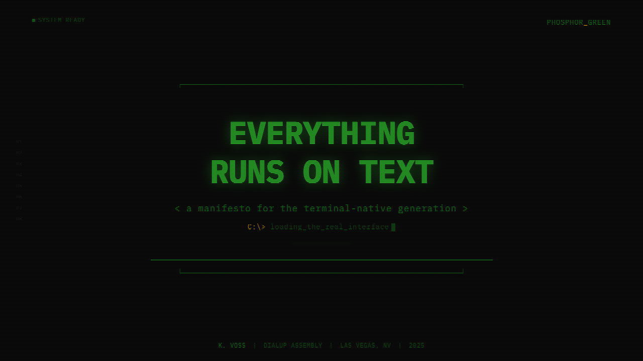
For editorial and marketing work, the style supports headlines and cover designs that want to project technical authority. A poster or cover in this style reads as coming from inside the culture rather than commenting on it from outside. Key discipline: every character must earn its place, and any visual element that would not have been possible on an actual VT220 requires explicit justification. Mixing terminal type with photographic imagery tends to undermine the style's logic; the system is most coherent when it operates within its own constraints throughout.对于编辑和营销工作,这种风格支持想要投射技术权威的标题和封面设计。这种风格的海报或封面读起来像是来自文化内部,而非从外部对其发表评论。关键纪律:每个字符都必须赚到自己的位置,任何在真实VT220上不可能存在的视觉元素都需要明确的理由。将终端字体与摄影图像混合往往会破坏这种风格的逻辑;系统在全程于自身约束内运作时最为连贯。
A common mistake when applying this aesthetic is treating the green glow as the main feature and neglecting the underlying grid discipline. Designers often add phosphor-green color and scanline effects to layouts that are otherwise structured with contemporary conventions — variable-width typefaces, organic spacing, gradient shadows — and expect the color to carry the meaning alone. It does not. The authority of the phosphor-green terminal comes from the combination of color and grid and constraint; remove the grid and you have a Halloween costume, not a design system. Similarly, mixing in ornamental elements — icons, photography, soft gradients — immediately breaks the material logic. The style's power is inseparable from its austerity.应用这种美学时最常见的错误是将绿色辉光视为主要特征,而忽视底层的网格纪律。设计师经常将磷光绿色彩和扫描线效果添加到在其他方面以当代惯例构建的版面上——可变宽度字体、有机间距、渐变阴影——并期望颜色单独承载意义。它做不到。磷光绿终端的权威来自颜色与网格与约束的组合;移除网格,你得到的是万圣节服装,而非设计系统。同样,混入装饰性元素——图标、摄影、柔和渐变——立即破坏了材料逻辑。这种风格的力量与其朴素不可分割。
See the CLI Hacker Phosphor Green (1985) design system →查看 CLI Hacker Phosphor Green (1985) 完整设计系统 →
CLI Hacker Phosphor Green (1985) — FAQCLI Hacker Phosphor Green (1985) · 常见问题
Is the phosphor-green color essential, or can the system work in other terminal colors?磷光绿色是必不可少的,还是这套系统可以用其他终端颜色实现?
The system can be adapted to other authentic terminal colors — amber P3 phosphor and white-phosphor displays were historically accurate alternatives — but each color shift changes the cultural register significantly. Amber reads as slightly warmer and more industrial, less associated with the hacker subculture specifically and more with the word-processing environment of early business computing. White-on-black reads as more contemporary and is closer to modern terminal emulator defaults. The P1 green, however, carries the strongest cultural specificity: it is the color most associated with WarGames, with The Matrix, with the specific late-night technical culture the system evokes. Choosing a different color is a valid design decision but it is not the same system.这套系统可以适配其他真实的终端颜色——琥珀色P3磷光和白磷光显示器在历史上都是准确的替代方案——但每次颜色转换都会显著改变文化寄存器。琥珀色读起来稍微温暖、更具工业感,与黑客亚文化的关联不那么直接,更多与早期商业计算的文字处理环境相关。黑底白字读起来更当代,更接近现代终端模拟器的默认设置。然而,P1绿色承载着最强的文化特异性:它是与《战争游戏》、《黑客帝国》、与这套系统所唤起的特定深夜技术文化联系最紧密的颜色。选择不同颜色是有效的设计决策,但那不是同一套系统。
How should the scanline effect be handled — always visible, or subtle?扫描线效果应该如何处理——始终可见,还是保持微妙?
Subtle and consistent is almost always correct. Heavy scanlines dominate the composition and read as retro gaming pastiche rather than terminal authenticity; they attract attention to themselves rather than to the content. The authentic terminal experience was not one where scanlines were the first thing you noticed — they were ambient texture that you ceased to see after a few minutes of work. Applied correctly, scanlines should be barely perceptible at normal reading distance, adding material texture and reinforcing the emitted-light quality of the image without competing with the text. If a viewer immediately notices the scanlines, they are too strong.微妙而一致几乎总是正确的。过重的扫描线主导构图,读起来像复古游戏仿制品而非终端真实感;它们将注意力吸引到自身而非内容。真实的终端体验并不是扫描线是你第一个注意到的事物——它们是环境纹理,工作几分钟后你便不再看见。正确应用时,扫描线在正常阅读距离应几乎难以察觉,在不与文字竞争的情况下增添材料质感并强化图像的发射光品质。如果观看者立即注意到扫描线,那它们就太强了。
Can this system be used for products aimed at non-technical audiences?这套系统可以用于面向非技术受众的产品吗?
It can, but with significantly reduced effectiveness. The phosphor-green terminal aesthetic communicates competence and technical authority to audiences who recognize its reference — developers, engineers, technically literate users. For audiences without that cultural context, the same aesthetic communicates something different: it may read as retro, as gaming-adjacent, as deliberately obscure, or simply as difficult to read. The system does not have a neutral mode; it is a strong cultural signal that either resonates or alienates depending on the audience. The appropriate question before applying it is not 'is this technically achievable?' but 'does my audience share the cultural frame that makes this meaningful rather than merely unusual?'可以,但效果会大打折扣。磷光绿终端美学向认识其参照的受众——开发者、工程师、技术素养较高的用户——传达能力与技术权威。对于没有该文化语境的受众,同样的美学传达的是不同的东西:它可能被解读为复古、接近游戏风格、刻意晦涩,或者简单地难以阅读。这套系统没有中性模式;它是一个强烈的文化信号,取决于受众是产生共鸣还是产生疏离。在应用它之前适当的问题不是「这技术上能实现吗?」而是「我的受众是否共享使这有意义而非仅仅不寻常的文化框架?」
How does this aesthetic relate to contemporary dark-mode design?这种美学与当代深色模式设计有何关联?
They share a dark ground, but their logic is opposite. Contemporary dark mode typically reduces eyestrain by softening contrast — using off-black backgrounds, gray text rather than white, subtle shadows to suggest depth, and a full color palette with reduced saturation. The phosphor-green terminal maximizes contrast, uses a single color, eliminates all softening, and produces a surface that is optically demanding. Dark mode is about comfort and flexibility; the terminal aesthetic is about focus and constraint. The two can coexist in the same product if their purposes are clearly separated — terminal palette for data-dense interfaces, contemporary dark mode for reading and browsing — but mixing them in the same UI components typically produces something that satisfies neither purpose.两者都使用深色底面,但逻辑相反。当代深色模式通常通过柔化对比来减少眼部疲劳——使用非纯黑背景、灰色而非白色文字、微妙的阴影暗示深度,以及降低饱和度的完整色板。磷光绿终端最大化对比度,使用单一颜色,消除所有柔化,产生一个对视觉要求苛刻的表面。深色模式关乎舒适与灵活性;终端美学关乎专注与约束。两者可以在同一产品中共存,只要其目的清晰分离——终端调色板用于数据密集界面,当代深色模式用于阅读和浏览——但在同一UI组件中混合它们,通常产生的结果两种目的都无法满足。
What makes an application of this style feel authentic versus derivative?什么使这种风格的应用感觉真实而非衍生?
Authenticity in this system comes from operating within its constraints rather than selecting its surface elements. A derivative application might use a monospace typeface and a green color scheme but maintain flowing text, rounded corners, and multiple typeface weights — importing contemporary layout conventions into a period-specific aesthetic. An authentic application treats the grid as non-negotiable, uses only one color of text at varying brightness, builds spatial structure from indentation and whitespace rather than from decorative borders or cards, and limits visual complexity to what would have been achievable on the original hardware. The key question: if you printed this in black and white and removed the color, would the underlying structure and hierarchy still be entirely legible? If the answer is yes, the application is working within the system's logic. If the answer is no, it is borrowing the system's appearance without its discipline.这套系统的真实性来自于在其约束内运作,而非选择其表面元素。衍生性的应用可能使用等宽字体和绿色配色方案,但保持自由流动的文字、圆角和多种字体字重——将当代版面惯例引入特定时期的美学。真实的应用将网格视为不可妥协的,只使用不同亮度的单一颜色文字,从缩进和空白而非装饰性边框或卡片构建空间结构,并将视觉复杂度限制在原始硬件上可能实现的范围内。关键问题:如果你将其打印成黑白并去除颜色,底层结构和层级是否仍然完全可读?如果答案是肯定的,应用就在系统的逻辑内运作。如果答案是否定的,它就是在借用系统的外观而没有其纪律。
Related design styles相关设计风格
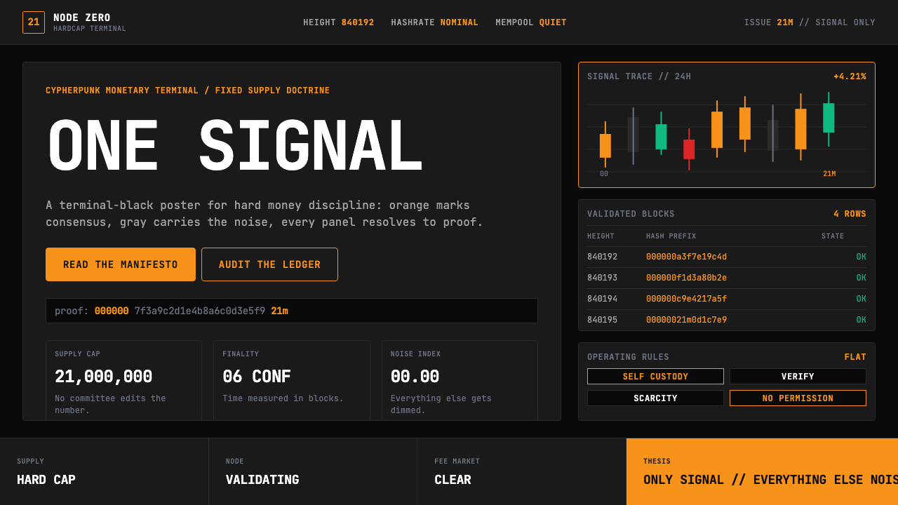 Bitcoin Maximalist OrangeOnly signal, zero spectacle. Orange mono data grids on terminal black enforce…只有信号,拒绝表演。终端黑上的橙色等宽数据网格,锁定硬钱秩序。
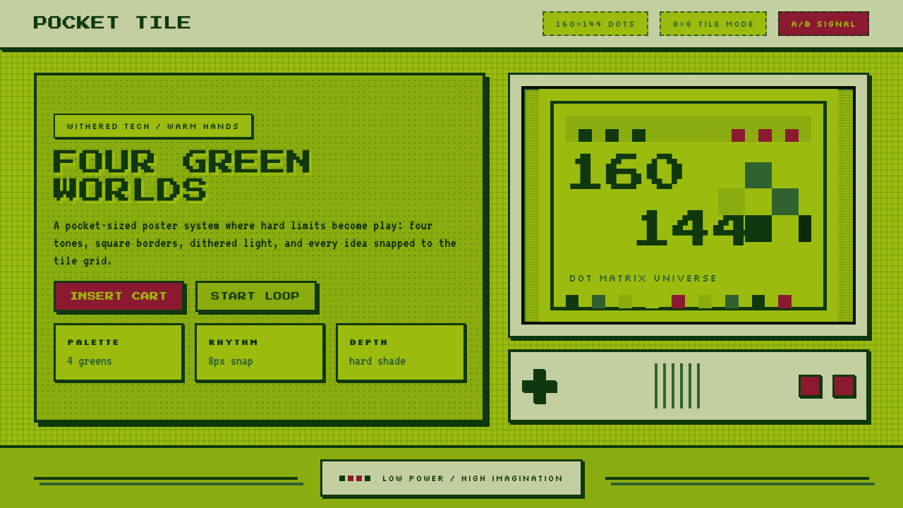 Nintendo Game BoyConstraint becomes play. Four swamp greens, pixel type, and an 8×8 grid do th…限制变成游戏:四档沼泽绿、像素字与8×8网格。
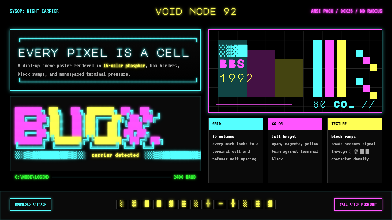 ASCII Art BBS (1992)Terminal art hits hard. Cyan-magenta-yellow glow, box borders, block ramps.终端艺术直击:青品黄磷光、方框边界与方块渐变。
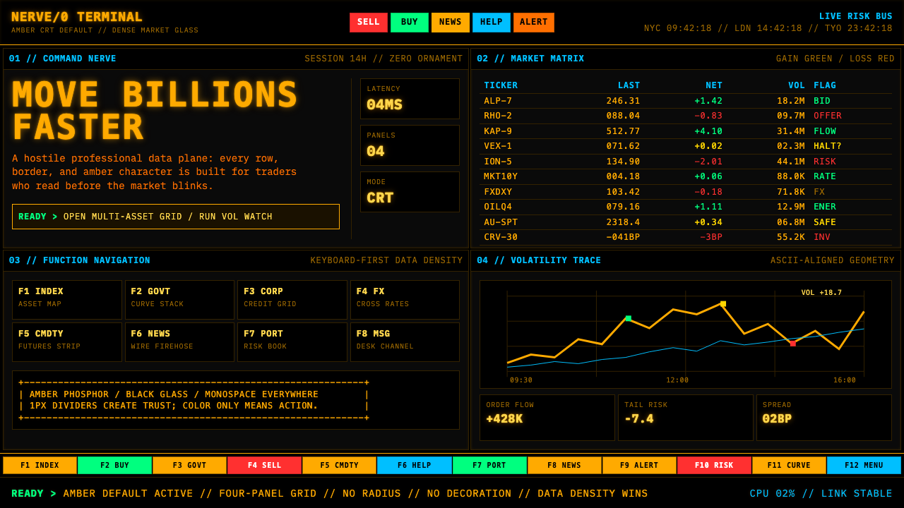 Bloomberg Terminal (Amber CRT)Hostile data authority. Amber mono grids and four hard panels make black glas…强硬的数据权威。琥珀等宽字与四格硬边框,让黑玻璃像市场神经。
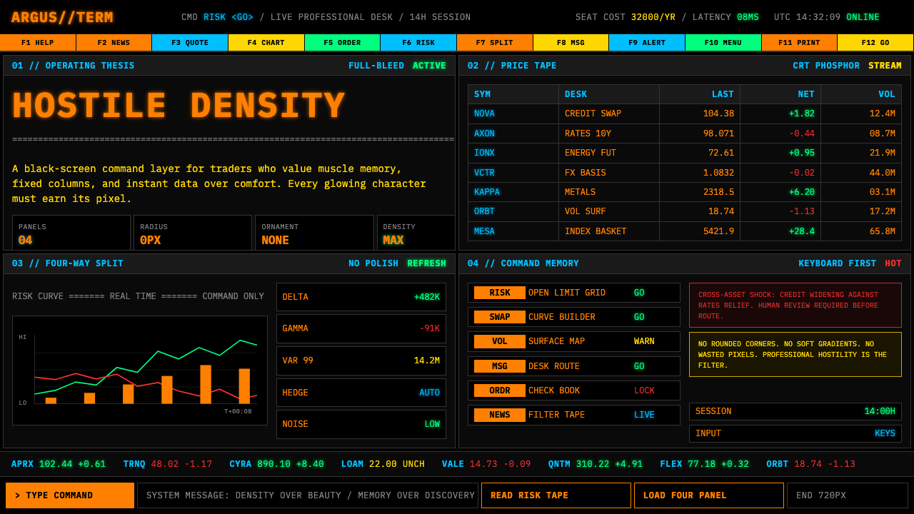 Bloomberg Terminal (CRT Green)Hostile density wins. Orange CRT mono, black grids, and four-panel data walls.敌意密度取胜:橙色CRT等宽字、黑底四分屏数据墙。
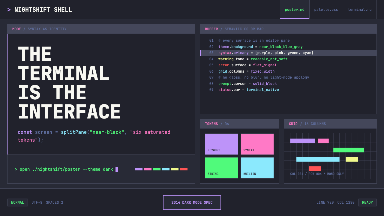 Terminal Vim Dracula (2014)Terminal-native darkness. Near-black panes carry six saturated syntax colors…终端原生的暗色:近黑分屏承载六色语法高亮与等宽网格。