What is Nintendo Game Boy?什么是 Nintendo Game Boy?
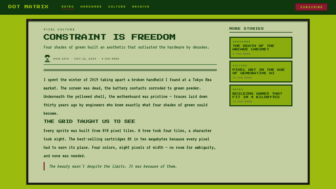
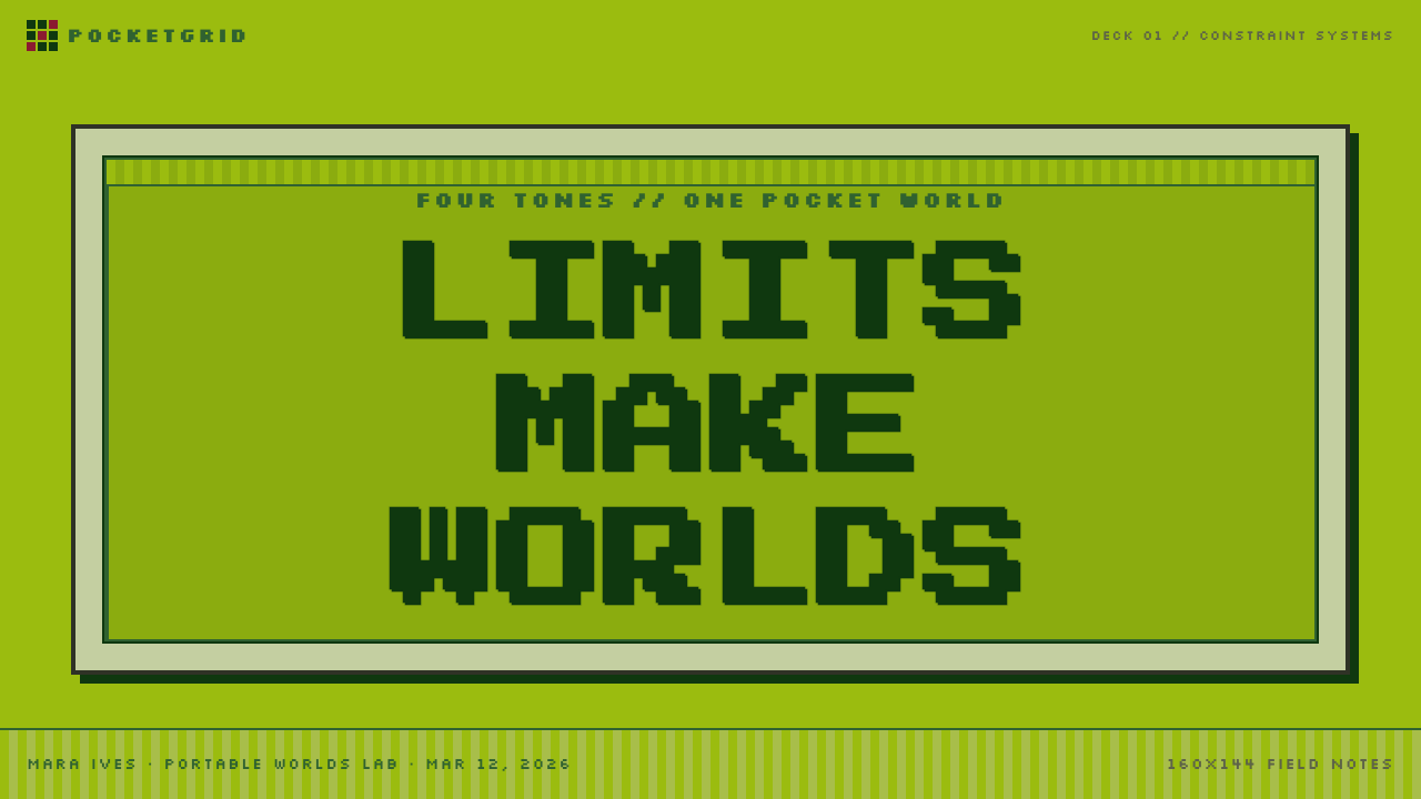
Four shades of swampy green, a pixel grid, and a pocket-sized screen proved that constraint is not limitation — it is a design language.四档沼泽绿、像素网格与一块口袋屏幕证明了:限制不是枷锁,而是一种设计语言。
Nintendo Game Boy in briefNintendo Game Boy 速览
The Nintendo Game Boy aesthetic is a visual language born from hardware limitation. Launched in 1989 as Nintendo's first mass-market handheld console, the DMG-01 — 'Dot Matrix Game' — was engineered around a monochrome dot-matrix LCD capable of rendering only four gradations of the same murky olive-green hue. Instead of disguising this constraint, Nintendo's designers and the generations of artists who worked within it embraced it as an identity. The result is one of the most instantly recognizable visual systems in the history of portable media.任天堂 Game Boy 美学是一种从硬件限制中生长出来的视觉语言。1989 年,DMG-01(Dot Matrix Game)作为任天堂首款面向大众市场的掌机问世,其单色点阵液晶屏只能显示同一种混浊橄榄绿的四个梯度。设计师们和后来无数在此框架内工作的艺术家没有掩盖这一限制,而是将它拥抱为一种身份标识。由此诞生了便携媒体史上辨识度最高的视觉体系之一。
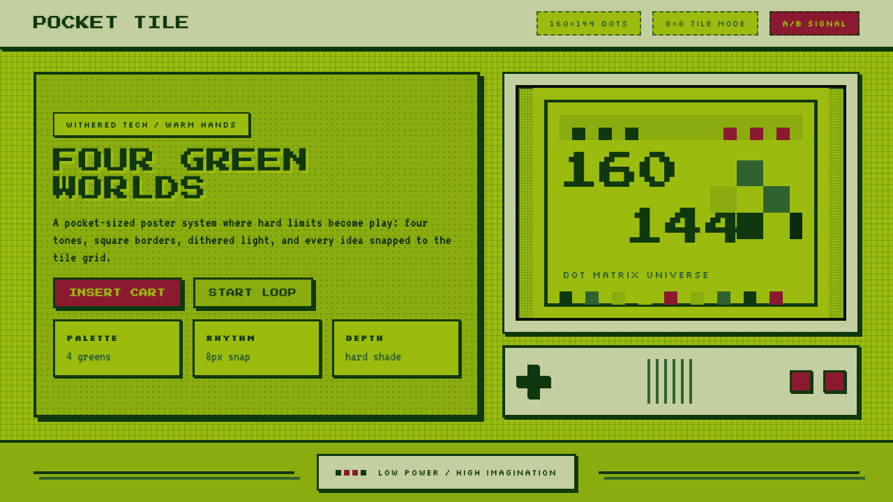
At its core, the Game Boy palette runs from the deepest possible dark green — so dark it reads as near-black — through two intermediate mid-tones, to a pale, almost yellowed green at the lightest extreme. Every image, every character sprite, every screen of text was rendered within this four-tone band. Transitions between tones were achieved not with true gradients but through dithering: a checkerboard or dot pattern that optically blends two adjacent tones into the illusion of a fifth. This pixel-level craft became the style's most characteristic texture.这套色板的核心,从最深的墨绿——深到近乎黑色——经过两个中间调,一直延伸到最浅的、略带黄色的浅绿。所有图像、角色精灵、文字界面都在这四个色调的区间内完成。色调之间的过渡不借助真正的渐变,而通过抖动点阵实现:棋盘格或点状图案在视觉上将两个相邻色调混合成第五种假象色。这种像素级的手艺成为整套风格最具特征的纹理。
Typography in the Game Boy world is equally governed by constraint. Characters are drawn on an eight-by-eight pixel grid — each letter a tiny bitmap constructed from individual lit or unlit dots. This grid-native letterform has its own rhythm: chunky, squarish, highly legible at small sizes, and utterly distinct from any smooth-edged digital typeface. The aesthetic has been revived and celebrated in retro game culture, in independent pixel-art communities, and now as a deliberate design choice for brands, presentations, and interfaces that want to evoke nostalgia, authenticity, and a certain quiet playfulness.Game Boy 世界的字体排印同样受约束支配。字符绘制在八乘八像素网格上——每个字母都是由单个亮起或熄灭的点构成的微型位图。这种网格原生字形有自己的节奏:笨拙、方块状、在小尺寸下极为清晰,与任何平滑边缘的数字字体截然不同。这套美学在复古游戏文化、独立像素艺术社群中得到复兴与赞颂,如今已成为品牌、演示文稿和界面的主动设计选择,用以唤起怀旧感、真实感与一种低调的顽皮气质。
See the Nintendo Game Boy design system查看 Nintendo Game Boy 完整设计系统
Where does Nintendo Game Boy come from?Nintendo Game Boy 从何而来?
The Game Boy was the creation of Gunpei Yokoi, a Nintendo engineer whose career had begun assembling mechanical toys on the factory floor. Yokoi developed a design philosophy he called 'lateral thinking with withered technology' — the idea that mature, inexpensive, well-understood technology, used imaginatively, could outperform expensive cutting-edge hardware. By 1989, reflective LCD technology was cheap, robust, and power-efficient. The Sega Game Gear and Atari Lynx would launch later the same year with full-color backlit screens; both drained their batteries in hours. The Game Boy, with its unlit monochrome display, ran for roughly thirty hours on four AA batteries. Yokoi chose longevity and affordability over visual spectacle.Game Boy 出自横井军平之手,这位任天堂工程师的职业生涯始于流水线上组装机械玩具。横井军平发展出一套设计哲学,他称之为「枯れた技術の水平思考」——用成熟、廉价、经过充分验证的技术,通过富有想象力的运用,来超越昂贵的前沿硬件。1989 年,反射式液晶技术已经廉价、耐用且省电。当年晚些时候上市的世嘉 Game Gear 与雅达利山猫拥有全彩背光屏幕,但两者的电池都只能撑数小时。Game Boy 的无背光单色屏幕使它能以四节 AA 电池运行约三十小时。横井军平选择了续航与实惠,而非视觉奇观。
The DMG-01 launched in Japan on April 21, 1989, and in North America that summer, bundled with Alexey Pajitnov's Tetris — a pairing that may be the most consequential in gaming history. Tetris required no color: its falling geometric blocks mapped perfectly onto the four-tone palette, and the game's meditative, compulsive logic proved that hardware limits were irrelevant to player engagement. Over the following decade, the Game Boy's library expanded to include the original Pokémon Red and Green (1996), The Legend of Zelda: Link's Awakening (1993), and Metroid II (1991) — titles whose artists developed sophisticated visual techniques within the four-shade constraint, using dithering to simulate terrain depth, weather, and atmospheric shadow.DMG-01 于 1989 年 4 月 21 日在日本发售,同年夏天在北美上市,随机附赠阿列克谢·帕吉特诺夫的《俄罗斯方块》——这或许是游戏史上最具决定性意义的捆绑组合。《俄罗斯方块》不需要色彩:其下落的几何方块与四色调色板完美契合,游戏冥想式、令人着迷的逻辑证明了硬件限制与玩家沉浸感无关。此后十年,Game Boy 游戏库扩展至初代《宝可梦 红/绿》(1996)、《塞尔达传说:梦见岛》(1993)与《密特罗德 II》(1991)——这些作品的美术设计师在四色限制内发展出精密的视觉技法,以抖动点阵模拟地形深度、天气变化与氛围阴影。
The sound design of the Game Boy, handled primarily by composer Hirokazu Tanaka, contributed equally to the aesthetic identity. The console's audio processor produced four channels of waveform synthesis — two square waves, a programmable wave channel, and a noise channel — and the music composed for it became known as chiptune: a genre defined by the timbral constraints of limited-channel synthesis. Chiptune's relationship to the Game Boy's visual aesthetic mirrors the relationship between the pixel grid and the LCD palette: both are constraint-born languages that developed their own internal richness.Game Boy 的音效设计主要由作曲家田中宏和负责,同样对这套美学身份贡献卓著。主机的音频处理器产生四个波形合成声道——两个方波、一个可编程波形声道与一个噪声声道——为其创作的音乐被称为「芯片音乐」(chiptune):一个由有限声道合成的音色限制所定义的流派。芯片音乐与 Game Boy 视觉美学的关系,镜像了像素网格与液晶色板的关系:两者都是从限制中诞生的语言,并在约束之内发展出各自内在的丰富性。
The original Game Boy was replaced by the Game Boy Pocket in 1996, which refined the form factor, and the Game Boy Color in 1998, which added a full-color display and effectively ended the monochrome era. But the four-tone green palette had already embedded itself in cultural memory. The demoscene, homebrew development community, and retro game preservation movement kept the aesthetic alive through the 1990s and 2000s. By the 2010s, pixel art had re-emerged as a mainstream creative choice — in independent games, in graphic design, in fashion — and the Game Boy's specific palette became a touchstone for anyone working in the retro-digital mode.初代 Game Boy 于 1996 年被更精致的 Game Boy Pocket 取代,1998 年的 Game Boy Color 加入全彩屏幕,单色时代实际上就此终结。但四调绿色色板已将自身嵌入文化记忆。Demo 场景、自制开发社群与复古游戏保存运动在整个 1990 至 2000 年代延续了这套美学的生命。到 2010 年代,像素艺术已在独立游戏、平面设计与时尚领域重新作为主流创作选择涌现,而 Game Boy 的特定色板成为所有在复古数字模式下创作者的参照基石。
What defines the Nintendo Game Boy look?Nintendo Game Boy 的视觉特征是什么?
Four-Tone Palette四调色板
The defining feature of the aesthetic is an absolute restriction to four gradations of olive-green: deepest shadow, dark mid-tone, light mid-tone, and near-white highlight. No other hues enter the system. The palette reads simultaneously as technological artifact and as a kind of natural restraint — the greens feel organic, slightly warm, and period-specific in a way that no synthetic color system quite replicates. When the style is applied beyond its original hardware context, fidelity to the four-tone structure (rather than simply 'green') is what makes the reference legible.这套美学的决定性特征是对四个橄榄绿梯度的绝对限制:最深的阴影、深中调、浅中调与接近白色的高光。其他色相一概不进入系统。这套色板同时读作技术遗存与某种自然克制——那些绿色感觉有机、略带暖意,具有时代特殊性,是任何合成色彩体系都无法完全复制的质感。当这套风格被应用于原始硬件之外时,对四调结构的忠实(而非仅仅「绿色」)才是让引用清晰可读的关键。
Dithered Gradients抖动渐变
Because true gradients are impossible within a four-tone palette, Game Boy artists developed dithering as the primary tool for creating tonal transitions. A dithered region alternates pixels of two adjacent tones in a regular pattern — checkerboard, diagonal stripe, or dot clusters — to create the perceptual impression of an intermediate tone. Dithering is simultaneously a technical workaround and an aesthetic signature: applied well, it gives surfaces a woven, tactile quality absent from smooth digital gradients. Overused, it reads as noise. The discipline of knowing when to dither and when to commit to a solid tone is central to the style.由于在四调色板内无法实现真正的渐变,Game Boy 美术师发展出抖动点阵作为创造色调过渡的主要工具。抖动区域以两个相邻色调的像素按规则图案交替排列——棋盘格、斜条纹或点簇——在感知上制造出中间色调的印象。抖动同时是一种技术变通和美学签名:运用得当时,它赋予表面一种机织般、触感十足的质量,有别于平滑数字渐变的光洁感。过度使用则读作噪点。知道何时抖动、何时坚守纯色调的自律,是这套风格的核心。
Eight-by-Eight Pixel Grid八乘八像素网格
The DMG-01 hardware processed graphics in tiles of eight-by-eight pixels — the fundamental unit of the console's rendering engine. Every sprite, every background element, every character of text was built from these tiles. This grid is not merely a technical detail: it imposes a modular logic on all composition. Elements snap, align, and repeat at multiples of the base unit. The grid is legible in finished artwork as a kind of underlying architecture, giving the style a structural regularity that feels both rigid and rhythmically alive.DMG-01 硬件以八乘八像素的瓷砖为单位处理图形——这是主机渲染引擎的基本单元。每个精灵、每个背景元素、每个文字字符都由这些瓷砖构建。这个网格不仅仅是技术细节:它对所有构图施加了一种模块化逻辑。元素以基础单元的整数倍对齐、排列与重复。网格在完成的艺术作品中作为一种底层建筑清晰可见,赋予这套风格一种结构规整感,既显刚硬又充满节奏生命力。
Hard Pixel Edges硬像素边缘
Edges in the Game Boy aesthetic are never soft. Anti-aliasing — the technique of blurring pixel edges to create the illusion of smooth curves — did not exist at the hardware level. Every curve is an approximation constructed from stairstepping pixels, and every boundary between two tones is a crisp, hard line. This quality gives Game Boy-derived work a boldness and graphic density that smooth-edge digital work rarely achieves. In contemporary application, preserving hard edges is among the most important rules: introducing anti-aliasing or soft blurs immediately reads as anachronistic.Game Boy 美学中的边缘从不柔和。反锯齿——通过模糊像素边缘制造平滑曲线幻觉的技术——在硬件层面不存在。每条曲线都是用阶梯状像素堆砌的近似值,每个色调边界都是清晰、硬朗的线条。这种特质赋予 Game Boy 衍生作品一种大胆的、平面图形式的密度,是平滑边缘数字作品难以达到的。在当代应用中,保持硬边缘是最重要的规则之一:一旦引入反锯齿或柔和模糊,立即读作时代错位。
Pixel-Native Typography像素原生字体
Text in the Game Boy visual world is constructed from the same eight-by-eight grid as every other element. Bitmap fonts designed at this scale have their own character: letterforms are squarish, strokes are one or two pixels wide, and each character has a fixed width that gives text blocks an even, monospaced rhythm. The typefaces built for or in the tradition of this hardware — and the independent pixel fonts designed in their spirit — carry the aesthetic's identity into typographic choices. Using smooth vector fonts in an otherwise pixel-authentic layout undermines the coherence of the system.Game Boy 视觉世界中的文字与其他所有元素一样,从八乘八网格构建。在此比例下设计的位图字体有其自身个性:字形方块状,笔画宽一到两个像素,每个字符宽度固定,赋予文本块均匀的等宽节奏。为这种硬件设计或在其传统中创作的字体——以及在其精神中设计的独立像素字体——将美学身份带入字体排印选择。在其他方面像素真实的版面中使用平滑矢量字体,会破坏整套系统的连贯性。
Constrained Composition约束构图
The small screen area of the original hardware — a roughly postage-stamp-sized display — demanded extreme economy in composition. Designers learned to communicate character, environment, and action with minimal pixels, using negative space aggressively and relying on silhouette and shape over detail. This compositional economy carries into contemporary applications: Game Boy-derived layouts tend toward bold, simple shapes; large areas of a single tone; and careful placement of a few high-contrast elements rather than dense informational layering.原始硬件的小屏幕面积——大约一张邮票大小的显示区域——要求极度经济的构图。设计师们学会了用最少的像素传达角色、环境与动作,积极运用负空间,依赖轮廓与形状而非细节。这种构图经济性延续到当代应用中:Game Boy 衍生版面倾向于大胆、简洁的形状;大面积单一色调;以及少数高对比度元素的精心安置,而非密集的信息分层。
Nostalgia as Texture怀旧作为质感
Unlike many historical styles that are appreciated purely for formal qualities, the Game Boy aesthetic carries an unusually direct emotional charge: anyone who held a Game Boy as a child experiences an immediate, almost physical response to the palette and pixel grid. This nostalgia is not incidental — it is part of the aesthetic's communicative power, and deploying it is a deliberate rhetorical act. The style signals authenticity, craft, and a certain rejection of slick digital polish. It works best when that signal is intentional and honest rather than ironic or purely decorative.与许多纯粹因形式品质受到欣赏的历史风格不同,Game Boy 美学携带着一种异常直接的情感力量:任何童年曾握着 Game Boy 的人,对那套色板与像素网格都会产生即时的、近乎身体性的反应。这种怀旧感并非附带效应——它是美学传达力量的一部分,运用它是一种有意识的修辞行为。这套风格传递着真实感、手工感,以及对光鲜数字抛光感的某种拒绝。当这种信号是有意图的、诚实的,而非反讽的或纯粹装饰性的,它最能发挥效用。
See the Nintendo Game Boy design system查看 Nintendo Game Boy 完整设计系统
Who shaped Nintendo Game Boy?谁塑造了 Nintendo Game Boy?
Yokoi joined Nintendo in 1965 as a maintenance engineer and rose to become the company's most influential hardware designer. His philosophy of lateral thinking with withered technology — using mature, cost-effective components imaginatively rather than chasing the technological frontier — shaped not only the Game Boy but the entire trajectory of Nintendo's hardware strategy. The Game Boy's four-tone palette, long battery life, and indestructible construction were all direct expressions of Yokoi's conviction that gameplay experience mattered more than specification. After leaving Nintendo in 1996, Yokoi founded Koto Laboratory; he died in a road accident in 1997, a year before the Game Boy Color launched.横井军平于 1965 年以维修工程师身份加入任天堂,后成为公司最具影响力的硬件设计师。他的「枯れた技術の水平思考」哲学——富有想象力地使用成熟、经济高效的元件,而非追逐技术前沿——不仅塑造了 Game Boy,也塑造了任天堂整个硬件战略的走向。Game Boy 的四调色板、长续航与坚固构造,都是横井军平信念的直接体现:游戏体验比技术规格更重要。1996 年离开任天堂后,横井军平创立了 Koto 实验室;1997 年,他在一场交通事故中离世,距 Game Boy Color 发售仅一年之差。
Iwata joined Nintendo as president in 2002, but his connection to the Game Boy era runs deeper: as a programmer at HAL Laboratory in the early 1990s, he performed the technical optimization that made Pokémon Red and Green fit onto Game Boy cartridges simultaneously — compressing the dual-game package without sacrificing content. This contribution was invisible to players but essential to the commercial success of the franchise that would come to define the Game Boy's cultural legacy. Iwata's career exemplified the culture of creative constraint that the Game Boy aesthetic represents.岩田聪于 2002 年就任任天堂社长,但他与 Game Boy 时代的渊源更为深厚:1990 年代初,作为 HAL 研究所的程序员,他完成了使《宝可梦 红/绿》能够同时装入 Game Boy 卡带的技术优化——在不牺牲内容的前提下压缩了双游戏包。这一贡献对玩家不可见,却对定义 Game Boy 文化遗产的这一系列作品的商业成功至关重要。岩田聪的职业生涯体现了 Game Boy 美学所代表的创意约束文化。
Tanaka served as Nintendo's primary sound designer through the Game Boy era, composing music and sound effects for Metroid, Tetris, and the original Pokémon games, among many others. Working within the four-channel audio limitations of the DMG-01's sound processor, Tanaka developed compositional techniques that became foundational to chiptune as a genre. His work demonstrated that the sonic constraints of early handheld hardware, like the visual constraints of the LCD palette, were generative rather than merely limiting — they forced a kind of formal discipline that gave the music its lasting identity.田中宏和在 Game Boy 时代担任任天堂首席音效设计师,为《密特罗德》《俄罗斯方块》及初代《宝可梦》等众多游戏创作音乐与音效。在 DMG-01 音频处理器四声道限制内工作,田中宏和发展出成为芯片音乐流派基础的作曲技法。他的工作证明了早期掌机硬件的声音限制——如同液晶色板的视觉限制——是生成性的,而非仅仅是束缚:它们迫使出一种形式自律,赋予了那些音乐持久的身份认同。
Sugimori served as the lead artist for the original Pokémon Red and Green, designing the first 151 Pokémon characters and their pixel representations for the Game Boy. The challenge of making each creature distinctly readable as a character within the four-tone palette — using silhouette, proportion, and the placement of key details within a tiny sprite — made Sugimori's work a masterclass in pixel economy. His designs established the visual grammar of a franchise that would span multiple console generations, and his approach to character design under constraint influenced an entire generation of independent pixel artists.杉森建担任初代《宝可梦 红/绿》的首席美术设计师,在四调色板限制内为 Game Boy 设计了最初的 151 只宝可梦角色及其像素形象。在微型精灵内,通过轮廓、比例与关键细节的位置,使每只生物作为角色清晰可辨——这一挑战使杉森建的工作成为像素经济学的大师课。他的设计确立了跨越多个主机世代的系列作品的视觉语法,他在限制下进行角色设计的方式影响了整整一代独立像素艺术家。
Miyamoto's direct contribution to the Game Boy's visual language came through his supervision of titles like The Legend of Zelda: Link's Awakening, which pushed the four-tone palette to its expressive limits. As Nintendo's most senior creative director, Miyamoto championed the philosophy that game design was fundamentally about creating engaging experiences within whatever constraints the hardware imposed — a philosophy fully aligned with Yokoi's hardware approach. His presence over the Game Boy library helped ensure that constraint was treated as a creative opportunity rather than an obstacle.宫本茂对 Game Boy 视觉语言的直接贡献,体现在他对《塞尔达传说:梦见岛》等作品的监制上——这些游戏将四调色板推至表现极限。作为任天堂最资深的创意总监,宫本茂倡导游戏设计从根本上说是在硬件施加的任何限制内创造引人入胜体验的哲学——这与横井军平的硬件理念完全契合。他对 Game Boy 游戏库的把控帮助确保了限制被当作创意机遇而非障碍来对待。
How do you use Nintendo Game Boy today?今天怎么用 Nintendo Game Boy?
The Game Boy aesthetic is among the most context-specific historical styles available to contemporary designers: its nostalgic charge is precise, its formal rules are strict, and its audience associations are strong. Applying it correctly requires understanding both what the visual system does formally and what it signals culturally — then making deliberate choices about which of those signals are appropriate for the work at hand.Game Boy 美学是当代设计师可用的历史风格中语境最为特定的之一:其怀旧力量精准,形式规则严格,受众联想强烈。正确应用它,需要同时理解这套视觉系统在形式上做了什么,以及它在文化上传递了什么信号——然后对哪些信号适合当前作品做出有意识的选择。
For presentation slides, the style works particularly well on covers and section dividers. A cover built in the Game Boy mode uses the four greens as the entire color vocabulary: the deepest tone as a background field or bold typographic anchor, the lightest tone for headline text, with the two mid-tones used for supporting graphic elements. Pixel-native lettering in a large, blocky scale immediately signals the aesthetic. Content slides should be treated with more restraint: a light near-white ground with dark-green type and a single illustrative pixel element maintains the reference without overwhelming the information. Data slides translate naturally — bar charts rendered in the four-tone palette, with dithered fills distinguishing categories, have an almost diagrammatic quality that reads as both retro and crisp.对于演示文稿,这套风格在封面和章节分隔页上尤为出色。以 Game Boy 模式构建的封面使用四档绿色作为全部色彩词汇:最深调作为背景底面或大胆的字体锚点,最浅调用于标题文字,两个中间调用于辅助图形元素。大尺度、块状的像素原生字体立即传递美学信号。内容页应当更为克制处理:接近白色的浅色底面配深绿色文字和单一像素插图元素,在不淹没信息的前提下保持风格引用。数据页转化自然——以四调色板渲染的柱状图,以抖动填充区分类别,呈现出一种既复古又清晰的近乎示意图式品质。
For web interfaces, the Game Boy aesthetic is best suited to contexts where the retro-gaming cultural signal is intentional: portfolio sites for game developers, landing pages for indie game releases, developer tool interfaces positioned as playful and authentic, or brand campaigns targeting audiences with a direct relationship to early gaming culture. Dashboard and pricing layouts can adopt the palette and grid vocabulary without full pixel commitment — using the four greens as the color system, hard-edge card components, and monospaced or pixel-style typography — while remaining legible at web resolutions. The key discipline is consistency: mixing the palette with unrelated color accents or smooth-gradient UI elements immediately breaks the system.对于网页界面,Game Boy 美学最适合复古游戏文化信号是有意图的场景:游戏开发者的作品集网站、独立游戏发布的落地页、定位为顽皮且真实的开发者工具界面,或面向与早期游戏文化有直接关联受众的品牌活动。仪表板与定价版面可以采用色板与网格词汇而无需完全的像素承诺——将四档绿色作为色彩体系,采用硬边卡片组件与等宽或像素风字体——同时在网页分辨率下保持清晰可读。关键在于一致性:将色板与无关的色彩强调或平滑渐变 UI 元素混合,立即破坏整套系统。
For editorial and marketing work, the style supports strong visual hierarchy and poster-like boldness. An editorial layout using the Game Boy palette works with the deepest green as a structural anchor — a full-width header band, a bold rule, a large typographic element — and the lightest green as the body field. Dithered texture can serve as a section background, evoking pixel surfaces without reducing every element to literal pixel art. Marketing campaigns benefit from the nostalgia signal: the four-tone palette combined with pixel illustration and chiptune-inspired visual rhythms (repeating tile motifs, grid-aligned layouts) creates an immediate and specific cultural reference that resonates with audiences aged roughly thirty to fifty.对于编辑与营销内容,这套风格支持强烈的视觉层级和海报式大胆感。使用 Game Boy 色板的编辑版面以最深绿作为结构锚点——全宽页眉带、粗水平线、大型字体元素——以最浅绿作为正文底面。抖动纹理可用作段落背景,唤起像素表面感而不将每个元素都字面还原为像素艺术。营销活动受益于怀旧信号:四调色板结合像素插图与受芯片音乐启发的视觉节奏(重复瓷砖母题、网格对齐版面),创造出即时而具体的文化引用,在大约三十至五十岁的受众中产生共鸣。
A common mistake when applying the Game Boy aesthetic is confusing 'pixel art' with 'Game Boy.' Pixel art encompasses a much broader range of palettes, styles, and resolutions — many pixel art traditions use full color, isometric perspective, or fine-detail work that has nothing to do with the four-tone monochrome palette. The Game Boy reference is specific: four greens, eight-by-eight grid logic, dithering as the transition tool, and hard pixel edges throughout. A second common error is applying the four-green palette to smooth-edge, anti-aliased design elements — a rounded button in swamp green is not Game Boy, it is merely green. The pixel grid and hard edge are not optional; they are what makes the reference legible.应用 Game Boy 美学时最常见的错误是将「像素艺术」与「Game Boy」混为一谈。像素艺术涵盖了更广泛的色板、风格与分辨率范围——许多像素艺术传统使用全彩、等轴测视角或与四调单色色板毫无关联的精细细节作品。Game Boy 引用是特定的:四档绿色、八乘八网格逻辑、抖动作为过渡工具,以及全程硬像素边缘。第二个常见错误是将四绿色板应用于平滑边缘、经过反锯齿处理的设计元素——一个沼泽绿圆角按钮不是 Game Boy,它只是绿色而已。像素网格与硬边缘不是可选项;正是它们使风格引用清晰可辨。
See the Nintendo Game Boy design system查看 Nintendo Game Boy 完整设计系统
Nintendo Game Boy — FAQNintendo Game Boy · 常见问题
Can the Game Boy palette be adapted for dark-mode interfaces?Game Boy 色板可以适配深色模式界面吗?
Yes, with a specific inversion strategy. The standard palette runs from near-black at one end to near-white at the other, so a dark-mode variant simply treats the darkest tone as the background field and the lightest tone as the primary text and foreground color, with the two mid-tones serving as supporting elements. This preserves the four-tone structure and the tonal relationships between shades while reversing the ground-figure relationship. The result feels like looking at a Game Boy screen in a dark room rather than in daylight — which is itself a period-accurate reference. Introducing colors outside the four-tone palette to compensate for the inversion breaks the system.可以,但需要特定的反转策略。标准色板从一端的近黑延伸到另一端的近白,因此深色模式变体只需将最深调作为背景底面,将最浅调作为主要文字和前景色,两个中间调充当辅助元素。这在反转底图关系的同时,保留了四调结构与各色调之间的色调关系。效果就像在黑暗房间而非白天注视 Game Boy 屏幕——这本身就是一个时代准确的引用。引入四调色板之外的颜色来补偿反转,会破坏整套系统。
How do you handle photography or imagery in Game Boy-style layouts?在 Game Boy 风格版面中如何处理摄影或图像?
Photography is incompatible with authentic Game Boy aesthetic unless it is processed into the four-tone system. The canonical approach is to convert any photographic image to the four-tone palette through a combination of posterization and ordered dithering — reducing the image to four tonal levels, then applying a pixel-grid dither pattern to simulate tonal transitions. The result looks like a Game Boy rendering of the photograph rather than a photograph. Vector illustrations fare better: simplified, flat vector shapes can be re-colored in the four-tone palette and rendered at pixel resolution to read as native. Realistic photography used without processing immediately reads as anachronistic and breaks the coherence of the aesthetic.摄影与真实 Game Boy 美学不兼容,除非将其处理转化为四调系统。标准做法是通过色调分离与有序抖动的组合将任何摄影图像转换为四调色板——将图像降至四个色调级别,然后应用像素网格抖动图案模拟色调过渡。结果看起来像是 Game Boy 对这张照片的渲染,而非照片本身。矢量插图则更为适合:简化的、平面的矢量形状可以用四调色板重新着色,并以像素分辨率渲染,读作原生像素艺术。未经处理直接使用的写实摄影立即读作时代错位,破坏美学的连贯性。
Is the Game Boy style appropriate for professional or enterprise contexts?Game Boy 风格适用于专业或企业场景吗?
In most enterprise and professional contexts, the style is a poor fit and should be avoided. Its nostalgic charge is specific to gaming culture, and most enterprise audiences will read it as playful rather than authoritative — a significant liability for financial services, healthcare, legal, or industrial clients. The exceptions are narrow: a developer tool company, a gaming platform, or a technology brand deliberately positioning itself as culturally connected to gaming communities might deploy the aesthetic intentionally. Even then, the decision should be explicit and researched rather than assumed. The question to ask is not whether the palette is attractive, but whether the cultural signal it sends aligns with what the organization needs to communicate.在大多数企业和专业场景中,这套风格不太适合,应当避免使用。它的怀旧力量特定于游戏文化,大多数企业受众会将其读作顽皮而非权威——对于金融服务、医疗、法律或工业客户来说,这是显著的负担。例外情况很少:刻意将自身定位为与游戏社区有文化关联的开发者工具公司、游戏平台或科技品牌,可能会有意识地部署这套美学。即便如此,这一决定也应当是明确的、经过研究的,而非想当然的。要问的问题不是色板是否好看,而是它传递的文化信号是否与组织需要传达的内容一致。
How is the Game Boy aesthetic different from general retro or lo-fi pixel art?Game Boy 美学与一般复古或低保真像素艺术有何不同?
The Game Boy aesthetic is a specific subset of retro pixel art defined by the four-tone olive-green palette, the eight-by-eight pixel grid, and the dithering conventions of the DMG-01 hardware. General retro pixel art is a much broader category that includes NES-style work with a fifty-four color palette, Commodore 64 work with its characteristic warm tones, CGA graphics with their high-contrast primary palette, and many other platform-specific traditions. Lo-fi pixel art may use any palette at any resolution. A Game Boy reference is legible only when the four greens are present and the grid logic is respected. Using other warm tones, adding a fifth color, or working at a resolution inconsistent with the hardware shifts the reference to generic retro pixel art — which may be intentional, but is a different aesthetic.Game Boy 美学是复古像素艺术的一个特定子集,由 DMG-01 硬件的四调橄榄绿色板、八乘八像素网格与抖动惯例所定义。一般复古像素艺术是更广泛的类别,包括拥有五十四色色板的 NES 风格作品、以其特征性暖色调著称的 Commodore 64 作品、具有高对比度主色板的 CGA 图形,以及许多其他平台特定传统。低保真像素艺术可以使用任何色板、任何分辨率。Game Boy 引用仅在四档绿色存在且网格逻辑受到尊重时才清晰可辨。使用其他暖色调、添加第五种颜色、或以与硬件不一致的分辨率工作,都会将引用转移到通用复古像素艺术——这可能是有意为之,但那是另一种美学。
What makes a Game Boy-styled design feel authentic versus derivative?什么使 Game Boy 风格设计感觉真实,而非衍生?
Authenticity in Game Boy-derived work comes from understanding the internal logic of the constraints rather than copying surface features. A designer who understands why dithering exists — as a solution to the impossibility of true gradients within a four-tone palette — will use it purposefully and knowingly, applying it where tonal transition is genuinely needed and committing to solid tones where it is not. A designer who treats dithering as decoration will overuse it. Similarly, understanding that the eight-by-eight grid was a rendering unit, not just a visual style, leads to compositions where elements genuinely align and snap to the grid at all scales. Derivative work borrows the look without the logic; authentic work obeys the logic and lets the look follow.Game Boy 衍生作品的真实性,来自理解约束的内在逻辑,而非模仿表面特征。理解抖动为何存在的设计师——作为四调色板内无法实现真正渐变的解决方案——会有目的、有意识地使用它:在真正需要色调过渡时应用,在不需要时坚守纯色调。将抖动当作装饰的设计师则会过度使用它。同样,理解八乘八网格是一个渲染单元而非仅仅是一种视觉风格,会带来所有比例下元素真正对齐并吸附于网格的构图。衍生作品借用外观而不借用逻辑;真实作品遵循逻辑,让外观随之而来。
Related design styles相关设计风格
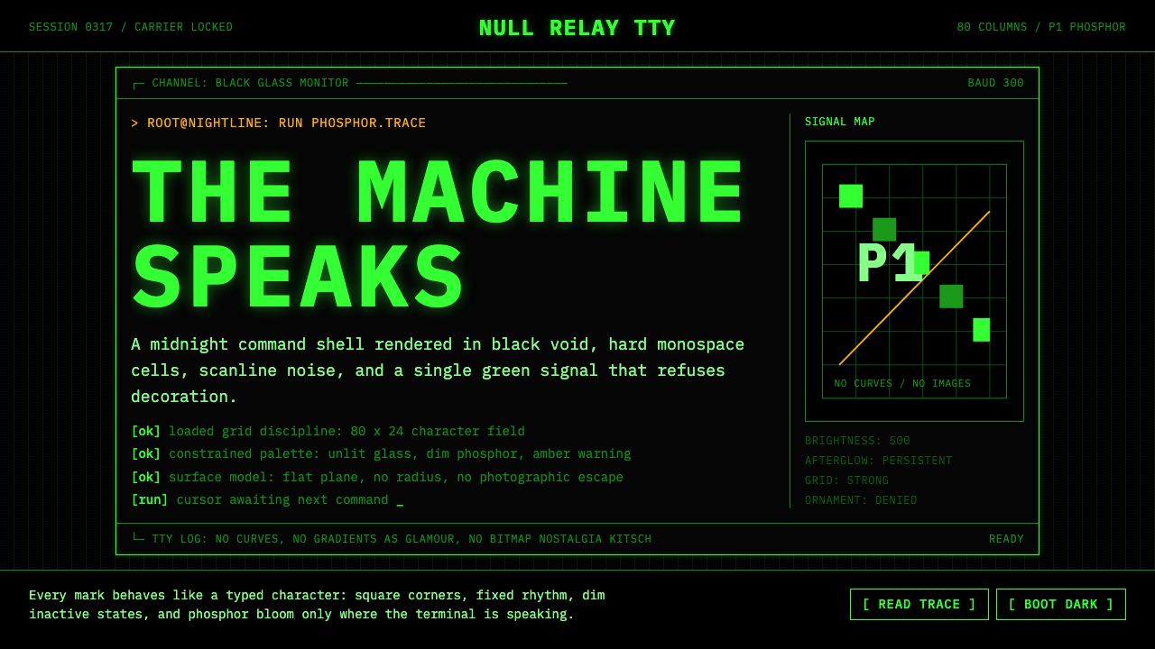 CLI Hacker Phosphor Green (1985)Pure terminal myth. Black glass, P1 green mono type, scanlines, and rigid 80-…纯粹终端神话。黑玻璃与P1绿等宽字、扫描线、80列秩序。
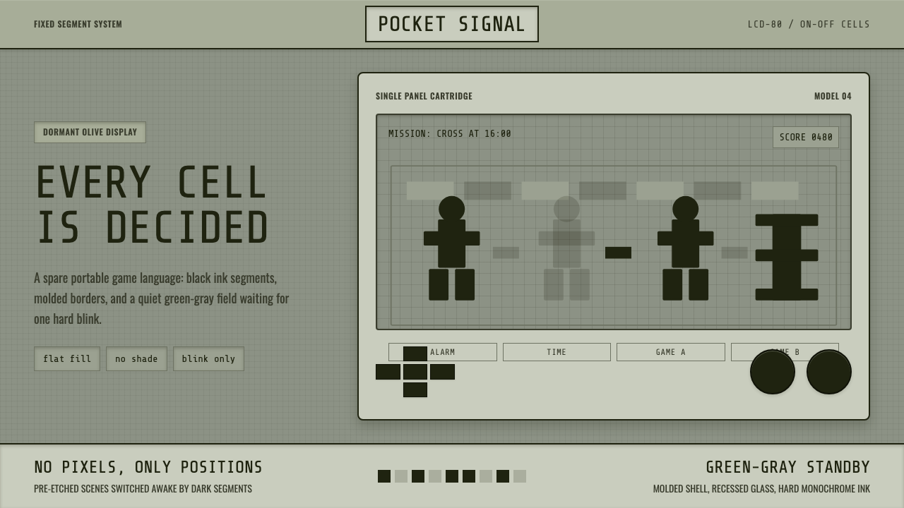 Handheld LCD GameConstraint is the charm. Olive LCD grid, black segment ink, tight molded beze…限制就是魅力:橄榄灰LCD格、黑色段墨、紧实塑料边框。
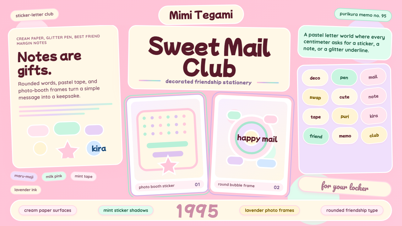 Kawaii Japanese Letter PurikuraCuteness fills every inch. Pink cream paper, mint stickers, lavender frames.可爱填满每寸:粉色奶油纸、薄荷贴纸、薰衣草相框。
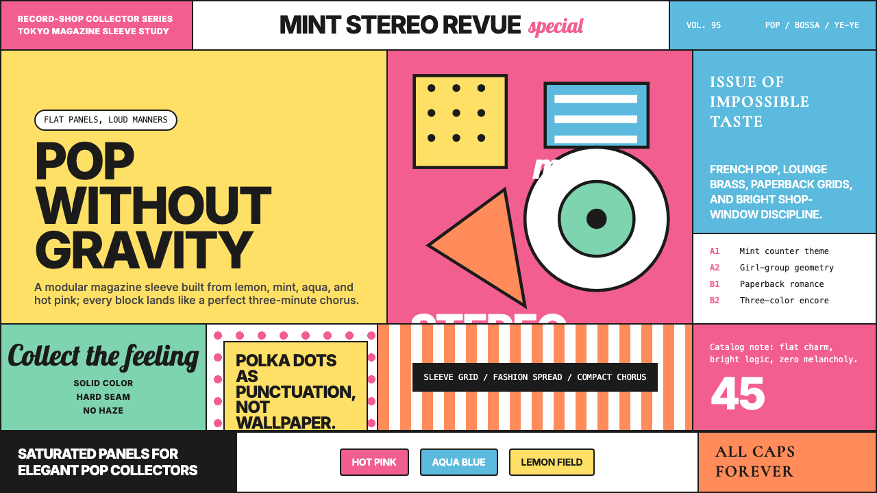 Shibuya-kei (Flipper's Guitar, 1995)Pop without gravity. Hot pink, mint, lemon, and aqua snap into album-sleeve g…流行但不沉重:粉红、薄荷、柠檬与水蓝拼成唱片封套网格。
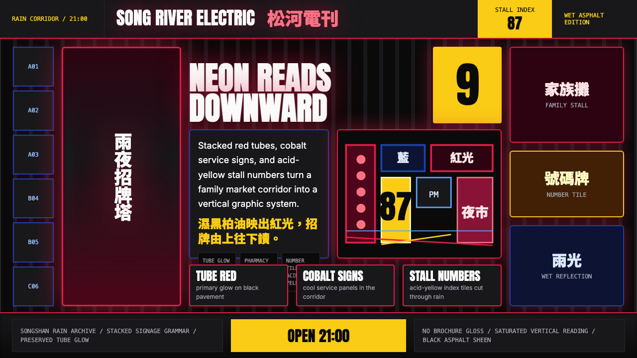 Taiwanese Raohe Night Market NeonTaipei night reads vertically. Neon red, cobalt panels, and acid-yellow numbe…台北夜色垂直閱讀:霓虹紅、鈷藍看板與酸黃號碼疊在濕黑地面。