What is Pixel Art / 8-bit Retro?什么是 Pixel Art / 8-bit Retro?
Born in smoky arcades and phosphor-lit living rooms, 8-bit pixel art transformed hardware poverty into a visual language that still feels electric fifty years later.诞生于烟雾弥漫的街机厅与磷光闪烁的客厅,八位像素美学将硬件的贫乏化为一套视觉语言,半个世纪后依然充满张力。
Pixel Art / 8-bit Retro in briefPixel Art / 8-bit Retro 速览
Pixel art is a form of digital imagery in which individual square picture elements — pixels — are placed deliberately, one by one, on a strict grid. In the 8-bit era, this constraint was absolute: hardware could address only a small, fixed number of colors simultaneously, and sprites were assembled from tiles no larger than eight pixels on each side. The aesthetic that emerged from these limits is characterized by hard, staircase-like edges on every diagonal line, flat areas of pure color, and a luminous intensity that comes from rendering saturated hues against deep black backgrounds.像素画是一种数字图像形式,其中每一个正方形的图像单元——像素——都被逐一、刻意地放置在严格的网格上。在八位机时代,这种约束是绝对的:硬件能够同时寻址的颜色数量极为有限,精灵图(sprite)由边长不超过八像素的图块拼接而成。从这些限制中涌现出的美学,以每条斜线上阶梯状的硬边、纯色的平面填充,以及饱和色彩在深黑背景上所散发的明亮光感为标志。
The term 'pixel art' today encompasses both authentic period work from the late 1970s and 1980s and contemporary work that deliberately embraces the same constraints — limited palettes, no anti-aliasing, grid-locked composition — as an expressive choice rather than a technical necessity. The 8-bit retro style draws specifically on the arcade and home-console visual vocabulary: chunky character sprites, high-contrast color blocking, and an overall sense of designed simplicity that communicates information legibly even at very small sizes.今天,「像素画」这个词既涵盖 1970 年代末至 1980 年代的真实历史作品,也包括当代设计师刻意拥抱同样约束——有限色板、无抗锯齿、网格锁定的构图——作为表达选择而非技术必要的创作。八位复古风格特别汲取自街机与家用主机的视觉语汇:厚实的角色精灵、高对比度色块,以及一种整体上经过设计的简洁感,即便在极小的尺寸下也能清晰传达信息。
What makes the style visually distinctive is not merely its technical origin but its emotional register. Pixel art carries the encoded memory of a particular cultural moment — the first mass encounter with interactive digital imagery — and that association gives it a warmth and nostalgia that newer, more technically sophisticated styles cannot easily replicate. Used intentionally, it does not read as low-resolution; it reads as handmade, precise, and full of personality.让这种风格在视觉上与众不同的,不仅仅是它的技术起源,更是它的情感频率。像素画承载着一个特定文化时刻的编码记忆——人类第一次与交互式数字图像的大规模相遇——这种关联赋予了它一种温度与怀旧感,是更新、更精密的技术风格难以轻易复制的。刻意运用时,它不会让人感到分辨率不足,而是让人感受到一种手工质感、精确与充沛的个性。
See the Pixel Art / 8-bit Retro design system查看 Pixel Art / 8-bit Retro 完整设计系统
Where does Pixel Art / 8-bit Retro come from?Pixel Art / 8-bit Retro 从何而来?
The story of 8-bit pixel art begins in the Japanese and American arcades of 1978. Tomohiro Nishikado designed Space Invaders for Taito that year, composing the alien sprites on graph paper before transferring them into ROM — a design process that was, in its essential character, illustration adapted to a grid. Each creature was a small puzzle in how to make a recognizable silhouette from fewer than sixty lit pixels. Toru Iwatani's Pac-Man followed in 1980, introducing a maze environment built from equal-width tiles and a central character whose shape — defined almost entirely by a missing wedge — demonstrated how much expression a minimal pixel count could carry. These were not merely technical exercises; they were acts of visual invention operating under extreme constraint.八位像素艺术的故事始于 1978 年的日美街机厅。西角友宏那一年为 Taito 设计《太空侵略者》,在方格纸上构思外星人精灵图形,再将其烧录进 ROM——这一设计过程,在本质上是插图绘制对网格的适应。每个生物都是一道关于如何用不足六十个点亮像素构成可识别轮廓的谜题。岩谷彻的《吃豆人》于 1980 年随之而来,引入了由等宽图块搭建的迷宫环境,以及一个几乎完全由一个缺口楔形来定义形态的主角——证明了极少的像素数可以承载多大的表现力。这些不仅仅是技术练习,而是在极端约束下进行的视觉发明。
The hardware architecture of the era was the direct cause of the aesthetic. Processors in the late 1970s and early 1980s could address a color palette of sixteen or fewer simultaneous hues, drawn from a larger fixed set. Background tile maps were limited to grids of eight-by-eight or sixteen-by-sixteen pixel cells. Sprite layers sat above backgrounds and were subject to their own count limits — some systems allowed only eight sprites on a single horizontal scanline before hardware artifacts appeared. Designers at companies like Nintendo, Atari, Namco, and Capcom learned to work within and around these ceilings, and the problem-solving process itself became a craft tradition. Shigeru Miyamoto's team at Nintendo built the visual vocabulary of Donkey Kong, Mario, and The Legend of Zelda entirely inside these limits, producing characters recognizable worldwide.那个时代的硬件架构是这种美学的直接成因。1970 年代末至 1980 年代初的处理器,能同时寻址的色板只有十六色甚至更少,从一个更大的固定色集中抽取。背景图块地图被限定在八乘八或十六乘十六像素的单元格网格内。精灵图层叠加于背景之上,自有数量上限——某些系统在单条水平扫描线上超过八个精灵便会出现硬件瑕疵。任天堂、雅达利、南梦宫、卡普空等公司的设计师们学会了在这些上限之内及周围工作,这一解题过程本身演变为一种工艺传统。宫本茂在任天堂的团队完全在这些限制之内构建了《大金刚》《马力欧》《塞尔达传说》的视觉语汇,造就了举世公认的角色形象。
The domestic counterpart to the arcade was the home console and home computer, which brought the aesthetic into living rooms. The Nintendo Entertainment System, the Commodore 64, and the ZX Spectrum each had distinct hardware personalities that shaped their visual output: the NES favored a bold, jewel-like palette; the Commodore 64's color set leaned toward earthier, more muted tones; the Spectrum worked in stark primaries with a characteristic color-clash artifact that became an identifying signature. Players and designers alike learned to read these hardware fingerprints, and the differences between them gave 8-bit visual culture a degree of variety and regional character it is easy to overlook in retrospect.街机的家用对应物是家用主机与家用电脑,它们将这种美学带入了客厅。任天堂娱乐系统(NES)、Commodore 64 与 ZX Spectrum 各有其独特的硬件个性,塑造出各自迥异的视觉输出:NES 偏爱大胆、宝石般鲜亮的色板;Commodore 64 的色彩组合倾向于更浑厚、更沉静的色调;Spectrum 以鲜明的原色运作,伴有一种被称为「颜色冲突」的特有硬件瑕疵,反而成为其辨识性标志。玩家与设计师都学会了解读这些硬件指纹,它们之间的差异赋予了八位视觉文化一种多样性与地域性格,回头看来往往令人低估。
By the early 1990s, hardware had advanced far enough that the constraints of 8-bit design were no longer mandatory. The industry moved toward sixteen-bit and eventually three-dimensional rendering. But the pixel aesthetic did not disappear — it migrated. Independent game developers in the 2000s adopted it deliberately as a statement of identity and craft, producing games like Cave Story and Spelunky that treated pixel art not as a budget compromise but as an aesthetic argument. Simultaneously, the broader design world began to recognize the style's communicative power: its legibility at small sizes, its emotional warmth, and its capacity to signal authenticity, nostalgia, or playfulness in contexts far removed from gaming. The aesthetic moved from arcade cabinets to album covers, sneaker drops, fashion runways, and brand identity systems.到 1990 年代初,硬件已足够先进,八位设计的约束不再是必需。行业向十六位乃至三维渲染演进。但像素美学并未消失——它迁徙了。2000 年代的独立游戏开发者将其作为一种身份与工艺的声明刻意采用,创作出《洞窟物语》《穴居人》等作品,将像素画不视为预算妥协,而视为美学主张。与此同时,更广泛的设计界开始认识到这种风格的传播力量:其在小尺寸下的清晰可读性、情感上的温度,以及在远离游戏的语境中传递真实感、怀旧或趣味性的能力。这种美学从街机柜台迁移至唱片封套、球鞋发布、时装秀台与品牌识别体系。
What defines the Pixel Art / 8-bit Retro look?Pixel Art / 8-bit Retro 的视觉特征是什么?
Grid-Locked Composition网格锁定的构图
Every element in pixel art exists on an explicit square grid, and that grid is never hidden or softened. The grid is the structural argument of the style — it imposes a rhythm on spacing, sizing, and alignment that makes even complex compositions feel ordered and intentional. In contemporary applications, the grid needn't be literally eight-by-eight pixels, but the principle holds: all spacing and sizing decisions should snap to a consistent module rather than existing on a continuous scale.像素画中的每一个元素都存在于一个显式的正方形网格之上,这个网格从不被隐藏或柔化。网格是这种风格的结构性论点——它对间距、尺寸与对齐施加了一种节律,使即便复杂的构图也感觉有序而刻意。在当代应用中,网格不必字面上是八乘八像素,但原则不变:所有间距与尺寸的决定都应咬合至一个统一的模数,而非存在于一条连续的刻度尺上。
Hard Edges and No Anti-Aliasing硬边与无抗锯齿
Diagonal lines in pixel art are rendered as staircase sequences of square blocks — there is no gradient blending at the edge of a form to create the illusion of smoothness. This hard-edge quality is the style's most immediately recognizable feature, and it is not a defect to be apologized for but a design choice to be embraced. The clarity of a hard pixel boundary reads with unusual confidence at small sizes, making the style well-suited to contexts where elements must remain legible when scaled down.像素画中的斜线以方形色块的阶梯序列呈现——形体边缘没有渐变混合来制造平滑的幻觉。这种硬边特质是这种风格最易辨识的特征,它不是需要道歉的缺陷,而是需要拥抱的设计选择。硬像素边界的清晰度在小尺寸下展现出非同寻常的自信,使这种风格非常适合元素缩小后必须保持清晰可读的场景。
Limited, High-Contrast Palette有限而高对比的色板
Authentic 8-bit work was constrained to palettes of sixteen colors or fewer, and the best designers treated this restriction as a compositional tool rather than a limitation. Colors in pixel art tend toward high saturation and are placed in sharp contrast against one another — often a luminous foreground against a near-black background. The result is an almost electric visual intensity. In contemporary use, a restricted palette of four to eight colors (including background and neutral tones) will produce more cohesive results than a full-spectrum approach.真实的八位作品被限定于十六色甚至更少的色板之内,最优秀的设计师将这一限制作为构图工具而非障碍。像素画中的颜色往往趋向高饱和度,相互之间以鲜明对比并置——通常是明亮的前景色对抗近乎纯黑的背景色。结果是一种近乎电流般的视觉强度。在当代应用中,四至八色(含背景色与中性色调)的有限色板,比全谱色彩的做法产生更具凝聚力的效果。
Flat Color with No Shading Gradient纯色平涂,无渐变阴影
Volume and depth in pixel art are suggested not through continuous shading gradients but through deliberate placement of a small number of distinct tones — typically a highlight tone, a base tone, and a shadow tone drawn from the same hue. Each tone occupies a clearly defined pixel area with a hard border; there is no blending between them. This approach gives pixel art figures a simplified, almost diagrammatic solidity that is visually efficient and immediately readable even at thumbnail size.像素画中的体积感与深度感,不是通过连续的渐变阴影来暗示,而是通过刻意放置少量各不相同的色调来实现——通常是从同一色相中抽取的高光色、基础色与阴影色。每种色调占据清晰界定的像素区域,边界硬朗,彼此之间无任何混合。这种做法赋予像素画人物一种简洁的、近乎示意图式的立体感,视觉上高效,在缩略图尺寸下也立即可读。
Silhouette Legibility轮廓的清晰可读性
The most important design constraint in 8-bit sprite work was that a character had to be recognizable by silhouette alone, at a size rarely larger than a postage stamp. This forced designers to reduce figures to their most essential shape — Pac-Man is a circle with a wedge removed; Space Invaders aliens are bilaterally symmetric creatures built from just a handful of pixel differences per row. The silhouette-first discipline carries directly into contemporary applications: any icon, character, or UI element designed in this aesthetic should read as a clear, unambiguous shape when reduced to a single flat tone.八位精灵图设计中最重要的约束,是一个角色必须仅凭轮廓就可识别,而尺寸往往不超过一枚邮票。这迫使设计师将人物简化至最本质的形态——吃豆人是一个切去楔形的圆;《太空侵略者》的外星人是由每行仅几个像素差异构成的左右对称生物。轮廓优先的原则直接延伸至当代应用:任何以这种美学设计的图标、角色或界面元素,在简化为单一平色时都应呈现为清晰、无歧义的形态。
CRT Glow and Scanline TextureCRT 辉光与扫描线纹理
The original context for pixel art was the cathode ray tube display, whose phosphor coating produced a characteristic warm luminescence, and whose electron beam refreshed the screen line by line, leaving visible horizontal bands at close range. These scanlines, along with the slight bleed of phosphor glow between adjacent pixels, gave early digital imagery a physical, almost tactile quality distinct from modern flat-panel rendering. In contemporary design, this texture is evoked through subtle horizontal banding, a slight softening of brightness between pixel rows, or a warm tinted background rather than pure white — it is a reference to the original display environment rather than a technical requirement.像素画最初的展示环境是阴极射线管(CRT)显示器,其磷光涂层产生一种特有的温暖发光,电子束逐行刷新屏幕,在近距离下留下可见的水平条带。这些扫描线,连同相邻像素之间磷光辉光的轻微溢出,赋予早期数字图像一种物质性的、近乎触觉的质感,有别于现代平板屏幕的渲染。在当代设计中,这种质感通过微妙的水平条带、像素行间亮度的轻微衰减,或温暖色调的背景(而非纯白)来唤起——这是对原始显示环境的致敬,而非技术要求。
Dithering as Tonal Transition抖动(Dithering)作为色调过渡
When a limited palette cannot represent the full range of tones needed for a scene, pixel artists use dithering — alternating two colors in a checkerboard or irregular pattern to create the optical impression of a third, intermediate tone. Dithering is a technique unique to pixel art and gives experienced work a characteristic texture in transitional areas. In contemporary applications, dithering patterns can be used decoratively to create visual interest in areas that would otherwise be flat, functioning as a kind of pixel-native hatching or crosshatching.当有限的色板无法涵盖场景所需的全部色调范围时,像素艺术家使用「抖动」技术——以棋盘格或不规则图案交替两种颜色,制造出第三种中间色调的视觉印象。抖动是像素画独有的技术,赋予成熟作品在过渡区域独特的质感。在当代应用中,抖动图案可用作装饰,在原本平坦的区域制造视觉趣味,起到一种原生于像素的排线或交叉排线效果。
See the Pixel Art / 8-bit Retro design system查看 Pixel Art / 8-bit Retro 完整设计系统
Who shaped Pixel Art / 8-bit Retro?谁塑造了 Pixel Art / 8-bit Retro?
Nishikado designed Space Invaders in 1978, serving simultaneously as programmer, artist, and hardware engineer — he custom-built the arcade circuit because no existing chip was fast enough to move all the invaders at once. His alien designs, drawn on graph paper and derived from H.G. Wells's War of the Worlds, established the foundational convention of 8-bit creature design: bilateral symmetry, layered detail within a tiny bounding box, and silhouettes that remain recognizable from across a dim arcade floor. Space Invaders was the first video game to achieve widespread cultural impact, and its visual approach set the template for an entire industry.西角友宏于 1978 年设计了《太空侵略者》,同时身兼程序员、美术师与硬件工程师——他自行定制了街机电路板,因为当时没有现成芯片足够快速地同时移动所有入侵者。他的外星人设计画在方格纸上,灵感源自 H.G. 威尔斯的《世界大战》,确立了八位生物设计的基础规范:左右对称、在极小的边界框内叠加细节、以及即便在昏暗街机厅远处也可辨认的轮廓。《太空侵略者》是第一款产生广泛文化影响的电子游戏,其视觉方法为整个行业设立了模板。
Iwatani created Pac-Man for Namco in 1980 with a conscious goal that almost no arcade game had previously attempted: to make a game appealing to women and couples, not just competitive young men. This intention shaped every visual decision. The main character was designed to be friendly and non-threatening — inspired, according to Iwatani, by a pizza with one slice removed. The maze was clean, tile-based, and navigable at a glance. The ghost enemies had distinct color identities but identical body silhouettes, a design strategy that compressed variety into a minimal pixel budget. Pac-Man demonstrated that pixel art could encode personality and emotion, not merely action.岩谷彻于 1980 年为南梦宫创作了《吃豆人》,怀有几乎此前没有任何街机游戏尝试过的明确目标:让女性与情侣都觉得有吸引力,而不仅仅是好胜的年轻男性。这一意图塑造了每一个视觉决定。主角被设计为友善而无威胁感——据岩谷本人描述,灵感来自一个切去一块的比萨饼。迷宫干净、基于图块构建,一眼便可通览。幽灵敌人拥有不同的颜色身份,但身体轮廓完全相同,这一设计策略在极小的像素预算内压缩了多样性。《吃豆人》证明了像素画可以编码个性与情感,而不仅仅是动作。
Miyamoto's contribution to pixel art aesthetics spans more than a decade of Nintendo output: from the original Donkey Kong arcade cabinet in 1981 through the Super Mario series on the NES and the first Legend of Zelda. His teams developed conventions that became industry standards — the fixed-color character outline to ensure legibility against any background, the distinctive walking and jumping animations that communicated character weight through frame timing alone, and the environmental tile grammar that allowed enormous worlds to be built from a small set of repeating graphic modules. Miyamoto never treated hardware limits as obstacles; he treated them as the rules of the game.宫本茂对像素画美学的贡献跨越了任天堂超过十年的输出成果:从 1981 年的原版《大金刚》街机柜台,到 NES 上的《超级马力欧》系列与第一代《塞尔达传说》。他的团队开发出多项成为行业标准的规范——固定颜色的角色外轮廓确保在任何背景下的清晰可读,独特的行走与跳跃动画仅通过帧时序传达角色的重量感,以及允许用少量重复图形模块构建庞大世界的环境图块语法。宫本茂从不将硬件限制视为障碍;他将其视为游戏规则。
Bushnell co-founded Atari in 1972 and was the architect of the commercial arcade industry that gave pixel art its original stage. While Atari's in-house designers — most famously the creators of Breakout and Asteroids — produced some of the earliest distinct pixel-art visual languages, Bushnell's larger contribution was infrastructural: he created the business model and distribution network that put CRT displays running pixel-graphic software into public spaces across North America, establishing the viewing context in which the aesthetic developed. Without the arcade as a physical venue, 8-bit pixel art would have had no audience and no urgency.布什内尔于 1972 年联合创立了雅达利,是赋予像素画最初舞台的商业街机产业的缔造者。虽然雅达利的内部设计师——最著名的是《打砖块》与《小行星》的创作者——产出了一些最早具有鲜明个性的像素视觉语言,但布什内尔更大的贡献是基础设施层面的:他创造了商业模式与发行网络,将运行像素图形软件的 CRT 显示器布置于北美各地的公共空间,建立了这种美学得以生长的观看环境。没有街机厅作为实体场所,八位像素画就不会有观众,也不会有紧迫性。
From the mid-2000s onward, independent game developers — most visible through platforms like itch.io and Steam — collectively rehabilitated pixel art as a serious contemporary medium. Developers including Daisuke Amaya (Cave Story), Derek Yu (Spelunky), and Toby Fox (Undertale) produced games in which the pixel aesthetic was not a budget constraint but a carefully considered visual argument: legible characters, expressive animation within tight pixel budgets, and a visual economy that forced every design decision to be purposeful. This community also developed and shared a sophisticated critical vocabulary for the form — distinguishing authentic low-resolution work from upscaled approximations — and their output demonstrated that the style was not nostalgia alone but a technically demanding discipline with its own standards of excellence.从 2000 年代中期起,独立游戏开发者社群——在 itch.io 与 Steam 等平台上最为可见——集体为像素画恢复了名誉,将其确立为严肃的当代媒介。天谷大辅(《洞窟物语》)、Derek Yu(《穴居人》)、Toby Fox(《传说之下》)等开发者创作了像素美学不是预算妥协、而是经过深思熟虑的视觉主张的游戏:清晰可读的角色、在极小像素预算内表情丰富的动画,以及迫使每一个设计决定都必须有的放矢的视觉经济性。这个社群还发展并分享了对这一形式精密的批评词汇——将真实的低分辨率作品与放大后的近似品区分开来——他们的产出证明了这种风格不仅仅是怀旧,而是一门有着自身卓越标准的、技术要求严苛的学科。
How do you use Pixel Art / 8-bit Retro today?今天怎么用 Pixel Art / 8-bit Retro?
Pixel art and 8-bit retro aesthetics are among the most versatile retro styles in the contemporary design toolkit, but they work differently from most historical styles because their emotional core — nostalgia, playfulness, and a reference to the first mass encounter with digital culture — is inseparable from the visual execution. Applying them correctly requires understanding that every design decision should reinforce the style's internal logic: deliberate grid alignment, hard edges, restrained color, and an overall commitment to simplicity that reads as intentional rather than incomplete.像素画与八位复古美学是当代设计工具箱中可移植性最强的复古风格之一,但它们的运作方式有别于大多数历史风格,因为其情感核心——怀旧、趣味性,以及对人类与数字文化第一次大规模相遇的致敬——与视觉执行不可分割。正确应用它们,需要理解每一个设计决定都应强化这种风格的内在逻辑:刻意的网格对齐、硬边、克制的色彩,以及一种整体上让人感觉是刻意为之而非半途而废的简洁承诺。
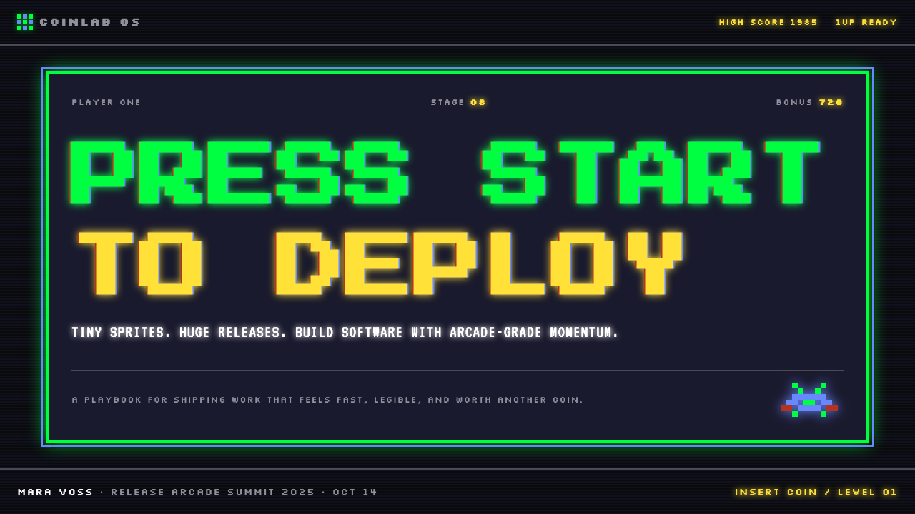
For presentation decks, the 8-bit aesthetic delivers its strongest impact on cover slides treated as full-bleed game screens. A deep, near-black background anchors large pixel-art letterforms or a central character illustration, with a restricted palette of two or three accent colors providing all the visual energy. Content slides benefit from the grid discipline inherent to the style: information arranged in clear horizontal bands, section markers that resemble score counters or progress bars, and data visualizations built from chunky bar elements that echo sprite graphics. The style is particularly effective for technology, gaming, and entertainment-sector presentations where the audience will read the visual reference fluently.对于演示文稿,八位美学在被当作全出血游戏画面处理的封面幻灯片上呈现最强冲击力。深邃的近黑色背景托住大尺寸像素字体或中央角色插画,两到三种强调色组成的有限色板提供所有视觉能量。内容幻灯片受益于这种风格固有的网格纪律:信息编排在清晰的水平条带中,章节标记模拟得分计数器或进度条,数据可视化由厚重的条形元素构成,呼应精灵图的语言。这种风格对于技术、游戏与娱乐行业的演示尤为有效,那里的观众能够流利地解读这种视觉参照。
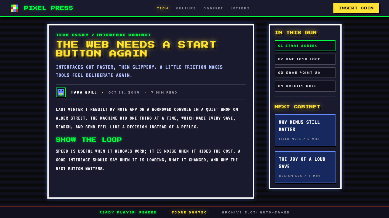
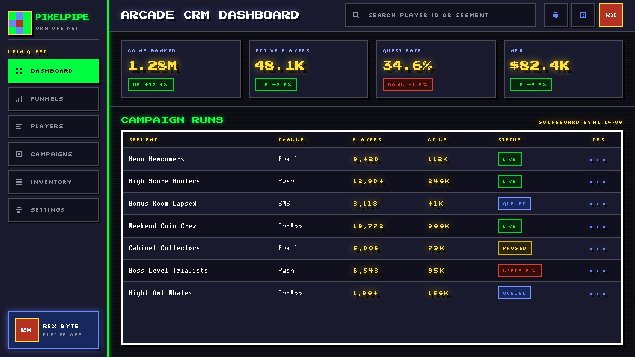
For web interfaces, the pixel aesthetic is most coherent when applied to complete visual systems rather than used as surface decoration. Dashboards designed in this mode use a dark background with high-saturation accent colors for interactive states and status indicators, sharp-cornered card components with no shadow blur, and iconography built from grid-locked pixel shapes rather than smooth vectors. Pricing pages take on the character of a game's item-select screen: tiers rendered as distinct cards with pixel-border frames, feature lists using pixel-scale checkmarks, and a single accent color used consistently for the recommended or featured tier. Navigation should be typographic and minimal — pixel-influenced typefaces with a single weight — with no decorative flourishes.对于网页界面,像素美学应用于完整视觉系统时最为连贯,而非用作表面装饰。以此模式设计的仪表板使用深色背景配以高饱和度强调色标示交互状态与状态指示器,卡片组件为直角、无阴影模糊,图标由网格锁定的像素形状构建而非平滑矢量。定价页面呈现出游戏物品选择界面的特质:套餐以带像素边框的独立卡片呈现,功能列表使用像素级复选标记,以单一强调色一致标示推荐或特色套餐。导航应当字体性且极简——采用像素风格字体,单一字重——无任何装饰花边。
For editorial and marketing work, the style supports strong information hierarchy through visual contrast rather than spatial complexity. A pixel-art editorial spread uses a dark or vivid background field, headline type set in a blocky, pixel-influenced face, and body text in a clean readable face that contrasts deliberately with the retro character of the display type. Marketing pages work well with alternating full-width blocks — dark-on-light and light-on-dark — each focused on a single message, with small pixel-art character or object illustrations serving as visual anchors rather than decorative filler. The key marketing strength of the style is that it signals both authenticity (craft, precision, deliberateness) and approachability (warmth, nostalgia, play).对于编辑与营销内容,这种风格通过视觉对比而非空间复杂度来支持强劲的信息层级。像素画编辑版面使用深色或鲜艳的背景色场,大标题采用厚重的像素风格字体,正文采用与展示字体的复古特质刻意形成对比的清晰可读字体。营销页面适合使用交替的全宽区块——深色底浅色字与浅色底深色字交替——每个区块聚焦于一条信息,小幅像素画角色或物体插画作为视觉锚点,而非装饰性填充。这种风格在营销中的核心优势在于它同时传递真实感(工艺、精确、刻意为之)与亲近感(温度、怀旧、趣味)。
The most common mistake when applying this aesthetic is using it as a texture or filter rather than as a structural design language. Overlaying a scanline effect on an otherwise conventional design, or inserting one pixel-art illustration into a layout that follows no grid logic, produces a result that reads as pastiche. The style works when the grid, the palette restriction, and the hard-edge principle govern the entire composition — not just the decorative elements. A second common error is palette overreach: using twelve or sixteen saturated colors simultaneously destroys the high-contrast legibility that makes the style effective. A disciplined palette of four to six colors, with one serving as the dominant background tone and one as the primary accent, will almost always outperform a larger set.应用这种美学时最常见的错误,是将其用作一种纹理或滤镜,而非结构性设计语言。在一个否则循规蹈矩的设计上叠加扫描线效果,或在一个完全不遵循网格逻辑的版面中插入一幅像素画插图,产生的结果会被读作模仿秀。这种风格在网格、色板限制与硬边原则支配整个构图——而非仅仅支配装饰性元素——时才能奏效。第二个常见错误是色板过度扩张:同时使用十二到十六种饱和色会摧毁这种风格赖以有效的高对比度清晰度。四到六色的严格色板,其中一种作为主导背景色调、一种作为主要强调色,几乎总是优于更大的色彩集合。
See the Pixel Art / 8-bit Retro design system查看 Pixel Art / 8-bit Retro 完整设计系统
Pixel Art / 8-bit Retro — FAQPixel Art / 8-bit Retro · 常见问题
Is pixel art the same as low-resolution design, or is there a meaningful distinction?像素画等同于低分辨率设计吗,还是两者之间有实质区别?
There is a meaningful distinction. Low-resolution design is simply design produced at or for a screen resolution that makes individual pixels visible — it may be accidental or a technical constraint. Pixel art is intentional: every pixel is placed deliberately, and the grid structure, color choices, and hard-edge rendering are conscious aesthetic decisions rather than side effects of limited hardware. A design can be low-resolution without being pixel art (blurry upscaling is the clearest example), and contemporary pixel art can be produced at display resolutions that make the individual pixels invisible to the naked eye but preserve the visual grammar of the form.两者之间有实质区别。低分辨率设计只是在或为使单个像素可见的屏幕分辨率而生产的设计——它可能是意外的或是技术约束的结果。像素画是刻意为之的:每一个像素都被有意放置,网格结构、色彩选择与硬边渲染是有意识的美学决定,而非有限硬件的副作用。一个设计可以是低分辨率而不是像素画(模糊的放大处理是最清晰的例子),而当代像素画可以在裸眼不可见单个像素的显示分辨率下创作,但依然保留这一形式的视觉语法。
Can pixel art work in professional or corporate contexts, or does it always read as casual or gaming-adjacent?像素画能否在专业或企业语境中使用,还是它总是让人联想到休闲或游戏?
The association with gaming and casual culture is real but not fixed. The determining factors are palette discipline, typographic execution, and the overall density of pixel-art elements relative to the rest of the design. A presentation that uses a controlled two-color palette, clean grid alignment, and pixel-art iconography as the only retro reference reads as technically confident and distinctive — not juvenile. A presentation that saturates every slide with character sprites, flashy colors, and retro sound-effect references will read as costume rather than design. The style has been deployed successfully in technology company rebrands, cultural institution campaigns, and financial-sector investor materials — the context adapts when the execution is disciplined.与游戏和休闲文化的关联是真实存在的,但并非固定不变。决定因素是色板纪律、字体执行,以及像素画元素相对于其余设计的整体密度。一个使用受控双色色板、干净网格对齐,并将像素画图标作为唯一复古参照的演示,读起来是技术上有自信而与众不同的——而非幼稚的。一个用角色精灵、炫目色彩与复古音效参照饱和每张幻灯片的演示,读起来像是戏服而非设计。这种风格已成功应用于科技公司的品牌重塑、文化机构的活动,以及金融行业的投资者材料——当执行到位、克制有度时,语境自然适应。
How should color be approached differently in pixel art versus other retro design styles?在像素画与其他复古设计风格中,色彩的处理方式有何不同?
Pixel art's relationship to color is defined by scarcity and contrast rather than harmony in the traditional sense. Where a style like Art Deco or Bauhaus selects colors for their symbolic or compositional relationships, pixel art selects colors primarily for their ability to distinguish one element from adjacent elements at a very small scale. This means high saturation, sharp contrast between adjacent tones, and a premium on legibility over mood. The historical hardware palettes — NES, Game Boy, Commodore 64 — each had fixed color sets that artists learned to use expressively, and contemporary pixel work tends to honor this tradition by working with constrained, intentional sets rather than picking freely from a full spectrum.像素画与色彩的关系由稀缺与对比来定义,而非传统意义上的和谐。装饰艺术或包豪斯等风格依据色彩的象征或构成关系来选色,像素画则主要依据色彩在极小尺度下将一个元素与相邻元素区分开来的能力来选色。这意味着高饱和度、相邻色调之间的鲜明对比,以及清晰可读性优先于氛围营造的价值取向。历史上的硬件色板——NES、Game Boy、Commodore 64——各有固定色集,艺术家们学会了有表现力地使用它们;当代像素作品倾向于通过使用受限而刻意的色集来尊重这一传统,而非从完整色谱中随意取色。
What is the difference between using pixel art as a theme versus using it as a design system?将像素画作为主题使用与将其作为设计系统使用,有什么区别?
Using pixel art as a theme means applying its surface signatures — a pixelated typeface, a sprite-style illustration, a scanline overlay — to a design that is otherwise built on different structural principles. The result is decorative rather than coherent; the pixel elements sit on top of the design rather than arising from it. Using pixel art as a design system means letting its structural principles govern everything: the grid module determines all spacing; the palette restriction constrains every color decision; hard edges replace rounded corners and soft shadows throughout. The second approach requires more discipline but produces results that feel complete and intentional rather than accessorized.将像素画作为主题使用,意味着将其表面特征——像素化字体、精灵图风格的插画、扫描线叠加——应用于一个在其他方面遵循不同结构原则的设计。结果是装饰性的而非连贯的;像素元素浮于设计之上,而非从设计中生长出来。将像素画作为设计系统使用,意味着让其结构原则支配一切:网格模数决定所有间距;色板限制约束每一个色彩决定;硬边在整体上取代圆角与柔和阴影。第二种方法需要更多纪律,但产生的结果让人感觉完整而刻意,而非堆砌配饰。
Are there contexts where pixel art and 8-bit retro styling consistently underperform or should be avoided?有没有像素画与八位复古风格持续表现不佳或应当避免的场景?
The style struggles in contexts that depend on warmth, organic texture, or premium sensory richness. Luxury brand materials, wellness and health products, fine dining, and anything where the communication goal is sophistication or natural authenticity will be undermined rather than enhanced by the hard-edged, synthetic quality of 8-bit aesthetics. The style also presents challenges in dense text environments — long-form editorial work where extended reading is required — because pixel-influenced typography is optimized for impact at display sizes, not for extended reading at body-text sizes. Finally, the style is associated strongly enough with youth culture and gaming that it can create an audience-mismatch problem in sectors that need to signal institutional authority, such as legal services, healthcare, or traditional financial services.这种风格在依赖温度感、有机质感或高级感官丰富性的场景中表现欠佳。奢侈品牌的材料、健康与养生产品、高档餐饮,以及任何传播目标是精致感或自然真实性的场合,都会被八位美学硬朗而合成的特质所削弱而非强化。这种风格在密集文字环境中也面临挑战——需要长篇阅读的深度编辑内容——因为受像素影响的字体为展示尺寸下的视觉冲击而优化,并非为正文尺寸下的持续阅读而优化。最后,这种风格与年轻文化和游戏的关联足够强烈,在需要传递机构权威性的行业——如法律服务、医疗健康或传统金融服务——会制造观众错配问题。
Related design styles相关设计风格
 Taiwanese Raohe Night Market NeonTaipei night reads vertically. Neon red, cobalt panels, and acid-yellow numbe…台北夜色垂直閱讀:霓虹紅、鈷藍看板與酸黃號碼疊在濕黑地面。
 Cartoon Network 90s BlocksKids-cable noise, squared. Black-white checkerboards crash into hot-yellow Bu…方块化的儿童有线电视噪音:黑白棋盘撞上热黄 Bungee 字块。
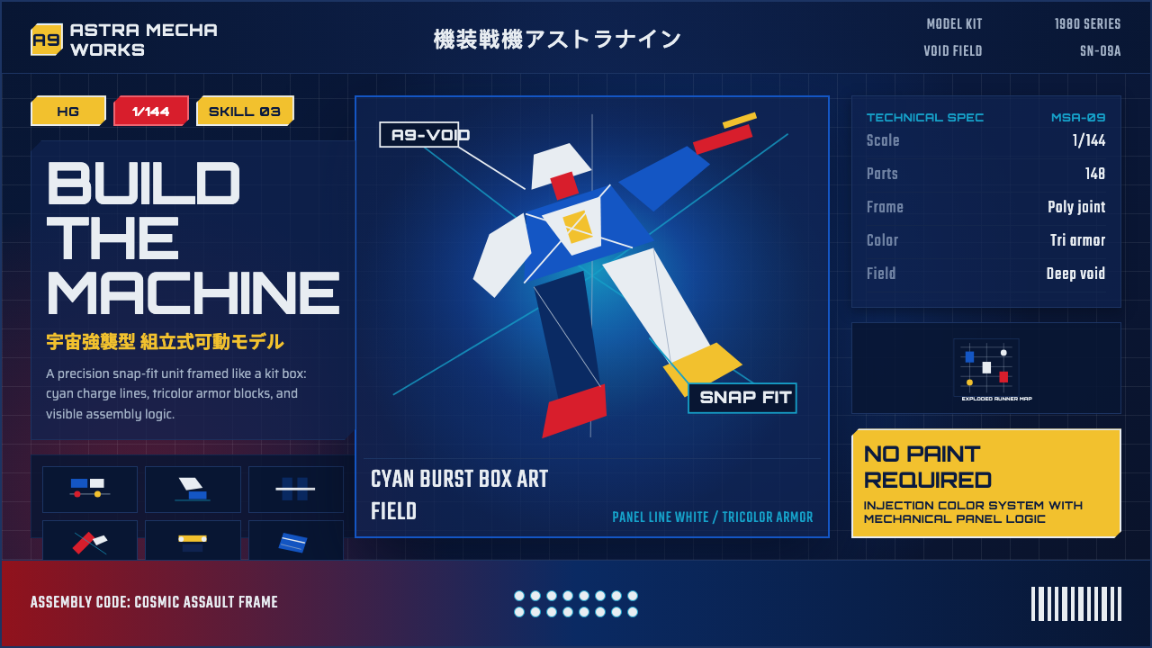 Gunpla Model BoxBuild-sheet drama. Cosmic navy, cyan burst, tricolor armor, and spec-panel gr…拼装说明般的戏剧感:宇宙蓝、青蓝爆光、三色装甲与参数网格。
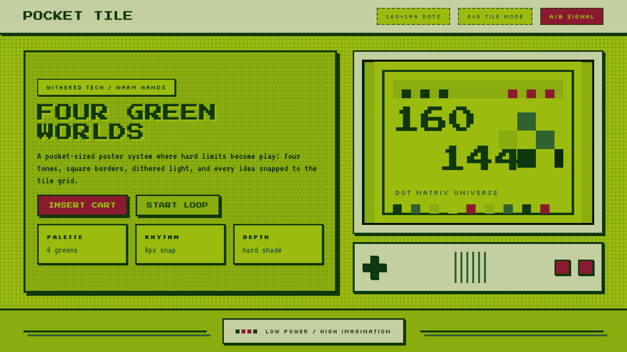 Nintendo Game BoyConstraint becomes play. Four swamp greens, pixel type, and an 8×8 grid do th…限制变成游戏:四档沼泽绿、像素字与8×8网格。
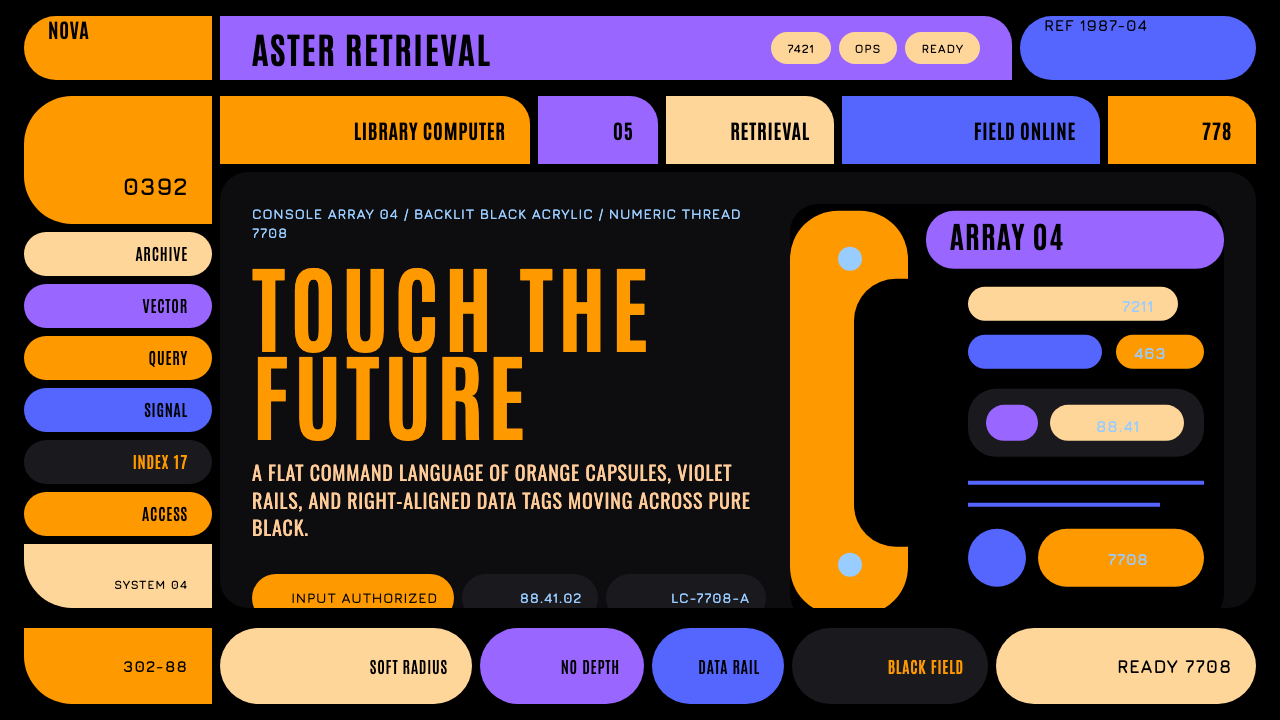 Star Trek LCARSFuture as flat command. Orange-violet elbows and Jura numbers glow on black.未来即平面指令:黑底橙紫弯肘与Jura数字发光。
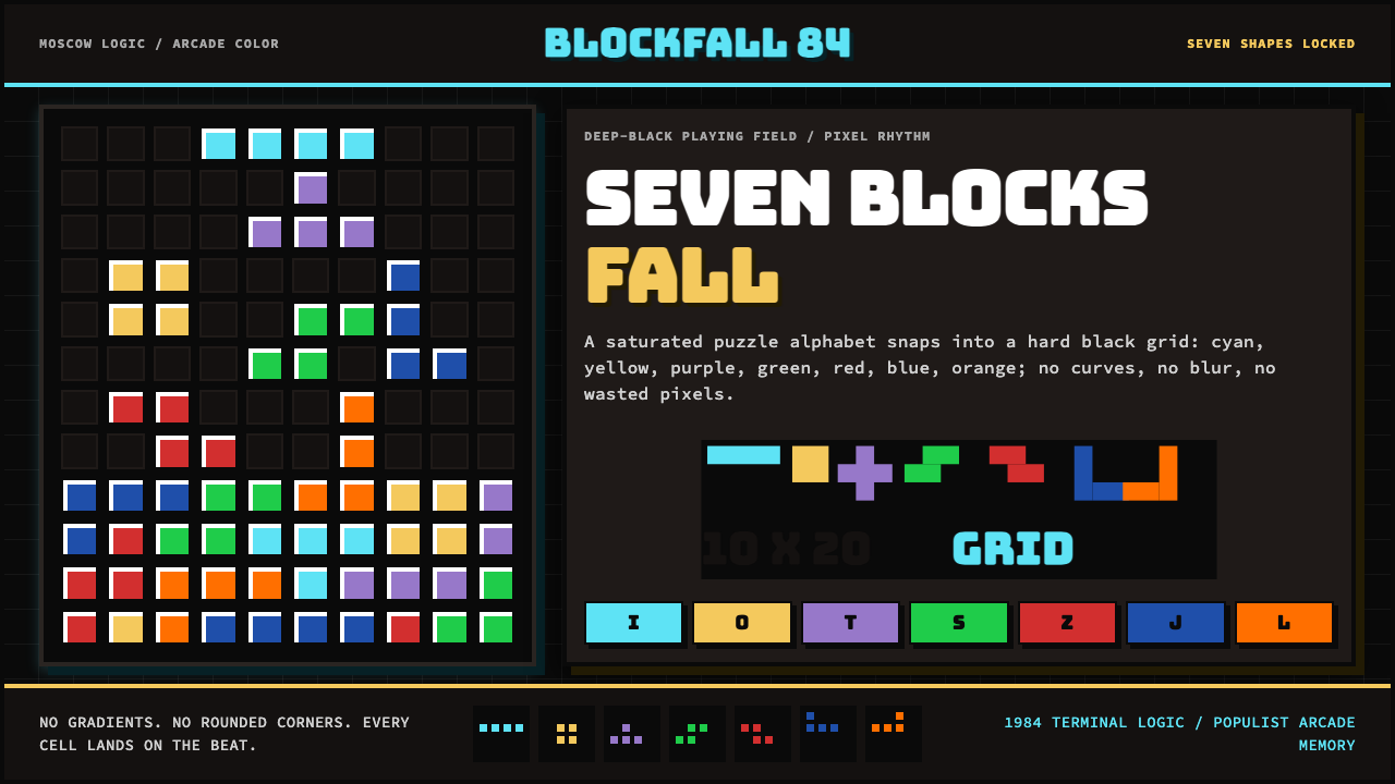 Tetris (1984)Arcade gravity, pixel exact. Black grid, Bungee type, seven saturated blocks.街机重力,像素精确。黑色网格承载七色方块。