What is Handheld LCD Game?
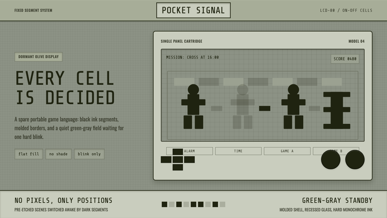
The handheld LCD game turned a calculator screen into a playground — pre-printed silhouettes blinking on and off against a dormant olive-gray liquid crystal field.
Handheld LCD Game in brief
Handheld LCD Game is a design system distilled from the pocket electronic games that defined portable play from roughly 1980 to 1991 — most famously Nintendo's Game & Watch line. Its visual language is built from a single hard constraint: a segmented liquid crystal display can only show shapes that were etched into the panel at the factory, and each shape can only be fully on or fully off. There is no in-between state, no partial opacity, no smooth motion. A running figure does not glide across the screen; it exists as several pre-drawn poses in fixed positions, and animation happens by switching which pose is lit.
That hardware limitation became the entire aesthetic. The screen itself sits in a state of quiet readiness even when powered off — a flat, slightly greenish-gray field, cool and inert, waiting to be switched on. When active, black segment shapes appear against that field with no shading, no outline weight variation, no gradient of any kind. Every character, number, and icon is a flat silhouette, legible purely through its outline. The surrounding hardware reinforces the same restraint: molded plastic shells in a small number of solid colors, a rectangular window bezel framing the display, chunky raised buttons, and printed graphics on the case itself that hint at the game's fictional world without the screen ever having to render it.
The result reads as both a technological artifact and a design philosophy. Because the system could not gesture at realism, it never tried to. Every visual decision is a decision about legibility at a glance — which is precisely why the aesthetic still communicates so cleanly on modern screens that have far more room to spare.
Where does Handheld LCD Game come from?
The direct ancestor of the style is Nintendo's Game & Watch series, launched in April 1980 and produced in various forms through 1991. The line was the brainchild of Gunpei Yokoi, a Nintendo engineer who had already made his name with the Ultra Hand toy and would later lead development of the Game Boy. The story often repeated inside Nintendo is that Yokoi observed a bored commuter on a train idly playing with a pocket calculator, pressing its buttons to pass the time, and saw in that gesture the outline of a product: a small, affordable, always-in-your-pocket device that offered a single game rather than a general-purpose tool.
The technology that made this possible was Sharp's segmented liquid crystal display, developed for calculators and watches during the 1970s. Nintendo licensed and adapted the panels, but the core limitation stayed the same as in any calculator screen: a fixed set of etched segments, each either energized or not, with no ability to draw arbitrary new shapes after manufacturing. Where a calculator used this to display digits, Nintendo's designers used it to pre-draw entire casts of characters — a chef juggling eggs, a fireman catching falling babies, an octopus grabbing at a diver — with several poses per character etched into the glass at fixed screen positions. The game logic simply decided which poses to illuminate and when.
Game & Watch launched at a moment when the video game industry itself was still finding its footing — arcades were the dominant venue, home consoles were a new and unproven category, and nothing resembling a general-purpose handheld existed. The line's commercial success (it eventually spanned dozens of titles and sold in the tens of millions) demonstrated that people would buy a device built around a single game, provided it was cheap, pocketable, and durable enough to survive a schoolbag. That premise directly funded and validated the R&D that Yokoi's team later poured into the Game Boy, making Game & Watch the technical and philosophical precursor to the entire handheld console category.
The aesthetic outlived the hardware that produced it. Long after segmented LCDs were replaced by pixel-addressable screens capable of full animation, the look of the fixed-segment display — its olive-toned dormancy, its silhouette characters, its bezel-and-shell casing — remained instantly recognizable as a marker of a specific technological moment: the years when 'portable' and 'digital' first met, and design had to solve for a screen that could barely move.
What defines the Handheld LCD Game look?
Color
The palette is dominated by a single dormant tone: a muted, slightly desaturated olive-gray that describes the liquid crystal field itself, whether or not any segment is currently lit. Active segments render as flat black, with no tinting or transparency. Accent color, where it appears, is confined to the physical shell and bezel — a small number of solid, unblended plastic colors rather than a gradient or multi-hue palette. There is no ambient lighting effect and no glow; the screen is either resting in its olive quiet or showing hard black shapes against it.
Silhouette and Form
Every figure — human, animal, object, number — is drawn as a solid, flat silhouette with no internal detail, no shading to suggest volume, and no line weight variation along its own outline. A character is identifiable purely by the overall shape of its pose, the way a shadow puppet is identifiable by silhouette alone. Because each pose had to be etched permanently into the display, designers favored bold, simplified, exaggerated postures over subtle or naturalistic ones — the reading has to work at a glance, at small size, with only two visual states available.
Grid and Fixed Positions
Because segments cannot move continuously, every element in the system occupies one of a small number of pre-determined positions on the display. Motion is simulated by cycling which position is lit, not by sliding a shape across space. This produces a layout logic closer to a grid of discrete cells than to a canvas: composition is planned in terms of which cells exist, not in terms of free placement. Applied outside the original hardware, this translates into deliberately blocky, cell-based arrangements rather than fluid or overlapping layouts.
Bezel and Shell
The display is always presented inside a visible rectangular window, set into a molded plastic shell that is itself part of the visual identity — not a neutral container to be ignored. The bezel has real thickness and often a subtle color break from the shell around it, so the screen reads as a distinct inset object rather than a borderless surface. The shell carries printed illustration — logos, character art, decorative line work — that exists entirely outside the LCD's technical limitations, letting the product show color and detail everywhere except the one place that structurally cannot support it.
Iconography and Numerals
Score counters, time displays, and status icons borrow directly from calculator and digital-watch conventions: blocky seven-segment-adjacent numerals and simple pictographic icons (a battery symbol, a small bell, a game-select icon) rendered in the same flat black as the character silhouettes. These elements are typically placed at the fixed corners or edges of the display, separated from the main play area, echoing how a watch or calculator reserves specific zones of its display for specific kinds of information.
Stillness as Default
Unlike most digital interfaces, which are designed assuming constant activity, this system treats the un-powered or idle state as a first-class visual moment. A dormant screen — segments unlit, olive field visible, nothing happening — is not an error state or an empty state to be avoided; it is the resting personality of the object, as calm and legible as the active state. Designs drawing on this system often preserve that sense of a quiet, breathing pause rather than filling every moment with motion.
Who shaped Handheld LCD Game?
Yokoi was the Nintendo engineer who conceived and led development of the Game & Watch line, drawing directly on his observation that people already enjoyed idly interacting with calculator-like devices in idle moments. He championed what he called 'lateral thinking with withered technology' — using cheap, mature, well-understood components (like calculator LCDs) in novel product combinations rather than chasing the newest, most expensive hardware. That philosophy defined not just this system's constraints but Nintendo's broader hardware strategy for the following decade, including the Game Boy, which he also led.
As the company that developed, manufactured, and marketed the entire Game & Watch line, Nintendo shaped every visible convention of the style — the bezel-and-shell casing, the printed character art surrounding the screen, the pairing of a single dedicated game with a dedicated device. The commercial scale of the line (dozens of titles across roughly a decade) gave the aesthetic enough consistency and reach to become a recognizable visual shorthand for early handheld gaming, rather than a one-off design experiment.
Sharp supplied and helped adapt the segmented liquid crystal display technology that made the entire product category physically possible. The company had already commercialized LCDs for calculators and watches through the 1970s, and it was this existing, cost-effective manufacturing base — not a bespoke new display invented for gaming — that let Nintendo build a game device cheap enough for a mass consumer market. The hard on/off, no-gradient visual language of the style is a direct inheritance from Sharp's calculator-era panel technology.
How do you use Handheld LCD Game today?
Handheld LCD Game translates well into modern design work because its constraints map cleanly onto modern needs for clarity, nostalgia, and playful restraint — as long as the underlying discipline (flat silhouettes, a single dormant background tone, hard on/off states) is respected rather than treated as a generic 'retro tech' filter.
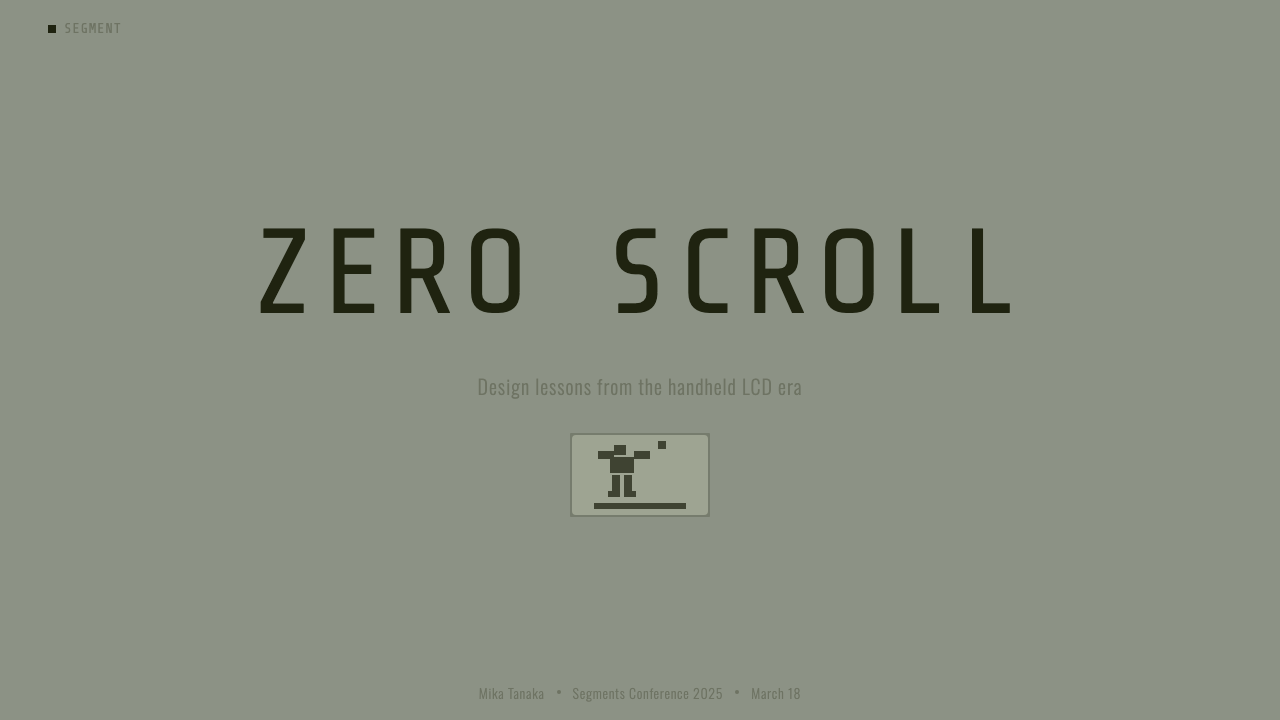
For presentation cover slides, the style reads strongly through a large flat silhouette shape set against the muted olive-gray field, with a bezel-like frame around the composition to evoke the screen window. Content and data slides benefit from being organized as a grid of discrete cells rather than a free canvas — each metric or bullet point occupying its own fixed 'segment,' echoing how the original hardware could only light pre-determined shapes. Numerals should stay blocky and flat, closer to a calculator readout than a refined display typeface, and charts read best as simple, high-contrast silhouettes rather than shaded or gradient-filled graphics.
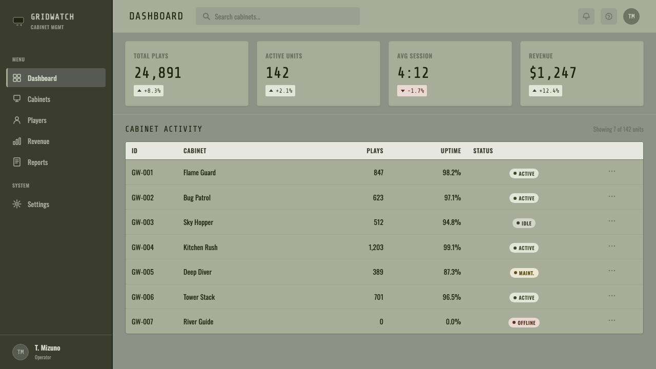
For web UI, the aesthetic is a natural fit for dashboards and pricing pages that want to signal playful minimalism without sacrificing legibility: a near-monochrome olive-gray base, flat black iconography with no drop shadows or gradients, and bordered card components that mimic the bezel-and-shell relationship between screen and housing. Interactive states should snap between two clear conditions — on or off, active or inactive — rather than fading or animating smoothly, in keeping with the system's binary logic. Pricing tiers can borrow the shell's use of a small number of solid accent colors to differentiate plans, while keeping all data displays in flat black on the olive field.
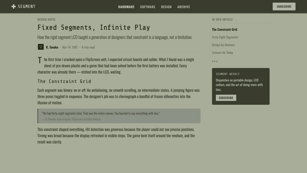
For editorial and marketing work, the style supports a confident, nostalgic tone well suited to gaming culture, retro tech, and childhood-adjacent brands. Feature sections work best as bordered 'screen' panels — a defined rectangular window holding flat silhouette illustration — surrounded by a shell-like margin that can carry a secondary accent color. Marketing headlines benefit from blocky, geometric letterforms that echo segment-display numerals rather than delicate or high-contrast serif type, keeping the whole composition anchored to the flat, no-gradient logic of the source material.
A common mistake when applying this style is adding gradients, soft shadows, or smooth easing animations to make the design feel more 'modern' — this directly contradicts the aesthetic's core premise, which is that the flat, binary, hard-edged look is not a limitation to be softened but the entire point. Another frequent error is treating the olive-gray tone as decorative background color to be paired freely with other saturated hues; in the source material it functions as a near-neutral base specifically because the display had no other tone to offer, and mismatching it with a busy multi-color palette undermines the quiet, dormant character that defines the system.
Handheld LCD Game — FAQ
Is this the same as '8-bit' or 'pixel art' retro style?
No, and the distinction matters. Pixel art describes a grid of individually addressable square pixels, each of which can in principle be any color, which is how console and computer graphics of the 1980s and 1990s worked. Handheld LCD Game describes something more restrictive: a small number of fixed, pre-drawn segment shapes that can only be fully on or fully off, with no ability to address individual pixels or introduce new shapes after manufacturing. Pixel art can depict gradients, shading, and dozens of colors within its grid; this style structurally cannot, and its entire visual identity comes from that deeper constraint.
Why is the background color olive-gray instead of a cleaner white or black?
The tone comes directly from the physical chemistry of the liquid crystal material used in the original displays, viewed under typical ambient light without any backlight or color filter. It is not a designer's color choice in the way a brand palette is chosen — it is what the actual material looked like when idle. Treating it as a fixed, deliberate 'brand color' rather than trying to neutralize it toward pure white or pure black is what keeps a design honest to the source technology, in the same way that respecting an LCD's binary on/off logic keeps the silhouettes honest.
Can this style support smooth animation or transitions in a modern product?
It resists them by design. The original hardware could only switch discrete pre-drawn segments on or off, so anything resembling a smooth fade, slide, or ease-in reintroduces a visual grammar the style was defined against. A faithful application favors instant, snap-cut state changes — a shape simply appears or disappears — even where the underlying technology stack would easily support smoother motion. Designers wanting more fluid interaction are better served by borrowing this system's color and silhouette language while pairing it, deliberately, with a different motion approach rather than forcing false continuity onto it.
What kinds of products or brands does this style suit best?
It suits contexts that want to signal playful nostalgia, technological history, or a deliberately pared-back, low-fi character: gaming brands referencing early handheld culture, toy and children's products, retro-technology publications, and products that want to stand out through restraint in a market crowded with high-gloss, gradient-heavy interfaces. It is less suited to contexts demanding a sense of premium polish, rich imagery, or emotional warmth through color variety, since the system's entire vocabulary is built around a single dormant tone and flat black — any attempt to add richness on top works against the style's logic rather than with it.
How does this style differ from general 'skeuomorphic' design?
Skeuomorphism typically means digital interfaces imitating the rich surface detail of physical objects — leather textures, metallic shading, realistic shadows — to make new technology feel familiar. Handheld LCD Game does something closer to the opposite: it faithfully represents a physical object (a segmented display and its plastic housing) but that object was itself already flat, binary, and free of shading. There is no added illusion of depth or material richness layered on top; the style is honest about a source technology that was inherently graphic and two-dimensional, rather than dressing up a flat screen to look like leather or brushed metal.
Related design styles
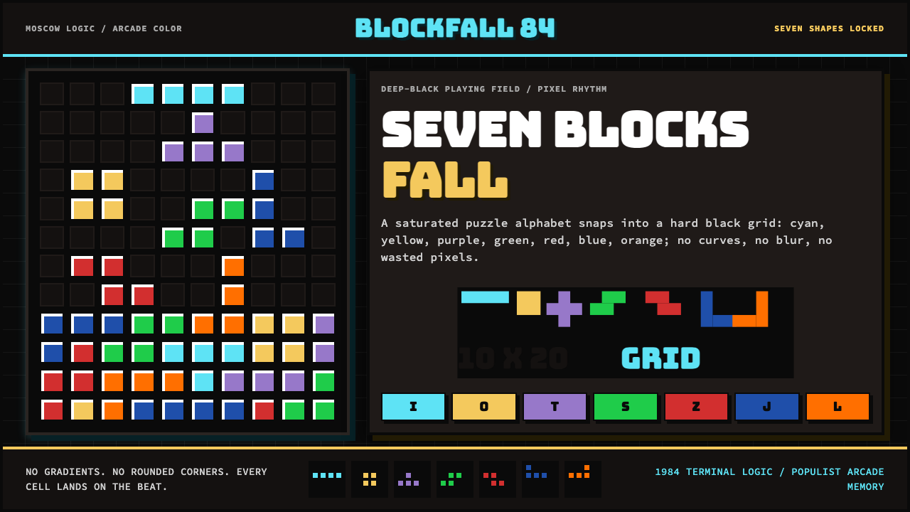 Tetris (1984)Arcade gravity, pixel exact. Black grid, Bungee type, seven saturated blocks.
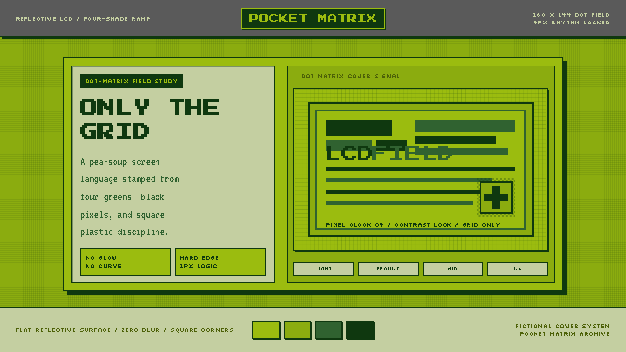 Game Boy DMG Green ScreenOnly the grid remains. Olive LCD tones, pixel type, and hard black borders.
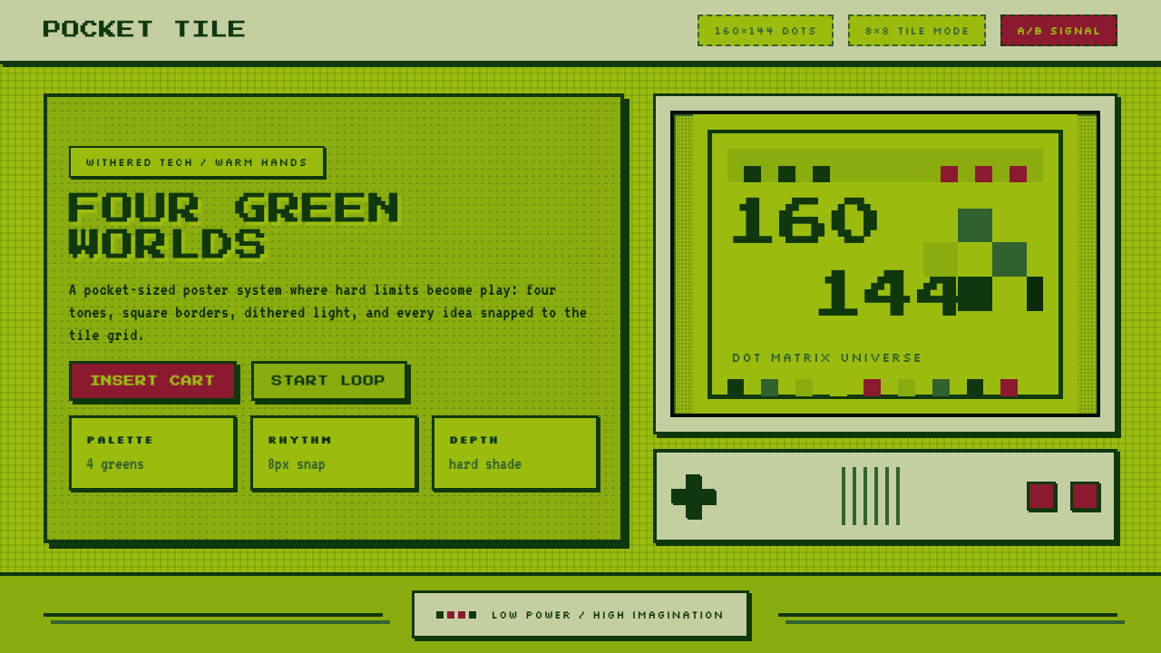 Nintendo Game BoyConstraint becomes play. Four swamp greens, pixel type, and an 8×8 grid do th…
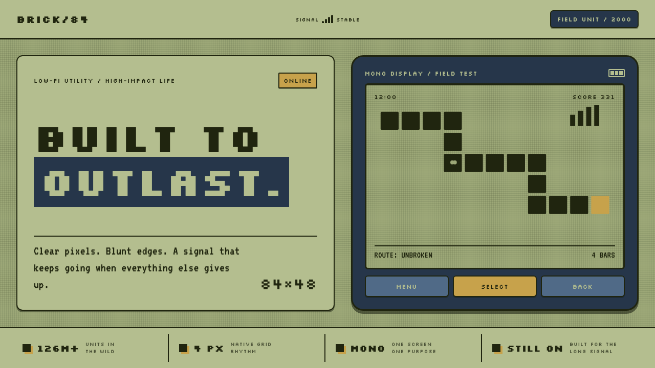 Nokia 3310 (2000)Built to outlast. Dark pixels march across olive glass inside a matte navy fr…
 Pixel Art / 8-bit RetroHard-edged digital joy. CRT black, phosphor green, and 8x8 grids snap every p…
 Street Fighter II (1991 Arcade)Pixel muscle hits hard. Hadouken blue, gold HUD bars, and outlined type blaze…