What is iMac G3 Bondi Blue (1998)?什么是 iMac G3 Bondi Blue (1998)?
A translucent teal egg on a desk in 1998 proved that a computer could look like something you actually wanted.1998年桌上那颗半透明的青绿色蛋形机器证明了一件事:电脑也可以是你真正想要的东西。
iMac G3 Bondi Blue (1998) in briefiMac G3 Bondi Blue (1998) 速览
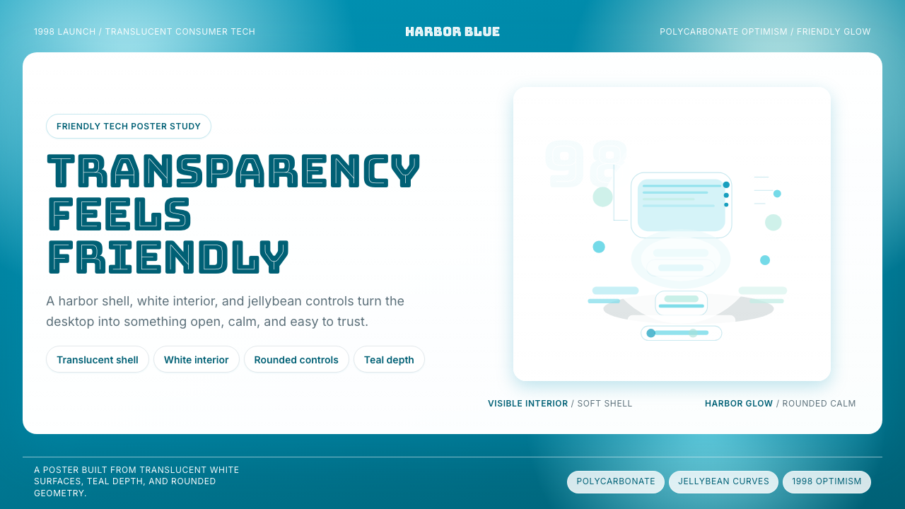
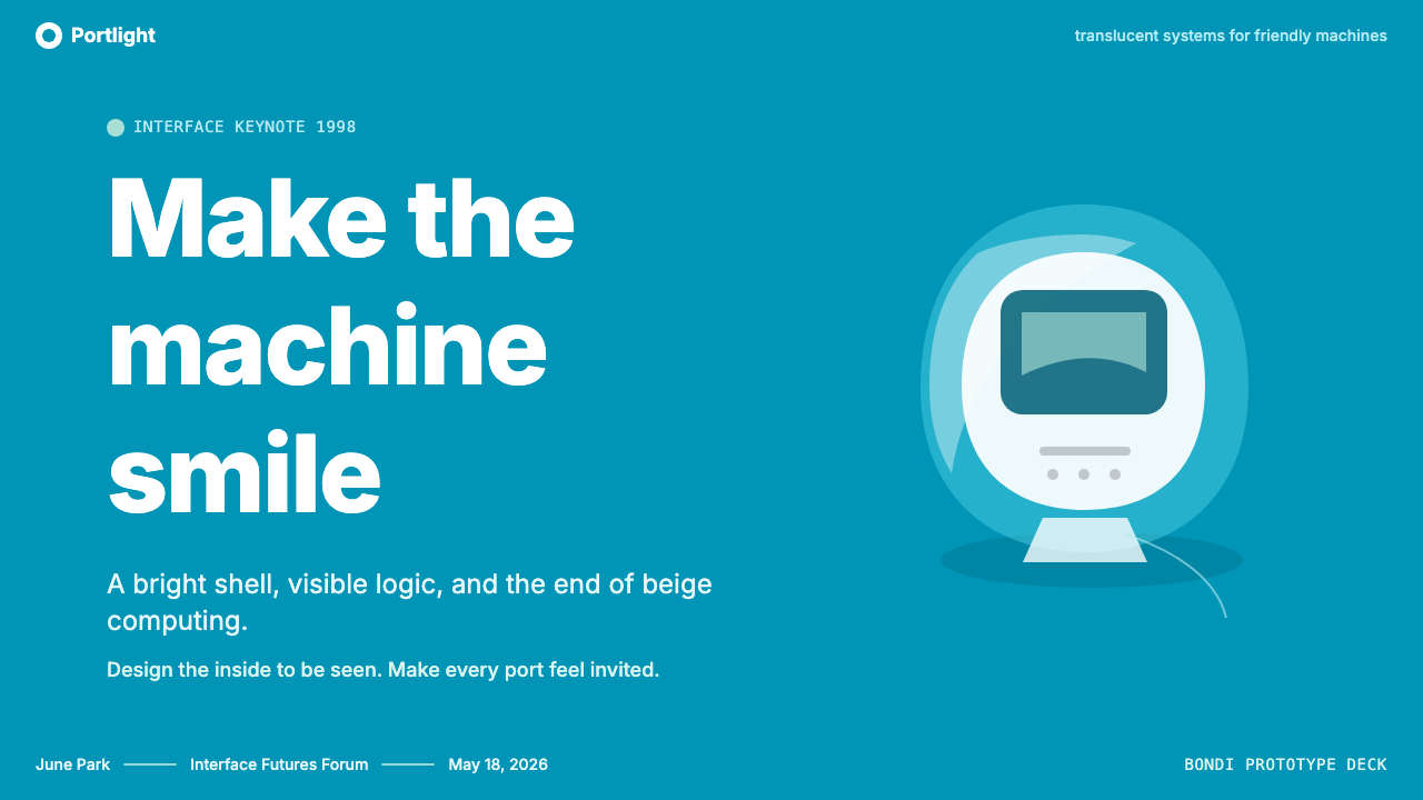
The iMac G3 Bondi Blue aesthetic is a design language built around translucency, curvature, and saturated color — a direct repudiation of the beige, angular, anonymous personal computer that had dominated offices and homes since the late 1970s. Where the prevailing PC aesthetic communicated utility through blankness, the Bondi Blue iMac communicated friendliness through visibility: the machine's internal components were legible through its polycarbonate shell, and the teal-cyan color shifted in intensity depending on the angle of light.iMac G3邦迪蓝的美学是一套以透明感、曲线与饱和色彩为核心的设计语言——对自1970年代末主导办公室与家庭的米色、棱角分明、毫无个性的个人电脑的直接否定。既有PC美学用空白来传达功用,邦迪蓝iMac则用可见性传达友好:机器内部的零部件透过聚碳酸酯外壳清晰可辨,那抹青绿色随光线角度而深浅变幻。
As a visual system, Bondi Blue centers on a specific tension between richness and approachability. The background color — that distinctive blue-green drawn from the waters of Sydney's Bondi Beach — is deeply saturated but not aggressive. White surfaces act as counterweights, keeping the palette from tipping into heaviness. Interface elements are rounded to near-circular extremes, a formal choice that made the machine feel safe and playful rather than clinical. The visual language says: technology is not hostile territory; come closer and look inside.作为视觉系统,邦迪蓝的核心是丰富感与亲和力之间的特定张力。那种取自悉尼邦迪海滩海水的蓝绿色背景色,饱和度极深却并不咄咄逼人。白色表面作为对冲,使整套配色不至于沉重压抑。界面元素被圆化至近乎圆形的极致——这一形式选择使机器显得安全而充满趣味,而非冷峻。这套视觉语言在说:科技并非敌对领域,走近些,往里面看。
This aesthetic belongs to a brief, specific window in consumer-technology history — the late 1990s moment when the internet was being sold to ordinary households as a place of optimism and possibility. Every visual decision in the iMac G3's design reinforces that narrative: the curves soften authority, the transparency builds trust, the saturated color signals that this is not a tool for specialists but a companion for everyone.这一美学属于消费电子史上短暂而特定的窗口期——1990年代末,互联网被向普通家庭兜售为一处充满乐观与可能性的地方。iMac G3设计中的每一个视觉决定都强化了这个叙事:曲线软化权威,透明建立信任,饱和的色彩表明这不是专家的工具,而是所有人的伙伴。
See the iMac G3 Bondi Blue (1998) design system查看 iMac G3 Bondi Blue (1998) 完整设计系统
Where does iMac G3 Bondi Blue (1998) come from?iMac G3 Bondi Blue (1998) 从何而来?
In the summer of 1997, Apple was weeks from insolvency. The company that had invented the graphical user interface for a mass market was being outsold by commodity PC makers running Windows. Steve Jobs, returning as interim CEO after a twelve-year absence, identified the problem with characteristic bluntness: Apple had lost its identity, and its products had become as anonymous as any other beige box. His prescription was equally blunt — make something undeniably, visibly different.1997年夏,苹果公司距离资不抵债只有数周之遥。这家曾为大众市场发明图形用户界面的公司,正在被运行Windows的廉价PC制造商压倒。阔别十二年后以临时CEO身份归来的史蒂夫·乔布斯,以他一贯的直白点出了问题所在:苹果已失去自身的身份认同,产品变得和其他任何一台米色机箱一样默默无名。他的处方同样直白——做出一些无可置疑地、肉眼可见地与众不同的东西。
Jonathan Ive, the British industrial designer who had joined Apple in 1992 and led its industrial design group since 1996, had already been developing concepts for a radically new form factor. Working under the code name 'C1', the design team explored polycarbonate as a primary casing material — a choice that enabled the translucency that became the machine's defining characteristic. The form that emerged was bulbous and egg-like, a complete break from the rectilinear logic that had governed computer enclosure design since the beginning of the personal computer era. The integrated handle on top communicated that this was a consumer object, meant to be moved and owned personally, not bolted to a corporate workstation.1992年加入苹果、1996年起主导工业设计团队的英国工业设计师乔纳森·艾维,此前已在开发一种全新形态的概念方案。设计团队以代号「C1」展开工作,探索将聚碳酸酯作为主要外壳材料——正是这一选择成就了后来定义这台机器的透明感。最终呈现的造型浑圆而蛋形,与自个人电脑时代伊始统治计算机外壳设计的直线逻辑彻底决裂。顶部集成的提手传递出明确的信息:这是一件消费者物品,用来被个人搬动和拥有,而不是被固定在企业工作站上。
The name 'Bondi Blue' was chosen by Jobs himself, reportedly after he saw a swatch of the color during the development process and declared it perfect. The reference to Bondi Beach in Sydney — known internationally for its vivid blue-green water — carried associations of leisure, beauty, and the natural world rather than technology or industry. This was deliberate: the iMac was being positioned as a gateway to the internet, and its color was meant to evoke the openness and optimism of that promise rather than the mechanical seriousness of computing.「邦迪蓝」这个名字由乔布斯本人亲自选定——据说他在开发过程中看到一块色样后当即宣布:就是它。对悉尼邦迪海滩的指涉——那片以其鲜艳蓝绿色海水闻名于世的海滩——唤起的联想是休闲、美丽与自然界,而非科技或工业。这是刻意为之的:iMac被定位为进入互联网的门户,它的色彩要唤起那份承诺所具有的开放与乐观,而非计算机运算的机械严肃。
The iMac G3 launched on August 15, 1998, at a retail price that was aggressive by Apple's standards, and it sold 800,000 units in its first 139 days — at the time, the fastest-selling Macintosh in company history. In 1999, Apple extended the line with five additional colors under the 'Five Flavors' campaign: Blueberry, Strawberry, Tangerine, Grape, and Lime. Each variant extended the design language while retaining the translucent polycarbonate shell and the rounded, integrated form. The Bondi Blue original remained the design's purest expression — the one that established the visual grammar that all subsequent variants inherited. The line was discontinued in 2003, replaced by the flat-panel iMac that pointed toward a different aesthetic future, but the Bondi Blue iMac's influence on consumer electronics, industrial design, and interface design had already been profound and lasting.iMac G3于1998年8月15日发布,以苹果标准而言颇具攻击性的零售价上市,在最初139天内售出80万台——彼时是麦金塔历史上销售最快的产品。1999年,苹果以“五种口味”活动将产品线延伸至五种额外配色:蓝莓、草莓、橘子、葡萄与酸橙。每一款变体在延续设计语言的同时,保留了半透明聚碳酸酯外壳与圆润的一体化造型。邦迪蓝原版始终是这套设计最纯粹的表达——正是它建立了视觉语法,令所有后续变体得以继承。该产品线于2003年停产,被指向另一种美学未来的平板显示器iMac所取代,但邦迪蓝iMac对消费电子、工业设计与界面设计的影响,早已深远而持久。
What defines the iMac G3 Bondi Blue (1998) look?iMac G3 Bondi Blue (1998) 的视觉特征是什么?
Translucent Color半透明色彩
The defining material quality of the Bondi Blue aesthetic is translucency rather than opacity. The teal-cyan color is not a surface coating but a property of the material itself, allowing light to pass through and interior structures to remain partially visible. This quality makes the color feel alive and variable — it shifts from deeper blue-green in shadow to a brighter, more aqueous tone in direct light. When applied to digital surfaces, this translucency is evoked through layered semi-transparent overlays and materials that suggest depth without creating literal see-through windows.邦迪蓝美学最具定义性的材料品质是半透明而非不透明。那抹青绿色并非表面涂层,而是材料本身的属性,允许光线穿透,使内部结构保持部分可见。这种品质让色彩显得鲜活而富于变化——在阴影中偏向更深的蓝绿色,在直射光下转为更明亮、更水润的色调。当应用于数字界面时,这种半透明感通过叠加的半透明图层与暗示深度的材料效果来唤起,而非制造字面意义上的透视窗口。
Generous Curves饱满曲线
Every form in this aesthetic curves — corners are rounded to a degree that would have seemed extreme in earlier consumer electronics, buttons approach pill or jellybean shapes, and container edges follow sweeping arcs rather than right angles. This pervasive curvature is not merely decorative; it communicates that the object or interface is safe, approachable, and designed for human hands and eyes rather than industrial efficiency. The curves also give the aesthetic a slightly organic quality, as though the forms have been inflated from within or shaped by gentle pressure.这套美学中的每一个形态都是弯曲的——圆角的圆润程度在早期消费电子中会显得极端,按钮接近胶囊或糖豆的形状,容器边缘沿着宽阔的弧线而非直角延伸。这种无处不在的弧度并非纯粹装饰性的;它传达着对象或界面是安全、亲切的,是为人的手和眼睛而设计,而非为工业效率而设计。这些曲线也赋予美学一种略微有机的品质,仿佛那些形态是从内部充气膨胀或被轻柔施压塑形而成的。
Saturated Teal-Cyan Palette饱和青绿色板
The primary color of this aesthetic sits in the precise zone between blue and green — not quite teal, not quite cyan, not quite turquoise, but something that partakes of all three. It is deeply saturated, meaning it reads as vivid and confident rather than muted or pastel. White is the essential counterpart, used generously for content surfaces to let the saturated background breathe. Black appears rarely, primarily for high-contrast text. Secondary accent colors, when present, tend toward complementary warm tones rather than additional saturated cool hues, maintaining the palette's internal coherence.这套美学的主色调落在蓝与绿之间的精确地带——不完全是青色,不完全是蓝绿色,不完全是绿松石色,而是三者共有的某种色调。它深度饱和,意味着看起来鲜活而自信,而非低沉或粉嫩。白色是不可或缺的对应色,大量用于内容表面,让饱和的背景得以呼吸。黑色极少出现,主要用于高对比度文本。次要强调色若出现,倾向于互补的暖色调,而非额外的饱和冷色调,以维护配色的内在一致性。
Soft Glow and Inner Light柔和光晕与内发光
Unlike design systems that use shadow to create the impression of elevation, the Bondi Blue aesthetic relies on luminosity — a sense that surfaces glow from within. Highlights are placed at the edges and upper faces of rounded elements as though light is passing through the material. Gradients, when they appear, are extremely gentle and suggest illumination rather than dramatic dimension. This gives the aesthetic a slightly ethereal quality that distinguishes it from both the flat, shadowless look of later minimal design and the hard-edged realism of skeuomorphism.与用阴影制造海拔感的设计系统不同,邦迪蓝美学依赖发光度——一种表面从内部发光的感觉。高光被置于圆润元素的边缘与上表面,仿佛光线正在穿透材料。渐变若出现,极为轻柔,暗示照明而非戏剧性的立体感。这赋予美学一种略微空灵的品质,将它与后来极简设计的扁平无影风格,以及拟物化的硬边写实主义都区别开来。
Friendly, Rounded Typography友好圆润的字体排印
Text in this aesthetic favors rounded letterforms — typefaces that echo the overall formal vocabulary of curves and softness rather than the geometric precision of modernist sans-serifs or the authority of traditional serifs. Headlines can be bold and expressive, communicating warmth rather than corporate weight. Body text is set generously with comfortable line spacing, reinforcing the approachable character of the system. The overall typographic tone is conversational rather than instructional.这套美学中的文字偏向圆润字形——与整体曲线和柔和的形式词汇相呼应的字体,而非现代主义无衬线的几何精确性或传统衬线字体的权威感。标题可以粗重而富有表达力,传递温暖而非企业权威。正文行距宽松舒适,强化系统的亲和性格。整体排版基调是对话式的,而非指令式的。
White Space as Invitation留白作为邀请
The Bondi Blue aesthetic uses white space not as austere reduction but as generous invitation. Padding inside containers is spacious, giving content room to breathe in a way that feels welcoming rather than sparse. Content areas are typically set against bright white or near-white backgrounds, creating a sharp contrast with the saturated interface chrome and drawing the eye naturally to the primary content. This allocation of white space signals that the design is not trying to cram in information but to make it comfortable to receive.邦迪蓝美学中的白色空间不是严苛的削减,而是宽厚的邀请。容器内部的内边距宽敞,给内容留有充分的呼吸空间,感觉温馨而非稀疏。内容区域通常置于明亮的白色或接近白色的背景之上,与饱和的界面框架形成鲜明对比,自然地将视线引向主要内容。这种白色空间的分配方式表明:设计并非试图塞满信息,而是让信息易于接收。
Tactile Material Suggestion触觉材料暗示
Even in purely digital applications, the Bondi Blue aesthetic carries a sense of material presence derived from the original polycarbonate casing. Surfaces are not perfectly flat; they have subtle curvature and highlights that suggest a three-dimensional shell. Interactive elements feel pressable and tangible rather than purely diagrammatic. This is a careful calibration — the aesthetic avoids full skeuomorphism while retaining enough material suggestion to make the interface feel physically engaging rather than abstract.即使在纯数字应用中,邦迪蓝美学也带有源自原始聚碳酸酯外壳的材料存在感。表面并非完全平整,它们有微妙的弧度和高光,暗示着三维外壳的存在。交互元素感觉可以被按压和触碰,而非纯粹的示意图式。这是一种精心的校准——美学避开了完整的拟物化,同时保留了足够的材料暗示,使界面感觉有物理参与感而非抽象的。
See the iMac G3 Bondi Blue (1998) design system查看 iMac G3 Bondi Blue (1998) 完整设计系统
Who shaped iMac G3 Bondi Blue (1998)?谁塑造了 iMac G3 Bondi Blue (1998)?
Jonathan Ive joined Apple in 1992 and became head of the industrial design group in 1996. The iMac G3 was his first major project executed in close collaboration with the returning Steve Jobs, and it established the design philosophy that would define Apple for the next two decades: material expressiveness, manufacturing precision, and the conviction that industrial design is not ornamental but fundamental to a product's meaning. Ive went on to oversee the iPod, iPhone, and iPad, each of which carried forward the principle demonstrated in the Bondi Blue iMac — that the physical and visual qualities of a product determine how users feel about themselves when they use it.乔纳森·艾维于1992年加入苹果,1996年成为工业设计团队负责人。iMac G3是他与归来的史蒂夫·乔布斯密切合作完成的第一个重大项目,由此确立了此后二十年定义苹果的设计哲学:材料表现力、制造精密性,以及工业设计并非装饰性而是产品意义根本的信念。艾维此后主导了iPod、iPhone与iPad的设计,每一款都延续了邦迪蓝iMac所展示的原则——产品的物理与视觉品质决定了用户使用时对自身的感受。
Jobs returned to Apple in September 1997 and within months had approved the iMac G3 project, personally selecting the Bondi Blue color and the consumer-facing name. His insistence that the machine look unlike anything else on the market — combined with his decision to remove the floppy disk drive, add a USB port, and price the machine accessibly — transformed it from a design experiment into a commercial phenomenon. Jobs's role in the iMac was less that of a designer and more that of a demanding editor: he set the parameters within which Ive's team could find the optimal form, and he used his authority to protect decisions that would have been reversed under conventional product management.乔布斯于1997年9月重返苹果,数月之内便批准了iMac G3项目,亲自选定了邦迪蓝配色和面向消费者的产品名称。他坚持这台机器的外观必须与市场上任何产品都不同——加之他决定去除软盘驱动器、添加USB接口、以亲民价格定价——将其从设计实验转变为商业现象。乔布斯在iMac中扮演的角色与其说是设计师,不如说是要求严苛的编辑:他设定了艾维团队寻找最优形态的参数边界,并以自己的权威保护了那些在常规产品管理下本会被推翻的决定。
As Apple's head of worldwide product marketing at the time of the iMac G3 launch, Phil Schiller was responsible for the commercial framing that made the machine's design legible to a mainstream audience. The 'Five Flavors' campaign, which extended the iMac line into additional colors in 1999, was a marketing invention that transformed a design decision into a cultural event — each color variant becoming a form of personal expression. Schiller's approach demonstrated that a product's visual identity is not fixed at manufacturing but is continuously shaped by how it is presented, talked about, and associated with particular lifestyles.作为iMac G3发布时苹果全球产品营销负责人,菲尔·席勒负责为这台机器的设计构建让主流受众能够理解的商业框架。1999年将iMac产品线扩展至更多配色的五种口味活动,是一项营销发明,将设计决定转化为文化事件——每一款配色变体都成为个人表达的形式。席勒的方式证明:产品的视觉身份并非在制造时固定,而是持续地被它被呈现、谈论和与特定生活方式相关联的方式所塑造。
Avie Tevanian served as Apple's chief software technology officer and oversaw the operating system software that ran on the iMac G3. The visual design of Mac OS 8 and the early Mac OS 9 interface — with its Platinum appearance and the later Aqua interface previewed in 2000 — was developed in parallel with the hardware aesthetic that Ive's team was creating. Tevanian's contribution to the iMac's legacy lies in demonstrating that hardware and software design needed to speak the same visual language: the rounded, translucent, material-aware qualities of the physical machine required a software interface that could honor rather than contradict them.艾维·特瓦尼安担任苹果首席软件技术官,负责监管iMac G3上运行的操作系统软件。Mac OS 8及早期Mac OS 9界面的视觉设计——其铂金外观,以及2000年预览的后续Aqua界面——与艾维团队打造的硬件美学并行开发。特瓦尼安对iMac遗产的贡献,在于证明了硬件与软件设计需要使用同一套视觉语言:实体机器那种圆润、半透明、材料感十足的品质,需要一个能够呼应而非抵触它们的软件界面。
Though not directly involved in the iMac G3, Hartmut Esslinger's earlier work at Apple — particularly the Snow White design language he developed for Apple in the early 1980s through his firm frogdesign — established the principle that Apple computers should have a distinctive, unified visual language that set them apart from competitors. The beige, rectilinear Snow White aesthetic that characterized Apple through the 1980s and much of the 1990s was precisely what the iMac G3 was designed to replace, but Esslinger's foundational insight — that design is a competitive advantage and a form of communication, not merely an aesthetic preference — was one the iMac inherited and amplified.尽管哈特穆特·艾斯林格并未直接参与iMac G3的设计,他早年在苹果的工作——尤其是1980年代初通过其公司frogdesign为苹果开发的「雪白」设计语言——确立了苹果电脑应当拥有独特统一视觉语言以区别于竞争对手的原则。那套贯穿1980年代及1990年代大部分时期的米色、直线形「雪白」美学,正是iMac G3被设计来取代的对象;但艾斯林格的根本洞见——设计是竞争优势与传播手段,而非仅仅是美学偏好——正是iMac所继承并放大的遗产。
How do you use iMac G3 Bondi Blue (1998) today?今天怎么用 iMac G3 Bondi Blue (1998)?
The Bondi Blue iMac aesthetic is most effective in design contexts where the product needs to feel simultaneously premium and approachable — not the cold authority of a professional tool, not the casual disposability of a budget product, but something that feels considered, welcoming, and slightly joyful. It works well for consumer software products, creative tools aimed at non-specialists, educational platforms, and any interface where the goal is to reduce the anxiety that technology can provoke and replace it with a sense of invitation.邦迪蓝iMac美学在产品需要同时显得高端又亲切的设计场景中最为有效——不是专业工具的冷峻权威,不是廉价产品的随意感,而是某种经过深思熟虑、充满邀请感、略带喜悦的东西。它适合消费类软件产品、面向非专业人士的创意工具、教育平台,以及任何目标是消除科技可能引发的焦虑、代之以邀请感的界面。
For presentation slides, the Bondi Blue palette operates most naturally as a full-saturated-background treatment for cover and section-break slides, with white content slides providing the working surface for information. A cover slide benefits from the teal-cyan ground occupying the full field, with white type and simple geometric shapes — perhaps a soft circular or oval form — creating a focal point. Content slides should be treated as white-surface layouts with teal used sparingly for accent, highlighting key figures or calls to action. Data slides can use the teal as a primary bar or chart color against a white ground, letting the saturation provide hierarchy without additional color complexity.在演示文稿中,邦迪蓝配色最自然的用法是作为封面页与章节分隔页的全饱和背景处理,白色内容页提供信息展示的工作表面。封面幻灯片适合让青绿色铺满整个画面,白色文字搭配简单几何形状——也许是柔和的圆形或椭圆形——形成视觉焦点。内容幻灯片应作为白色底面版面处理,将青绿色保留用于强调,点亮关键数字或行动号召。数据幻灯片可将青绿色作为图表的主色,衬于白色底面,让饱和度提供层级感,无需额外的色彩复杂度。
For web interfaces, Bondi Blue suits consumer-facing dashboards, onboarding flows, pricing pages, and marketing landing pages more naturally than it suits dense productivity tools or data-heavy enterprise applications. The approach is to set the overall page field in either the saturated teal or in white, use rounded card containers with generous internal padding, and apply soft translucent overlay effects for modal layers and hover states rather than hard shadows or color inversion. Navigation elements should be rounded rather than rectangular, and interactive buttons should carry the pill or jellybean form that makes the system legible as a coherent visual language.对于网页界面,邦迪蓝比起密集的效率工具或数据繁重的企业应用,更自然地适合面向消费者的仪表板、引导流程、定价页面与营销落地页。方法是:将整体页面底色设为饱和青绿色或白色,使用内边距宽裕的圆角卡片容器,为模态层与悬停状态应用柔和半透明的叠加效果,而非硬边阴影或色彩反转。导航元素应圆润而非矩形,交互按钮应带有胶囊或糖豆造型,使系统作为连贯的视觉语言得以识别。
For editorial and marketing work, the aesthetic supports strong feature moments — a full-width hero section in deep teal-cyan with white headline type creates immediate visual impact, while white-background body sections allow content to breathe without the palette becoming fatiguing. Pull quotes and highlighted facts work well inside teal containers with white text, giving editorial emphasis without resorting to heavy typographic treatment. In print or social card contexts, the aesthetic's natural friendliness makes it effective for announcements, invitations, and communications that need to feel both considered and warm rather than purely formal.对于编辑与营销内容,这套美学支撑有力的特色时刻——一个深青绿色全宽主视觉区域配上白色大标题文字,产生即时的视觉冲击,而白色背景的正文区段则让内容有呼吸空间,不至于使配色令人疲倦。引用语与高亮事实在青绿色容器配白色文字的处理中效果出色,赋予编辑强调感而无需诉诸沉重的排版处理。在平面印刷或社交卡片场景中,这套美学的天然友好感使它在需要既显得用心又充满温度而非纯粹正式的公告、邀请与传播物上颇为有效。
A common mistake when applying this aesthetic is confusing translucency with transparency and either making surfaces fully opaque — which loses the material quality entirely — or fully transparent — which creates visual noise rather than depth. The correct calibration is a middle state: surfaces that have presence and weight but allow some sense of what lies beneath. A second common mistake is over-applying the saturated teal to body text, borders, and secondary UI elements simultaneously, which quickly becomes visually dense and loses the contrast that gives the palette its energy. The teal is most powerful when it has room — used for large surfaces, primary interactive states, and moments of emphasis, with white carrying the informational weight.应用这套美学时最常见的错误,是将半透明与透明混为一谈——要么将表面做得完全不透明(完全失去材料品质),要么做得完全透明(制造视觉噪音而非深度感)。正确的校准是中间状态:表面有存在感和重量感,但允许对底层内容有一定的感知。第二个常见错误是同时将饱和青绿色大量用于正文、边框和次级界面元素,这会迅速造成视觉密度过高,失去赋予配色活力的对比感。青绿色在拥有空间时最为有力——用于大面积底色、主要交互状态和强调时刻,让白色承载信息的重量。
See the iMac G3 Bondi Blue (1998) design system查看 iMac G3 Bondi Blue (1998) 完整设计系统
iMac G3 Bondi Blue (1998) — FAQiMac G3 Bondi Blue (1998) · 常见问题
Is Bondi Blue iMac aesthetic the same as general 1990s nostalgia design?邦迪蓝iMac美学和泛泛的1990年代怀旧设计是同一回事吗?
No. General 1990s nostalgia design tends to evoke the era through specific typographic choices, color palettes associated with early web design (browser-safe colors, garish gradients), and cultural reference points (grunge, neon, early rave aesthetics). The Bondi Blue iMac aesthetic is specifically about the consumer optimism of the late 1990s internet moment and the material language of translucent polycarbonate. It is cleaner, more premium, and more specifically tied to a single product family than broad 1990s pastiche. Where 1990s nostalgia often embraces the era's visual excess and confusion, the Bondi Blue aesthetic is actually quite disciplined — it is 1990s consumer hope, not 1990s visual chaos.不是。泛泛的1990年代怀旧设计倾向于通过特定的排版选择、与早期网页设计相关的配色(浏览器安全色、刺眼的渐变),以及文化参照点(grunge、霓虹、早期锐舞美学)来唤起那个时代。邦迪蓝iMac美学专门关于1990年代末互联网时刻的消费乐观主义,以及半透明聚碳酸酯的材料语言。它比宽泛的1990年代拼贴更干净、更高端,与特定产品家族的联系也更为具体。1990年代怀旧往往拥抱那个时代的视觉过剩与混乱,而邦迪蓝美学实际上相当自律——它是1990年代的消费者希望,而非1990年代的视觉混乱。
Can this aesthetic work in a dark-mode context?这套美学在深色模式语境下能使用吗?
With significant modification, yes — but dark mode inverts the aesthetic's fundamental logic in ways that require care. The original Bondi Blue palette works because the saturated teal-cyan contrasts against white, not against black; against a dark background, the teal becomes less legible as a background color and more useful as a glowing accent. A dark variant of this aesthetic works best when the background is a very deep, slightly warm neutral (not pure black, which reads as too hard-edged for this system), the teal is used selectively for interactive elements and highlights, and white or near-white is used generously for text and content containers. The translucent overlay effects require extra attention in dark mode — the inner-glow quality that defines the aesthetic tends to wash out against dark fields rather than reading as luminous.需要大幅调整,可以——但深色模式从根本上颠覆了这套美学的逻辑,需要谨慎处理。原版邦迪蓝配色之所以有效,是因为饱和青绿色与白色形成对比,而非与黑色对比;在深色背景下,青绿色作为背景色的可读性降低,更适合作为发光强调色使用。这套美学的深色变体在以下情况下效果最佳:背景为极深的略带暖意的中性色(而非纯黑——纯黑对这套系统而言边缘感太强),青绿色选择性地用于交互元素和高光,白色或接近白色的色调大量用于文字和内容容器。半透明叠加效果在深色模式下需要格外注意——定义这套美学的内发光品质,在深色底面上往往会消散而非显现为光亮感。
How is this aesthetic different from Apple's later Aqua interface style?这套美学与苹果后来的Aqua界面风格有何不同?
Aqua, introduced with Mac OS X in 2000, was the direct software descendant of the Bondi Blue hardware aesthetic, but it evolved in a more explicitly liquid and reflective direction. Aqua used more aggressive wet-surface highlights, more complex multilayer translucencies, and a fuller range of colors including the famous lozenge-shaped traffic-light window controls. The Bondi Blue aesthetic is its simpler, more restrained predecessor — rooted in the physical properties of a specific material (polycarbonate) rather than in the possibility space of a software rendering engine. Bondi Blue is material memory; Aqua is material imagination. In practice, Bondi Blue references tend to feel warmer and more grounded, while Aqua references tend toward a slightly more hyperreal glossiness.Aqua随Mac OS X在2000年发布,是邦迪蓝硬件美学在软件领域的直接后裔,但它向更明确的液态与反射方向演化。Aqua使用了更激进的湿润表面高光、更复杂的多层半透明效果,以及更丰富的色彩范围,包括著名的菱形红绿灯窗口控件。邦迪蓝美学是其更简洁、更克制的前身——根植于特定材料(聚碳酸酯)的物理属性,而非软件渲染引擎的可能性空间。邦迪蓝是材料记忆,Aqua是材料想象。在实践中,邦迪蓝的引用往往感觉更温暖、更有根基,而Aqua的引用则倾向于略带超现实的光泽感。
What kinds of products and brands should avoid this aesthetic?哪些类型的产品和品牌应该避免这套美学?
The Bondi Blue iMac aesthetic carries specific associations that make it unsuitable for certain brand positions. Products that want to communicate serious professional authority — financial services, legal platforms, medical devices, enterprise security tools — will find the aesthetic's friendliness and playfulness working against their credibility. Luxury brands will find the consumer-accessible, design-for-everyone quality of the aesthetic at odds with the exclusivity they are trying to project. Products aimed at older demographics who did not experience the late 1990s internet moment may find the aesthetic's references opaque rather than evocative. And products that need to feel timeless or culturally neutral will find the aesthetic's specific historical moment too legible — it is unmistakably of its era, which can be a strength or a liability depending on the product's relationship to nostalgia.邦迪蓝iMac美学携带着特定的联想,使它不适合某些品牌定位。希望传达严肃专业权威的产品——金融服务、法律平台、医疗设备、企业安全工具——会发现这套美学的友好感和趣味感与其公信力相悖。奢侈品牌会发现这套美学面向大众消费者、设计为所有人服务的品质,与他们试图投射的排他性格格不入。面向未曾经历1990年代末互联网时刻的年长人群的产品,可能会发现这套美学的参照令人费解而非唤起共鸣。而需要显得超越时代或文化中立的产品,会发现这套美学特定的历史时刻太过清晰可辨——它明确地属于那个年代,这可能是优势也可能是负担,取决于产品与怀旧感的关系。
How does translucency work in a flat digital design context where there is no physical material?在没有实体材料的纯数字设计语境中,半透明感如何实现?
In digital design, translucency is an effect rather than a material property, and achieving the Bondi Blue quality of it requires a specific approach distinct from both full opacity and full transparency. The technique is to layer elements such that a background surface is partially visible through a foreground element — but with the foreground element carrying enough color and luminosity of its own to read as a distinct layer rather than a window. Practically, this means applying a saturated teal-cyan at reduced opacity over a white or near-white content area, or using a frosted-glass-style blur effect that softens rather than transmits the background. The inner-glow quality is achieved through subtle highlights — lighter values at the upper edge and corners of rounded elements — that suggest internal luminosity. The key calibration is that the translucent elements should feel like they are made of something, not like holes in the layout.在数字设计中,半透明是一种效果而非材料属性,实现邦迪蓝式的半透明感需要一种有别于完全不透明和完全透明的特定方法。技巧在于对元素进行分层,使背景表面通过前景元素部分可见——但前景元素自身携带足够的色彩与发光度,作为独立图层而非窗口来识别。在实践中,这意味着在白色或接近白色的内容区域上叠加降低不透明度的饱和青绿色,或使用磨砂玻璃式的模糊效果——柔化而非直接透传背景。内发光品质通过微妙的高光来实现——圆润元素上边缘和角落处更亮的色值——暗示内部发光。关键的校准在于:半透明元素应当感觉像是由某种材料制成的,而非版面中的镂空。
Related design styles相关设计风格
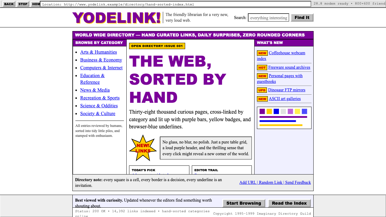 Yahoo! 1995Directory-era optimism. Purple table bars, yellow NEW badges, blue underlined…目录时代的乐观:紫色表格栏、黄色NEW徽章、蓝色下划线链接。
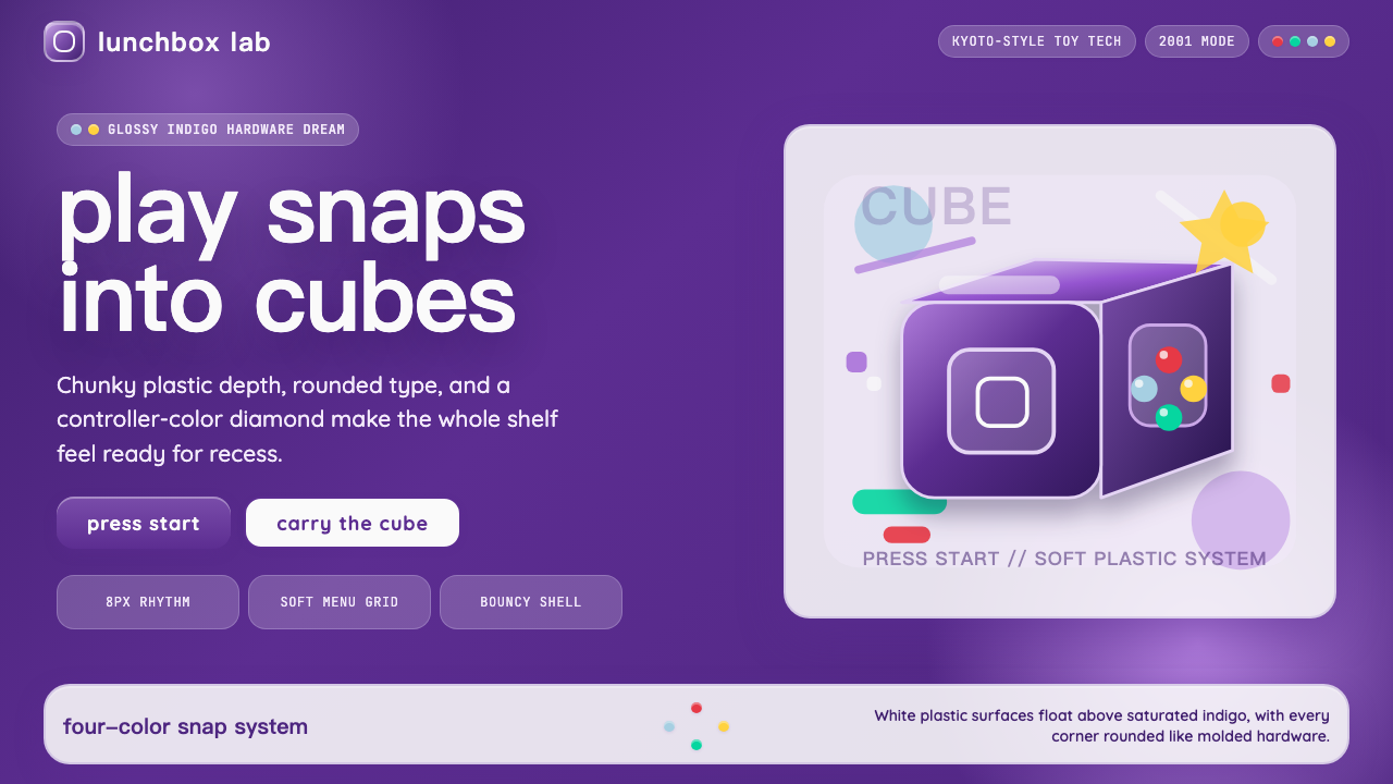 Nintendo GameCube (2001)Toy-tech refuses restraint. Indigo plastic, glossy cubes, and four-color butt…玩具科技拒绝克制:靛紫塑料、光泽立方与四色按钮传递快乐。
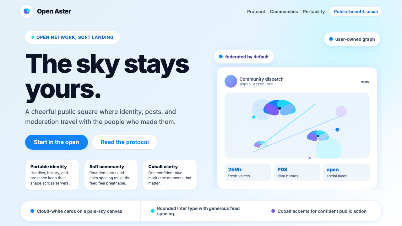 Bluesky AT Protocol 2024Open tech feels warm. Pale sky, cloud cards, Inter, and one cobalt accent car…开放科技也温暖:浅天蓝、云白卡片、Inter 与钴蓝强调。
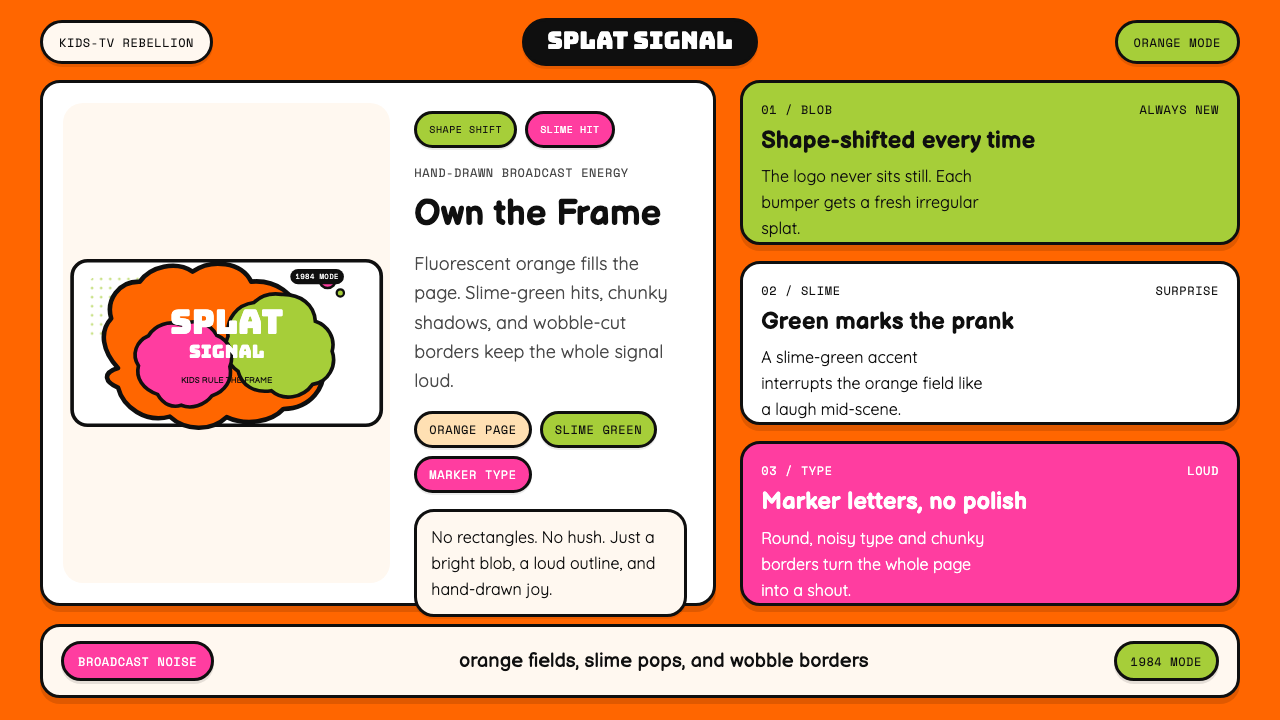 Nickelodeon Orange Splat (1984)Kids own the screen. Orange fields, slime-green pops, and wobble borders do t…孩子掌控屏幕。橙底、史莱姆绿点缀和歪斜边框一起喊话。
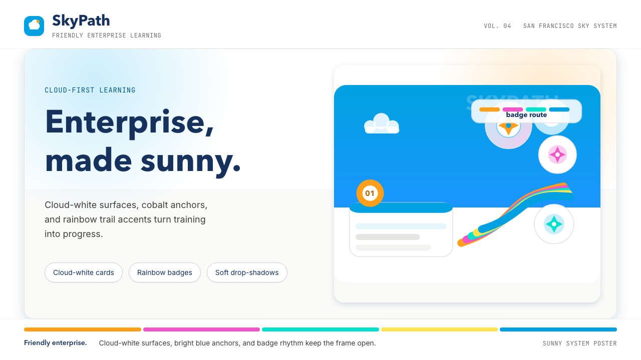 Salesforce TrailheadFriendly enterprise glows. Cloud-white, cobalt, and rainbow badges keep it wa…友好企业感发光。云白、钴蓝和彩虹徽章把它变暖。
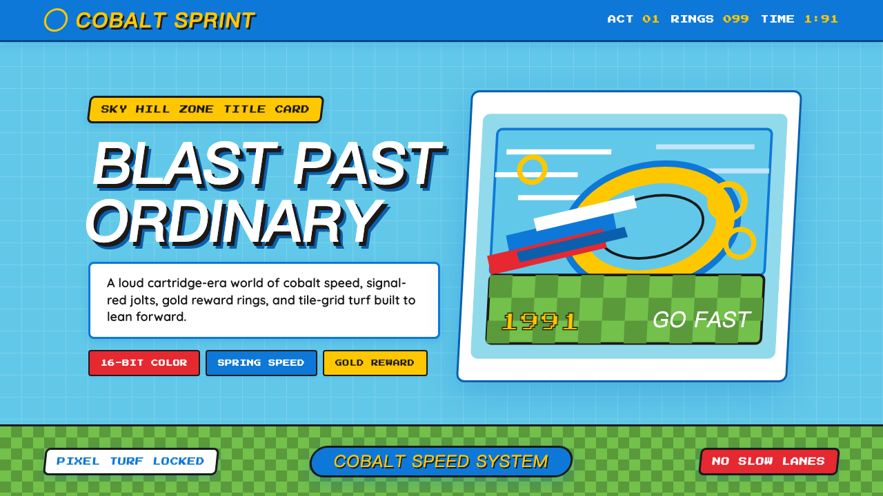 Sonic the Hedgehog (1991)Velocity has teeth. Sky-cyan, cobalt slant type, gold rings, checkerboard tur…速度带刺:天青底、钴蓝倾斜字、金环与棋盘草地。