What is Nintendo GameCube (2001)?什么是 Nintendo GameCube (2001)?
The GameCube turned a game console into a lunchbox-shaped declaration of joy — indigo plastic, translucent accents, and four candy-colored buttons that made play feel like a promise.GameCube 把游戏主机变成了一个便当盒形状的快乐宣言——靛紫塑料、半透明点缀与四枚糖果色按键,让「玩」这件事充满了承诺感。
Nintendo GameCube (2001) in briefNintendo GameCube (2001) 速览
Nintendo GameCube (2001) is a consumer-electronics design style rooted in the visual identity of Nintendo's sixth-generation home console, released in Japan in September 2001 and worldwide through 2002. Its aesthetic is defined by a deep indigo shell, a glossy translucent handle and disc cover, generous rounded corners on every surface, and the iconic four-button diamond rendered in vivid green, red, blue, and yellow. Together these elements form a visual language that is unambiguously playful — one that deliberately chose approachability and personality over the aggressive angular styling common among rival consoles of the era.任天堂 GameCube(2001)是一套根植于任天堂第六代家用主机视觉身份的消费电子设计风格。这款主机于2001年9月在日本发售,2002年陆续面向全球推出。其美学由深靛紫色外壳、光泽半透明的提手与碟仓盖、所有曲面上慷慨的圆角,以及以鲜艳绿、红、蓝、黄呈现的标志性四键菱形共同定义。这些元素合力构建了一套毫无歧义地充满游戏感的视觉语言——它有意选择亲近感与个性,而非同时代竞争对手普遍采用的攻击性棱角造型。
The style belongs to a broader wave of late-1990s and early-2000s consumer-technology optimism in which translucent plastics, candy colors, and rounded industrial forms signaled that technology could be friendly and even joyful. Nintendo had previewed this philosophy with the iridescent plastic of the Game Boy Color and the bold palette of the Game Boy Advance, but the GameCube pushed it further: every major component — the controller, the memory cards, the carrying handle — participated in the same exuberant formal language. Functionally the console was a cube; emotionally it was a toy.这套风格属于1990年代末至2000年代初消费科技乐观主义的更大浪潮——在那个时代,半透明塑料、糖果色与圆润的工业形态共同传递着一个信号:科技可以是友好的,甚至是令人愉悦的。任天堂在 Game Boy Color 的彩虹光泽塑料和 Game Boy Advance 的大胆色板上已预演过这一哲学,而 GameCube 将其推进得更彻底:每一个主要组件——手柄、记忆卡、携带提手——都参与同一套充满活力的形式语言。从功能上说它是一个立方体;从情感上说它是一件玩具。
As a design system for contemporary work, GameCube (2001) distills that toy-tech optimism into a transferable vocabulary: glossy surfaces with subtle gradient depth, high-chroma color used with confidence rather than restraint, rounded forms that soften every corner, and a playful hierarchy that prioritizes tactile delight over austere order. It is a style for products and communications that want to feel energetic, warm, and genuinely fun without tipping into the chaos of pure novelty.作为当代设计系统,GameCube(2001)将那种玩具科技乐观主义提炼为可移植的视觉词汇:带有微妙渐变深度的光泽表面、以自信而非克制的态度使用的高纯度色彩、柔化每一个转角的圆润形态,以及优先考虑触觉愉悦而非清冷秩序的玩味层级。这是一套适合那些希望感觉充满活力、温暖、真正有趣而又不滑向纯粹新奇混乱的产品与传播场景的风格。
See the Nintendo GameCube (2001) design system查看 Nintendo GameCube (2001) 完整设计系统
Where does Nintendo GameCube (2001) come from?Nintendo GameCube (2001) 从何而来?
The GameCube's visual identity was shaped within Nintendo's Kyoto design studios under the leadership of hardware designer Kenichiro Ashida, whose team also created the distinctive wave-surfed controller that accompanied the console. Nintendo's design philosophy in this period was driven by Shigeru Miyamoto's conviction that hardware should communicate its purpose through form — that a game machine should look like something you want to touch and pick up, not something you rack in an entertainment center and forget about. The cube shape was chosen partly for internal engineering reasons but also because it was the least intimidating geometry available: blunt, honest, and immediately readable as a self-contained object.GameCube 的视觉身份在任天堂京都设计工作室内成型,由硬件设计师芦田健一郎主导——他的团队同期设计了配套的标志性波浪曲面手柄。任天堂在这一时期的设计哲学受到宫本茂信念的驱动:硬件应当通过形态传达其用途——游戏机应该看起来像你想要触摸和拿起的东西,而非某件塞进娱乐柜后就被遗忘的设备。立方体的形状在一定程度上出于内部工程原因,但同样因为它是最不具威胁感的几何体:直白、诚实,作为独立物体一眼即可读懂。
The indigo colorway that became the console's signature was selected after extensive user research suggested it struck a balance between the warm purples associated with fantasy and play and the cooler blues associated with technology and precision. Nintendo offered the GameCube in several regional colorways — platinum silver, jet black, and a translucent Spice Orange released in Japan — but indigo dominated marketing materials worldwide and became the generation's visual shorthand. The translucent purple handle and disc cover were not merely decorative; they echoed the peek-inside aesthetic that had defined the Macintosh G3 iMac in 1998 and which had by 2001 become a shared grammar of consumer-tech friendliness.成为主机标志的靛紫配色是在大量用户研究后选定的——研究表明它在与幻想和游戏相关联的暖紫色调与与科技和精确相关联的冷蓝色调之间取得了平衡。任天堂在不同地区提供了多种配色——铂金银、纯黑,以及在日本发售的半透明香料橙——但靛紫色主导了全球营销物料,成为那个世代的视觉速记符号。半透明紫色提手与碟仓盖并非纯粹装饰;它们呼应了1998年 Macintosh G3 iMac 所定义的「窥视内部」美学,而到2001年,这一美学已成为消费科技友善感的共同语法。
The four-button diamond on the controller — A in green, B in red, X in blue, Y in yellow — distilled decades of Nintendo input-device thinking into its most legible form. Color was used functionally, not decoratively: each button's hue corresponded to its role in most game contexts, training muscle memory through chromatic association rather than text labels alone. This principle — that color should carry meaning rather than merely brighten a surface — runs through the entire GameCube aesthetic and distinguishes it from the arbitrary palette choices of lesser toy-tech imitators.手柄上的四键菱形——绿色 A 键、红色 B 键、蓝色 X 键、黄色 Y 键——将任天堂数十年的输入设备思考提炼为最清晰可读的形态。色彩在此是功能性的,而非装饰性的:每枚按键的色调在大多数游戏语境中对应其作用,通过色彩联想而非单纯文字标签来训练肌肉记忆。这一原则——色彩应当承载意义而非仅仅为表面增色——贯穿于 GameCube 美学的整体,并将其与劣等玩具科技模仿者的任意色板选择区分开来。
Satoru Iwata, then Nintendo's head of corporate planning and soon to become president, played a crucial role in shaping the GameCube era's communication style. Under his influence, Nintendo's marketing leaned into the console's personality rather than its specifications — advertisements showed children and adults laughing together, not polygon counts. This communication philosophy reinforced the design language: the GameCube was not marketed as the most powerful machine but as the most joyful one, and every element of its visual identity, from the chunky logo type to the primary-plus-indigo color system, was in service of that claim.时任任天堂企业策划部长、不久后成为社长的岩田聪,在塑造 GameCube 时代的传播风格上扮演了关键角色。在他的影响下,任天堂的营销侧重于主机的个性而非性能参数——广告展示的是大人小孩一起大笑,而非多边形数量。这一传播哲学强化了设计语言:GameCube 被推广为最令人快乐的机器而非最强大的机器,从粗壮的标志字体到主色加靛紫的色彩系统,每一个视觉身份元素都在为这一主张服务。
What defines the Nintendo GameCube (2001) look?Nintendo GameCube (2001) 的视觉特征是什么?
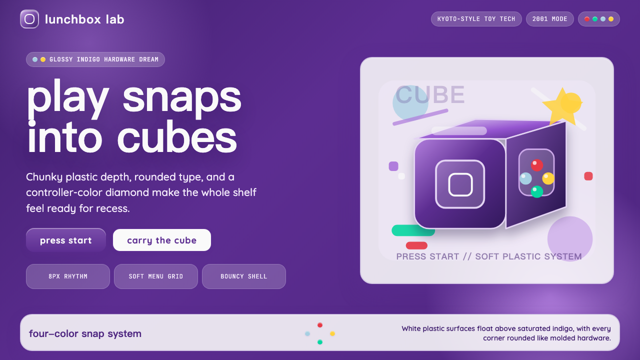
Indigo-Led Color System靛紫主导的色彩体系
The palette centers on a deep, saturated indigo — neither a cool violet nor a flat navy but a warm purple-blue that reads as uniquely playful in the consumer-electronics context. This base is complemented by the four-button primary quartet: vivid green, red, blue, and yellow. Each of the four accent colors is used at full chroma, without muddying or softening, which gives the system an almost graphic-design boldness. Whites and light grays function as neutral grounds, and the translucent purple elements introduce a luminous, backlit quality that softens the palette's intensity without neutralizing it.色板以深度饱和的靛紫为核心——既非冷调紫罗兰,也非平板深蓝,而是一种在消费电子语境中独特地传递游戏感的暖紫蓝色。这一基础由四键主色四重奏补充:鲜艳的绿、红、蓝、黄。四种点缀色均以全饱和度使用,不作任何混浊或柔化处理,赋予整套体系一种近乎平面设计的大胆感。白色与浅灰作为中性底面,而半透明紫色元素则引入一种发光的、被光穿透的品质,在不中和色板强度的前提下柔化其力度。
Glossy Gradient Depth光泽渐变深度
Unlike flat-design systems that reject all depth simulation, GameCube aesthetic embraces a specific kind of glossy, highlight-driven gradient that recalls the sheen of hard polished plastic. Surfaces catch a diffuse highlight near the top or center and deepen toward the edges, suggesting a convex, tactile form even in two-dimensional applications. This is not the soft atmospheric shadow of skeuomorphism or the hard offset shadow of Bauhaus — it is a surface-level luminosity that reads as material quality rather than spatial depth. The effect communicates that the object is solid, satisfying to hold, and manufactured with care.与拒绝一切深度模拟的平面设计系统不同,GameCube 美学拥抱一种特定的、以高光驱动的光泽渐变——它让人想起硬质抛光塑料的光泽。表面在顶部或中央附近捕捉漫射高光,向边缘逐渐加深,即使在二维应用中也暗示一种凸起的、可触摸的形态。这不是拟物化设计的柔和大气阴影,也不是包豪斯的硬边偏移投影——而是一种表层发光性,传达的是材质品质而非空间深度。这种效果传达出物体是坚实的、握持令人满足的、经过精心制造的。
Generous Rounded Corners慷慨的圆角
Every form in the GameCube visual language carries a pronounced curve radius at its corners — far beyond the subtle rounding that became a contemporary UI convention. This is not a polish detail but a formal commitment: rounded corners signal safety, approachability, and the tactile logic of a handheld object designed not to hurt you. In layout applications, this principle extends to cards, buttons, badges, and containers, all of which should feel chunky and friendly rather than precise and edged. The roundness is part of the personality, and trimming it back toward a tighter radius undermines the style's core warmth.GameCube 视觉语言中的每一个形态,在其转角处都带有明显的曲线半径——远超成为当代 UI 惯例的那种微妙圆润。这不是一个打磨细节,而是一种形式承诺:圆角传递安全感、亲近感,以及一件手持物品不会伤到你的触觉逻辑。在版面应用中,这一原则延伸至卡片、按钮、徽章与容器,所有这些都应感觉厚实而友好,而非精确而棱角分明。圆润是个性的一部分,将其收紧至更小的圆角半径会破坏这套风格的核心温度。
Toy-Scale Typography玩具尺度的字体排印
Text in the GameCube style is set with the deliberate boldness of a toy label rather than the precision of editorial type. Headlines favor rounded, slightly inflated letterforms — either rounded sans-serifs or display typefaces with a friendly, bubbly quality. Weight is used generously: where an editorial system might use a medium weight for body and a bold for headers, this style reaches for extra-bold or black weights at headline level. Letter-spacing is tight, reinforcing the chunky, self-contained feel. Body text remains readable but is secondary — this is a style where the headline is the experience and the body copy is supporting information.GameCube 风格的文字排印带有玩具标签式的刻意粗壮感,而非编辑字体的精准气质。标题偏好圆润、略微膨胀的字形——无论是圆润无衬线,还是带有友好、泡泡质感的展示字体。字重被慷慨使用:在编辑系统中或许使用中等字重作为正文、粗体作为标题的地方,这套风格在标题层级会选择特粗或黑体字重。字距收紧,强化厚实、自成一体的感觉。正文保持可读性,但处于次要地位——在这套风格中,标题才是体验本身,正文是支撑信息。
Translucent Accent Elements半透明点缀元素
A defining material signature of the GameCube era is the use of translucent or frosted plastic alongside the solid-colored primary material. In the original hardware this appears in the handle, the disc cover, and memory card edges. In two-dimensional design applications, this translucency translates to frosted-glass panels, semi-opaque overlays, or glassmorphism-adjacent cards that allow background color to bleed through at reduced opacity. The effect should preserve some legibility of whatever lies beneath — it is not a full opacity block but a layered luminosity. This distinguishes the style from pure opaque flat design and adds the specific lightness associated with that era of consumer tech.GameCube 时代最具定义性的材质标签之一,是在主体实色材料旁使用半透明或磨砂塑料。在原始硬件上,这体现于提手、碟仓盖和记忆卡边缘。在二维设计应用中,这种半透明性转化为磨砂玻璃面板、半透明叠加层,或允许背景色以降低不透明度渗透的类毛玻璃卡片。效果应保留底层内容的一定可读性——它不是完全不透明的遮挡,而是分层的发光性。这将这套风格与纯粹不透明的平面设计区分开来,并添加了与那个消费科技时代相关联的特有轻盈感。
Joyful Hierarchy快乐的层级感
Information hierarchy in the GameCube style is organized around emotional emphasis rather than pure logical ranking. The most important element on a layout is not necessarily the most information-dense — it is the most delightful. A bold color splash, an oversized icon, or a playful label gets visual priority even if it carries relatively little semantic weight. Supporting information steps back but does not disappear: it is rendered in a lighter weight or a neutral tone, allowing the hero element to dominate without abandoning legibility. This hierarchy rewards users who scan for feeling before they read for content — which is the natural behavior of a consumer engaging with a playful product.GameCube 风格的信息层级围绕情感强调而非纯逻辑排序组织。版面上最重要的元素不一定是信息密度最高的——而是最令人愉悦的。大胆的色彩飞溅、超大图标或玩味标签获得视觉优先级,即使它们承载的语义权重相对较少。支撑信息退后但不消失:以较轻的字重或中性色调呈现,让主角元素主导而不放弃可读性。这种层级奖励那些先感受后阅读的用户——这正是消费者与充满游戏感的产品互动时的自然行为。
Chunky, Tactile Form Language厚实的触觉形态语言
The GameCube aesthetic consistently prefers mass over thinness, substance over elegance, and tactile implied weight over visual lightness. Buttons look pressable. Cards look stackable. Iconography appears three-dimensional enough to pick up. This is the opposite of the ultra-thin, borderless minimalism that dominated design in the mid-2010s — it is a deliberate return to the period when designed objects were unafraid to take up space. In UI applications, this means borders and outlines are present rather than ghosted, interactive elements have visible states, and the overall impression is of a system that has physical confidence in itself.GameCube 美学始终偏好厚重而非纤薄、实质而非优雅、暗示触觉重量而非视觉轻盈。按钮看起来可以被按下,卡片看起来可以被叠放,图标看起来有足够的立体感可以被拿起。这与2010年代中期主导设计的超薄、无边框极简主义恰恰相反——它是对那个设计对象不惧占据空间的时代的刻意回归。在 UI 应用中,这意味着边框和轮廓是可见的而非幽灵化的,交互元素有可见的状态,整体印象是一套在自身存在上具有物理自信的系统。
See the Nintendo GameCube (2001) design system查看 Nintendo GameCube (2001) 完整设计系统
Who shaped Nintendo GameCube (2001)?谁塑造了 Nintendo GameCube (2001)?
Ashida led the industrial design of the GameCube hardware at Nintendo's Kyoto studios. His team was responsible for the console's distinctive cube form factor, the indigo and translucent-purple color system, and the ergonomically unconventional GameCube controller — a piece of input-device design that remains studied for its radical departure from the symmetric gamepad conventions of the preceding decade. Ashida's design approach at Nintendo consistently prioritized the emotional and tactile experience of holding hardware over its visual alignment with broader consumer-electronics trends, a philosophy that made each Nintendo product of the era immediately recognizable as distinct from the competition.芦田健一郎在任天堂京都工作室主导了 GameCube 硬件的工业设计。他的团队负责主机标志性的立方体形态、靛紫与半透明紫色的色彩系统,以及人体工程学上颇具争议的 GameCube 手柄——这件输入设备设计作品因其对前十年对称手柄惯例的激进偏离而至今仍被研究。芦田在任天堂的设计方法始终优先考虑手持硬件的情感与触觉体验,而非其与更广泛消费电子趋势的视觉对齐,这一哲学使那个时代每一款任天堂产品都能立即被辨认为有别于竞争对手的独特存在。
Miyamoto, as Nintendo's most senior creative director, set the overarching design philosophy that the GameCube hardware and software visual identity had to serve. His insistence that games and game hardware should communicate joy through their form — not just their content — shaped every aesthetic decision from the choice of indigo over neutral gray to the decision to make the carry handle a design feature rather than an afterthought. Miyamoto's practice of playtesting hardware in the hands of children and non-gamers to observe their emotional reactions directly informed the softened, approachable language of the GameCube era, and his influence ensured that playfulness was treated as a discipline rather than a decoration.宫本茂作为任天堂最资深的创意总监,设定了 GameCube 硬件与软件视觉身份必须服务的整体设计哲学。他坚持游戏与游戏硬件应通过形态而非仅仅通过内容来传达快乐——这一坚持塑造了每一个美学决定,从选择靛紫而非中性灰,到把携带提手做成设计特征而非事后想法。宫本茂将硬件交到儿童和非玩家手中进行游玩测试、直接观察情感反应的实践,直接影响了 GameCube 时代柔和、亲近的形态语言,而他的影响确保了游戏感被视为一门纪律而非一种装饰。
Iwata joined Nintendo as head of corporate planning during the GameCube's development and became president in 2002 as the console launched globally. His contribution to the GameCube design era was primarily one of communication and philosophy: under his direction, Nintendo's public-facing identity emphasized human connection and accessible fun over technical specification. This stance shaped how the visual identity was deployed in marketing — the indigo cube appeared in contexts of laughter and shared play rather than technical power — and set the groundwork for the DS and Wii eras that followed. Iwata's deep respect for both engineering precision and user empathy made him an unusual bridge between the technical and aesthetic ambitions of the GameCube project.岩田聪在 GameCube 开发期间以企业策划部长身份加入任天堂,并于2002年主机全球发售之际出任社长。他对 GameCube 设计时代的贡献主要体现在传播与哲学层面:在他的主导下,任天堂面向公众的身份强调人际连接与易于上手的乐趣,而非技术参数。这一立场塑造了视觉身份在营销中的部署方式——靛紫立方体出现在笑声与共同游玩的语境中,而非技术实力的展示——并为随后的 DS 与 Wii 时代奠定了基础。岩田聪对工程精度与用户同理心的深厚尊重,使他成为 GameCube 项目技术与美学抱负之间罕见的桥梁。
The GameCube did not emerge in a vacuum: it was the product of a specific moment in consumer-technology design history when translucent plastics and candy-colored housings became a shared aesthetic grammar. Apple's iMac G3 (1998) had demonstrated that consumers responded emotionally to hardware they could see through and that came in colors beyond beige. The movement — often called Y2K design — swept through electronics, household appliances, and even automotive interiors in the years around 2000. Nintendo absorbed this grammar and pushed it further, combining the translucence aesthetic with a stronger primary-color system and a more explicitly toy-derived formal language, resulting in a product that was simultaneously of its moment and distinctly itself.GameCube 并非凭空而生:它是消费科技设计史上一个特定时刻的产物——在那个时刻,半透明塑料与糖果色外壳成为共同的美学语法。苹果 iMac G3(1998年)已经证明,消费者会对可以透过外壳看见内部、并且有米色以外颜色的硬件产生情感反应。这场运动——通常被称为 Y2K 设计——在2000年前后席卷了电子产品、家用电器乃至汽车内饰。任天堂吸收了这套语法并将其推进得更远:将半透明美学与更强烈的主色系统以及更明确源自玩具的形态语言相结合,造就了一件既属于那个时代、又distinctly属于自身的产品。
How do you use Nintendo GameCube (2001) today?今天怎么用 Nintendo GameCube (2001)?
GameCube (2001) is a style whose personality is its primary asset, which means applying it correctly requires committing to its emotional register rather than borrowing only its surface details. The indigo-and-four-color system, the rounded forms, and the glossy depth all work together as a system. Using the rounded corners without the bold color, or the translucent elements without the playful hierarchy, produces something that feels neither authentically GameCube nor clearly anything else. The first discipline is committing to the whole vocabulary rather than sampling from it.GameCube(2001)是一套以个性作为首要资产的风格,这意味着正确应用它需要投入其情感基调,而非仅仅借用表面细节。靛紫加四色系统、圆润形态与光泽深度作为系统协同运作。单独使用圆角而不搭配大胆色彩,或使用半透明元素而不搭配玩味层级,产生的效果既不正宗地像 GameCube,也不清晰地像任何其他东西。第一条纪律是投入整套词汇,而非从中采样。
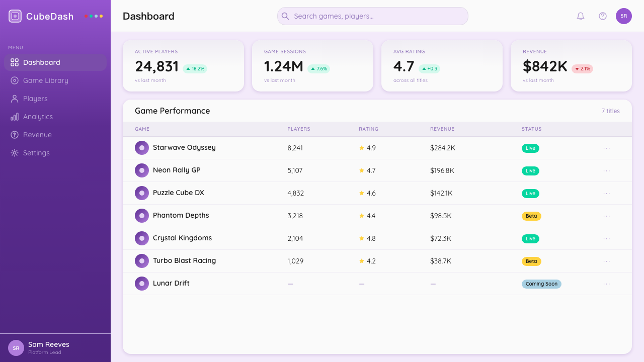
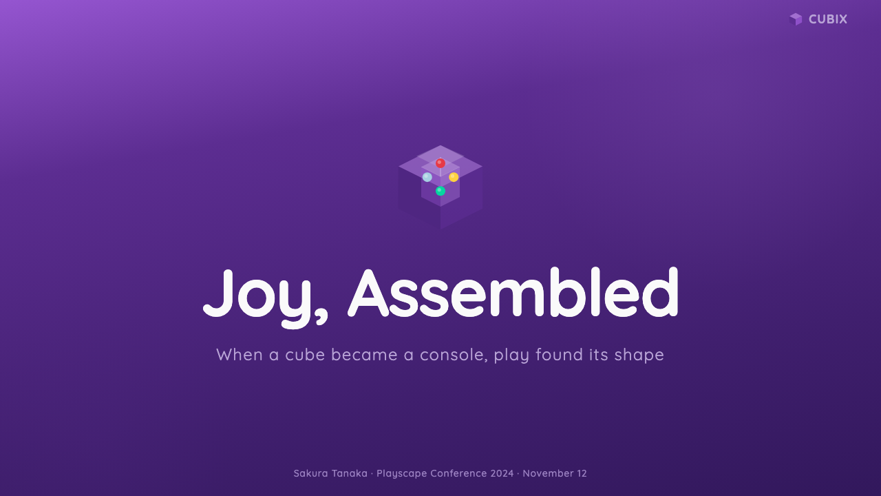
For presentation slides, the style works exceptionally well for product launches, team introductions, gaming or entertainment industry decks, and any context where warmth and energy are desired over formal authority. A cover slide benefits from the style's poster-like boldness: a large indigo ground with one oversized element — a bold typographic title, an icon rendered in the four-button palette, or a product hero shot — anchored against generous white space at the bottom for subtitle and date information. Content slides should use the rounded card system as their primary organizing principle, with each card carrying a distinct accent color drawn from the four-button palette to signal its category or priority. Data slides lean into the toy-scale approach: bar charts and bubble charts become bold geometric objects, with bars filled in the primary accent colors and value labels set in a heavy, rounded typeface.对于演示文稿,这套风格在产品发布、团队介绍、游戏或娱乐行业演讲以及任何希望温暖和活力胜过正式权威的场合表现出色。封面幻灯片受益于这套风格的海报式大胆感:大面积靛紫底面配合一个超大元素——大胆字体标题、以四键色板呈现的图标,或产品主图——锚定于底部为副标题和日期信息留出的慷慨留白。内容幻灯片应使用圆角卡片系统作为主要组织原则,每张卡片带有从四键色板中取出的独特点缀色,以标示其类别或优先级。数据幻灯片贯彻玩具尺度方法:柱状图和气泡图成为大胆的几何对象,柱条以主点缀色填充,数值标签以粗重圆润的字体设置。
For web interfaces, the style is best suited to consumer-facing products where delight is a feature: gaming platforms, children's educational tools, entertainment subscription services, and playful productivity tools aimed at creative professionals. Dashboard layouts should use the rounded card grid as their backbone, with interactive elements — buttons, toggles, badges — rendered in the full-chroma accent colors rather than muted variants. Pricing pages work well with the style's bold hierarchy: a featured tier gets a full indigo background with light text, flanked by lighter-toned alternatives that allow the primary selection to dominate. Navigation should be confident and label-heavy, with rounded pill-shaped active states replacing thin underlines.对于网页界面,这套风格最适合以愉悦感作为功能的面向消费者产品:游戏平台、儿童教育工具、娱乐订阅服务,以及面向创意专业人士的趣味生产力工具。仪表板布局应以圆角卡片网格为骨架,交互元素——按钮、切换开关、徽章——以全饱和度点缀色而非柔和变体呈现。定价页面配合这套风格的大胆层级效果良好:推荐套餐使用完整靛紫背景配浅色文字,两侧的替代选项使用较浅色调,让主要选项主导视觉。导航应当自信且标签丰富,以圆润胶囊形状的激活状态替代细线下划线。
For editorial and marketing work, GameCube (2001) suits campaign materials, event branding, social card series, and any communication that wants to feel celebratory and energetic. A social card template should commit to one dominant color per card — rotating through indigo, green, red, and yellow across a series — with a single bold typographic statement and a supporting line at smaller scale. Editorial layouts in this style avoid the narrow, justified body-text conventions of serious editorial; instead they prefer wider line spacing, shorter measures, and a reading experience that feels more like a magazine feature than a journal article. The key is maintaining the sense that reading is a pleasure rather than an obligation.对于编辑与营销内容,GameCube(2001)适合活动物料、活动品牌、社交卡片系列,以及任何希望感觉充满庆祝感和活力的传播。社交卡片模板应每张只提交于一种主导色——在一个系列中轮换靛紫、绿、红和黄——配合一句大胆字体声明和一行较小尺度的支撑文字。这种风格下的编辑版面避免严肃编辑的窄幅对齐正文惯例;取而代之的是更宽的行距、更短的行宽,以及一种感觉更像杂志专题而非学术期刊的阅读体验。关键在于维持阅读是一种愉悦而非义务的感觉。
A common mistake when applying GameCube (2001) is confusing playfulness with randomness. Authentic GameCube aesthetic is rigorous about which colors appear where and in what proportion: the indigo is the dominant ground, the four accent colors are used individually rather than simultaneously, and the translucent elements appear as highlights rather than backgrounds. Placing all four accent colors on the same panel, using random rounded shapes as decoration without structural purpose, or applying the glossy gradient to every element equally — all of these flatten the style into a generic retro-gaming pastiche. The discipline here is the same as in any strong design system: constraint enables personality, and personality requires restraint.应用 GameCube(2001)时最常见的错误是将游戏感与随机性混淆。正宗的 GameCube 美学对哪些颜色出现在哪里、以何种比例出现非常严格:靛紫是主导底面,四种点缀色单独使用而非同时出现,半透明元素作为高光而非背景出现。在同一面板上放置全部四种点缀色、将随机圆润形状作为没有结构目的的装饰使用、或对每一个元素均等地应用光泽渐变——所有这些都会将这套风格压平为一种泛化的复古游戏拼贴。此处的纪律与任何强大设计系统中的纪律相同:约束赋能个性,而个性需要克制。
See the Nintendo GameCube (2001) design system查看 Nintendo GameCube (2001) 完整设计系统
Nintendo GameCube (2001) — FAQNintendo GameCube (2001) · 常见问题
Is GameCube (2001) the same as general Y2K design?GameCube(2001)和泛泛的 Y2K 设计是同一回事吗?
They overlap but are not identical. Y2K design is a broad umbrella covering translucent plastics, iridescent surfaces, chrome gradients, and candy colors across many product categories from roughly 1997 to 2004. GameCube (2001) is a more specific and coherent visual system: it has a defined color anchor in indigo, a specific formal vocabulary in chunky rounded geometry, and a philosophical grounding in Nintendo's toy-tech approach that distinguishes it from purely trend-driven Y2K pastiche. Applying GameCube means applying a specific grammar, not just reaching for any translucent purple element from that era.两者有重叠,但并不相同。Y2K 设计是一个宽泛的大类,涵盖了大约1997年至2004年间跨越多个产品品类的半透明塑料、彩虹光泽表面、铬渐变和糖果色。GameCube(2001)是一套更具体、更连贯的视觉系统:它有明确的靛紫色彩锚点,有厚实圆润几何体的特定形态词汇,以及任天堂玩具科技方法所赋予的哲学基础——这将其与纯粹由趋势驱动的 Y2K 拼贴区分开来。应用 GameCube 意味着应用一套特定的语法,而非仅仅从那个时代拾取任何半透明紫色元素。
Can this style work for serious or professional products?这套风格能用于严肃或专业产品吗?
It can, but it requires careful calibration. The style's natural territory is consumer-facing products where warmth, approachability, and energy are assets. In more serious professional contexts — financial tools, medical platforms, enterprise analytics — the full GameCube vocabulary risks reading as juvenile or insufficiently authoritative. A productive approach in such contexts is to borrow specific elements selectively: the rounded card system and the confident color accents can work in a product-management tool or a creative-agency website, while the full glossy-gradient and four-color-diamond treatment is reserved for moments of celebration or reward states rather than the default UI.可以,但需要仔细校准。这套风格的自然领域是温暖感、亲近感和活力感是资产的面向消费者产品。在更严肃的专业场景中——金融工具、医疗平台、企业分析——完整的 GameCube 词汇可能被解读为幼稚或不够权威。在这类场景中富有成效的方法是有选择地借用特定元素:圆角卡片系统和自信的色彩点缀可以在产品管理工具或创意机构网站中发挥作用,而完整的光泽渐变与四色菱形处理则保留用于庆祝时刻或奖励状态,而非默认 UI。
How does this style handle dark mode?这套风格如何处理深色模式?
The canonical GameCube palette is light-ground — white or light gray backgrounds with the indigo and accent colors as dominant chromatic elements. A dark variant is possible and can work well, but it shifts the aesthetic toward something closer to an arcade interface or a gaming dashboard rather than the original toy-tech warmth. On a dark background, the indigo becomes a mid-tone accent rather than a ground color, and the four button colors may need to be toned down slightly to avoid overwhelming brightness. The translucent elements work particularly well in dark mode, as the frosted-glass quality creates a luminous layering effect against dark grounds without sacrificing legibility.标准的 GameCube 色板以浅色底面为基础——白色或浅灰背景配以靛紫和点缀色作为主要色彩元素。深色变体是可能的,也可以效果良好,但它会将美学转移向更接近街机界面或游戏仪表板的方向,而非原始的玩具科技温暖感。在深色背景上,靛紫成为中间调的点缀色而非底面色,四种按键颜色可能需要稍微降低饱和度以避免过于耀眼的亮度。半透明元素在深色模式中特别有效,因为磨砂玻璃质感在深色底面上创造出发光的分层效果,同时不牺牲可读性。
What makes this different from generic retro-gaming aesthetics?这套风格与泛化的复古游戏美学有何不同?
Generic retro-gaming aesthetics tend to reach for pixel art, scanlines, phosphor-glow gradients, and the visual language of cathode-ray-tube screens and eight-bit or sixteen-bit game graphics. GameCube (2001) is a different historical moment entirely — it is smooth, three-dimensional, plastic, and optimistic rather than pixelated, nostalgic, and screen-simulating. The style is rooted in physical industrial design rather than digital display artifacts. Confusing the two produces a hybrid that satisfies neither reference: pixels and rounded plastic do not share a visual logic, and combining them produces work that reads as confused rather than layered.泛化的复古游戏美学倾向于借助像素艺术、扫描线、荧光屏发光渐变,以及阴极射线管屏幕与八位或十六位游戏图像的视觉语言。GameCube(2001)完全是不同的历史时刻——它是流畅的、三维的、塑料质感的、乐观主义的,而非像素化的、怀旧的、模拟屏幕的。这套风格根植于实体工业设计而非数字显示器的人工痕迹。混淆两者会产生一种两端都无法满足的混合体:像素与圆润塑料没有共同的视觉逻辑,将它们组合只会产生读起来混乱而非有层次感的作品。
How should the four-button colors be distributed across a layout?四种按键颜色在版面中应如何分配?
The most common and most successful approach is to treat the four accent colors as a category system: each color is assigned to a distinct group, tier, or content type, and it appears consistently for that group across the entire design. This mirrors how the buttons functioned on the original controller — each color reliably meant something specific. What does not work is applying all four colors to a single hero element for visual richness, or cycling through them randomly across similar-level elements. The indigo should remain the dominant ground throughout; the four accent colors are highlights within that system, not competitors to it.最常见也最成功的方法是将四种点缀色作为类别系统:每种颜色被指定给某个独特的群组、层级或内容类型,并在整个设计中一致地为该群组出现。这映照了按键在原始手柄上的功能方式——每种颜色可靠地意味着某种特定的东西。不奏效的做法是为了视觉丰富性而将全部四种颜色应用于单一主角元素,或在同等级别的元素间随机循环使用它们。靛紫应在始终保持主导底面的地位;四种点缀色是该系统内的高光,而非与其竞争的角色。
Related design styles相关设计风格
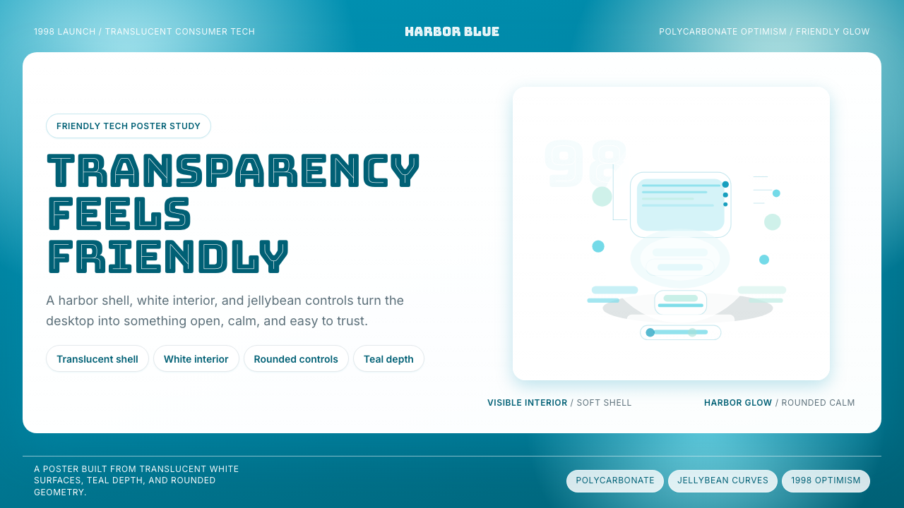 iMac G3 Bondi Blue (1998)Transparency feels friendly. Bondi blue, white glass, and pill curves set the…透明也很亲切。邦迪蓝、白色玻璃和圆润胶囊感定调。
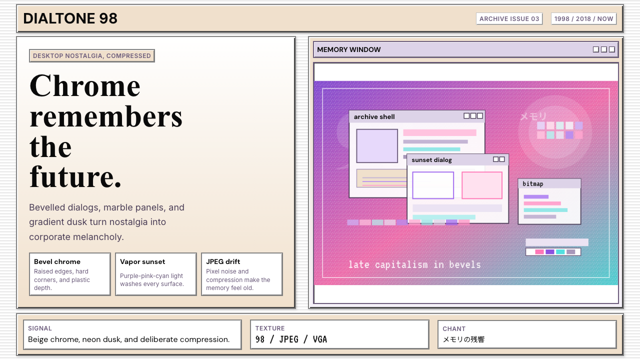 Windows 98 VaporwaveCorporate melancholy glows. Bevelled panels and purple-pink-cyan dusk do the…企业忧郁发光。凸起面板与紫粉青渐变撑起画面。
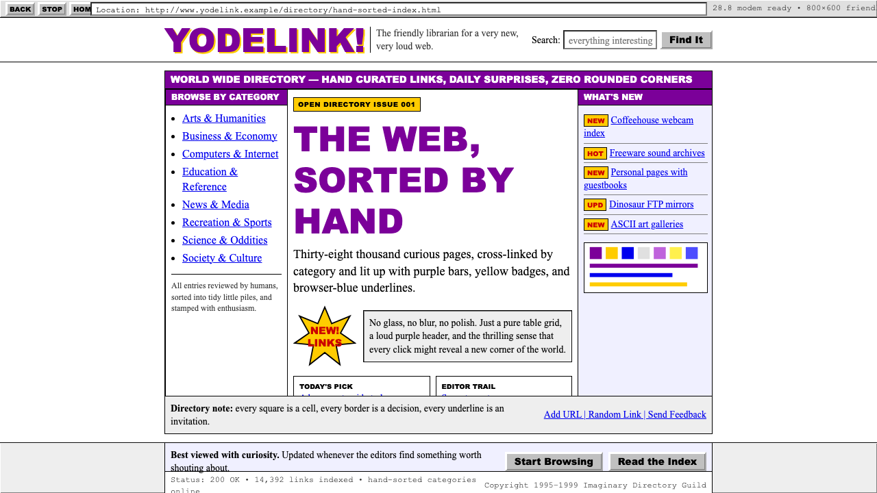 Yahoo! 1995Directory-era optimism. Purple table bars, yellow NEW badges, blue underlined…目录时代的乐观:紫色表格栏、黄色NEW徽章、蓝色下划线链接。
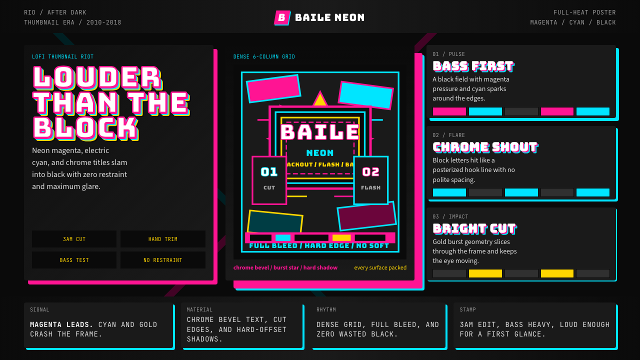 Funk Carioca FavelaMaximalist and unruly. Magenta, cyan, and chrome slam into black at thumbnail…极繁又躁动。洋红、电青与镀铬在黑底上硬碰硬。
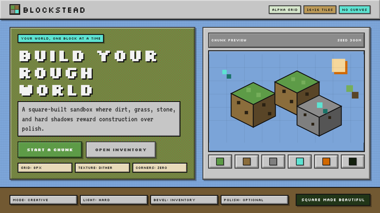 Minecraft VoxelUgly becomes buildable. Grass green, dirt brown, hard bevels, and 16×16 grids…丑也能亲手搭:草绿泥棕、硬边物品栏与16×16栅格。
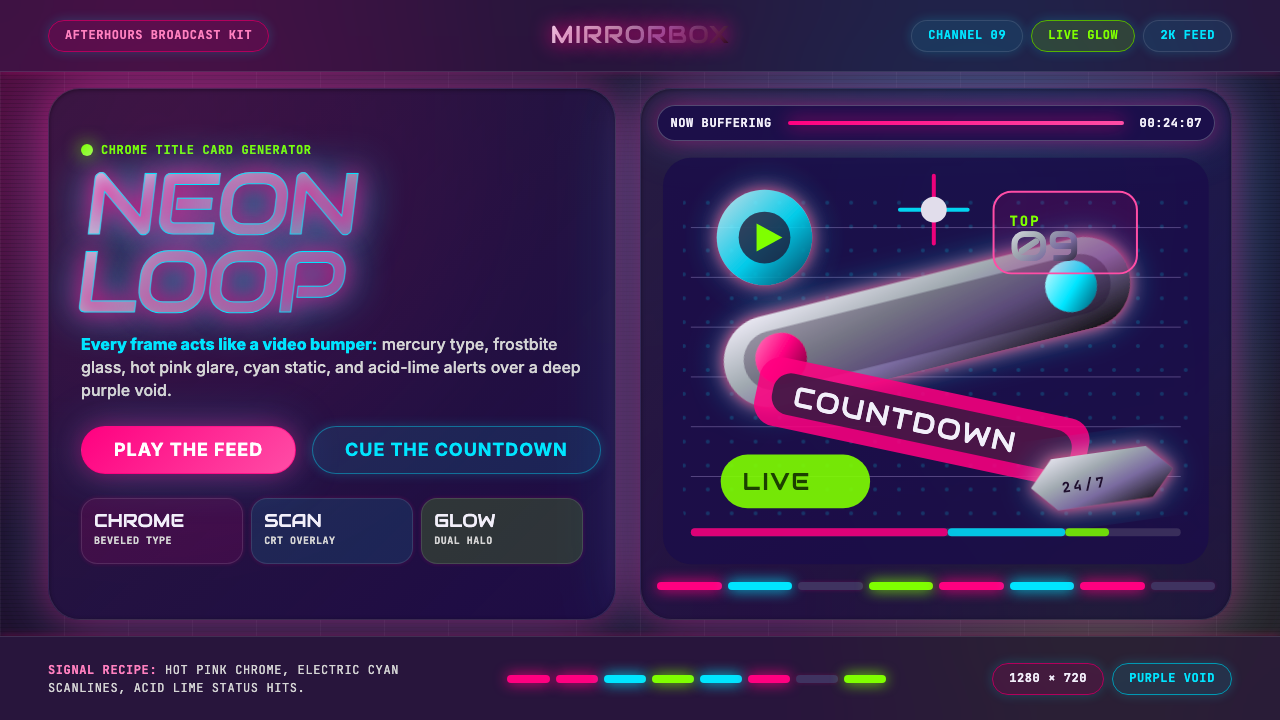 MTV Y2K (2000s)Maximum-volume Y2K. Hot pink chrome, cyan scanlines, and lime hits burn over…高音量千禧感:粉铬、青色扫描线与酸橙光烧过紫色虚空。