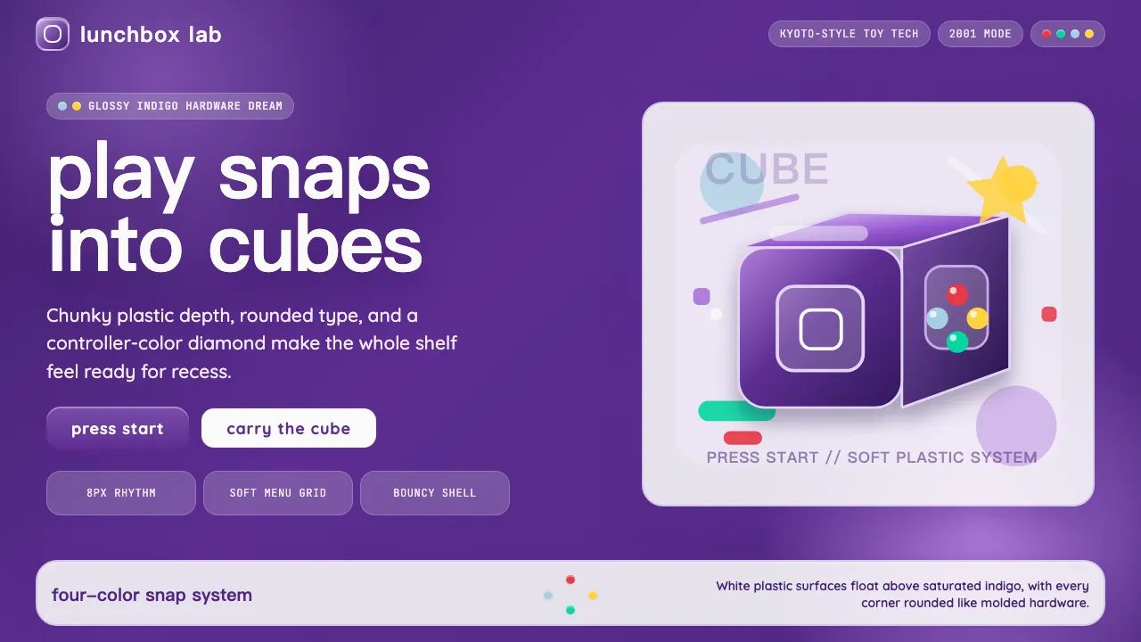
About Nintendo GameCube (2001)
The GameCube era distilled Nintendo's philosophy into a literal cube — friendly, chunky, and unapologetically plastic. Its indigo shell, translucent highlights, and four-color button diamond created a visual language that said "play" louder than any spec sheet could.
This system captures that 2001 toy-tech optimism: glossy gradients, generous rounded corners, and the confidence to make a game console look like a lunchbox you'd proudly carry to school.
- Origin
- Kyoto, Japan
- Era
- 2001 hardware launch; visual identity ~2001–2007
- Key figures
- Shigeru Miyamoto · Kenichiro Ashida · Satoru Iwata
- Movements
- Y2K consumer-tech translucence · Japanese toy-tech · post-N64 console-industrial design
Nintendo GameCube (2001) design spec
Colors
Background
Surface
Primary
Secondary
Accent
Text
Typography
VAG RoundedHeadings
QuicksandBody
JetBrains MonoMono
Unlock for 1 credit
The other 11 sections — buttons, cards, spacing, motion, techniques and more — open once you unlock. Download the DESIGN.md or send it to your AI in one click. Unlock once, yours forever.
Sign up nowHave an account? Sign in
Styles similar to Nintendo GameCube (2001)
Also inspired by brands & products, with a close feel.
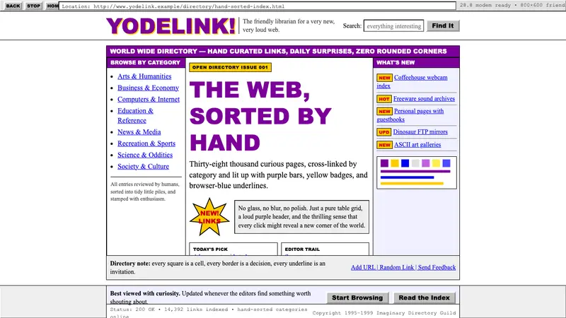 Yahoo! 1995Directory-era optimism. Purple table bars, yellow NEW badges, blue underlined links.
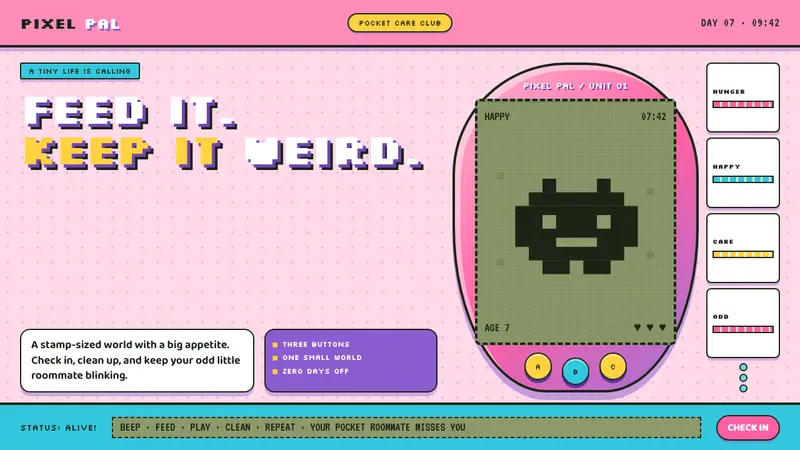 Tamagotchi (1996)Care gets candy-coated. Bubblegum plastic frames a crunchy pea-green pixel world.
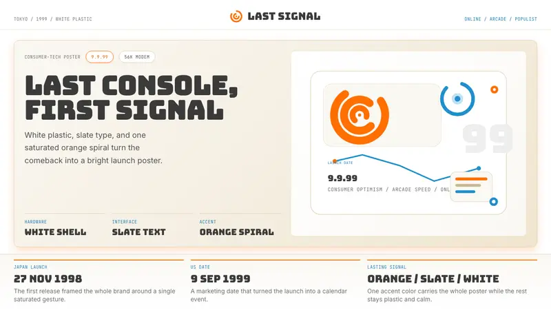 Sega Dreamcast (1999)Last-console cool. White plastic, slate type, and one orange spiral.
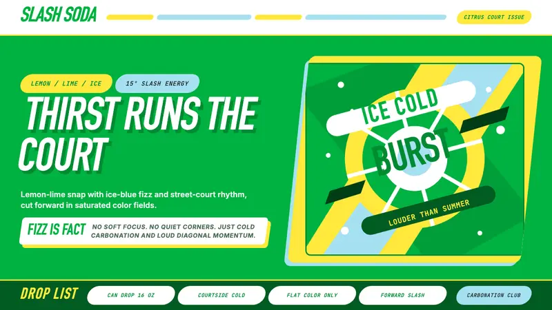 Sprite — Obey Your ThirstCitrus hits like asphalt heat. Saturated green, lemon yellow, and 15° slashes drive the poster.