What is Minecraft Voxel?什么是 Minecraft Voxel?
Minecraft proved that a world built from dirt-brown cubes and pixelated grass could become the best-selling game in history — because the grid itself was an invitation.《我的世界》证明了一件事:一个由泥土色方块和像素草地堆砌的世界,可以成为史上最畅销的游戏——因为那张栅格本身就是一封邀请函。
Minecraft Voxel in briefMinecraft Voxel 速览
Minecraft Voxel is the visual language born from Markus Persson's blocky sandbox game and refined across fifteen years of global play. Its grammar is built on three unbreakable constraints: every surface snaps to a square grid, every texture lives within a small, fixed resolution, and geometry is composed entirely from right-angle forms. No curves, no diagonals, no anti-aliasing. The result is an aesthetic that is immediately legible as digital, handmade, and infinite all at once.Minecraft Voxel 是由 Markus Persson 的方块沙盒游戏所孕育、经过十五年全球玩家打磨而成的视觉语言。它的语法建立在三条铁律之上:每一个面都对齐到方形栅格,每一张贴图都活在固定的低分辨率边界内,所有几何体都只由直角形态构成。不允许曲线,不允许斜线,不做抗锯齿。这套规则造就了一种审美——它同时呈现出数字感、手工感和无限延展感。
What distinguishes this style from generic pixel art is its three-dimensional commitment. Voxel design is not merely flat sprites scaled up — it is a full volumetric world rendered as stacked cubes, where every block casts hard-edge shadows onto its neighbors and light is calculated in discrete steps rather than continuous gradients. The signature color palette leans earthy and slightly desaturated: grass greens, soil browns, stone grays, and ore-tinged highlights punctuate a world that never feels artificially polished.将这种风格与普通像素艺术区分开来的,是它对三维空间的彻底承诺。体素设计不是简单放大的平面精灵图——它是一个由堆叠方块构成的完整体积世界,每个方块在相邻面上投下硬边阴影,光线以离散步进而非连续渐变的方式计算。标志性色板偏向朴实、略微去饱和:草地绿、泥土棕、石头灰,以及矿石高光点缀其中,整个世界从不显得经过人工打磨。
The style's most distinctive UI artifact is the inventory slot: a thick, dark border surrounding a lighter interior field, creating a recessed-tray illusion entirely through flat color. This component has become a cultural shorthand for 'crafting, building, and ownership.' When applied to design work outside gaming, Minecraft Voxel signals handcraft at digital scale, creative empowerment, and a certain honest roughness that audiences raised on the game immediately trust.这种风格最具辨识度的界面元素是物品栏格子:粗重深色边框围住浅色内底,完全通过平面色彩制造出内嵌托盘的视错觉。这个组件已经成为「制作、建造与拥有」的文化速记符号。当它被应用到游戏之外的设计工作中时,Minecraft Voxel 传递的是数字尺度上的手工质感、创造性赋权,以及一种在游戏中成长的受众群体本能信任的、诚实的粗粝感。
See the Minecraft Voxel design system查看 Minecraft Voxel 完整设计系统
Where does Minecraft Voxel come from?Minecraft Voxel 从何而来?
The Minecraft aesthetic was not designed — it was defaulted into. In early 2009, Markus 'Notch' Persson was working alone in Stockholm, building a survival game prototype inspired by Infiniminer, an open-source voxel mining game. The sixteen-by-sixteen texture resolution he chose was not a stylistic statement; it was a technical ceiling for a one-person project running on limited hardware. The blocky geometry followed directly from the voxel data structure: each unit of the world was a cube, so each face of the world was a square. Curves were simply not in the model.Minecraft 的美学并非被设计出来的——它是在技术默认中浮现的。2009 年初,Markus「Notch」Persson 独自在斯德哥尔摩工作,基于开源体素挖矿游戏 Infiniminer 搭建一个生存游戏原型。他选择十六乘十六的贴图分辨率,不是风格宣言,而是单人项目在有限硬件上的技术上限。方块几何直接来自体素数据结构:世界的每个单元是一个立方体,世界的每个面因此是一个正方形。曲线根本不在模型里。
Persson released the alpha publicly in May 2009, and the response was immediate. Players did not experience the low resolution as a limitation — they experienced it as a medium. The coarse texture tiles made it easy to read the world at a glance, and the grid made it possible to plan and execute constructions mentally before placing a single block. The aesthetic that had been a technical compromise became a design affordance. By the time the game reached full commercial release in November 2011, it had already sold over one million copies and the visual language was established.Persson 于 2009 年 5 月公开发布了 alpha 版本,反响立竿见影。玩家们并没有把低分辨率体验为一种局限,而是把它体验为一种媒介。粗糙的贴图格块让玩家可以一眼读懂世界,栅格让人在放置第一块方块之前就可以在脑中规划和演算建筑。原本是技术妥协的美学,变成了设计上的可供性。到 2011 年 11 月游戏正式商业发行时,它已经售出超过一百万份,这套视觉语言也随之定型。
Jens 'Jeb' Bergensten joined Mojang and took over primary development responsibility after the full release, continuing to expand the game's block vocabulary while rigorously preserving the core texture resolution and geometry rules. Each new material — prismarine, deepslate, copper — had to read legibly at the original tile size, a constraint that forced designers to work with silhouette and color contrast rather than fine detail. Jasper Boerstra later led texture work and produced a major visual refresh in 2019, updating hundreds of block textures for higher-fidelity monitors while preserving the characteristic palette relationships and the strict grid.Jens「Jeb」Bergensten 加入 Mojang 并在正式发行后接手了主要开发职责,持续扩展游戏的方块词汇,同时严格保留核心贴图分辨率与几何规则。每一种新材质——海晶石、深板岩、铜——都必须在原始贴图尺寸下清晰可辨,这一约束迫使设计师依靠轮廓和色彩对比而非精细细节来区分材质。Jasper Boerstra 后来主导纹理工作,于 2019 年完成了一次大规模视觉刷新,为数百种方块贴图更新了对高分辨率显示器的适配,同时保留了特有的色板关系与严格的栅格体系。
The broader cultural diffusion of the Minecraft aesthetic followed from YouTube and Twitch. By the mid-2010s, Minecraft was the most-viewed gaming content on the internet. The visual grammar — chunky geometry, earthy palette, pixelated inventory UI — was absorbed by an entire generation as a shared visual reference, much as earlier generations absorbed certain cartoon styles through Saturday morning television. By the early 2020s, the aesthetic had migrated out of gaming into merchandise, educational materials, event branding, and eventually into professional design work targeting audiences who had grown up building in the game.Minecraft 美学更广泛的文化扩散,跟随 YouTube 和 Twitch 而来。到 2010 年代中期,Minecraft 已经是互联网上被观看最多的游戏内容。这套视觉语法——厚重的几何体、朴实的色板、像素化的物品栏界面——被整整一代人作为共同的视觉参照系吸收内化,如同更早一代人通过周六早晨的电视节目吸收某种卡通风格一样。到 2020 年代初,这种美学已经从游戏迁移到了周边商品、教育材料、活动视觉识别,最终进入面向那些在游戏中长大的受众群体的专业设计工作。
What defines the Minecraft Voxel look?Minecraft Voxel 的视觉特征是什么?
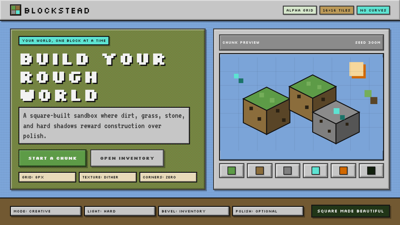
Grid Absolutism栅格绝对主义
Every element in the Minecraft Voxel system aligns to a square grid with no exceptions. There are no half-units, no optical corrections, no elements positioned between grid intersections. This rigidity is the style's structural spine: it makes compositions feel architecturally inevitable rather than arbitrarily placed. When applied to design work, the grid should be treated as a hard constraint, not a guide — elements either sit on it or they violate the system.Minecraft Voxel 体系中的每一个元素都无一例外地对齐到方形栅格。没有半格单位,没有视觉修正,没有元素被放置在栅格交叉点之间。这种刚性是这套风格的结构脊梁:它让构图感觉像建筑上的必然,而非任意摆放的结果。应用于设计工作时,栅格应被视为硬性约束而非参考线——元素要么贴合栅格,要么就是在违反这套系统。
Earthy, Slightly Desaturated Palette朴实、略去饱和的色板
The Minecraft palette is neither vibrant nor muddy — it occupies a specific middle register. Greens lean toward yellow-green rather than pure green; browns carry warmth without tipping into orange; stone tones stay cool without going clinical. Accent colors — lava orange, diamond blue, emerald green — appear as rewards amid the earthiness, never as background fields. The overall effect reads as organic and handmade even at high contrast, because no color is fully saturated to its maximum chroma.Minecraft 的色板既不鲜艳也不浑浊——它占据一个特定的中间音域。绿色偏向黄绿而非纯绿;棕色带有温暖感却不滑向橙色;石头色调保持冷静但不显得刻板。强调色——熔岩橙、钻石蓝、绿宝石绿——作为朴实底色中的奖励点缀出现,从不作为背景色场。整体效果即便在高对比下也显得有机而手工,因为没有任何颜色被推到最大饱和度。
Hard-Edge Dithered Shading硬边点阵抖动阴影
Depth and shadow in the voxel world are rendered through hard-edge value shifts and, in transition zones, through dithering — a checkerboard or diagonal pattern of two tones that the eye blends into a middle value. There are no soft gradients, no ambient occlusion halos, no gaussian blurs. Each face of each block receives a flat value — brighter on top-facing surfaces, darker on side-facing surfaces, darkest underneath. Shadow is structural information, not atmospheric mood.体素世界中的深度与阴影通过硬边明度跳变来渲染,在过渡区域则通过点阵抖动实现——两种色调以棋盘或斜向交错排列,使眼睛融合为一个中间值。没有柔和渐变,没有环境遮蔽光晕,没有高斯模糊。每个方块的每个面接受一个平铺明度——顶面较亮,侧面较暗,底面最暗。阴影是结构性信息,而非氛围情绪。
The Inventory Slot Component物品栏格子组件
The inventory slot is the style's most transferable UI primitive: a square cell with a thick, dark outer border, a medium-tone intermediate border, and a slightly lighter interior — all rendered as flat color blocks with no rounded corners and no drop shadows. The slight inset illusion created by the border sequence communicates 'container' without any literal depth simulation. This component works equally well at small icon scale and at large card scale, making it remarkably versatile for design systems that want to reference the aesthetic.物品栏格子是这种风格中可移植性最强的界面原语:一个带有粗重深色外边框、中间色调过渡边框、以及略浅内底的方形单元格——全部以平铺色块渲染,无圆角,无投影。由边框序列营造出的轻微内嵌错觉传达了「容器」的语义,而无需任何字面意义上的深度模拟。这个组件在小图标尺度和大卡片尺度下同样有效,使其在想要引用这种美学的设计系统中具有出色的通用性。
Chunky, Unrefined Typography粗厚、未经精修的字体排印
The in-game typeface is a bitmap font drawn on the same grid as the world: each character is composed of filled and empty squares rather than smooth vector curves. Letters read as constructed objects rather than refined glyphs. When applying the style to design work, this translates to a preference for display typefaces with visible structure — squared-off terminals, low contrast stroke variation, and a heaviness that reads from a distance. The feel is not polished; it is purposeful.游戏内字体是与世界同一栅格上绘制的位图字体:每个字符由填充和留空的方格构成,而非平滑的矢量曲线。字母读起来像是被搭建出来的对象,而非精修过的字形。将这种风格应用于设计工作时,这转化为对视觉上有明显结构感的展示字体的偏好——方形端点、低对比度笔画粗细变化,以及在远距离依然可读的厚重感。那种感觉不是精致,而是笃定。
Volumetric Thinking in Two Dimensions二维平面中的体积思维
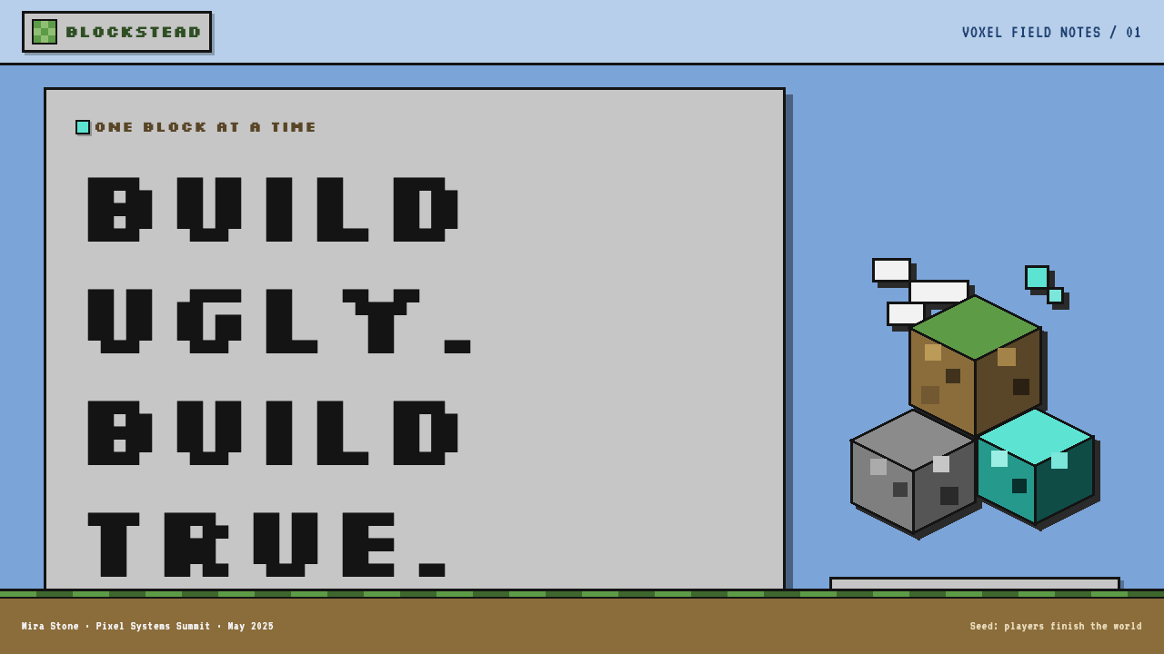
Even in flat design contexts, Minecraft Voxel composition maintains a sense of stacked, constructed volume. Elements are presented as faces of three-dimensional objects seen from a consistent angle — typically a slightly elevated isometric or axonometric viewpoint — rather than as flat shapes on a plane. This creates a characteristic spatial depth that distinguishes the style from standard pixel art: things feel built, not drawn.即便在平面设计语境下,Minecraft Voxel 的构图也保持着一种堆叠、搭建的体积感。元素被呈现为从一致视角——通常是略微抬高的等轴或斜轴视点——观察到的三维对象的面,而非平面上的平面形状。这创造出一种将这种风格与标准像素艺术区分开来的特有空间深度:东西感觉是被搭建出来的,而不是被画出来的。
Deliberate Pixel Visibility刻意呈现的像素可见性
The individual pixel — or block — is never hidden. Zoom controls and scaling are always set to integer multiples so that each source pixel maps to a clean square on screen. Subpixel rendering, bilinear smoothing, and any form of interpolation that would blur the grid are actively avoided. This choice is ideological: the pixel is a unit of construction, and the visible grid is a record of the work. Smoothing it out would erase the craft.单个像素——或方块——从不被隐藏。缩放比例始终设置为整数倍,使每个源像素在屏幕上精确映射到一个干净的方格。亚像素渲染、双线性平滑以及任何会模糊栅格的插值形式都被主动回避。这个选择是有意识形态立场的:像素是建造的单位,可见的栅格是劳动的记录。把它平滑掉,就是在抹去手艺本身。
See the Minecraft Voxel design system查看 Minecraft Voxel 完整设计系统
Who shaped Minecraft Voxel?谁塑造了 Minecraft Voxel?
Persson created the original Minecraft prototype in Stockholm in 2009, working alone and making purely pragmatic visual decisions that would define a global aesthetic. The choice to use small square textures, axis-aligned geometry, and a grid-locked world model was driven entirely by the scope of a solo project on consumer hardware. His willingness to release the unfinished prototype publicly and iterate based on player response established the aesthetic's first principles before any deliberate art direction had been applied. The visual language that emerged from his constraints has outlasted every technical limitation that created it.Persson 于 2009 年在斯德哥尔摩独自创建了 Minecraft 的最初原型,做出的全是纯粹务实的视觉决策,却由此定义了一种全球性美学。选择小尺寸方形贴图、轴对齐几何体和栅格锁定的世界模型,完全是单人项目在消费级硬件上的规模驱动。他愿意公开发布未完成的原型、基于玩家反馈迭代——这在任何刻意的美术指导介入之前,就奠定了这套美学的第一性原则。从他的约束中浮现出的视觉语言,已经比创造它的每一个技术局限活得更久。
Bergensten joined Mojang early and became the primary development lead after the full release, shepherding the game's visual vocabulary through a decade of expansion. His guardianship of the core visual constraints — maintaining the texture resolution rule even as computing power made larger textures trivially possible, and ensuring that each new block type read legibly within the established palette — transformed what could have been a relaxed early-release aesthetic into a durable, consistent design system. He is the figure most responsible for proving that the Minecraft visual language could scale.Bergensten 早期加入 Mojang,在游戏正式发行后成为主要开发负责人,带领游戏的视觉词汇经历了十年的扩展。他对核心视觉约束的守护——即便计算能力早已使更大贴图唾手可得,仍然坚守贴图分辨率规则,确保每一种新方块类型在既有色板中清晰可辨——将原本可能是松散早期版本美学的东西,转化为一套经久耐用、高度一致的设计系统。他是最有功劳证明 Minecraft 视觉语言可以伸缩自如的人。
Boerstra led the texture overhaul released in 2019, a project that updated hundreds of block textures to better suit high-resolution displays while preserving the distinctive palette relationships and grid discipline of the original style. The update required navigating an extremely vocal player community with strong opinions about visual fidelity versus familiarity — the new textures needed to read as Minecraft at a glance even while correcting inconsistencies that had accumulated over a decade. Boerstra's work demonstrates that a mature pixel-art visual system can be refined without being diluted.Boerstra 主导了 2019 年发布的纹理全面修订,该项目更新了数百种方块贴图,使其更适合高分辨率显示器,同时保留了原始风格的特有色板关系与栅格规律。这次更新需要在一个对视觉保真度与亲切感都有强烈意见的极具声量的玩家社群中穿行——新贴图需要一眼看去就像 Minecraft,同时修正十年来积累的各种不一致。Boerstra 的工作证明,一套成熟的像素艺术视觉体系可以被精炼,而无需被稀释。
An unusual feature of the Minecraft aesthetic is that it was co-developed by its player community as much as by its authors. Fan texture packs, resource packs, and community-made tools have continuously expanded and tested the boundaries of the visual system since 2009, creating a shared understanding of what changes the aesthetic can absorb and what changes break it. The community produced the first high-resolution texture packs, the first shader mods simulating realistic lighting, and the first explicit tests of which departures from the grid felt like enhancements versus violations. No other design system at this scale has been stress-tested by its users in quite the same way.Minecraft 美学的一个不寻常之处在于,它与其说是由作者开发,不如说是与玩家社群共同开发的。自 2009 年以来,玩家贴图包、资源包和社群工具持续扩展并测试这套视觉系统的边界,形成了一种共同理解——哪些改变可以被这套美学吸收,哪些改变会打破它。社群制作了第一批高分辨率贴图包、第一批模拟真实光照的着色器模组,以及对哪些偏离栅格的做法感觉像是增强、哪些感觉像是违规的第一批明确测试。没有任何其他同等规模的设计系统被它的用户以同样的方式进行过压力测试。
How do you use Minecraft Voxel today?今天怎么用 Minecraft Voxel?
Minecraft Voxel transfers well to design work when the target audience has grown up with the game or when the project goal is to evoke creativity, construction, and tangible ownership. Its structural principles — grid alignment, flat color, hard edges, and an earthy restricted palette — are concrete enough to apply systematically, but the style carries strong cultural associations that must be considered before deployment. It works best when those associations reinforce the product's values rather than merely decorating it.当目标受众是随这款游戏成长起来的群体,或当项目目标是唤起创造、建造与切实拥有感时,Minecraft Voxel 能很好地迁移到设计工作中。它的结构性原则——栅格对齐、平铺色彩、硬边线条、以及朴实而受限的色板——足够具体,可以系统性地应用;但这种风格带有强烈的文化联想,在部署之前必须认真考量。它在这些联想能够强化产品价值观而非仅仅装点产品的时候表现最好。
For presentation slides, the style is most effective on cover pages and section dividers where boldness matters more than information density. A cover built in this idiom uses a blocky isometric illustration as the dominant visual — rendered at a visible grid scale — with the title set in a heavy, square-terminal typeface against an earthy neutral ground. Content slides should be treated with restraint: the grid guides layout and spacing, the earthy palette limits color use to one or two accent tones, and data visualizations take on the appearance of block structures — bar charts rendered as stacked pixel-unit columns, progress indicators as partially filled grid rows. The style is less suited to dense data slides where fine-grained legibility is required at small scale.对于演示文稿,这种风格在封面页和章节分隔页上最为有效——那些大胆感比信息密度更重要的地方。用这种语汇制作的封面,以一幅方块等轴测插画作为主视觉——在可见栅格尺度下渲染——标题用粗重、方形端点的字体置于朴实中性底色之上。内容页应保持克制:栅格指导版面和间距,朴实色板将配色限制在一到两种强调色,数据可视化呈现出方块结构的外观——柱状图渲染为堆叠像素单元柱,进度指示器渲染为部分填充的栅格行。这种风格不太适合需要在小尺寸下高精度可读性的密集数据页。
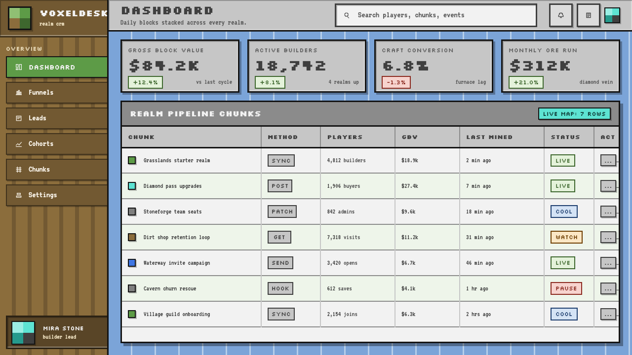
For web interfaces and dashboards, the approach works well for products targeting younger audiences, creative tools, educational platforms, and gaming-adjacent services. The key is applying the grid system structurally — a module-based layout where every card, button, and container width is a clean multiple of the base grid unit — and using the inventory-slot UI pattern for item or card containers. Background tones should stay in the earthy neutral range: warm off-whites, mid-tone stone grays, dark charcoal rather than pure black. Accent colors should be used as rewards, appearing on interactive states, highlighted tiers, or progress milestones rather than as ambient decoration. Navigation and labels benefit from a squared, slightly heavier typeface than the site's reading body text.对于网页界面和仪表板,这种方法适用于面向年轻受众的产品、创意工具、教育平台和游戏周边服务。关键在于从结构上应用栅格系统——一种基于模块的版面,其中每张卡片、每个按钮和每个容器的宽度都是基础栅格单位的整数倍——并将物品栏界面模式用于物品或卡片容器。背景色调应保持在朴实中性范围内:温暖的近白色、中调石头灰、深炭色而非纯黑。强调色应作为奖励出现,用在交互状态、高亮等级或进度里程碑上,而不是作为环境装饰。导航和标签受益于比正文阅读字体更为方正、略重的字体。
For editorial and marketing work, the style supports strong graphic boldness at large format — posters, event banners, social cards, and hero sections. An effective approach uses a grid-locked isometric construction scene as a full-bleed visual with the headline set in hard, blocky letterforms above or below. Marketing pages for products using this style benefit from alternating full-width sections that each feature a different earthy color field, maintaining palette coherence while creating visual rhythm. The style's honest, unfinished quality makes it work especially well for educational content, maker tools, and brands that want to signal that users are active creators rather than passive consumers.对于编辑和营销工作,这种风格在大幅面格式上支持强劲的图形大胆感——海报、活动横幅、社交卡片和首屏主视觉。一种有效的方式是将栅格锁定的等轴测建造场景作为满幅视觉,标题以硬朗、方块化的字形设置在上方或下方。使用这种风格的产品营销页面,受益于交替呈现的全宽区块,每个区块采用不同的朴实色彩底场,在保持色板连贯性的同时创造视觉节奏。这种风格诚实、未经打磨的质感,使其在教育内容、创客工具,以及想要传达「用户是主动创造者而非被动消费者」的品牌中表现格外出色。
The most common mistake when applying Minecraft Voxel is smoothing things out — adding rounded corners, soft drop shadows, gradients, or subpixel-antialiased type. Each of these choices erodes the style's defining characteristic: the visible construction grid. A second frequent error is palette drift toward hyper-saturated neon, which replaces the style's earthiness with a generic 'gaming' look that does not carry the Minecraft associations. A third pitfall is treating the aesthetic as inherently juvenile; applied with compositional rigor and strong typographic hierarchy, the style reads as confident and authoritative for audiences who grew up with it, regardless of the product's seriousness.应用 Minecraft Voxel 时最常见的错误是把东西做「圆滑」——添加圆角、柔和投影、渐变或亚像素抗锯齿字体。这些选择中的每一个都在侵蚀这种风格的核心特征:可见的建造栅格。第二个常见错误是色板漂向超饱和霓虹色,这会将风格的朴实感替换为一种通用的「游戏感」外观,无法承载 Minecraft 的文化联想。第三个陷阱是将这种美学视为天然幼稚的;当以严格的构图逻辑和强健的字体层级来应用时,这种风格对于随之成长的受众而言,无论产品多么严肃,都能呈现出自信而权威的气质。
See the Minecraft Voxel design system查看 Minecraft Voxel 完整设计系统
Minecraft Voxel — FAQMinecraft Voxel · 常见问题
Is Minecraft Voxel the same as pixel art?Minecraft Voxel 和像素艺术是同一回事吗?
They overlap but are not identical. Pixel art is a broad category covering any image where individual pixels are intentionally visible and the low-resolution grid is a deliberate aesthetic choice — this includes everything from classic arcade sprites to contemporary indie game graphics. Minecraft Voxel is a specific subset: three-dimensional, volumetric, and defined by the cubic block as the fundamental unit rather than the flat sprite. The isometric and axonometric depth of voxel art, the distinctive earthy palette, and the inventory-slot UI component are all specific to the Minecraft idiom. You can make pixel art that looks nothing like Minecraft, but Minecraft Voxel work is always a form of pixel art.两者有重叠,但并不相同。像素艺术是一个宽泛的类别,涵盖任何个别像素被有意呈现、低分辨率栅格被作为刻意美学选择的图像——从经典街机精灵图到当代独立游戏图形都包含在内。Minecraft Voxel 是其中一个特定子集:三维的、体积性的,以立方体方块而非平面精灵图作为基本单元。体素艺术的等轴测和斜轴测深度、特有的朴实色板,以及物品栏格子界面组件,都是 Minecraft 语汇所特有的。你可以制作与 Minecraft 毫无关联的像素艺术,但 Minecraft Voxel 的作品始终是像素艺术的一种形式。
Can this style work for professional or enterprise-facing products?这种风格能用于专业或企业级产品吗?
It can, but with significant caveats. The Minecraft Voxel aesthetic carries strong associations with play, childhood, and consumer gaming. In an enterprise context — financial dashboards, B2B SaaS, legal or medical software — these associations can undermine the product's authority unless the target user base explicitly values them. The style works in enterprise contexts when the product itself is about building or construction (project management, infrastructure tooling, developer platforms), when the audience is heavily weighted toward engineers or technical users who grew up with the game, or when the brand is explicitly positioning itself as anti-corporate. Outside those conditions, the structural principles of the style — grid rigor, flat color, hard edges — can be borrowed without the full Minecraft palette and iconography.可以,但有重大前提条件。Minecraft Voxel 美学承载着与游戏、童年和消费级游戏产业的强烈联想。在企业语境下——金融仪表板、B2B SaaS、法律或医疗软件——这些联想可能削弱产品的权威感,除非目标用户群体明确地珍视这些联想。在以下情况下,这种风格可以在企业语境中发挥作用:产品本身与建造或构建相关(项目管理、基础设施工具、开发者平台);受众群体以随游戏成长的工程师或技术用户为主;或者品牌明确将自身定位为反企业文化。在这些条件之外,这种风格的结构性原则——栅格的严格性、平铺色彩、硬边线条——可以被借鉴,而无需采用完整的 Minecraft 色板和图标语汇。
How do you handle text legibility at small sizes in this style?在这种风格中,如何处理小尺寸下的文字可读性?
This is the style's most practical challenge. Bitmap fonts drawn on the game's own grid break down at sizes smaller than their native resolution and become illegible at typical body text scales in web or print contexts. The solution in applied design work is to use the Minecraft aesthetic for display text and structural elements — headlines, labels, UI chrome — while switching to a well-hinted, slightly squared sans-serif typeface for body text and any content that must be read continuously. The key is maintaining the structural vocabulary of the style (grid alignment, hard edges, earthy color) in the display layers while allowing the reading layer to be conventionally legible. Pixel-perfect bitmap fonts should be reserved for large-scale display use where their construction character reads as intentional rather than technical limitation.这是这种风格最实际的挑战。在游戏自身栅格上绘制的位图字体,在小于其原生分辨率的尺寸下会失去可读性,在网页或印刷语境中的典型正文尺寸下则会变得无法辨认。应用设计工作中的解决方案是:将 Minecraft 美学用于展示文字和结构性元素——标题、标签、界面框架——而将正文和任何需要连续阅读的内容切换到暗示良好、略带方正感的无衬线字体。关键是在展示层保持这种风格的结构性词汇(栅格对齐、硬边线条、朴实色彩),同时让阅读层保持常规的可读性。像素精确的位图字体应保留用于大尺度展示场合,在那里它们的建造感特质被读作有意为之,而非技术局限。
What makes an application of this style feel authentic versus superficial?是什么让这种风格的应用感觉真实而非流于表面?
Authentic application starts with the grid — not as a layout guide but as a hard constraint that governs every element's size, position, and proportion. Superficial application typically applies visible pixels and blocky illustrations as decorative layer on top of an otherwise conventional layout with rounded corners, soft shadows, and full-saturation accent colors. The test is simple: if you removed the pixel-art elements, would the underlying layout still feel like Minecraft? If yes, the style is structural. If the layout immediately reads as generic web design, the Minecraft elements are decoration. Authentic work also uses the earthy palette as a system — browns, warm grays, and muted greens as the dominant field, with saturated accents deployed sparingly — rather than mapping bright saturated colors across all elements for visual energy.真实的应用从栅格开始——不是作为版面参考线,而是作为支配每个元素尺寸、位置和比例的硬性约束。流于表面的应用通常是把像素可见的图形和方块插画作为装饰层叠加在一个依然常规的版面之上——圆角、柔和阴影、满饱和度强调色,一个都不少。测试方法很简单:如果去掉像素艺术元素,底层版面还会有 Minecraft 的感觉吗?如果是,这种风格是结构性的。如果版面立刻读起来像通用网页设计,那么 Minecraft 元素只是装饰。真实的作品还将朴实色板作为一个系统来使用——棕色、暖灰色和静默绿色作为主导底场,饱和强调色被节制地部署——而不是为了视觉活力把鲜艳饱和色铺满所有元素。
Does the style have a dark mode?这种风格有深色模式吗?
The natural dark mode for Minecraft Voxel is the cave interior or the nighttime overworld — deep charcoal grounds with torch-orange and lava-glow accents, rather than the pure black of typical dark mode interfaces. A well-executed dark variant maintains the earthy character of the palette: backgrounds should read as dark stone or deep soil rather than as pure neutral black. Accent colors need rebalancing at this end of the value range — earthy greens and warm oranges hold up well, while sky blues tend to flatten. The inventory slot component translates effectively to dark mode by darkening the field while maintaining the tonal sequence of the borders. The critical mistake to avoid is converting to pure white text on pure black background, which eliminates the earthy warmth that gives the style its character.Minecraft Voxel 自然的深色模式是洞穴内部或夜晚世界的地表——深炭灰底色配以火把橙和熔岩光晕作为强调,而非典型深色模式界面那种纯黑。执行良好的深色变体保持色板的朴实性格:背景应该读起来像深色石头或深层泥土,而非纯中性黑。强调色在这端明度范围内需要重新平衡——朴实绿和暖橙色表现良好,而天空蓝则容易变平。物品栏格子组件通过加深底场同时保持边框的色调序列,能够有效迁移到深色模式。需要避免的关键错误是转换为纯白字加纯黑底,这会消除赋予这种风格性格的朴实温度。
Related design styles相关设计风格
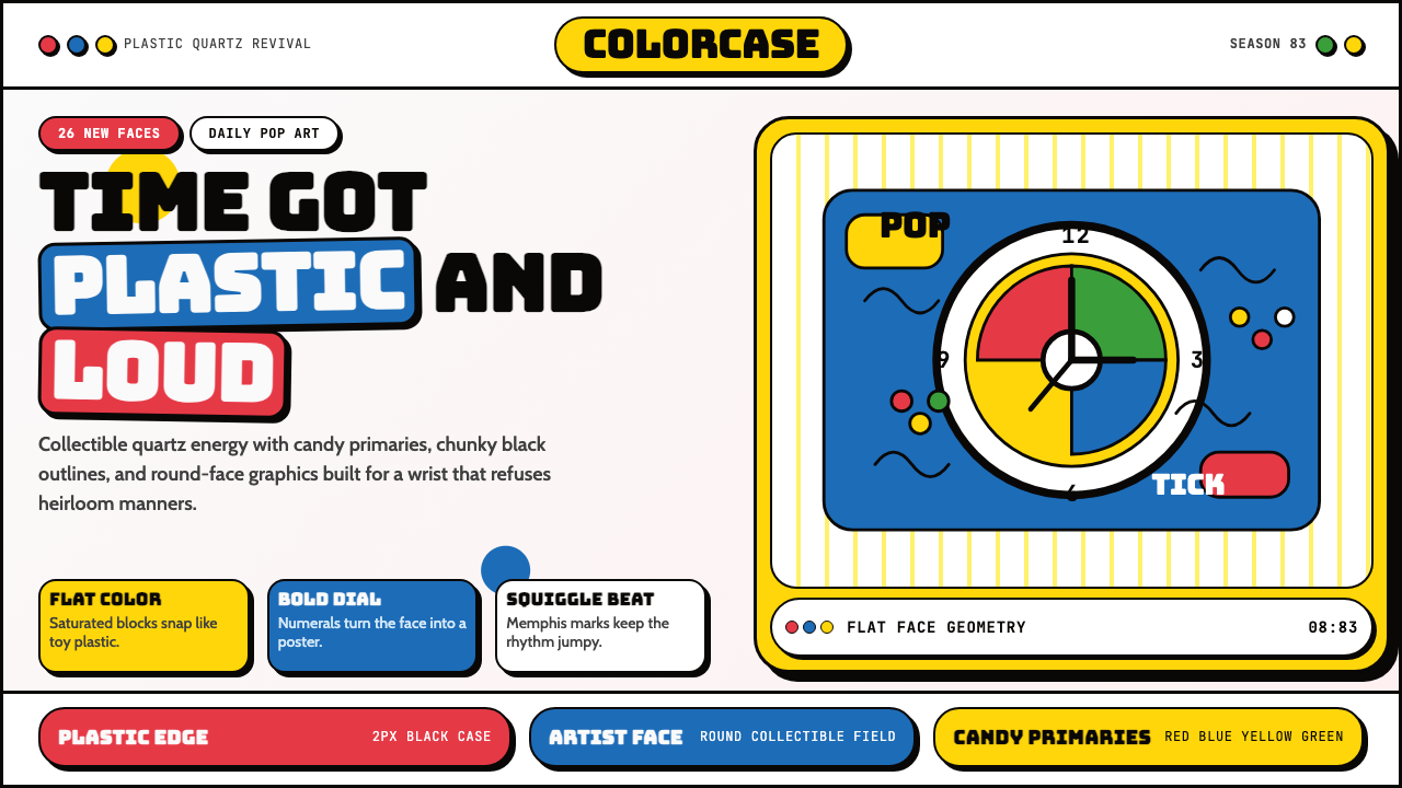 Swatch Watch (1983)Pop plastic optimism. Bungee type, candy primaries, round dials and squiggles…塑料乐观主义:Bungee 字体、糖果三原色、圆表盘与波浪线一起跳响。
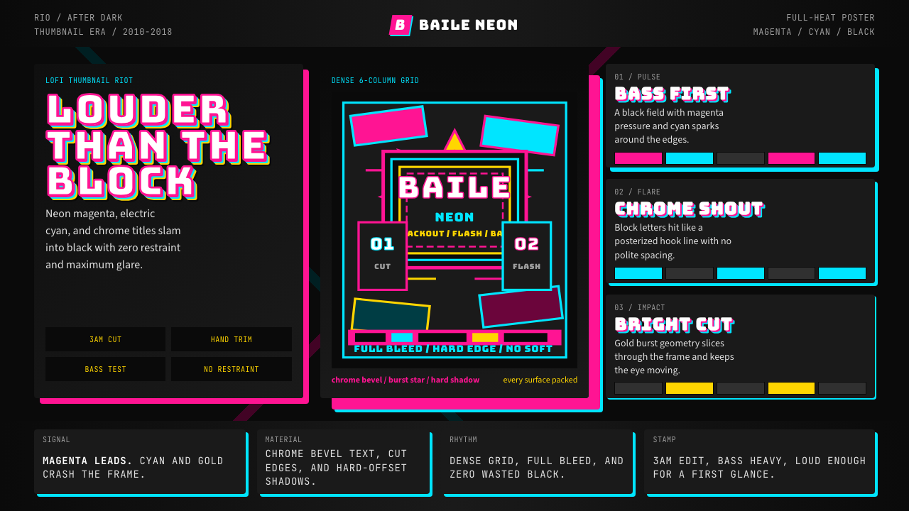 Funk Carioca FavelaMaximalist and unruly. Magenta, cyan, and chrome slam into black at thumbnail…极繁又躁动。洋红、电青与镀铬在黑底上硬碰硬。
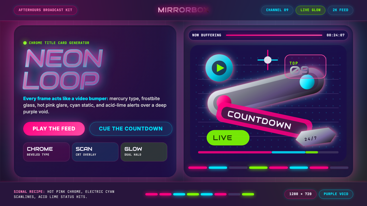 MTV Y2K (2000s)Maximum-volume Y2K. Hot pink chrome, cyan scanlines, and lime hits burn over…高音量千禧感:粉铬、青色扫描线与酸橙光烧过紫色虚空。
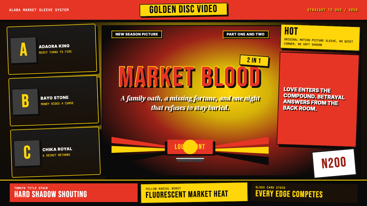 Nigerian Nollywood DVD Poster (2010)Market-stall cinema shouts. Tomato red type and yellow burst collide on jet b…市场摊位式电影在喊:番茄红大字与黄色爆裂撞上黑底。
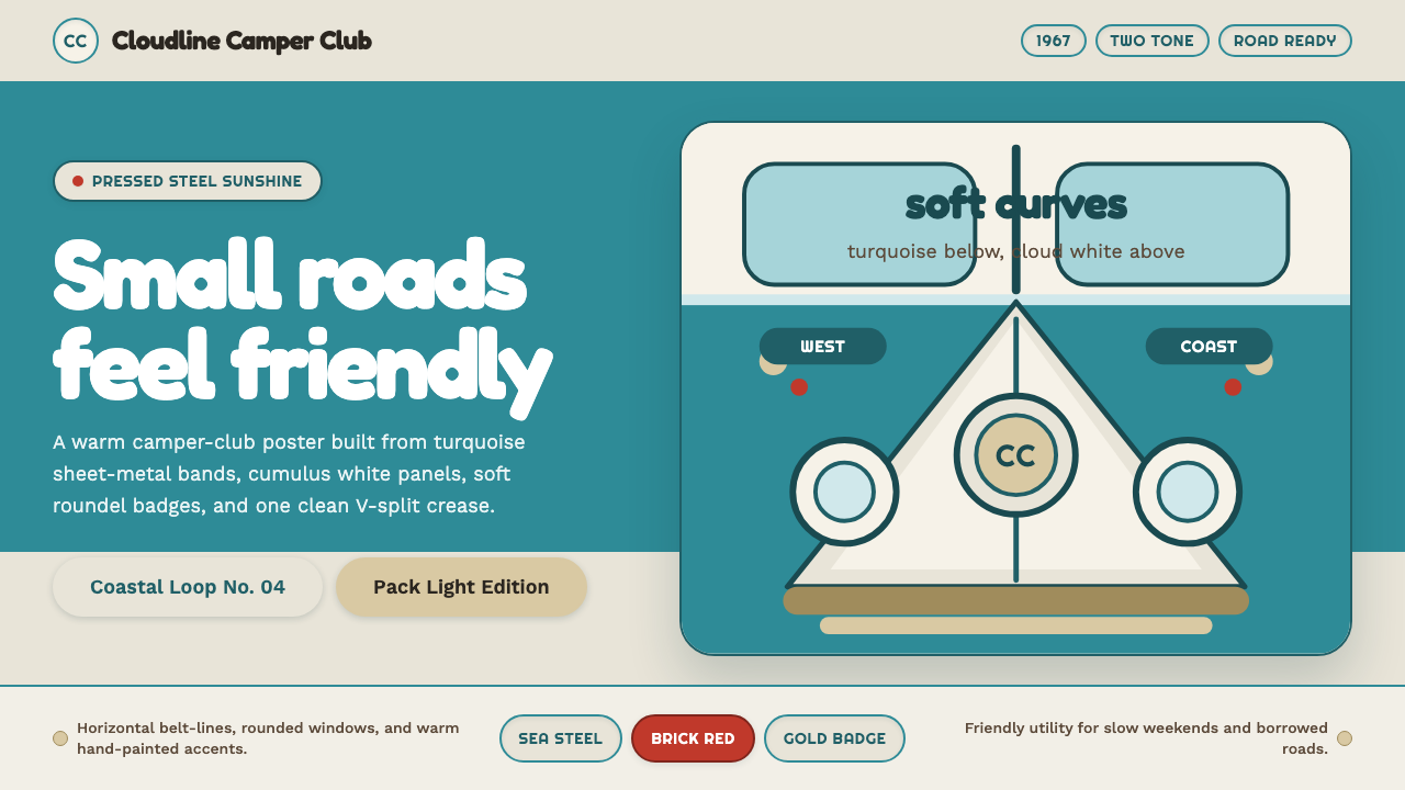 VW Kombi BusSunny steel optimism. Turquoise-and-white belt lines, Fredoka curves, warm go…晴朗钢板乐观主义。青绿白双色腰线、Fredoka圆角与金色徽章。