What is Swatch Watch (1983)?什么是 Swatch Watch (1983)?
Swatch turned the wristwatch into a daily pop-art accessory — cheap plastic, candy colors, and bold geometry that rescued Swiss timekeeping and redefined fashion's relationship with function.Swatch 将手表变成日常波普艺术配饰——廉价塑料、糖果色彩与大胆几何,拯救了瑞士制表业,也重新定义了时尚与功能的关系。
Swatch Watch (1983) in briefSwatch Watch (1983) 速览
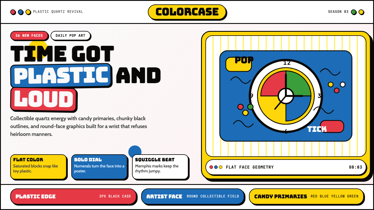
Swatch is a Swiss watch brand and design language born in 1983 in Biel/Bienne, Switzerland. Its visual identity fuses the playful geometry of the Memphis Group with the saturated optimism of 1980s mass-market consumer culture, producing a look that is simultaneously Swiss-precise and joyfully irreverent. Round dial compositions, thick black outlines, flat candy-bright color fields, squiggle lines, polka-dot grids, and artist-collaborated face graphics define the aesthetic.Swatch 是1983年诞生于瑞士比尔/比安的手表品牌与设计语言。其视觉身份将孟菲斯设计组的趣味几何与八十年代大众消费文化的饱和乐观主义融为一体,形成一种既瑞士精准又欢快无忌的面貌。圆形表盘构图、粗黑轮廓线、平涂糖果亮色色块、波浪线、圆点网格,以及艺术家联名表盘图形,共同定义了这套美学。
The style operates by treating the watch face as a canvas — a small but highly visible circular surface where color, pattern, and typography compete for attention without any of the reserve associated with traditional horology. Swatch dials embrace loudness as a virtue. Background fields are saturated primaries or pastel secondaries; indices and hands are graphic elements rather than functional signifiers; and the entire composition is sealed beneath a plastic crystal that amplifies the toy-like quality of the object.这种风格将表盘视为画布——一个小而高度可见的圆形表面,色彩、图案与字体在此争相夺目,毫无传统钟表学那份矜持。Swatch 表盘将响亮视为美德:底面色场是饱和三原色或粉嫩间色,刻度与指针是图形元素而非功能符号,整个构图封存在塑料表镜之下,进一步放大了物件的玩具质感。
Beyond the dial, the design language extends to strap graphics, packaging, and marketing materials, all of which share the same vocabulary: flat color, rounded forms, informal hand-drawn lettering alongside bold compressed display type, and an overall sense that the object is meant to be noticed, collected, and worn differently each day. This pop sensibility — the idea that a watch is not an heirloom but a mood — is the philosophical core of the Swatch aesthetic.设计语言延伸至表带图案、包装与营销物料,这一切共享同一词汇:平涂色彩、圆润形态、非正式手写字与粗壮压缩展示字体并置,以及整体上那种物件理应被注意、被收藏、每天换着戴的感觉。这种波普感性——手表不是传家宝而是心情的具现——是 Swatch 美学的哲学核心。
See the Swatch Watch (1983) design system查看 Swatch Watch (1983) 完整设计系统
Where does Swatch Watch (1983) come from?Swatch Watch (1983) 从何而来?
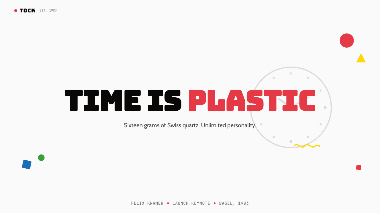
The Swatch story begins with a crisis. By the late 1970s, the Swiss watch industry had been devastated by Japanese quartz technology. Brands that had dominated the market for generations suddenly found themselves unable to compete on price or volume. The industry's response, orchestrated in large part by Nicolas G. Hayek and the newly formed SMH group (later Swatch Group), was counterintuitive: instead of competing on precision or prestige, they would compete on personality. The watch would become a fashion object.Swatch 的故事始于一场危机。七十年代末,日本石英技术重创瑞士制表业,数代称霸市场的品牌骤然发现自己在价格与产量上无力竞争。以尼古拉斯·海耶克为核心、通过新组建的 SMH 集团(后改名 Swatch 集团)策划的应对之策出人意料:不在精度或声望上竞争,而在个性上竞争。手表将成为时尚物件。
Engineers Elmar Mock and Jacques Müller solved the manufacturing puzzle in Neuchâtel: by injection-molding the case and movement together as a single plastic unit, they reduced the part count from around ninety to fifty-one components and enabled a production cost that made a sub-thirty-franc retail price possible. The technical achievement was extraordinary, but it was the design decision that followed which defined the brand. With production costs low enough that the watch could be treated as disposable — or more precisely, as collectible — the surface became free for pure expression. The dial was handed to artists and graphic designers.工程师埃尔玛·莫克与雅克·穆勒在纳沙泰尔解决了制造难题:通过将表壳与机芯注塑为一体的单一塑料单元,他们将零件数量从约九十件压缩至五十一件,使低于三十法郎的零售定价成为可能。这是非凡的技术成就,但随之而来的设计决策才真正定义了这个品牌。生产成本低到可以将手表当作一次性品——或更准确地说,当作收藏品——表面由此获得了纯粹表达的自由。表盘被交给了艺术家与平面设计师。
The first Swatch collection launched in March 1983 with twelve models. The early releases established the core visual grammar: round white or boldly colored dials, applied graphics that referenced pop art and street culture, and an unmistakable plastic transparency on the strap that showed the mechanism beneath. By 1985, the brand had established its artist-collaboration program, commissioning work from figures including Keith Haring, whose graphic line-figures and thick black outlines translated almost perfectly to the circular dial format. Haring's Swatch designs — produced in 1985 and 1986 — became among the most sought-after collectibles of the decade.首批 Swatch 系列于1983年3月发布,共十二款。早期产品确立了核心视觉语法:圆形白色或大胆彩色表盘,引用波普艺术与街头文化的应用图形,以及表带上标志性的透明塑料——可以透见其下的机芯。到1985年,品牌建立了艺术家合作计划,委托了包括凯斯·哈林在内的创作者。哈林的图形线条人物与粗黑轮廓线几乎完美地转化到圆形表盘格式之上。他于1985至1986年间设计的 Swatch 款式,成为那个十年最受追捧的收藏品之一。
The cultural timing was perfect. The mid-1980s were a moment of intensive cross-pollination between art, commerce, and popular culture. The Memphis Group, founded in Milan in 1981, had spent several years making the case that design could be playful, irrational, and decorative without apology. Andy Warhol had long since established that popular objects were legitimate artistic subjects. Street art was moving from New York walls into gallery spaces. Swatch landed in the middle of all of this as a product that was already all three: functional object, fashion accessory, and collectible artwork. The watch's circular format became a kind of recurring graphic problem solved differently each season, accumulating into an ongoing visual archive of 1980s and 1990s popular aesthetics.文化时机恰到好处。八十年代中期是艺术、商业与大众文化深度交融的时刻:1981年在米兰成立的孟菲斯设计组花了数年时间证明设计可以不加掩饰地趣味横生、非理性且装饰性十足;安迪·沃霍尔早已确立大众物件是合法的艺术主题;街头艺术正从纽约墙壁移入画廊空间。Swatch 恰好降落于此,作为一件同时是功能物件、时尚配饰与收藏艺术品的产品。手表的圆形格式成为一道每季以不同方式求解的图形题,积累为一份八九十年代大众美学的持续视觉档案。
What defines the Swatch Watch (1983) look?Swatch Watch (1983) 的视觉特征是什么?
Color色彩
Color is the loudest tool in the Swatch vocabulary. Palettes reach for full saturation without apology: pure primary red, royal blue, canary yellow, and a supporting cast of hot pink, acid green, and electric orange. These are not toned or muted — they are candy-store saturations applied flatly, usually against each other or against clean white. The interaction between high-saturation hues creates the sense of visual energy the style depends on. Pastels appear as a seasonal softening — mint, peach, powder blue — but always retain the flatness and graphic clarity of their louder counterparts.色彩是 Swatch 词汇中最响亮的工具。色板毫不犹豫地追求完全饱和:纯正红、皇室蓝、金丝雀黄,以及热粉、荧光绿、电光橙的配角阵容。这些色彩不被调和或减淡——它们以糖果铺那种饱和度平涂,通常彼此相对,或与纯白相对。高饱和色调之间的互动制造了这种风格赖以为生的视觉能量感。粉嫩色调作为季节性柔化出现——薄荷、蜜桃、粉蓝——但始终保持与其更响亮同伴一致的平涂质感和图形清晰度。
Round Dial Composition圆形表盘构图
The circular canvas is the defining constraint of the Swatch design language. Every graphic decision — color fields, pattern repeats, figure placement, typographic elements — must resolve within a circle, a format that encourages radial symmetry, concentric layering, and dynamic rotational balance. This constraint produces a characteristic compositional logic that carries over into non-watch applications: Swatch-inspired design tends to favor circular or oval framing, centered compositions with graphic incidents at the edges, and a strong focal point at the center of a bounded field.圆形画布是 Swatch 设计语言的决定性约束。每一个图形决策——色彩色场、图案重复、人物位置、字体元素——都必须在圆形内解决。这一格式鼓励放射对称、同心层叠与动态旋转平衡。这种约束产生了一种标志性的构图逻辑,并延伸到非手表应用场景:受 Swatch 启发的设计倾向于偏好圆形或椭圆形框架,边缘有图形事件的居中构图,以及有界场域中心的强焦点。
Thick Black Outlines粗黑轮廓线
Heavy black contour lines define and separate color fields, borrowing equally from comic-book illustration, stained-glass craft, and street mural traditions. The outline weight is substantial — thick enough to read clearly at watch-face scale, which is also the scale at which bold graphic mark-making becomes most legible. This technique allows colors to sit adjacent without optically merging, and gives the overall composition a hand-drawn, artisanal quality that contrasts deliberately with the industrial manufacturing context. Keith Haring's collaborations made this characteristic most explicit and most famous.粗重的黑色轮廓线定义并分隔各个色域,同等地借鉴了漫画插图、彩色玻璃工艺与街头壁画传统。轮廓线的线重相当可观——粗到足以在表盘尺寸下清晰可读,而表盘尺寸也正是大胆图形笔触最为易读的尺度。这种技法让相邻色彩不发生光学融合,并赋予整体构图一种手绘的、手工艺般的质感,与工业化制造语境形成刻意的对比。凯斯·哈林的合作款最明确、最著名地彰显了这一特征。
Squiggles, Dots, and Graphic Pattern波浪线、圆点与图形图案
Where the dial surface is not occupied by a primary color field or figurative illustration, it is typically filled with repeat patterns: squiggle lines that evoke neon signage and 1980s interior graphics, regular dot grids, hatched fills, zigzag stripes, or geometric tile repeats. These patterns are drawn from the same visual archive as the Memphis Group — an aesthetic that embraced pattern as decoration and decoration as value. The patterns serve both compositional and expressive functions: they fill space with visual activity and communicate a sense of restless energy.当表盘表面未被主色场或具象插图占据时,通常由重复图案填充:唤起霓虹招牌与八十年代室内图形的波浪线、规则圆点网格、斜线填充、锯齿条纹或几何瓷砖式重复。这些图案与孟菲斯设计组源自同一视觉档案——那种拥抱图案为装饰、以装饰为价值的美学。图案同时服务于构图与表达功能:它们以视觉活动填充空间,并传达一种躁动不安的能量感。
Flat Plastic Materiality塑料平涂质感
Swatch design does not pretend to be anything other than what it is: a mass-produced plastic consumer object. The material's glossy, uniform surface is a perfect ground for flat printed graphics — it neither absorbs ink the way fabric does nor adds grain the way paper does. This flatness becomes aesthetic. Color areas are perfectly even, outlines are perfectly crisp, and the entire surface has a slightly unreal, saturated quality that reads as deliberately synthetic. The aesthetic is not in spite of the plasticity but because of it.Swatch 设计不假装自己是别的什么:它就是一件大批量生产的塑料消费品。这种材料光泽均匀的表面是平涂印刷图形的完美底料——它既不像织物那样吸墨,也不像纸张那样增加纹理。这种平涂性成为美学本身。色块完全均匀,轮廓完全清晰,整个表面具有一种略显失真的饱和质感,被刻意读解为合成感。这种美学不是尽管塑料,而是因为塑料。
Pop-Art Figure and Letterform波普艺术人物与字母形态
When figurative imagery appears on a Swatch dial, it arrives in a heavily reduced form: silhouetted figures, cartoon outlines, pictograms, or expressive line drawings. Letterforms, when used decoratively, lean toward compressed display faces with exaggerated weight contrast, or toward the rounded informal scripts associated with 1980s graphic culture. There is a strong preference for type-as-image — words treated as visual shapes rather than information carriers. The overall effect positions text and image on the same level of graphic materiality.当具象图像出现在 Swatch 表盘上时,以高度简化的形态呈现:剪影人物、卡通轮廓、象形图,或表现性线条画。当字母形态用于装饰时,倾向于字重对比夸张的压缩展示字体,或八十年代图形文化中那种圆润非正式的手写体。对于字体即图像有着强烈偏好——文字被当作视觉形态而非信息载体处理。整体效果将文字与图像置于同一层次的图形物质性之上。
Collectible Seasonal Variety可收藏的季节性多样
Unlike most design systems that aim for a consistent single look, the Swatch visual identity is structurally committed to variation. Each seasonal collection introduces new color combinations, new pattern vocabularies, and new graphic themes. What remains constant is not the specific colors or motifs but the underlying approach: circular canvas, bold flat graphics, saturated palette, thick outlines. The system is a flexible framework rather than a fixed set of components. This makes Swatch a rare example of a brand whose identity is defined by its range rather than its consistency.与大多数追求统一单一外观的设计系统不同,Swatch 的视觉识别在结构上承诺多样性。每一季系列引入新的色彩组合、新的图案词汇、新的图形主题。保持不变的不是具体色彩或母题,而是底层方法:圆形画布、大胆平涂图形、饱和色板、粗黑轮廓。这个系统是灵活的框架而非固定的组件集合。这使 Swatch 成为一个罕见的范例——一个品牌身份由其多样性而非一致性来定义。
See the Swatch Watch (1983) design system查看 Swatch Watch (1983) 完整设计系统
Who shaped Swatch Watch (1983)?谁塑造了 Swatch Watch (1983)?
As co-founder and chief executive of SMH (later Swatch Group), Hayek was the commercial and strategic force behind Swatch's creation. His conviction that Swiss watches could be repositioned as affordable fashion objects rather than precision instruments was widely dismissed before 1983 and widely imitated after. Hayek oversaw the brand's global expansion through the late 1980s and 1990s, establishing the artist-collaboration program and the collectible model that turned the watch into a cultural event rather than merely a timekeeping purchase.作为 SMH(后改名 Swatch 集团)的联合创始人兼首席执行官,海耶克是 Swatch 诞生背后的商业与战略力量。他关于瑞士手表可以重新定位为平价时尚物件而非精密仪器的信念,在1983年前广受嘲讽,在1983年后广受效仿。他主导了品牌在八十年代末至九十年代的全球扩张,建立了艺术家合作计划与收藏品模式,将手表变成文化事件而非单纯的计时消费行为。
Mock was the lead engineer who, together with Jacques Müller, solved the technical problem that made Swatch possible: the injection-molded monobloc case that reduced part count and production cost dramatically. Mock later went on to found Creaholic, an innovation consultancy, but his contribution to Swatch was the enabling invention — without the manufacturing breakthrough, the design freedom that defines the brand's visual identity would never have had an economic foundation.莫克是首席工程师,与雅克·穆勒共同解决了使 Swatch 成为可能的技术难题:注塑一体式表壳,大幅减少零件数量与生产成本。莫克后来创立了创新咨询公司 Creaholic,但他对 Swatch 的贡献是那项使能性发明——没有制造业的突破,定义品牌视觉身份的设计自由度就永远不会有经济基础。
Haring's two Swatch collaborations in 1985 and 1986 are among the most celebrated products of the artist-collaboration program and helped establish the dial as a legitimate gallery-quality surface. His characteristic thick black outlines, radiant figures, barking dogs, and dancing forms translated with uncanny precision to the circular dial format. The Swatch collections brought his work to a mass market audience at a price point far below that of his gallery pieces, while simultaneously lending the watch an artistic legitimacy that reinforced the brand's positioning at the intersection of art and everyday life.哈林于1985和1986年的两次 Swatch 合作,是艺术家合作计划中最受赞誉的产品,帮助确立了表盘作为画廊级表面的合法性。他标志性的粗黑轮廓线、辐射能量的人物、吠叫的狗与起舞的形态,以惊人的精准度转化到圆形表盘格式之上。这批 Swatch 系列以远低于其画廊作品的价格将他的创作带向大众市场受众,同时赋予手表一种艺术合法性,强化了品牌在艺术与日常生活交汇处的定位。
Though not directly involved with Swatch, the Memphis Group — founded in Milan in 1981 under the leadership of Ettore Sottsass — provided the immediate aesthetic climate from which the Swatch visual language emerged. Memphis designs used the same saturated palette, the same bold graphic patterns, the same embrace of plastic as a legitimate material, and the same philosophical rejection of the idea that design must be serious or permanent. Swatch translated Memphis principles from furniture and objects into the watch format, applying them to a mass-market product at a scale and price that Memphis never attempted.尽管未直接参与 Swatch,孟菲斯设计组——1981年在米兰由埃托雷·索特萨斯主导创立——提供了 Swatch 视觉语言生长其中的直接美学气候。孟菲斯设计使用同样的饱和色板、同样大胆的图形图案、同样将塑料视为合法材料的态度,以及同样从哲学上拒绝设计必须严肃或永恒的观念。Swatch 将孟菲斯原则从家具与物件转译至手表格式,以孟菲斯从未尝试的规模与价格将其应用于大众市场产品。
Müller worked alongside Elmar Mock as co-inventor of the Swatch manufacturing concept at ETA SA's Neuchâtel facilities. The two engineers filed the core patents in 1981 and 1982, establishing the technical foundation on which every subsequent Swatch was built. Müller's contribution represents the industrial engineering dimension of the Swatch story — the proof that radical design ambition and radical cost reduction could be achieved simultaneously if the manufacturing problem was rethought from first principles.穆勒与埃尔玛·莫克在 ETA SA 的纳沙泰尔工厂共同发明了 Swatch 制造概念。两位工程师于1981至1982年间申请了核心专利,奠定了此后每一款 Swatch 赖以建立的技术基础。穆勒的贡献代表了 Swatch 故事中工业工程师的维度——证明了如果从第一原理重新思考制造问题,激进的设计雄心与激进的成本削减可以同时实现。
How do you use Swatch Watch (1983) today?今天怎么用 Swatch Watch (1983)?
The Swatch design language translates surprisingly well to digital and print work far beyond watchmaking. Its core proposition — bold flat color, graphic circular motifs, playful pattern, and the principle that variety is itself a design value — gives designers a rich and immediately recognizable vocabulary. The key to applying it well is understanding that Swatch aesthetics are driven by joyful excess within clear formal constraints: the dial is the constraint, the graphic freedom is the excess. In any application context, the analogous constraint must be identified and honored.Swatch 设计语言出乎意料地能够迁移到远超制表业的数字与印刷场景。其核心主张——大胆平涂色彩、图形化圆形母题、趣味图案,以及多样性本身即设计价值的原则——赋予设计师丰富且即刻可辨认的视觉词汇。良好应用的关键在于理解:Swatch 美学由明确形式约束之内的欢乐过剩所驱动——表盘是约束,图形自由是过剩。在任何应用场景中,都必须识别并尊重其类似的约束。
For presentation slides, the Swatch visual language excels on covers and section dividers where high visual impact is the primary goal. A cover slide built in this mode might center a large circular graphic — a bold abstract composition of flat color fields and thick outlines — against a clean white background, with the title set in a compressed display face at large scale. Content slides should strip back to a simpler grid: the pattern-and-color energy is reserved for structural moments (section transitions, data highlights), while body content is carried in legible type against a neutral ground. Data visualization benefits from the candy palette: bar charts and donut charts become graphic objects, with segment colors pulled from the saturated primaries and pastels of the Swatch archive.在演示文稿中,Swatch 视觉语言在高视觉冲击力为首要目标的封面页与章节分隔页上表现出色。这种模式下的封面幻灯片,可以在干净的白色背景上居中放置一个大型圆形图形——由平涂色域与粗黑轮廓线构成的大胆抽象构图——标题以压缩展示字体大号排列。内容页则应简化为更纯粹的网格:图案与色彩的能量保留给结构性时刻(章节过渡、数据高亮),正文内容在中性底面上以易读字体呈现。数据可视化受益于糖果色板:柱状图与圆环图成为图形对象,区段颜色从 Swatch 档案的饱和三原色与粉嫩色系中取用。
For web interfaces, the Swatch aesthetic is most at home in contexts that call for delight and cultural energy: consumer brands, lifestyle applications, portfolio showcases, event pages, and limited-edition product launches. Dashboard and utility interfaces can also use this vocabulary selectively — reserving the saturated color and circular motifs for status indicators, notification badges, and avatar frames while keeping data-dense areas in a neutral register. The risk in web application is visual fatigue: a fully Swatch-saturated interface becomes exhausting over extended use. Apply the vocabulary to the top layer of the experience — hero sections, modals, empty states — and let the operational layer breathe.在网页界面中,Swatch 美学最适宜于需要欢乐感与文化能量的场景:消费品牌、生活方式应用、作品集展示、活动页面,以及限量产品发布页。仪表板与工具界面也可选择性地使用这套词汇——将饱和色彩与圆形母题保留给状态指示器、通知标记与头像框架,同时让数据密集区域保持中性基调。网页应用中的风险是视觉疲劳:一个全面 Swatch 饱和化的界面在长时间使用后会令人疲惫。将词汇应用于体验的顶层——英雄区块、弹窗、空状态——让操作层得以呼吸。
For editorial and marketing work, the style's poster heritage makes it naturally suited to high-energy promotional material: event flyers, product launch announcements, campaign landing pages, and social content intended for immediate visual impact. The circular motif works particularly well in circular-cropped photography, record-label style typography layouts, and anywhere a contained graphic unit — a badge, a sticker, a button — needs to carry strong identity. Print work benefits from the style's tolerance for full-bleed saturated color; the flat palette reproduces reliably across screen and offset printing without the color-shift risks associated with gradient-heavy design.在编辑与营销工作中,这种风格的海报传承使其天然适合高能量推广物料:活动传单、产品发布公告、推广落地页,以及追求即时视觉冲击的社交内容。圆形母题在圆形裁切摄影、唱片厂牌式排版布局,以及任何需要传达强烈身份感的有界图形单元——徽章、贴纸、按钮——中尤为出色。印刷品受益于这种风格对满版饱和色彩的包容:平涂色板在屏幕与胶版印刷之间稳定复制,不存在渐变主导设计所伴随的色偏风险。
The most common mistake when applying Swatch aesthetics is confusing its loudness with its freedom. The style is not a license to be random. Authentic Swatch design is loud within a tight formal system: the circle is always honored, the outlines are always consistent in weight, and the color palette — however wide — is applied with internal logic, not arbitrarily. A second common error is mixing the saturated pop register with a refined or luxury design language in an attempt to have both. The two systems have incompatible value propositions: Swatch celebrates mass-production, disposability, and democratized joy, while luxury aesthetics depend on restraint, permanence, and scarcity. Attempts to merge them usually satisfy neither.应用 Swatch 美学时最常见的错误,是将其响亮与其自由混为一谈。这种风格不是随机的许可证。真实的 Swatch 设计在严格的形式系统之内响亮:圆形始终被尊重,轮廓线的线重始终保持一致,色板无论多宽,都以内在逻辑而非随意方式应用。第二个常见错误是试图将饱和波普语境与精致或奢华设计语言混合,以期两者兼得。这两套系统具有不可兼容的价值主张:Swatch 颂扬大批量生产、一次性消费与大众化的欢乐,而奢华美学则依赖克制、永久性与稀缺性。试图融合两者的结果通常两边都不满意。
See the Swatch Watch (1983) design system查看 Swatch Watch (1983) 完整设计系统
Swatch Watch (1983) — FAQSwatch Watch (1983) · 常见问题
How is Swatch different from Memphis Group design?Swatch 与孟菲斯设计组有何不同?
Memphis and Swatch share a vocabulary — saturated flat color, bold geometric patterns, decorative surface — but operate at very different scales and with different material philosophies. Memphis was furniture and object design for gallery and wealthy domestic contexts; Swatch was mass-market consumer goods sold at a mass-market price. Memphis rejected modernist functionalism from an intellectual and artistic position; Swatch redirected an entire industrial sector from a commercial one. Memphis pieces were expensive, singular, and collected by design insiders; Swatch pieces were cheap, multiple, and collected by teenagers. The visual results often look similar because both drew on the same 1980s graphic culture, but the underlying logics and cultural positions are distinct.孟菲斯与 Swatch 共享一套词汇——饱和平涂色彩、大胆几何图案、装饰性表面——但运作于截然不同的尺度之上,且有着不同的材料哲学。孟菲斯是面向画廊和富裕家庭场景的家具与物件设计;Swatch 是以大众市场价格销售的大众市场消费品。孟菲斯从知识和艺术立场拒绝现代主义功能主义;Swatch 从商业立场重新定向了整个工业部门。孟菲斯单品昂贵、独一无二,由设计圈内人收藏;Swatch 产品廉价、大量生产,由青少年收藏。视觉结果常常相似,因为两者都借鉴了同一八十年代图形文化,但其底层逻辑与文化立场截然不同。
Can Swatch aesthetics work in a minimal or neutral design context?Swatch 美学能在极简或中性设计场景中发挥作用吗?
Yes, but it requires selective application rather than full immersion. The most effective hybrid approach treats the Swatch vocabulary as a highlight system: a predominantly neutral layout — white ground, restrained typography, generous white space — punctuated by a single circular graphic element or a narrow band of saturated color. This is how the aesthetic appears in many contemporary streetwear and lifestyle brand applications: the surrounding design is quiet enough that the pop element reads as a deliberate, confident choice rather than visual noise. Attempting to apply the full Swatch intensity to a context that depends on calm and restraint will undermine both the original integrity of the style and the communicative goals of the layout.可以,但需要选择性应用而非全面沉浸。最有效的混合方法是将 Swatch 词汇作为高亮系统:一个以中性为主的版面——白色底面、克制的排版、充足的留白——被单个圆形图形元素或一条窄幅饱和色彩所点缀。当代街头服饰与生活方式品牌中经常出现这种美学:周围的设计足够安静,使波普元素被读解为刻意且自信的选择,而非视觉噪音。试图将完整的 Swatch 强度应用于依赖平静与克制的场景,将同时破坏这种风格的原始完整性与版面的传达目标。
Does the style work outside of circular formats?这种风格在圆形格式之外能发挥作用吗?
The Swatch design language originated in a circular constraint, and it carries that preference with it: the style naturally gravitates toward circular crops, circular badges, round-cornered containers, and oval framing. That said, the core vocabulary — saturated flat color, thick outlines, graphic pattern — is fully portable to rectangular and grid-based layouts. The approach works in rectangular format when the circular motif is treated as a recurring compositional element rather than the organizing structure. A grid of circular badges on a rectangular page, for instance, or circular color-field inserts within a standard magazine-format layout. The key is that some reference to the circular format should remain as a nod to the style's origin.Swatch 设计语言起源于圆形约束,并携带着这种偏好:这种风格自然地倾向于圆形裁切、圆形徽章、圆角容器与椭圆形框架。话虽如此,其核心词汇——饱和平涂色彩、粗黑轮廓、图形图案——完全可以移植到矩形与网格布局。当圆形母题被视为反复出现的构图元素而非组织结构时,这种方法在矩形格式中同样有效。例如,矩形页面上的圆形徽章网格,或标准杂志版面格式内的圆形色域插件。关键是保留对圆形格式的某种呼应,作为对这种风格起源的致意。
How does Swatch aesthetics relate to other 1980s design movements?Swatch 美学与八十年代其他设计运动有何关联?
Swatch aesthetics sits at the intersection of several 1980s visual tendencies. It shares saturated color and graphic boldness with the Memphis Group. It shares the use of popular culture imagery and the embrace of mass production with Pop Art's later commercial legacy. It shares the layering of pattern and the celebration of surface with 1980s postmodern graphic design as practiced by studios such as April Greiman and the Cranbrook Academy circle. What distinguishes Swatch is the industrial constraint — everything had to work at watch-face scale, in mass production, and at a low price — which forced a simplicity and directness that more academically inclined postmodern work sometimes lacked. The result is postmodern visual culture at its most democratic and most durable.Swatch 美学处于多种八十年代视觉倾向的交汇点。它与孟菲斯设计组共享饱和色彩与图形大胆感;与波普艺术的后期商业遗产共享大众文化图像的使用与对大批量生产的拥抱;与埃普里尔·格雷曼及克兰布鲁克学院圈子等工作室实践的八十年代后现代平面设计共享图案层叠与对表面的颂扬。区别 Swatch 的是工业约束——一切必须在表盘尺寸下运作,在大批量生产中实现,以低廉价格出售——这种约束迫使其具备更偏学术的后现代作品有时所缺乏的简洁与直接。其结果是后现代视觉文化最民主、最持久的形态。
What makes a Swatch-inspired design feel authentic versus derivative?是什么让受 Swatch 启发的设计显得真实而非衍生性的?
Authenticity in Swatch-inspired work comes from honoring the underlying logic rather than copying the surface appearance. The authentic approach starts with the circular constraint: even if the final application is a rectangular web page or a slide deck, the design decisions should be organized around a circular focal point or circular compositional units. From there, color should be applied with conviction — full saturation, not pastel approximations — and outlines, when used, should be consistent in weight and purpose. The derivative mistake is importing the candy palette without the structural logic: saturated colors floating on a layout without containment, without the thick-outline vocabulary that gives them definition, and without the circular motif that gives the whole system its formal identity. Swatch is not a color scheme; it is a compositional philosophy with a color scheme attached.受 Swatch 启发的作品的真实性,来自于尊重底层逻辑而非复制表面外观。真实的方法从圆形约束开始:即使最终应用是矩形网页或幻灯片,设计决策也应围绕圆形焦点或圆形构图单元组织。在此基础上,色彩应以信念应用——完全饱和,而非粉嫩的近似——轮廓线使用时,在线重与目的上应保持一致。衍生性错误是在没有结构逻辑的情况下引入糖果色板:饱和色彩漂浮在版面上,没有包容性,没有赋予它们定义的粗轮廓线词汇,也没有赋予整个系统形式身份的圆形母题。Swatch 不是一套配色方案;它是一种构图哲学,恰好附带一套配色方案。
Related design styles相关设计风格
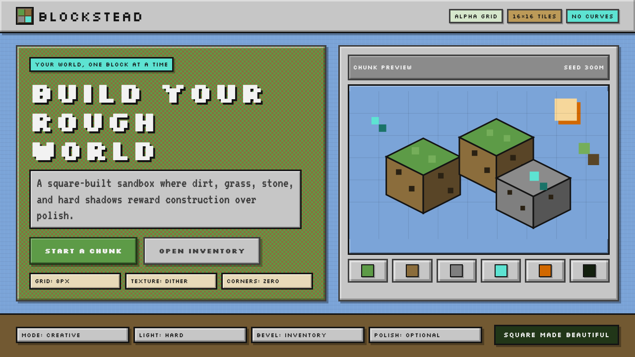 Minecraft VoxelUgly becomes buildable. Grass green, dirt brown, hard bevels, and 16×16 grids…丑也能亲手搭:草绿泥棕、硬边物品栏与16×16栅格。
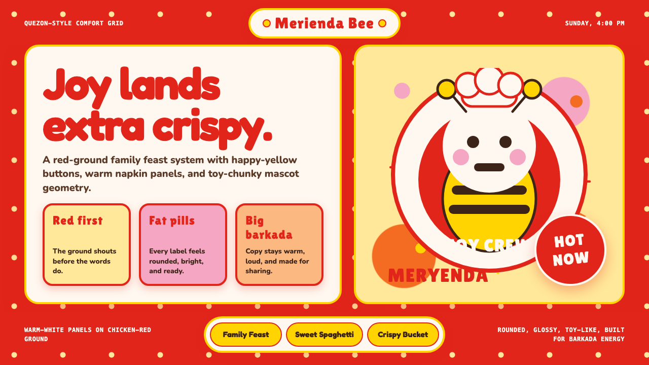 Philippines Jollibee Bee MascotJoy shouts first. Red ground, Fredoka curves, yellow pills, chunky grid.欢乐先喊出来:红底、Fredoka圆字、黄色胶囊与厚实网格。
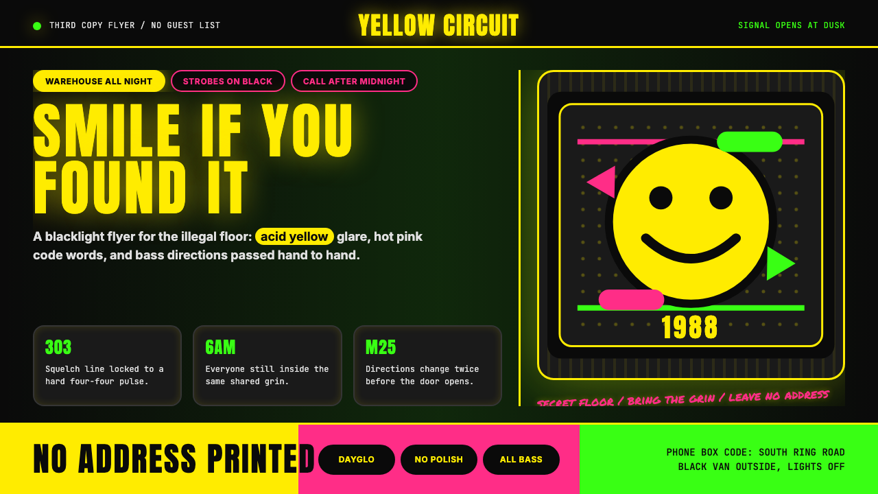 Acid House Smiley (1988)Rave energy hits first. Acid yellow on black, Anton caps, smiley glow.锐舞能量先撞上来。黑底酸黄、Anton大写与笑脸辉光。
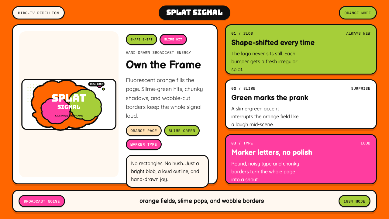 Nickelodeon Orange Splat (1984)Kids own the screen. Orange fields, slime-green pops, and wobble borders do t…孩子掌控屏幕。橙底、史莱姆绿点缀和歪斜边框一起喊话。
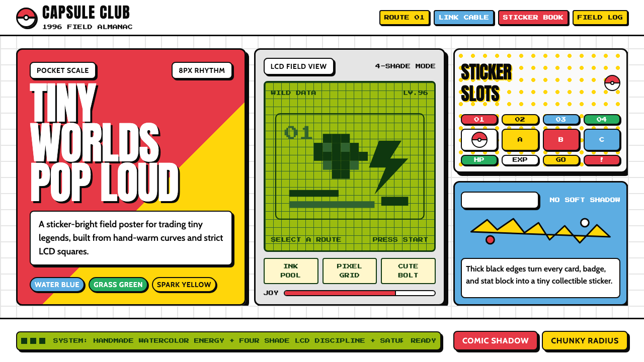 Pokémon Game BoyKawaii meets cartridge logic. Capsule red, LCD green, Anton heft, and 8px gri…卡哇伊撞上卡带逻辑:胶囊红、LCD绿、Anton粗字与8px网格同屏。