What is Sprite — Obey Your Thirst?什么是 Sprite — Obey Your Thirst?
Sprite's citrus-green slash hit the pavement in 1961 and found its cultural soul in 1994 — the moment a soft-drink brand chose hip-hop realness over polished aspiration.雪碧的柠檬绿斜切在1961年落地,在1994年找到了文化灵魂——那一刻,一个饮料品牌选择了嘻哈的真实态度,而非抛光的美好憧憬。
Sprite — Obey Your Thirst in briefSprite — Obey Your Thirst 速览
Sprite's visual identity is a citrus explosion — saturated green and lemon-yellow bursts that hit like a cold can on a summer court. The design language is kinetic and unapologetic: diagonal slashes carve through every composition at a consistent angle, ALL-CAPS condensed lettering demands attention without apology, and flat color fields reject atmospheric depth in favor of pure, percussive energy.雪碧的视觉语言是一场柠檬酸橙的爆发——饱和的绿色与柠檬黄如同炎夏球场上一罐冰镇汽水般直击感官。设计语言充满动感且毫不妥协:对角线斜切以一致的角度劈开每一幅构图,全大写紧缩字体毫无歉意地索取注意力,纯色块拒绝大气深度,转而投向纯粹的、节奏鲜明的能量。
What makes this aesthetic distinctive is not individual elements but their choreography. The signature diagonal is not merely a decorative flourish — it is a structural axis that tilts every layout forward, creating a visual momentum that reads as urgency and heat. Green is the dominant note, used at a saturation level that would feel aggressive in almost any other context; against lemon yellow and stark white, it achieves equilibrium through contrast rather than restraint.这套美学的独特之处不在于单个元素,而在于它们的编排方式。标志性斜切并不只是装饰性花哨——它是一条结构轴线,将每个版面向前倾斜,制造出一种被解读为紧迫感与热度的视觉动势。绿色是主导音符,以一种在几乎任何其他语境下都会显得咄咄逼人的饱和度使用;在柠檬黄与纯白的映衬下,它通过对比而非克制达到平衡。
The style belongs to a specific cultural moment — the convergence of 1990s street sports culture, the golden era of hip-hop marketing, and the visual vocabulary of athletic packaging — but its underlying logic is timeless: high-contrast color, bold directional geometry, and compressed type that communicates speed. Designers working in this idiom are essentially working with the visual language of confidence.这种风格属于一个特定的文化时刻——1990年代街头运动文化、嘻哈营销黄金时代与运动包装视觉词汇的汇流——但其底层逻辑是永恒的:高对比度色彩、大胆的方向性几何、传达速度感的紧缩字体。在这种语汇中工作的设计师,本质上是在使用自信心的视觉语言。
See the Sprite — Obey Your Thirst design system查看 Sprite — Obey Your Thirst 完整设计系统
Where does Sprite — Obey Your Thirst come from?Sprite — Obey Your Thirst 从何而来?
Sprite was created by The Coca-Cola Company and launched in the United States in 1961, entering a market already contested by 7UP. The early brand visual was functional rather than distinctive — green and silver packaging that signaled lemon-lime flavor without expressing character. For nearly three decades, Sprite occupied a secondary position in the soft-drink category, a reliable product that lacked a cultural identity of its own.雪碧由可口可乐公司创建,1961年在美国上市,进入一个已被7UP占据的市场。早期品牌视觉功能性多于独特性——绿银配色的包装传递柠檬味信号,却缺乏个性表达。将近三十年里,雪碧在软饮品类中占据次要位置,是一个可靠但缺乏自身文化身份的产品。
Everything changed in 1994 when Coca-Cola and agency Lowe & Partners launched the 'Obey Your Thirst' campaign. The campaign was built on a direct rejection of the aspirational celebrity endorsement model that had defined soft-drink marketing through the 1980s. Instead of presenting athletes as superhuman achievers whose success was somehow linked to their beverage preference, Sprite's ads placed NBA stars — Grant Hill, Kobe Bryant — in contexts that questioned the very idea of image-driven consumption. The tagline was an instruction: trust your own instincts, not the advertising.一切改变于1994年,可口可乐与代理商Lowe & Partners推出了「服从你的渴望」(Obey Your Thirst)广告战役。这场战役的基础是对1980年代贯穿软饮营销的名人代言模式的直接拒绝。广告不是将运动员呈现为某种程度上与饮料选择挂钩的超人成就者,而是将NBA球星——格兰特·希尔、科比·布莱恩特——置于质疑形象驱动消费这一理念本身的情境中。标语是一条指令:相信你自己的直觉,而不是广告。
This alignment with hip-hop's foundational value of authenticity over artifice had immediate cultural impact. Sprite became a genuine presence in basketball and rap culture, not through paid placement but through the perception that the brand understood and respected that world. The visual language that accompanied the campaign — saturated green, diagonal energy lines, compressed bold type — was not incidental decoration but an expression of the same attitude: direct, unfiltered, kinetic.这种与嘻哈文化「真实性高于人造性」这一核心价值的对齐,产生了即时的文化影响。雪碧成为篮球与说唱文化中的真实存在,不是通过付费植入,而是通过这种品牌理解并尊重那个世界的感知。伴随战役出现的视觉语言——饱和的绿色、对角线能量线、紧缩粗体字——不是附带的装饰,而是相同态度的表达:直接、未经过滤、充满动感。
The brand's visual evolution continued into the 2000s and beyond. Turner Duckworth brought systematic identity thinking to Sprite's packaging and communications, sharpening the diagonal-slash motif into a more considered structural element. A significant environmental pivot came in 2022, when Sprite announced the retirement of its iconic green bottle in favor of clear packaging — a decision driven by recycling efficiency rather than aesthetics, but one that shifted the green identity marker entirely onto the label and graphic system. More recently, musician and cultural figure Tyler the Creator appeared in brand campaigns, continuing the brand's tradition of alignment with authentic creative voices rather than conventional celebrity spokespeople.品牌的视觉演变延续到2000年代及之后。Turner Duckworth将系统性的品牌识别思维引入雪碧的包装与传播,将斜切母题磨砺为更经过深思熟虑的结构性元素。2022年出现了一个重要的环保转向——雪碧宣布停用标志性的绿色瓶,改用透明包装,这一决定出于回收效率而非美学考量,但将绿色身份标识完全转移到标签与图形系统上。近年来,音乐人与文化人物Tyler the Creator出现在品牌战役中,延续了品牌对接真实创意声音而非传统名人代言人的传统。
What defines the Sprite — Obey Your Thirst look?Sprite — Obey Your Thirst 的视觉特征是什么?
Citrus Color Pairing柑橘配色
The Sprite palette is built on two colors in extreme tension: a highly saturated mid-green and a sharp lemon yellow, deployed together at full intensity without desaturation or muting. White and stark black serve as structural frames rather than dominants. The relationship between green and yellow is deliberately confrontational — they compete for the eye's attention, and that competition generates visual heat. No neutral intermediaries soften the contrast; the collision is the point.雪碧的色板建立在极度张力中的两种颜色之上:高度饱和的中绿色与尖锐的柠檬黄,以完全强度并置,不经过去饱和或柔化处理。白色和纯黑作为结构性框架而非主导色。绿色与黄色之间的关系是刻意对抗性的——它们争夺眼睛的注意力,这种竞争产生视觉热度。没有中性过渡来软化对比;碰撞本身就是目的。
The Diagonal Slash对角线斜切
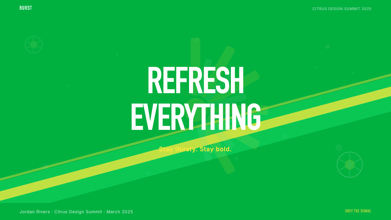
Every Sprite composition is organized around a diagonal axis — a hard-edged slash or wedge that cuts across the layout at a consistent forward angle. This is not a decorative accent but the primary structural device: it creates implied motion, divides color zones, and ensures that even a static layout reads as kinetic. The angle echoes the physical form of liquid being poured or a can being opened — organic energy translated into a geometric decision.每一幅雪碧构图都围绕一条对角轴线组织——一道以一致的前倾角度斜穿版面的硬边斜切或楔形。这不是装饰性点缀,而是主要的结构性装置:它创造暗示性的运动感,划分色彩区域,并确保即使是静态版面也被解读为动态的。这个角度呼应了液体倾倒或开罐时的物理形态——有机能量转化为几何决定。
Condensed ALL-CAPS Type紧缩全大写字体
Sprite's typographic signature is compressed, uppercase lettering with tight tracking — letterforms that occupy minimal horizontal space while projecting maximum presence. The approach is drawn from sports jersey numbering and athletic advertising, contexts where legibility at speed matters more than elegance at rest. Scale is used dramatically: hero text can dwarf supporting copy several times over, creating an immediate reading hierarchy that requires no decorative scaffolding.雪碧的字体排印标志是紧缩的全大写字母,字母间距收紧——字形在最小的水平空间内投射出最大的存在感。这一手法源自运动球衣编号与运动广告,那是一个速度中的可读性比静止中的优雅更重要的语境。字号被戏剧性地运用:主体文字可以将辅助文案压缩数倍,制造出无需装饰性支架的即时阅读层级。
Flat Color Fields纯色色块
Color areas in Sprite's visual language are applied as flat, unmodulated fields — no gradients, no vignettes, no simulated illumination. This flatness is not minimalism for its own sake but a direct consequence of the style's roots in packaging, poster, and broadcast advertising, where clarity at multiple scales and reproduction conditions is essential. The flatness also amplifies the diagonal geometry: where one color field meets another, the edge is crisp and structural, reinforcing the sense of hard impact.雪碧视觉语言中的色彩区域以纯粹、未调制的色块形式呈现——无渐变、无晕影、无模拟光照。这种平面性并非为极简而极简,而是这种风格根植于包装、海报与电视广告的直接结果——在这些媒介中,多种尺寸与复制条件下的清晰度至关重要。平面性也放大了对角线几何:一个色块与另一个相遇之处,边缘清脆而具有结构感,强化了硬性冲击的感觉。
Sports-Court Energy球场能量
The Sprite aesthetic is inseparable from its cultural context: the asphalt basketball court, the worn sneaker, the unrehearsed gesture. This manifests not in literal illustration but in compositional attitude — layouts feel improvised within a tight system, like a pick-up game played under strict rules. Elements are placed at tension with each other rather than in comfortable alignment. The result is designed urgency: something that looks like it happened fast, even when it was carefully constructed.雪碧的美学与其文化语境不可分割:沥青篮球场、磨损的运动鞋、未经排练的姿态。这不体现为字面上的插图,而体现在构图态度中——版面感觉像是在严格规则下打的即兴街头赛,系统严密却充满即兴感。元素被置于相互张力之中而非舒适对齐的位置。结果是被设计的紧迫感:看起来很快就完成的东西,即使实际上是精心构建的。
High-Contrast Legibility高对比度可读性
Every Sprite layout is built for immediate legibility under demanding conditions — glanced at from a moving vehicle, seen on a refrigerator door in passing, read on a small screen in bright sunlight. This means maximum contrast at every text-to-background junction, no decorative type treatments that reduce letterform clarity, and no background patterns that compete with foreground information. Legibility is not a constraint on the style; it is constitutive of it.每一个雪碧版面都是为在苛刻条件下即时可读而构建的——从行驶中的车辆上瞥见,路过冰箱门时看到,在强烈阳光下通过小屏幕阅读。这意味着每一处文字与背景交界处的最大对比度,没有降低字形清晰度的装饰性字体处理,也没有与前景信息竞争的背景图案。可读性不是这种风格的约束条件;它是这种风格的构成性要素。
Anti-Aspirational Directness反憧憬式直接性
Where many consumer brands of the same era used aspirational imagery — lifestyle tableaux, achievement moments, idealized beauty — Sprite's visual language consistently chose confrontation over invitation. Compositions lean in rather than recede; the viewpoint is close and slightly low, a stance borrowed from street photography and basketball court-level camera angles. The aesthetic positions the viewer as a peer rather than an aspirant, which is its most culturally specific quality.当同时代许多消费品牌使用憧憬性图像——生活方式场景、成就时刻、理想化的美感——雪碧的视觉语言始终选择对抗而非邀请。构图向前倾斜而非退缩;视角贴近且略偏低,这是从街头摄影和篮球场地面相机角度借来的姿态。这种美学将观者定位为同伴而非仰望者,这是它最具文化特异性的品质。
See the Sprite — Obey Your Thirst design system查看 Sprite — Obey Your Thirst 完整设计系统
Who shaped Sprite — Obey Your Thirst?谁塑造了 Sprite — Obey Your Thirst?
As the parent company that launched Sprite in 1961, Coca-Cola made the pivotal strategic decision in the early 1990s to reposition Sprite away from generic lemon-lime territory and toward authentic cultural alignment. The internal mandate to pursue a younger, street-culture audience — rather than compete directly with 7UP on product attributes — created the conditions for the 'Obey Your Thirst' campaign and the visual identity that accompanied it. Coca-Cola's willingness to let the brand speak in an unpolished register was unusual for a global corporation of its scale at the time.作为1961年推出雪碧的母公司,可口可乐在1990年代初做出了关键的战略决策——将雪碧从普通柠檬味饮料定位向真实文化对齐重新定位。追求年轻街头文化受众而非直接在产品属性上与7UP竞争的内部命令,为「服从你的渴望」战役及其视觉识别创造了条件。对于当时那种规模的全球企业而言,可口可乐愿意让品牌以未经打磨的语调说话,是不寻常的。
The advertising agency Lowe & Partners was the creative force behind the 1994 'Obey Your Thirst' campaign that transformed Sprite's cultural position. Their contribution was not merely tagline invention but a complete tonal repositioning: the decision to use hip-hop artists and NBA players in ads that questioned the value of celebrity endorsement rather than celebrating it. This self-referential quality — advertising that critiqued advertising — gave the campaign an authenticity that was rare in soft-drink marketing and drove the visual language toward a rawer, more confrontational aesthetic.广告代理商Lowe & Partners是1994年「服从你的渴望」战役的创意力量,这场战役彻底改变了雪碧的文化地位。他们的贡献不只是标语发明,而是完整的语调重新定位:决定使用嘻哈艺术家和NBA球员出演质疑名人代言价值而非颂扬它的广告。这种自我指涉的品质——批评广告的广告——赋予了战役在软饮营销中罕见的真实性,并将视觉语言推向更原生、更具对抗性的美学。
Design consultancy Turner Duckworth brought systematic identity discipline to Sprite at a later stage of the brand's evolution, working on packaging and brand communications to distill the diagonal-slash energy into a cleaner, more scalable system. Their work represents the maturation phase of the visual identity: taking an aesthetic born from advertising energy and translating it into a coherent brand language that could function across packaging, point of sale, digital surfaces, and licensed merchandise without losing its essential attitude.设计咨询公司Turner Duckworth在品牌演变的后期阶段为雪碧带来了系统性的品牌识别规范,致力于包装和品牌传播工作,将斜切能量提炼为更简洁、更具可扩展性的系统。他们的工作代表了视觉识别的成熟阶段:将一种诞生于广告能量的美学转化为连贯的品牌语言,使其能够跨越包装、销售点、数字表面与授权商品运作,而不失去其本质态度。
Tyler the Creator's involvement with Sprite in more recent brand campaigns continues a pattern established in 1994: aligning the brand with artists who represent authentic creative voices rather than sanitized mainstream celebrity. Tyler's visual sensibility — bold color, irreverence, and a refusal to separate personal aesthetic from commercial work — resonates with the brand's original positioning. His presence signals that the 'Obey Your Thirst' ethos remains operative, updated for a generation that consumes brand content through social media and music videos rather than broadcast television.Tyler the Creator在近期品牌战役中的参与延续了1994年建立的模式:将品牌与代表真实创意声音而非经过净化的主流名人的艺术家对齐。Tyler的视觉感性——大胆的色彩、不敬权威以及拒绝将个人美学与商业工作分离——与品牌的原始定位产生共鸣。他的存在表明「服从你的渴望」的精神仍然有效,更新为一个通过社交媒体和音乐视频而非广播电视消费品牌内容的一代。
The NBA stars who appeared in the landmark 1994–2000 Sprite campaigns were not merely endorsers but participants in an argument. The ads placed them in scenarios where their fame and endorsement power were explicitly questioned — a metacommentary unusual in athlete advertising. Grant Hill and Kobe Bryant lent their credibility to a campaign that used their credibility to argue against credibility-based marketing. This paradox was the campaign's central creative tension and the source of its cultural longevity.出现在1994至2000年标志性雪碧战役中的NBA球星不只是代言人,而是一场论证的参与者。广告将他们置于其名气与代言力量被明确质疑的场景中——这在运动员广告中是不寻常的元评论。格兰特·希尔和科比·布莱恩特将他们的可信度借给了一场用他们的可信度来论证反可信度营销的战役。这个悖论是战役的核心创意张力,也是其文化持久性的来源。
How do you use Sprite — Obey Your Thirst today?今天怎么用 Sprite — Obey Your Thirst?
The Sprite aesthetic is among the more demanding historical styles to apply correctly in contemporary design work, because it depends on tension as much as composition. The diagonal slash, the saturated color collision, the compressed type — these elements create energy through contrast and confrontation, not through harmony. Applying the style without understanding this principle produces work that feels busy rather than powerful. The designer's primary task is to build controlled tension into every layout decision.雪碧美学是当代设计实践中正确应用难度较高的历史风格之一,因为它依赖张力与构图同等重要。对角线斜切、饱和色彩碰撞、紧缩字体——这些元素通过对比与对抗而非和谐创造能量。在不理解这一原则的情况下应用这种风格,产出的作品会感觉繁忙而非有力。设计师的首要任务是将受控的张力融入每一个版面决定。
For presentation slides, the style works best when a clear hierarchy is established before any visual treatment is applied. Cover slides benefit from a full diagonal composition: a bold color field occupies more than half the slide, cut by the slash, with the title set in compressed uppercase against maximum contrast. Content slides should resist the temptation to diagonalize everything — the slash is most effective when it appears selectively, as a structural accent on key section breaks or data callouts. Data slides can adopt the visual language of sports statistics: large numerals in condensed type, minimal labels, strong color-coding by category rather than by decoration.对于演示文稿,这种风格在先建立清晰层级再进行任何视觉处理时效果最佳。封面幻灯片受益于完整的对角线构图:一个大胆的色块占据幻灯片超过一半的面积,被斜切划过,标题以紧缩全大写字体置于最大对比度之上。内容幻灯片应抵制将一切都斜切化的诱惑——斜切在有选择地出现时最为有效,作为关键章节分隔或数据标注的结构性点缀。数据幻灯片可以采用运动统计数据的视觉语言:紧缩字体的大号数字、极简标签、按类别而非按装饰的强色彩编码。
For web interfaces and dashboards, the Sprite palette and compositional logic translate well to environments where information density is high and attention spans are short. Header sections, hero banners, and pricing tier cards are natural fits — the bold color blocking communicates tier differentiation instantly without requiring the user to read fine print. Navigation and body content areas should use a reduced version of the palette, with the saturated green and yellow reserved for key interactive states or alerts. The diagonal motif works in hero sections but should not be repeated at every content level, or it loses its structural meaning.对于网页界面和仪表板,雪碧的色板与构图逻辑在信息密度高、注意力时间短的环境中表现良好。页头区域、英雄横幅和定价层级卡片是自然的适配点——大胆的色块分割即时传递层级区分,无需用户阅读细节文字。导航和正文内容区域应使用简化版色板,将饱和的绿色和黄色保留给关键的交互状态或警示。对角线母题在英雄区有效,但不应在每个内容层级重复,否则会失去其结构意义。
For editorial and marketing work — social posts, event posters, promotional emails — the style operates at its fullest intensity. A single diagonal axis, two colors from the palette at full saturation, compressed type at strong scale contrast, and flat graphic shapes derived from the brand's circular and wedge vocabulary will produce work that feels authentically in the style. The key discipline is restraint in complexity: one strong idea per composition, not five competing elements. Marketing pages work well with alternating full-bleed panels — green on white, white on green, with yellow as a consistent accent for calls to action and key product claims.对于编辑与营销工作——社交帖子、活动海报、促销邮件——这种风格以最充分的强度运作。单条对角轴线、两种满饱和度的色板颜色、强烈尺度对比的紧缩字体,以及源自品牌圆形和楔形词汇的平面图形形状,将产出真实呈现这种风格的作品。关键的规范是构图复杂度的克制:每幅构图一个强烈创意,而非五个竞争元素。营销页面适合交替的全宽面板——绿底白字与白底绿字交替,以黄色作为行动号召和关键产品主张的一致点缀色。
A common mistake when applying this style is treating the saturated green as equivalent to any other brand green, and adding secondary palette elements — tints, gradients, soft shadows, pastels — that neutralize the saturation contrast the style depends on. Equally common is overusing the diagonal: when every element tilts, the tilt loses its meaning and the layout reads as chaotic rather than energetic. Authenticity in this style requires committing to the confrontational quality of the original — high saturation, hard edges, direct hierarchy — and trusting that restraint in decoration produces more energy, not less.应用这种风格时最常见的错误是将饱和的绿色等同于任何其他品牌绿色,并添加二级色板元素——色调、渐变、柔和阴影、粉彩——这些会中和这种风格所依赖的饱和度对比。同样常见的是过度使用对角线:当每个元素都倾斜时,倾斜就失去了意义,版面读起来是混乱的而非充满活力的。这种风格的真实性要求坚守原作的对抗性品质——高饱和度、硬边缘、直接的层级——并相信装饰上的克制产生的是更多能量,而非更少。
See the Sprite — Obey Your Thirst design system查看 Sprite — Obey Your Thirst 完整设计系统
Sprite — Obey Your Thirst — FAQSprite — Obey Your Thirst · 常见问题
How is Sprite's visual style different from general 1990s streetwear graphics?雪碧的视觉风格与一般1990年代街头服饰图形有何不同?
Sprite's visual identity shares DNA with 1990s streetwear graphics — compressed type, saturated color, diagonal geometry — but is more disciplined in its structural logic. Streetwear graphics of that era drew heavily from skateboarding, graffiti, and underground zine culture, resulting in intentionally rough, layered, maximalist compositions. Sprite's visual system, despite its energy, is a corporate identity refined for mass reproduction at scale: it maintains consistent color relationships, predictable compositional structure, and high legibility across contexts. The key difference is intentionality — Sprite's chaos is designed chaos.雪碧的视觉识别与1990年代街头服饰图形共享基因——紧缩字体、饱和色彩、对角线几何——但在结构逻辑上更为严格。那个时代的街头服饰图形大量借鉴滑板、涂鸦和地下杂志文化,产生了刻意粗糙、分层、极大化的构图。雪碧的视觉系统尽管充满能量,却是经过为大规模量产复制而精炼的企业识别系统:它保持一致的色彩关系、可预测的构图结构,以及跨语境的高可读性。关键区别在于意图性——雪碧的混乱是被设计的混乱。
Can the Sprite aesthetic work for premium or luxury products?雪碧美学能用于高端或奢侈品产品吗?
Not naturally. The Sprite aesthetic is constitutively anti-aspirational and anti-premium in its foundational logic — it was built specifically to reject the polished, status-signaling visual language of upscale brands. Applying it to a premium product creates tonal dissonance: the high saturation, compressed type, and confrontational diagonal communicate immediacy and democratization, not exclusivity and craft. That said, a sophisticated inversion is possible: some premium brands in streetwear-adjacent categories have used this visual language deliberately to signal that they reject the conventions of luxury, positioning that requires a culturally aware audience to read correctly.不是自然合适的。雪碧美学在其基础逻辑上构成性地反憧憬、反高端——它被专门构建来拒绝高档品牌那种经过打磨的、传递地位信号的视觉语言。将其应用于高端产品会产生语调失调:高饱和度、紧缩字体和对抗性的对角线传达的是即时性和民主化,而非排他性和工艺感。话虽如此,一种复杂的反转是可能的:街头服饰邻近品类中的一些高端品牌刻意使用这种视觉语言来传达他们拒绝奢侈惯例的姿态,这种定位需要具有文化意识的受众才能正确解读。
Is the 15-degree diagonal angle a strict rule, or can other angles work?15度斜切角是严格规则吗?其他角度能用吗?
The specific angle in Sprite's brand system is a proprietary design decision, not a universal principle of the broader aesthetic. What the angle achieves — a sense of forward lean, dynamic division, implied velocity — is the meaningful constraint, not the precise measurement. Other diagonal-led visual systems from the same era used slightly different angles to similar effect. If you are building work inspired by this style rather than reproducing Sprite's actual brand, the key discipline is consistency: choose an angle that reads as active rather than passive, and maintain it rigorously across all compositions rather than varying it element by element.雪碧品牌系统中的具体角度是一个专有的设计决定,而非更广泛美学的普遍原则。角度所实现的——前倾感、动态分割、暗示性速度——才是有意义的约束,而非精确的度量值。同一时代其他对角线主导的视觉系统使用了略微不同的角度,却产生了相似的效果。如果你是在构建受这种风格启发的作品而非复制雪碧的实际品牌,关键规范是一致性:选择一个被解读为主动而非被动的角度,并在所有构图中严格保持一致,而不是逐元素变化。
How does this style handle dark-mode or night-mode contexts?这种风格如何处理深色模式或夜间模式语境?
The Sprite visual system was conceived for light grounds — saturated green and lemon yellow read at their most intense against white or near-white backgrounds, and the structural clarity of the diagonal is sharpest on a light field. A dark-mode inversion introduces complications: on a near-black ground, lemon yellow can become dominant to the point of aggression, while saturated green tends to recede. A well-considered dark-mode variant typically inverts the color logic — using green as a foreground element against near-black, with yellow reserved for accent rather than structural color, and white type rather than black. The diagonal retains its function regardless of ground color.雪碧视觉系统是为浅色底面构想的——饱和的绿色和柠檬黄在白色或接近白色的背景上呈现出最强烈的色感,对角线的结构清晰度在浅色场上也最为鲜明。深色模式反转带来了复杂性:在接近黑色的底面上,柠檬黄可能变得具有攻击性地主导,而饱和的绿色则倾向于退缩。经过深思熟虑的深色模式变体通常会反转色彩逻辑——将绿色作为接近黑色背景上的前景元素,黄色保留为点缀色而非结构色,并使用白色字体而非黑色。对角线无论底色如何都保持其功能。
What is the biggest mistake people make when trying to evoke this style?人们试图呈现这种风格时最常犯的错误是什么?
The single most common failure is reaching for the color palette while abandoning the structural principles — applying green and yellow to a layout that is otherwise conventionally organized, without the diagonal drive, the compressed type, the flat color fields, and the high-contrast confrontational composition that make those colors meaningful. Color alone does not make the style; the entire system is required. A secondary failure is over-complexity: adding too many competing diagonals, too many type sizes, or too much supplementary color 'to make it more interesting.' The style's energy comes from simplicity in service of impact — one axis, two dominant colors, one clear typographic hierarchy. Additions dilute rather than amplify.最常见的失败是伸手拿色板,同时放弃结构原则——将绿色和黄色应用于一个其他方面仍然按常规组织的版面,没有对角线驱动力、紧缩字体、纯色色块,以及使这些颜色有意义的高对比度对抗性构图。仅凭色彩不能构成这种风格;需要整个系统。第二种失败是过度复杂:添加太多相互竞争的对角线、太多字号,或太多辅助性色彩「来让它更有趣」。这种风格的能量来自服务于冲击力的简洁——一条轴线、两种主导色、一个清晰的字体层级。添加是稀释而非放大。
Related design styles相关设计风格
 Swatch Watch (1983)Pop plastic optimism. Bungee type, candy primaries, round dials and squiggles…塑料乐观主义:Bungee 字体、糖果三原色、圆表盘与波浪线一起跳响。
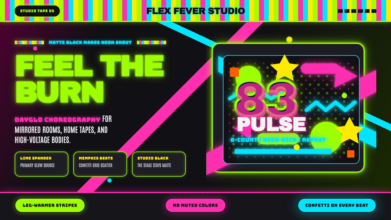 80s Aerobics Fluoro SpandexNeon refuses restraint. Lime spandex, pink-cyan confetti, and black-stage typ…霓虹拒绝克制:荧光绿氨纶、粉蓝彩屑与黑场大字一起燃烧。
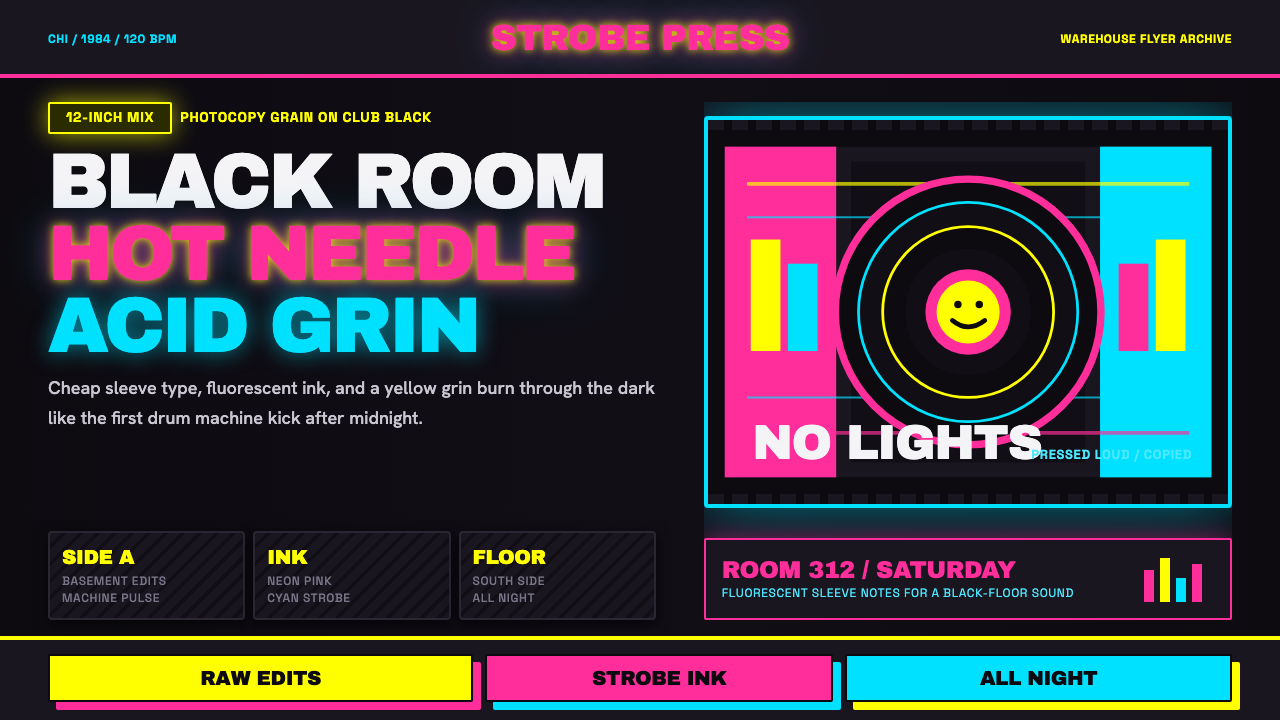 Chicago HouseDarkness starts the track. Neon pink, yellow and cyan hit black like Xerox st…黑暗先起拍。霓虹粉、黄与青打在黑底上,像复印频闪。
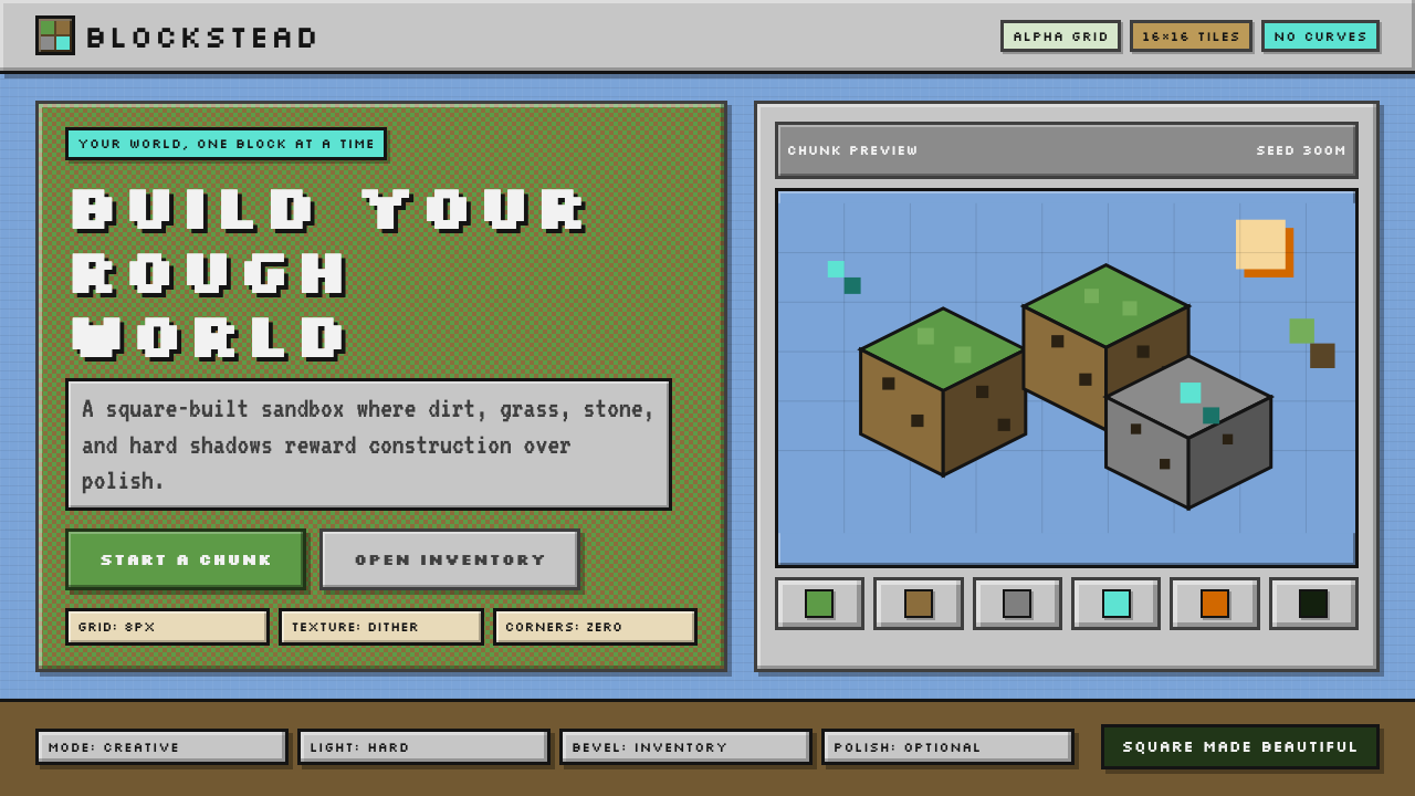 Minecraft VoxelUgly becomes buildable. Grass green, dirt brown, hard bevels, and 16×16 grids…丑也能亲手搭:草绿泥棕、硬边物品栏与16×16栅格。
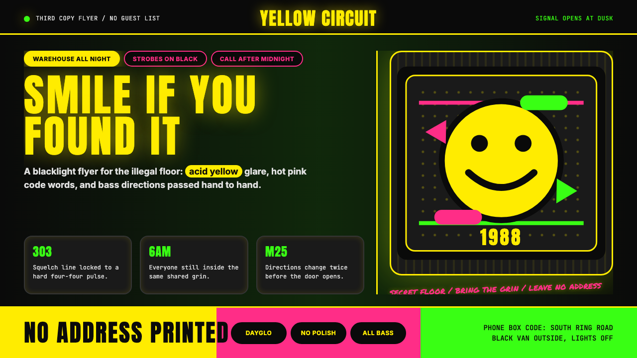 Acid House Smiley (1988)Rave energy hits first. Acid yellow on black, Anton caps, smiley glow.锐舞能量先撞上来。黑底酸黄、Anton大写与笑脸辉光。
 Cartoon Network 90s BlocksKids-cable noise, squared. Black-white checkerboards crash into hot-yellow Bu…方块化的儿童有线电视噪音:黑白棋盘撞上热黄 Bungee 字块。