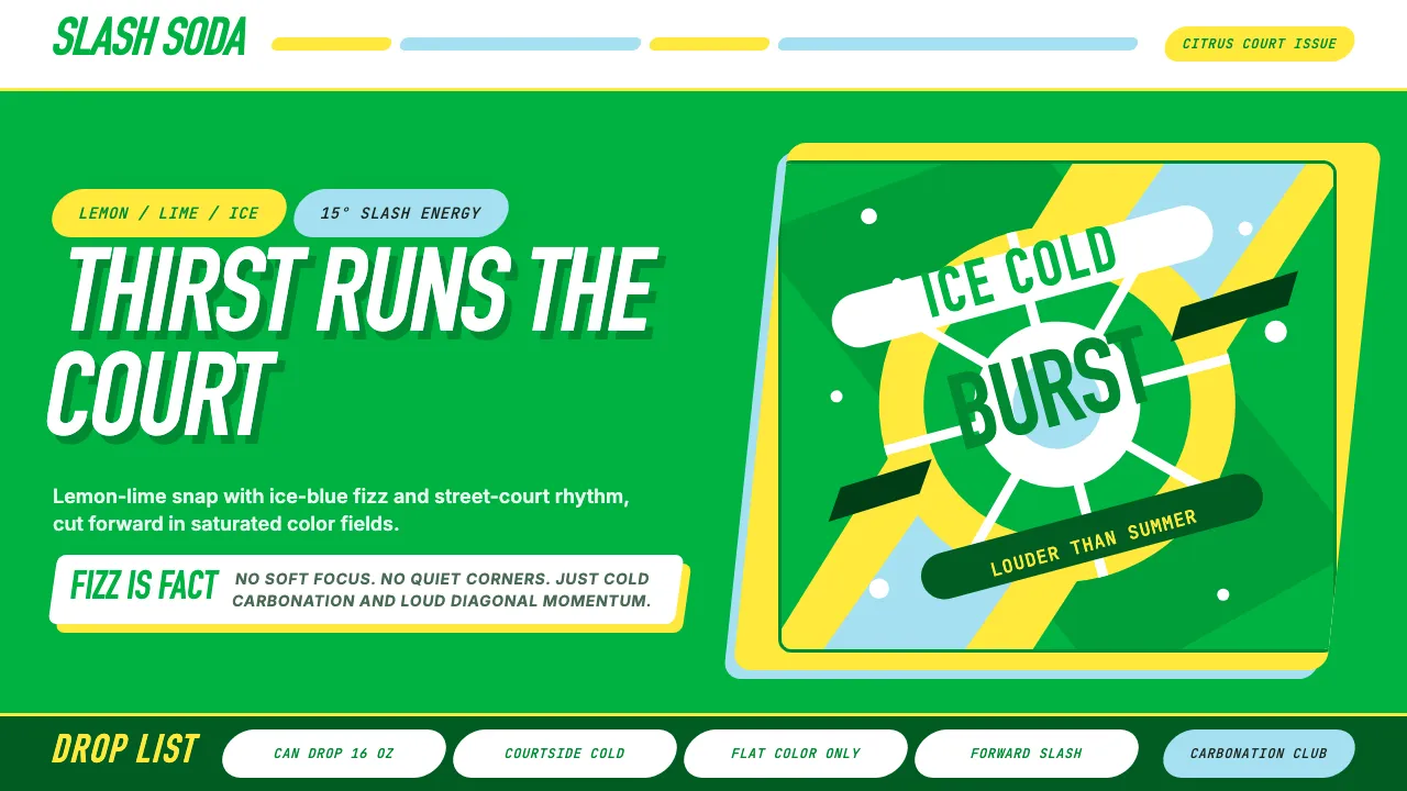
About Sprite — Obey Your Thirst
Sprite's visual identity is a citrus explosion — saturated green and lemon-yellow bursts that hit like a cold can on a summer court. Born from Coca-Cola's Atlanta headquarters in 1961, the brand found its cultural voice in the 1994 "Obey Your Thirst" campaign, aligning with hip-hop authenticity and NBA star power.
The design language is kinetic and unapologetic: diagonal slashes, ALL-CAPS condensed type, and flat saturated color fields that reject subtlety in favor of pure refreshment energy. Every element tilts forward at 15°, echoing the iconic green-bottle slash.
- Origin
- Atlanta, Georgia, United States
- Era
- 1961 introduced; iconic 1994–2000 'Obey Your Thirst' era; 2022 clear-bottle rebrand
- Key figures
- The Coca-Cola Company · Lowe & Partners · Turner Duckworth · Tyler the Creator
- Movements
- 90s hip-hop marketing crossover · ESPN-era basketball celebrity branding · late-20c soft-drink rivalry
Sprite — Obey Your Thirst design spec
Colors
Typography
The other 11 sections — buttons, cards, spacing, motion, techniques and more — open once you unlock. Download the DESIGN.md or send it to your AI in one click. Unlock once, yours forever.
Sign up nowStyles similar to Sprite — Obey Your Thirst
Also inspired by brands & products, with a close feel.
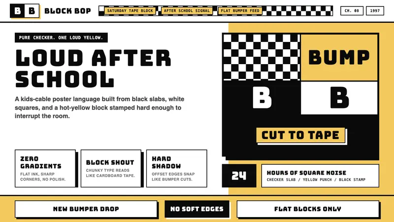 Cartoon Network 90s BlocksKids-cable noise, squared. Black-white checkerboards crash into hot-yellow Bungee blocks.
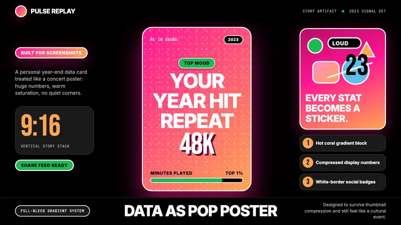 Spotify Wrapped 2023Social data goes neon. Hot pink-orange gradients, huge Inter stats, sticker badges.
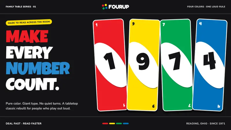 UNO (1971)Every number shouts. Four pure primaries punch through black with tilted white ovals.
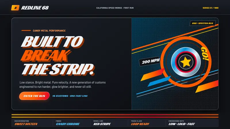 Hot Wheels (1968)Velocity in candy metal. Flame-orange tracks and fat italic type tear across garage black.