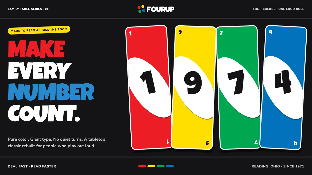
About UNO (1971)
UNO is the visual language of the deck in every junk drawer: four saturated suit colors fighting on a matte-black card back, each numeral floating on a fat white ellipse tilted to the diagonal. Corner index digits mirror top-left and bottom-right; the center carries a numeral you could read from across the room.
Built by Merle Robbins in 1971 and scaled by International Games, the system is loud, rounded, and instantly legible. No suit outranks another — red, yellow, green, and blue are equal-weight, glossy, and pure. Skip, Reverse, Draw Two, and Wild are glyphs, not words: a barred circle, chase-arrows, a stacked pair, a four-color pinwheel.
- Origin
- Reading, Ohio, USA
- Era
- 1971 founded; mass-market boom 1972–1992; current visual ~standard-deck heritage
- Key figures
- Merle Robbins · Robert Tezak · Mattel brand team
- Movements
- American mass-market game graphics · 1970s bold primary packaging · playing-card index conventions
UNO (1971) design spec
Colors
Typography
The other 11 sections — buttons, cards, spacing, motion, techniques and more — open once you unlock. Download the DESIGN.md or send it to your AI in one click. Unlock once, yours forever.
Sign up nowStyles similar to UNO (1971)
Also inspired by brands & products, with a close feel.
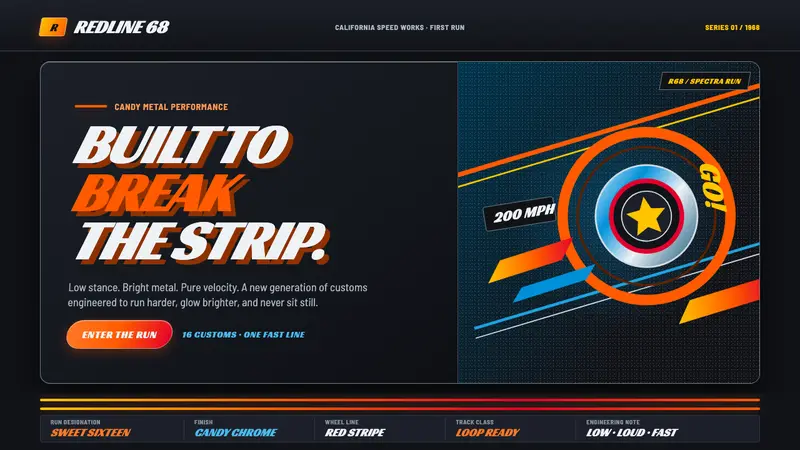 Hot Wheels (1968)Velocity in candy metal. Flame-orange tracks and fat italic type tear across garage black.
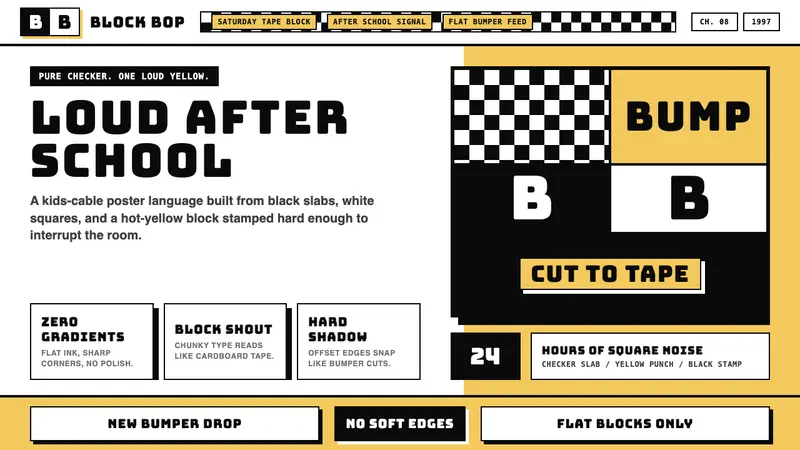 Cartoon Network 90s BlocksKids-cable noise, squared. Black-white checkerboards crash into hot-yellow Bungee blocks.
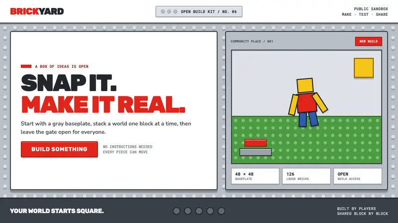 Roblox (2006)Play begins with a click. Fire-engine red cuts through a hard-edged gray stud grid.
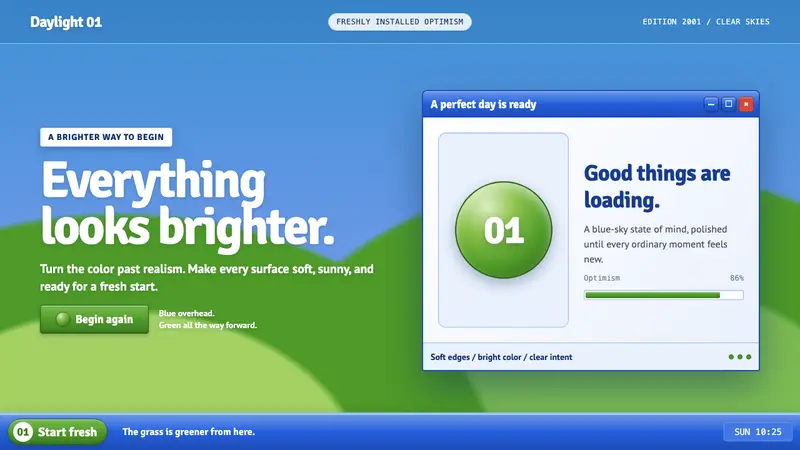 Windows XP Bliss (2001)Fresh-install optimism. Sky blue, hill green, and glossy gel chrome turn realism brighter.