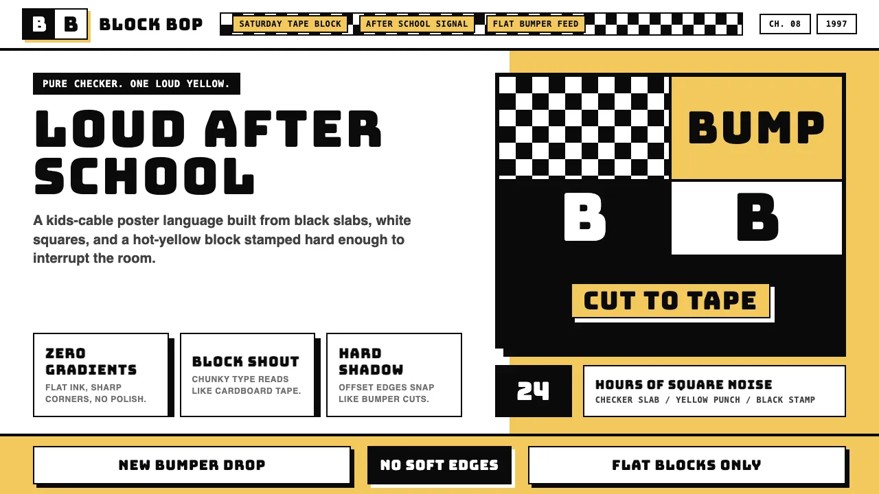
About Cartoon Network 90s Blocks
Cartoon Network's 1990s identity reads like a TV bumper made of cardboard and tape: a black-and-white checkerboard slab, a saturated primary color punching through, and the chunky "CN" wordmark stamped on top. Launched in 1992 to claw cable shelf space from Disney and Nickelodeon, it weaponized a populist counterculture-fun grammar — flat blocks, sharp corners, zero gradients.
The aesthetic is loud on purpose. Red, hot-yellow, cobalt, lime, and hot-pink slam against pure black and pure white. Type is Bungee, Anton, or Lilita One — display sans-serif so chunky it reads like a brick. Used today it broadcasts kids-cable nostalgia: Dexter's Laboratory, Powerpuff Girls, Adult Swim — black-and-white checker, saturated-primary blocks, end of story.
- Origin
- Atlanta, Georgia, USA — global cable-cartoon-network influence
- Era
- Launched October 1992 (Ted Turner / Time Warner); peak 1990s–2000s 'Cartoon Cartoons' era; ongoing
- Key figures
- Ted Turner · Mike Lazzo · Genndy Tartakovsky · Craig McCracken
- Movements
- 1990s cable-television cartoon canon · Cartoon Cartoons block · Adult Swim block (1994+) · Hanna-Barbera library revival
Cartoon Network 90s Blocks design spec
Colors
Typography
The other 11 sections — buttons, cards, spacing, motion, techniques and more — open once you unlock. Download the DESIGN.md or send it to your AI in one click. Unlock once, yours forever.
Sign up nowStyles similar to Cartoon Network 90s Blocks
Also inspired by brands & products, with a close feel.
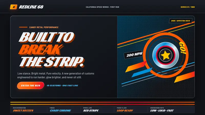 Hot Wheels (1968)Velocity in candy metal. Flame-orange tracks and fat italic type tear across garage black.
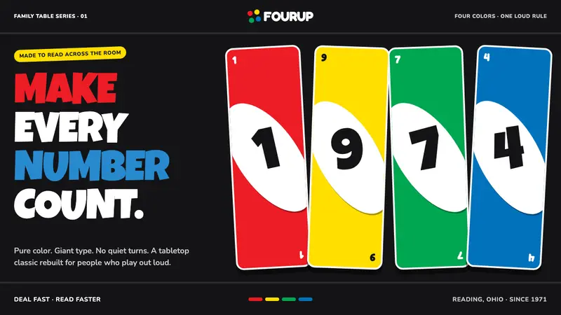 UNO (1971)Every number shouts. Four pure primaries punch through black with tilted white ovals.
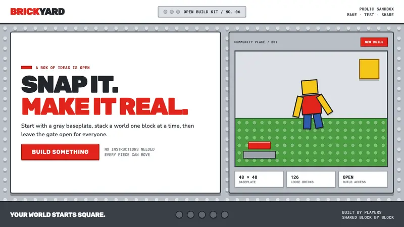 Roblox (2006)Play begins with a click. Fire-engine red cuts through a hard-edged gray stud grid.
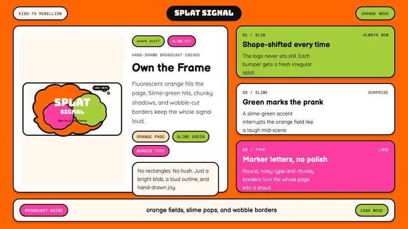 Nickelodeon Orange Splat (1984)Kids own the screen. Orange fields, slime-green pops, and wobble borders do the shouting.