What is UNO (1971)?
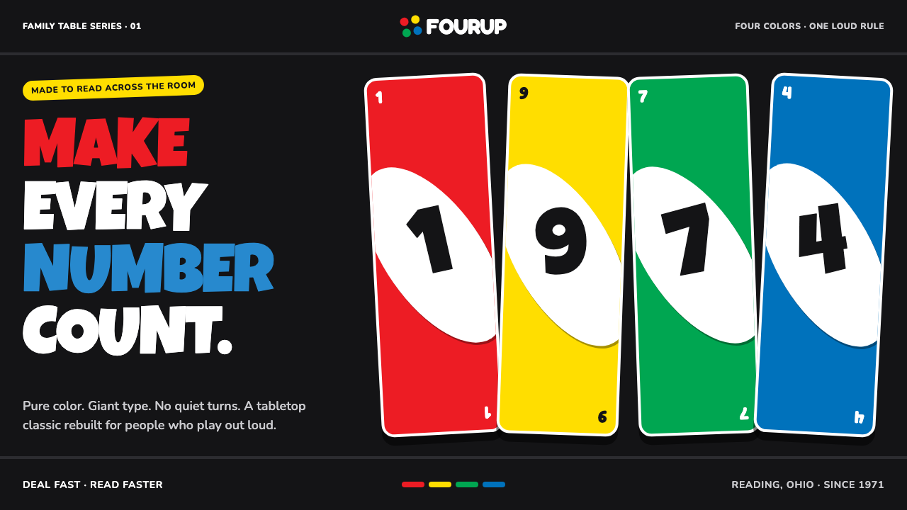
UNO turns a deck of cards into a visual shout: pure suit colors, black fields, tilted white ovals, and numerals built to win attention from across the room.
UNO (1971) in brief
UNO is the visual language of a mass-market card game built around immediate recognition. Its cards place large numerals or action glyphs inside tilted white ovals, while red, yellow, green, and blue establish the suit system. The black card back gives those colors a dark stage, making the deck feel energetic even before a game begins.
The system is loud, rounded, and deliberately uncomplicated. A player does not need to read dense instructions to understand a card at a glance: color, numeral, and symbol work together as a single signal. Corner index digits mirror one another at opposite corners, while the center carries a mark large enough to remain legible across a table.
UNO belongs to the tradition of American mass-market game graphics, but its identity is more concentrated than ordinary packaging design. Every suit receives equal visual status. Action cards use glyphs rather than explanatory words: a barred circle for Skip, chasing arrows for Reverse, stacked cards for Draw Two, and a four-color pinwheel for Wild. The result is a compact visual vocabulary whose purpose is speed, playfulness, and instant recall.
Where does UNO (1971) come from?
UNO was created by Merle Robbins in 1971 in Reading, Ohio. The deck began with the intimacy of a tabletop game rather than the distance of a corporate identity system: a set of cards designed to be handled, compared, called out, and recognized under ordinary household conditions. That domestic origin remains visible in its directness. The cards do not ask players to decode a refined visual metaphor; they announce their role immediately.
Its early visual logic drew on established playing-card index conventions. The mirrored corner digits allow a card to be read from more than one orientation, while the central numeral supplies a dominant focal point. UNO amplified those familiar conventions with unusually bold scale, rounded forms, and suit colors that could carry game information without any need for elaborate illustration.
International Games scaled UNO into the mass market, where the deck experienced a major boom from 1972 through 1992. That expansion favored a visual language capable of surviving shelves, family rooms, travel bags, and repeated handling. The four suit colors remained equal in emphasis, and the core hierarchy stayed stable: color first, central mark second, supporting corner index third.
The current deck inherits this standard-deck visual heritage. Its look also sits within the broader world of 1970s bold primary packaging, where saturated color and simplified forms made products readable at a glance. Mattel’s brand team is named among the key figures connected with the contemporary brand context, while the enduring design system remains anchored in the original premise: every number should be impossible to ignore.
What defines the UNO (1971) look?
Four Equal Suits
Red, yellow, green, and blue are the deck’s primary informational colors. None is treated as a prestige suit or a subdued background color. Their equal intensity makes matching feel immediate and keeps the game’s visual rhythm distributed across the whole deck rather than concentrated in a single dominant color.
Black as a Stage
Matte black provides the visual field against which the suit colors can punch forward. It is not used to make the deck elegant or restrained; it intensifies contrast and gives the colored areas a feeling of movement. The dark ground also makes the white oval and central numeral appear especially assertive.
Tilted White Oval
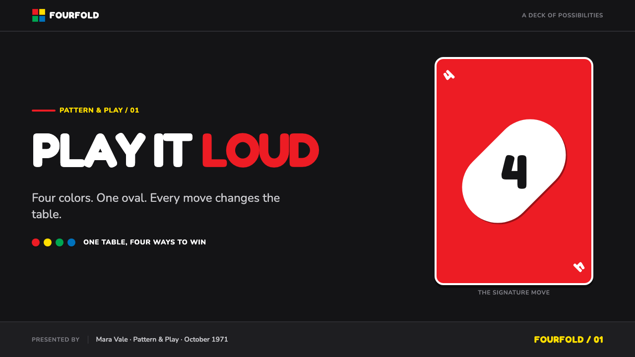
The fat white oval is the deck’s most recognizable framing device. Set on the diagonal, it breaks the stillness of a rectangular card and pushes the central mark into the foreground. Its rounded silhouette softens the otherwise forceful palette, giving UNO a playful physicality rather than a severe graphic tone.
Oversized Numerals
The central numeral is designed as the card’s visual event. Its scale supports fast recognition across a tabletop, while its rounded, substantial form matches the oval that contains it. The number is not a label attached to the card; it is the card’s main image, carrying both game information and graphic personality.
Mirrored Corner Indexes
Small index digits appear at the upper-left and lower-right corners in mirrored arrangement. This playing-card convention turns orientation into a non-issue: a player can identify the card even when another player holds it from the opposite side. The indexes are secondary, but their placement makes the whole system practical under active play.
Action as Glyph
Skip, Reverse, Draw Two, and Wild are communicated through distinct graphic signs instead of written instructions. A barred circle, chase-arrows, stacked cards, and a four-color pinwheel compress game actions into memorable silhouettes. The glyphs belong to the same visual world as the numerals: bold, rounded, high-contrast, and legible before language becomes necessary.
Who shaped UNO (1971)?
Robbins created UNO in 1971 in Reading, Ohio. His importance to the style is foundational: the deck’s loud suit colors, tilted white oval, mirrored indexes, and oversized central marks all belong to the original premise of a game that could communicate instantly across a table.
Tezak is listed among the key figures in UNO’s origin context. Within the supplied account, his presence situates the deck within the people and commercial relationships surrounding its early development and mass-market history, rather than treating the familiar visual system as the work of an anonymous package.
The Mattel brand team represents the contemporary stewardship of UNO’s recognizable standard-deck heritage. The role of such stewardship is not to replace the deck’s core signals, but to preserve their coherence: equal suit colors, black contrast, a diagonal oval, and marks that remain legible under quick, social play.
How do you use UNO (1971) today?
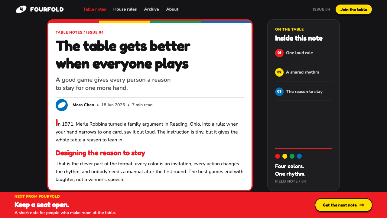
For presentation covers, UNO’s visual language works when a single large numeral or action-like symbol becomes the event of the page. Use a dark field, let one suit color lead, and place the central mark inside a tilted white oval. The title should behave like a card index or a call across the table: short, large, and immediately readable rather than descriptive or delicate.
For content slides, borrow the deck’s hierarchy rather than copying every decorative cue. Give each section one color identity, use a large number or compact glyph as a section anchor, and keep supporting copy visibly subordinate. Data slides can turn categories into the four suit colors, with a central total or key figure functioning as the oversized numeral. The aim is instant scanning, not a literal card-shaped chart.
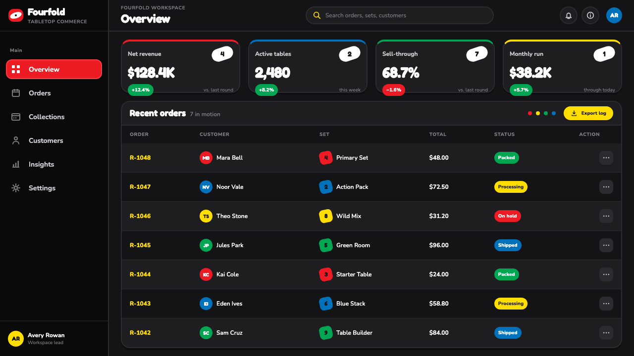
For web interfaces, UNO is best suited to playful dashboards, scoreboards, game-adjacent tools, and pricing or comparison pages that benefit from high-energy differentiation. A dark interface can use the four suit colors to distinguish states or categories, while white oval containers can elevate the most important count, status, or call to action. Corner-index logic can also inform compact badges, giving small information a reliable repeated location.
For editorial and marketing work, the style is useful when a campaign needs the familiarity of a household game without becoming visually nostalgic or cluttered. Posters, launch pages, and social graphics can create momentum through diagonal framing, isolated oversized marks, and color blocks that seem to compete in friendly tension. Keep copy concise; UNO’s visual language loses force when surrounded by long explanatory text or too many secondary motifs.
The common mistake is treating UNO as a generic rainbow palette. Its effect depends on disciplined roles: four colors identify suits, black heightens contrast, white creates the central stage, and the tilted oval directs attention. Using every color as decoration, adding soft atmospheric effects, or shrinking the central marks until they behave like ordinary labels removes the directness that makes the system recognizable.
UNO (1971) — FAQ
Why does UNO use four suit colors instead of one dominant brand color?
The four colors are functional game signals, not merely decorative accents. They establish equal suits that players can match quickly, and their equal visual weight prevents any one suit from reading as more important. The system gains its energy from the coexistence of four vivid identities against the same black and white structure.
What makes the tilted white oval so important?
It creates a clear stage for the numeral or action glyph while introducing diagonal movement into the rectangular card. The oval separates the main mark from the saturated suit color, increases contrast, and gives the deck its rounded, playful signature. Without it, the cards would retain their colors but lose much of their immediate UNO character.
Can UNO-inspired design work without literal card graphics?
Yes. The transferable principles are concentrated hierarchy, equal-color categories, dark-versus-light contrast, oversized central information, and compact repeatable indexes. A dashboard, poster, or slide can use those principles without drawing a card outline. Literal card shapes are optional; the important part is making the main signal feel immediate and playable.
Where does an UNO-inspired style struggle?
It can struggle when the subject requires quiet authority, dense reading, subtle emotional nuance, or a restrained premium tone. The deck’s visual language is built to call attention quickly, so applying its saturated competition and oversized marks to every interface element can become exhausting. It works best when used to spotlight decisions, categories, scores, or calls to action.
Related design styles
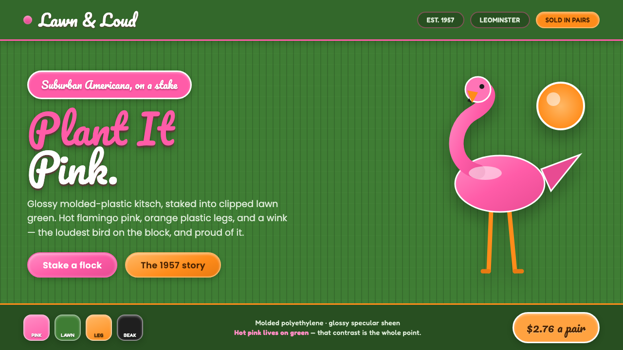 Pink Flamingo Lawn OrnamentLoud on purpose. Hot flamingo pink staked into lawn green, glossy molded plas…
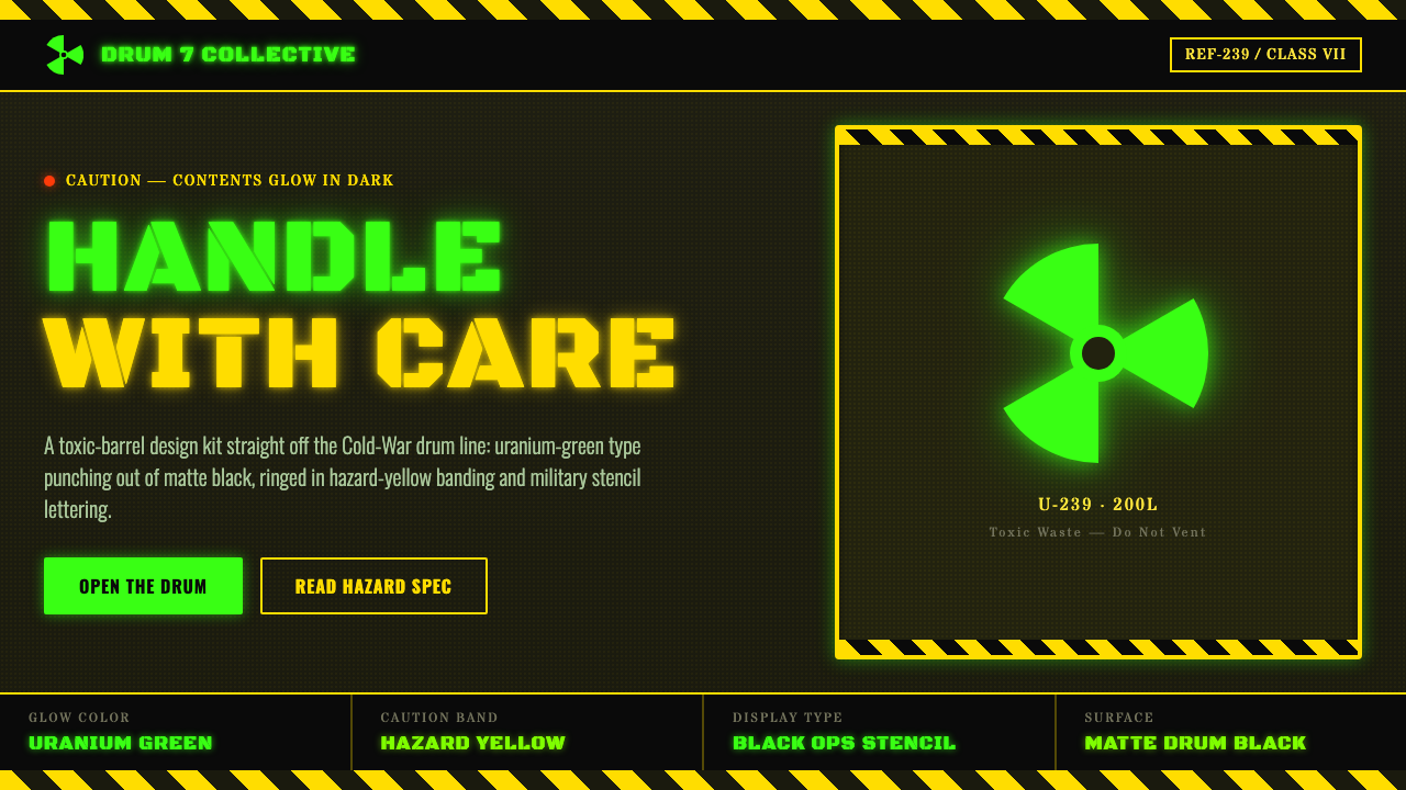 Radioactive Trefoil SignToxic-barrel glow, not the official sign. Neon-green trefoils on matte-black…
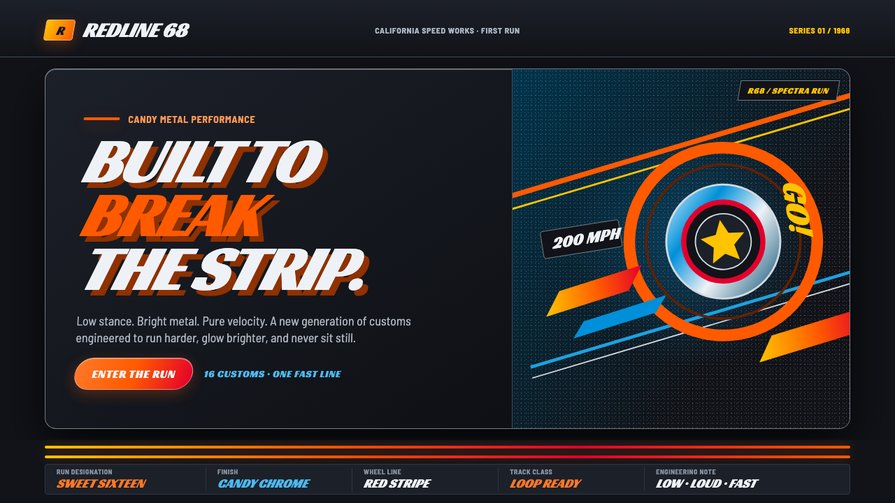 Hot Wheels (1968)Velocity in candy metal. Flame-orange tracks and fat italic type tear across…
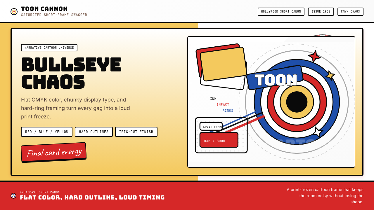 Looney Tunes (Warner Bros.)Pure cartoon chaos. Bull's-eye rings, Bungee type, and red-blue-yellow blocks.
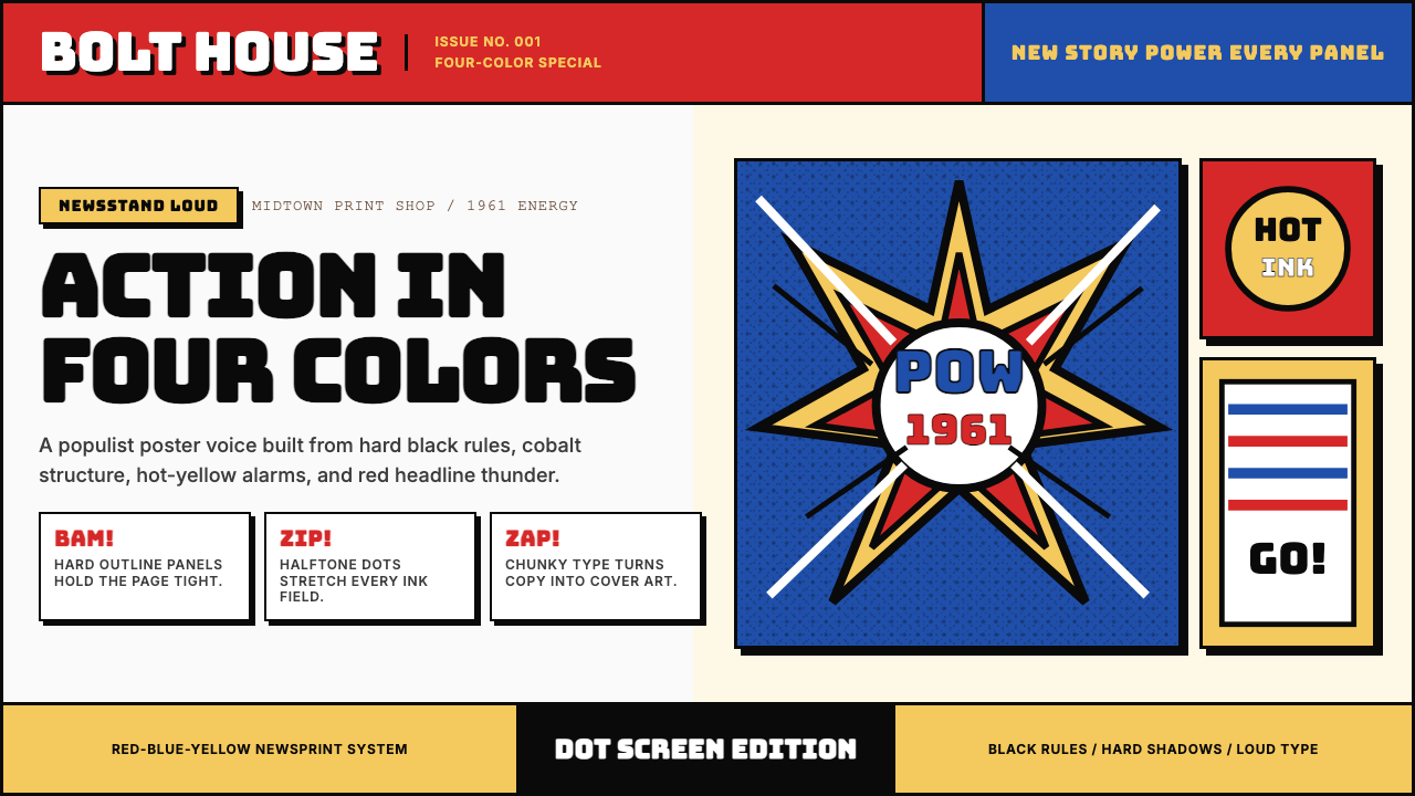 Marvel Comics (Kirby Era)Populist color hits hard. Red-blue-yellow panels, black rules, and halftone d…
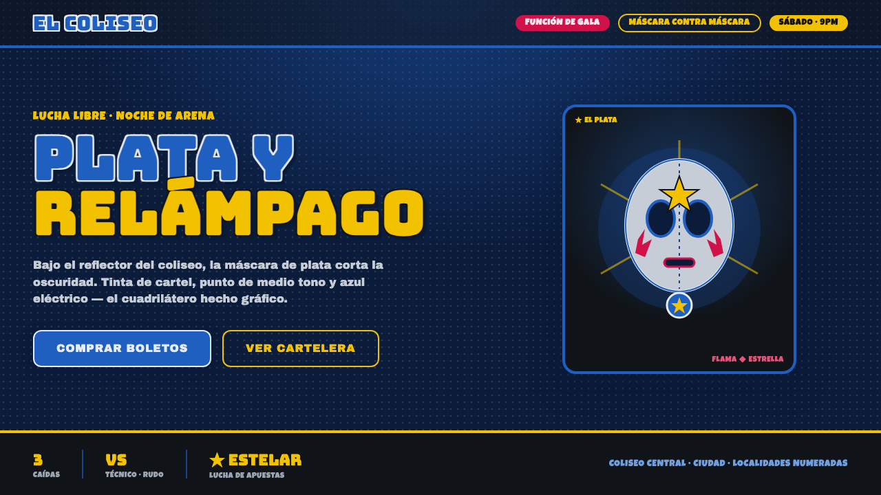 Mexican Lucha Mask GraphicComic-book lucha, lit from above. Silver-blue mask out of arena-night dark, h…