What is Pink Flamingo Lawn Ornament?
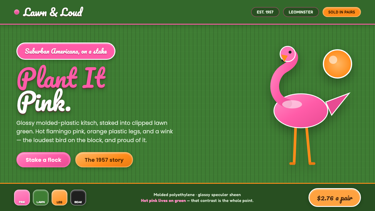
Pink Flamingo Lawn Ornament turns suburban good taste upside down: glossy hot pink, clipped lawn green, and a grin broad enough to make kitsch feel deliberate.
Pink Flamingo Lawn Ornament in brief
The Pink Flamingo Lawn Ornament is the visual world of Don Featherstone’s 1957 icon for Union Products: a glossy molded-plastic bird, staked on metal legs into a carefully maintained suburban lawn. Its force comes from collision. The bird is loudly artificial, the lawn is orderly and natural-looking, and neither side apologizes for the contrast. The result is a compact piece of North American Americana that is cheerful, synthetic, and impossible to ignore.
This style does not try to rescue kitsch by making it tasteful. It treats loudness as the point. Flamingo pink appears against a deep lawn-green ground, orange-yellow legs introduce another hit of plastic brightness, and glossy highlights announce the object’s molded surface. The palette recalls a plastics industry that understood bright color as forward-looking, while the lawn context supplies the familiar suburban setting that makes the color feel even more outrageous.
As an interface language, Pink Flamingo Lawn Ornament becomes friendly, rounded, script-driven, and knowingly theatrical. It prefers shapes that look molded rather than engineered, highlights that suggest polished plastic rather than restrained luxury, and decorative lettering that feels hand-painted on a backyard sign. The important idea is not nostalgia alone. It is the pleasure of choosing an object that is visibly excessive and enjoying the fact that everyone recognizes the joke.
Where does Pink Flamingo Lawn Ornament come from?
The ornament was designed in 1957 by Don Featherstone for Union Products in Leominster, Massachusetts. It belongs to a North American period spanning the middle decades of the twentieth century through 1990, when mass-produced plastic decor became a familiar part of domestic outdoor display. A bird placed in a lawn is simple enough to read instantly, but the material and color transformed it from a garden object into a cultural signal.
Its setting matters as much as its silhouette. The clipped green suburban lawn represents upkeep, conformity, and public-facing domestic pride. The flamingo interrupts that order with a color that has no interest in blending in. Metal legs make the bird visibly staked into the ground, turning the lawn into a stage and the ornament into a performer. The object works because this contrast is literal rather than subtle.
The supplied visual system draws directly from that material history: deep lawn green, screaming flamingo pink, orange-yellow plastic legs, and glossy specular highlights. It is associated with mid-century kitsch, suburban Americana, and mass-produced plastic decor, but it should not be flattened into a generic retro look. Its identity depends on the tension between a molded, cheerful object and the disciplined yard that frames it.
By extending the motif across an interface, the style treats ornamental excess as a coherent organizing principle. Rounded surfaces and Pacifico script preserve the sense of a friendly, display-ready object. The wink is essential: the design is loud with awareness, not loud by accident. It welcomes the viewer into a shared understanding that polished plastic, cultivated grass, and flamboyant pink can coexist as an unmistakable public gesture.
What defines the Pink Flamingo Lawn Ornament look?
Color Collision
Deep lawn green creates the setting, while hot flamingo pink refuses to recede. Orange-yellow legs add a second artificial note, and glossy light catches make the palette feel physically molded rather than digitally decorative. The contrast should feel immediate, cheerful, and slightly outrageous.
Glossy Plastic
Surfaces should suggest molded plastic with a polished finish. Highlights are crisp and visible, describing curvature and manufactured smoothness. This is not glass, chrome, or luxury lacquer; it is everyday plastic made proudly theatrical by shine.
Rounded Form
Edges favor softness, bulbous contours, and forms that seem pressed into shape. Corners should feel approachable rather than severe. The visual language inherits the ornament’s friendly silhouette, making controls and containers feel like display objects instead of anonymous interface machinery.
Script Personality
Pacifico script provides the expressive voice. It should be used where the interface needs charm, recognition, or a sign-painter flourish, not as the default voice for every sentence. Supporting text stays clear so the script reads as personality rather than noise.
Lawn as Stage
The green ground is not a neutral backdrop. It evokes clipped suburban grass and gives the pink ornament a place to perform. Broad green fields, gentle organic accents, and carefully framed empty areas can preserve the sense that the flamingo has been planted in a maintained yard.
Knowing Kitsch
The style succeeds when it is conspicuous with intention. It can be playful, excessive, and decorative, but it must remain organized enough to show that the joke is controlled. A loud accent earns its place by reinforcing the flamingo-and-lawn contrast, not by competing with every other element.
Who shaped Pink Flamingo Lawn Ornament?
Featherstone designed the Pink Flamingo Lawn Ornament in 1957 for Union Products. His role gives the style a concrete origin: it is not an abstract retro palette, but a visual language derived from a named molded-plastic lawn object and its deliberately conspicuous presence.
Union Products is the company for which the ornament was designed in Leominster, Massachusetts. Within this story, the company represents the industrial side of the aesthetic: molded plastic, repeatable outdoor decor, and an object made for broad domestic visibility rather than private connoisseurship.
The ornament itself is the central figure. Its hot pink body, orange-yellow legs, glossy molded surface, and placement in manicured lawn green define the system’s visual grammar. Every interface application should preserve the relationship among object, material, color, and setting.
How do you use Pink Flamingo Lawn Ornament today?
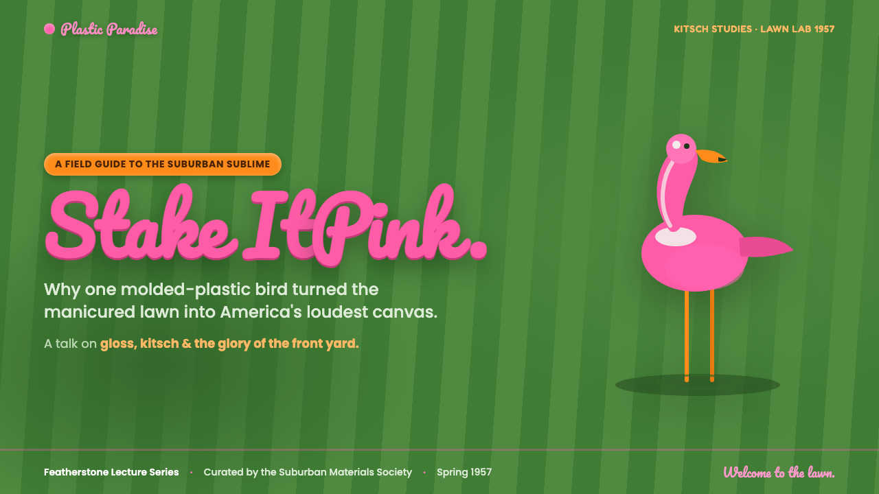
For presentation slides, use the style to make a cover feel like a lawn-sign reveal: a broad green field establishes place, a single flamingo-pink form introduces the subject, and a script title supplies the wink. Content slides should become calmer without becoming generic. Keep explanatory text highly legible, use rounded containers sparingly, and let pink appear at moments of emphasis rather than behind every paragraph. On data slides, charts can borrow the green-and-pink contrast, while orange-yellow identifies a supporting category. The information must remain easier to read than the ornament is to admire.
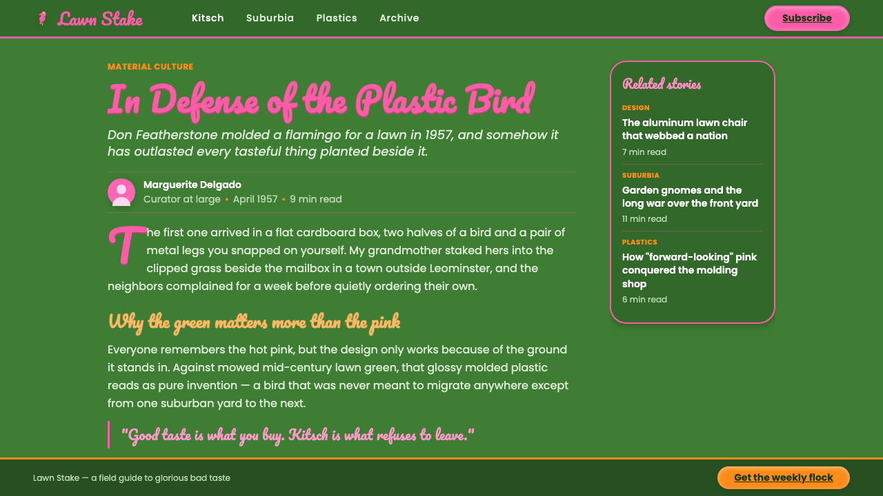
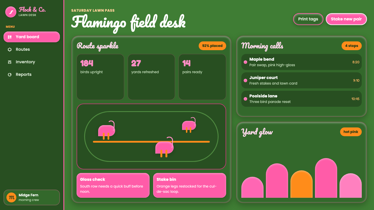
For web interfaces, the style is strongest on dashboards, promotional homepages, event pages, and pricing views that benefit from a memorable personality. Treat the deep green ground as environment rather than mere background. Pink should guide attention to a key action, active state, featured option, or memorable metric. Rounded panels can suggest molded objects, and restrained glossy highlights can distinguish important surfaces. Pacifico works best for names, campaign moments, and short celebratory phrases; navigation, forms, tables, and dense controls need a plainer reading voice.
For editorial and marketing work, use the flamingo as a point of view rather than a repeating sticker. A feature story can open with a dramatic lawn-green field and a loud script headline, then move into calm reading sections with pink used for pull quotes, labels, or section moments. Marketing modules can alternate between lush green expanses and bright plastic-like accents, always leaving enough empty room for the contrast to register. The desired effect is a backyard display seen with affection: public, polished, humorous, and unmistakably intentional.
The common mistake is confusing this system with indiscriminate neon retro design. If pink, green, orange-yellow, gloss, script, and rounded shapes all demand attention at once, the specific flamingo-on-lawn idea disappears. Do not make Pacifico carry dense information, do not apply highlights to every surface, and do not use green simply because it is available. Establish the lawn, introduce the bird, then reserve the loudest treatment for the moment that deserves it.
Pink Flamingo Lawn Ornament — FAQ
Is this style simply a generic retro aesthetic?
No. Its identity comes from a specific relationship: Don Featherstone’s 1957 molded-plastic flamingo, Union Products, hot pink, metal legs, and the manicured suburban lawn. A generic retro treatment may borrow bright color or script lettering, but it misses the deliberate collision between cultivated green order and flamboyant plastic display.
Why is the lawn-green ground so important?
Because the green ground supplies the ornament’s social setting. It evokes a maintained suburban lawn, which makes the flamingo’s pink body read as an interruption rather than merely a colorful shape. Without that setting, the palette loses the tension between domestic order and cheerful excess that gives the style its character.
Can Pacifico be used throughout the interface?
It should be selective. Pacifico gives the system its sign-painter warmth and playful personality, making it valuable for names, short headers, and special moments. Used for navigation, paragraphs, forms, and data, it weakens readability and turns the wink into a constant shout. Pair it with a clear supporting type treatment for everyday information.
Where does Pink Flamingo Lawn Ornament work best?
It works best where a brand can benefit from friendly spectacle: campaigns, event experiences, promotional pages, playful dashboards, editorial packages, and offers that need to be remembered. It is less suitable for contexts requiring quiet neutrality or severe institutional restraint. The style asks a product to be seen, and that should match the product’s intended voice.
Related design styles
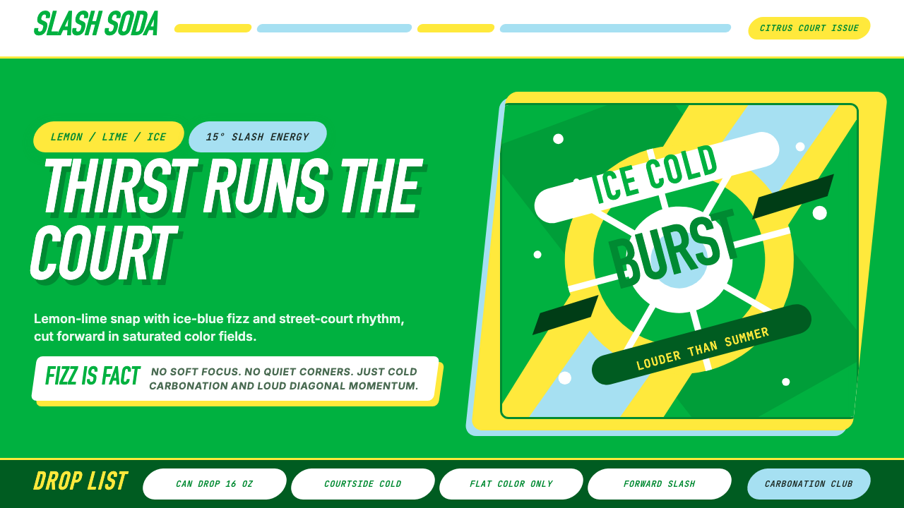 Sprite — Obey Your ThirstCitrus hits like asphalt heat. Saturated green, lemon yellow, and 15° slashes…
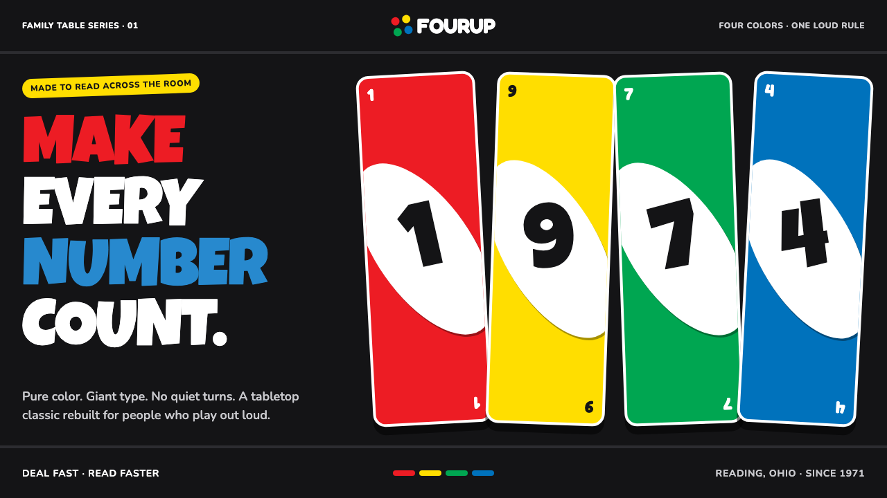 UNO (1971)Every number shouts. Four pure primaries punch through black with tilted whit…
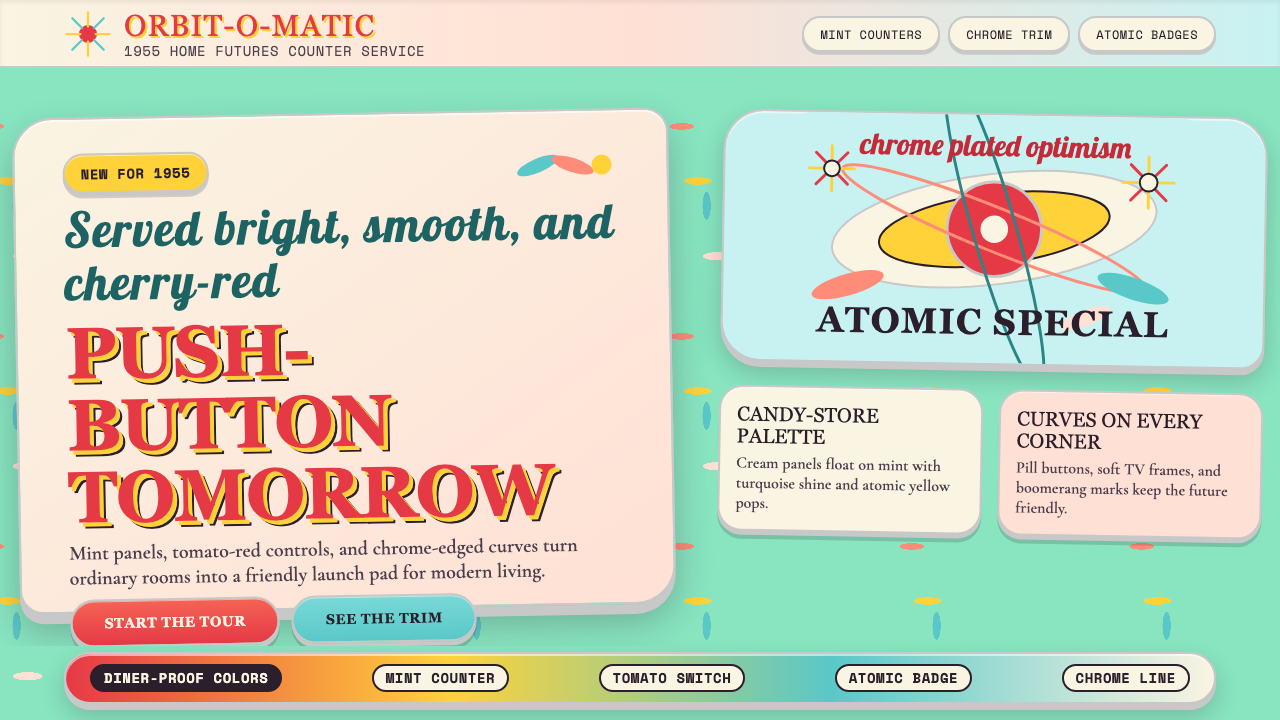 Populuxe Atomic AgeThe future grins. Mint Formica, tomato-red pills, Cooper Black, and atomic st…
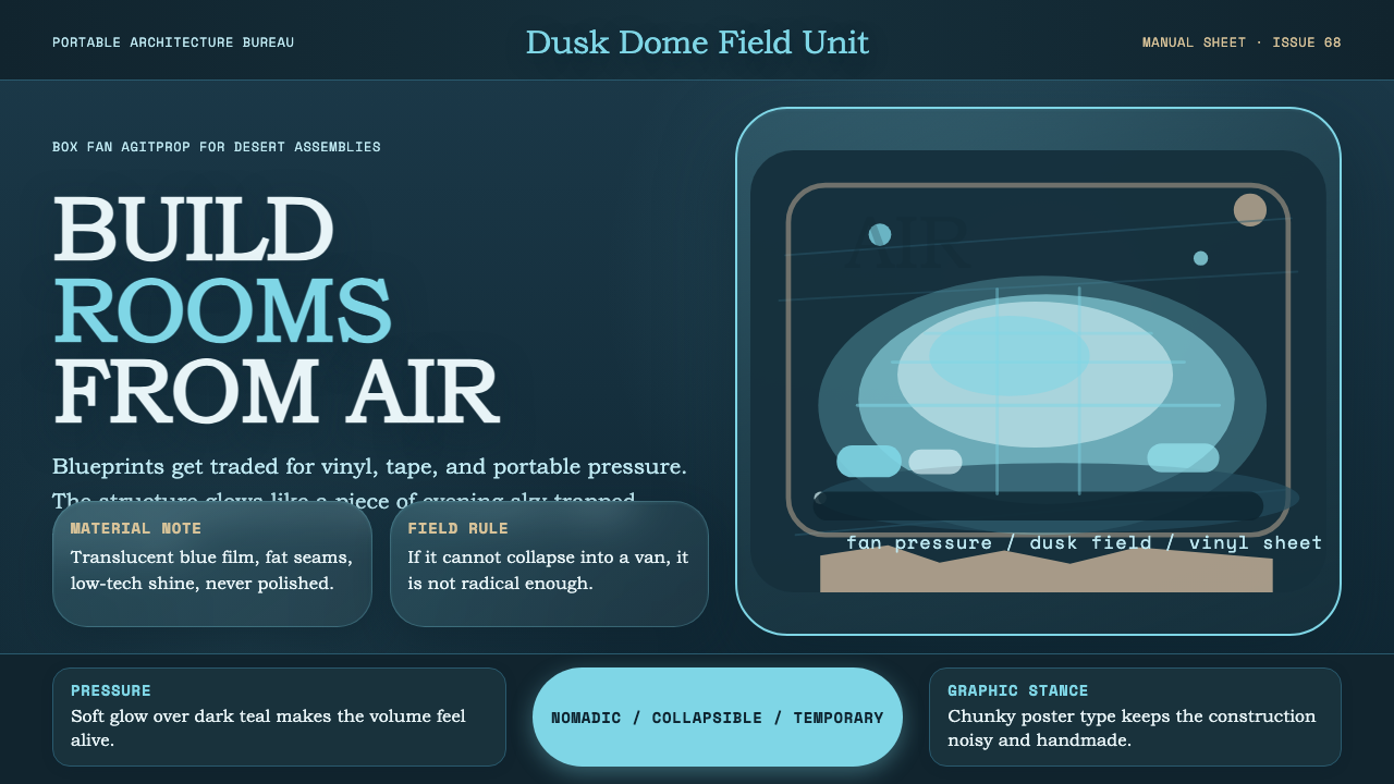 Ant Farm InflatablesTemporary architecture glows. Vinyl-blue domes swell over dark desert teal.
 Corita Kent SerigraphJoy printed at full volume. Flame red, hot pink, and misregistered type flood…
 Crayola (1903)Color never whispers. Golden yellow, a green slash, and waxy swatches make ev…