What is Corita Kent Serigraph?
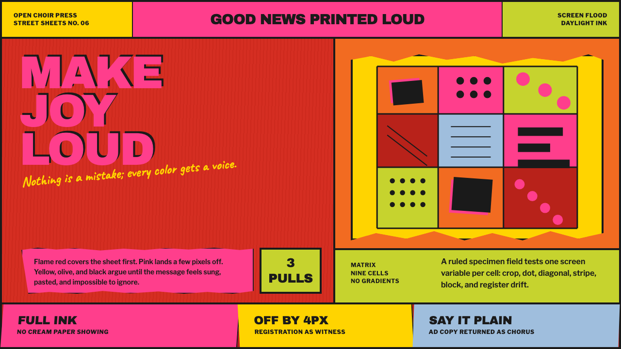
Corita Kent Serigraph prints joy at full volume — flame red and hot pink flood every corner of the sheet, and type is allowed to land slightly out of register because precision was never the point.
Corita Kent Serigraph in brief
Corita Kent Serigraph is drawn from the screenprints made by Corita Kent, a Catholic nun who worked in the art department of Immaculate Heart College in Los Angeles. Working in serigraphy — screenprinting — she pulled screens flooded edge to edge with daylight fluorescent ink, a pigment class that glows brighter than ordinary color because it reflects light in the ultraviolet range as well as the visible one. The sheet, in her finished prints, is never left white; ink at full pigment strength covers essentially the entire surface.
Her source material came directly off the street rather than out of an artist's imagination: Wonder Bread wrappers, Esso gas station signage, and the General Mills Big G logo were torn, crumpled, re-photographed, and then cut into paper stencils for printing. This is appropriation as a working method rather than a one-off gesture — commercial, disposable packaging became the raw visual material for serious, repeated printmaking.
Nothing in the resulting work is drawn cleanly. Edges are torn rather than cut with precision, color separations land a few pixels out of register rather than aligning perfectly, and hand-lettered text curves around blobs of flat color rather than sitting on a straight baseline. The system treats this imprecision as a feature rather than a flaw: it is what keeps the work feeling handmade and urgent rather than mechanically produced. Even the language on the sheet participates in this transformation — advertising copy lifted from packaging and signage is re-lettered in a tone closer to scripture than to a sales pitch, so that a phrase originally written to sell bread or gasoline reads instead like a small, joyful proclamation.
Where does Corita Kent Serigraph come from?
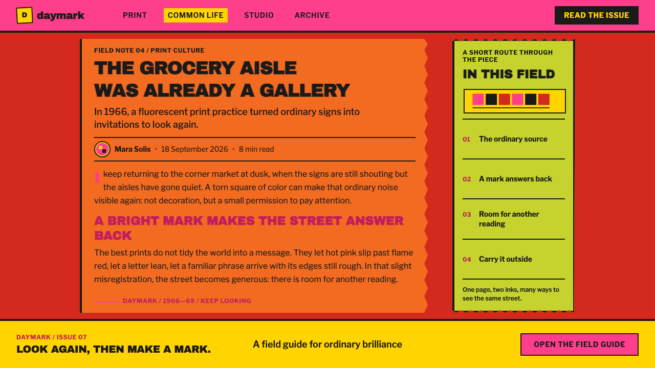
Corita Kent's active printmaking period ran from 1950 to 1990, with her Day-Glo, Pop-inflected work concentrated specifically between 1964 and 1969. She made this work in Los Angeles, in the art department of Immaculate Heart College, before later relocating to Boston. That five-year concentration of Day-Glo work sits at the center of what this system draws from — it is the period in which flooded fluorescent color, appropriated advertising, and deliberately imprecise printing came together as a single, recognizable practice.
Kent worked alongside other named figures in the same printmaking practice, including Harry Hambly and Harry Metcalf, whose involvement in producing this body of serigraphy work situates it as a shared studio practice rather than the output of one person working entirely alone. Screenprinting at this scale and pace — with edge-to-edge fluorescent ink and hand-cut stencils — depended on more than one set of hands pulling screens and registering colors, and the studio's working rhythm favored speed and volume of output over the kind of slow, singular perfectionism associated with fine-art printmaking in other traditions.
The use of daylight fluorescent pigment was unusual for printmaking at the time, and its extent has since been documented directly: conservation analysis of a substantial sample of her prints found that a significant portion used this fluorescent pigment class, confirming that the glowing, oversaturated color effect was a deliberate, sustained material choice across her body of work rather than an occasional experiment. This is a materially unusual finding, since fluorescent pigment of this kind was more commonly associated with commercial signage and safety markings than with fine-art printmaking, which underlines how directly Kent's practice borrowed its raw material — not just its imagery, but its pigment chemistry — from the commercial visual world around her.
This system is named directly alongside three movements: American Pop art, serigraphy as a printmaking discipline, and Rules for Students and Teachers — a set of guiding principles associated with the Immaculate Heart College art department where Kent worked. That the movement's own name includes a set of studio rules, rather than only a stylistic label, reflects how much Kent's work was produced within a specific teaching environment that treated attentiveness to everyday material, rule-breaking, and continuous work as values in themselves.
What defines the Corita Kent Serigraph look?
Full-Bleed Saturation
The sheet is never left white or lightly covered. Ink at full pigment strength floods edge to edge, so the composition reads as completely filled rather than composed against empty space, with color functioning as the ground itself rather than as a shape placed on top of one.
Daylight Fluorescent Color
Flame red and hot pink appear at a glowing intensity beyond what ordinary pigment achieves, reflecting the daylight fluorescent inks Kent used, documented in later analysis across a large share of her prints.
Deliberate Misregistration
Color separations are allowed to land slightly out of alignment rather than registering perfectly. This small, consistent imprecision is what keeps the work feeling urgent and handmade.
Torn Stencil Edges
Shapes carry rough, torn silhouettes rather than clean-cut edges, reflecting how source imagery was physically torn and crumpled before being turned into a stencil.
Curving Hand Lettering
Text follows the curve of a color blob or shape rather than sitting on a straight baseline, giving lettering a hand-guided, improvisational quality.
Appropriated Street Source
Visual motifs are drawn from recognizable commercial packaging and signage rather than original illustration, then transformed enough that the source is felt rather than directly legible.
Scripture-Toned Copy
Text lifted from advertising is re-lettered in a tone closer to proclamation or scripture than to a sales pitch, so ordinary commercial language reads as joyful and declarative rather than transactional.
Who shaped Corita Kent Serigraph?
Corita Kent made this body of serigraphy work while a member of the art department at Immaculate Heart College in Los Angeles, with her Day-Glo, Pop-inflected prints concentrated between 1964 and 1969, before her later years working in Boston. Her method of tearing and re-photographing street advertising into paper stencils, then flooding the sheet with daylight fluorescent ink, defines every characteristic this system draws from — from the saturated color and torn edges down to the scripture-toned re-lettering of found commercial text.
Harry Hambly worked alongside Corita Kent in producing this serigraphy work, part of the shared studio practice that made prints at this scale and with this level of finish possible. His involvement is documented directly among the figures central to this body of work.
Harry Metcalf is named alongside Corita Kent and Harry Hambly as central to the serigraphy practice this system draws from, underscoring that the fluorescent, appropriated, deliberately imprecise printmaking style documented here emerged from collaborative studio work rather than a single individual's isolated output.
How do you use Corita Kent Serigraph today?
Corita Kent Serigraph transfers well anywhere a design needs to feel joyful, loud, and urgently handmade rather than polished or corporate — but the transfer only works if the sheet stays fully saturated and small imprecisions, like slight misregistration, are allowed to remain rather than being cleaned up.
For presentation slides, a cover page benefits from full-bleed flame red or hot pink filling the entire frame, with a bold, hand-lettered-style headline curving slightly rather than sitting perfectly straight. Content slides should avoid large areas of plain white background; even a supporting slide should carry a flooded color field with type set directly over it, echoing the way Kent's prints never leave the sheet bare.
For web interfaces, the style suits products built around creativity, community joy, or youth culture — art platforms, event pages, or campaigns that want to feel energetic rather than restrained. A saturated fluorescent-adjacent accent color used generously, combined with deliberately imperfect or hand-styled type treatments for headlines, can carry the same loud, urgent energy without needing literal torn-paper textures. Buttons and calls to action can afford to feel oversized and slightly off-grid rather than crisply aligned, since precision was never the value this system was built to express.
For editorial and marketing layouts, the style supports bold, poster-like spreads: a flooded color field as background, large type curving around a central graphic element, and imagery treated as roughly cropped or silhouetted rather than cleanly composed. Appropriated or remixed everyday imagery — packaging, signage, ordinary text — fits this system's spirit far better than polished original illustration.
A common mistake is applying the bright color palette while keeping everything else clean, aligned, and precisely registered. The system's actual power comes from the combination of saturated color and deliberate imprecision together; bright color alone, rendered with corporate-level polish, produces something that looks decorative rather than urgent, losing the handmade quality that makes this style recognizable. A second mistake is treating the appropriated-text idea too literally, by lifting real slogans or trademarks wholesale; the system's real lesson is the transformation itself — take ordinary language, re-letter it by hand, and let it curve until it sounds like a proclamation rather than a pitch.
Corita Kent Serigraph — FAQ
Is this the same as generic Pop art design?
It is related but more specific. Generic Pop art design borrows bold color and commercial imagery broadly. This system is drawn specifically from serigraphy practice that floods the entire sheet with daylight fluorescent ink, tears and re-photographs real advertising into stencils, and deliberately allows color separations to land out of register — a combination of material choices and controlled imprecision that most generic Pop-inspired design does not include.
Why is misregistration treated as a feature rather than a mistake?
Because in Kent's actual prints, this small imprecision is what keeps the work feeling handmade, urgent, and produced under real studio conditions rather than mechanically perfect. Cleaning it up would remove exactly the quality that distinguishes this system from a generic, corporately polished bright-color design.
Does this style require using real advertising or brand imagery?
No, and doing so with recognizable trademarks in unrelated commercial work raises its own legal and ethical issues. What transfers safely is the underlying method — transforming ordinary, everyday visual material through tearing, cropping, and re-photographing until it becomes a new abstract or typographic element — rather than a literal reuse of any specific brand's imagery.
How saturated should the color be to match this style?
As saturated and as fully covering as possible. This system does not use color sparingly or as an accent — the defining quality is that ink floods the entire sheet at full pigment strength, so a design with large areas of white, muted, or pastel color has already departed from the source material's core logic. If a layout still reads as calm or restrained after applying this palette, the color has not been pushed far enough.
What kind of products or contexts does this style not suit?
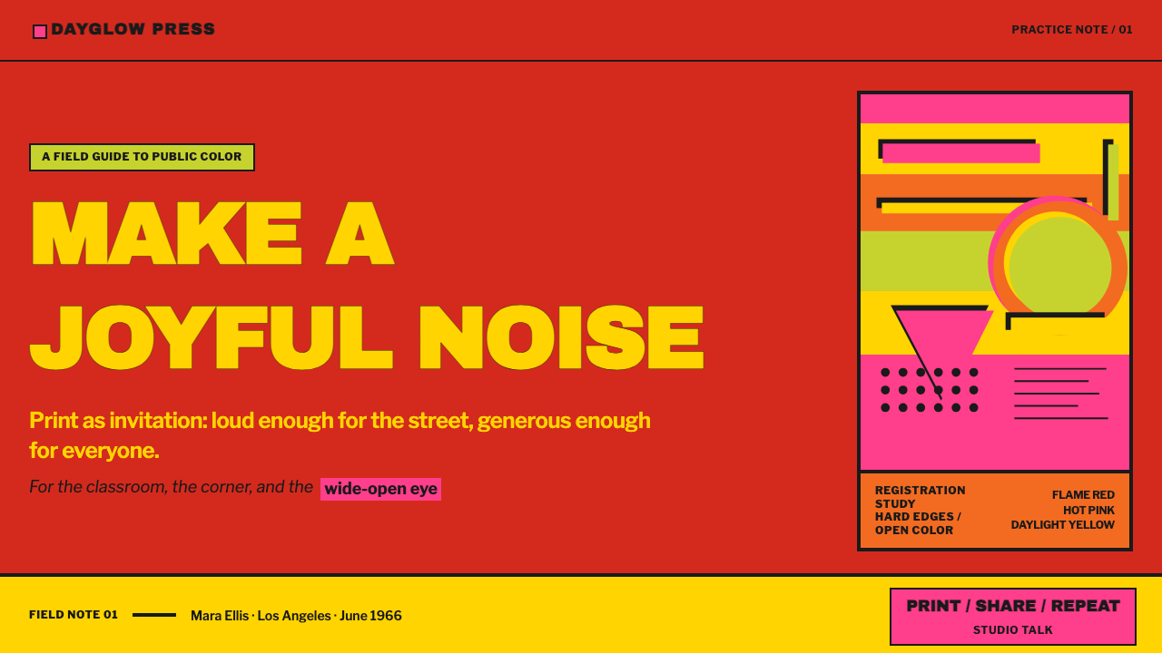
It struggles in contexts that require calm precision, restraint, or a sense of quiet authority — financial dashboards, legal or medical platforms, or any product where loud, saturated color and visible imprecision would undermine trust. The style's entire energy depends on embracing imperfection and volume; forcing it into a context that demands calm exactness contradicts its basic character, and a viewer accustomed to reading full-bleed fluorescent color as playful may find it actively distracting in a setting that calls for careful, unhurried reading.
Related design styles
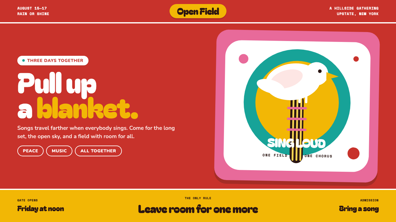 Woodstock (1969)Peace goes poster-loud. Vermilion ink, plump white forms, and bulging hand-cu…
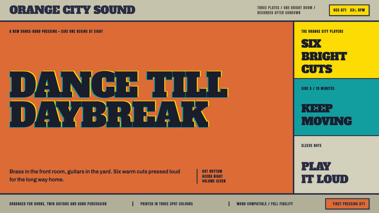 Highlife Record SleevePrint it loud. Hot orange fields and fat slab type keep the sleeve gloriously…
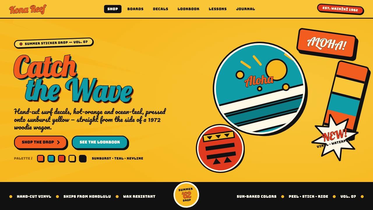 Hapa-Haole Surf DecalSurf-shop signage, loud and laminated. Sunburst yellow ground, chunky black k…
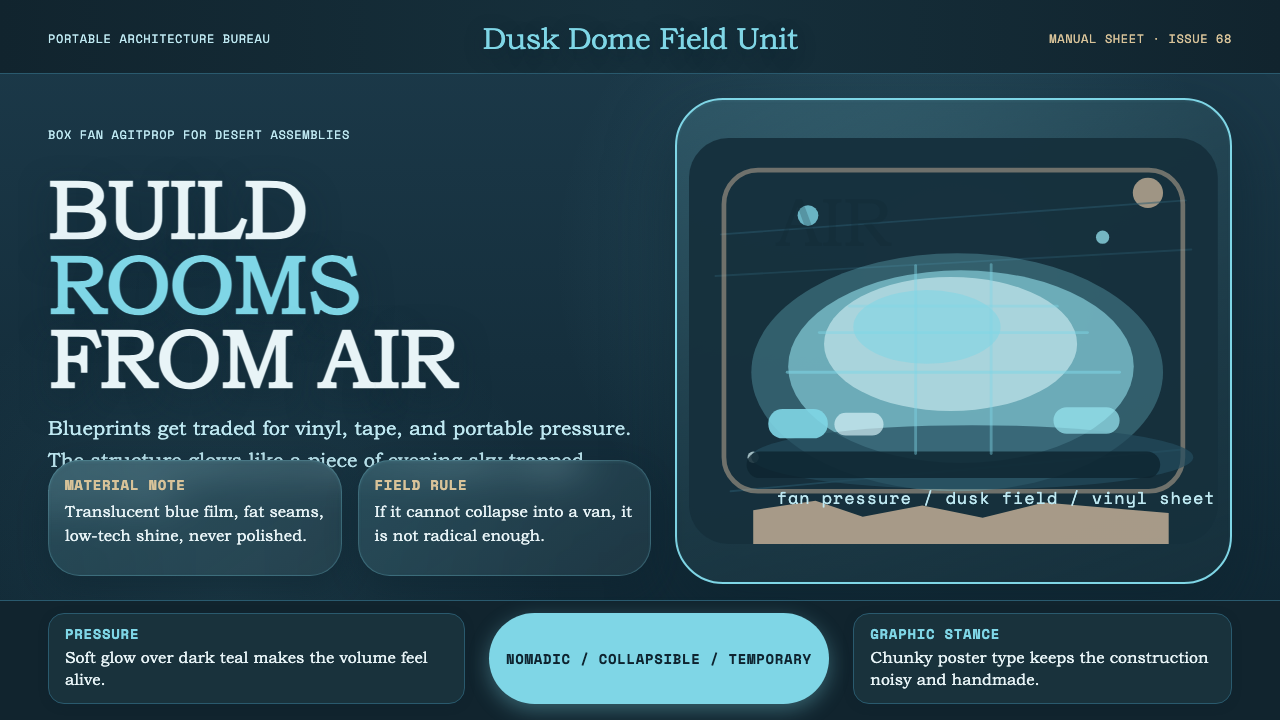 Ant Farm InflatablesTemporary architecture glows. Vinyl-blue domes swell over dark desert teal.
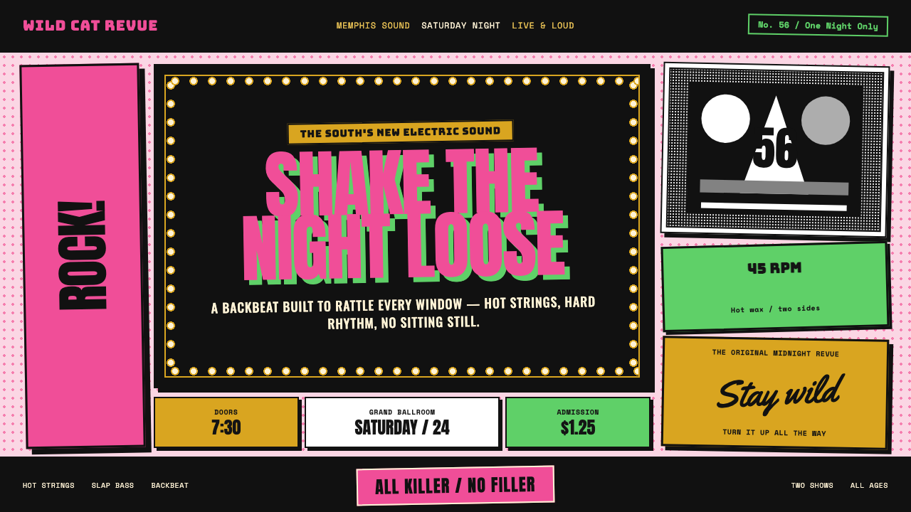 Elvis Presley (1956)Rock learned to shout. Bubblegum pink, acid green and jailhouse type land wit…
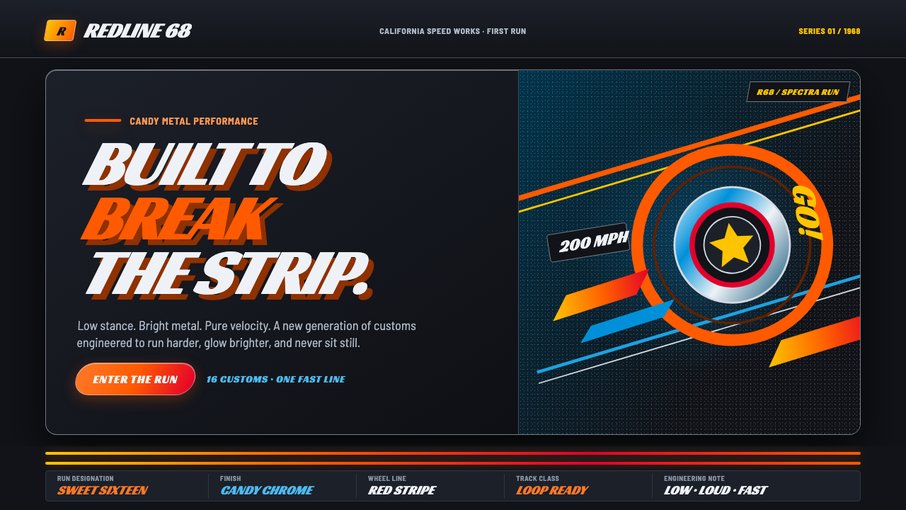 Hot Wheels (1968)Velocity in candy metal. Flame-orange tracks and fat italic type tear across…