What is Highlife Record Sleeve?
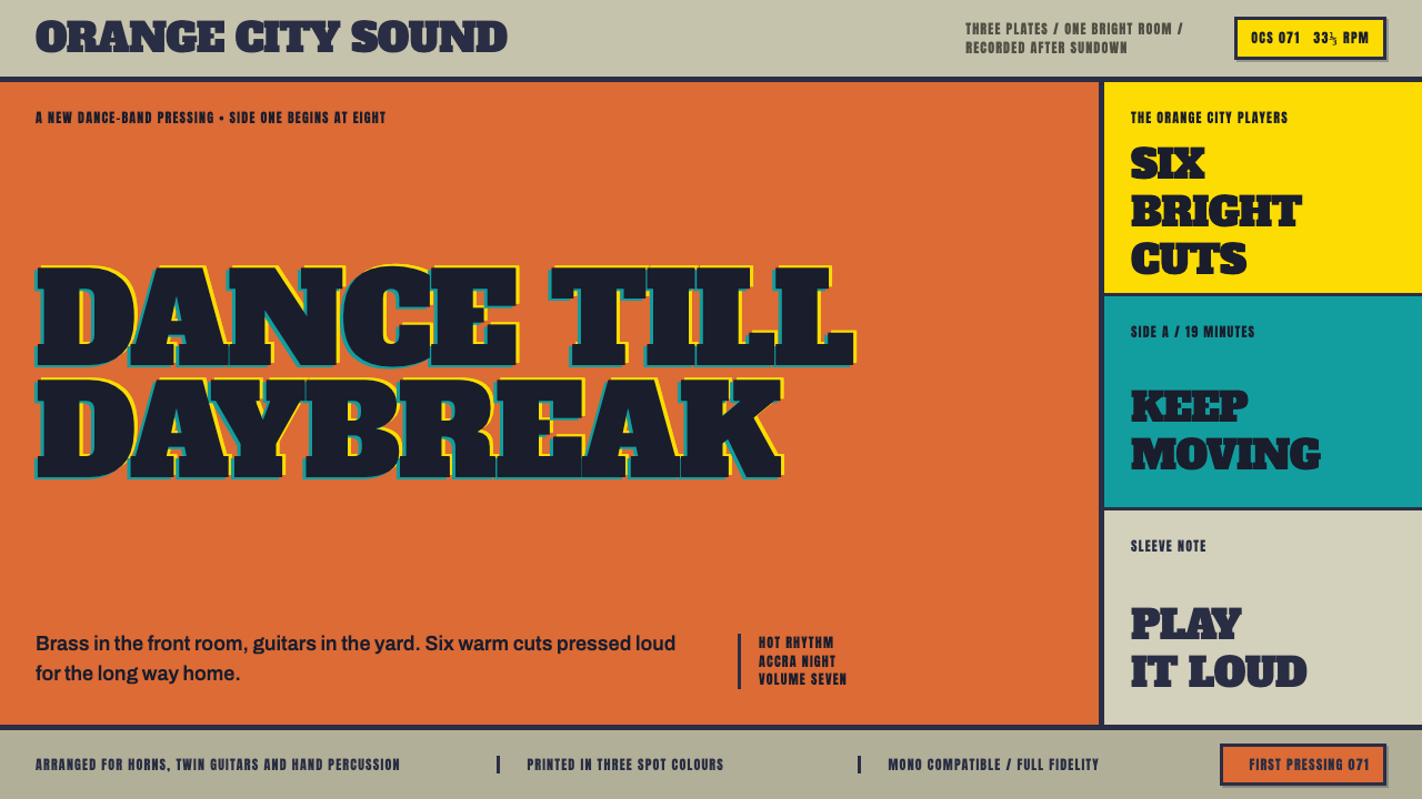
Highlife Record Sleeve reprints the cheap two- and three-plate presses that dressed Accra and Kumasi dance records in the 1950s–70s — hot flat color, one thick black line doing all the drawing, and registration that never quite lines up.
Highlife Record Sleeve in brief
Highlife Record Sleeve is built from the commercial printing that dressed Ghanaian dance-band and palm-wine records from the 1950s through the 1970s. A highlife jacket was printed cheap and fast, with only two or three plates and no half-tones, which meant every figure — a guitarist, a horn section, a singer mid-note — had to be drawn as a single heavy black line doing all the work a photograph or a shaded illustration would otherwise do.
Color in this world was never subtle, because the press could not render subtlety even if an artist wanted it to. The band was flooded into a field of hot orange or process yellow, sometimes a bright lake blue, and the title was not printed on top of the ink but knocked out of it — left as the bare jacket board showing through, set in the fattest slab lettering the print shop owned, built on a loose, handwritten foundation rather than a formal typeface.
This system reproduces exactly what came off that press, imperfections included. The page reads as grey-olive jacket board rather than white or cream paper, and color arrives as whole, untrimmed fields rather than neatly cropped shapes. Most tellingly, the plates land a hair off register — the way real cheap printing actually behaved — and that misalignment is preserved on purpose, because it is precisely what makes an object look printed rather than digitally rendered.
Where does Highlife Record Sleeve come from?
The style sits inside the history of highlife itself — the palm-wine and dance-band strains of Ghanaian popular music — and the commercial printing industry that grew up alongside it in Accra and Kumasi. Record jackets did not start out illustrated at all: through the 1920s, records commonly shipped in blank brown paper sleeves with no artwork whatsoever.
Full illustration only arrived later, developing across the 1950s to the 1970s as the local record industry grew and commercial printers in Accra and Kumasi took on jacket work using the screen and offset printing technology available to them. That technology, not artistic preference, is the direct cause of the look: a shop running two or three plates could not afford half-tones or fine color separation, so an entire visual vocabulary grew up around what a heavy black keyline and a couple of flat, saturated ink colors could achieve.
The economics of the format shaped its boldness. A limited plate count meant every illustration had to communicate instantly and cheaply — hence the single dominant black line carrying all figurative detail, and hues chosen for maximum punch rather than accuracy, since a flood of hot orange or yellow ink covered more area, more evenly, and more cheaply than a carefully mixed or graduated tone ever could.
This commercial print culture and the musicians whose records it dressed grew up together, with figures such as Francis Kwakye, Dick Essilfie-Bondzie, A. K. Yeboah — known as Akwaboa — and K. Frimpong associated with the highlife sleeve tradition as it matured across Accra and Kumasi. The style's off-register plates, worn jacket board, and record-groove wear marks are the direct physical residue of that commercial printing process, not later stylistic invention — this system simply keeps what the original presses actually produced rather than cleaning it up.
What defines the Highlife Record Sleeve look?
Hot Flat Color Fields
Color arrives as whole, untrimmed fields — hot orange, process yellow, a bright lake blue — with no shading, no gradient, and no attempt at photographic realism. A cheap two- or three-plate press could not render subtlety, so the palette leans instead into maximum saturation and flat, confident coverage.
Grey-Olive Jacket Ground
The base is not white or cream paper but an aged, grey-olive jacket board tone, grounding every bright color field against a slightly muted, worn surface rather than a clean white page.
Single Black Keyline
One heavy, continuous black line does the entire job of drawing a figure — a guitarist, a horn player, a singer — standing in for shading, modeling, and detail all at once. This is the direct legacy of a press with no half-tone capability.
Knocked-Out Slab Type
Titles are not printed as ink sitting on top of a color field; they are knocked out of it, appearing as the bare board color showing through a cut in the surrounding ink, set in the fattest slab lettering available and built on a loose, handwritten foundation.
Off-Register Drift
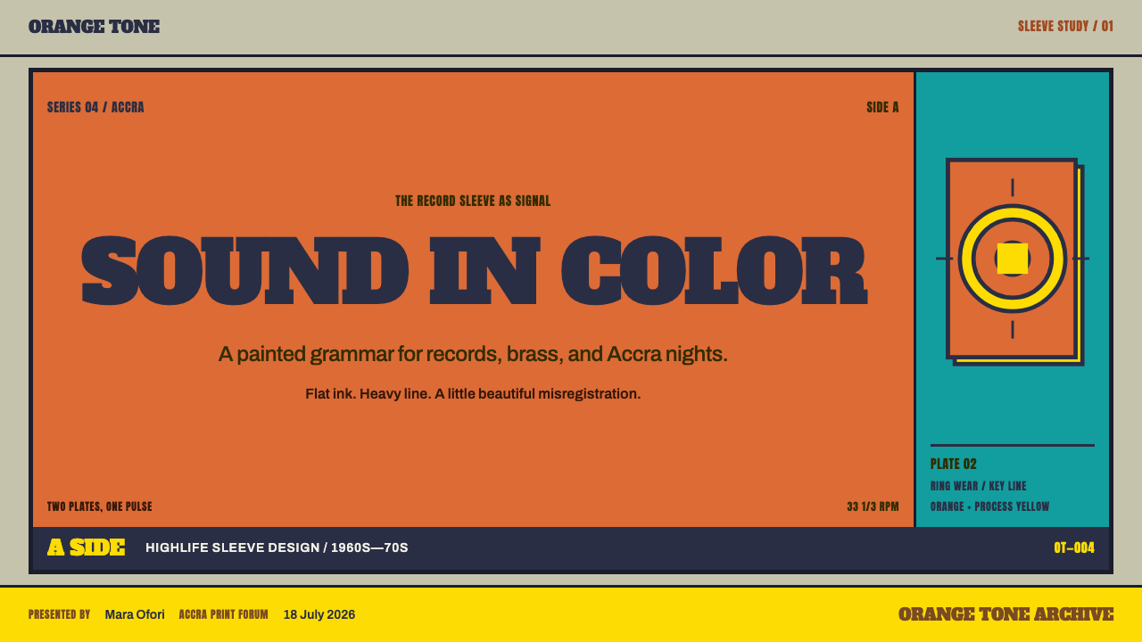
Color plates land a hair out of alignment with the black keyline beneath them, producing a visible, slightly shifted edge. This imperfection is deliberately preserved rather than corrected, since a perfectly registered image would look printed by a machine that never existed in this format's actual history.
Ink Halo
The edges where plates run slightly off-register leave a faint ring of stray ink beyond the intended shape, a direct visual trace of the press's mechanical limits rather than a designed decorative effect.
Record-Wear Ring
A circular scuff mark sits at the center of the composition, echoing the wear a vinyl disc's surface picks up from repeated play — a reminder that the object being depicted was handled and played, not kept pristine on a shelf.
Who shaped Highlife Record Sleeve?
Kwakye is associated with the commercial print and illustration tradition that produced highlife record sleeves in Accra and Kumasi as the format matured across the 1950s to 1970s.
Essilfie-Bondzie is linked to the same commercial art tradition that turned cheap two- and three-plate printing into the bold, flat-color illustration style that defined highlife jackets of the period.
Known by the name Akwaboa, Yeboah is counted among the figures associated with the highlife sleeve tradition as it developed in Ghana's commercial printing centers.
Frimpong is tied to the highlife scene whose recordings these sleeves were made to sell, part of the broader dance-band and palm-wine musical culture the printed jacket style grew up around.
How do you use Highlife Record Sleeve today?
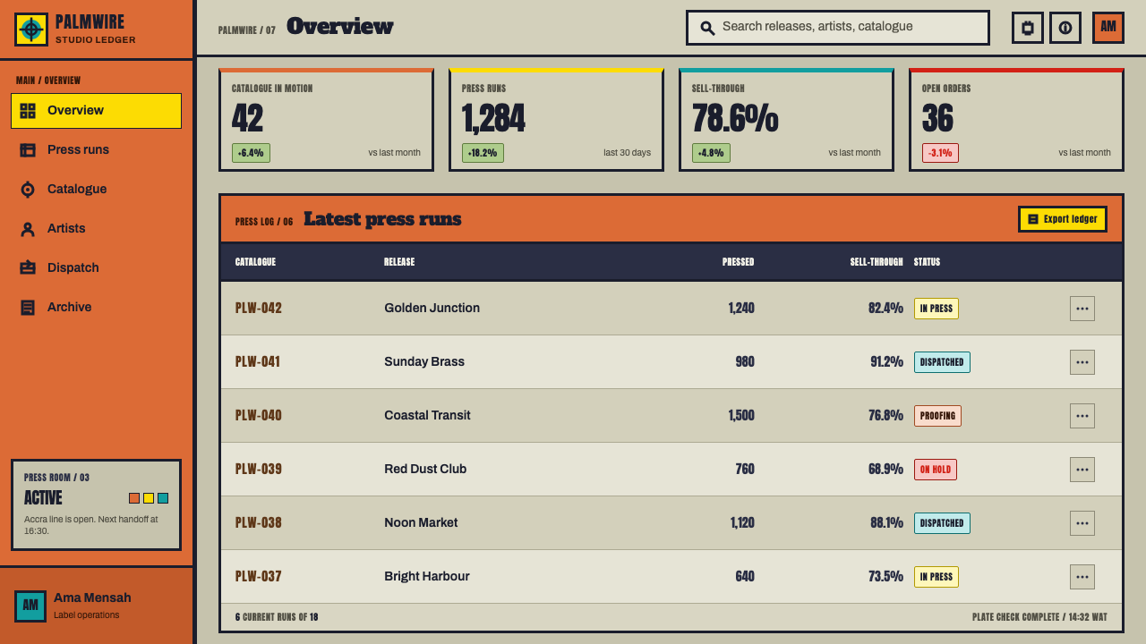
On presentation slides, the style works well for anything that wants to feel handmade and immediate rather than corporate. A cover slide can use a single flooded color field with a bold, knocked-out slab title, while content slides keep illustration reduced to a single heavy keyline per figure or icon rather than shaded artwork. Data should be shown in flat, saturated color bars rather than gradients, echoing the press's inability to render subtlety.
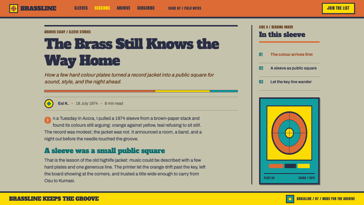
For web interfaces, this system suits music, culture, and community platforms that want warmth and handmade energy over polish. Keep backgrounds toned rather than pure white, use hot flat colors for primary actions and headers, and let icons or illustrations read as single-keyline drawings rather than detailed renderings. A small off-register shift on decorative elements can reinforce the print-shop feel without undermining legibility.
In editorial and marketing contexts, the knocked-out slab typography is the style's strongest asset — a headline reversed out of a hot color field reads with real punch and works well for pull quotes or section headers. Marketing pages benefit from leaning into the record-wear ring motif as a recurring graphic device, subtly signaling that the product has been used and loved rather than freshly unboxed.
The off-register drift and ink halo are best used sparingly and deliberately — as an accent on key decorative elements rather than applied uniformly across an entire layout, where it would start to read as noise rather than character.
The most common mistake is cleaning the imperfections up: perfectly aligning every plate, using pure white instead of toned jacket board, or smoothing the black keyline into a thin, precise outline. Every one of those corrections removes the exact evidence of cheap, real-world printing that gives the style its authenticity and warmth.
Highlife Record Sleeve — FAQ
Why does the style deliberately include printing mistakes like off-register color?
Because those imperfections are what real highlife jackets actually looked like. The presses that printed them were cheap and fast, and perfect registration was neither expected nor achievable; keeping that drift is what separates an authentic reproduction of the format from a clean, generic flat-design look that borrows only the color palette.
Is this the same as generic bold, flat 1970s-style graphic design?
It shares the flat-color sensibility, but the specific mechanical fingerprints — the single black keyline standing in for all shading, the knocked-out slab type, the record-wear ring, the toned jacket-board ground — come directly from a particular cheap commercial print process, not from a broader decade-based design trend.
What does 'knocked out' type actually mean here?
It means the lettering is not ink printed on top of a color field but a cut left in that field, through which the bare board color shows. It reads as a shape carved out of color rather than a shape added onto a surface, which is why it looks so bold and immediate compared to conventional printed type.
Does this style require bright, saturated colors, or can it work in a muted palette?
The hot, saturated palette is central to the look — it is a direct product of cheap ink flooding whole plates for maximum visual impact. A muted version would lose the specific commercial energy the style is built on, though the toned jacket-board ground does keep the overall effect from feeling purely garish.
What is the biggest mistake when applying this style digitally?
Over-polishing it. Perfect registration, pure white backgrounds, and crisp vector outlines all erase the mechanical imperfections — the drift, the halo, the wear ring — that are the entire point. The style depends on looking printed by a real, limited machine, not rendered by an unlimited one.
Related design styles
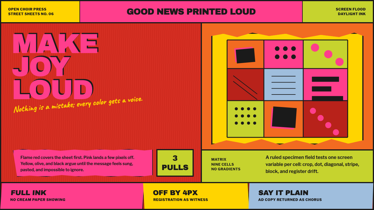 Corita Kent SerigraphJoy printed at full volume. Flame red, hot pink, and misregistered type flood…
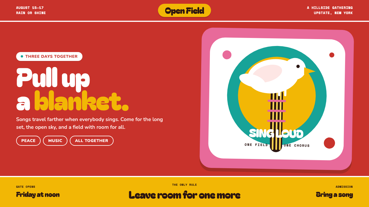 Woodstock (1969)Peace goes poster-loud. Vermilion ink, plump white forms, and bulging hand-cu…
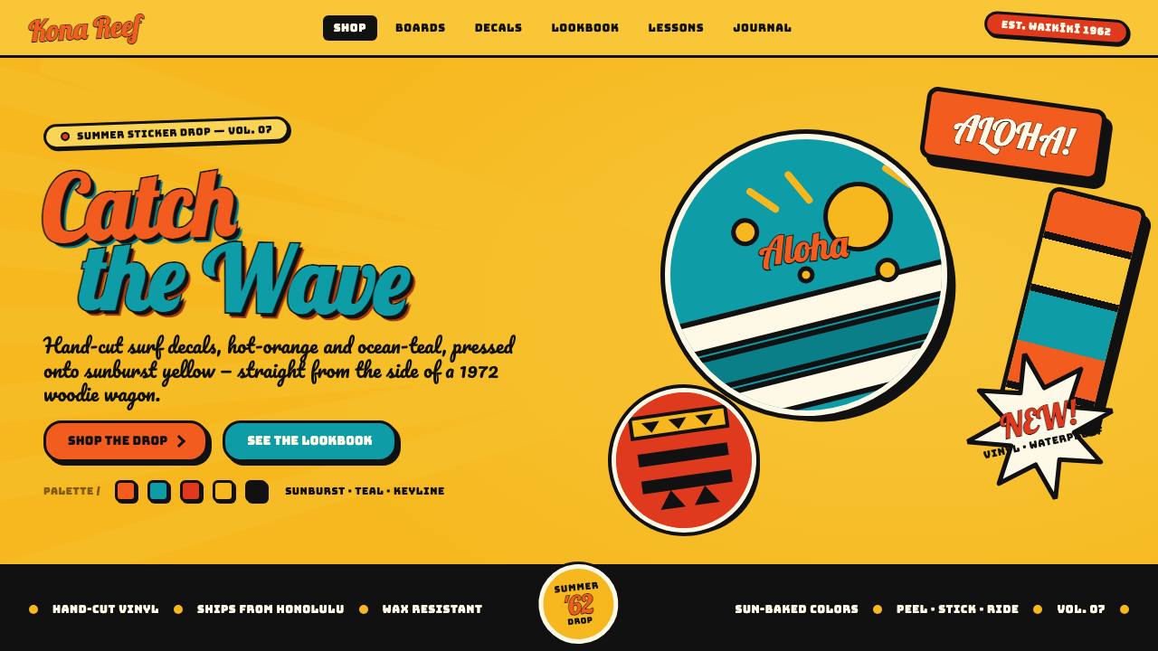 Hapa-Haole Surf DecalSurf-shop signage, loud and laminated. Sunburst yellow ground, chunky black k…
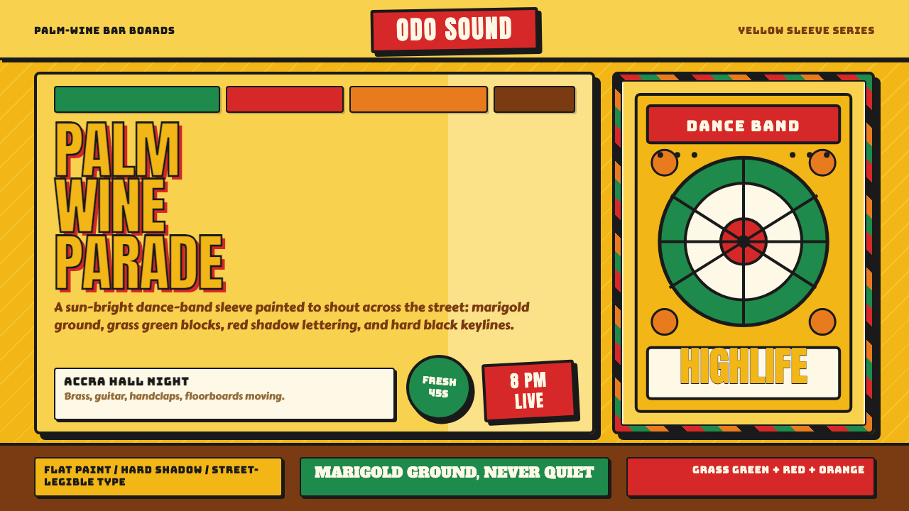 Ghanaian HighlifeMusic before words. Marigold ground, black keylines, red-green signboard bloc…
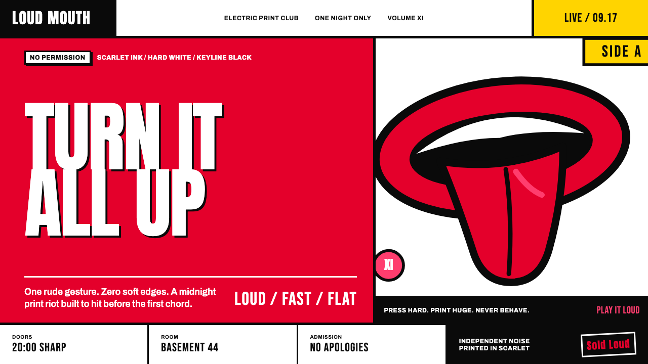 Rolling Stones Tongue (1971)Flat ink shouts loud. Scarlet curves, black keylines, and cropped poster scal…
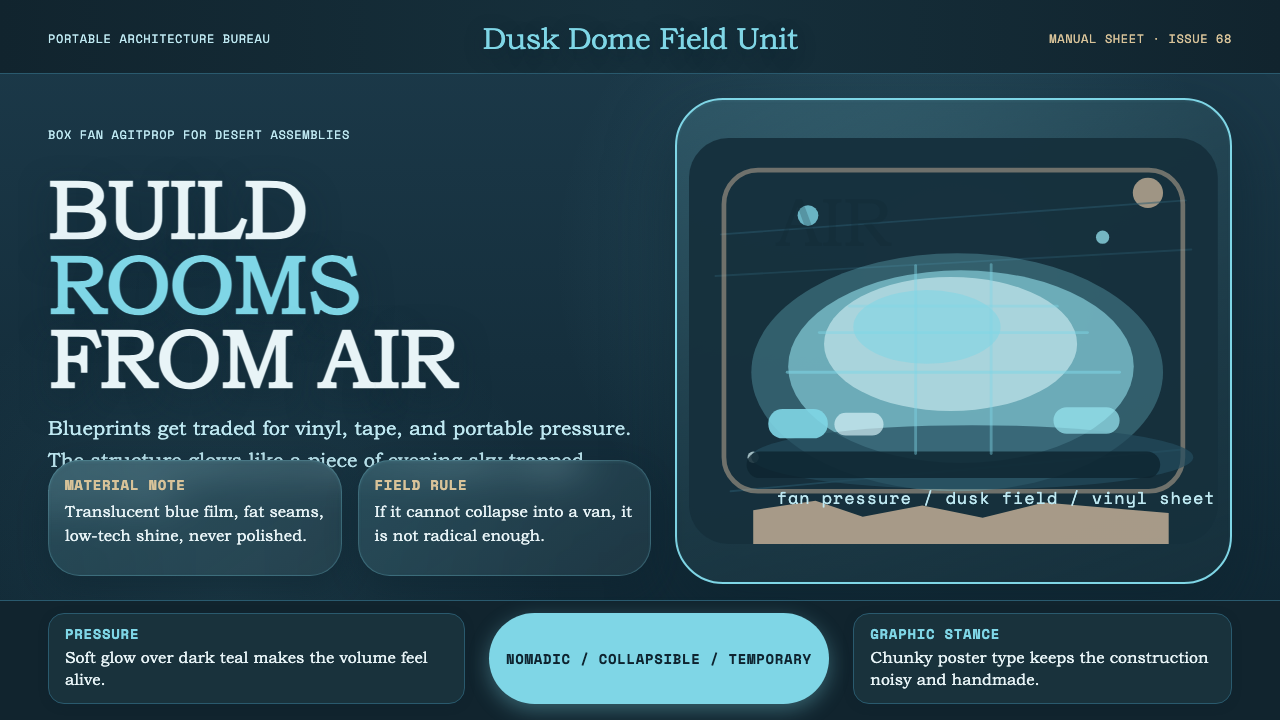 Ant Farm InflatablesTemporary architecture glows. Vinyl-blue domes swell over dark desert teal.