What is Woodstock (1969)?
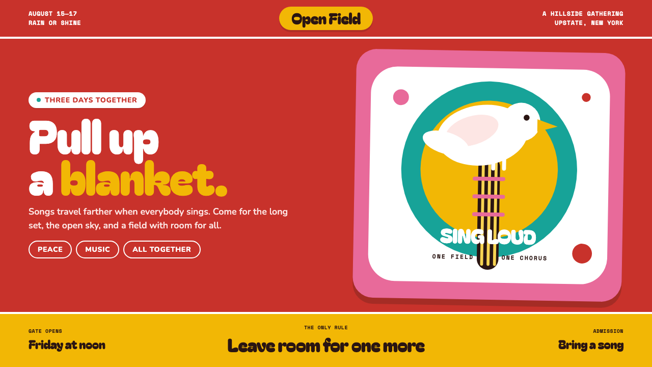
Woodstock turns peace into something loud enough for a field: vermilion ink, a white dove, a guitar neck, and letters that seem to expand with the crowd.
Woodstock (1969) in brief
Woodstock is a visual style rooted in the 1969 festival at Max Yasgur’s dairy farm in Bethel, New York, and most directly in Arnold Skolnick’s poster. Its essential image is remarkably economical: a plump white dove perched on a guitar neck against an uninterrupted vermilion field. The composition communicates music, gathering, warmth, and peace without needing a crowded scene, a realistic landscape, or a detailed narrative. It has the blunt readability of a public notice, but the emotional temperature of an invitation.
The style belongs to the cultural atmosphere of late-1960s hippie counterculture, flower power, psychedelic poster art, and the folk-rock revival. Yet it is less visually frantic than many psychedelic posters. Rather than filling every surface with optical vibration or elaborate illustration, Woodstock uses open space, rounded silhouettes, and a single emblem with unusual confidence. The result is communal rather than chaotic: a design that feels made for people arriving together, carrying blankets, instruments, and expectations.
Visually, Woodstock-derived work is flat, warm, and physically legible. It suggests screen-printed ink rather than glowing digital light. White forms are soft and full rather than sharp; lettering is hand-cut in spirit, fat enough to read from a moving bus and irregular enough to feel touched by a human hand. There are no gradients, no pointed corners, and no need for realistic depth. A few large decisions carry the whole composition.
Where does Woodstock (1969) come from?
Woodstock took place from August 15 to 18, 1969, at Max Yasgur’s dairy farm in Bethel, New York, in the Catskills. The festival became inseparable from the visual language surrounding it: an image of gathering that had to remain intelligible across posters, signs, printed matter, and the movement of people. In this setting, direct symbolic communication mattered. A peaceful public event needed an image that could be recognized quickly without becoming impersonal.
Arnold Skolnick’s 1969 poster supplied that image. Its dove and guitar-neck motif condenses several ideas into one quiet arrangement: music is present, but so is an unmistakable sign of peace; the bird is gentle, while the instrument gives it a physical perch. The design does not describe a performance or depict a crowd. It establishes a mood before it supplies information, making the poster itself feel like a shared signal.
The festival’s style grew within a broader field that included hippie counterculture, psychedelic poster art, flower power, and the folk-rock revival. Woodstock shares their interest in liberation, hand-made presence, music, and collective experience. Its distinction is restraint. The palette is concentrated, the central symbol is singular, and the forms remain clean enough to work at public scale. It takes the optimism of the era and gives it a poster’s discipline.
The visual memory of Woodstock continued through Michael Wadleigh’s 1970 film and through photography associated with Baron Wolman. Together with the original poster, these public images fixed Woodstock not merely as a festival name but as a cultural shorthand for an enormous peaceful gathering. For contemporary design, that history is important: the style should not be treated as generic retro decoration. Its rounded type, open field, and dove imagery carry the specific promise of music as a social space.
What defines the Woodstock (1969) look?
Vermilion Field
The field is broad, flat, and unapologetically warm. Vermilion functions less as background than as atmosphere: it surrounds the symbol with energy while allowing the white dove and lettering to arrive with immediate force. Keep the surface uniform and ink-like. Variation, texture, and modeled light would weaken the poster’s public clarity.
Plump White Forms
White is used as a soft, generous shape rather than an empty absence. The dove should feel rounded, calm, and physically present, with a silhouette simple enough to be understood at a glance. Its softness counters the force of the vermilion field. This balance is central: the image is loud in color but gentle in form.
Hand-Cut Lettering
Typography should appear swollen, cut by hand, and made for distance rather than typographic neutrality. The letters are broad and friendly, with enough irregularity to avoid corporate smoothness. Their job is to carry a message across a field, a bus, or a crowded public setting. Precision matters, but it is the precision of a bold printed sign, not a mechanical specimen.
Open Breathing Space
The composition needs room around its central symbol. Open space does not make the poster empty; it gives the dove, guitar neck, and words a place to settle. This is how the style conveys ease amid scale. Rather than packing the surface with references to the festival, let a warm symbol float with enough surrounding quiet to feel welcoming.
Flat Print Logic
Woodstock works through screen-printed decisiveness. Forms are solid, edges are chosen, and contrast comes from adjacent fields rather than simulated illumination. Gradients and naturalistic shadows introduce a different visual world, one based on rendering rather than printing. Treat every colored region as ink placed deliberately on paper or on a sign.
Warm Symbolism
The dove and guitar neck are not decorative props. Together they make peace inseparable from music and gathering. A Woodstock-derived layout should preserve this economy of meaning: choose one emblem that can carry the emotional premise, then let the composition support it. Adding many competing symbols turns collective warmth into visual noise.

Who shaped Woodstock (1969)?
Skolnick created the 1969 Woodstock poster that supplies the style’s defining visual system: the vermilion field, white dove, guitar neck, open space, and broad hand-cut lettering. His poster demonstrates how a single image can carry both event identity and an emotional proposition.
Lang is named among Woodstock’s key figures. Within the style’s public memory, the festival context matters as much as the image: the poster language was made for a large gathering organized around music, arrival, and shared space.
Kornfeld is named among the festival’s key figures. His presence in the Woodstock story situates the visual language within the broader network of people and cultural ambitions behind the 1969 event, rather than reducing it to an isolated poster aesthetic.
Wadleigh’s 1970 film extended Woodstock’s public afterlife beyond the festival dates. Alongside the original poster, the film helped preserve Woodstock as a cultural image of music, scale, and peaceful collective experience.
Wolman is named among Woodstock’s key figures. Photography associated with the event adds an important counterpoint to the poster: while photographs record the gathering’s human scale, the graphic system distills that scale into a calm, immediately recognizable symbol.
How do you use Woodstock (1969) today?
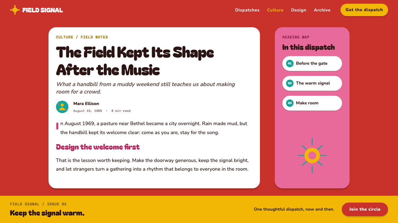
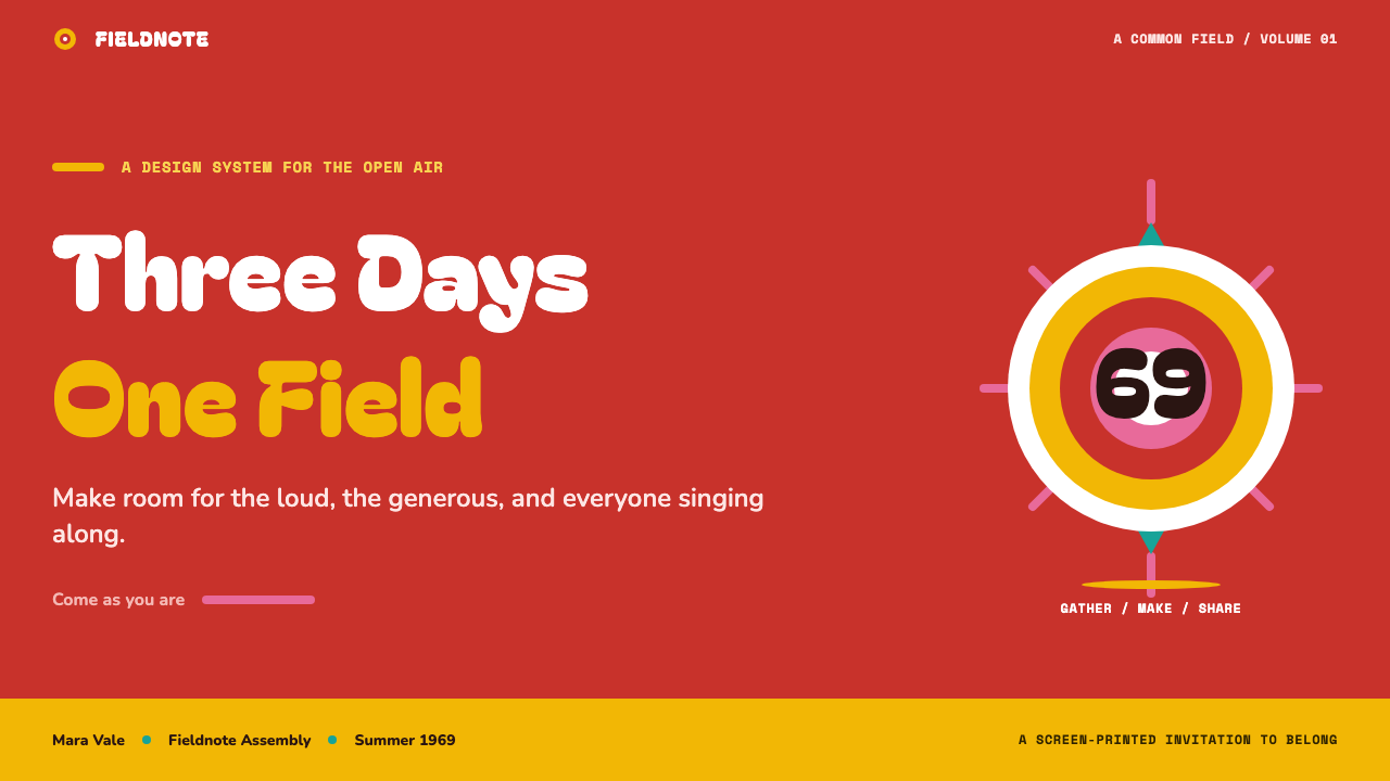
For presentation covers, use the Woodstock approach when the subject calls for collective energy, music, cultural memory, or an inviting public voice. Let one rounded white emblem settle against a broad vermilion ground, then give the title enough room to feel poster-loud. Content slides should remain more restrained: use large, friendly headings, generous open areas, and simple flat separators. The cover can make the emotional promise; the following slides should make the information easy to absorb.
For data slides, translate charts into the same print logic rather than copying the dove literally. Use broad solid marks, rounded labels, and a limited relationship between warm field and white information. A chart should read as a communal noticeboard, not as a glowing control panel. Avoid depth effects, decorative texture, or dense ornamental framing; the system is strongest when comparison remains immediate and every visual mark has a clear role.
For web interfaces, Woodstock is best used selectively on landing pages, event pages, cultural archives, music-oriented products, and editorial campaigns. A dashboard or pricing page can borrow its warm hierarchy, broad type, flat surfaces, and rounded indicators, but must retain practical scanning behavior. Keep navigation plain, make actions unmistakable, and use the vermilion field as a meaningful moment rather than a constant visual shout. The style should support arrival and orientation, not obstruct them.
For editorial and marketing work, build around a single memorable symbol and a headline that can survive distance. Large feature panels, event announcements, newsletters, and campaign pages benefit from the style’s open warmth. The common mistake is to confuse Woodstock with a collage of generic sixties signals: overcrowded flowers, multiple peace signs, wavy psychedelic lettering, and every available retro motif. The original power lies in reduction. One dove, one instrument, one field, and enough air around them are more convincing than nostalgia piled high.
Woodstock (1969) — FAQ
Is Woodstock style simply psychedelic design?
It is related to psychedelic poster art through its late-1960s context, but it is not defined by visual overload. Woodstock uses a concentrated field, a single warm symbol, broad lettering, and open space. Many psychedelic posters pursue optical movement and dense transformation; Woodstock is calmer, flatter, and more publicly legible.
Why is the dove on a guitar neck so effective?
It joins peace and music without explaining either one. The dove brings a familiar peaceful meaning, while the guitar neck makes the image specific to a musical gathering. Because the relationship is simple and physically plausible, the symbol feels warm rather than abstract. It can be understood before any accompanying copy is read.
Can the style work without vermilion?
The underlying principles can travel: flat print logic, plump white forms, rounded hand-cut lettering, open breathing space, and a single emotional symbol. But vermilion is central to the source image’s warmth and poster force. Replacing it should preserve the same sense of concentrated, solid, welcoming energy rather than introducing a complex or atmospheric palette.
Where does Woodstock style struggle?
It struggles when a product needs restrained neutrality, dense operational information, or a tone of technical distance. A permanently vermilion interface can become tiring, and hand-cut display lettering can reduce clarity when applied to long reading. Use the style where warmth, gathering, and cultural voice are genuine product values; let quieter interface patterns handle detailed work.
Related design styles
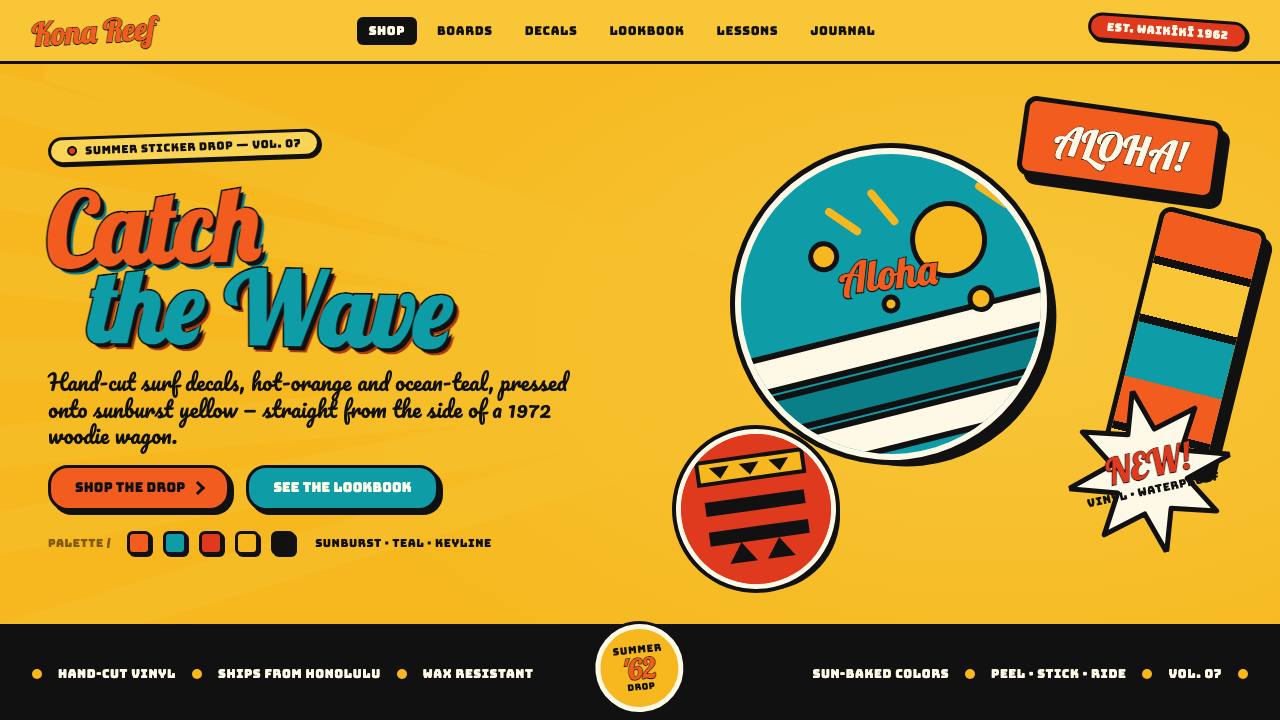 Hapa-Haole Surf DecalSurf-shop signage, loud and laminated. Sunburst yellow ground, chunky black k…
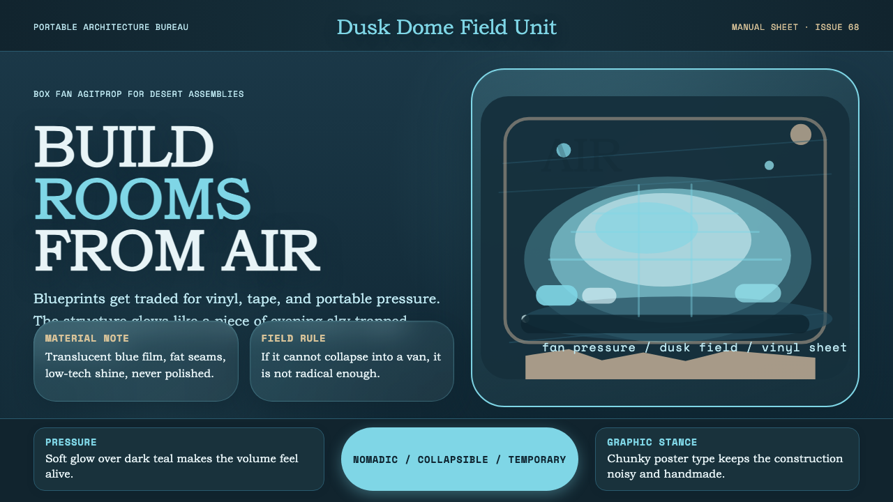 Ant Farm InflatablesTemporary architecture glows. Vinyl-blue domes swell over dark desert teal.
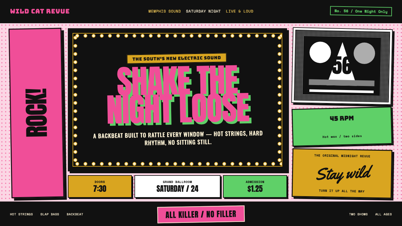 Elvis Presley (1956)Rock learned to shout. Bubblegum pink, acid green and jailhouse type land wit…
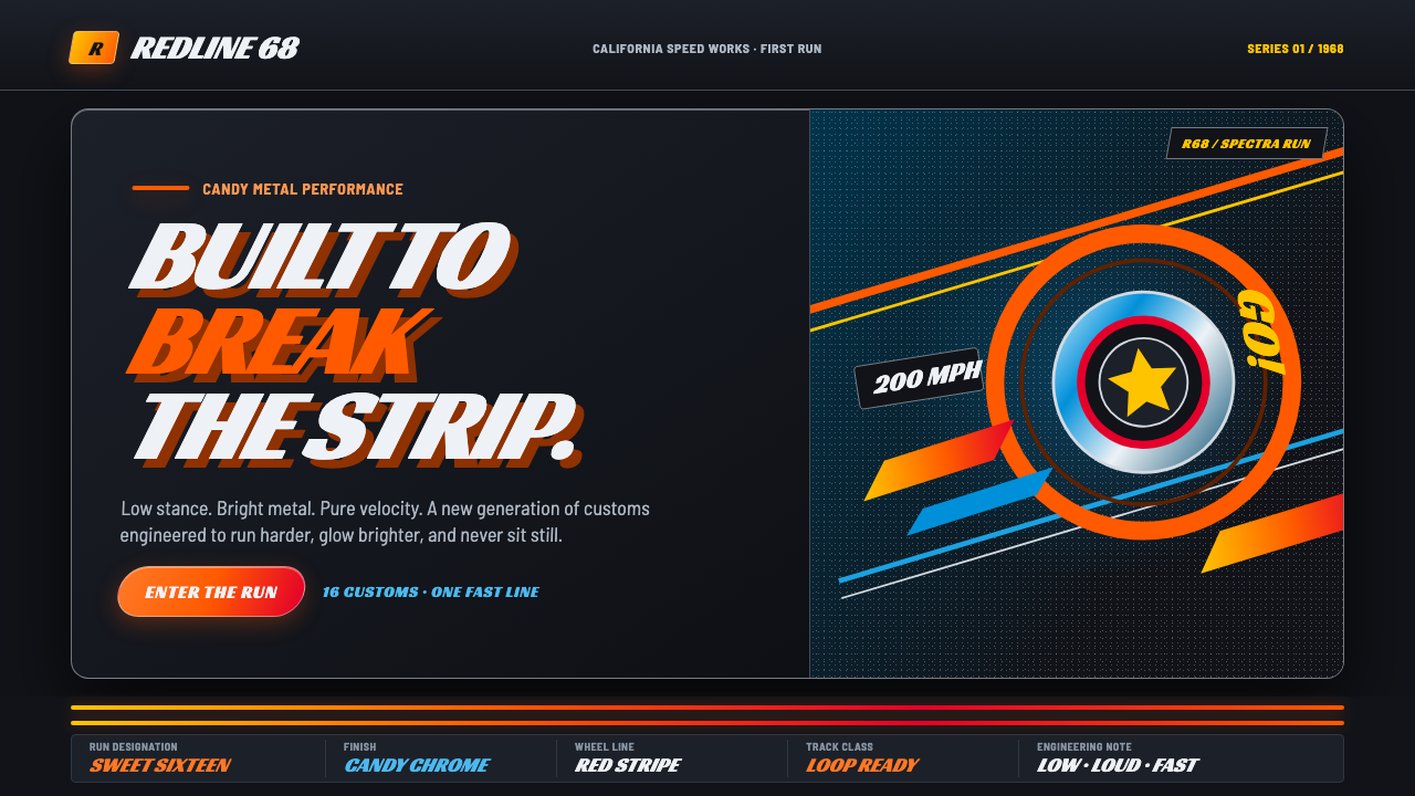 Hot Wheels (1968)Velocity in candy metal. Flame-orange tracks and fat italic type tear across…
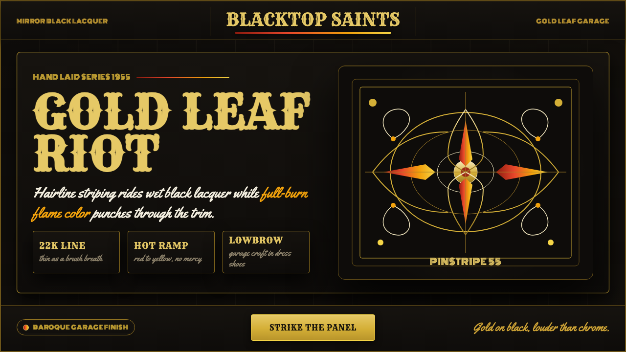 Kustom Kulture PinstripeGarage baroque burns hot. Rye woodtype, black lacquer, gold hairlines, flame…
 Pink Flamingo Lawn OrnamentLoud on purpose. Hot flamingo pink staked into lawn green, glossy molded plas…