What is Hapa-Haole Surf Decal?
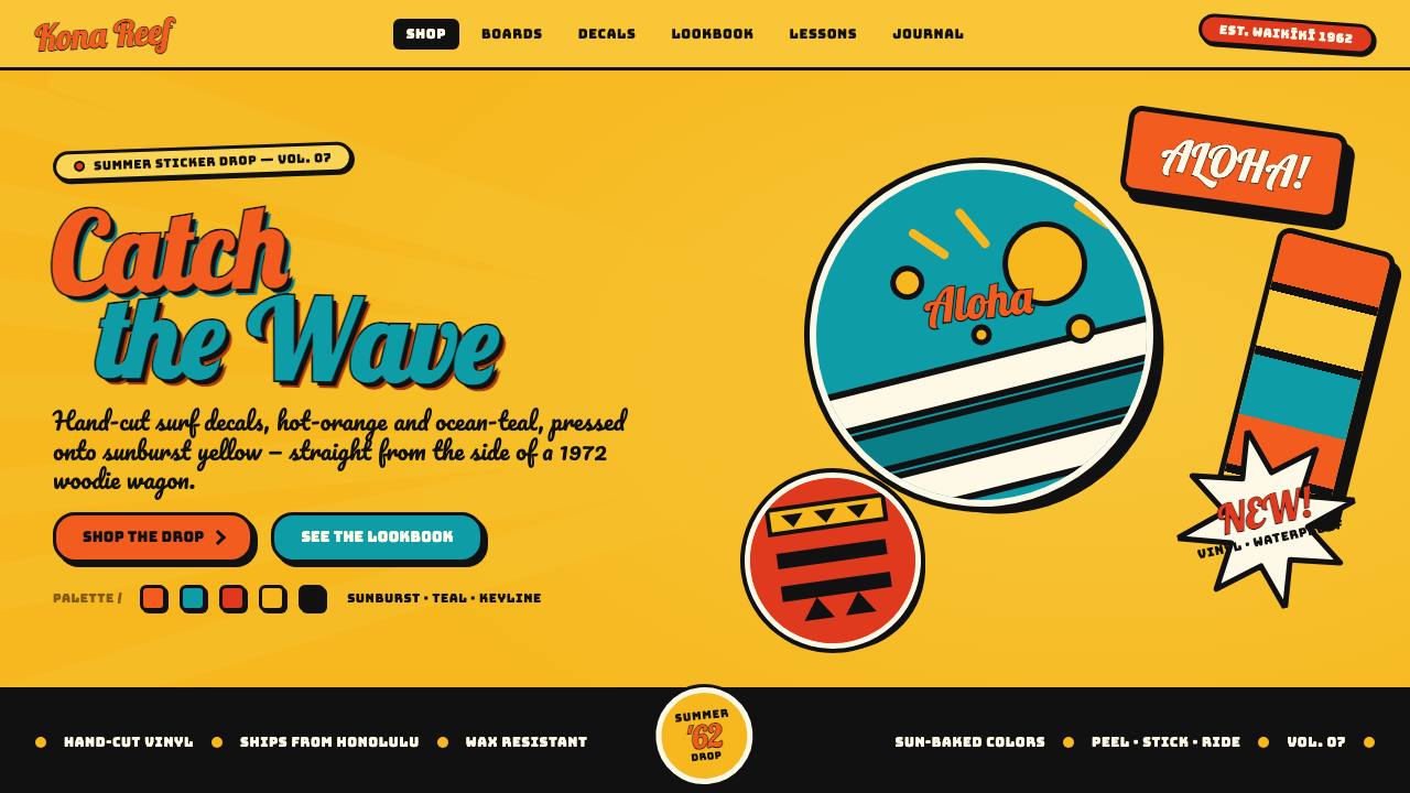
Hapa-Haole Surf Decal turns the beach storefront into a shout — banana-yellow ground, buoyant brush lettering, and every bright form sealed inside a heavy black edge.
Hapa-Haole Surf Decal in brief
Hapa-Haole Surf Decal is a graphic style distilled from the die-cut water-slide and vinyl stickers that covered Hawaiian surf shops and tiki bars from the 1950s through the surf boom of the 1980s. Its language is immediate and commercial: a sunburst or banana-yellow field, bouncy brush-script lettering, chunky black keylines, and compact shapes designed to read as self-contained decals rather than quiet elements within a neutral composition.
The style depends on visual pressure. Yellow is not a small accent but the atmosphere of the entire piece. Hot orange, ocean teal, and red sit on top in flat, saturated blocks, while black outlines prevent neighboring colors from dissolving into one another. The result resembles loud laminated signage or a beach poster: glossy in spirit, direct in message, and unconcerned with restraint.
Its defining unit is the sticker-like silhouette. Words, tiki forms, badges, bursts, and decorative marks are grouped into bold clusters with unmistakable outer edges. Brush lettering supplies movement, but the heavy keyline keeps that movement legible. This tension between bounce and containment gives the style its character: exuberant without becoming shapeless, crowded without losing its commercial clarity.
Where does Hapa-Haole Surf Decal come from?
The style belongs to the visual environment of Hawaiian surf-shop and tiki culture, within the broader Oceania setting identified with Hapa-Haole surf culture. Its formative period begins in the 1950s, continues through the following decades, and reaches the surf boom of the 1980s before the stated era closes around 1990. It was not presented as a single formal school. It emerged through repeated commercial objects and signs that shared a recognizable beach-facing attitude.
Die-cut water-slide and vinyl decals were central to that environment. They could cover shop surfaces and bar settings with many small, assertive images, each carrying its own contour. Because every decal needed to behave like a complete object, the style favored compact arrangements, readable lettering, decisive silhouettes, and outlines strong enough to preserve an image against a visually busy setting.
Surf-shop sign painters shaped the style through large, energetic lettering and storefront immediacy. Decal printers translated that energy into repeatable sticker forms, strengthening the dependence on flat color and bounded shapes. Tiki-bar graphic shops brought in the cut tiki forms and the dense, festive quality associated with exotica graphics. These practices overlapped rather than forming isolated branches, producing a shared vocabulary of brush script, black keylines, bright fields, and beach-poster color.
Across the mid-century decades and into the 1980s surf boom, the vocabulary remained consistent because its purpose remained clear: attract attention, establish a sunny leisure atmosphere, and make names or emblems memorable at a glance. The laminated impression, saturated palette, and sticker edge were not incidental decoration. Together they formed a practical identity system for places that wanted to look active, informal, and unmistakably tied to Hawaiian surf and tiki settings.
What defines the Hapa-Haole Surf Decal look?
Yellow Ground
Sunburst or banana yellow is the indispensable ground. It fills the composition with heat and daylight before any lettering or imagery appears. Cream and pure white would weaken the identity by making the work feel neutral. Here the background is an active participant: loud, sunny, and immediately associated with beach-facing signage.
Saturated Accent Color
Hot orange, ocean teal, and red provide the secondary bursts of energy. They appear as flat, confident areas rather than shaded or atmospheric color. Their role is to divide phrases, spotlight motifs, and intensify the yellow field. The palette should feel sunlit and printed, never dusty, restrained, or softly blended.
Chunky Black Keylines
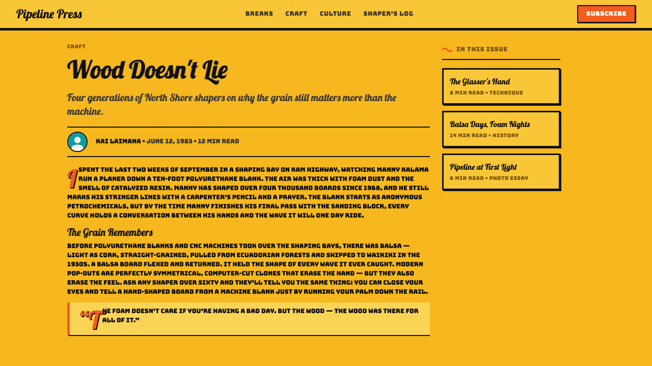
A thick black keyline locks every important form into place. It separates saturated colors, preserves legibility, and gives lettering or imagery the physical presence of a cut decal. The outline should feel integral rather than added afterward. Without it, the palette becomes merely bright; with it, the image becomes unmistakably sticker-like.
Bouncy Brush Script
Lettering carries the rhythm of a hand-painted surf-shop sign. Strokes feel buoyant, informal, and slightly irregular, allowing words to rise, dip, and lean without losing their overall silhouette. The black keyline stabilizes this motion. Mechanical neatness would drain the style of life, while uncontrolled scribbling would sacrifice its advertising clarity.
Die-Cut Silhouette
Compositions are built as bounded emblems rather than open-ended scenes. Text, tiki forms, bursts, and accent marks gather into compact silhouettes that could plausibly exist as individual decals. The outer edge matters as much as the internal drawing, creating a visual object that can sit forcefully on a sign, panel, or poster.
Flat Gloss
The forms are flat and saturated, yet the overall impression is glossy and laminated. That gloss comes from clean color separation, strong contrast, and sealed-looking contours rather than delicate modeling. Depth is secondary to surface impact. The work should resemble a fresh commercial sticker catching beach light, not a softly rendered illustration.
Loud Commercial Density
The style welcomes packed arrangements, but every cluster must remain instantly readable. Bold words dominate, smaller motifs reinforce the theme, and black contours keep the pieces from merging. Empty space may separate decal groups, yet spacious refinement is not the goal. The intended voice is that of a busy surf shop calling across the street.
Who shaped Hapa-Haole Surf Decal?
Surf-shop sign painters supplied the style's hand-driven energy. Their contribution is visible in large brush-script names, elastic baselines, and compositions built to seize attention from outside a storefront. They balanced informality with immediate recognition: lettering could bounce and lean, but the business name still had to arrive first. That combination became central to the decal vocabulary.
Decal printers gave the style its bounded, repeatable form. The logic of water-slide and vinyl stickers encouraged compact silhouettes, flat saturated color, strong separation, and an edge that made each graphic feel complete. Their production context helped turn exuberant sign-painting gestures into durable visual units that could accumulate across surf-shop and tiki-bar surfaces.
Tiki-bar graphic shops extended the vocabulary beyond lettering through cut tiki forms and the festive density associated with exotica graphics. Their work reinforced the preference for bold silhouettes, bright beach-poster accents, and clusters that felt decorative yet commercially purposeful. In combination with surf signage and decal printing, they helped establish the style's unmistakable mixture of celebration, signage, and sticker logic.
How do you use Hapa-Haole Surf Decal today?
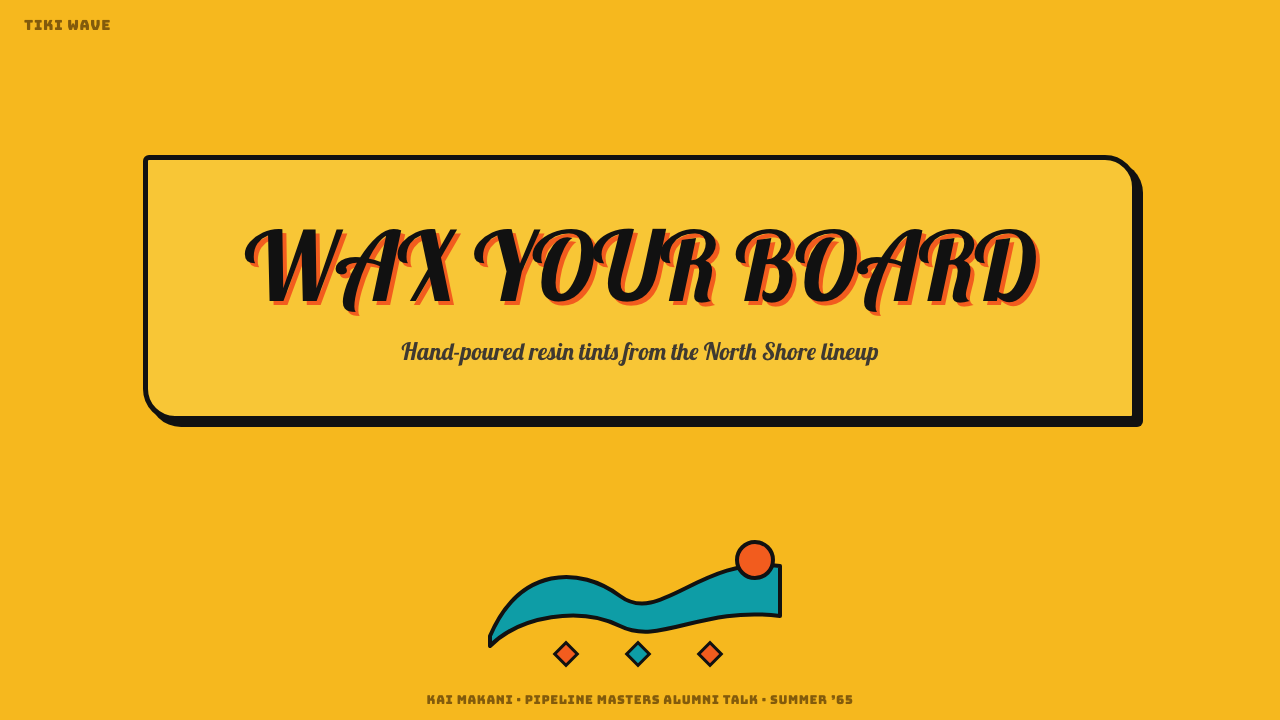
For presentation covers, treat the title as a hero decal. Set buoyant brush lettering over a full yellow field, contain it with a decisive black keyline, and add only a few orange, teal, or red motifs around the silhouette. Content slides need calmer organization but should preserve the same voice: solid black headings, sticker-like callouts, and compact clusters separated by clear open areas.
Data slides work best when information is translated into bold, bounded shapes. Use black to establish labels and separation, yellow as the continuous field, and the accent colors to distinguish categories or spotlight the principal result. Charts should remain flat and immediately readable. Avoid delicate tonal distinctions; this style communicates through categorical contrast, poster-like emphasis, and memorable silhouettes.
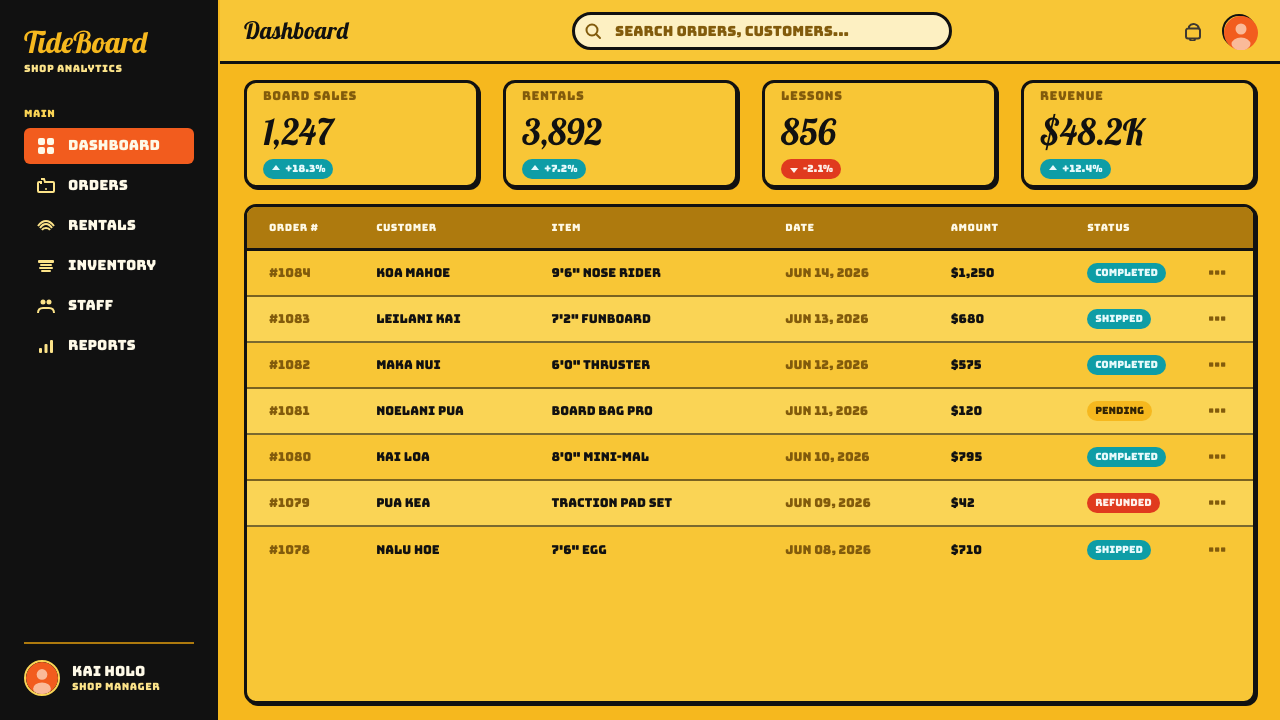
For web dashboards and pricing pages, apply the language selectively so the interface remains usable. A yellow page field, black-framed panels, brush-script section moments, and bright status accents can carry the identity without turning every control into a novelty. Pricing tiers can behave like individual decals, with distinct outlines and color accents, while navigation and dense operational information stay visually firm and direct.
Editorial and marketing layouts benefit from the style's ability to turn phrases into objects. A campaign headline can become a large die-cut emblem, while supporting copy sits in simpler blocks around it. Feature sections may alternate between broad yellow fields and compact sticker clusters. Product names, offers, and calls to action should receive the strongest outlines because the style is most persuasive when its commercial hierarchy is unmistakable.
The common mistake is to borrow bright tropical color while omitting the structural ingredients. Orange, teal, and red scattered on a pale neutral page do not create Hapa-Haole Surf Decal. The yellow ground, heavy black keyline, brush-script bounce, and closed sticker silhouette must work together. Another failure is excessive refinement: thin outlines, restrained color, or overly orderly lettering removes the loud surf-shop character that gives the style meaning.
Hapa-Haole Surf Decal — FAQ
Is Hapa-Haole Surf Decal simply a tropical color palette?
No. Color is essential, but the style is equally defined by construction. The yellow field creates the atmosphere; orange, teal, and red generate emphasis; black keylines separate and contain every major form. Brush-script movement and die-cut silhouettes complete the system. Without those bounded shapes and heavy outlines, the result may feel beach-inspired but will not carry the specific logic of a surf-shop decal.
Can the style use a white or cream background?
Not without losing one of its defining conditions. The source vocabulary treats the sunburst-banana-yellow ground as intrinsic, not optional. White or cream introduces neutrality and quiet that contradict the style's loud signage character. Small light areas may separate details inside a decal, but the composition as a whole should remain governed by yellow heat and brightness.
How should imagery be treated within the style?
Imagery should behave like a decal rather than an open illustration. Tiki forms, bursts, badges, and beach-associated marks work as compact silhouettes with flat color and black containment. Internal detail should support recognition instead of competing with the outline. The strongest images can be understood first as shapes, then examined for smaller features.
Does every piece need brush-script lettering?
Brush script is one of the clearest signals of the style, especially for names and primary slogans, but it need not carry every line. Supporting information can be simpler so long as the hierarchy remains bold and the overall composition retains its yellow ground, black keylines, saturated accents, and sticker silhouettes. Using brush script everywhere can turn buoyancy into noise and weaken the main message.
Where does Hapa-Haole Surf Decal work poorly?
It struggles wherever quiet neutrality, restrained authority, or subtle tonal distinction is the primary requirement. Its yellow field, bouncing script, dense motifs, and heavy outlines announce themselves before the content does. That is an advantage for surf-facing marketing, energetic presentation covers, pricing highlights, and memorable campaign graphics, but a liability when users must process long, delicate, or visually understated information.
Related design styles
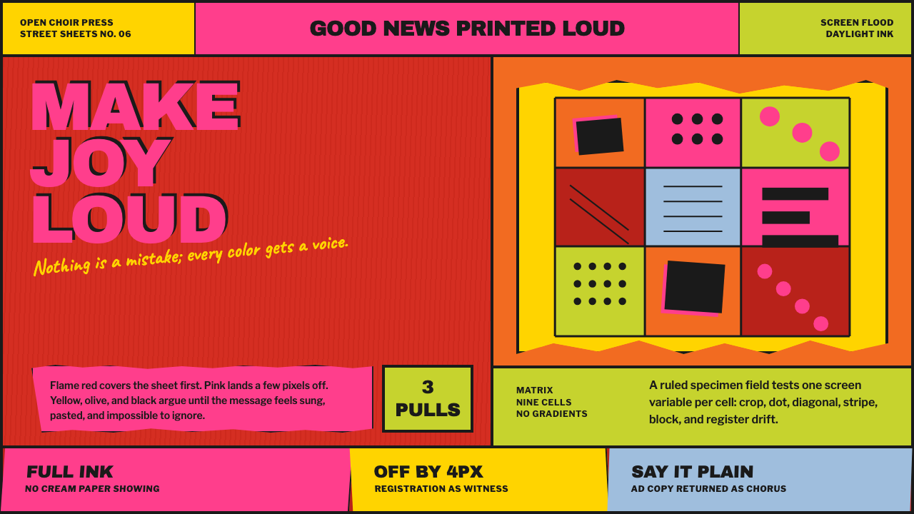 Corita Kent SerigraphJoy printed at full volume. Flame red, hot pink, and misregistered type flood…
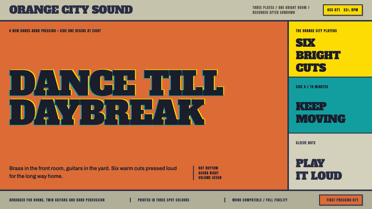 Highlife Record SleevePrint it loud. Hot orange fields and fat slab type keep the sleeve gloriously…
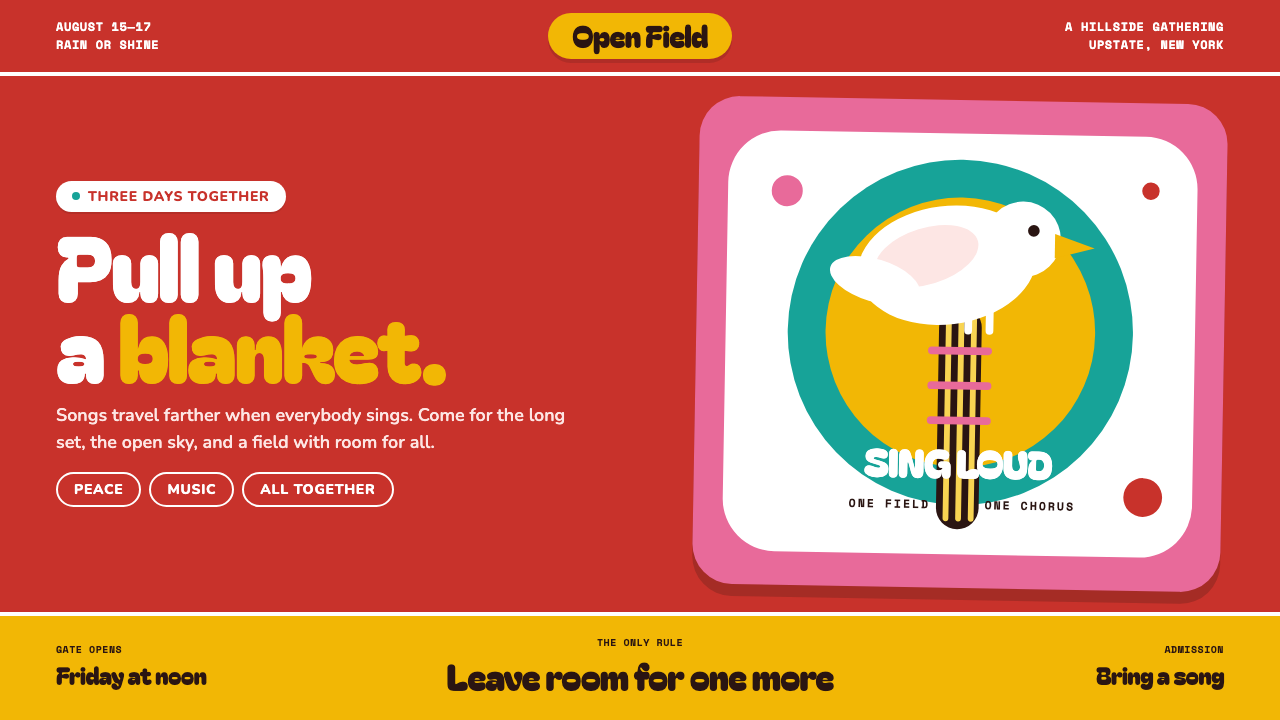 Woodstock (1969)Peace goes poster-loud. Vermilion ink, plump white forms, and bulging hand-cu…
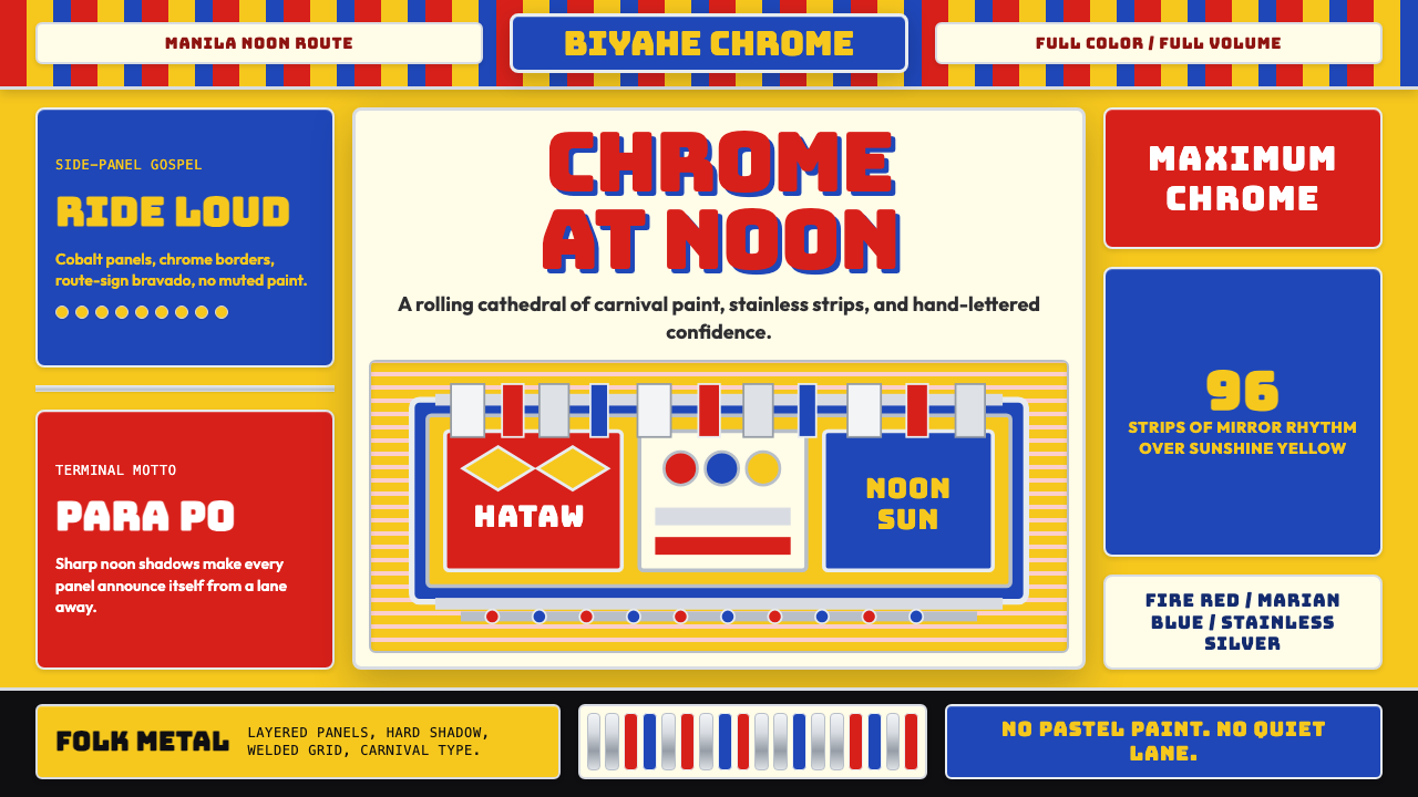 Filipino Jeepney (Chrome & Streamer)Maximalism has wheels. Sunshine yellow, chrome strips, Bungee route-sign type.
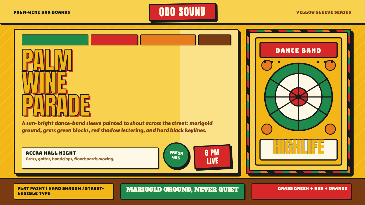 Ghanaian HighlifeMusic before words. Marigold ground, black keylines, red-green signboard bloc…
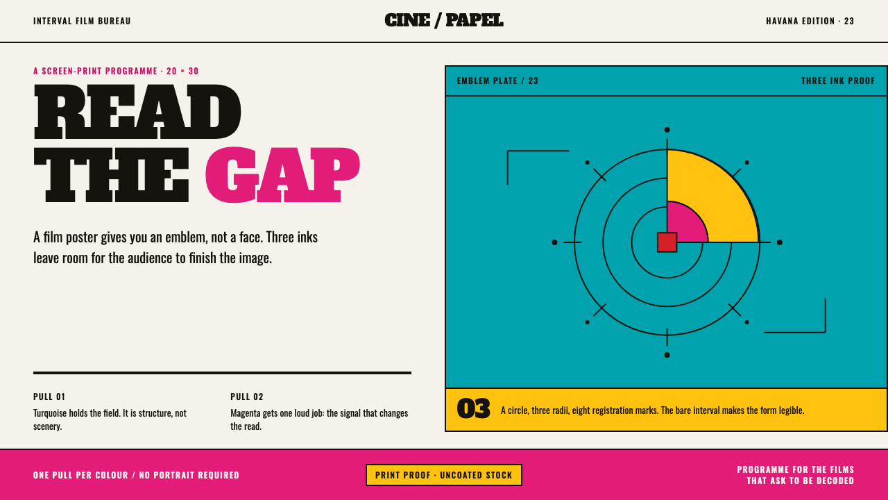 ICAIC Film PosterMetaphor wins the screen. Magenta and turquoise flat inks frame a measured em…