What is ICAIC Film Poster?
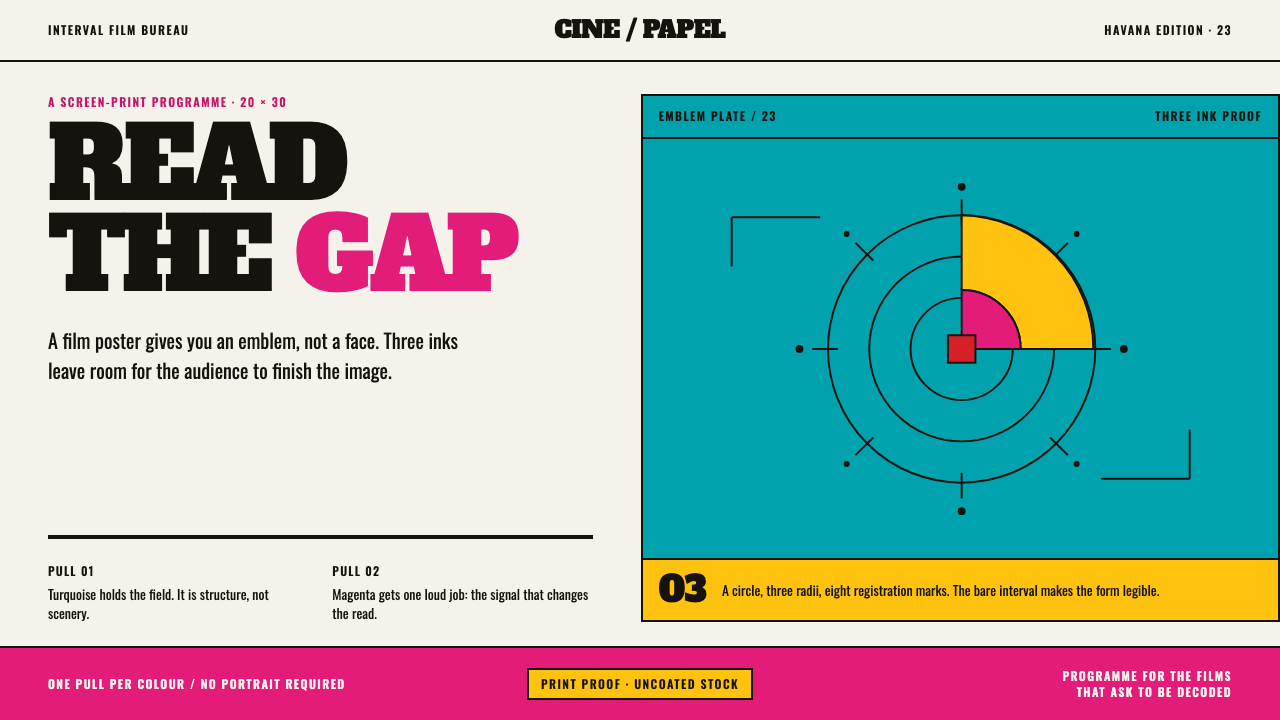
ICAIC Film Poster is Cuban silkscreen design at its most economical: two or three flat inks, bare paper, and an image that resolves in the gaps between colours.
ICAIC Film Poster in brief
ICAIC Film Poster is a design style drawn from the posters made for the Cuban Institute of Cinematographic Art and Industry, founded in Havana in March 1959. Its look is built from two or three flat inks, in this system a magenta and a turquoise, set against the bare off-white of uncoated paper, with a measured emblem at the centre where a Hollywood poster would put a photograph of a face.
The printing method defines the look. Each colour was a separate screen, pulled once with a squeegee onto uncoated wove stock in a large vertical format of 20 × 30 inches. Without photographic stencils, the studio cut its halftone dots by hand, so the grey of a film still arrives as a field of visibly irregular marks rather than a clean mechanical screen. Inks butt against the bare sheet, and the image resolves in the gap between them.
The doctrine was metaphor over the star portrait. A poster taught its audience to read an abstraction rather than recognise a face, and the title was lettered by hand and bent around the drawing instead of resting on a baseline. The result is conceptual, graphic and legible from a distance, and it treats the viewer as someone able to decode.
Where does ICAIC Film Poster come from?
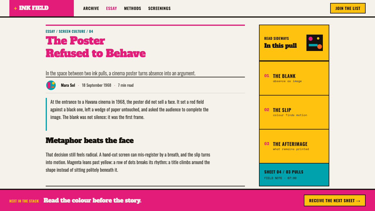
ICAIC was founded in March 1959, soon after the Cuban revolution, as the state body for cinema. Posters announcing both Cuban and imported films became its most visible public product, and the source dates the poster canon from 1959 to 2009, five decades of output made by designers working in Havana. That corpus is inscribed on UNESCO's Memory of the World register, which frames the posters as documentary heritage as well as graphic design.
The look was shaped by constraint. Without photographic stencil-making, the studio worked by hand: one screen per colour, one squeegee pull per colour, halftone dots cut by hand. A technical limit became an aesthetic position. If a full photographic image is not possible, the designer is pushed toward a bold symbol in two or three inks, and toward the empty paper as a colour in its own right. What looks like deliberate minimalism began as a response to what could actually be printed.
Its designers formed a recognisable circle. Eduardo Muñoz Bachs, René Azcuy Cárdenas, Alfredo Rostgaard, Antonio Fernández Reboiro and Raúl Martínez are the names the source ties to the canon. They shared the doctrine of metaphor over portrait, but each brought a different hand to it. The movement belongs to Cuban revolutionary graphics, and it sits beside the OSPAAAL solidarity posters, which were also produced in Havana and sometimes by the same designers.
Pop is the other influence the source names. The flat colour, the iconic emblem and the lifting of a single image into a symbol echo Pop practice, but with a different purpose. Instead of selling a product, the poster trains a public in reading. The cinema audience was asked to find the film inside a metaphor, so every poster became a small lesson in interpretation, and that habit of visual reading is the true inheritance of the style.
What defines the ICAIC Film Poster look?
Two or Three Flat Inks
The picture is built from a very small number of flat colours, each printed as a solid field with no tints or blends. Fewer inks mean harder decisions. Overlap and adjacency do the work that shading would do elsewhere, so the colours need to be chosen as a pair or trio, not as a spectrum.
Magenta and Turquoise
The leading pair is a hot magenta against a cool turquoise, two colours that sit near opposites in temperature and vibrate where they meet. Their contrast gives the poster energy without needing a third hue. Any extra ink is used sparingly, as a sharp accent or a dark keyline.
Bare Paper as a Colour
The uncoated off-white of the sheet is not a background left over from printing but a working colour. Shapes are defined by where ink stops and paper begins, and the image resolves in the gap. Generous blank areas are therefore part of the composition and are never padded with texture or pattern.
Hand-Cut Halftone
Greys are made from dots cut by hand, so they arrive as fields of marks that vary in size and spacing. The edge of such a field is uneven and a little rough. This irregularity is the style's visible signature of a human process, and it should be kept rather than cleaned up into a perfect mechanical screen.
Metaphor over Portrait
A measured emblem sits where a star's face would otherwise be: an object, a silhouette, a pair of shapes that stands for an idea in the film. The viewer is invited to decode it. The emblem is precisely placed and well balanced, so that its abstraction feels designed and not accidental.
Hand Lettering That Bends
Titles are lettered by hand and bent, stretched or wrapped around the drawing instead of sitting on a straight baseline. The lettering is part of the image rather than a caption laid over it. Letterforms vary in weight and shape to suit the film, and a single typeface applied mechanically would defeat the idea.
One Pull per Colour
The format is a large vertical sheet, built colour by colour, with each layer a separate pull of the squeegee. That process leaves a flat, matte, slightly handmade surface. Digital equivalents should echo it with flat fills and an absence of gloss, glow or soft shadow, so that the result still reads as ink on paper.
Who shaped ICAIC Film Poster?
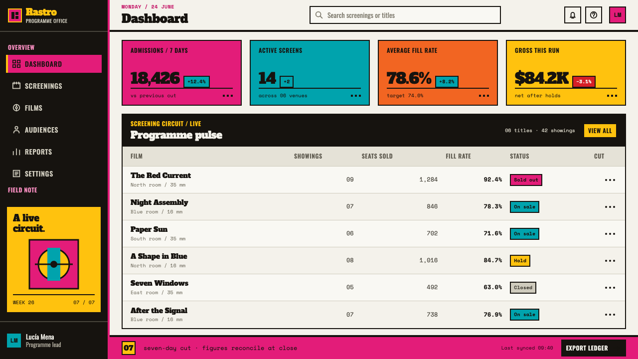
A central ICAIC poster designer, known for wit and a light, playful hand. His work shows how the doctrine of metaphor can be delivered with humour, turning a film into a small visual joke or a gentle riddle, and it explains why the style can feel warm as well as conceptual.
A designer named with the core of the ICAIC canon. His presence in the source is a reminder that this style is a studio language shared by many hands, not the signature of one author, and that its rules of flat ink, bare paper and measured emblem were common property.
A designer who moved between film posters and the wider world of Cuban revolutionary and solidarity graphics. His work helps connect the ICAIC poster to the OSPAAAL tradition and explains how a method developed for cinema could serve political internationalism as well.
Another designer tied to the ICAIC poster canon. He stands for the studio's habit of reducing a film to a few shapes and inks, and he is part of the evidence that the canon spans several distinct personalities working inside one shared discipline.
A Cuban painter and designer associated with Pop. His flat colour and repeated, iconic imagery fed into Cuban public graphics and help explain the Pop strand in the style. He shows that the poster tradition drew on fine-art practice as well as printing necessity.
How do you use ICAIC Film Poster today?
ICAIC Film Poster is best used where an idea needs to be seen at a glance and a viewer is willing to read an image. It rewards products, events and stories that can be reduced to one strong symbol. Applying it well means committing to few colours, honest paper and a measured emblem, not just adding a magenta and turquoise tint to a conventional layout.
On slides, a cover works as a small poster: a bare paper field, one emblem set slightly off-centre in two flat inks, and a hand-lettered title wrapped around it. Content slides stay quiet, with the same off-white paper and one ink for emphasis. Data slides suit the style when the chart is reduced to one or two flat shapes, such as a single bar in magenta against a turquoise block, without gradients, gridlines or shadows.
In web interfaces the style suits event pages, film and culture platforms, campaign sites, portfolios and anything where the first screen is a single memorable image. Hero areas become posters. Cards are flat blocks of ink with no shadow, buttons are solid colour on bare paper, and the title lettering can be a custom graphic. It is less suited to dense dashboards and long forms, where the poster logic would starve the interface of structure.
For editorial and marketing work, the style supports campaign posters, festival identities, covers, invitations and manifesto-style pages. Pick one metaphor and let it carry the message. Photographs should be turned into coarse, flat-toned images, using visible dots and hard-edged crops, or replaced by a drawn emblem. Copy is short and punchy, with the headline treated as part of the artwork.
The most common mistake is making the poster too tidy. Smooth halftone gradients, drop shadows, glossy gradients and a perfectly kerned typeface erase the traces of hand work that give the style its credibility. A second mistake is adding a third or fourth ink until the pair stops vibrating. A third is putting a star's photograph in the middle, which abandons the doctrine on which the whole style is built.
ICAIC Film Poster — FAQ
Why do the colours look so flat?
Because the posters were screen-printed by hand, one flat ink at a time. Each colour is a solid field laid by a single pull of the squeegee, so there are no blends or soft shadows. The flatness is a result of the process and a defining trait of the look. Digital versions should keep it, using solid fills and no gradients.
Why use hand-cut halftone instead of a clean screen?
Because the studio did not have photographic stencils and had to cut the dots by hand. The irregular marks that resulted are part of the visual identity. They give greys a living texture and show that the image was made by people. A perfect mechanical halftone would look more polished but less true to the source.
Why is the poster built around a symbol and not a portrait?
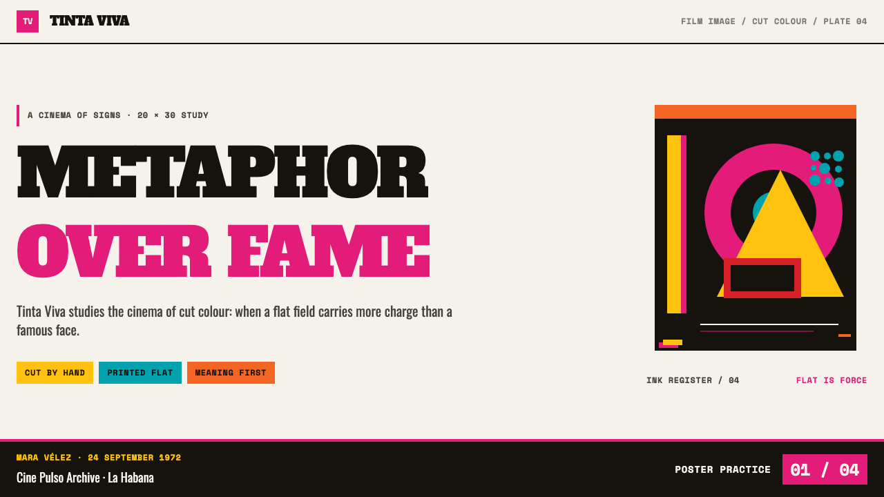
The ICAIC doctrine was metaphor over the star portrait. Posters aimed to teach their audience to read an abstraction, finding the film inside an image rather than recognising a famous face. This makes each poster conceptual and memorable, and it keeps the style distinct from the commercial poster logic it set itself against.
Can I use more than three colours?
You can, but the character of the style depends on restraint. Every extra ink dilutes the tension between the main pair and weakens the role of the bare paper. If a fourth colour is needed, treat it as a tiny accent or a keyline, and do not give it the same area as the others.
Does it work for corporate or product marketing?
It can, if the message is simple and the brand is willing to be playful and conceptual. It suits launches, campaigns, culture and event marketing well. It struggles with products that must show precise detail, real faces or dense feature lists, since the poster logic favours a single idea over comprehensive explanation.
Related design styles
 Crayola (1903)Color never whispers. Golden yellow, a green slash, and waxy swatches make ev…
 Ghanaian HighlifeMusic before words. Marigold ground, black keylines, red-green signboard bloc…
 Corita Kent SerigraphJoy printed at full volume. Flame red, hot pink, and misregistered type flood…
 Fluorescent HighlighterStudy notes at 1am, made into a system. Translucent lime ink layered until th…
 Hapa-Haole Surf DecalSurf-shop signage, loud and laminated. Sunburst yellow ground, chunky black k…
 Highlife Record SleevePrint it loud. Hot orange fields and fat slab type keep the sleeve gloriously…