What is Fluorescent Highlighter?
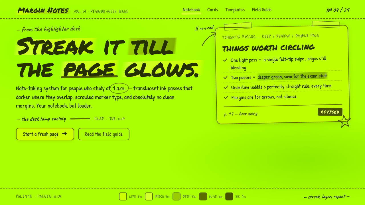
Fluorescent Highlighter turns the visual residue of a late-night study session — translucent lime strokes, bleeding edges, and hurried annotations — into a complete design system.
Fluorescent Highlighter in brief
Fluorescent Highlighter is a stationery-derived aesthetic built from the familiar behavior of fluorescent felt-tip ink. Its defining gesture is the broad wedge stroke: translucent electric lime is dragged across a surface in visible passes, allowing earlier marks, handwriting, and neighboring strokes to remain perceptible beneath the color. Where strokes overlap, the ink appears denser and shifts toward deeper green, making repetition itself a method of shading.
The style expands the logic of the Stabilo Boss beyond isolated emphasis. Instead of placing a restrained stripe behind a sentence, it treats the entire composition as a field of accumulated highlighting. Bands cross, double back, and gather into saturated areas until the page seems illuminated by ink rather than merely marked by it. The resulting depth comes from transparency and overlap, not from polished lighting effects.
Its emotional register is inseparable from study-notes culture: concentrated, improvised, slightly restless, and visibly handmade. Marker-written type, wavering underlines, imperfect coverage, and softly bleeding edges preserve the pressure and direction of the hand. Clean vector geometry would contradict the premise. Fluorescent Highlighter succeeds when the viewer can almost reconstruct the sequence in which each stroke was laid down.
Where does Fluorescent Highlighter come from?
The practical origin of the style is the Stabilo Boss, launched in 1971. Produced by the German stationery company Schwan-Stabilo and associated in the supplied history with Günter Schwanhäußer, the marker established a recognizable combination of fluorescent ink, a broad felt-tip wedge, and the ordinary act of dragging color across text. Its visual identity did not begin as an art movement; it emerged from a tool designed for reading, sorting, and remembering.
The wedge tip gave the object its characteristic graphic behavior. A single movement could produce a broad translucent band, while changes in angle and pressure created narrower edges, uneven deposits, and blunt terminals. Because the ink remained see-through, it could emphasize information without fully concealing it. Successive passes produced darker intersections, turning an everyday annotation technique into a simple system of layering, hierarchy, and visual rhythm.
As fluorescent markers became generic worldwide, their marks entered office work, classrooms, revision pages, and personal notebooks. Felt-tip marker culture contributed the loose handwriting, bleeding contours, and direct physicality; study-notes aesthetics contributed urgency, repetition, underlining, and the sense that every mark answers an immediate need. The look remained global because it depended less on a particular decorative tradition than on a widely recognized stationery action.
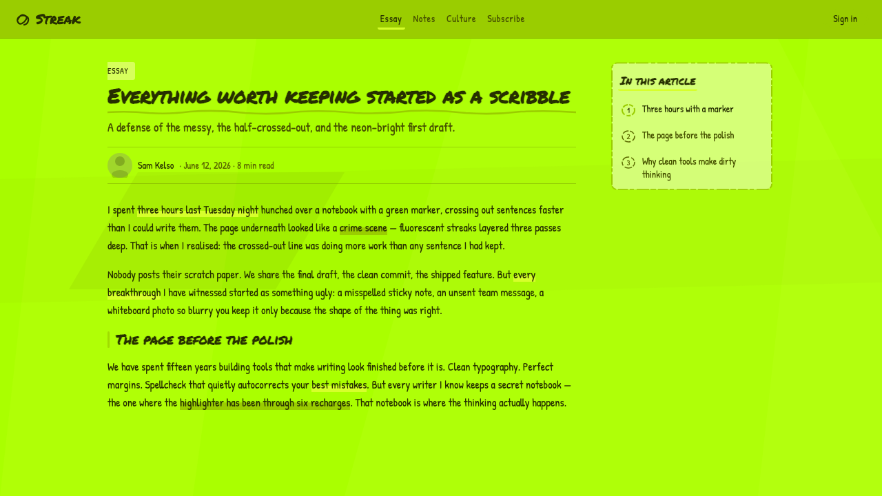
From 1971 to the present, the aesthetic has moved naturally into internet imagery and contemporary design references. What was once supporting evidence on a page can now become the page itself: enlarged marker bands form backgrounds, overlapping strokes create tonal structure, and handwritten annotations become display typography. The transformation preserves the tool's original communicative purpose while amplifying its accidental beauty — transparency, buildup, wobble, and imperfect coverage.
What defines the Fluorescent Highlighter look?
Fluorescent Color
Electric lime dominates the palette, carrying the unmistakable brightness of fluorescent stationery rather than the solidity of ordinary green paint. Deeper greens emerge through accumulated ink, not as unrelated accent colors. Supporting tones should remain quiet enough for the lime field to feel luminous, concentrated, and slightly excessive.
Transparency and Overlap
Every stroke should preserve some evidence of what lies beneath it. Intersections become visibly denser, allowing the composition to build depth without abandoning flat media. Overlap is therefore both a material effect and an organizing principle: important regions can be reinforced through repeated passes rather than enclosed by formal boxes.
Wedge-Stroke Geometry
The broad felt-tip wedge produces bands with blunt ends, variable edges, and directional momentum. These marks may run horizontally like conventional highlighting, but they can also tilt, cross, or gather into larger fields. Their geometry remains bodily and tool-specific; it must never become perfectly uniform striping.
Marker Typography
Lettering should feel written during active thought rather than typeset after reflection. Forms are informal, compressed or stretched by the hand, with visible changes in pressure and occasional crowding. Hierarchy comes from scale, repetition, circling, and underlining, while mechanical polish is deliberately withheld.
Bleed and Imperfection
Edges feather gently as ink meets an absorbent surface. Coverage varies within a stroke, terminals remain blunt or overloaded, and neighboring passes do not align exactly. These irregularities are essential evidence of contact between marker and page; removing them leaves only a generic neon graphic.
Annotated Rhythm
Wobbling underlines, quick arrows, encircled phrases, and repeated marks create the cadence of active revision. They should direct attention rather than serve as detached decoration. The strongest compositions alternate dense zones of correction and emphasis with quieter passages, reproducing the rhythm of a page being understood in real time.
Who shaped Fluorescent Highlighter?
Schwan-Stabilo is the German stationery company identified with the Stabilo Boss and therefore with the material foundation of the aesthetic. Its role is important because Fluorescent Highlighter begins with product behavior rather than abstract theory: fluorescent translucent ink, a felt-tip wedge, and a marker form made for repeated everyday use.
Günter Schwanhäußer is the individual named in the supplied origin material alongside Schwan-Stabilo. Within the history of this style, he represents the connection between a practical stationery object and the enduring visual vocabulary that grew around it. The marker's communicative function ultimately generated an aesthetic far beyond its original use.
Launched in 1971, the Stabilo Boss is the central object of the aesthetic rather than a passive historical reference. Its fluorescent ink supplies the luminous color, its transparency permits text to remain visible, and its wedge tip determines the broad directional stroke. The style is most convincing when these physical behaviors remain legible even in digital form.
How do you use Fluorescent Highlighter today?
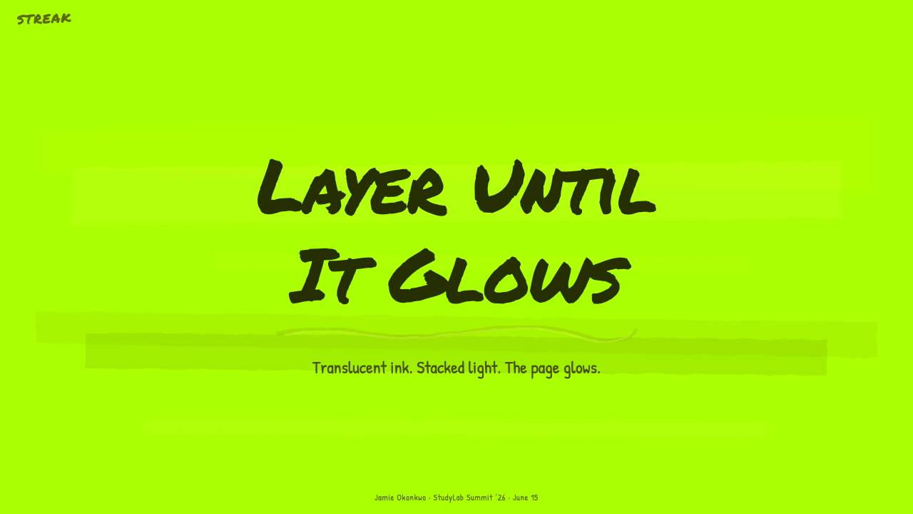
For presentation covers, Fluorescent Highlighter works best when a forceful band of translucent lime sweeps behind or across a short title, with a second pass producing one concentrated area. The field should feel marked in a single burst of attention. Content slides can translate annotation into hierarchy: highlighted phrases identify the argument, wavering underlines connect supporting points, and open regions prevent the accumulated ink from overwhelming the reading order.
Data slides should use highlighting to direct interpretation rather than recolor every value. A broad stroke can isolate the decisive category, repeated passes can indicate greater emphasis, and handwritten notes can state the conclusion beside the chart. The chart itself should remain readable beneath the ink-like layer. If every bar, label, and background glows equally, the style loses the distinction between evidence and annotation.
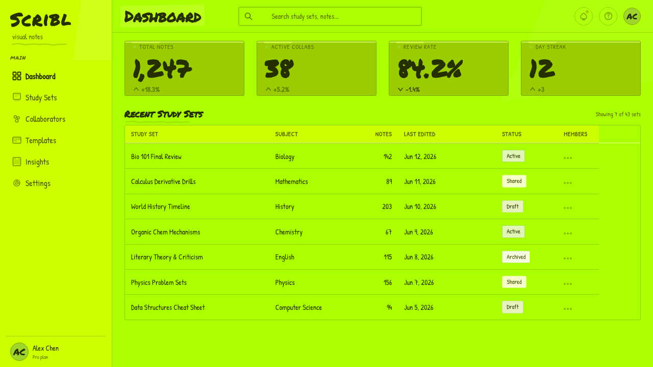
In web interfaces, the aesthetic suits dashboards, study tools, research workspaces, and pricing pages that benefit from energetic emphasis. Translucent marker fields can distinguish an active summary, important metric, or recommended offer, while handwritten accents can signal interpretation or urgency. Interaction states should feel like a fresh pass of ink rather than a sterile color swap. Persistent navigation and long-form controls need calmer treatment so the interface remains usable.
Editorial and marketing layouts can treat highlighting as a visible editorial voice. Key phrases may be swept over, quotations circled, and transitions marked with loose strokes that resemble decisions made in the margin. Campaign pages can enlarge these gestures until they become poster-like fields, but the copy should still appear embedded within a process of reading and selection. The style is especially effective when the message concerns learning, focus, revision, or concentrated attention.
The common mistake is reducing Fluorescent Highlighter to a clean neon rectangle behind polished typography. That reproduces the color but discards the tool. Authentic applications preserve transparency, overlap, directional strokes, irregular coverage, and the contrast between hurried marks and readable information. Another frequent error is saturating every surface equally; without quieter passages and visible lower layers, fluorescent emphasis becomes a flat green wall rather than a living record of attention.
Fluorescent Highlighter — FAQ
Is Fluorescent Highlighter simply a neon color palette?
No. Electric lime is immediately recognizable, but color alone cannot reproduce the style. Its identity depends on the behavior of translucent felt-tip ink: earlier content remains visible, overlapping passes become denser, wedge strokes retain direction, and edges bleed slightly. A solid bright shape with perfectly sharp boundaries may be neon, but it does not communicate the physical logic of highlighting.
Why must overlapping strokes become darker?
Because overlap is the style's primary evidence of material buildup. It shows that the field was made through successive passes rather than filled all at once, and it creates depth while preserving the flatness of ink on a page. Darker intersections also reveal sequence and emphasis: the regions revisited by the hand naturally appear more insistent.
Can clean digital typography be used with this style?
Yes, when it acts as the stable information layer beneath or beside handmade marks. Readable digital type can prevent a dashboard, slide, or long article from becoming exhausting, while marker lettering supplies emphasis and voice. The tension is productive: orderly information meets impulsive annotation. Problems arise when every word imitates hurried handwriting or when all irregularity is removed.
Does Fluorescent Highlighter require a visible paper background?
Not necessarily. The source aesthetic explicitly allows the page to become the saturated ink wash itself. A pale ground can make transparency easy to read, but enlarged and overlapping lime strokes may also cover most of the composition. What must remain visible is not literal paper texture but the relationship between separate passes, translucent layers, and the information beneath them.
Where does the style work poorly?
It struggles when an interface demands sustained neutrality, extreme information density, or a highly polished sense of permanence. The visual language is urgent and interpretive: it suggests that someone has just selected, corrected, or emphasized something. Used everywhere, that urgency becomes noise. It is strongest when attention itself is part of the subject and when calmer structural elements can support its expressive marks.
Related design styles
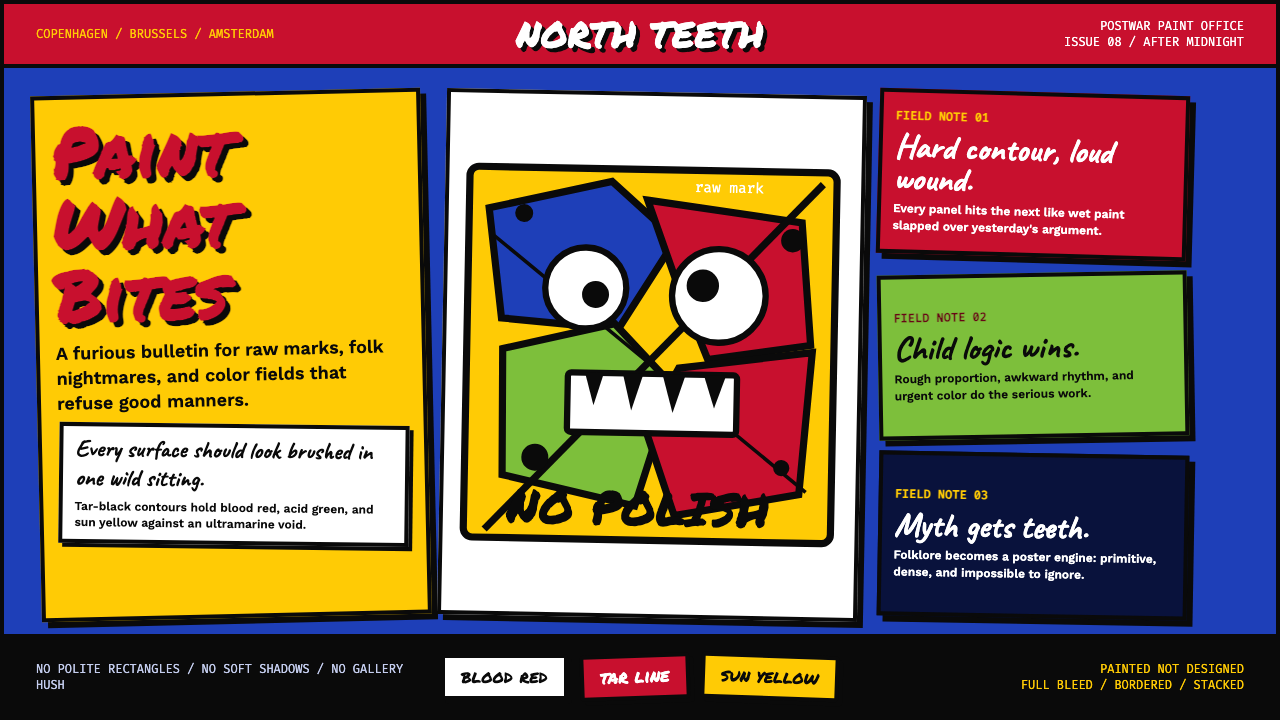 CoBrA (Asger Jorn, 1948)Paint refuses polish. Ultramarine ground, blood red slabs, and marker type th…
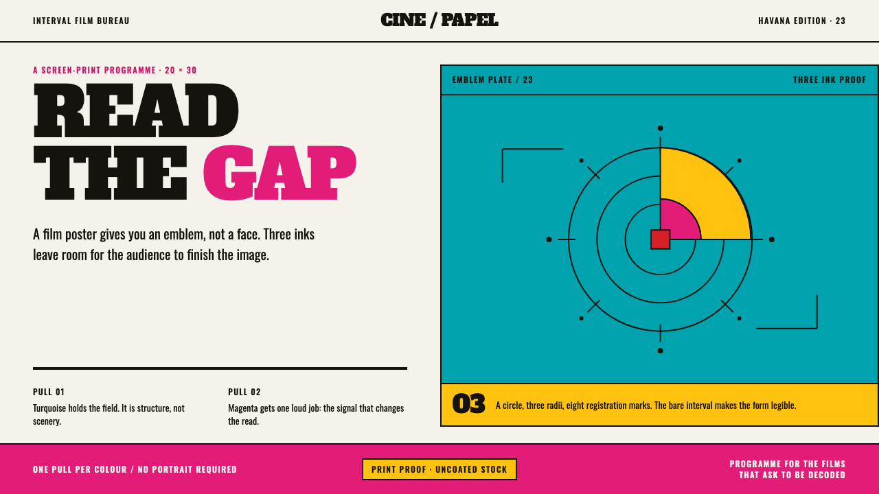 ICAIC Film PosterMetaphor wins the screen. Magenta and turquoise flat inks frame a measured em…
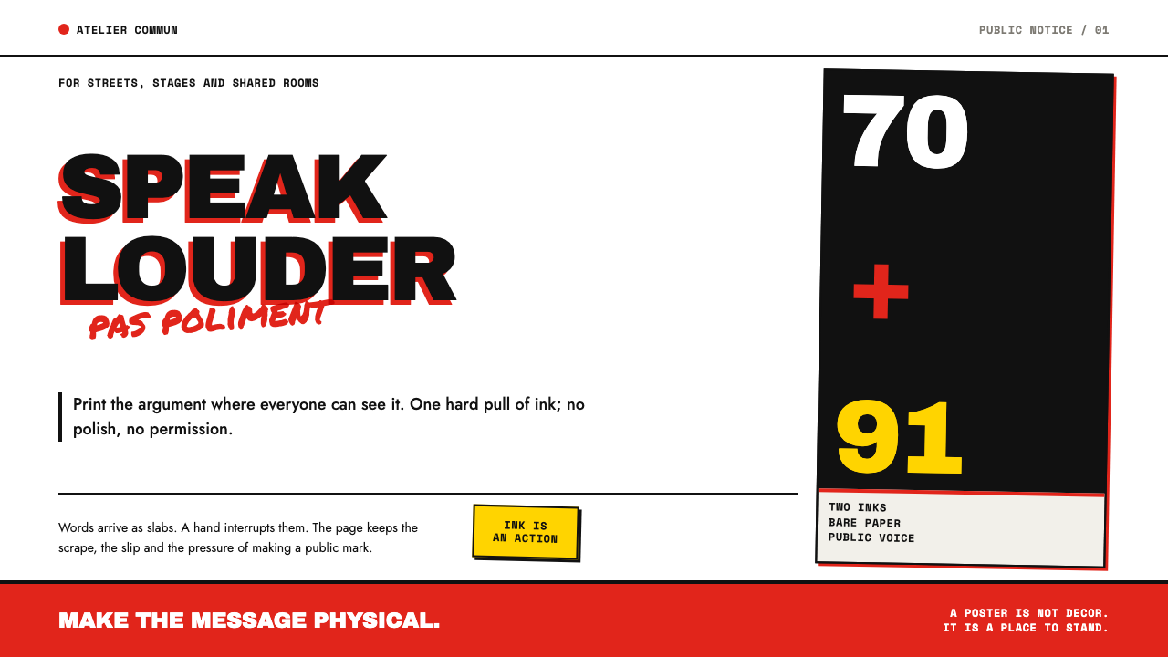 Grapus CollectivePrints dissent without polish. Red-black type slabs are disrupted by blunt ma…
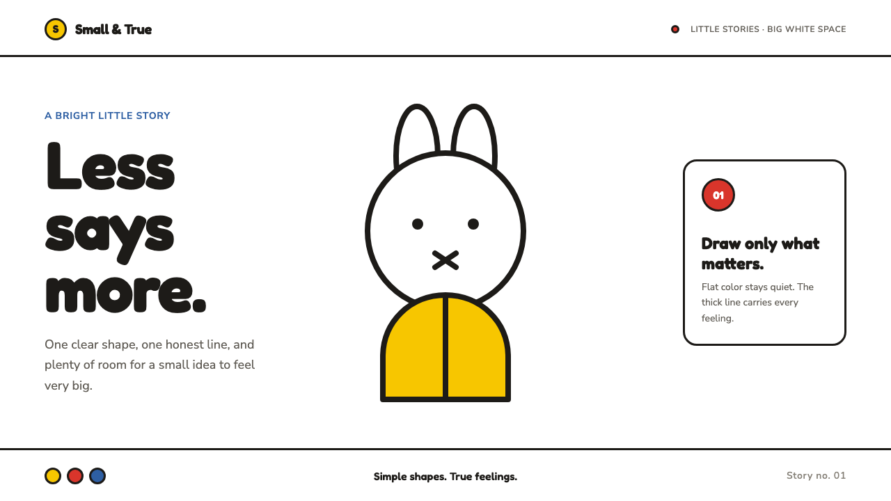 Miffy (Dick Bruna, 1955)Reduction feels alive. Flat primary shapes and one thick line float in pure w…
 Ant Farm InflatablesTemporary architecture glows. Vinyl-blue domes swell over dark desert teal.
 Art Brut (Dubuffet, 1948)Rawness crowds the frame. Mud brown, oxblood marks, and hand scrawl erase the…