What is Grapus Collective?
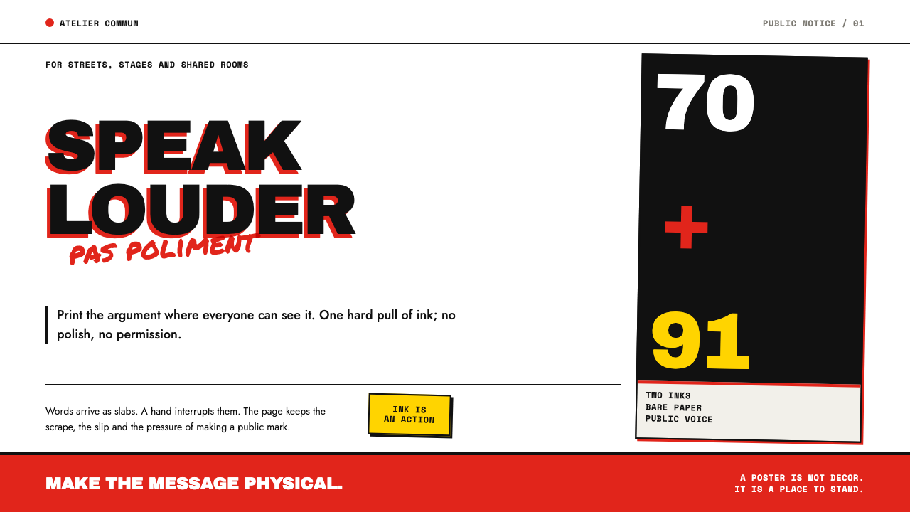
Grapus made French political posters that refused to look polished: red and black ink, brick-heavy type, and marker scrawl proving that a person was speaking.
Grapus Collective in brief
Grapus was a French graphic design collective that, for twenty-one years, made posters for the French Communist Party, the CGT trade union, town halls, experimental theatre, a popular relief organisation and schools, and signed none of them with a personal name. The only credit at the foot of a sheet was the single word Grapus. As a design style it is flat, opaque red and black ink on a bare white sheet, with heavy slabs of type that are interrupted, overwritten and disrupted by blunt marker and brush.
The visual language was settled by the means of production. Screenprinting is cheap, quick and works one colour at a time, so each pull of ink is flat and opaque and lies straight on the paper with no tonal blending. Red and black became a signature pairing, a combination that runs back to political posters in Russia in 1917. Type was set heavy and brick-like and then attacked by hand: marker and brush ride over it, photographs are blurred and overprinted, paper is torn and pasted back at an angle, and fingerprints and stains stay in.
The roughness is an argument, not a lapse. Registration, the alignment of one colour over the next, is allowed to slip on purpose, so where red crosses black a third colour appears that nobody mixed. Advertising wanted surfaces to be smooth; Grapus made them coarse, so that a viewer could see at a glance that people had made the thing. What the style keeps is that tone: dissent spoken out loud, without polish.
Where does Grapus Collective come from?
Grapus was born in 1970 out of the world of the May 1968 uprising in Paris, where a people's workshop, the Atelier Populaire, turned out screenprinted posters for strikers and demonstrators. The workshop's posters were collective and anonymous, and its tactics of cheap printing, bold simple images and slogans made to be read at a glance set the template. Grapus inherited all of that and then did something rarer: it stayed together as a working studio for twenty-one years, carrying a protest-poster method into the long, ordinary business of commissions. The collective dissolved in January 1991.
The studio's geography explains its clients. Grapus worked in Paris and in the communist-run communes of the northern suburbs, notably Aubervilliers, and its work came from the institutions of the French left and of the municipalities the party governed: the Communist Party itself, the CGT, town halls, experimental theatre, a popular relief organisation and schools. That is an unusual patronage for graphic design. There was no product to sell and no brand to polish, only a public to address, and the posters are shaped by that fact. They argue, announce and mobilise instead of seducing.
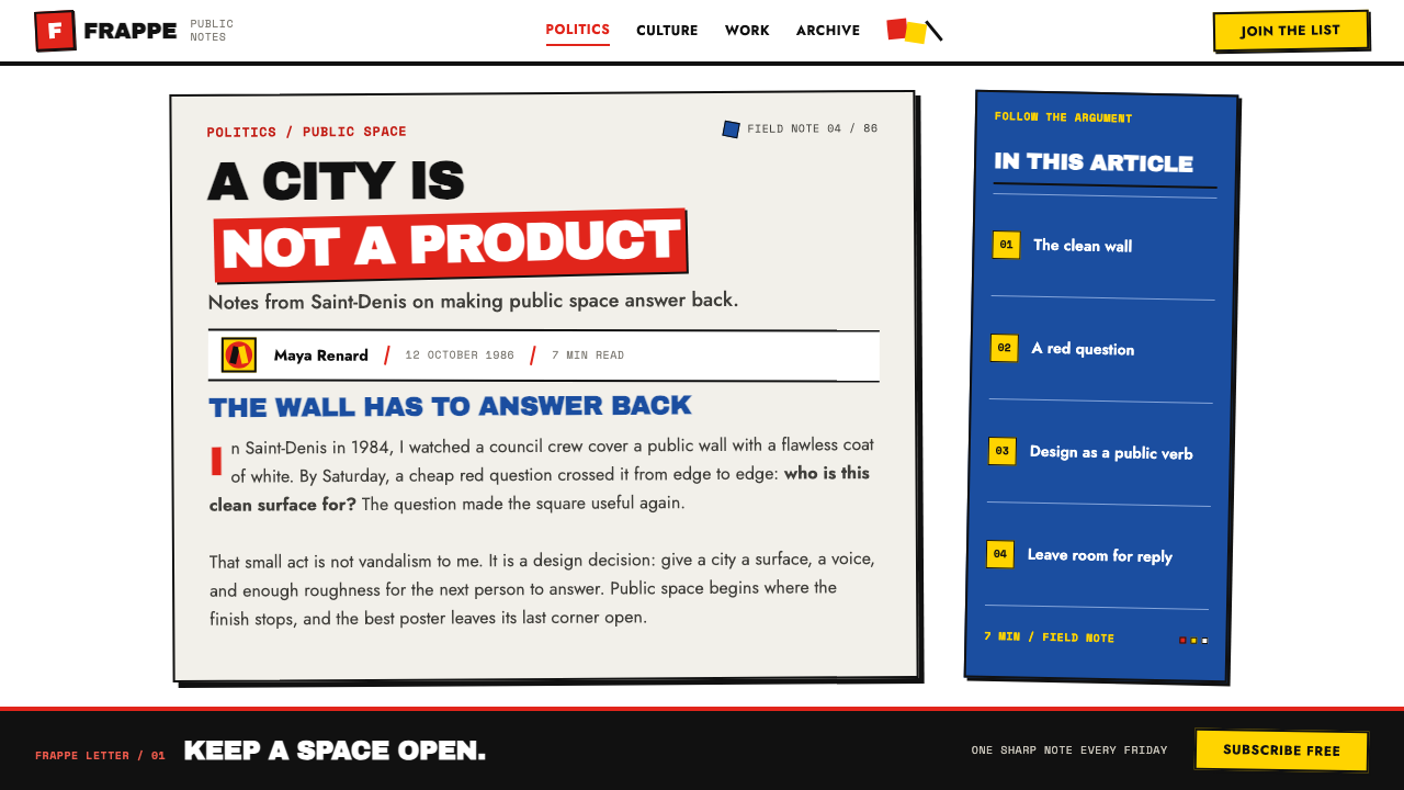
Three traditions feed the look. The first is the screenprinted poster of May 1968. The second is the wider French political poster, and behind it the red-and-black pairing of Russian posters from 1917, which the collective took as its signature. The third is Situationist détournement, the practice of hijacking an existing image, slogan or format and turning it against its original purpose. In Grapus work that tactic shows up as photographs blurred and overprinted until they stop being neutral pictures, and as handwriting dragged across set type so that a respectable slab of text is made to talk back.
The collective's members included Pierre Bernard, François Miehe, Gérard Paris-Clavel and Alex Jordan, yet the posters carried only the single word Grapus. That rule is part of the style's meaning: authorship belonged to the group, and the work was meant to be read as a position, not as a portfolio piece. What survives for designers today is therefore not a personal manner to be copied but a method drawn from the screenprint bench: flat ink, heavy type, an interruption by hand, and a registration error left in on purpose.
What defines the Grapus Collective look?
Red and Black on Bare White
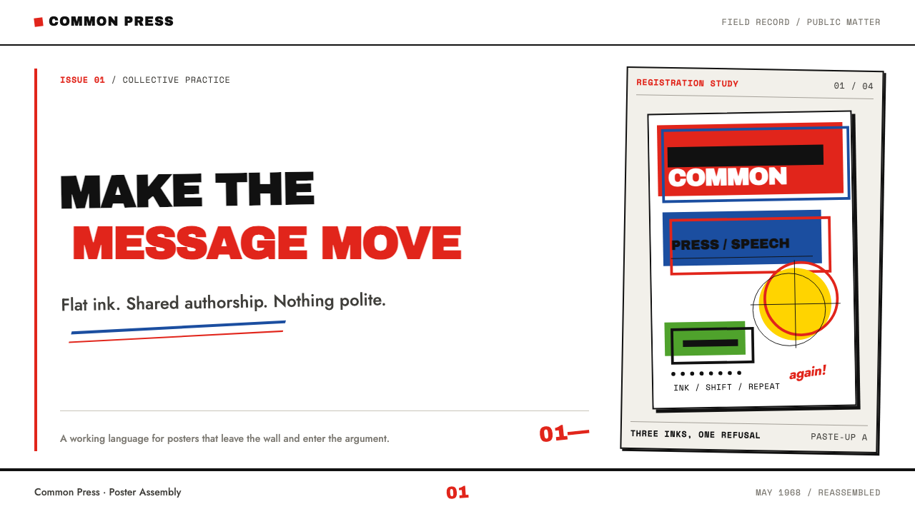
Two inks on an unprimed white sheet make up the whole palette. Red and black are the signature pairing, and white is simply the paper showing through, never a tinted ground. Every additional colour in the finished image comes from the inks overlapping, not from a third ink being added. The restraint is what lets the work read from across a street.
Flat Opaque Ink
The ink lies flat and opaque, one pull per colour, with no gradients, no soft shadows and no tonal blending. An area is either covered or it is not. This comes straight from the economics of screenprinting, and it gives edges a hard decisiveness. Translate it by using solid fills and hard-edged shapes, and avoid anything that suggests light falling on a surface.
Heavy Type Slabs
Type is set thick, tight and brick-like, so a headline is a block of mass rather than a line of words. Letters sit close, and the slab is treated as a shape in the composition. The type has to be strong enough to take abuse, because the next step is for a hand to cross it out, underline it or write straight through it.
Hand Over Type
Marker and brush ride over the set type in blunt, quick strokes: underlines, circles, arrows, slashes, handwritten words. The handwriting is the argument. It tells the viewer that a person is speaking, and it interrupts the authority of printed text without destroying its legibility. The scrawl should be confident and fast, never neat.
Blurred, Overprinted Photographs
Photographs are not clean illustrations here. They are blurred on purpose, coarsened into visible halftone dots, enlarged past comfortable sharpness and overprinted with colour or type. The image is raw material to be pushed around, in the spirit of détournement, rather than a window onto a scene.
Torn and Pasted Paper
Paper is torn rather than cut and pasted back at an angle, so the layout carries diagonal shifts and ragged edges. Fingerprints and stains are left where they fell. The collage is evidence of process: it shows that the poster was physically assembled by hands before it was printed.
Deliberate Misregistration
Colours are allowed to slip out of alignment on purpose. Where red crosses black, a third colour appears that nobody mixed, and edges show thin gaps and overlaps. This is a position as much as a technique: advertising wanted perfection, and the collective chose an imperfection that stays visible.
Who shaped Grapus Collective?
Bernard is one of the designers associated with Grapus from its founding in 1970. His name is a reminder of the collective's governing rule: posters carried the single word Grapus, so his individual hand is deliberately hard to isolate. When you cite the style, credit the group's method, and treat the names as context rather than as separate signatures.
Miehe is another of the designers named among the founders of the collective. Together with the others he worked in Paris and in the communist-run communes of the northern suburbs, where commissions came from the party, the CGT, town halls and theatres. His name points to the unusual patronage behind the style: public institutions with a public to address, and no product to sell.
Paris-Clavel is the third of the names usually given for the collective's beginnings. His name belongs with the hand-made side of the style: marker and brush dragged across set type, handwriting used as an argument. That interruption by hand, descended from the poster workshops of 1968 and from Situationist détournement, is the part of the language that is easiest to imitate and easiest to get wrong.
Jordan is counted among the members of Grapus, which worked for twenty-one years and dissolved in January 1991. His name rounds out the roll call of a collective that chose group authorship over personal credit. The lesson for designers is that the style's strength came from sustained shared practice, not from one person's signature look.
The Atelier Populaire was the people's workshop of May 1968 in Paris, which produced screenprinted posters collectively and anonymously for strikers and demonstrators. Grapus grew out of its world and kept its basic method: cheap printing, flat ink and slogans meant to be read at a glance. Without it there is no Grapus style, only a taste for rough red and black.
How do you use Grapus Collective today?
Grapus suits work that has something to say and someone to say it to: campaigns, civic and nonprofit communication, cultural events, theatre, education, activism, manifestos. It also gives a brand a human, unafraid voice when the message is a position rather than a product. It is a poor fit for anything whose promise is smoothness, luxury or reassurance.
For presentation slides, a cover can be a bare white field with one huge slab of red or black type crossed by a marker underline or a circled word. Content slides carry one idea at a time in very large type, with short handwritten notes in the margins. Data slides use flat red and black blocks for bars and areas, let colours overprint where categories overlap, and annotate by hand with circles, arrows and scribbled figures. Leave out gradients, glow and every other piece of chart decoration.
For web interfaces, the style is strongest on campaign sites, event pages, petitions and donation flows. Pricing or donation tiers can be flat slabs in red and black, and buttons can be solid blocks with a hand-drawn underline on hover. Dense dashboards are a harder fit, because interface work needs reliable legibility. Keep body text plain and quiet, and let the style live in headlines, borders, labels and a few chosen marks of the hand, not scattered through every control.
For editorial and marketing work, think flyer, zine, newsletter and poster. Headlines are heavy slabs, photographs are coarse and overprinted, and handwritten annotations sit in the margins as a second voice answering the printed one. The layout may tilt, tear and overlap, as long as the main message survives. Treat the roughness as a carrier for a clear position, never as a decorative mood.
The most common mistake is to use the roughness as a grunge texture applied to a message with nothing at stake, which turns dissent into costume. Others follow: scrawling over every element until nothing can be read, adding colours beyond red and black, softening the ink with gradients, or aligning the colour layers so precisely that the overprint disappears. Grapus works when the mess is chosen and the message under it is plain.
Grapus Collective — FAQ
Is Grapus the same thing as punk or grunge graphic design?
No. Grunge is usually a texture, a distressed surface applied for mood. In Grapus work the roughness has a cause: it comes from screenprinting, from collective political practice and from a deliberate refusal of advertising polish. The palette is also strict, flat red and black on white, and the imperfections have a job to do, whether that is a hand argument over type or a registration slip that creates a third colour.
Why only red and black?
Partly economy and partly lineage. Screenprinting works one colour per pull, so two inks keep a poster cheap and fast. The pairing also carries a history that runs back to Russian posters of 1917, and the collective adopted it as a signature. Because red can overprint black, two inks still produce a third colour where they overlap, so the restricted palette gives more than it seems to.
What does détournement mean in this style?
Détournement is the Situationist practice of hijacking something that already exists, an image, slogan or format, and turning it against its original purpose. In Grapus posters you see it when a photograph is blurred and overprinted until it says something new, or when handwriting is dragged across authoritative set type so that the text answers back. In design terms it means treating found material as something to be pushed, not preserved.
Can I add a third spot colour?
You can, but the style begins to dissolve. The third colour that matters here is the one produced where red overprints black, which nobody mixed. Introducing a separate third ink turns the poster into an ordinary colour layout and removes the economy that gives the work its force. If you must, use it once and small, as an interruption rather than as another field.
How do I keep a Grapus-style layout legible?
Let the roughness live in a few chosen places and keep the message itself plain. Heavy dark type on white already has strong contrast, so the hand-drawn marks should interrupt it rather than bury it. Limit scrawl to underlines, circles, arrows and a handful of handwritten words. If a viewer cannot find the main point within a glance, the mess has stopped serving the argument.
Related design styles
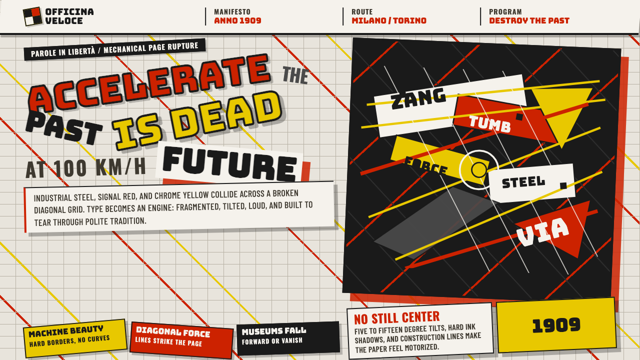 Italian Futurism (Marinetti 1909)Speed murders tradition. Signal red and chrome yellow slash a broken diagonal…
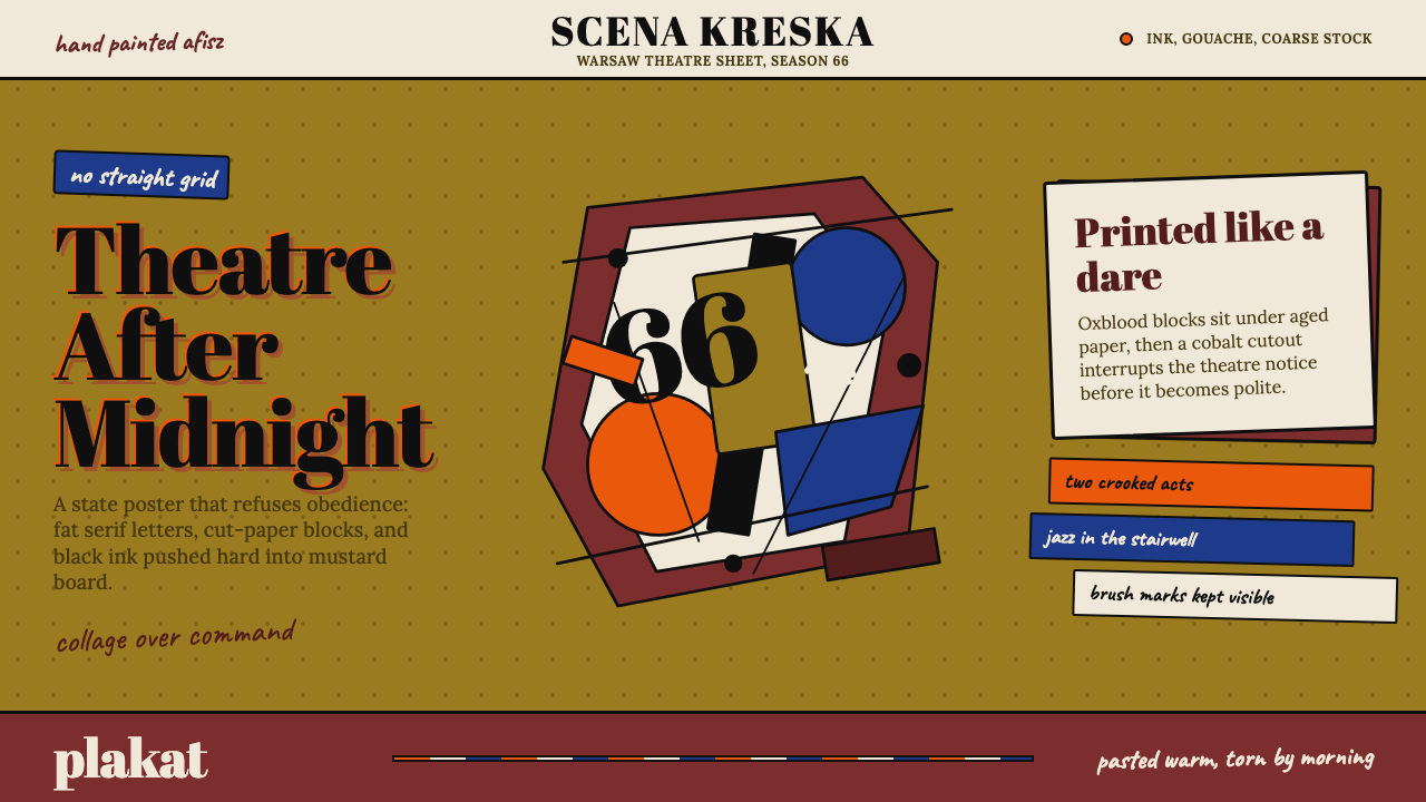 Polish Poster School (1960s)Painterly rebellion. Mustard board, oxblood collage, and fat serif letters re…
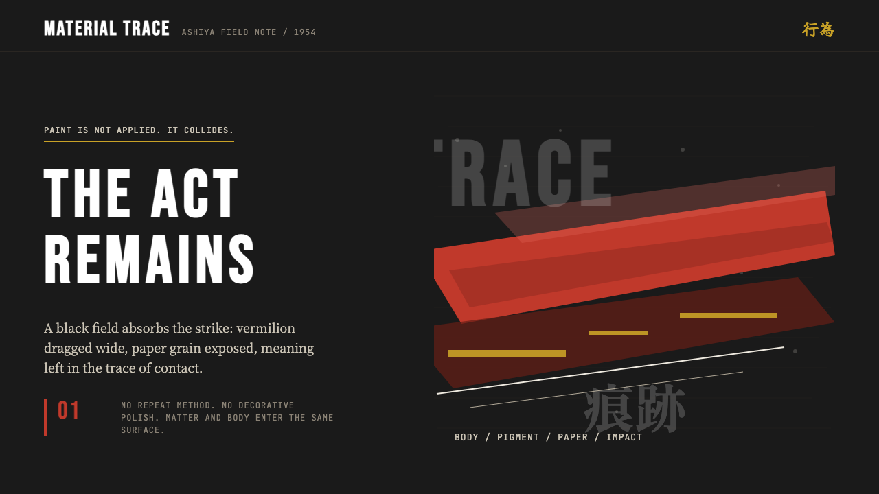 Gutai (Yoshihara, 1954)The gesture survives. Sumi black carries one vermilion strike and rough paper…
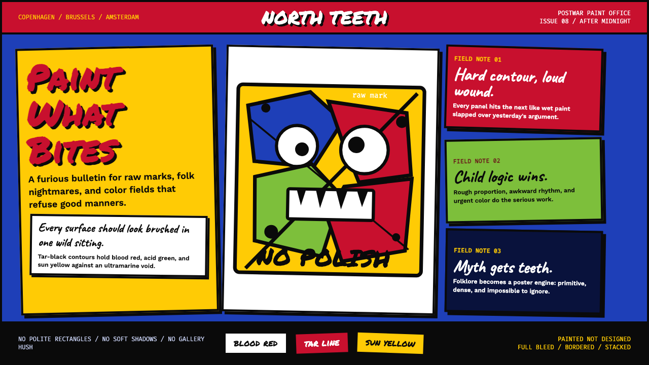 CoBrA (Asger Jorn, 1948)Paint refuses polish. Ultramarine ground, blood red slabs, and marker type th…
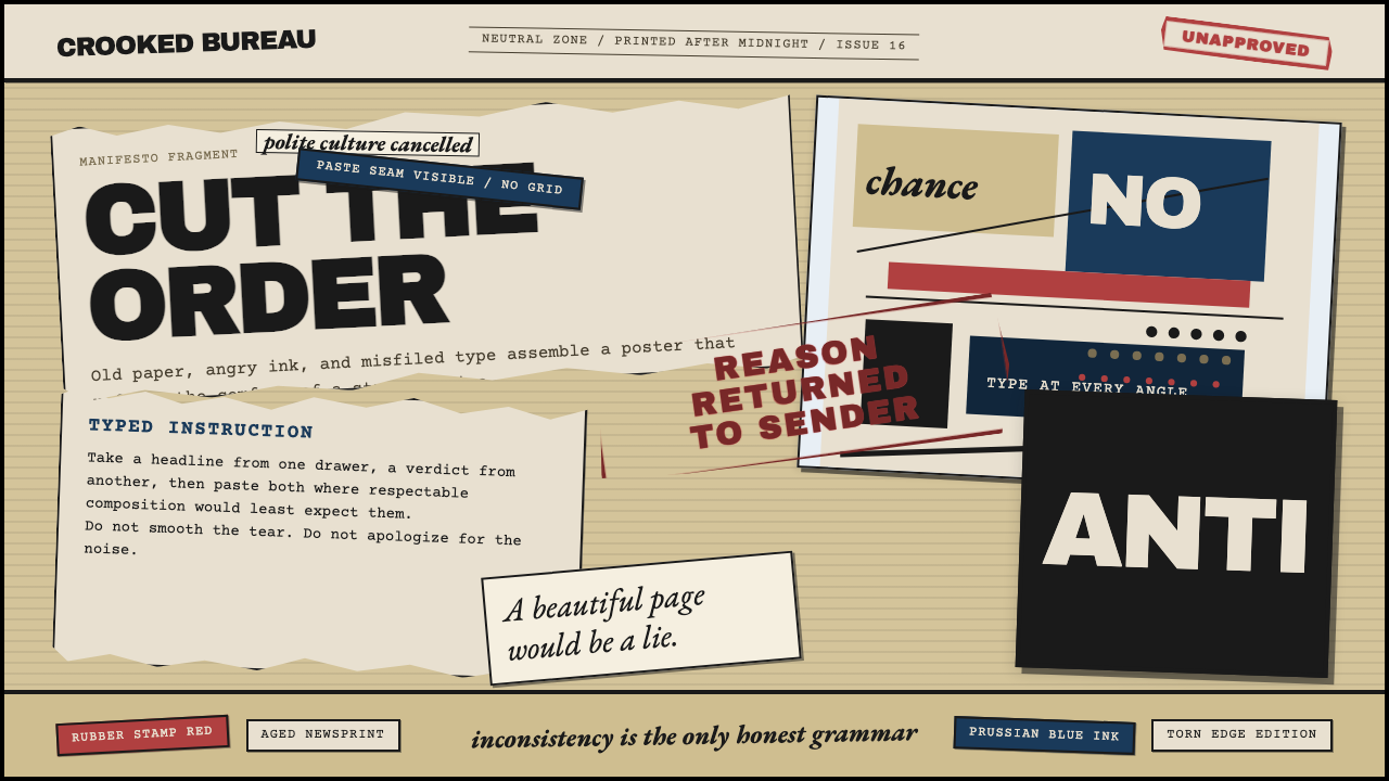 Dadaism (Zürich 1916)Chaos is the grammar. Aged newsprint, stamp red, Prussian blue, and tilted ty…
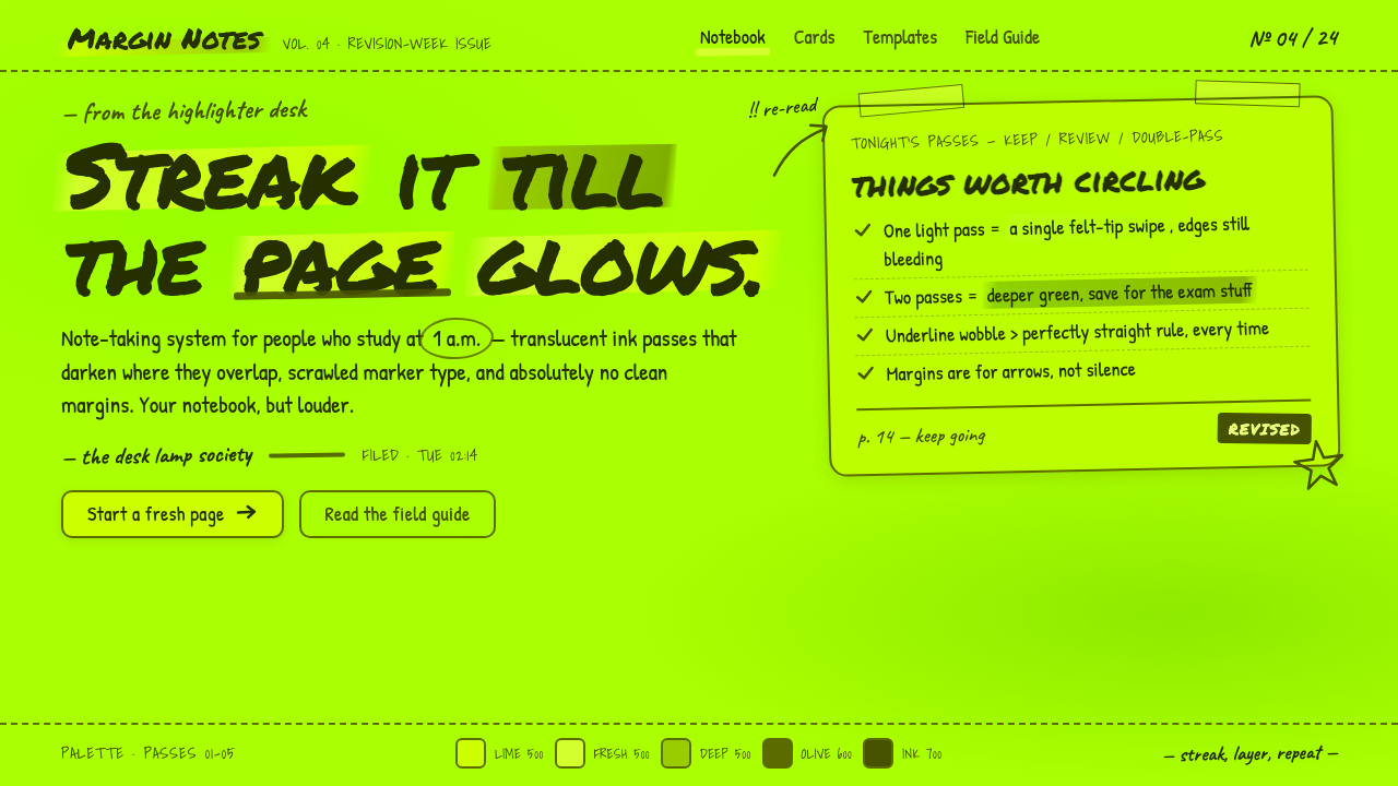 Fluorescent HighlighterStudy notes at 1am, made into a system. Translucent lime ink layered until th…