What is Polish Poster School (1960s)?什么是 Polish Poster School (1960s)?
Warsaw's state-funded designers weaponized paint, collage, and surrealist wit to produce the most visually arresting posters the Cold War ever saw.华沙的国家编制设计师以颜料、拼贴与超现实主义机智为武器,创作出冷战时代视觉张力最强的海报。
Polish Poster School (1960s) in briefPolish Poster School (1960s) 速览
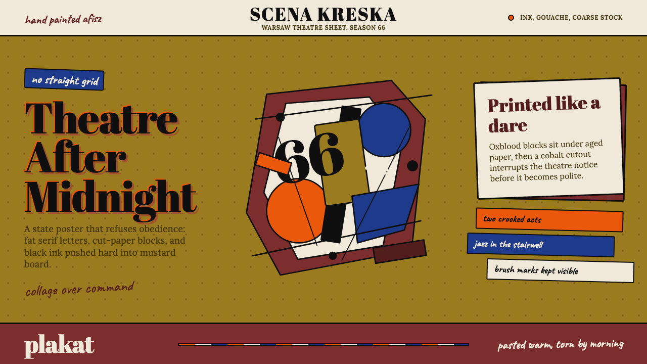
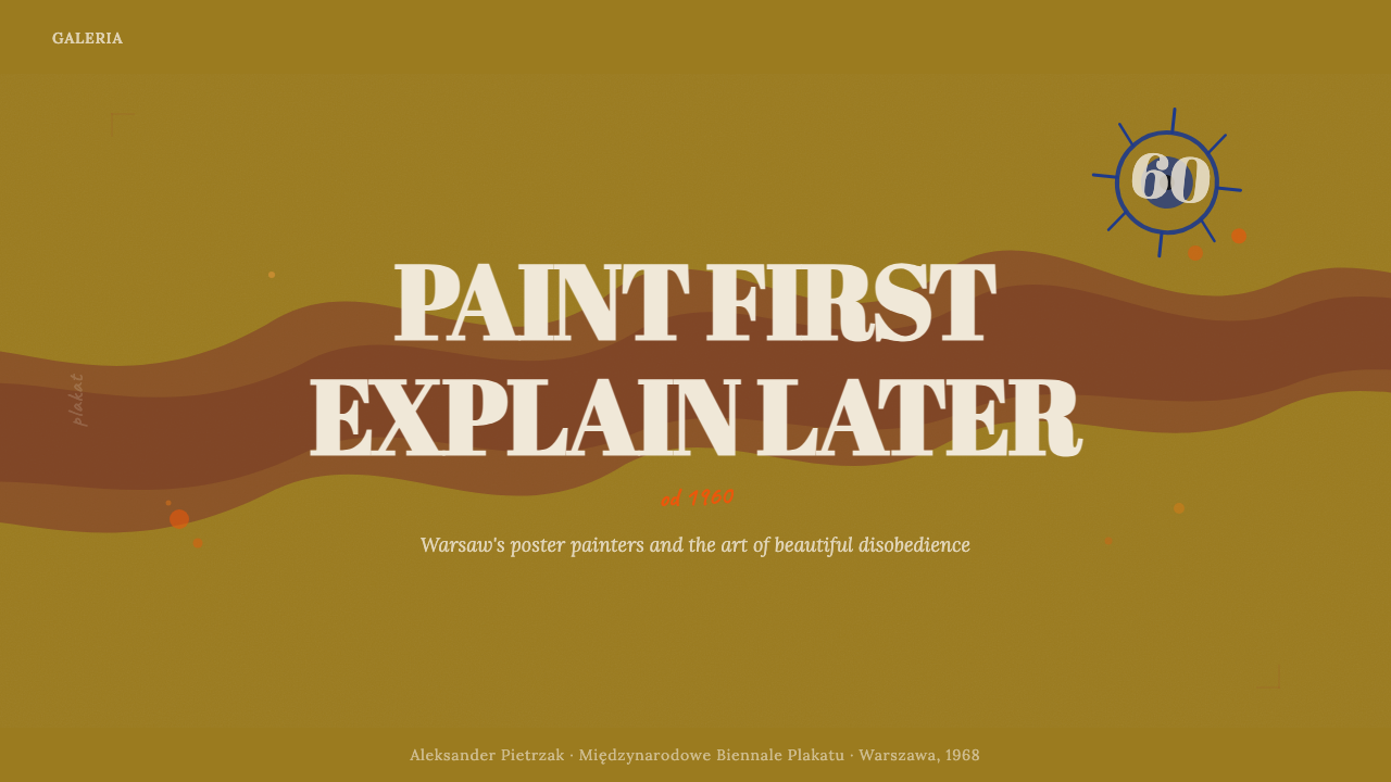
The Polish Poster School (Polska Szkoła Plakatu) was a movement of graphic artists working primarily in Warsaw and Kraków from the late 1940s through the 1980s, reaching its creative peak in the 1960s. Its practitioners produced hand-painted, collage-driven posters for theatre, film, opera, jazz festivals, and circuses that bore little resemblance to the mechanically printed propaganda of the Soviet bloc. The visual language they invented — saturated earthy grounds, fragmented hand-lettered type, distorted figurative imagery, and a painterly texture that recalled gouache on toned paper — became one of the most recognizable national design identities of the twentieth century.波兰海报学派(Polska Szkoła Plakatu)是一批主要活跃于华沙与克拉科夫的图形艺术家运动,从二十世纪四十年代末延续至八十年代,并在六十年代达到创作顶峰。他们为剧场、电影、歌剧、爵士音乐节与马戏表演创作了手绘、拼贴驱动的海报,与苏联阵营机械印刷的宣传品几乎没有任何相似之处。他们发明的视觉语言——饱和的泥土色基底、碎片化的手写字体、扭曲的具象图像,以及令人联想到有色纸上水粉画的绘画质感——成为二十世纪最具辨识度的国家设计身份之一。
What distinguished the Polish school from its Western contemporaries was its insistence on the poster as an autonomous artwork rather than a commercial communication tool. Where Swiss International Style subordinated expression to a rational grid, and American mid-century commercial art answered to the brief, Polish designers treated the poster surface as a canvas. Composition was governed by visual drama rather than readability hierarchy: a single distorted eye might occupy the full field, with the event title inscribed in brush lettering at an oblique angle along one edge. The image was the argument, and the text was almost an afterthought.波兰学派有别于同时代西方设计师之处,在于它坚持将海报视为自律的艺术作品,而非商业传播工具。瑞士国际主义风格将表现力服从于理性网格,美国中世纪商业艺术服务于简报,而波兰设计师则将海报版面当作画布对待。构图由视觉戏剧性而非可读性层级主导:一只变形的眼睛可能占满整个画面,活动标题以刷笔字沿某条边斜向题写。图像即论点,文字几乎是事后之想。
The style is immediately recognizable by its palette and its texture. Grounds tend toward deep, warm tones — the ochre of aged paper, the dark red of dried pigment, the warm black of India ink on rough stock — offset by bursts of brilliant contrast. Letterforms are drawn rather than set: thick brush strokes, hand-cut stencil shapes, or roughly torn paper edges replace the mechanically even letterpress or phototypesetting that dominated commercial print elsewhere in Europe. The deliberate imperfection, the visible grain of the surface, and the evidence of the maker's hand are not flaws but essential carriers of meaning.这种风格以其色调与质感令人一眼即辨。底面倾向于深沉温暖的色调——陈旧纸张的赭黄、干燥颜料的深红、粗纹纸上墨汁的暖黑——被强烈的对比色点燃。字形是画出来而非排出来的:粗重的刷笔笔触、手工切割的模板形状、粗糙撕裂的纸边,取代了欧洲其他地区商业印刷中机械均匀的活字或照相排版。刻意的不完美、可见的纸面纹理、制作者手的痕迹,都不是缺陷,而是意义的基本载体。
See the Polish Poster School (1960s) design system查看 Polish Poster School (1960s) 完整设计系统
Where does Polish Poster School (1960s) come from?Polish Poster School (1960s) 从何而来?
The Polish Poster School emerged from a precise historical conjunction: the devastation of World War II, the imposition of communist governance, and an institutional paradox that transformed state patronage into unexpected creative freedom. Poland lost approximately six million citizens and saw Warsaw almost entirely razed between 1939 and 1945. The country that emerged from the war was physically and culturally shattered, absorbed into the Soviet sphere, and theoretically committed to Socialist Realism — the officially mandated aesthetic of heroic labor, optimistic faces, and legible didactic imagery. Yet within a decade, Polish graphic designers had carved out a space for something almost opposite.波兰海报学派诞生于一个精确的历史交汇点:二战的浩劫、共产主义治理的强制推行,以及一个将国家赞助转化为意外创作自由的制度悖论。1939至1945年间,波兰约失去六百万人口,华沙几乎被夷为平地。从战争废墟中涌现的这个国家,在物质与文化上双重破碎,被纳入苏联势力范围,理论上承诺奉行社会主义现实主义——那套关于英雄劳动、乐观面孔与清晰说教图像的官方授权美学。然而不出十年,波兰平面设计师已为几乎完全相反的东西开辟出空间。
The mechanism of this inversion was institutional. The Polish state needed posters — for theatre, for cinema, for cultural festivals that demonstrated the vitality of socialist culture — and it needed them in volume. It established dedicated poster studios attached to cultural institutions and gave designers considerable autonomy over how they solved the creative brief. Critically, the films, plays, and operas being advertised were often foreign or experimental works that Socialist Realism had no ready vocabulary for: an Orson Welles film, a Beckett play, an American jazz ensemble. Polish designers, trained in fine arts traditions and philosophically acquainted with Surrealism and the European avant-garde, found that the brief itself demanded invention.这种逆转的机制是制度性的。波兰国家需要海报——为戏剧、为电影、为展示社会主义文化活力的文化节——而且需要大量。它在文化机构附属建立了专门的海报工作室,并赋予设计师相当大的创作自主权。关键在于,被宣传的电影、戏剧与歌剧往往是外国或实验性作品,社会主义现实主义对此没有现成的视觉词汇:奥逊·威尔斯的电影、贝克特的戏剧、美国爵士乐队。受过纯艺术传统训练、在哲学上熟悉超现实主义与欧洲先锋派的波兰设计师,发现简报本身就要求发明。
Henryk Tomaszewski, widely acknowledged as the father of the Polish school, had already established the painterly, metaphor-driven approach by the early 1950s. His posters operated through visual association rather than literal illustration — a film about grief might yield a single tear rendered as a vast landscape, rather than a weeping face. Tomaszewski trained a generation of students at the Warsaw Academy of Fine Arts who absorbed this method: Jan Lenica, Roman Cieslewicz, Waldemar Świerzy, and Franciszek Starowieyski each extended the vocabulary in distinct directions, from Lenica's intricate organic line-work to Starowieyski's darkly erotic neo-Baroque imagery.亨里克·托马谢夫斯基被公认为波兰学派之父,他早在五十年代初就已确立了绘画式、隐喻驱动的方法。他的海报通过视觉联想而非字面插图来运作——一部关于悲痛的电影,可能呈现一滴被渲染为广阔风景的眼泪,而非一张哭泣的脸。托马谢夫斯基在华沙美术学院培养了一代学生,他们吸收了这种方法:杨·莱尼察、罗曼·切希莱维奇、瓦尔德马尔·希维尔兹、弗兰齐谢克·斯塔罗维耶斯基,各自将这套词汇延伸至截然不同的方向——从莱尼察复杂的有机线条,到斯塔罗维耶斯基暗黑情色的新巴洛克图像。
By the early 1960s, the school had attracted international attention. Polish posters won prizes at international biennales and entered the permanent collections of the Museum of Modern Art in New York and design institutions across Europe. The irony — state-subsidized art from behind the Iron Curtain winning acclaim in Western capitals — was not lost on observers on either side. The 1966 Warsaw International Poster Biennial, inaugurated in that decade, became a permanent institution and formalized Poland's position as the world center of poster art. The school's influence extended outward through emigration: Cieslewicz moved to Paris in 1963, where his work informed French graphic design for decades, while the Lenica–Borowczyk animation collaborations brought the visual language into film.到六十年代初,波兰学派已引起国际关注。波兰海报在国际双年展上屡获奖项,进入纽约现代艺术博物馆和欧洲各地设计机构的永久收藏。这个讽刺——来自铁幕后的国家资助艺术在西方首都赢得喝彩——两边的观察者都心知肚明。1966年,华沙国际海报双年展揭幕,成为永久性机构,正式确立了波兰作为世界海报艺术中心的地位。学派的影响力通过移居向外延伸:切希莱维奇于1963年迁居巴黎,其作品影响法国平面设计数十年;莱尼察与博洛夫奇克的动画合作则将这套视觉语言带入了电影。
What defines the Polish Poster School (1960s) look?Polish Poster School (1960s) 的视觉特征是什么?
Earthy, Saturated Ground Colors浓郁的大地色基底
The Polish school grounds its compositions in deep, warm, non-neutral tones that read less like paper and more like pigment: ochre yellows recalling raw mustard or aged parchment, dark reds in the range of oxblood or dried lacquer, warm blacks that hold visible texture. These are not background colors in the passive sense — they carry the weight of gouache or casein paint applied to toned stock, and they set the emotional register of the piece before any figure or letterform appears. Against these grounds, accent colors arrive with shocking force: a pure cerulean, a vivid vermillion, a near-white that vibrates at the edge of the composition.波兰学派将构图植根于深沉温暖的非中性色调,读来不像纸张而更像颜料:令人联想到芥末原料或陈旧羊皮纸的赭黄、牛血或干漆范围内的深红、保留可见纹理的暖黑。这些不是被动意义上的背景色——它们承载着水粉或酪蛋白颜料涂抹于有色纸上的重量,在任何图形或字母形态出现之前,就已定下作品的情感基调。在这些底面之上,强调色以令人震惊的力度到来:纯粹的群青、鲜艳的朱红、在构图边缘颤动的近白。
Surrealist and Metaphoric Imagery超现实与隐喻图像
Where commercial poster design elsewhere in Europe used literal illustration — a film still, an actor's portrait, a product rendering — the Polish school substituted visual metaphor. A poster for a play about memory might show a human figure dissolving into fragments of paper; a circus advertisement might replace the performers with menacing anatomical hybrids. The imagery draws on Surrealist precedents — the dislocated body parts of Max Ernst, the dreamlike spatial compression of de Chirico — but filters them through Polish folk tradition and post-war existential weight. Nothing is depicted that could be photographed; everything is transformed through the act of drawing and cutting.欧洲其他地区的商业海报设计使用字面插图——电影剧照、演员肖像、产品渲染——而波兰学派以视觉隐喻取而代之。一张关于记忆的戏剧海报,可能呈现一个人体形象溶解为纸片碎片;马戏表演的广告,可能以威胁性的解剖学杂交生物替代表演者。这些图像援引超现实主义先例——马克斯·恩斯特错位的身体部件、德·基里科梦幻般的空间压缩——却经由波兰民间传统与战后存在主义的重量过滤。没有任何可以被拍摄的东西被描绘;一切都通过绘画与剪切的行为而变形。
Hand-Drawn and Collage Typography手绘与拼贴字体
Letterforms in Polish school posters are almost never typeset from a standard face. Instead they are drawn, painted, stenciled, or assembled from cut paper — each character slightly irregular, each word carrying the pressure and personality of the hand that made it. The lettering might be thick and gestural, like brushwork in a hurry; or it might be deliberately crude, like a child's cut-out letters; or it might be so abstracted that it hovers between legible text and pure visual form. This approach treats the title not as information to be efficiently conveyed but as a visual element with the same pictorial weight as the central image. The words belong to the picture.波兰学派海报中的字母形态几乎从不从标准字体排印。相反,它们是画出来、涂出来、用模板印出来,或从剪纸中拼装的——每个字符略有不规则,每个词语都承载着制作者手的压力与个性。字母可能粗重而富有姿态,像匆忙中的笔触;或者刻意粗糙,像孩子的剪贴字母;或者高度抽象,徘徊在可读文字与纯视觉形态之间。这种方式将标题视为不仅仅是需要高效传达的信息,而是与中心图像具有同等图像分量的视觉元素。文字属于画面。
Collage Composition Over Grid拼贴构图优先于网格
The organizing principle of Polish school composition is layering rather than alignment. Elements — painted shapes, torn paper, photographic fragments, drawn figures — overlap and interrupt each other without deference to a rational grid. Scale relationships are driven by expressive priority rather than information hierarchy: the thing that matters most emotionally is largest, regardless of whether it is the headline, the central figure, or an atmospheric detail in a corner. Negative space, when it appears, is itself treated as a shaped form — a deliberate cut in the composition rather than empty margin.波兰学派构图的组织原则是层叠而非对齐。各元素——绘制的形状、撕裂的纸张、摄影碎片、画出的人物——相互叠压与打断,不服从理性网格。比例关系由表达优先级驱动,而非信息层级:情感上最重要的东西最大,无论它是标题、中心人物还是角落里的氛围细节。负空间出现时,本身也被视为一种成形的形态——构图中刻意的切口,而非空白边距。
Painterly Texture and Surface Evidence绘画质感与表面痕迹
Perhaps the most immediately recognizable quality of Polish school work is its insistence on visible surface. Paint strokes are not smoothed; paper grain reads through areas of flat color; torn edges reveal the substrate beneath. This is the opposite of the seamless commercial print finish that characterized most contemporary European poster production. The texture is not incidental — it carries temporal and emotional information, suggesting that the work was made by hand, over time, with physical effort. The visible labor is part of the meaning: these are not reproductions of designs but artifacts of making.波兰学派作品最直接可辨认的品质,也许是它对可见表面的坚持。笔触不被抹平;纸张纹理在平涂色块区域透出;撕裂的边缘揭露下方的基底。这与当时欧洲大多数商业海报生产所追求的无缝印刷完成度截然相反。纹理不是偶然的——它承载着时间与情感信息,暗示着作品是手工、耗时、以体力劳作制作的。可见的劳动是意义的一部分:这些不是设计的复制品,而是制作行为的遗物。
Figurative Distortion and Dark Wit具象变形与黑色幽默
Human figures in Polish school imagery are rarely intact. They may be fragmented, combined with animal or mechanical parts, inverted, repeated in unsettling series, or reduced to a single expressive feature — an eye, a hand, a mouth — detached from any body. This distortion is not random but purposeful: it reflects the existential concerns of a post-war culture that had witnessed the literal disintegration of the human body, and the surrealist inheritance that treated the body as a site of psychic as much as physical reality. Alongside the darkness runs a thread of absurdist wit — incongruous juxtapositions, visual puns, and moments of unexpected comedy that prevent the work from becoming merely grim.波兰学派图像中的人体形象很少是完整的。它们可能被碎片化,与动物或机械部件结合,倒置,以令人不安的方式反复出现,或被简化为单一的表现性特征——一只眼睛、一只手、一张嘴——与任何身体分离。这种变形不是随意的,而是有目的的:它反映了一种目睹过人体字面意义上崩解的战后文化的存在主义关切,以及将身体视为心理现实场所的超现实主义遗产。在黑暗之中,一股荒诞主义机智的线索贯穿其中——不协调的并置、视觉双关、意外的喜剧瞬间,防止作品沦为单纯的阴郁。
Cultural Specificity and Folkloric Reference文化特殊性与民间传统引用
Despite its engagement with European avant-garde movements, the Polish school retained distinctly local visual references. Polish folk art, with its bold cut-paper silhouettes (wycinanki), vivid painted decorations, and flattened figurative imagery, provided a parallel vocabulary to Surrealism — one that was simultaneously modern and rooted. Certain recurring motifs — the rooster, the folk mask, stylized plant forms — appear across many designers' work as shared cultural shorthand. This folkloric layer gives the style a grounded specificity that distinguishes it from the internationalism of Swiss design or the consumerism of American commercial art.尽管与欧洲先锋主义运动有所交涉,波兰学派仍保留了鲜明的本地视觉参照。波兰民间艺术以其粗犷的剪纸剪影(wycinanki)、鲜艳的彩绘装饰和平面化的具象图像,为超现实主义提供了一套平行词汇——既现代又扎根于传统。某些反复出现的母题——公鸡、民间面具、程式化的植物形态——作为共同的文化简称出现在许多设计师的作品中。这一民俗层次赋予了这种风格一种扎实的特殊性,将其与瑞士设计的国际主义或美国商业艺术的消费主义区别开来。

See the Polish Poster School (1960s) design system查看 Polish Poster School (1960s) 完整设计系统
Who shaped Polish Poster School (1960s)?谁塑造了 Polish Poster School (1960s)?
Tomaszewski is the acknowledged patriarch of the Polish school. Teaching at the Warsaw Academy of Fine Arts from the late 1940s onward, he developed the foundational approach that defined the movement: image as metaphor, paint as primary medium, and the poster as autonomous artwork rather than functional announcement. His work ranged across theatre, film, and political subjects, always prioritizing visual intelligence over legibility. He trained virtually every major designer of the subsequent generation, making his influence structural as well as stylistic. His own work retained a lightness and wit even as it engaged difficult subjects — a balance that prevented the school from collapsing into academic gravity.托马谢夫斯基是公认的波兰学派宗师。他从四十年代末起在华沙美术学院任教,发展出定义这一运动的基础方法:图像即隐喻,颜料是主要媒介,海报是自律的艺术作品而非功能性公告。他的创作涵盖戏剧、电影与政治题材,始终将视觉智识置于可读性之上。他几乎培养了下一代所有重要设计师,使其影响既是结构性的,也是风格性的。他自己的作品即便在涉及困难题材时,也保持着一种轻盈与机智——这种平衡防止了学派陷入学院式的沉重。
Lenica brought the school's visual language into animated film as well as poster design, collaborating with Walerian Borowczyk on films that exported the Polish aesthetic to international art cinema. His poster work is characterized by intricate, organic line-work — figures that seem to grow from biological process rather than geometric decision, letterforms that curl and branch like living matter. Where Tomaszewski's influence was broadly humanist, Lenica's was more unsettling, closer to the anxious imagery of Kafka — not coincidentally, he produced a celebrated animated adaptation of Kafka's The Trial. His emigration to West Germany and later France in the 1960s spread the school's methods into European animation and graphic design.莱尼察将学派的视觉语言带入动画电影以及海报设计,与瓦莱里安·博洛夫奇克合作,将波兰美学带入国际艺术电影。他的海报作品以复杂的有机线条为特征——人物形象仿佛从生物过程而非几何决定中生长出来,字母形态蜿蜒分支如同活体物质。托马谢夫斯基的影响广泛人文主义,而莱尼察的则更令人不安,更接近卡夫卡焦虑的图像——并非偶然,他制作了一部著名的卡夫卡《审判》动画改编。他在六十年代移居西德、后来至法国,将学派的方法传播到欧洲动画与平面设计中。
Cieslewicz was the member of the Polish school most directly engaged with the visual language of mass media and photography. Where his contemporaries worked primarily with paint and drawn line, Cieslewicz incorporated photographic imagery — cropped, high-contrast, often distorted — into collage compositions that prefigured much of what the 1980s would call postmodern graphic design. After emigrating to Paris in 1963, he worked for Elle magazine and the Opus International art journal, introducing Polish poster sensibility into French editorial design and influencing designers across Europe who had no direct connection to Warsaw.切希莱维奇是波兰学派中最直接介入大众媒体与摄影视觉语言的成员。当同时代人主要以颜料和画线工作时,他将摄影图像——经过裁切、高对比度处理、常被扭曲——融入拼贴构图,预示了1980年代所谓后现代平面设计的许多面貌。1963年移居巴黎后,他为《Elle》杂志和《Opus International》艺术期刊工作,将波兰海报感性引入法国编辑设计,影响了欧洲各地与华沙没有直接联系的设计师。
Świerzy was the school's most prolific personality portraitist, producing a vast body of work for jazz and rock music subjects that brought a painterly, almost Expressionist approach to the portrait poster format. His depictions of musicians — Jimi Hendrix, Louis Armstrong, and others — used loose, gestural mark-making and vivid non-naturalistic color to capture energy rather than likeness. Within Poland, his work extended the school's reach beyond the theatre and art-film context into popular music and mass entertainment, demonstrating that the painterly poster could carry contemporary cultural subjects without sacrificing pictorial intensity.希维尔兹是学派最多产的人物肖像画家,为爵士和摇滚音乐题材创作了大量作品,将一种绘画式、近乎表现主义的方式带入肖像海报形式。他对音乐家的描绘——吉米·亨德里克斯、路易·阿姆斯特朗等——使用松弛、姿态性的标记制作和鲜艳的非自然主义色彩来捕捉能量而非肖似。在波兰国内,他的作品将学派的触角从剧场和艺术电影语境延伸至流行音乐和大众娱乐,证明了绘画式海报可以承载当代文化题材而不牺牲图像强度。
Starowieyski occupied the furthest extreme of the school's range, producing imagery of baroque complexity and erotic darkness that tested the limits of what state cultural institutions would commission and display. His posters — often for theatre festivals or experimental cinema — drew on the anatomical illustration tradition, medieval memento mori imagery, and central European grotesque, combining them in densely detailed compositions that rewarded extended looking. He referred to himself as a painter who happened to work in the poster format, and his canvases and prints extended the same obsessions into fine art contexts. His work remains the most difficult to apply as a design reference precisely because its power derives from irreducible personal obsession.斯塔罗维耶斯基占据学派范围的最远极端,创作出具有巴洛克复杂性和情色黑暗性的图像,考验着国家文化机构愿意委托和展示的极限。他的海报——通常为戏剧节或实验电影制作——援引解剖学插图传统、中世纪的死亡警示图像(memento mori)与中欧怪诞,将它们组合在密集精细、值得长时间凝视的构图中。他称自己是碰巧以海报形式工作的画家,他的画布和版画将同样的执念延伸至纯艺术语境。他的作品之所以最难作为设计参照应用,正是因为其力量来自不可简化的个人执念。
How do you use Polish Poster School (1960s) today?今天怎么用 Polish Poster School (1960s)?
The Polish Poster School transfers into contemporary design work through texture, metaphor, and a willingness to treat the image as primary. Applying it correctly means resisting the instinct to center information and instead asking what emotional or conceptual experience the composition should produce. This is not a style driven by grid logic or typographic hierarchy — it is driven by pictorial argument. The designer working in this mode functions more like a painter composing a scene than a typographer arranging a brief.波兰海报学派通过质感、隐喻以及将图像置于首位的意愿,转化进当代设计实践。正确应用它意味着抵制将信息居中的本能,转而思考构图应产生怎样的情感或概念体验。这不是一种由网格逻辑或排版层级驱动的风格——它由图像论点驱动。以这种模式工作的设计师,更像是构图一个场景的画家,而非编排简报的排版师。
For presentation slides, the Polish school works most powerfully on cover and section-break pages where a single strong image can carry the full communicative weight. A cover should feel like a poster: one bold ground color, a central image that has been drawn, collaged, or heavily treated rather than photographed cleanly, and a title in hand-drawn or rough brush lettering placed off-center, at an angle, or along an edge rather than centered in the traditional slide position. Content slides should use the same warm ground but simplify radically — a textured background, one large pull-quote in heavy letterforms, minimal body text. Data slides can adopt the school's palette without its complexity: earthy grounds, hand-drawn-style chart elements, axes and labels in a single contrasting color.在演示文稿中,波兰学派在封面页和章节间隔页上最有力量,这些地方单一强烈的图像可以承载全部传达重量。封面应有海报感:一种粗犷的底色,一个被画出、拼贴或经大量处理而非清晰拍摄的中心图像,以及一个用手绘或粗刷体置于偏心、斜向或沿边位置而非传统幻灯片居中位置的标题。内容页应使用同样温暖的底面,但大幅简化——质感背景、一句以粗重字母形态排列的大型引言、极少的正文。数据页可采用学派色板而不采用其复杂性:大地色底面、手绘风格的图表元素、以单一对比色标注坐标轴和标签。
For web interfaces and dashboards, the style is best used selectively rather than as a total system. It suits editorial headers, landing page hero sections, and any context where the goal is arrest-then-read rather than efficient scanning. A dashboard built entirely in Polish school aesthetics would be illegible — the texture and irregularity that give the style its power conflict with the scannable, data-dense requirements of analytics interfaces. The productive middle ground is using the palette and a degree of textural richness for hero areas and empty states, then stepping back to cleaner, more neutral components for data-heavy sections. Pricing pages and marketing splash pages are the strongest fit: the poster-like boldness of a single strong ground color with a contrasting feature image and typographically heavy call-to-action works in the same way a street poster demands attention from a passing eye.对于网页界面和仪表板,这种风格最好选择性使用,而非作为完整系统。它适合编辑标题、落地页英雄区,以及任何目标是先吸引注意再引导阅读而非高效扫描的语境。完全以波兰学派美学构建的仪表板将难以阅读——给予风格力量的质感与不规则性,与分析界面对可扫描、数据密集需求相冲突。富有成效的中间地带是:在英雄区和空状态中使用色板与一定程度的质感丰富性,然后在数据密集区段回退到更整洁、更中性的组件。定价页和营销首页是最佳适配:单一强烈底色配以对比特色图像和字体重量强调的行动号召,以海报般的大胆感发挥作用,正如街头海报向路过的眼睛要求关注。
For editorial and marketing print, the school's methods apply most directly. A magazine spread inspired by Polish school aesthetics might use a heavily textured full-bleed image on one page — not a clean photograph but something painted over, collaged, or printed with visible halftone grain — with the facing page using a warm earthy ground for the text block, body type in a face with some personality and warmth, and pull-quotes set in large irregular letterforms. Marketing posters and event announcements are the most natural home for the style: the brief aligns with the original context, the single-image single-message format matches the school's compositional logic, and the large print format accommodates the textural richness that screens compress.对于编辑和营销印刷品,学派的方法最直接适用。受波兰学派美学启发的杂志跨页,可能在一页使用重质感满版图像——不是干净的照片,而是涂绘过、拼贴过或以可见网点纹理印刷的东西——对页用温暖大地色底面布置文字块,正文字体带有些许个性与温度,引言以大型不规则字母形态排列。营销海报和活动公告是这种风格最自然的归宿:简报与原始语境对齐,单一图像单一信息的格式契合学派的构图逻辑,大型印刷格式也能容纳屏幕所压缩的质感丰富性。
The most common mistake when applying this style is aestheticizing the surface while abandoning the underlying logic. Designers sometimes add painterly texture, earth tones, and hand-lettered type but arrange them within a conventional centered grid — the result is a costume, not a translation. The Polish school is fundamentally asymmetric, fundamentally image-led, and fundamentally willing to sacrifice legibility for visual impact. If a composition looks polished and orderly, it is not yet Polish school. The other common error is treating the palette as somber throughout: the historic work always contains moments of brilliant, almost jarring contrast — a vivid orange cutting across a dark ground, a white letterform bursting from deep ochre — and without those moments of optical shock, the earthy tones read as merely dull rather than rich.应用这种风格时最常见的错误,是将表面审美化,同时放弃底层逻辑。设计师有时添加绘画质感、大地色调和手写字体,但将它们排列在传统的居中网格中——结果是一套戏服,而非翻译。波兰学派在根本上是非对称的,在根本上是图像主导的,在根本上愿意为视觉冲击牺牲可读性。如果一个构图看起来精致而有序,它还不是波兰学派。另一个常见错误是将色板始终处理得阴郁:历史作品中始终包含鲜艳、几乎刺眼的对比瞬间——鲜橙色切割深色底面、白色字母从深赭黄中迸发——没有这些视觉震撼的瞬间,大地色调读起来只是单调,而非丰富。
See the Polish Poster School (1960s) design system查看 Polish Poster School (1960s) 完整设计系统
Polish Poster School (1960s) — FAQPolish Poster School (1960s) · 常见问题
How is the Polish Poster School different from Surrealism?波兰海报学派与超现实主义有何不同?
The Polish school draws on Surrealist imagery — dreamlike spatial logic, the distorted body, the uncanny juxtaposition — but it operates in a fundamentally different cultural and functional context. Surrealism was a Paris-based art movement with no commercial brief and a manifesto of pure psychic automatism. The Polish school was producing posters for specific cultural events, working within (and often against) a state commissioning structure, and drawing simultaneously on local folk traditions that Surrealism had no connection to. Polish poster imagery is more anchored in narrative — even when abstract, it refers to a specific play or film — and more physically rooted in the evidence of making: the brushstroke, the torn edge, the grain of the paper. Surrealism aimed to bypass conscious thought; Polish poster art aims to focus and intensify it.波兰学派援引超现实主义图像——梦幻般的空间逻辑、变形的身体、令人不安的并置——但在根本上不同的文化与功能语境中运作。超现实主义是巴黎的艺术运动,没有商业简报,以纯粹的心理自动主义为宣言。波兰学派在为特定文化活动制作海报,在国家委托结构内(通常是对抗性地)工作,同时援引与超现实主义毫无关联的本地民间传统。波兰海报图像在叙事上更有锚定——即便抽象,也指涉特定的戏剧或电影——在制作证据上更具身体感:笔触、撕裂的边缘、纸张的纹理。超现实主义旨在绕过有意识的思维;波兰海报艺术旨在聚焦并强化它。
Can this style work for digital products and screens, or is it only suited to print?这种风格能用于数字产品和屏幕吗,还是仅适合印刷?
The style can work on screen, but it requires deliberate translation rather than direct application. The qualities that define it in print — visible paper grain, physical brushstroke texture, the weight of gouache on toned stock — need to be evoked through treated imagery and textured background assets rather than literally reproduced, since screens have no physical substrate. The palette translates well: the warm ochres, dark reds, and near-blacks that define the school's ground colors are effective on screen and carry the same emotional register. The more challenging translation is typography: screens reward legibility, and the hand-lettered irregular letterforms that work at large poster scale can become fatiguing or unreadable at body text sizes on screen. The practical answer is to use the painterly imagery and palette at large scale — hero sections, splash pages, editorial headers — while keeping smaller text in a cleaner, more regular face that harmonizes with the overall color system.这种风格可以在屏幕上工作,但需要刻意的转化而非直接应用。定义它在印刷中的品质——可见的纸张纹理、物理笔触质感、有色纸上水粉的重量——需要通过经过处理的图像和质感背景素材来唤起,而非字面复制,因为屏幕没有物理基底。色板转化效果良好:定义学派底面色的温暖赭黄、深红和近黑,在屏幕上有效,承载同样的情感基调。更具挑战性的转化是排版:屏幕奖励可读性,而在大型海报比例下有效的手写不规则字母形态,在屏幕正文字号下可能变得疲倦或难以辨认。实际的答案是:在大比例使用绘画图像和色板——英雄区、首页、编辑标题——同时将较小的文字保持在更整洁、更规整、与整体色彩系统协调的字面上。
Is it possible to use this style without hand-drawn elements, using only digital tools?能否不使用手绘元素、仅用数字工具实现这种风格?
It is possible, but it requires care to avoid producing work that feels like a superficial quotation rather than a genuine application of the style's logic. The Polish school's power comes not from the hand-drawn technique per se, but from the qualities that hand-drawing produces: irregularity, texture, evidence of process. These qualities can be approximated digitally through high-resolution scanned textures used as overlays, deliberately imperfect brushstroke assets, image treatments that introduce grain and visual noise, and typography choices that favor faces with optical irregularity or calligraphic heritage over mechanically precise grotesques. The risk in a purely digital approach is that everything becomes too clean, too consistent, too controllable — the opposite of what gives the school its emotional charge. Building in deliberate imperfection at every layer of the composition, rather than adding it as a final filter, produces more convincing results.这是可能的,但需要谨慎,避免产生感觉像是表面引用而非真正应用风格逻辑的作品。波兰学派的力量并非来自手绘技法本身,而是来自手绘所产生的品质:不规则性、质感、过程的证据。这些品质可以通过数字方式近似实现:用作叠加层的高分辨率扫描纹理、刻意不完美的笔触素材、引入颗粒和视觉噪点的图像处理,以及倾向于光学不规则或书法传承字体而非机械精确的无名氏字体的排版选择。纯数字方式的风险是一切变得过于整洁、过于一致、过于可控——恰恰与赋予学派情感力量的东西相反。在构图的每个层次刻意引入不完美,而非作为最终滤镜添加,会产生更有说服力的结果。
What kinds of brands or products fit this style, and which should avoid it?哪些品牌或产品适合这种风格,哪些应该回避它?
The Polish Poster School suits contexts where cultural seriousness, artistic credibility, and a degree of deliberate difficulty are assets rather than liabilities. Performing arts organizations, independent film festivals, literary publishers, cultural institutions, and brands in the premium creative sector — architecture, fine craft, independent music labels — can carry the style's intensity without alienating their audiences. It also works for brands that want to signal handmade, artisanal, or anti-corporate values, since the visible evidence of making is central to the aesthetic. It is poorly suited to contexts requiring immediate legibility at small sizes, clinical clarity, or warmth and approachability: healthcare products, children's brands, enterprise software, consumer packaged goods, and any product where the user relationship is built on ease and reassurance rather than aesthetic challenge. The style requires an audience that is willing to spend time with an image — a condition that applies in some commercial contexts and not at all in others.波兰海报学派适合文化严肃性、艺术可信度以及一定程度的刻意难度是资产而非负债的语境。表演艺术机构、独立电影节、文学出版社、文化机构,以及高端创意领域的品牌——建筑、精细工艺、独立音乐厂牌——可以承载这种风格的强度而不疏远受众。它也适用于想要传递手工、手艺人或反企业价值观的品牌,因为制作的可见证据是这种美学的核心。它不适合需要在小尺寸下立即可读、临床式清晰度、或温暖与亲近感的语境:医疗保健产品、儿童品牌、企业软件、消费包装品,以及任何用户关系建立在便利与安慰而非美学挑战上的产品。这种风格需要愿意在图像上花时间的受众——这个条件在某些商业语境中适用,在另一些中完全不适用。
How does the Polish school relate to contemporary risograph and letterpress print culture?波兰学派与当代孔版印刷(risograph)和活版印刷文化有何关联?
The connection is genuine and mutual. Contemporary risograph and letterpress printing culture shares the Polish school's central values: visible process, ink on paper, deliberate color limitation, and the productive accident that comes from physical printing. Risograph's characteristic ink bleed, slight misregistration, and limited but vivid color range produce results that rhyme with the Polish school's gouache-and-collage surfaces, even though the technical process is entirely different. Many contemporary designers working in risograph consciously reference the Polish school, and the Polish poster tradition is frequently cited in the risograph design community as a historical precedent for embracing print's physical imperfection. The key difference is intentionality: Polish school designers were working against the smooth commercial finish of their era, making a choice to hand-paint when photomechanical reproduction was available. Risograph practitioners make a similar choice today, selecting a slow, limited process when digital printing offers speed and precision.这种联系是真实而相互的。当代孔版印刷和活版印刷文化与波兰学派共享核心价值:可见的过程、纸上的油墨、刻意的色彩限制,以及物理印刷带来的富有成效的偶然性。孔版印刷特有的油墨渗透、轻微的套版不准、有限但鲜艳的色彩范围,产生与波兰学派水粉与拼贴表面相呼应的效果,尽管技术过程完全不同。许多从事孔版印刷的当代设计师有意识地参照波兰学派,波兰海报传统在孔版印刷设计界经常被引用为拥抱印刷物理不完美的历史先例。关键区别在于意向性:波兰学派设计师在与他们时代的光滑商业完成度对抗,在光机械复制已经可用时选择手绘。孔版印刷从业者今天做出类似的选择,在数字印刷提供速度与精确度时,选择一种缓慢、有限的过程。
Related design styles相关设计风格
 Brazilian Tropicália (1968)Art must be loud. Jungle green, banana yellow Anton type, and hard-shadow col…艺术必须喧哗:丛林绿、香蕉黄Anton字与硬阴影拼贴爆发。
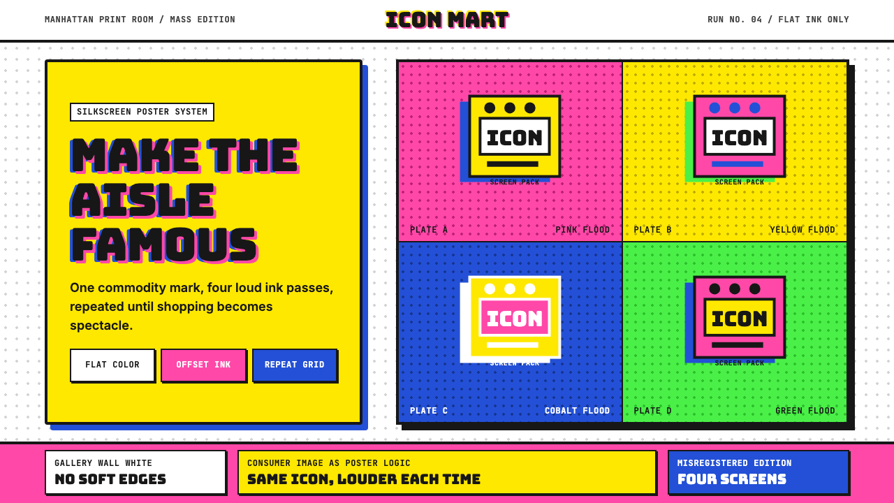 Warhol PopMass culture turns iconic. Hot pink, yellow, cobalt grids repeat flat silkscr…大众文化成了图标。热粉、亮黄、钴蓝网格重复扁平罐头。
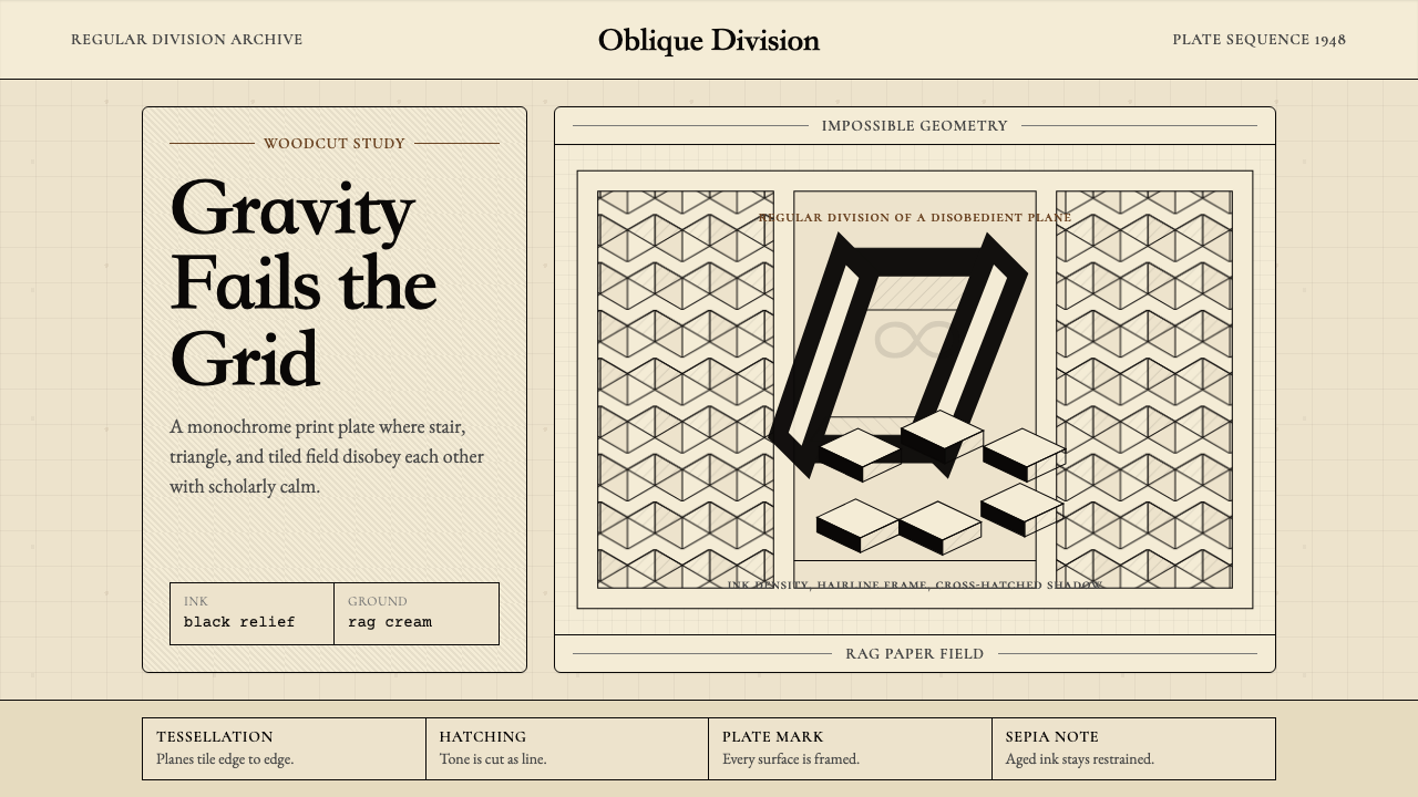 M.C. Escher ImpossibleImpossible calm. Ink-black tessellations and hatching fold cream paper into p…不可能的冷静:墨黑镶嵌与排线,让奶油纸折成悖论。
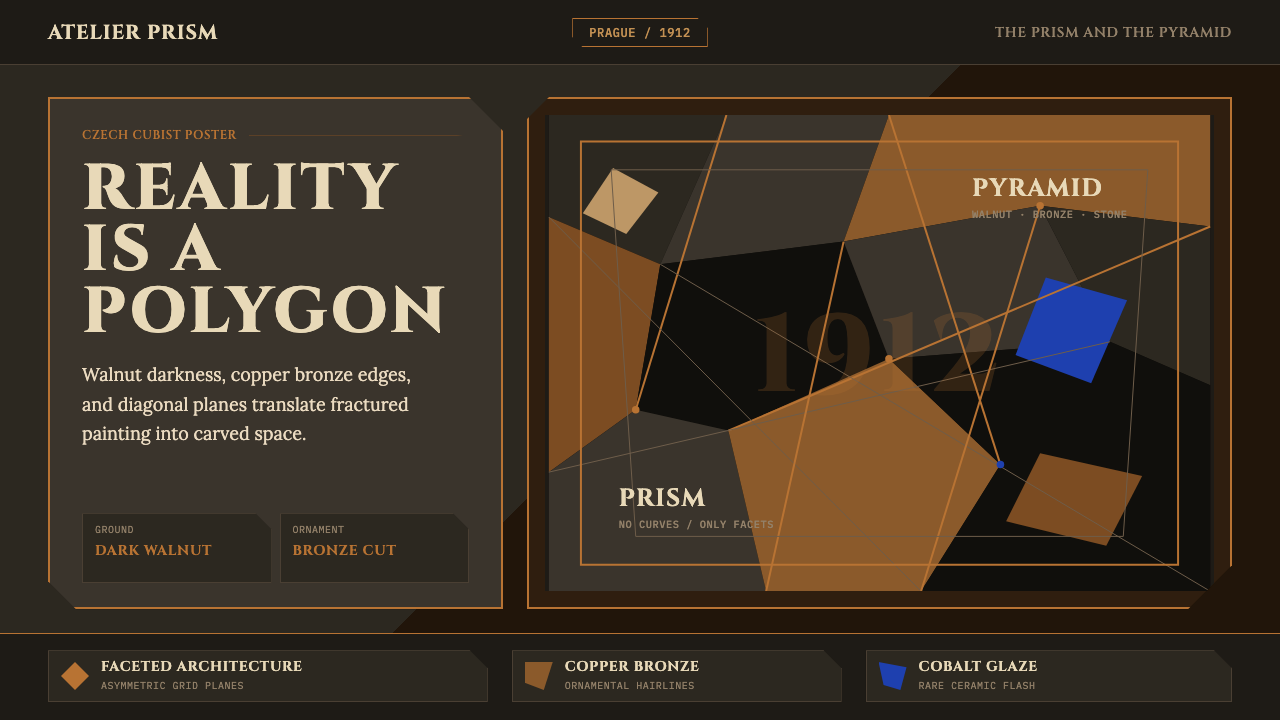 Czech Cubism (Prague 1912)Reality is faceted. Walnut ground, Cinzel capitals, and bronze diagonals cut…现实是多面体。胡桃木底、Cinzel 大写与青铜斜线切开平面。
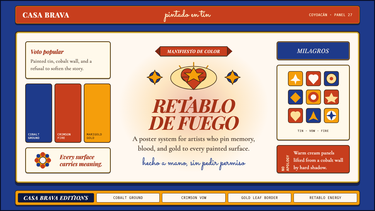 Mexican Folk Art (Frida-era)Defiance painted on tin. Cobalt ground, crimson vows, marigold borders, hard…锡板上的反叛:钴蓝底、深红誓言、万寿菊金边与硬投影。
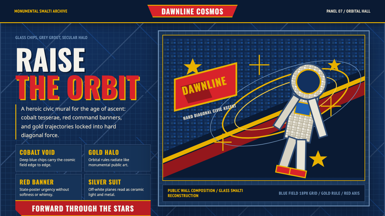 Soviet Cosmic MosaicMonumental and reverent. Cosmic-blue tesserae, red axis, gold orbital halo.纪念碑式崇高:宇宙蓝马赛克、红色轴线与金色轨道光环。