What is M.C. Escher Impossible?什么是 M.C. Escher Impossible?
Escher turned ink and paper into paradox — tessellating creatures, infinite staircases, and architectures that fold space into knots no hand can untie.埃舍尔用墨水和纸张制造悖论——镶嵌生物、无限阶梯,以及将空间折叠成无法解开之结的不可能建筑。
M.C. Escher Impossible in briefM.C. Escher Impossible 速览
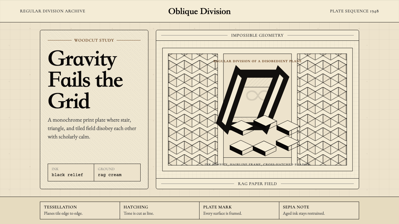
M.C. Escher Impossible is a design aesthetic rooted in the monochrome printmaking discipline of Maurits Cornelis Escher, whose woodcuts, mezzotints, and lithographs from the late 1930s through the early 1970s produced the most recognizable geometric optical illusions of the twentieth century. The visual system is built on a warm cream ground — the color of aged rag paper — against which dense ink-black geometry performs impossible feats: fish become birds mid-flight, a waterfall perpetually falls upward, staircases ascend and descend simultaneously.M.C.埃舍尔不可能风格是一套根植于莫里茨·科内利斯·埃舍尔单色版画传统的设计美学。埃舍尔从1930年代末至1970年代初创作的木刻版画、美柔汀版画与石版画,产生了二十世纪最具辨识度的几何视错觉作品。这套视觉系统建立在温暖的奶油底色之上——那是陈年手工棉纸的颜色——密集的墨黑几何在其上完成不可能的壮举:鱼在飞翔途中变成鸟,瀑布永恒地向上倾泻,阶梯同时在上升又在下降。
The aesthetic is not primarily about surrealism or fantasy. It is about the disciplined exploitation of perceptual rules. Escher studied the mathematics of tessellation, hyperbolic geometry, and crystallographic symmetry groups not as an academician but as a craftsman seeking to understand what the eye will accept as consistent. Every impossible image in his oeuvre is built on a foundation of strict internal logic — the paradox only works because the surrounding geometry is scrupulously correct.这种美学的核心并非超现实主义或奇幻,而是对视知觉规律的严格利用。埃舍尔研究镶嵌的数学、双曲几何与晶体学对称群,不是以学者身份,而是以手工艺人的身份——他想理解眼睛会接受什么样的视觉逻辑为一致的。他每一幅不可能图像都建立在严格内在逻辑的基础上——悖论之所以成立,恰恰因为周围的几何是无可挑剔的正确。
Translated into a design system, this sensibility produces something austere and precise: cross-hatched shadow gradients rendered in parallel lines rather than tonal wash, geometric tiling patterns that lock without gap or overlap, hairline borders that echo the pressure of a burin on a woodblock, and the persistent warmth of cream paper as a ground that is never pure white and never cold. The palette is essentially binary — ink against paper — but within that constraint the system achieves remarkable tonal and spatial complexity.转化为设计系统后,这种感性产生出一种严谨而精密的风格:以平行细线而非色调渲染的交叉线影渐变、无缝无叠地锁合的几何镶嵌图案、呼应木刻刀刃在木块上压力的发丝级细边框,以及奶油纸张的持久暖意——它永不是纯白,也永不冰冷。调色板本质上是二元的——墨水对纸张——但在这一约束之内,系统实现了令人瞩目的色调与空间复杂性。
See the M.C. Escher Impossible design system查看 M.C. Escher Impossible 完整设计系统
Where does M.C. Escher Impossible come from?M.C. Escher Impossible 从何而来?
Maurits Cornelis Escher was born in Leeuwarden, in the Netherlands, in 1898. He trained initially as an architect at the Haarlem School of Architecture and Decorative Arts before abandoning that path in favor of printmaking under the tutelage of Samuel Jessurun de Mesquita. His early work consisted largely of Italian landscape prints made during extended stays in Rome and across the Italian south, and they display the precision of observation and the technical command of the woodcut medium that would later serve his impossible architectures.莫里茨·科内利斯·埃舍尔1898年生于荷兰吕伐登。他最初在哈勒姆建筑与装饰艺术学院接受建筑训练,后在萨缪尔·耶苏伦·德·麦斯基塔的指导下转向版画,放弃了建筑师的道路。他早期的作品大多是在罗马和意大利南部长期旅居期间创作的风景版画,展现出对木刻媒介的精确观察力与技术掌控——这些品质后来为他的不可能建筑奠定了基础。
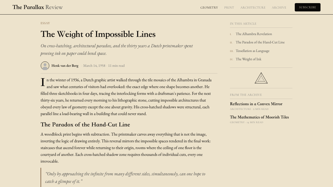
The decisive turning point came in 1936, when Escher made his second visit to the Alhambra palace in Granada, Spain. The Moorish tilework there — intricate geometric tessellations covering every surface — arrested him completely. He spent days making careful sketches of the symmetry systems, filling notebooks with observations about how interlocking shapes could cover a plane without gap or remainder. Where the Islamic craftsmen had restricted themselves to geometric abstraction out of religious principle, Escher saw the possibility of biological metamorphosis: his tessellating units would be fish, birds, lizards, and horsemen, recognizable figures that would dissolve into one another across the picture plane.决定性的转折点发生在1936年,埃舍尔第二次造访西班牙格拉纳达的阿尔罕布拉宫。那里的摩尔式瓷砖——覆盖每一个表面的繁复几何镶嵌——彻底迷住了他。他连续数日仔细描摹那些对称体系,在笔记本里记录下关于互锁形状如何无缝、无余地覆盖平面的观察。伊斯兰工匠出于宗教原则将自己限制在几何抽象之内,埃舍尔却在其中看见了生物变形的可能:他的镶嵌单元将是鱼、鸟、蜥蜴和骑士——可识别的具象图形,在画面平面上彼此融合消解。
His engagement with mathematics deepened through correspondence and collaboration with academic mathematicians. The geometer H.S.M. Coxeter sent Escher a diagram illustrating hyperbolic geometry in 1954, and Escher — who had no formal mathematical training beyond secondary school — studied it until he understood how to use it, producing his celebrated Circle Limit series in which identical figures diminish toward an infinite boundary. Roger Penrose independently invented the impossible tribar figure in 1958 and sent a paper on impossible objects to Escher; Escher incorporated the Penrose staircase into his 1960 lithograph Ascending and Descending, one of the most reproduced images of the twentieth century. These collaborations were unusual — a craftsman corresponding with mathematicians as an equal, each side finding in the other confirmation of intuitions they had pursued by different means.他与学术数学家的通信与合作使他对数学的理解不断深化。几何学家H.S.M.科克斯特在1954年寄给埃舍尔一张阐释双曲几何的图示,埃舍尔——没有受过中学以上正规数学训练——对它反复研究直至理解,由此创作出著名的《圆极限》系列:相同的图形向无限边界递减收缩。罗杰·彭罗斯于1958年独立发明了不可能三角形,并将一篇关于不可能物体的论文寄给埃舍尔;埃舍尔将彭罗斯阶梯融入1960年的石版画《上升与下降》,这幅作品成为二十世纪被复制最多的图像之一。这些合作关系非同寻常——一位手工艺人以平等身份与数学家通信,双方各自在对方身上找到了用不同方式追求的直觉的印证。
Escher worked in relative obscurity through most of his career; his work was appreciated in the Netherlands but was not widely known internationally until the late 1950s and early 1960s, when it was reproduced in Scientific American and discovered by mathematicians, psychologists, and the emerging counterculture. The psychedelic movement of the 1960s and 1970s adopted his impossible architectures as emblems of expanded consciousness, and his work was widely distributed on posters and album covers, reaching audiences far beyond the gallery world. He died in 1972 in the Netherlands, by which point his imagery had become genuinely iconic — reproduced so often that the visual language had, to some degree, separated from his name and entered the general vocabulary of Western visual culture.埃舍尔在职业生涯的大部分时间里默默无闻;他的作品在荷兰受到欣赏,但直到1950年代末至1960年代初被《科学美国人》刊载、并为数学家、心理学家及新兴的反文化运动发现后,才广泛进入国际视野。1960至70年代的迷幻运动将他的不可能建筑作为扩展意识的象征,他的作品在海报和唱片封套上广泛传播,触及远超画廊世界的受众。1972年他在荷兰辞世,此时他的图像已经真正成为图标——被如此频繁地复制,以至于这套视觉语言在某种程度上已经脱离了他的名字,进入了西方视觉文化的公共词汇。
What defines the M.C. Escher Impossible look?M.C. Escher Impossible 的视觉特征是什么?
Palette调色板
The palette is essentially binary: dense ink-black against the warm cream of aged rag paper. This is not a neutral white and a neutral black — the warmth of the ground is deliberate, referencing the specific cream of handmade printing papers, and the black carries the slight density variation of actual ink pressed into fiber. Where tonal variation appears, it is achieved through the spacing and weight of hatching lines rather than through intermediate hues. Color, where it occasionally appears in design applications derived from this system, is used sparingly and almost always as a single accent against the monochrome field.调色板本质上是二元的:密集的墨黑对峙陈年手工棉纸的温暖奶油色。这不是中性的白与中性的黑——底色的暖意是刻意的,指涉手工印刷纸张特有的奶油感,而黑色则承载着真实墨水压入纤维时的微妙浓淡变化。色调变化在需要时通过排线间距与线重来实现,而非通过中间色相。在这套系统的设计应用中偶尔出现的色彩总是使用克制,几乎始终作为单一强调色对照单色底面出现。
Tessellation镶嵌
Interlocking geometric or figurative units that tile a plane without gap or overlap are the most distinctive structural device in this aesthetic. A tessellation is not simply a repeating pattern — each unit must be the negative space of its neighbor, so that the boundary between one figure and the next is shared and indivisible. In design applications, tessellation logic governs background fields, border treatments, and any decorative fill. The eye should be able to switch between reading the dark shapes and the light shapes as figure and ground, a deliberate exploitation of perceptual ambiguity.互锁的几何或具象单元无缝无叠地铺满一个平面——这是这种美学中最具辨识度的结构手法。镶嵌不仅仅是重复图案——每个单元必须是其邻接单元的负空间,使得相邻图形间的边界是共享的、不可分割的。在设计应用中,镶嵌逻辑支配着背景底纹、边框处理以及所有装饰性填充。眼睛应当能够在将深色形状或浅色形状读作图与底之间切换——这是对知觉歧义性的刻意利用。
Impossible Geometry不可能几何
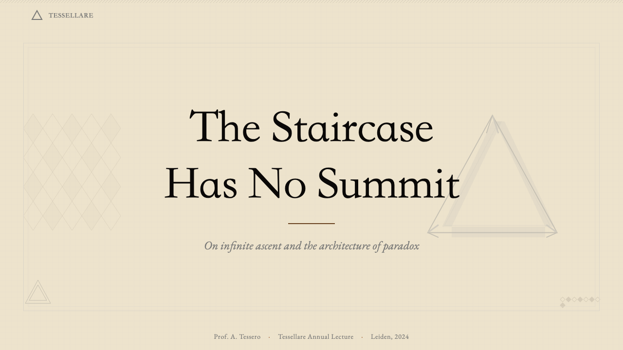
Architectural or structural forms that are locally consistent but globally contradictory define the most conceptually distinctive aspect of this style. The Penrose staircase, the impossible tribar, the Necker cube inversion — each exploits the eye's tendency to infer three-dimensional structure from two-dimensional cues. When used in design, impossible geometry is most powerful as a focal element rather than a background texture: a single impossible object in a composition commands attention precisely because the mind cannot resolve it and keeps returning to try.局部一致却整体矛盾的建筑或结构形式,定义了这种风格在概念上最具特色的维度。彭罗斯阶梯、不可能三角形、内克尔立方体反转——每一种都利用了眼睛从二维线索推断三维结构的倾向。在设计中使用时,不可能几何作为焦点元素而非背景纹理最为有力:构图中的单一不可能对象能精准吸引注意力,因为大脑无法解决它,并会不断回来尝试。
Cross-hatching and Line Weight交叉排线与线重
Shadow, volume, and tonal depth are built not through washes or gradients but through systems of parallel and crossing lines. The density of hatching controls perceived darkness; the angle and regularity of the lines signal whether a surface is receding or advancing. This approach references the specific constraints of woodcut and engraving — media in which tone must be constructed from line because the tool cannot blend. In design applications, hatching patterns replace flat shadows and gradient fills wherever tonal variation is needed, maintaining the handcraft quality of the original medium.阴影、体量与色调深度不通过晕染或渐变,而是通过平行线与交叉线的系统来构建。排线密度控制感知到的暗度;线条的角度与规律性标示着面是在退后还是在前进。这种方法指涉木刻与雕版的特定约束——在这些媒介中,色调必须由线条构筑,因为工具无法融合。在设计应用中,需要色调变化的地方,排线图案取代平面阴影与渐变填充,维系着原始媒介的手工艺品质。
Metamorphosis变形
The gradual transformation of one figure into another — a geometric grid dissolving into recognizable creatures, fish morphing into birds at the edge of a composition — is the most narrative element in this aesthetic vocabulary. Metamorphosis creates visual momentum: the eye is pulled across the picture plane by the process of change rather than by conventional compositional diagonals or focal points. In design applications, this principle can be translated into transitional elements between sections, progressive figure-ground inversions within a single decorative band, or diagrammatic sequences that show transformation over time.一个图形逐渐变形为另一个——几何网格溶解成可识别的生物,鱼在构图边缘形变为鸟——是这套美学词汇中最具叙事性的元素。变形制造视觉动势:眼睛被变化的过程而非传统的构图对角线或焦点拖拽穿越画面平面。在设计应用中,这一原则可以转化为区块之间的过渡元素、单一装饰带内的渐进图底反转,或展示随时间推移之变化的示意图序列。
Spatial Depth Without Color无色彩的空间深度
Escher's prints achieve a convincing sense of architectural depth and three-dimensional space using only line weight, hatching density, and the geometry of perspective — without any color differentiation to separate foreground from background. This discipline produces a particular kind of visual tension in which the spatial relationships are simultaneously clear and destabilizing. In design work, this means that hierarchy and depth can be established entirely through line quality and geometric structure, without recourse to the color contrasts that normally separate layers in a composition.埃舍尔的版画仅凭线重、排线密度与透视几何,在不借助任何色彩差异区分前景与背景的情况下,实现了令人信服的建筑纵深感与三维空间感。这种自律产生出一种特殊的视觉张力——空间关系同时清晰而不稳定。在设计工作中,这意味着层级与深度可以完全通过线条质量与几何结构来建立,而无需依赖通常用于分隔构图层次的色彩对比。
Geometric Precision几何精密性
Everything in this system is governed by strict geometric logic. Curves are derived from mathematical constructions rather than gestural freehand drawing; angles are consistent and deliberate; repeating units are genuinely identical rather than approximately so. The visual effect is not cold or mechanical, because the warmth of the paper ground and the slight imprecision inherent in handcut printing preserve a human quality — but the geometric framework beneath is rigorously correct. This combination of mathematical precision and craft warmth is the system's most characteristic quality.这套系统中的一切都受到严格几何逻辑的支配。曲线源自数学构造而非随意的徒手绘制;角度一致而刻意;重复单元是真正相同的,而非近似相同。视觉效果并不冰冷或机械,因为纸张底色的温暖与手工刻版固有的轻微不精确性保留了人的质感——但其下的几何框架是无可挑剔地正确的。数学精密性与手工温度的这种结合,是这套系统最具特征性的品质。

See the M.C. Escher Impossible design system查看 M.C. Escher Impossible 完整设计系统
Who shaped M.C. Escher Impossible?谁塑造了 M.C. Escher Impossible?
Escher (1898–1972) was a Dutch graphic artist who worked primarily in woodcut, mezzotint, and lithography. Self-taught in mathematics beyond the secondary level, he developed an intimate understanding of tessellation, symmetry, and non-Euclidean geometry through direct observation and correspondence with mathematicians. His mature work from the late 1930s onward systematically explored the perceptual paradoxes that would define this aesthetic: impossible architectures, infinite recursions, and biological metamorphoses built on interlocking geometric units. He worked with extraordinary technical precision and was prolific by the standards of the labor-intensive printmaking media he favored.埃舍尔(1898—1972年)是荷兰图形艺术家,主要从事木刻版画、美柔汀版画与石版画创作。他在中学以外的数学领域完全自学,通过直接观察和与数学家通信,发展出对镶嵌、对称与非欧几何的深刻理解。他从1930年代末开始的成熟期作品系统性地探索了界定这种美学的知觉悖论:建立在互锁几何单元上的不可能建筑、无限递归与生物变形。他以极高的技术精确性工作,在他所钟爱的劳动密集型版画媒介标准下,创作量相当丰厚。
Penrose is a British mathematical physicist who, with his father Lionel, developed the concept of impossible objects as formal geometric constructions in the late 1950s. Their 1958 paper introduced the impossible tribar and the impossible staircase — figures that are locally consistent in three dimensions but globally contradictory. Penrose sent this paper to Escher, who incorporated the staircase into Ascending and Descending (1960). This exchange exemplifies the unusual relationship between this aesthetic and formal mathematics: the visual paradoxes are not tricks but rigorous demonstrations of specific perceptual and geometric principles.彭罗斯是英国数学物理学家,他与父亲莱昂内尔在1950年代末将不可能物体作为正式几何构造加以发展。他们1958年的论文引入了不可能三角形与不可能阶梯——在三维空间局部一致、却在整体上自相矛盾的图形。彭罗斯将这篇论文寄给埃舍尔,后者将不可能阶梯融入了1960年的《上升与下降》。这次交流是这种美学与正式数学之间不寻常关系的典型例证:视觉悖论不是把戏,而是对特定知觉与几何原理的严格演示。
Harold Scott MacDonald Coxeter was a British-Canadian geometer whose work on hyperbolic geometry and regular polytopes provided Escher with the mathematical framework for his Circle Limit series. When Coxeter published a diagram illustrating the Poincaré disk model of hyperbolic geometry in a 1954 paper, Escher recognized in it a structure he had been intuitively pursuing — a way of filling a bounded circle with infinitely diminishing identical figures. Their subsequent correspondence, in which Escher described his geometric discoveries and Coxeter confirmed or corrected them, is one of the most documented examples of artist-mathematician collaboration in the twentieth century.哈罗德·斯科特·麦克唐纳·科克斯特是英裔加拿大几何学家,他在双曲几何与正多胞形方面的工作为埃舍尔的《圆极限》系列提供了数学框架。1954年,科克斯特在一篇论文中发表了一张阐释双曲几何庞加莱圆盘模型的图示,埃舍尔在其中认出了他一直凭直觉追寻的结构——一种用无限递减的相同图形填充有界圆的方法。他们随后的通信——埃舍尔描述他的几何发现,科克斯特加以确认或纠正——是二十世纪记录最充分的艺术家与数学家合作案例之一。
Bruno Ernst — the pen name of Hans de Rijk — was a Dutch mathematics teacher and writer who became the most authoritative interpreter of Escher's work during the artist's lifetime. His book The Magic Mirror of M.C. Escher, published in 1976, provided the first systematic analysis of the geometric and perceptual structures underlying Escher's prints, and it remains the standard reference for understanding the mathematical content of the work. Ernst's access to Escher's studio and notebooks allowed him to document the working methods that produced these images, making visible the laborious construction processes behind apparently spontaneous paradoxes.布鲁诺·恩斯特——汉斯·德·赖克的笔名——是荷兰数学教师和作家,在埃舍尔在世期间成为其作品最权威的阐释者。他1976年出版的《M.C.埃舍尔的魔镜》首次系统分析了埃舍尔版画背后的几何与知觉结构,至今仍是理解这批作品数学内涵的标准参考文献。恩斯特进入埃舍尔工作室和笔记本的机会使他得以记录产生这些图像的工作方法,让看似自发的悖论背后繁重的构造过程变得可见。
De Mesquita was a Dutch Jewish graphic artist and the teacher who recognized and cultivated Escher's printmaking talent at the Haarlem School. He taught Escher the technical foundations of woodcut and introduced him to the tradition of the Dutch graphic arts. De Mesquita's own work combined decorative pattern-making with figuration in ways that anticipated Escher's later tessellations. He was murdered at Auschwitz in 1944, and Escher spent the rest of his life honoring his memory and preserving examples of his work — a connection that grounds this apparently abstract aesthetic in human tragedy and artistic debt.德·梅斯基塔是荷兰犹太图形艺术家,也是在哈勒姆学院发现并培育埃舍尔版画才能的老师。他向埃舍尔传授了木刻的技术基础,并将他引入荷兰图形艺术传统。德·梅斯基塔自己的作品将装饰性图案与具象描绘结合,预示了埃舍尔后来的镶嵌创作。他于1944年在奥斯维辛被杀害,埃舍尔此后一生都在缅怀他的记忆并保存其作品样本——这一关联将这个表面上抽象的美学根植于人类悲剧与艺术传承的现实土壤之中。
How do you use M.C. Escher Impossible today?今天怎么用 M.C. Escher Impossible?
The Escher Impossible aesthetic transfers most effectively to design contexts where intellectual engagement, geometric precision, and a sense of depth-without-ornamentation are desired values. Unlike decorative historicist styles that can be applied as a surface layer, this system asks you to construct compositions according to the same principles that govern the original prints: geometry must be internally consistent, tonal variation must be earned through line work rather than color, and any impossible element must be placed with an understanding of why it produces the perceptual effect it does.埃舍尔不可能风格最有效地适用于以下设计语境:智识参与度、几何精密性,以及不依赖装饰的深度感是期望价值的场合。与可以作为表面层叠加的装饰性历史主义风格不同,这套系统要求你按照支配原始版画的同一原则来构建构图:几何必须内部一致,色调变化必须通过线条劳动而非色彩来赢得,任何不可能元素的放置都必须建立在对其为何产生这种知觉效果的理解之上。
For presentation slides, the style works exceptionally well as a cover treatment and for section dividers. A cover composition built on a central impossible object — a Penrose triangle rendered in careful line work against a cream ground — commands attention and signals conceptual seriousness without resort to photography or decorative illustration. Content slides should be treated with restraint: the full tessellation and hatching vocabulary is too dense for text-heavy layouts. Instead, reserve the geometric patterning for framing elements and section backgrounds, and use the ink-on-cream palette consistently for all typographic and structural elements. Data visualizations gain distinction from this style when chart forms are treated as geometric objects in their own right — bars, segments, and nodes rendered in the system's line-weight vocabulary rather than as filled solid shapes.对于演示文稿,这种风格作为封面处理和章节分隔页效果卓越。以一个中心不可能物体——在奶油底面上以细心线条绘制的彭罗斯三角形——构建的封面构图能够吸引注意力,传达概念上的严肃性,而无需借助摄影或装饰插图。内容页应当保持克制:完整的镶嵌与排线词汇对于文字密集的版面过于繁密。相反,将几何图案保留给框架元素和章节背景,并在所有排版与结构元素中一贯使用墨-奶油色板。当图表形式被当作几何对象本身处理时——柱条、扇区与节点以系统的线重词汇而非填充实心形状呈现——数据可视化从这种风格中获得特别的辨识度。
For web interfaces and dashboards, the key is selectivity. The monochrome ink-on-cream palette translates well to pricing pages, documentation sites, and portfolio presentations where the content itself is complex and the visual system should not compete. Use tessellation geometry in hero backgrounds or empty-state illustrations; use cross-hatching as a texture for card backgrounds or section fills where a flat color would feel lifeless; use hairline borders and precise geometric containers throughout. For interactive states, a single warm accent color used sparingly against the monochrome field will feel coherent rather than intrusive. Marketing pages built on this aesthetic tend to work best when they commit to a single hero impossible object and build all visual hierarchy through typography and geometric structure rather than color.对于网页界面和仪表板,关键在于选择性。单色墨-奶油色板在定价页面、文档网站和作品展示中表现良好——在那些场合,内容本身已经复杂,视觉系统不应与之竞争。在主视觉背景或空状态插图中使用镶嵌几何;将交叉排线作为卡片背景或区块填充的纹理,用在平面色彩会显得缺乏生气的地方;在全局使用发丝边框与精确几何容器。对于交互状态,单一暖调强调色在单色底面上克制使用,感觉连贯而非突兀。建立在这种美学之上的营销页面,在承诺使用单一主视觉不可能物体、并完全通过排版与几何结构而非色彩建立视觉层级时,往往表现最佳。
For editorial and print applications, the aesthetic is a natural fit for publications dealing with mathematics, architecture, science, philosophy, or any subject that rewards patient close reading. A layout derived from this system uses a narrow justified measure, generous margins that accommodate marginal annotations or geometric ornament, and section breaks marked by tessellating border patterns rather than decorative flourishes. Pull quotes and callouts are framed by geometric containers — precise rectangles or interlocking shapes — rather than typographic flourishes. Cover designs built on a full tessellation field achieve visual impact through density and intricacy rather than through the bold color contrasts of more conventional poster-derived styles.对于编辑与印刷应用,这种美学天然适合涉及数学、建筑、科学、哲学,或任何奖励耐心细读的主题的出版物。从这套系统衍生的版面使用窄列对齐正文、宽裕的页边距以容纳边注或几何装饰,以镶嵌边框图案而非装饰花饰标记段落分隔。引用文字与标注以几何容器框定——精确矩形或互锁形状——而非排版花饰。建立在完整镶嵌底纹之上的封面设计通过密度与精巧性实现视觉冲击,而非通过更常规的海报衍生风格中的大胆色彩对比。
A common mistake when applying this aesthetic is reaching for the most dramatic impossible geometry immediately — filling a composition with staircases and infinite loops — without the supporting structure of consistent line work and geometric discipline that makes the impossible element legible. The paradox only works when the surrounding space is scrupulously ordered; an impossible figure placed in a chaotic or decoratively inconsistent composition simply looks like an error. Similarly, applying digital gradients or soft shadows to elements within this system destroys its internal logic, because the system's depth is built from line density rather than from lighting simulation. Every tonal transition should be achievable in a two-color print.应用这种美学时最常见的错误,是急于引入最戏剧性的不可能几何——用阶梯和无限循环填满构图——却没有让不可能元素变得可读所必需的一致线条工作与几何自律作为支撑。悖论只有在周围空间被无可挑剔地秩序化时才能奏效;一个不可能图形置于混乱或装饰性前后矛盾的构图中,看起来只是一个错误。同样,在这套系统的元素上应用数字渐变或柔和阴影会摧毁其内在逻辑,因为系统的深度建立于线条密度而非光照模拟之上。每一处色调过渡都应当在双色印刷中实现得了。
See the M.C. Escher Impossible design system查看 M.C. Escher Impossible 完整设计系统
M.C. Escher Impossible — FAQM.C. Escher Impossible · 常见问题
Is this aesthetic purely black and white, or can color be introduced?这种美学只能是黑白的吗?还是可以引入色彩?
Escher's own prints were almost entirely monochrome, and the core logic of the system is built on the binary relationship between ink and paper. Color can be introduced, but it must be handled with the same discipline that governs the rest of the system. A single warm accent color — used for a specific figure type in a tessellation, or to highlight a single impossible element in a composition — can extend the vocabulary without breaking it. What tends to break the system is using multiple colors simultaneously at full saturation, which undermines the monochrome tonal logic and makes the geometric structure harder to read. When color appears, it should feel like an analytical distinction rather than a decorative one.埃舍尔自己的版画几乎完全是单色的,系统的核心逻辑建立于墨水与纸张的二元关系之上。色彩可以引入,但必须以支配系统其余部分的同样自律来处理。单一暖调强调色——用于镶嵌中的特定图形类别,或用于突出构图中的单一不可能元素——可以在不破坏词汇的情况下扩展它。往往破坏系统的是同时以全饱和度使用多种色彩,这会削弱单色色调逻辑,使几何结构更难阅读。当色彩出现时,它应当感觉像是一种分析性区分,而非装饰性区分。
How do I use impossible geometry without it looking like a novelty or a gimmick?如何使用不可能几何而不让它看起来像噱头或把戏?
The key is that impossible geometry only works as a serious visual device when the surrounding composition is scrupulously ordered. The paradox depends on the viewer first trusting the spatial logic, then experiencing its contradiction. If the broader layout is chaotic or decoratively inconsistent, there is no established spatial logic to contradict, and the impossible figure simply looks like an error or an affectation. Practically: place impossible geometry at the compositional center or primary focal point, surround it with precise and consistent geometric structure, and resist the temptation to add more than one such element per composition. One impossible object, placed correctly, creates sustained fascination. Several impossible objects compete and cancel each other out.关键在于:不可能几何只有当周围构图被无可挑剔地秩序化时,才能作为严肃的视觉手法发挥作用。悖论依赖观者首先信任空间逻辑,然后才体验到它的矛盾。如果更广泛的版面是混乱的或装饰性前后矛盾的,就没有可以被颠覆的既定空间逻辑,不可能图形只会看起来像是一个错误或矫揉造作。实践上:将不可能几何置于构图中心或主要焦点,用精确一致的几何结构包围它,并抵制在单一构图中添加多个此类元素的诱惑。一个不可能物体,正确放置,制造持续的着迷。多个不可能物体相互竞争,彼此抵消。
Can this style work for digital interfaces, or is it too print-derived?这种风格适用于数字界面吗?还是它过于根植于印刷传统?
It transfers to digital contexts, but with some translation required. The key values of the style — geometric precision, monochrome depth built from line work, and perceptual complexity that rewards close attention — are all achievable on screen. The challenge is that screen rendering tends toward smoothness and anti-aliasing, which can soften the sharp hairline geometry that gives the style its character. SVG-rendered geometric elements, rendered at precise vector fidelity, handle this better than rasterized assets. The cream ground, which is central to the warmth of the print aesthetic, works well on screen when treated as a warm off-white rather than a pure white or a grey. Animation should be used extremely sparingly, if at all — a slowly rotating tessellation can be hypnotic, but motion generally competes with the perceptual complexity of the static geometry.它可以迁移到数字语境,但需要一些转译。这种风格的核心价值——几何精密性、从线条劳动构建的单色深度,以及奖励近距离关注的知觉复杂性——在屏幕上都是可以实现的。挑战在于屏幕渲染倾向于平滑与抗锯齿,这会柔化赋予风格特色的锐利发丝几何。以精确矢量保真度渲染的SVG几何元素,比光栅化资产更好地处理这个问题。奶油底色是版画美学暖意的核心,当被视为温暖的近白色而非纯白或灰色时,在屏幕上效果良好。动效应当极其节制地使用——缓慢旋转的镶嵌可以令人着迷,但运动通常会与静态几何的知觉复杂性相竞争。
What kinds of projects or brands are a poor fit for this style?哪些类型的项目或品牌不适合这种风格?
The style is poorly suited to contexts that require emotional warmth, approachability, or sensory richness. Consumer products in the food, wellness, children's, or lifestyle categories depend on organic texture, human imagery, and color associations that the Escher Impossible system does not provide. The monochrome severity and intellectual complexity of the aesthetic can read as cold, exclusive, or intimidating in contexts where the user experience depends on immediate comfort and trust. Similarly, brands that rely on photographic lifestyle imagery as their primary communication mode will find the style difficult to integrate, since the system's logic is built on geometry and line rather than photography. The style is at its strongest where precision, intellectual engagement, and a certain deliberate difficulty are features rather than obstacles.这种风格不适合需要情感温度、亲近感或感官丰富性的语境。食品、健康、儿童或生活方式类别的消费品依赖有机质感、人物图像以及埃舍尔不可能系统所不提供的色彩联想。在用户体验依赖即时舒适与信任的场合,这种美学的单色严肃感与智识复杂性可能被解读为冷漠、排他或令人生畏。同样,以摄影生活方式图像作为主要传播方式的品牌,会发现这种风格难以整合,因为系统的逻辑建立于几何与线条而非摄影之上。这种风格在精确性、智识参与度,以及某种刻意的难度是特色而非障碍的场合中最为强大。
How does this style relate to Op Art, and are they interchangeable?这种风格与欧普艺术有何关联?二者可以互换吗?
Escher's work is frequently cited as part of the Op Art lineage, and there are real connections: both exploit perceptual ambiguity, both use geometric precision as a primary tool, and both emerged in the mid-twentieth century context of interest in visual psychology. But they are not interchangeable. Op Art — as represented by Bridget Riley, Victor Vasarely, and their contemporaries — typically uses color contrast and moiré effects to produce retinal vibration and perceptual instability in the viewer's visual field. Escher's work produces spatial paradox and conceptual impossibility rather than retinal vibration; its effect is intellectual as much as perceptual. Op Art tends to be non-figurative and purely abstract; Escher's most distinctive work is figurative and narrative. The two aesthetics can be confused at a glance but serve very different experiential purposes.埃舍尔的作品经常被引证为欧普艺术谱系的一部分,二者之间确实有真实联系:两者都利用知觉歧义性,都将几何精密性作为主要工具,都在二十世纪中期对视觉心理学兴趣浓厚的语境中兴起。但它们并不可互换。欧普艺术——以布里奇特·赖利、维克托·瓦萨雷利及其同代人为代表——通常使用色彩对比与摩尔纹效应,在观者视域中产生视网膜震颤与知觉不稳定性。埃舍尔的作品产生的是空间悖论与概念上的不可能性,而非视网膜震颤;其效果与其说是知觉性的,不如说是智识性的。欧普艺术往往是非具象的、纯粹抽象的;埃舍尔最具特色的作品是具象的、叙事性的。两种美学乍看可能被混淆,但服务于非常不同的体验目的。
Related design styles相关设计风格
 Senegalese Sous-VerreSacred joy in enamel. Fuchsia and saffron panes lock behind thick jet contour…神圣而热闹:洋红与藏红玻璃格,被粗黑轮廓锁住。
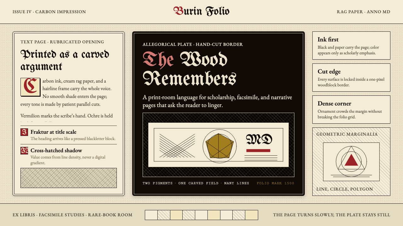 Dürer WoodcutInk remembers everything. Fraktur titles, rag-paper cream, and cross-hatched…木刻记住一切:哥特标题、破布纸奶油色与交叉排线。
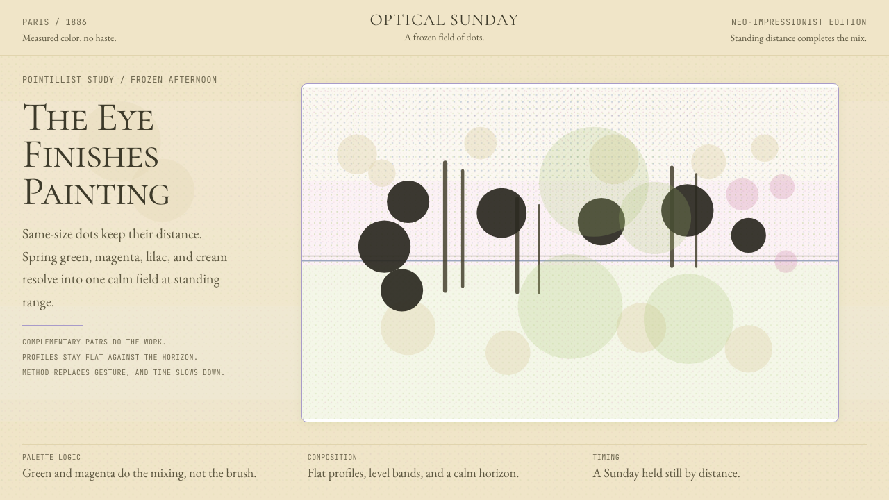 Seurat — Grande Jatte PointillismThe eye does the painting. Cream, green, magenta, and cobalt mix in a frozen…视网膜完成绘画。奶油底上,春绿、品红、钴蓝点阵静止混色。
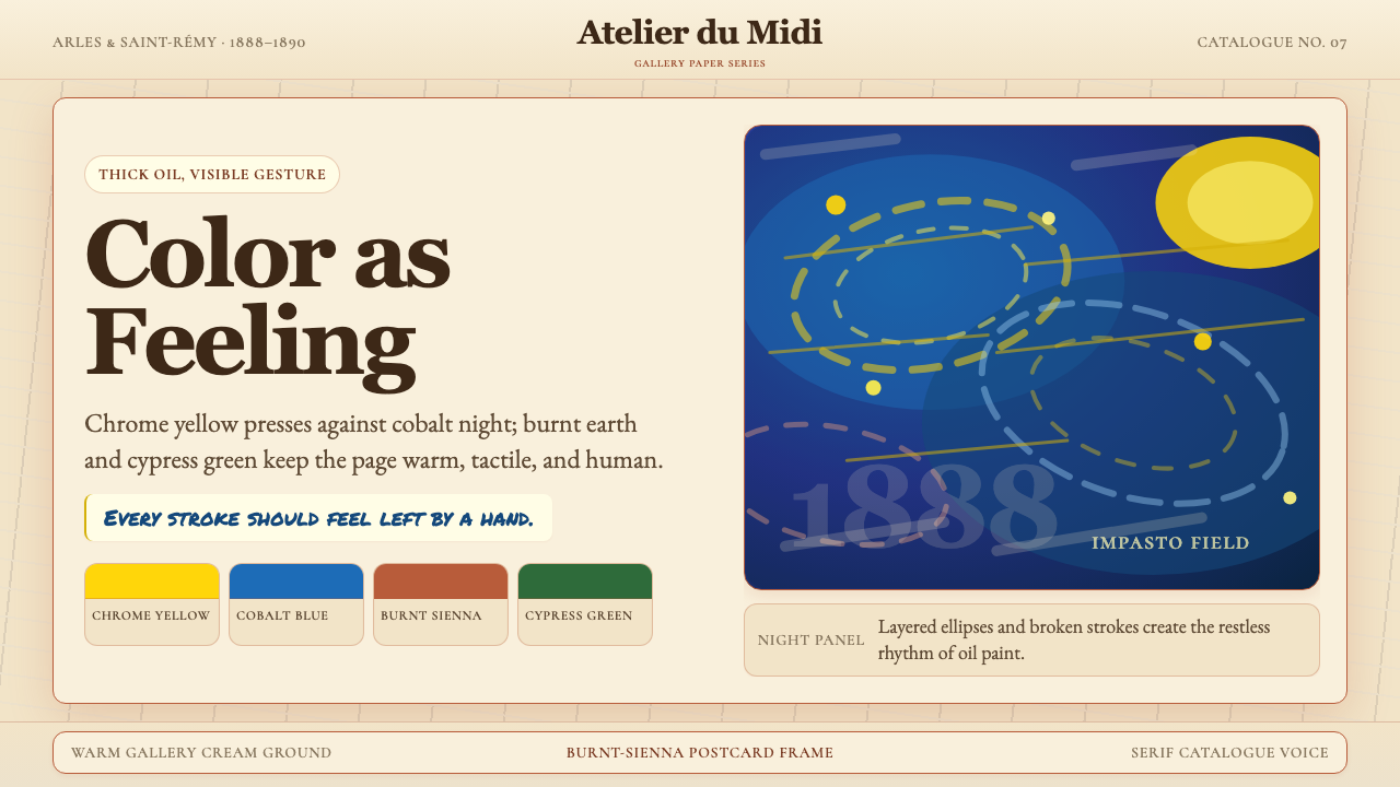 Van Gogh Post-ImpressionistFeeling made visible. Chrome yellow meets cobalt swirls on warm gallery cream.情感可见。铬黄与钴蓝旋涡落在暖画廊奶油底上。
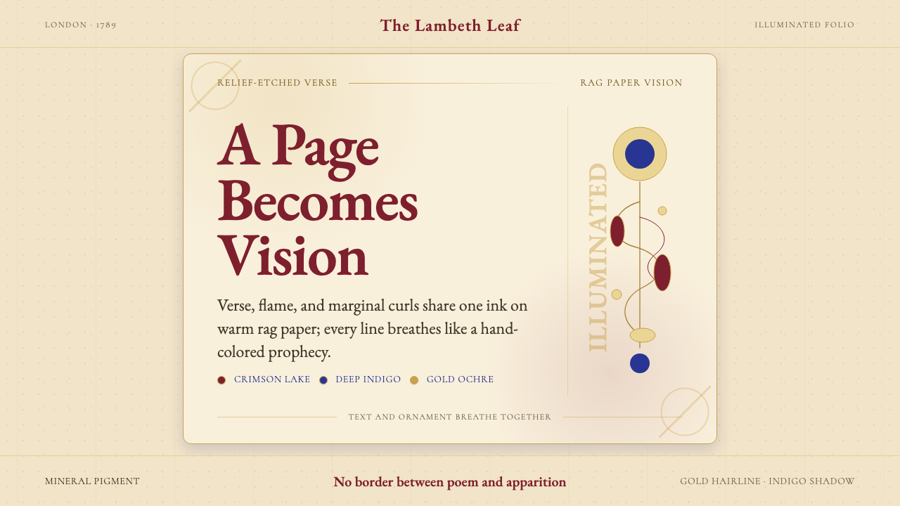 William Blake IlluminatedThe page becomes a vision. Crimson, indigo, and gold ornament breathe on rag…页面即异象:绛红、靛蓝与赭金纹饰在破布纸上呼吸。
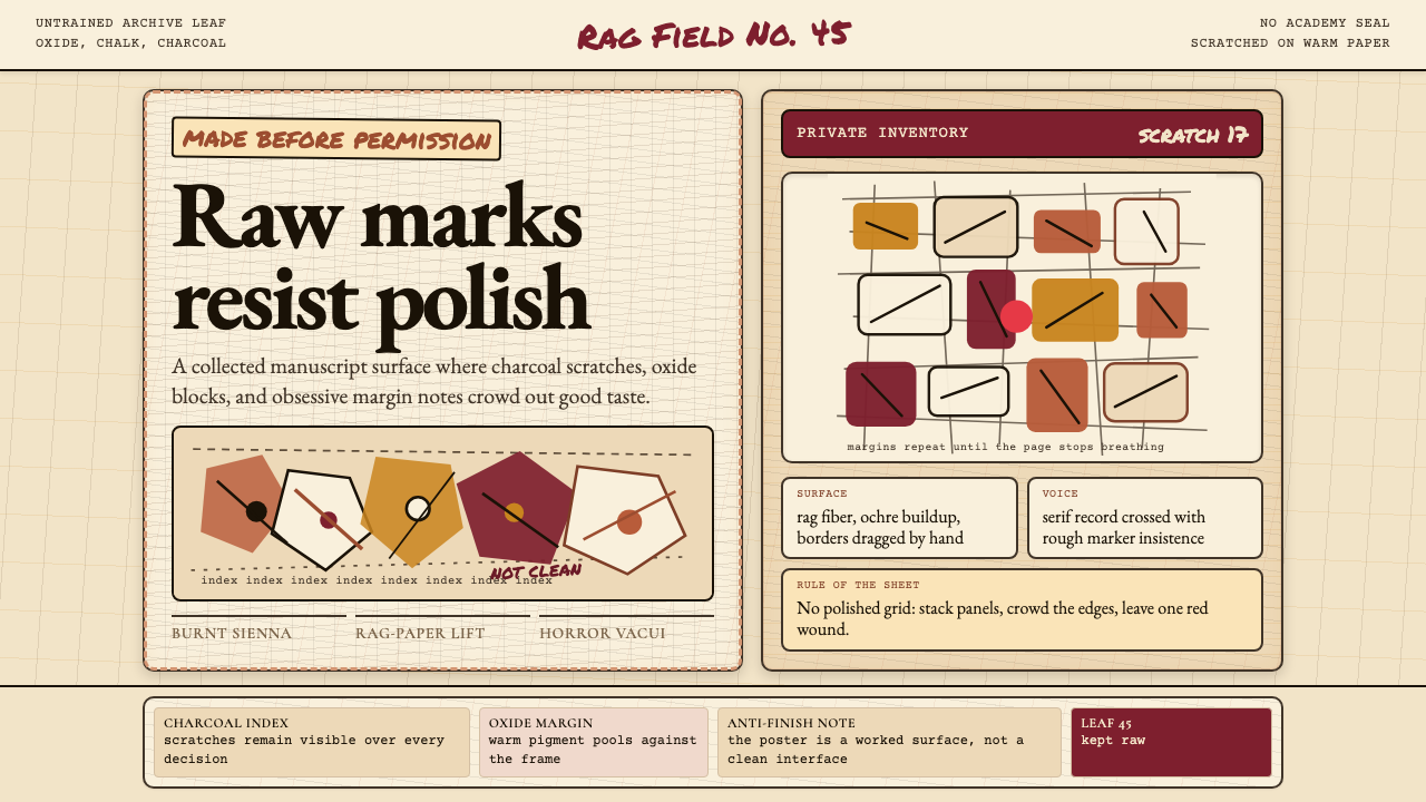 Art Brut (Dubuffet)Polish is refused. Bone-cream paper, earth pigments, scratched borders, dense…拒绝精致。骨白纸、大地颜料、刮痕边框和密集页边。