What is William Blake Illuminated?什么是 William Blake Illuminated?
Blake turned the printed page into a living prophecy — hand-etched, hand-painted, every poem inseparable from its vines and flames.布莱克将印刷页面变为活着的预言——亲手蚀刻、亲手上色,每首诗与蔓藤火舌浑然不可分割。
William Blake Illuminated in briefWilliam Blake Illuminated 速览
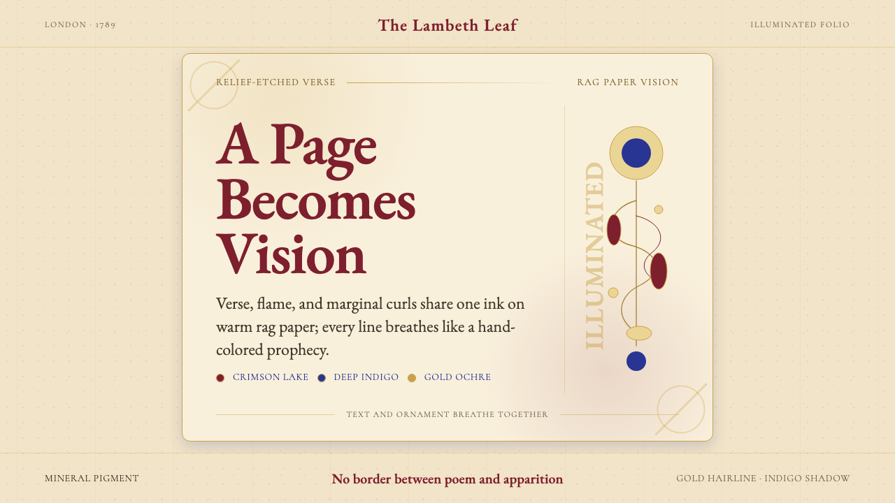
William Blake Illuminated describes the visual and literary aesthetic originating in the hand-produced illuminated books William Blake created in London beginning in 1788. Unlike any printed tradition before or since, each page fuses verse, prophecy, and image into a single organism: text flows around naked angelic figures, marginal vines curl between stanzas, and tongues of flame rise from the bottom of lines as naturally as punctuation. There is no hierarchy between word and image — both are drawn by the same hand, on the same plate, inked in the same session.威廉·布莱克彩绘风格,源自布莱克自1788年起在伦敦亲手制作的彩绘诗书所形成的视觉与文学美学。在此之前或之后,没有任何印刷传统像它这样:每一页面将诗句、预言与图像融为一个活的有机体。文字在裸身天使间蜿蜒,蔓藤在诗节之间卷曲,火舌从诗行底部升腾,自然得如同标点符号一般。文字与图像之间没有主次之分——两者皆出自同一双手,刻于同一铜版,在同一次印刷中着墨。
The palette is warm and mineral: deep indigo, crimson, and gold ochre spread across cream-toned rag paper whose texture shows through the pigment. Blake and his wife Catherine mixed their own watercolors from pigment and gum arabic, which gives each copy a slightly different warmth and opacity. No two copies of any Blake book are identical — the coloring of Songs of Innocence and of Experience, for instance, varies dramatically between the surviving copies, making each one a unique object rather than a reproduced edition.色调温暖而矿物感十足:深靛蓝、绛红与赭金散布于奶油色调的手工破布纸上,纸张的肌理透过颜料隐约可见。布莱克与妻子凯瑟琳亲手以颜料和阿拉伯胶调配水彩,这使得每个版本都带有略有不同的温度与透明度。布莱克的任何一部书,现存各册之间都不完全相同——以《天真与经验之歌》为例,现存各册的着色差异极为显著,使每一册都成为独一无二的对象,而非复制品。
As a design sensibility — applied to contemporary visual work — the Blake Illuminated aesthetic means: treat every surface as an integrated field, let type and ornament breathe together, choose colors that feel hand-mixed and luminous rather than flat and digital, and allow the composition to feel visionary and slightly asymmetric rather than mechanically balanced. It is the opposite of minimalism: density is a virtue, but the density must feel alive rather than cluttered.作为一种设计感性——应用于当代视觉创作——布莱克彩绘美学意味着:将每一个表面视为整合的场域,让文字与纹饰共同呼吸,选择那些看起来像是手调、富有光泽的色彩而非平板的数字颜色,并允许构图呈现出异象般的、轻度不对称的感觉,而非机械平衡的状态。这与极简主义截然相反:密度是一种美德,但这种密度必须令人感到鲜活,而不是杂乱。
See the William Blake Illuminated design system查看 William Blake Illuminated 完整设计系统
Where does William Blake Illuminated come from?William Blake Illuminated 从何而来?
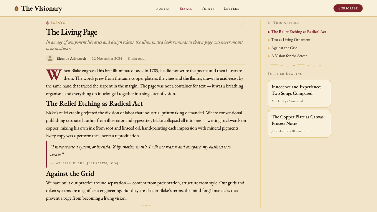
William Blake was born in London in 1757 and trained as an engraver from the age of fourteen, apprenticed to the commercial engraver James Basire. His technical mastery of the copper plate was therefore not an artistic affectation but a lifelong professional skill. By his late twenties, dissatisfied with commercial commissions and convinced that conventional publishing would never accommodate his prophetic poetry, he invented a new method he called relief etching. Instead of incising lines into copper (intaglio), he wrote his text and drew his designs directly onto the plate in acid-resistant varnish. Acid ate away the unprotected background, leaving the writing and drawing raised — printable like woodcut, but as fine as engraving.威廉·布莱克1757年生于伦敦,自十四岁起师从商业版画家詹姆斯·贝西尔学习雕刻,接受正规学徒训练。他对铜版技艺的精湛掌握因此并非艺术上的刻意为之,而是一生的专业技能。二十七八岁时,他对商业委托日感厌倦,并确信传统出版永远无法容纳他的预言诗歌,于是发明了一种他称为「凸版蚀刻」的新方法。与将线条刻入铜板的凹版印刷不同,他用防酸清漆直接在铜版上书写文字、绘制图案,再用酸液腐蚀未受保护的背景,使文字与图画凸起——像木版一样可印刷,却像版画一样精细。
The first completed illuminated book, All Religions Are One, dates to around 1788, followed quickly by There Is No Natural Religion. The celebrated Songs of Innocence appeared in 1789, the same year as the French Revolution — whose political energies Blake watched with ambivalent intensity. The Marriage of Heaven and Hell (c. 1790–1793) pushed the illuminated format toward its most visually complex form, with interleaved prose, aphorism, and grotesque imagery. The later prophetic books — America (1793), Europe (1794), Jerusalem (1804–1820) — grew larger, more labyrinthine, and more overtly apocalyptic in their imagery. Jerusalem, the longest and most ambitious, took sixteen years to complete and was finished when Blake was in his early sixties.第一部完成的彩绘书《万教皆一》约成于1788年,紧接着是《自然宗教并不存在》。广为人知的《天真之歌》于1789年问世——同年爆发了法国大革命,布莱克以复杂而强烈的目光注视着这场政治激荡。《天堂与地狱的婚姻》(约1790—1793年)将彩绘书的形式推向了视觉上最为复杂的境地,散文、格言与怪诞意象交织其中。后期的预言书——《美洲》(1793年)、《欧洲》(1794年)、《耶路撒冷》(1804—1820年)——规模越来越大,意象越来越迷宫式,末日色彩也越来越浓。《耶路撒冷》是其中最长、最具野心的一部,历时十六年才告完成,彼时布莱克已年逾六旬。
Blake and Catherine printed each copy themselves on a rolling press in their home, using oil-based ink. After printing, Catherine — whose role is often underacknowledged — helped apply the watercolor washes that gave each page its characteristic glow. Blake sometimes re-colored copies years after the original printing run, meaning that the same plate could produce very different-looking pages depending on the decade and his evolving vision. The entire enterprise was hand-made from start to finish: from the poem's composition to the acid bath to the press to the brushwork, no external craftsman or printer was involved.布莱克与凯瑟琳亲自在家中用滚筒印刷机、以油性墨水印制每一册。印刷完成后,凯瑟琳——她的贡献常被低估——协助施加水彩渲染,赋予每一页特有的光泽感。布莱克有时会在最初印刷数年之后为同一批铜版重新着色,这意味着同一块版可以根据年代与他不断演变的视觉理念,产出外观迥异的页面。整个创作过程从头到尾都是手工完成的:从诗歌的构思到酸液的腐蚀,从印刷机到笔触,没有任何外部工匠或印刷商参与其中。
During his lifetime, Blake sold few copies. His work was noticed by a small circle of admirers including the collector Thomas Butts, who commissioned many drawings, and the young painter John Linnell, who introduced Blake to the group of disciples known as the Ancients in the last years of his life. After Blake's death in 1827, his reputation remained marginal until the Pre-Raphaelite Brotherhood, and particularly Dante Gabriel Rossetti, rediscovered his visual work in the 1840s and 1860s. Rossetti's championing transformed Blake from a neglected eccentric into a founding figure of British Romanticism and visionary art. By the late nineteenth century, the illuminated books were recognized as unique objects — neither purely literary nor purely pictorial, but a synthesis that had no precedent and no direct successor.布莱克生前销售的册数寥寥无几。真正注意到他的只是一小圈仰慕者,其中包括委托他创作大量画作的收藏家托马斯·巴茨,以及在他晚年将他引荐给被称为「古代人」群体的年轻画家约翰·林内尔。布莱克于1827年去世后,其声誉长期处于边缘地带,直到前拉斐尔派——尤其是但丁·加布里埃尔·罗塞蒂——在1840至1860年代重新发现了他的视觉作品。罗塞蒂的大力推崇,将布莱克从一个被忽视的怪才转变为英国浪漫主义与异象艺术的奠基性人物。至十九世纪末,彩绘诗书已被公认为独一无二的对象——既非纯粹的文学,也非纯粹的图像,而是一种没有先例、也无直接后继者的综合体。
What defines the William Blake Illuminated look?William Blake Illuminated 的视觉特征是什么?
Integrated Text and Image文图一体
In Blake's pages, the division between text and illustration does not exist. Letters are drawn as part of the composition; figures emerge from the ascenders and descenders of words; vines and roots grow between stanzas. No element is purely decorative and none is purely typographic. Contemporary applications of this aesthetic strive for the same integration: type should feel placed within the visual field rather than laid over it, and ornamental elements should touch or surround the text rather than float separately.在布莱克的页面中,文字与插图之间的界限并不存在。字母作为构图的一部分被描绘出来;人物从文字的上伸部与下伸部中显现;蔓藤与根茎在诗节间生长。没有任何元素是纯装饰性的,也没有任何元素是纯排印性的。这种美学的当代应用追求同样的整合:文字应当感觉像是置于视觉场域之中,而非覆盖于其上;纹饰元素应当触及或环绕文字,而非单独漂浮。
Warm Mineral Palette温暖矿物色调
Blake's characteristic colors are deep indigo, warm crimson, and gold ochre, applied over cream rag paper that contributes its own warm undertone. These are not bright primary colors — they are the muted, slightly variable hues of hand-ground pigment, closer to fresco and manuscript than to commercial printing. Authentically Blake-influenced work avoids pure digital saturations; instead it favors colors with a perceptible warmth, slight earthiness, and a sense that they might have been mixed by hand.布莱克标志性的色彩是深靛蓝、暖绛红与赭金,施于奶油色破布纸上,纸张本身也贡献了温暖的底色调。这些并非明亮的原色——它们是手研颜料那种柔和、略带变化的色相,更接近壁画与手抄本,而非商业印刷。真正受布莱克影响的作品回避纯粹的数字饱和色;转而偏爱那些带有可感知的温度、轻微泥土感,以及仿佛可能由人手调配而成的色彩。
Flowing Organic Line流动的有机线条
Where Bauhaus privileges the ruled straight line and geometric form, Blake privileges the sinuous, undulating line of the natural world — the curve of a vine, the arc of a human back, the spiral of a flame. Blake was influenced by Gothic illuminated manuscripts and by his reading of Michelangelo's figure drawing, and his line has a muscular, expressive quality that is never mechanical. In contemporary applications, this characteristic translates to decorative borders that curve and branch, letterforms with slight calligraphic life, and figurative or botanical elements that are drawn rather than constructed.包豪斯推崇直尺画出的直线与几何形态,布莱克则推崇自然世界中那种蜿蜒起伏的线条——藤蔓的弧度、人体背部的曲线、火焰的螺旋。布莱克受到哥特彩绘手稿的影响,也受到他对米开朗基罗人物素描研究的影响,他的线条具有一种有力而富有表现力的品质,绝不机械。在当代应用中,这一特征体现为弯曲分叉的装饰边框、带有些许书法生命力的字形,以及经由描绘而非构建的具象或植物元素。
Visionary Figuration异象式人物
Blake's figures are idealized human bodies in extreme postures — stretching, falling, ascending, reaching across the full height of a page. They are rarely clothed; nudity for Blake signifies the eternal, spiritual condition of the soul as opposed to the temporal, social condition of the dressed body. The figures coexist with text without caption or explanation, as if naturally inhabiting the same space as the words. This prophetic, symbol-laden figuration is one of the style's most recognizable qualities and its most demanding: figures must be drawn with conviction to avoid pastiche.布莱克笔下的人物是处于极端姿态中的理想化人体——伸展、坠落、升腾、横跨页面全高地伸出手臂。他们鲜少着装;裸体对布莱克而言意味着灵魂永恒的、精神性的状态,有别于着装身体那种时间性的、社会性的状态。这些人物与文字共存于同一空间,没有说明文字或解释,仿佛自然栖居于词语的世界中。这种充满预言性与象征意涵的人物形象,是这种风格最易辨认的特质之一,也是要求最高的一点:人物必须以充分的确信感被描绘,否则便会沦为模仿。
Layered Density Without Claustrophobia层叠的密度而不令人窒息
Blake's pages are full — full of text, full of vine work, full of figures — but they do not feel oppressive. The key is luminosity: the warm paper shows through the washes, figures and plants share the same light source, and the overall composition has a vertical rhythm that creates breathing room between zones of density. This balance of richness and air is the central discipline of the style. Applied to contemporary design, it means that the goal is not to fill every square unit of space but to arrange layered elements so that the eye finds rest between them.布莱克的页面是充实的——充满文字,充满藤蔓,充满人物——但并不令人感到压抑。关键在于光泽感:温暖的纸张透过渲染层透出来,人物与植物共享同一个光源,整体构图具有一种垂直节奏,在密度集中的区域之间创造出呼吸的空间。丰富感与空气感之间的平衡,是这种风格的核心纪律。应用于当代设计时,意味着目标不是填满每一个空间单位,而是安排层叠元素,使眼睛在它们之间找到歇息之处。
Hand-Made Individuality手工的个体性
Because every copy of a Blake book was produced by hand, no two are alike. Slight variations in inking, coloring, and page placement are not defects but the signature of the process. Contemporary application of this aesthetic actively embraces slight irregularity — hand-lettered or calligraphic type elements, subtle variation in border thickness, textures that recall paper and pigment. The goal is to produce work that feels crafted and particular rather than algorithmically generated.由于布莱克每一本书的每一册都由人手制作,没有两册是完全相同的。着墨、着色和页面布置上的细微差异,并非缺陷,而是这一过程的签名。这种美学的当代应用主动拥抱轻微的不规则性——手写或书法式的文字元素、边框粗细的细微变化、令人想到纸张与颜料的质感。目标是产出一种感觉经过精心制作、具有个体性的作品,而非算法生成的产物。
Symbolic Color Temperature象征性的色彩温度
Blake used color expressively and symbolically rather than descriptively. Gold and warm yellows signify spiritual energy and divine presence; deep blues and indigos evoke night, experience, and the fallen world; crimson and rose suggest both beauty and sacrifice. The coloring choices in his later hand-painted copies often departed entirely from naturalistic expectation — trees might be indigo, skies gold, figures crimson. This symbolic rather than descriptive use of color is central to the style and distinguishes it from mere decorative historicism.布莱克以表现性与象征性而非描述性的方式使用色彩。金色与暖黄色意味着精神能量与神圣存在;深蓝与靛蓝唤起夜晚、经验与堕落的世界;绛红与玫瑰色同时暗示美丽与牺牲。在他后期手绘着色的副本中,色彩选择往往完全背离自然主义的预期——树木可能是靛蓝的,天空可能是金色的,人物可能是绛红的。这种象征性而非描述性的色彩运用,是这种风格的核心,也使它区别于单纯的装饰性历史主义。
See the William Blake Illuminated design system查看 William Blake Illuminated 完整设计系统
Who shaped William Blake Illuminated?谁塑造了 William Blake Illuminated?
Blake (1757–1827) was a poet, painter, and printmaker who invented the relief-etching method in 1788 and used it for the rest of his life to produce his illuminated books. He was also a commercial engraver by trade, working on book illustrations and reproductive prints throughout his career. His prophetic poems — including The Marriage of Heaven and Hell, Milton, and Jerusalem — contain an elaborate private mythology of cosmic forces called Zoas, which appear in visual form throughout the illuminated pages. Despite chronic poverty and public neglect during his lifetime, he produced a body of work — roughly twenty-five illuminated books — that is now recognized as one of the most singular achievements in the history of English literature and art.布莱克(1757—1827年)是诗人、画家与版画家,1788年发明了凸版蚀刻法,并在余生中持续运用这一技法创作彩绘诗书。他同时也是职业商业版画师,毕生承接书籍插图与复制版画的委托。他的预言诗——包括《天堂与地狱的婚姻》《弥尔顿》和《耶路撒冷》——包含一套关于宇宙力量的精密私人神话体系,这些力量被称为「佐亚斯」,以视觉形式贯穿于彩绘页面之中。尽管生前长期身处贫困与公众的忽视,他仍创作了约二十五部彩绘诗书——这一作品群体如今被公认为英国文学与艺术史上最独特的成就之一。
Catherine Boucher (1762–1831) married William Blake in 1782 and became his indispensable collaborator in the production of the illuminated books. She helped operate the press, applied watercolor washes to the printed pages, and managed the practical household economy that allowed Blake to work. Art historians have increasingly recognized that the distinction between William's and Catherine's hands in the coloring process is nearly impossible to establish with certainty, meaning that the visual character of many surviving copies reflects her contribution as much as his. After Blake's death, she continued selling his works and reportedly saw visions of him.凯瑟琳·布歇(1762—1831年)于1782年与威廉·布莱克成婚,成为他制作彩绘诗书过程中不可或缺的合作者。她协助操作印刷机,为印好的页面施加水彩渲染,并管理使布莱克得以专注工作的家庭经济事务。艺术史学家越来越多地认识到,在着色过程中,威廉与凯瑟琳两人之手几乎无法被明确区分,这意味着许多现存副本的视觉特质与她的贡献同等相关。布莱克去世后,她继续出售他的作品,据说还看到了他的幻象。
Thomas Butts (1757–1845) was a civil servant in the British War Office and the most important patron of Blake's visual work during his lifetime. Over a period of roughly two decades beginning around 1799, Butts commissioned hundreds of works from Blake — watercolors illustrating the Bible, Milton's Paradise Lost, and other literary subjects — providing the steady income that allowed Blake to continue producing his illuminated books without commercial success. Butts's collection, assembled largely out of personal loyalty and genuine admiration rather than investment calculation, preserved a significant body of Blake's work that might otherwise have been lost.托马斯·巴茨(1757—1845年)是英国战争部的一名文官,也是布莱克生前最重要的视觉作品赞助人。从约1799年起的大约二十年间,巴茨委托布莱克创作了数百件作品——以水彩描绘《圣经》、弥尔顿的《失乐园》及其他文学题材——提供了稳定的收入,使布莱克得以在商业上毫无成功的情况下继续创作彩绘诗书。巴茨的收藏主要出于个人忠诚与真挚的欣赏,而非投资计算,保存了大量否则可能早已散失的布莱克作品。
Rossetti (1828–1882) was the central figure of the Pre-Raphaelite Brotherhood and the artist most responsible for rescuing Blake's reputation after his death. In 1847, Rossetti purchased a notebook of Blake's drawings and poems (now known as the Rossetti Manuscript or Blake's Notebook) from Blake's friend William Palmer, which gave him direct access to Blake's working process. Rossetti's subsequent championing of Blake — in essays, lectures, and his own artistic practice — established the critical framework through which Victorian and Edwardian audiences encountered Blake's visual legacy and transformed him from a neglected eccentric into a canonical Romantic visionary.罗塞蒂(1828—1882年)是前拉斐尔兄弟会的核心人物,也是布莱克去世后最大力为其恢复名誉的艺术家。1847年,罗塞蒂从布莱克的友人威廉·帕尔默处购得一本布莱克的绘画与诗歌手记(今称「罗塞蒂手稿」或「布莱克笔记本」),从而得以直接接触布莱克的创作过程。罗塞蒂此后在文章、讲座与自身艺术实践中对布莱克的大力推介,建立起维多利亚与爱德华时代受众接触布莱克视觉遗产的批评框架,将他从一个被忽视的怪才转变为具有经典地位的浪漫主义异象者。
John Linnell (1792–1882) was a landscape painter who befriended Blake in 1818, when Blake was in his early sixties and in relative obscurity. Linnell introduced Blake to a circle of younger admirers known as the Ancients — including Samuel Palmer and George Richmond — who treated the elderly Blake with near-devotional reverence and were profoundly influenced by his visionary approach to landscape and figure drawing. Linnell also commissioned Blake's final major work, the one hundred engravings illustrating Dante's Divine Comedy, left unfinished at Blake's death. His practical support in Blake's final decade ensured that the late visionary works were completed and preserved.约翰·林内尔(1792—1882年)是一位风景画家,于1818年结识当时已年过六旬、相对默默无闻的布莱克。林内尔将布莱克引介给一群被称为「古代人」的年轻仰慕者——包括塞缪尔·帕尔默与乔治·里士满——他们以近乎虔诚的崇敬对待年迈的布莱克,并深受其对风景与人物描绘的异象式方法所影响。林内尔还委托布莱克创作了他最后的重要作品——为但丁《神曲》所作的一百幅版画——但这批作品在布莱克去世时尚未完成。他在布莱克晚年最后十年的实际支持,确保了这些晚期异象作品得以完成并留存于世。
How do you use William Blake Illuminated today?今天怎么用 William Blake Illuminated?
Applying the Blake Illuminated aesthetic requires understanding its fundamental premise: the page is a unified vision, not a container for separately designed elements. This is the deepest difference from grid-based contemporary design. Rather than placing type, then placing imagery, then adding decoration, the Blake approach asks you to conceive the entire surface as an integrated field where all elements grow from and into each other. Starting from this principle produces different decisions at every step.应用布莱克彩绘美学,需要理解其根本前提:页面是一个统一的异象,而非分别设计的元素的容器。这是它与基于网格的当代设计最深层的差异。与其先放置文字、再放置图像、再添加装饰,布莱克的方式要求你将整个表面构想为一个整合的场域,让所有元素从彼此中生长并融入彼此。从这一原则出发,会在每一个步骤上产生不同的决策。
For presentation slides, the style works powerfully on cover and section-divider pages where a full-bleed composition can do its work. A Blake-influenced cover might use a deep indigo or warm cream ground, with a central or asymmetrically placed figure rendered in flowing outline, and a title set in a letterform that has some calligraphic quality — even a slight irregularity — rather than a mechanically perfect sans-serif. Vine or flame ornament can grow from the corners or margins, framing rather than competing with the text. Content slides are harder: the density of the source aesthetic can quickly overwhelm practical information. The solution is to import only one Blake characteristic per slide — the warm palette, a single marginal ornament, a decorative initial letter — and let that single element carry the visual identity while the information remains clear and scannable.在演示文稿中,这种风格在封面页和章节分隔页上效果最为强劲,因为满版构图可以充分发挥其作用。受布莱克影响的封面可能采用深靛蓝或温暖奶油色的底面,以流动轮廓描绘居中或非对称放置的人物,标题采用带有某种书法质感的字形——甚至是轻微的不规则性——而非机械完美的无衬线字体。藤蔓或火焰纹饰可以从角落或边缘生长出来,框住而非压过文字。内容幻灯片难度更大:原始美学的密度很容易淹没实用信息。解决方案是每张幻灯片只引入一个布莱克特质——温暖的色调、单个边缘纹饰、一个装饰性首字母——让这单一元素承载视觉身份,同时保持信息清晰可读。
For web interfaces, Blake Illuminated is best suited to editorial, cultural, and luxury contexts: a poetry or literary journal, a museum or gallery site, a high-end craft or artisan brand. Dashboard and data-heavy interfaces generally resist this aesthetic because the ornamental density competes with the need for instant readability of numerical or relational information. In suitable contexts, the approach means choosing backgrounds with warm off-white or parchment tones, using borders and dividers that have some curve or leaf-like terminal rather than hard right angles, and selecting type with a perceptible human quality. Pricing pages can work in this style if tier differentiation is handled through color warmth — one tier in indigo, another in crimson, a third in gold — rather than generic blue-gray neutrals.对于网页界面,布莱克彩绘风格最适合编辑、文化与奢侈品场景:诗歌或文学期刊、博物馆或画廊网站、高端工艺或匠人品牌。数据密集的仪表板界面通常与这种美学相抵触,因为装饰性密度会与对数字或关系信息即时可读性的需求产生竞争。在合适的场景中,这种方法意味着选择带有温暖米白或羊皮纸色调的背景,使用带有某种曲线或叶状端点而非硬直角的边框与分割线,以及选择具有可感知的人文质感的字体。如果等级区分通过色彩温度处理——一个等级用靛蓝,另一个用绛红,第三个用金色——而非通用的蓝灰中性色,定价页面也能在这种风格下有效呈现。
For editorial and marketing materials, the aesthetic translates especially well to book covers, event posters, album artwork, and luxury packaging. A Blake-influenced poster layout might place a central figure or botanical motif that extends to all four edges, with the title integrated into the composition rather than floating above it. Marketing pages can use a two-color or three-color palette drawn from the Blake range — cream background with indigo headline and crimson accent — combined with ornamental section breaks and pull-quotes set inside decorative borders. The key discipline in marketing contexts is restraint: the palette and the organic line quality carry the style; attempting to add photographic realism, hard drop shadows, or modern sans-serif UI elements will break the coherence immediately.对于编辑与营销物料,这种美学尤其适合书籍封面、活动海报、专辑封面和高端包装。受布莱克影响的海报版面可能将一个中心人物或植物图案延伸至四边,标题融入构图而非漂浮于其上。营销页面可以使用从布莱克色域中提取的两色或三色色板——奶油底面配靛蓝标题与绛红强调色——结合装饰性章节分隔与置于装饰边框内的引言。在营销场景中,关键纪律是克制:色调与有机线条质感承载着这种风格;试图加入摄影写实主义、硬投影或现代无衬线UI元素,会立即破坏整体的连贯性。
A common mistake when applying Blake Illuminated is mistaking historical detail for the style itself. Adding Gothic letterforms, a few vine flourishes, and some aged-paper texture does not produce a Blake-influenced design — it produces a Renaissance Faire aesthetic. The real Blake sensibility is about integration and luminosity, not period decoration. Another common error is using the palette without the density: a cream-and-indigo color scheme on a clean, widely spaced layout will read as Scandinavian or Arts-and-Crafts rather than Blakean. The style needs layering, ornamental intricacy, and figures or botanical elements that genuinely interpenetrate with the type to achieve its characteristic visionary quality.应用布莱克彩绘风格时最常见的错误,是将历史细节误认为风格本身。添加哥特字形、几个藤蔓花饰和一些做旧纸张质感,并不能产生受布莱克影响的设计——产生的是文艺复兴集市的美学。真正的布莱克感性关乎整合与光泽,而非年代性的装饰。另一个常见错误是使用色调而不要密度:奶油与靛蓝的配色方案在干净、宽松的版面上,读起来会是斯堪的纳维亚风格或工艺美术运动风格,而非布莱克风格。这种风格需要层叠、纹饰的精细繁复,以及真正与文字相互穿透的人物或植物元素,才能实现其特有的异象品质。
See the William Blake Illuminated design system查看 William Blake Illuminated 完整设计系统
William Blake Illuminated — FAQWilliam Blake Illuminated · 常见问题
How is Blake Illuminated different from other ornate or maximalist historical styles?布莱克彩绘风格与其他繁复或极繁主义的历史风格有何不同?
The key difference is integration versus application. Art Nouveau, for instance, applies organic ornament to the surface of objects — the ornament is decorative layer on top of a functional substrate. In Blake's work, there is no substrate and no overlay: the text is drawn, the ornament is drawn, the figure is drawn, and all three exist in the same visual plane as parts of the same composition. The distinction matters when applying the style: Blake Illuminated done well has no background layer onto which elements are placed — it has a unified surface where everything is composed together from the beginning.关键区别在于整合与应用之间的差异。以新艺术运动为例,它将有机纹饰应用于物体的表面——纹饰是叠加在功能性基底之上的装饰层。在布莱克的作品中,既没有基底,也没有覆层:文字是画出来的,纹饰是画出来的,人物是画出来的,三者以同一视觉平面中同一构图的组成部分而存在。这一区别在应用这种风格时至关重要:做得好的布莱克彩绘风格,没有将元素摆放其上的背景层——它拥有一个统一的表面,所有元素从一开始就被共同构图于其中。
Can the Blake Illuminated aesthetic work in dark-mode or dark-background designs?布莱克彩绘美学能用于深色模式或深色背景的设计吗?
Blake himself produced some copies of his books with very dark, saturated grounds — deep blue-black or near-black — and the coloring in these copies is among the most visually dramatic. So a dark-ground variant is historically supported. The challenge is luminosity: the warm cream paper is what makes the standard Blake palette glow, and on a dark ground the same pigment colors can look muddy or heavy unless the values are actively adjusted upward. A workable dark-ground Blake approach uses deep indigo as the ground, applies gold and warm rose as primary accent colors (rather than the muted ochre of the light-ground originals), and ensures that figure and ornament are rendered in lighter, more saturated tones so that they seem to emit rather than absorb light.布莱克本人确实制作了一些采用非常深、饱和底面的版本——深蓝黑或接近黑色——这些版本的着色效果是视觉上最为震撼的。因此深色底面的变体在历史上是有据可循的。挑战在于光泽感:温暖的奶油色纸张正是使标准布莱克色调发光的原因,在深色底面上,同样的颜料色彩如果不主动提亮明度值,看起来会显得浑浊或沉重。可行的深色底面布莱克方案,以深靛蓝为底面,以金色与暖玫瑰色作为主要强调色(而非浅色底面原作中那种柔和的赭色),并确保人物与纹饰以更浅、更饱和的色调描绘,使它们看起来像是在发光而非吸光。
Is hand-lettering or calligraphy required to achieve this style, or can digital type work?实现这种风格是否需要手写字或书法,还是数字字体也能奏效?
Hand-lettering is ideal but not strictly necessary. Blake's own inscribed text has an irregular, drawn quality that is essentially impossible to replicate with standard digital type. However, the goal is to approximate the spirit — type that feels like it has been written rather than set — and this can be approached with typefaces that have genuine calligraphic ancestry: those drawn from historical chancery or humanist models that preserve some of the variation in stroke weight and terminal form that handwriting produces. The more critical requirement is that the type be integrated into the composition spatially, not simply placed on top of it: allowing ornament to touch the type, running type within a bordered field, or slightly rotating blocks of text within a larger figured composition all move closer to the Blakean ideal than choosing the most calligraphic typeface available and setting it on a clean background.手写字是理想的,但并非严格必要。布莱克自己的铭刻文字带有一种不规则的、被描绘出来的质感,这在本质上是标准数字字体无法复制的。然而,目标是近似其精神——让字体感觉像是被书写出来而非被排印出来——这可以通过具有真正书法渊源的字体来接近:那些从历史上的文书体或人文主义字体模型中提取的字体,保留了手写字在笔画粗细与端点形态上的某些变化。更关键的要求是,字体在空间上被整合入构图中,而非简单地覆盖于其上:让纹饰触及文字、将文字置于有边框的场域内、或在更大的人物构图中轻微旋转文字块,都比选择最具书法感的字体然后将其设置在干净的背景上,更接近布莱克的理想。
What kinds of brands or projects are best suited to this aesthetic, and which should avoid it?哪类品牌或项目最适合这种美学,哪类应当回避?
Blake Illuminated works best for projects where the values of vision, craft, depth, and individual authorship are central to the brand identity: literary publishing, independent music, artisan food and beverage with genuine craft credentials, luxury goods with a handmade emphasis, cultural institutions, and spiritual or philosophical wellness brands (not the generic wellness market, but genuinely contemplative contexts). It is genuinely difficult to execute well, and a poor execution reads as generic 'medieval fantasy' rather than Blakean vision. Projects that should avoid it include anything requiring fast visual scanning, any product where clarity and neutrality signal professionalism (SaaS, fintech, enterprise software), and contexts where the ornamental density would be interpreted as chaotic or untrustworthy by the target audience.布莱克彩绘风格最适合那些将异象感、手工艺、深度与个体作者性作为品牌身份核心价值的项目:文学出版、独立音乐、具有真实工艺背景的精品食品与饮料、强调手工制作的奢侈品、文化机构,以及精神性或哲学性的健康品牌(不是泛化的健康市场,而是真正具有冥想性质的场景)。这种风格执行难度颇高,一旦执行不当,读起来会像是泛化的「中世纪奇幻」而非布莱克式的异象。应当回避的项目包括:任何需要快速视觉扫描的场合、任何以清晰与中性传达专业感的产品(SaaS、金融科技、企业软件),以及目标受众会将纹饰密度解读为混乱或不值得信赖的场景。
How does Blake Illuminated relate to Arts and Crafts, Art Nouveau, and Pre-Raphaelite styles that it resembles?布莱克彩绘风格与它外表上相似的工艺美术运动、新艺术运动和前拉斐尔派风格有何关联?
The relationship is one of ancestry and influence rather than family membership. Blake's illuminated books, produced 1788–1820, predate all three movements and were a significant source for each of them. The Pre-Raphaelites — particularly Rossetti — explicitly championed Blake and absorbed his approach to integrated figure and ornament. William Morris, who founded the Arts and Crafts movement, admired Blake's book-as-total-object philosophy and shared his commitment to hand production. Art Nouveau took the organic line quality and the fusion of text and botanical ornament directly from the tradition Blake established. The key distinguishing factor is that Blake's work retains a prophetic intensity and compositional unpredictability that the later movements generally tempered in favor of decorative consistency. Blake Illuminated as a style is rawer, more asymmetric, and more visually confrontational than any of its aesthetic descendants.这种关系是渊源与影响的关系,而非同属一家的关系。布莱克的彩绘诗书创作于1788至1820年间,早于上述三种运动,并对每一种都产生了重要影响。前拉斐尔派——尤其是罗塞蒂——明确地推崇布莱克,并吸收了他将人物与纹饰整合的方法。创立工艺美术运动的威廉·莫里斯欣赏布莱克将书籍视为整体对象的哲学,也与他共享手工制作的承诺。新艺术运动则直接从布莱克所建立的传统中汲取了有机线条的质感,以及文字与植物纹饰的融合方式。关键的区别因素在于:布莱克的作品保留了一种预言性的强度与构图上的不可预测性,而后来的运动通常将这些特质加以软化,以换取装饰上的一致性。布莱克彩绘风格比它所有的美学后裔都更为粗粝、更不对称、视觉上也更具对抗性。
Related design styles相关设计风格
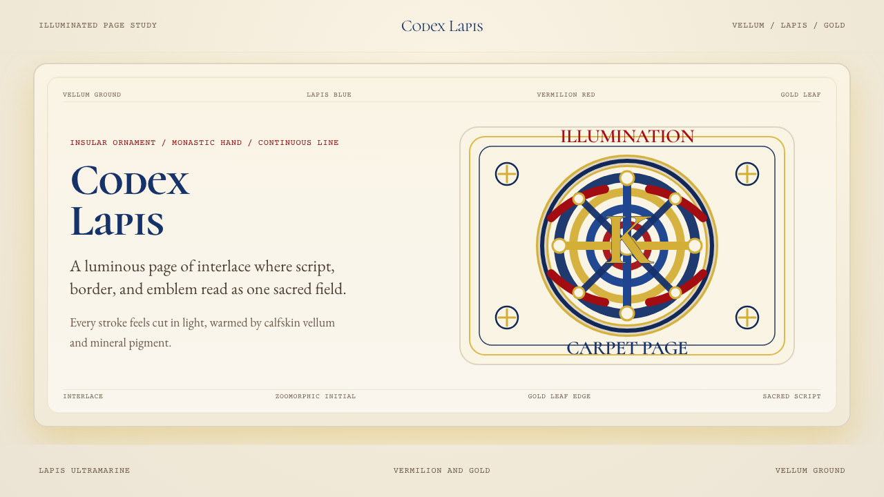 Book of Kells Celtic (800)Sacred and precise. Vellum cream, lapis, vermilion, and gold knotwork.神圣而精密。奶油羊皮底上铺陈青金石、朱砂与金色缠结纹。
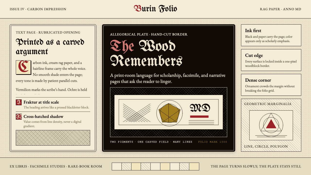 Dürer WoodcutInk remembers everything. Fraktur titles, rag-paper cream, and cross-hatched…木刻记住一切:哥特标题、破布纸奶油色与交叉排线。
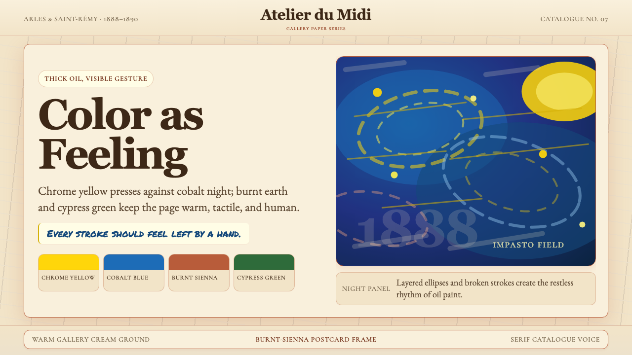 Van Gogh Post-ImpressionistFeeling made visible. Chrome yellow meets cobalt swirls on warm gallery cream.情感可见。铬黄与钴蓝旋涡落在暖画廊奶油底上。
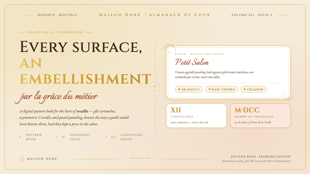 Versailles Rococo OrnamentEvery surface earns an embellishment. Cream paneling, ormolu gilt hairlines,…每一处表面都值得装饰:奶油护墙、鎏金细线、不对称 C 形涡卷卡图什。
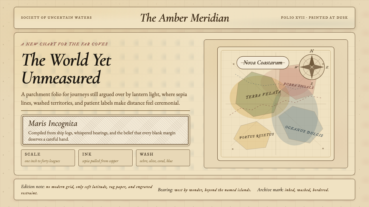 Vintage CartographyDiscovery feels ceremonial. Sepia copperplate on aged parchment, framed by co…发现如仪式。旧羊皮纸上的棕褐铜版线与罗盘几何。
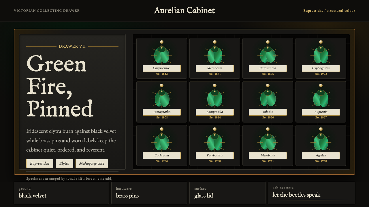 Beetle Specimen CabinetGreen burns in darkness. Emerald elytra grids glow under brass keylines and b…暗处燃起绿光。翡翠鞘翅格阵在黄铜线与黑绒底上发亮。