What is Art Brut (Dubuffet)?什么是 Art Brut (Dubuffet)?
Art Brut tears away every polish — bone-cream surfaces, earth pigments, obsessive scratched marks, and figures that crowd every margin with ungovernable urgency.原生艺术剥去一切精致——骨白底面、大地颜料、强迫性的刮痕,以及用无法驯服的冲动填满每一处边缘的粗拙人形。
Art Brut (Dubuffet) in briefArt Brut (Dubuffet) 速览
Art Brut — French for 'raw art' — is the name Jean Dubuffet coined in 1945 for work made outside the cultural mainstream: drawings, paintings, and sculptures by psychiatric patients, prisoners, mediums, and self-taught isolates who never sought gallery validation and were never shaped by academic tradition. Dubuffet argued that this work, precisely because it was free from received convention, represented a more authentic creative impulse than anything produced by trained artists operating within institutional art systems.原生艺术(Art Brut)是让·杜布菲于1945年为主流文化之外的创作所命名的——这些绘画、雕塑与视觉记录来自精神病患者、囚犯、通灵者和从未寻求画廊认可、也从未被学院传统塑造的自学者。杜布菲认为,正是因为这些作品不受既成惯例的束缚,它们才代表着比任何在体制内运作的受训艺术家更真实的创造冲动。
As a design aesthetic, Art Brut channels that radical anti-refinement through a specific visual vocabulary: warm bone-cream or aged-paper grounds, palettes drawn from earth pigments — ochre, raw umber, charcoal, rust, and muted terracotta — hand-worked surfaces that preserve the evidence of their own making, and a dense, horror-vacui composition that fills every available space with marks, figures, or texture. Nothing aspires to smoothness; everything insists on its own materiality.作为设计美学,原生艺术通过一套特定的视觉词汇传递这种反精致的激进立场:温暖的骨白色或做旧纸张底面,从大地颜料中提炼的色板——赭石、生赭、炭黑、铁锈和哑光赤陶——保留制作痕迹的手工处理表面,以及用标记、人形或纹理填满每一处可用空间的密集恐惧真空式构图。没有什么追求光滑,一切都坚持自身的物质性。
The style is immediately distinguishable from deliberate primitivism or folk art pastiche because it is systematic in its rawness. The scratched borders are intentional, the crude figure silhouettes are compositionally considered, and the obsessive mark-making follows a logic — even if that logic is closer to compulsion than to classical proportion. In contemporary design, Art Brut works as a counter-signal to digital slickness: it communicates authenticity, urgency, and the irreducible presence of the hand.这种风格与刻意的原始主义或民间艺术仿制品有着本质区别,因为它的粗拙是系统性的。刮痕边框是有意为之的,粗拙的人形轮廓在构图上经过权衡,强迫性的标记制作遵循着某种逻辑——即便那种逻辑更接近强迫冲动而非古典比例。在当代设计中,原生艺术作为对数字光滑感的反向信号发挥作用:它传递真实性、紧迫感和手的不可化约的在场。
See the Art Brut (Dubuffet) design system查看 Art Brut (Dubuffet) 完整设计系统
Where does Art Brut (Dubuffet) come from?Art Brut (Dubuffet) 从何而来?
The story of Art Brut begins not in a gallery but in a psychiatric institution. In 1945, Jean Dubuffet — a Paris-based painter who had already rejected academic training and spent years running his family's wine business before returning to art — traveled to Switzerland to visit asylums and collect drawings made by patients. What he found in institutions in Geneva, Bern, and Lausanne radicalized his thinking: he encountered work of staggering internal consistency, invented symbolic systems, obsessive spatial organization, and imagery that bore no relationship to any art-historical tradition because its makers had never encountered one.原生艺术的故事不是从画廊开始的,而是从一座精神病院开始的。1945年,巴黎画家让·杜布菲——他早年拒绝了学院训练,在重拾画笔之前花费数年经营家族葡萄酒生意——前往瑞士参观精神病院,收集患者的绘画。他在日内瓦、伯尔尼和洛桑的机构中发现的东西彻底改变了他的思想:令人震惊的内在一致性、自创的象征系统、强迫性的空间组织,以及与任何艺术史传统毫无关系的图像——因为那些创作者从未接触过这些传统。
Dubuffet returned to Paris with a collection and a manifesto. He called the work 'Art Brut' — raw, uncooked, unprocessed — and began arguing in lectures, writings, and his own painting practice that the Western art establishment had systematically mistaken sophistication for value. The training that produced skilled painters, he contended, also produced artists who could only recombine what they had already absorbed. The untrained maker, working without reference to tradition, was free to discover form independently — and that independence was not a limitation but a liberation.杜布菲带着一批藏品和一份宣言回到巴黎。他将这些作品称为「原生艺术」——生的、未经烹调的、未经加工的——并开始在演讲、写作和他自己的绘画实践中论证:西方艺术体制系统性地将精致误认为价值。他主张,培养出技艺精湛画家的训练,同时也培养出只能重新组合已吸收之物的艺术家。未受训练的创作者,在不参照传统的情况下工作,能够独立发现形式——而那种独立不是局限,而是解放。
In 1948, Dubuffet founded the Compagnie de l'Art Brut in Paris with a group that included the Surrealist André Breton and the writer Jean Paulhan. The collection he had been building — which would eventually grow to thousands of works — was housed in various locations over the following decades, including a period in the United States when it was stored at the home of the Surrealist collector Alfonso Ossorio. In 1971, Dubuffet donated the entire collection to the City of Lausanne, where it became the foundation of the Collection de l'Art Brut, still the world's primary institution dedicated to the genre.1948年,杜布菲与一个包括超现实主义者安德烈·布勒东和作家让·波朗在内的团体在巴黎创立了原生艺术联谊会(Compagnie de l'Art Brut)。他一直在建立的藏品——最终将增长至数千件——在此后数十年间被存放于不同地点,其中有一段时期在美国,存放于超现实主义藏家阿方索·奥索里奥的住所中。1971年,杜布菲将整批藏品捐赠给洛桑市,它成为原生艺术收藏馆(Collection de l'Art Brut)的基础——至今仍是世界上专门致力于这一流派的最主要机构。
Dubuffet's own painting practice, which ran from his decisive return to art in 1942 until his death in 1985, constituted a sustained demonstration of Art Brut principles applied by a trained, self-aware artist. His 'Hautes Pâtes' series of the late 1940s built surfaces from plaster, tar, sand, gravel, and industrial pigments to produce canvases that looked excavated rather than painted. His 'Corps de Dames' series deliberately deformed the female figure, flattening, fracturing, and spreading it across the picture surface in ways that recalled both children's drawings and cave painting simultaneously. His late 'Hourloupe' series introduced a different register — interlocking jigsaw cell-forms in flat red, white, and blue — that influenced subsequent generations of graphic designers looking for a systematic visual language rooted in hand-drawn irregularity.杜布菲自己的绘画实践,从1942年他决定性地重返艺术到1985年去世,构成了原生艺术原则由一位受过训练、具有自我意识的艺术家所做的持续示范。他在1940年代末创作的『厚涂系列』(Hautes Pâtes)用石膏、焦油、沙砾和工业颜料堆砌表面,产生出看起来像是被挖掘而非被绘制的画布。他的『女体系列』(Corps de Dames)刻意使女性身体变形,将其压平、破碎、铺展在画面上,同时令人联想到儿童绘画和洞穴壁画。他晚期的『乌鲁普系列』(Hourloupe)引入了一种不同的表达方式——用平涂红、白、蓝色勾勒出相互咬合的拼图细胞形——影响了此后寻求根植于手绘不规则性的系统视觉语言的几代平面设计师。
What defines the Art Brut (Dubuffet) look?Art Brut (Dubuffet) 的视觉特征是什么?
Color色彩
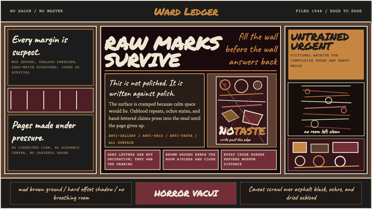
The Art Brut palette is rooted in earth and mineral pigments rather than mixed or synthetic colors. Ochre, raw umber, burnt sienna, charcoal black, chalky off-white, rust, and muted terracotta are the primary tones; they read as excavated or aged rather than chosen from a swatch book. Accent moments — if they appear at all — come from unexpected pops of crude primary pigment: an unmodulated red, a chalky sky blue, a raw cadmium yellow applied as if squeezed directly from a tube. The overall palette is warm and earthen, never cool or clinical, and the tones feel as though they have absorbed the time of their making.原生艺术的色板根植于大地和矿物颜料,而非调色或合成色。赭石、生赭、烧赭、炭黑、粉白、铁锈和哑光赤陶是主要色调;它们的感觉像是从地下挖掘出来的,或者像是岁月积淀的结果,而非从色卡中精心挑选的。偶尔出现的强调色——如果有的话——来自意外出现的原始主色颜料:未经调和的红色、粉笔质感的天蓝色、或者像是直接从颜料管中挤出来的生镉黄。整体色板温暖而大地化,从不冷峻或临床,那些色调感觉像是吸收了制作时间本身。
Surface and Texture表面与纹理
Every surface in an Art Brut composition reads as worked, not rendered. Scratches, gouges, layered buildup, visible brushstrokes, embedded grit, and smear marks are not accidents to be corrected but evidence to be preserved. The ground itself — often simulating the warm tooth of aged rag paper, plaster, or untreated canvas — participates actively in the image: its texture shows through thin applications of pigment and resists overly smooth passages. In digital applications, this quality is achieved through layered noise, grain, and deliberately imperfect edge treatments rather than clean vector shapes.原生艺术构图中的每一个表面都呈现出被加工过的感觉,而非被描绘的感觉。刮痕、凿痕、层叠堆积、可见的笔触、嵌入的砂砾和涂抹痕迹不是需要纠正的意外,而是需要保留的证据。底面本身——通常模拟做旧棉纸、石膏或未经处理的画布的温暖质感——主动参与图像的构成:它的纹理透过薄涂的颜料显现出来,并抵制过于光滑的笔触。在数字应用中,这种质感通过叠加噪点、颗粒和刻意不完美的边缘处理来实现,而非使用干净的矢量形状。
Figure and Form人形与形态
The human figure in Art Brut is consistently present and consistently deformed. Heads are oversized or reduced to oval blobs; limbs radiate at improbable angles; bodies flatten against the picture plane without foreshortening or spatial logic. These figures are not failed attempts at academic anatomy — they are systematic alternatives to it, encoding presence and energy rather than physical proportion. In design applications, figurative elements derived from Art Brut carry this same quality: silhouetted shapes, crude outlines filled with scratched marks, and repeated figure motifs that accumulate like obsessive inventory.人形在原生艺术中持续出现,也持续被变形。头部被夸张放大或缩减为椭圆色块;四肢以不可能的角度向外放射;身体不带透视缩短或空间逻辑地铺展在画面上。这些人形不是学院解剖学的失败尝试——它们是对后者的系统性替代,编码的是在场感和能量,而非身体比例。在设计应用中,源自原生艺术的具象元素承载着同样的品质:轮廓剪影、以刮痕填充的粗拙线条,以及像强迫性清单一样不断累积的重复人形母题。
Horror Vacui Density填满恐惧
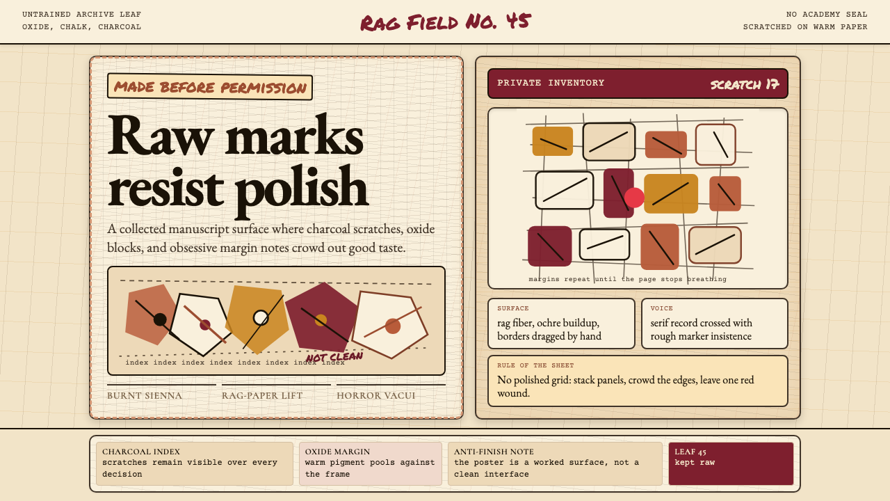
Where Bauhaus or Swiss International Style treats negative space as a structural resource, Art Brut treats it as a problem to be solved. Margins are invaded by figures, decorative borders leak inward, text and image compete for the same territory without clear hierarchy, and secondary marks fill any passage that might otherwise read as empty. This horror vacui — the compulsion to fill every void — is not compositional carelessness but a distinct aesthetic position: it communicates obsessive intensity and the refusal of editorial restraint.与包豪斯或瑞士国际主义风格将留白视为结构资源不同,原生艺术将留白视为需要解决的问题。边距被人形侵入,装饰边框向内渗漏,文字与图像在没有清晰层级的情况下争夺同一领域,次要标记填满任何可能被解读为空白的区域。这种填满恐惧——填补每一处空虚的强迫冲动——不是构图上的粗心大意,而是一种独特的美学立场:它传递强迫性的强度和对编辑克制的拒绝。
Typography字体排印
Art Brut typography resists the clean authority of typeset letterforms. Hand-lettering — whether scratchy and angular or densely repeated — is preferred over precision typesetting. When set type is used, it is typically a period serif or slab serif that carries the weight of the printed page rather than the precision of the screen, and it is often set in dense masses with irregular spacing or alongside hand-drawn annotations. Letter-spacing tightens to the point of collision; word spacing becomes unpredictable. The typographic effect is of language under pressure — words crowded into available space rather than given room to breathe.原生艺术的字体排印抵制排字字体的干净权威感。手写字——无论是潦草有角的还是密集重复的——优先于精准排版。当使用排字时,通常是带有印刷页面重量感而非屏幕精确感的传统衬线体或板状衬线体,并且常常以不规则间距密集排列,或与手绘注记并置。字距收紧到几乎碰撞的程度;词距变得难以预测。排版效果是语言承压的状态——文字被塞进可用空间,而不是被给予呼吸的余地。
Border and Frame边框与框架
Borders in Art Brut compositions are characteristically hand-drawn — irregular, scratched, or constructed from repeated marks rather than ruled lines. They are active visual elements rather than passive containers: the border scratches back, bleeds, or is partially obliterated by the content it supposedly encloses. Multiple nested frames, decorative border registers filled with repeated small marks, and the deliberate violation of frame edges by figures or text all belong to the Art Brut typology. In contemporary design, these qualities translate to rough-edge masks, layered frame treatments, and borders made from repeated illustrative marks rather than geometric rules.原生艺术构图中的边框是典型的手绘——不规则的、被刮划的,或由重复标记而非直线构成。它们是主动的视觉元素,而非被动的容器:边框会反向刮划、渗漏,或被它本应围合的内容部分遮蔽。多层嵌套框架、填满重复小标记的装饰边框带,以及人形或文字对框架边缘的刻意侵越,都属于原生艺术的类型学范畴。在当代设计中,这些品质转化为粗糙边缘遮罩、叠层边框处理,以及由重复插图标记而非几何直线构成的边框。
Expressive Mark-Making表现性标记
The individual mark — scratch, smear, dot, repeated incised line — is the fundamental unit of Art Brut visual language rather than the geometric form (as in Bauhaus) or the clean edge (as in Swiss Style). These marks accumulate into textures, become stand-in backgrounds, and build the visual field from the ground up in a way that preserves the evidence of duration and repetition. In some Art Brut works, individual marks are so dense and uniform that they create optical vibration; in others they are sparse enough to feel like isolated gestures. Either way, they declare the presence of a body at work — not a program, not a system, not a machine.个别标记——刮痕、涂抹、点、重复的刻痕线——是原生艺术视觉语言的基本单位,而非几何形态(如包豪斯中)或干净边缘(如瑞士风格中)。这些标记积累成纹理,成为替代性背景,以一种保留时间延续和重复证据的方式从底层建构视觉场域。在某些原生艺术作品中,个别标记如此密集而均匀,以至于产生视觉振动;在另一些作品中,它们又稀疏到足以感受到孤立姿态。无论如何,它们都宣告了一个在场工作的身体——不是程序,不是系统,不是机器。

See the Art Brut (Dubuffet) design system查看 Art Brut (Dubuffet) 完整设计系统
Who shaped Art Brut (Dubuffet)?谁塑造了 Art Brut (Dubuffet)?
Dubuffet (1901–1985) is the originating figure of Art Brut — its theorist, collector, and most prominent practitioner. Born in Le Havre to a wine merchant family, he enrolled at the École des Beaux-Arts in Paris before abandoning formal training in 1924, convinced that academic art education produced only competent imitators. He spent nearly two decades in his family's wine trade before returning decisively to painting in 1942 at the age of forty-one. His 1945 Switzerland journey to collect asylum art was the founding act of the movement; his subsequent writings, particularly the 1949 lecture 'Art Brut Preferred to the Cultural Arts,' became the movement's intellectual charter. His own paintings — layered, scratched, dense with crude figures — demonstrated that Art Brut principles could be applied consciously by a sophisticated thinker without losing their essential rawness.杜布菲(1901—1985年)是原生艺术的起源性人物——其理论家、收藏家与最重要的实践者。他出生于勒阿弗尔的一个葡萄酒商人家庭,在巴黎国立美术学院短暂就读后于1924年放弃了正规训练,确信学院艺术教育只能培养出称职的模仿者。他在家族葡萄酒行业度过了近二十年,直到1942年以四十一岁之龄决定性地重返绘画。1945年他前往瑞士收集精神病院艺术的旅程是这一运动的创立行为;他随后的写作,尤其是1949年的演讲《原生艺术优于文化艺术》,成为这一运动的知识宪章。他自己的绘画——分层、刮划、充满粗拙人形——证明了原生艺术的原则可以由一位老练的思考者有意识地运用,而不失去其本质的原始性。
Wölfli (1864–1930) is among the most celebrated of the artists Dubuffet came to categorize as Art Brut, though he died fifteen years before the term was coined. A Swiss laborer who was committed to the Waldau psychiatric clinic near Bern in 1895, Wölfli began drawing and writing in 1899 and over the following three decades produced a monumental autobiographical fantasy — 'From the Cradle to the Grave' — comprising thousands of pages of dense, obsessively detailed drawings, musical notations, and invented text, all embedded within elaborate decorative borders. His work exemplifies the horror vacui density and invented symbolic system that Dubuffet identified as characteristic of authentic Art Brut production.沃尔夫利(1864—1930年)是杜布菲最终归类为原生艺术的艺术家中最受赞誉的之一,尽管他在这一术语被创造出来之前十五年就已去世。这位瑞士工人于1895年被关押在伯尔尼附近的瓦尔道精神病院,从1899年开始绘画和写作,在此后三十年间创作了一部纪念碑式的自传体幻想作品——《从摇篮到坟墓》——包含数千页密集、强迫性精细的绘画、音乐记谱和自创文字,全部嵌入精心设计的装饰边框中。他的作品体现了杜布菲认定为真实原生艺术生产特征的填满恐惧密度和自创象征系统。
Aloïse Corbaz (1886–1964) was a Swiss-born woman who worked as a governess in the German court of Kaiser Wilhelm II before experiencing a psychotic break and being committed to psychiatric institutions in Switzerland in 1918, where she remained for the rest of her life. She began making secret drawings and paintings on salvaged paper using toothpaste, plant juices, and colored pencils. Her work — large-scale, vibrantly colored, depicting operatic scenes and royal figures crowded into every inch of the surface — represents one of the purest examples of the Art Brut impulse: a completely self-contained visual world built without any reference to or awareness of contemporary art.阿洛伊斯·科尔巴(1886—1964年)是一位出生于瑞士的女性,曾在威廉二世的德国宫廷担任家庭教师,后经历精神崩溃,于1918年被关入瑞士精神病机构,在那里度过了余生。她开始用牙膏、植物汁液和彩色铅笔在收集来的纸张上秘密创作绘画。她的作品——大尺幅、色彩鲜艳、描绘歌剧场景和皇室人物,将每一寸表面填满——代表着原生艺术冲动最纯粹的例证之一:一个完全自给自足的视觉世界,在不参照也不知晓任何当代艺术的情况下建构而成。
Henry Darger (1892–1973) was a Chicago hospital janitor who, upon his death, was discovered to have produced one of the most extraordinary private artistic works in the twentieth century: 'The Story of the Vivian Girls, in What Is Known as the Realms of the Unreal,' a fifteen-thousand-page illustrated manuscript accompanied by hundreds of large-format watercolor and collage paintings. Darger worked in total isolation over decades, tracing figures from coloring books and newspaper photographs and assembling them into epic battle scenes. He was unaware of the Art Brut movement and had no contact with the art world; his work was recognized posthumously and became central to international discussions of Outsider Art.亨利·达格(1892—1973年)是芝加哥的一名医院清洁工,他去世后被发现创作了二十世纪最非凡的私人艺术作品之一:《薇薇安女孩的故事,即所谓的非现实王国》——一部一万五千页的图文手稿,配有数百幅大幅水彩和拼贴画。达格在数十年间完全孤立地工作,从涂色书和报纸照片中描摹人物形象,将它们拼组成史诗般的战争场景。他对原生艺术运动一无所知,与艺术界毫无往来;他的作品在身后被发现,并成为国际局外人艺术讨论的核心。
While not Art Brut practitioners in Dubuffet's strict sense, the CoBrA artists — a collective active from 1948 to 1951, drawing its name from the initials of Copenhagen, Brussels, and Amsterdam — developed a parallel approach to raw, childlike imagery and crude figuration that shared significant aesthetic territory with Art Brut. Artists including Asger Jorn, Karel Appel, and Constant produced paintings with deliberately unschooled mark-making, bold unmixed pigment, and crude figurative forms that challenged the dominance of abstract geometric painting in post-war Europe. Their influence on the visual vocabulary available to contemporary designers applying Art Brut principles is substantial.尽管并非杜布菲严格意义上的原生艺术实践者,眼镜蛇画派(CoBrA)——一个活跃于1948至1951年间、以哥本哈根、布鲁塞尔和阿姆斯特丹首字母命名的集体——发展出了一种与原生艺术共享重要美学领域的平行方法:原始的、儿童式的图像和粗拙的具象表达。包括阿斯格·约恩、卡尔·阿佩尔和康斯坦特在内的艺术家创作了具有刻意不成熟标记制作、大胆未经调和的颜料以及粗拙具象形态的绘画,挑战了战后欧洲抽象几何绘画的主导地位。他们对当代设计师应用原生艺术原则时可用的视觉词汇影响深远。
How do you use Art Brut (Dubuffet) today?今天怎么用 Art Brut (Dubuffet)?
Art Brut is one of the most demanding historical styles to apply in contemporary design because its visual authority depends entirely on internal consistency. The temptation, when borrowing from this style, is to add 'roughness' as a surface treatment — a few scratchy textures, a slightly irregular border — while leaving the underlying layout logic smooth and digital. This produces pastiche rather than conviction. Authentic application requires committing to the aesthetic at every level: ground, color, type treatment, figure handling, density, and border logic all must speak the same language.原生艺术是当代设计中最难应用的历史风格之一,因为它的视觉权威性完全依赖内在一致性。借用这种风格时的诱惑在于将「粗糙感」作为表面处理来添加——几处潦草纹理、一个略微不规则的边框——同时保持底层版面逻辑的光滑与数字化。这只能产生仿制品而非信念。真实的应用需要在每一个层面上都对这种美学做出承诺:底面、色彩、字体处理、人形处理、密度和边框逻辑必须讲同一种语言。
For presentation slides, Art Brut works most powerfully as a cover and section-break system. A cover built in this aesthetic should feel excavated: warm bone-cream or aged-paper ground, earth-tone title treatment in dense hand-lettered or heavy serif type, crude figurative marks or obsessive textures filling the margins. Content slides require more restraint but should maintain the visual character: a single textured ground, text set in a dense serif with tight leading, data visualizations treated as hand-drawn diagrams rather than clean infographic elements. Data slides in this style — bar charts built from irregular mark accumulation, pie charts rendered as hand-divided circles — communicate craft and care rather than computational precision.对于演示文稿,原生艺术在封面和章节分隔页上最具力量。以这种美学构建的封面应该感觉像是被挖掘出来的:温暖的骨白色或做旧纸张底面,以手写感或粗重衬线字体处理的大地色调标题,粗拙的人形标记或强迫性纹理填满边距。内容页需要更多克制,但应保持视觉特征:单一纹理底面,以紧密行距排列的密集衬线字体,数据可视化被处理为手绘图表而非干净的信息图元素。这种风格的数据页——由不规则标记积累构成的柱状图、以手划方式呈现的饼图——传递的是工艺与用心,而非计算精确性。
For web interfaces and dashboards, Art Brut suits platforms where authenticity, craft, and independence from mainstream digital aesthetics are part of the brand value proposition. An Art Brut dashboard uses a warm off-white or parchment-toned background rather than a pure white or neutral grey canvas; interactive elements carry rough-edge borders and hard, offset shadows rather than soft drop-shadows or rounded corners; data visualizations are given textured fills and irregular edges. Pricing pages and feature callouts work well with the style's poster-like directness: large crude numerals, dense descriptive text, and figurative marks used as category indicators.对于网页界面和仪表板,原生艺术适合那些真实性、手工艺和独立于主流数字美学是品牌价值主张一部分的平台。原生艺术仪表板使用温暖的米白色或羊皮纸色调背景,而非纯白或中性灰画布;交互元素带有粗糙边缘边框和硬边偏移投影,而非柔和的阴影或圆角;数据可视化被赋予纹理填充和不规则边缘。定价页面和功能引导配合这种风格的海报式直接感效果很好:大型粗拙数字、密集描述性文字,以及用作类别指示的人形标记。
For editorial and marketing applications, Art Brut is particularly effective for brands and publishers whose positioning involves authenticity, craft production, independence, or counter-cultural stance. An Art Brut editorial layout treats the full page as a territory to be occupied: body text runs in dense columns with minimal leading, pull quotes are handwritten or set in a scratchy typeface and surrounded by border marks, images are reproduced with visible grain and aged paper simulation. Marketing pages derive their impact from density and accumulation rather than the white-space clarity of modernist layouts — the composition feels urgent, almost overwhelmed, which communicates abundance and intensity.对于编辑和营销应用,原生艺术对于那些定位涉及真实性、手工生产、独立性或反主流文化立场的品牌和出版商尤为有效。原生艺术编辑版面将整个页面视为需要占领的领域:正文以最小行距在密集栏目中排列,引用语以手写体或潦草字体排印并被边框标记环绕,图像以可见颗粒和做旧纸张模拟复现。营销页面的冲击力来自密度和积累,而非现代主义版面的留白清晰度——构图感觉紧迫,几乎被压倒,这传递的是丰盛与强度。
The most common mistake when applying Art Brut is confusing crude with careless. Every element in a well-executed Art Brut composition is deliberately placed — the scratched borders, the dense figure fills, the irregular type treatment — even if the result looks uncontrolled. A second common error is applying Art Brut textures only to decorative elements while keeping structural elements (grid, type hierarchy, spacing) clean and digital. The third, and most undermining, mistake is using the style's warmth and earthiness while stripping its density and horror vacui compulsion — this produces a 'rustic' aesthetic that borrows Art Brut's color palette but abandons its fundamental character. If the composition has comfortable breathing room and generous margins, it is not Art Brut.应用原生艺术时最常见的错误是将粗拙与粗心混淆。一个执行精良的原生艺术构图中的每一个元素都是经过刻意放置的——刮划的边框、密集的人形填充、不规则的字体处理——即便结果看起来是不受控制的。第二个常见错误是只对装饰性元素应用原生艺术纹理,同时保持结构性元素(网格、字体层级、间距)的干净和数字化。第三个,也是最根本的错误是使用这种风格的温暖和大地感的同时剥除其密度和填满恐惧的强迫性——这会产生一种「质朴」美学,借用了原生艺术的色板但放弃了其根本特征。如果构图有舒适的呼吸空间和宽裕的边距,那就不是原生艺术。
See the Art Brut (Dubuffet) design system查看 Art Brut (Dubuffet) 完整设计系统
Art Brut (Dubuffet) — FAQArt Brut (Dubuffet) · 常见问题
How does Art Brut differ from other 'raw' or expressive styles like Expressionism or Grunge?原生艺术与其他「原始」或表现性风格(如表现主义或垃圾摇滚美学)有什么区别?
Expressionism is a trained artist's emotional amplification of the visible world, using distortion and intensified color to convey subjective states. Grunge typography (1990s David Carson era) is a trained graphic designer's formal deconstruction of readability conventions. Art Brut is neither: it originates from makers who were never trained and are not commenting on conventions they know, but rather inventing visual systems from scratch. In practice, this means Art Brut design avoids the deliberate legibility-breaking moves of Grunge and the gestural bravado of Expressionism. It is slower, denser, and more obsessive — the mark-making feels compelled rather than chosen.表现主义是受训艺术家对可见世界的情感放大,通过扭曲和强化色彩来传达主观状态。垃圾摇滚字体排印(1990年代大卫·卡森时代)是受训平面设计师对易读性惯例的形式解构。原生艺术两者都不是:它源自从未受过训练、也不是在评论他们所了解的惯例的创作者,而是从头发明视觉系统。在实践中,这意味着原生艺术设计避免垃圾摇滚的刻意破坏易读性的手法和表现主义的姿态式大胆。它更缓慢、更密集、更具强迫性——标记制作感觉是被驱使的,而非被选择的。
Can Art Brut work in digital-first products like apps and websites, or is it too tactile?原生艺术能在应用程序和网站等数字优先产品中发挥作用吗,还是它太过触感化?
Art Brut can work well in digital products, but it requires deliberate adaptation. The key is to simulate materiality rather than deny the digital medium: layered grain and noise textures applied to backgrounds and surfaces, rough-edge SVG shapes in place of clean vector forms, system fonts given irregular tracking and alignment, and interaction states (hover, active, focus) expressed through physical metaphors — a deepened shadow, a texture shift — rather than smooth transitions. The style is less suited to interfaces requiring precision at small sizes, such as dense data tables or highly compact mobile navigation, where its characteristic density becomes illegibility.原生艺术在数字产品中可以很好地发挥作用,但需要刻意的适配。关键在于模拟物质性,而非否定数字媒介:将叠加的颗粒和噪点纹理应用于背景和表面,用粗糙边缘的SVG形状取代干净的矢量形式,给系统字体以不规则的字距和对齐,通过物理隐喻——加深的投影、纹理转变——而非平滑过渡来表达交互状态(悬停、激活、聚焦)。这种风格不太适合在小尺寸下需要精确性的界面,例如密集数据表格或高度紧凑的移动导航,在那里其特征性密度会变成难以辨认。
Is it appropriate to use Art Brut for serious or professional contexts like finance or healthcare?在金融或医疗等严肃或专业场景中使用原生艺术合适吗?
Art Brut is rarely appropriate for contexts where the primary design requirement is institutional authority and trust-signaling. Financial services, medical platforms, legal products, and government interfaces generally depend on visual conventions — clean type, ordered hierarchy, spatial generosity — that Art Brut directly contradicts. The style's associations with psychiatric institutions, outsider status, and radical anti-establishment positions make it a significant brand risk in contexts where users need to feel safe, regulated, and professionally handled. There are exceptions — an independent arts foundation, a psychiatric care organization communicating empathy and humanity rather than clinical authority, or a mental health platform deliberately rejecting the cold aesthetic of mainstream health tech — but these require explicit strategic justification rather than stylistic preference.在主要设计要求是机构权威性和信任信号的场景中,原生艺术很少是合适的。金融服务、医疗平台、法律产品和政府界面通常依赖原生艺术直接违背的视觉惯例——干净的字体、有序的层级、空间的宽裕感。这种风格与精神病机构、局外人身份和激进的反建制立场的关联,使其在用户需要感到安全、受到监管和专业处理的场景中面临重大品牌风险。也存在例外——独立艺术基金会、以传递同理心和人文关怀而非临床权威为目标的精神病护理机构,或刻意拒绝主流健康科技冷峻美学的心理健康平台——但这些需要明确的战略理由,而非风格偏好。
How do I handle color in Art Brut without it looking muddy or unintentional?如何在原生艺术中处理色彩,使其不显得浑浊或无意图?
The perceived muddiness of earth palettes is actually a feature of Art Brut, but it needs to be controlled to read as intention rather than accident. The key is contrast management: within the warm earth range, maintain clear value contrast — light ochre against dark charcoal, bone-cream against deep umber — so that the composition has legible structure even without clean hue separation. Reserve the occasional crude primary pop (an unmodulated rust red, a flat raw yellow) for single moments of emphasis, never distributed throughout the composition. Avoid mixing earth tones with cool grays or blues, which creates a visual conflict that reads as unresolved rather than deliberate. Test the palette at reduced size: if the composition loses all differentiation, the value contrast is insufficient.大地色板感知上的浑浊感实际上是原生艺术的一个特征,但它需要被控制,以使其看起来是有意为之而非意外。关键在于对比度管理:在温暖的大地色范围内,保持清晰的明度对比——浅赭石对深炭黑,骨白对深赭——使构图即使没有干净的色相分离也能有清晰的结构。将偶尔出现的原始主色点缀(未经调和的铁锈红、平涂的生黄)保留给单一的强调时刻,绝不分散在整个构图中。避免将大地色调与冷灰或蓝色混合,这会产生一种视觉冲突,被解读为未解决的而非刻意的。在缩小尺寸下测试色板:如果构图失去所有区分度,则明度对比不足。
What makes Art Brut feel contemporary rather than nostalgic or historical?是什么让原生艺术感觉是当代的,而非怀旧的或历史性的?
Art Brut feels contemporary when its rawness functions as a counter-signal to the specific visual conventions of the present moment — not as an evocation of any particular historical period. In the current context, dominated by ultra-smooth gradients, AI-generated imagery, and perfectly kerned geometric sans-serif type, Art Brut's earthy surfaces and hand-made marks communicate authenticity and human presence with genuine force. The risk of nostalgia arises when the style is applied too literally — simulating sepia-toned photographs, mimicking specific mid-century printing techniques, or using visual clichés like distressed type effects that have themselves become aesthetic conventions. Contemporary Art Brut should feel as if it was made today, by a hand, under urgency — not as if it was lovingly reproduced from a historical archive.当原生艺术的原始感作为对当下特定视觉惯例的反向信号发挥作用时,它就感觉是当代的——而不是对任何特定历史时期的唤起。在当前语境下,超光滑渐变、AI生成图像和完美字距的几何无衬线字体占主导,原生艺术的大地色表面和手工标记以真实的力量传递真实性和人的在场。当这种风格被过于字面地应用时,怀旧的风险就会出现——模拟棕褐色调照片、模仿特定的中世纪印刷技术,或使用本身已成为美学惯例的视觉陈词,如做旧字效果。当代原生艺术应该感觉像是今天用手在紧迫中制作的——而不是像被人从历史档案中精心复制出来的。
Related design styles相关设计风格
 Art Brut (Dubuffet, 1948)Rawness crowds the frame. Mud brown, oxblood marks, and hand scrawl erase the…粗粝填满画面:泥棕底、牛血红刻痕与手写体挤压边缘。
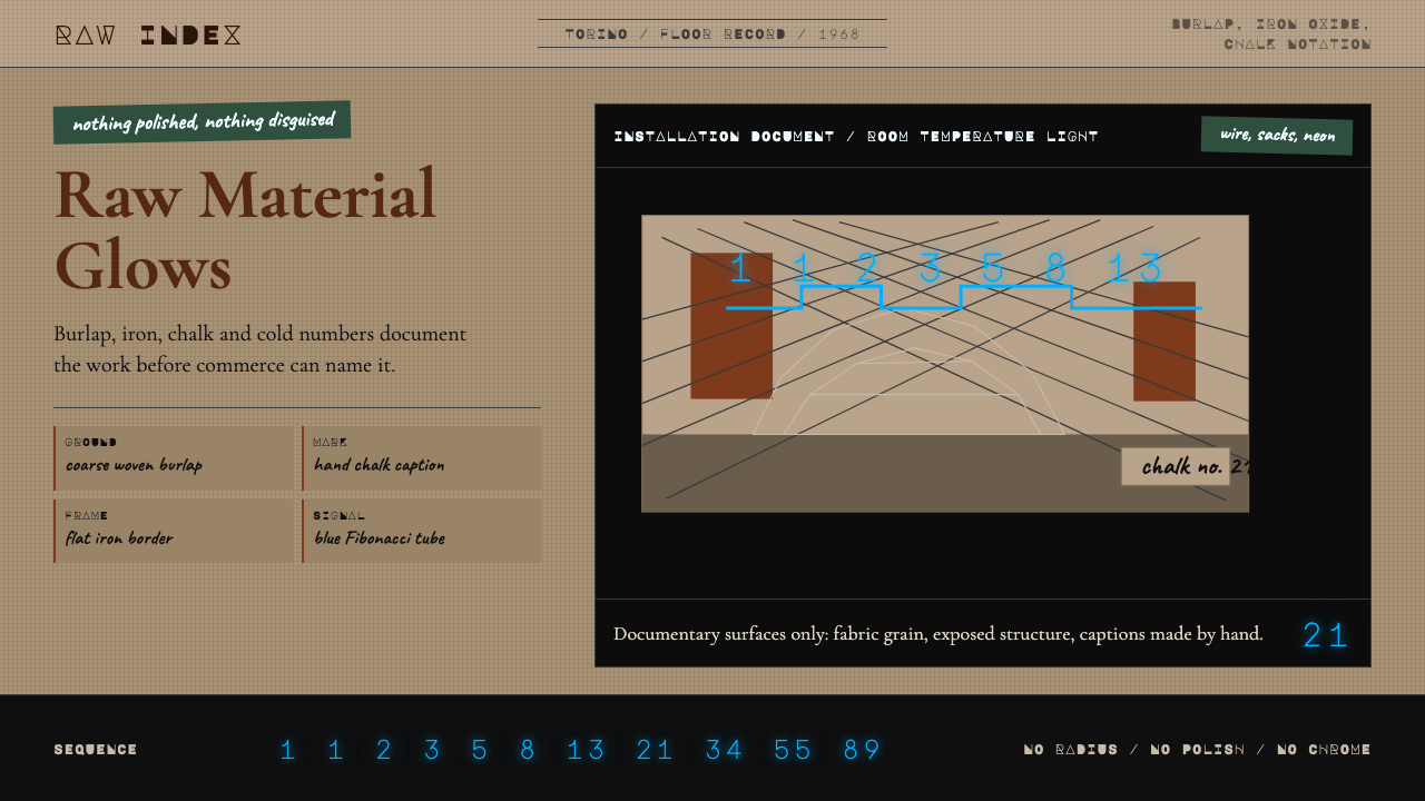 Arte Povera (Merz, 1968)Material refuses polish. Burlap ground, rust serif, chalk marks, neon Fibonac…材料拒绝抛光:麻布底、铁锈衬线、粉笔标注与霓虹斐波那契。
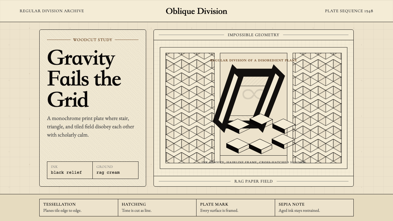 M.C. Escher ImpossibleImpossible calm. Ink-black tessellations and hatching fold cream paper into p…不可能的冷静:墨黑镶嵌与排线,让奶油纸折成悖论。
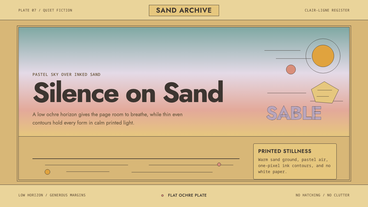 Sable (Mœbius)Still desert science fiction. Ochre ground, pastel sky, and thin ink contours…静默的沙漠科幻。赭黄地面、粉彩天空与细墨线在留白中呼吸。
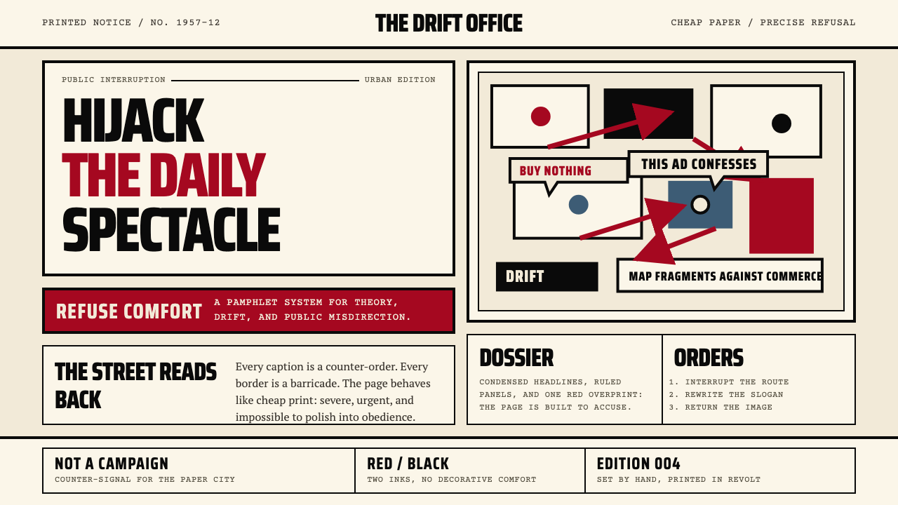 Situationist International (Debord, 1957)Agitation becomes structure. Red-black blocks and condensed type weaponize ne…煽动化为结构。红黑块面与压缩字体把新闻纸变成武器。
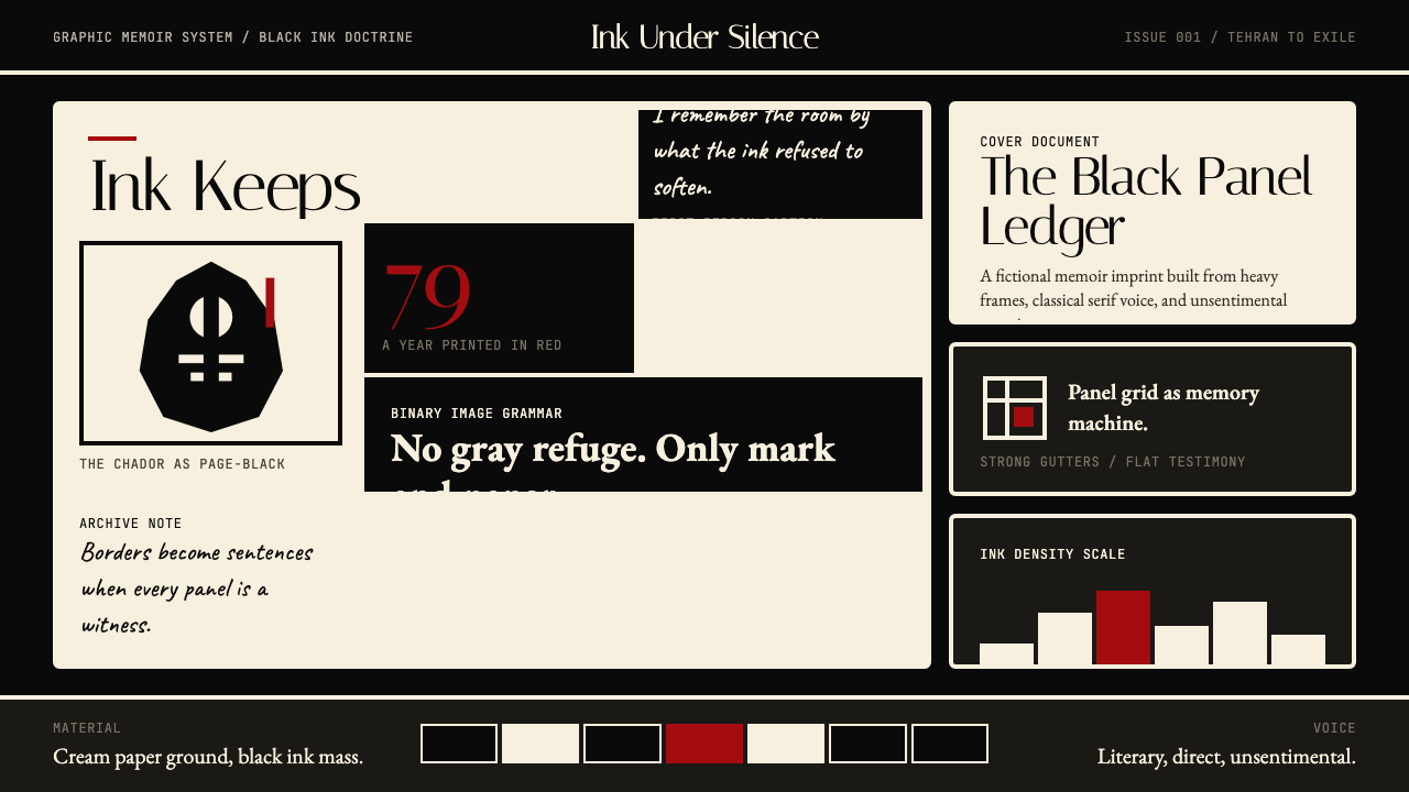 Persepolis (Marjane Satrapi, 2000)Stark memory, pure ink. Cream panels, heavy black borders, one revolution-red…记忆冷峻如墨。奶油纸格、粗黑边框,一笔革命红。