What is Persepolis (Marjane Satrapi, 2000)?什么是 Persepolis (Marjane Satrapi, 2000)?
Persepolis translates the stark black-and-white ink language of Marjane Satrapi's Iranian-revolution memoir into a design vocabulary of cream grounds, heavy borders, and a single revolution-red accent that hits only when it must.《我在伊朗长大》将玛赞·莎塔碧伊朗革命回忆录中那种质朴的黑白墨线语言,转化为奶油底色、粗重边框与一笔仅在必要时才出现的革命红点缀所构成的设计词汇。
Persepolis (Marjane Satrapi, 2000) in briefPersepolis (Marjane Satrapi, 2000) 速览
Persepolis is a graphic memoir published in four volumes by L'Association in Paris between 2000 and 2003, collected in English by Pantheon Books in 2003 and 2004, and adapted into an animated film in 2007. Its author and illustrator, Marjane Satrapi, depicts her childhood and adolescence in Tehran during and after the 1979 Islamic Revolution, her years as a teenager in Vienna, and her eventual return to Iran. The book's visual language — uncompromising black and white, dense ink, flat cut-out silhouettes, and the chador rendered as a pure page-black shape — became one of the most recognizable and studied aesthetic signatures of twenty-first-century literary comics.《我在伊朗长大》是玛赞·莎塔碧于2000至2003年间由巴黎L'Association出版的四卷图像回忆录,2003至2004年由万神殿出版社出版英文合集版,并于2007年改编为动画电影。作者以黑白墨线描绘了她在1979年伊斯兰革命前后于德黑兰度过的童年与少年时代、在维也纳的青春岁月,以及最终重返伊朗的历程。这本书的视觉语言——毫不妥协的黑与白、浓重的墨迹、扁平的剪纸式轮廓、以及作为纯黑色块呈现的查多尔头巾——成为二十一世纪文学漫画中最具辨识度、也最受学界关注的美学标志之一。
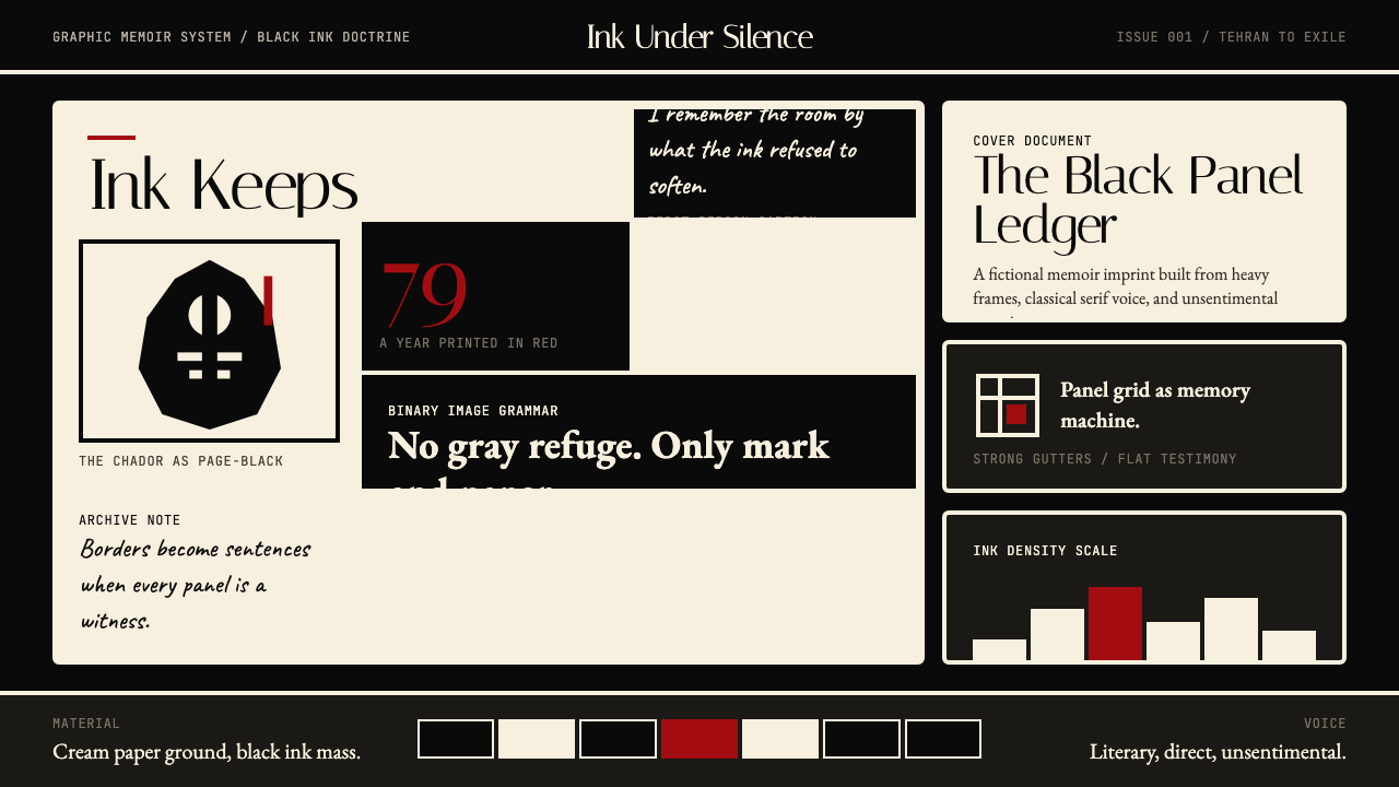
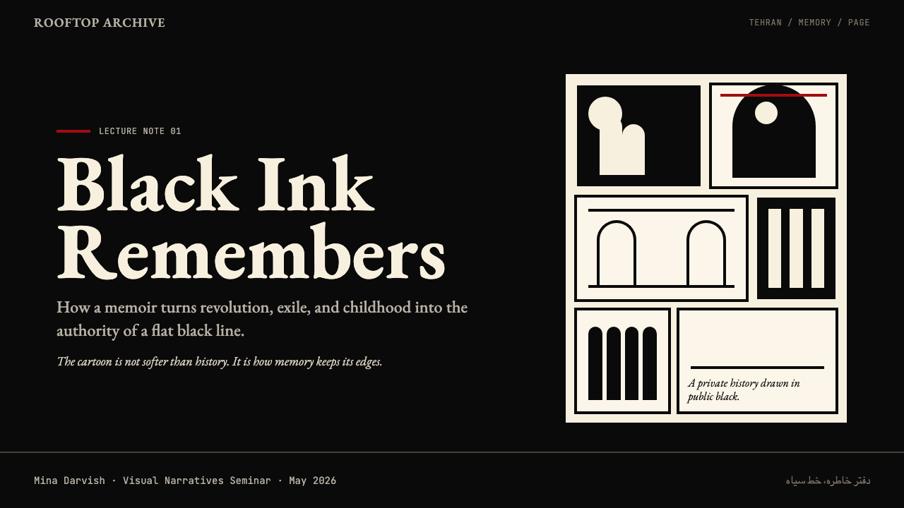
As a design system, Persepolis translates that memoir vocabulary into a precise set of visual decisions: cream paper grounds that evoke archival print rather than digital white; bold black ink borders that frame every panel and component with the same weight a woodblock printer would apply; a revolution-red accent deployed with deliberate scarcity, so that its appearance carries emotional and structural significance; and warm classical serif typefaces that honor the literary-comics lineage of L'Association, whose editions were themselves objects of typographic care. The result is an aesthetic of controlled severity that reads simultaneously as personal, political, and authoritative.作为设计系统,《我在伊朗长大》将这套回忆录视觉词汇转化为一系列精确的视觉决策:唤起档案印刷感而非数字白的奶油色底面;以木版印刷般的笔触勾勒每一个面板与组件的粗黑墨线边框;以刻意的克制部署的革命红点缀——出现的每一次都携带情感与结构意义;以及致敬L'Association文学漫画传统的温暖古典衬线字体(L'Association的每一版书籍本身就是排版艺术的体现)。这一切共同构成一种受控的严峻美学,同时传递出个人性、政治性与权威性。
The design system's central tension — between the intimacy of a handmade ink mark and the rigorous flatness of a cut-paper silhouette — mirrors Satrapi's own narrative tension between private memory and public history. This makes Persepolis particularly powerful for interfaces and editorial work that need to carry both intellectual weight and human directness: the visual language is stark enough to command attention but warm enough, through its cream grounds and serif letterforms, to sustain sustained reading.这一设计系统的核心张力——手工墨迹的亲密感与剪纸轮廓的严格平面性之间的张力——折射出莎塔碧叙事中私密记忆与公共历史之间的同一种张力。这使得《我在伊朗长大》对于那些需要同时承载知识分量与人文直接性的界面和编辑作品尤为有力:这套视觉语言足够质朴以引领注意力,又通过奶油色底面与衬线字体足够温暖以支撑持续阅读。
See the Persepolis (Marjane Satrapi, 2000) design system查看 Persepolis (Marjane Satrapi, 2000) 完整设计系统
Where does Persepolis (Marjane Satrapi, 2000) come from?Persepolis (Marjane Satrapi, 2000) 从何而来?
Marjane Satrapi was born in Rasht, Iran, in 1969 and grew up in Tehran in a secular, politically progressive family. Her great-grandfather had been a Qajar prince; her grandfather was a communist. This family history of navigating between privilege and dissent, between Iranian tradition and European intellectual life, gave Satrapi a particular vantage point on the Islamic Revolution of 1979 and the Iran-Iraq War that followed. At fourteen she was sent to Vienna by her parents to protect her from the worsening political climate, and it was the experience of cultural displacement — the foreigner in Europe, the Westernized girl in Iran — that would eventually become the emotional core of the book.玛赞·莎塔碧1969年生于伊朗拉什特,在德黑兰一个世俗、政治进步的家庭中长大。她的曾祖父曾是卡扎尔王朝的王子,祖父是一名共产主义者。这段在特权与异见之间、在伊朗传统与欧洲知识生活之间穿行的家族史,赋予了莎塔碧一个独特的棱镜,以审视1979年的伊斯兰革命与随之而来的两伊战争。十四岁那年,她被父母送往维也纳,以躲避日益恶化的政治气候。正是这段文化错位的经历——欧洲的异乡人,伊朗的西化女孩——最终成为这本书情感核心。
Satrapi studied illustration in Strasbourg and settled in Paris in the late 1990s, where she joined the orbit of L'Association, the French independent comics publisher founded in 1990 by a collective including David B., Jean-Christophe Menu, and Lewis Trondheim. L'Association was a decisive influence. The collective had established an aesthetic and ethical framework for the graphic novel as literary form: black-and-white printing as a commitment rather than a budget constraint, books as designed objects, and autobiographical and documentary subjects treated with the same formal rigor as fiction. David B.'s own memoir Epileptic — also black-and-white, also concerned with family, illness, and the surreal intrusions of history on private life — was a direct model for Satrapi's formal approach.莎塔碧在斯特拉斯堡学习插图,于1990年代末定居巴黎,进入L'Association的圈子。L'Association是法国独立漫画出版社,1990年由大卫·B、让-克里斯托夫·梅努、刘易斯·特伦翰等人共同创立。这家出版社是决定性的影响力。该集体为图像小说作为文学形式确立了美学与伦理框架:黑白印刷是一种承诺而非预算限制,书籍是设计对象,自传与纪录题材与虚构作品享有同等的形式严谨性。大卫·B自己的回忆录《癫痫》——同样黑白,同样关乎家庭、疾病,以及历史对私人生活的超现实闯入——是莎塔碧形式方法的直接范本。
The visual language of Persepolis draws from three distinct genealogies. The first is Persian miniature painting, with its flat grounds, bold outlining, and figures arranged to convey narrative status rather than perspectival depth — Satrapi absorbed this tradition through Iranian culture and schooling, and its economy of line and symbolic use of scale are visible throughout the memoir. The second is German Expressionist woodcut printmaking, whose high-contrast black-and-white and emotional intensity Satrapi encountered through European art history and which gave her the formal permission to make heavy ink and sharp silhouette carry psychological weight. The third is the French alt-comics lineage of L'Association itself, with its insistence on the page as a designed surface rather than a transparent window onto story.《我在伊朗长大》的视觉语言源自三条截然不同的谱系。第一条是波斯细密画:扁平的底面、粗黑的轮廓线、以传递叙事地位而非透视深度来排列人物——莎塔碧通过伊朗文化与教育吸收了这一传统,其线条的简约与对尺度的象征性运用在回忆录全书随处可见。第二条是德国表现主义木刻版画,其高对比度的黑白与情感张力是莎塔碧通过欧洲艺术史所接触到的,它赐予她形式上的许可,让厚重的墨迹与锐利的轮廓得以承载心理重量。第三条是L'Association自身的法国独立漫画传统,其坚持将页面视为被设计的表面而非通向故事的透明窗口。
The four volumes were published as Persepolis (2000), Persepolis 2 (2001), Persepolis 3 (2002), and Persepolis 4 (2003). The Pantheon English translation, published in two volumes in 2003 and 2004, brought the work to international audiences and sparked a broad critical reassessment of graphic memoir as a literary form. The 2007 animated film, co-directed by Satrapi and Vincent Paronnaud, translated the flat black-and-white ink aesthetic into motion with exceptional fidelity — using animation not to add depth or color but to honor the original's commitment to silhouette, bold outline, and the chador as a graphic form. The film won the Jury Prize at Cannes and an Academy Award nomination for Best Animated Feature.四卷分别于2000、2001、2002、2003年出版。万神殿出版社于2003至2004年出版的英文版将这部作品带到国际读者面前,并引发了学界对图像回忆录作为文学形式的广泛重新评价。2007年由莎塔碧与文森特·帕罗诺联合执导的动画电影,以非凡的忠诚度将扁平的黑白墨线美学转译为动态影像——动画并未添加深度或色彩,而是忠实于原作对轮廓、粗黑线条与查多尔作为图形形态的承诺。该片获戛纳电影节评审团奖和奥斯卡最佳动画长片提名。
What defines the Persepolis (Marjane Satrapi, 2000) look?Persepolis (Marjane Satrapi, 2000) 的视觉特征是什么?
Palette色彩
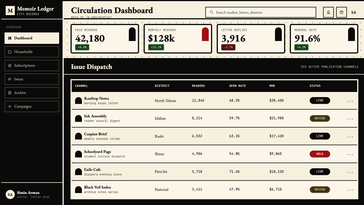
The core palette is a strict three-way system: cream — an aged-paper warmth rather than a clinical white — serves as the ground for all panels and surfaces; dense, absolute black carries every border, silhouette, letterform, and shadow; and a single revolution red, used with exceptional restraint, marks the moments of maximum emotional or structural emphasis. This red does not appear as a gradient or ambient wash — it strikes as a flat, solid shape, the way a stamp or a censored passage might. The effect is that each red element reads as a deliberate event rather than a decorative choice.核心色彩是严格的三元体系:奶油色——一种陈年纸张的温暖感,而非临床般的白——作为所有面板与表面的底色;浓重、绝对的黑色承载每一条边框、每一个轮廓、每一个字形与每一片阴影;以及一笔以极度克制使用的革命红,标记情感或结构强调达到顶点的时刻。这种红色不以渐变或氛围性铺色出现——它以扁平、实心的形状出现,如同印章或被涂抹的删除段落。其效果是:每个红色元素都被读取为一次蓄意的事件,而非装饰性的选择。
Ink Border and Framing墨线边框与框架
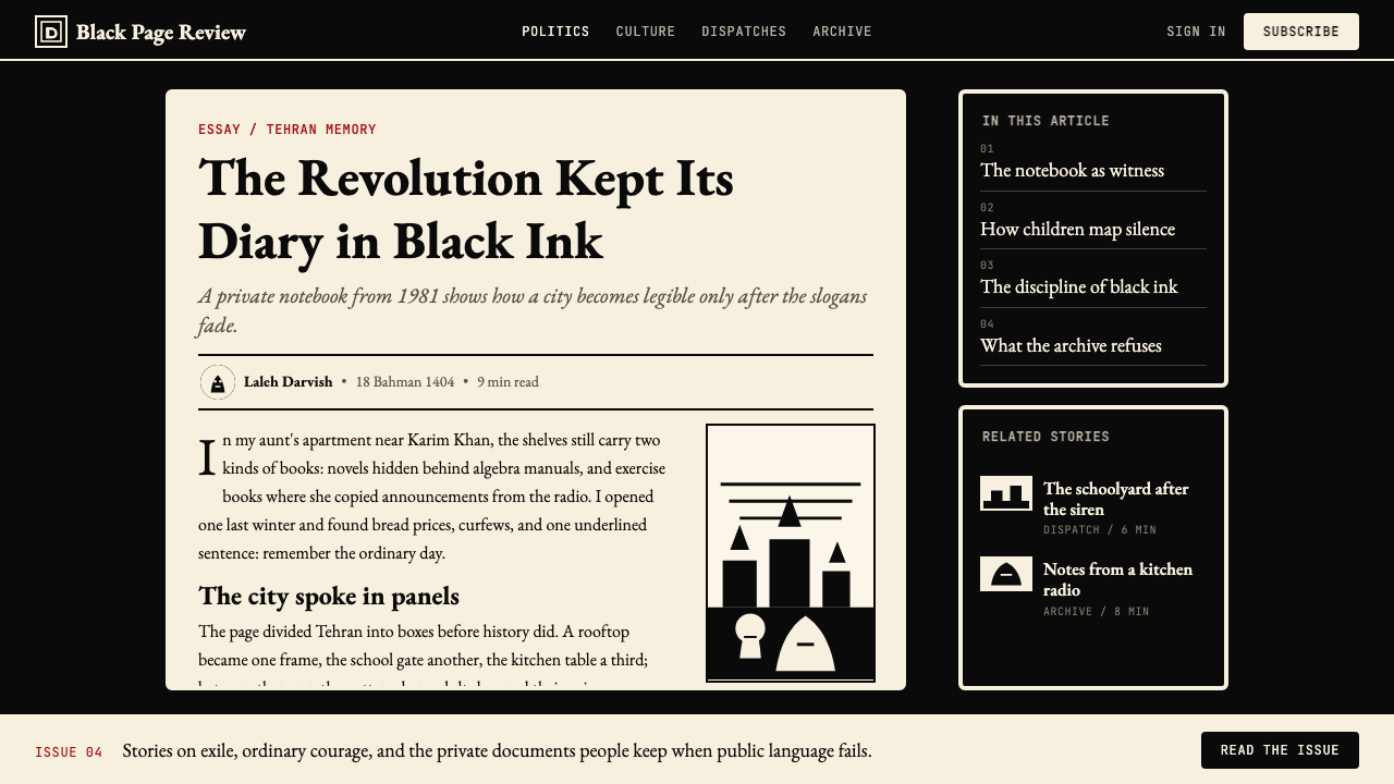
Every panel, card, and content region is bounded by a heavy black border whose weight is consistent throughout — a direct translation of the comic-panel grid into interface design. The border is not a drop shadow or a subtle outline; it is an ink mark, opaque and intentional. This framing device gives every element the quality of a hand-composed page: contained, legible, and self-sufficient. When borders vary in weight — a thicker frame around a feature or a primary call to action — the variation reads as editorial emphasis, not decoration.每一个面板、卡片与内容区域都被粗黑边框所界定,其笔触重量保持始终如一——这是将漫画格子网格直接转译为界面设计的产物。边框不是投影,不是若有若无的轮廓线;它是墨迹,不透明而有意为之。这种框架装置赋予每个元素手工排版页面的质感:被容纳、可辨读、自给自足。当边框在笔触重量上产生差异——以更粗的线框突出某个功能或主要行动号召时——这种差异被读取为编辑性强调,而非装饰。
Flat Silhouette and Shape Language扁平剪影与形态语言
Persepolis has no halftone, no gradient, and no rendered shading. Every figure, object, and illustration is reduced to its silhouette: a flat black shape on a cream ground, or a cream shape cut from black. This binary quality comes directly from Satrapi's woodcut-influenced line work and from the Persian miniature convention of arranging symbolic shapes rather than simulating three-dimensional space. In interface design this translates to icon systems and illustration styles that favor bold outlines over photographic realism, and to the avoidance of any texture or gradient overlay that would introduce the illusion of depth.《我在伊朗长大》没有半色调、没有渐变、没有渲染阴影。每一个人物、物体与插图都被简化为其轮廓:奶油色底面上的扁平黑色形状,或从黑色中镂刻出的奶油色形状。这种二元品质直接来自莎塔碧受木刻版画影响的线条风格,以及波斯细密画排列象征性形状而非模拟三维空间的传统。在界面设计中,这转化为偏重粗黑轮廓而非写实摄影感的图标系统与插图风格,以及对任何会引入深度幻觉的纹理或渐变叠加的刻意回避。
Typography and Serif Voice排版与衬线字体气质
Where most ink-heavy comic aesthetics pair with sans-serif or distressed display type, Persepolis draws on the L'Association tradition of treating the book as a literary object. Typography here is warm and classical: serif letterforms that read as authoritative and literary rather than utilitarian. Headline type is set at a large scale for immediate legibility and hierarchy; body text is generous in line spacing and narrow in measure, mimicking the column width of a well-set journal or small-press literary edition. Emphasis within text is achieved through bold weight or italic cut of the same face, never through decorative flourishes or competing type families.大多数浓墨重彩的漫画美学会搭配无衬线或做旧展示字体,但《我在伊朗长大》延续了L'Association将书籍视为文学对象的传统。这里的排版温暖而古典:衬线字形传递的是权威性与文学性,而非实用性。标题以大字号排设,确保即时的可读性与层级感;正文行距宽松、行宽收窄,模仿编排精良的期刊或小型出版社文学版本的栏宽。文内强调通过同一字体的粗体字重或斜体变体实现,绝不借助花饰或相互竞争的字体家族。
Negative Space and Breathing Room留白与呼吸空间
Despite the visual density of Satrapi's black ink panels, the page of Persepolis breathes through deliberate emptiness: cream gutters between panels, margins that allow the eye to rest before the next image, and the stark clarity of a white face against an all-black ground. In interface design, this translates to generous white or cream space around components, with content grouped in bordered panels rather than sprawled across an open canvas. The space between elements is not wasted — it is structural, giving the borders and type the room they need to read cleanly.尽管莎塔碧黑墨格子的视觉密度很高,《我在伊朗长大》的页面依然通过刻意的空白得以呼吸:格子之间的奶油色间距、让眼睛在下一幅图像前得以歇息的页边留白,以及全黑背景上一张白色面孔的锐利清晰。在界面设计中,这转化为组件周围慷慨的白色或奶油色空间,内容被分组置于有边框的面板中,而非铺展于开放画布之上。元素之间的空间不是浪费——它是结构性的,给予边框与文字所需要的清晰呈现的余地。
The Chador as Graphic Form查多尔作为图形形态
One of Persepolis's most distinctive visual inventions is the chador rendered as a flat black shape — an abstract form that reads simultaneously as clothing, censorship, and cultural imposition. In the design system this principle generalizes into a broader approach: dense, solid black shapes are used not as decorative fills but as meaningful presences, areas of high visual weight that demand the eye acknowledge them before moving on. A full-width black header band, a solid black sidebar, or a black framing element all carry this quality — they are not backgrounds but foreground statements.《我在伊朗长大》最具特色的视觉创造之一是将查多尔头巾描绘为扁平的纯黑色块——一种同时被读取为服装、审查与文化强制的抽象形态。在设计系统中,这一原则推广为一种更广泛的处理方式:浓重的实心黑色形状被用作具有意义的存在,而非装饰性填充——那是高度视觉分量的区域,要求眼睛在移向下一处之前先承认它们的存在。全宽黑色标题带、实心黑色侧边栏、或黑色框架元素都具有这种品质——它们不是背景,而是前景陈述。
Emotional Economy情感经济
Persepolis achieves its emotional power not through visual richness but through withholding. A single red splash in an otherwise entirely black-and-white spread becomes devastating precisely because the entire visual grammar has taught the reader not to expect it. The design system applies the same logic: decorative elements, gradients, and additional accent colors are not merely discouraged — they actively undermine the system's logic by diluting the semantic weight of the elements that do appear. Every element that exists must justify its presence; every element that is withheld creates the conditions for the next meaningful element to land with force.《我在伊朗长大》的情感力量并非来自视觉的丰富性,而来自刻意的克制。在一张完全黑白的跨页展开中,一抹单独的红色之所以令人震撼,恰恰是因为整套视觉语法已经教导读者不要期待它的出现。设计系统应用了同样的逻辑:装饰性元素、渐变色与额外的强调色不仅仅是被劝阻的——它们通过稀释已出现元素的语义重量而积极地破坏系统逻辑。每一个存在的元素都必须证明其存在的正当性;每一个被克制的元素都在为下一个有意义的元素的有力落地创造条件。
See the Persepolis (Marjane Satrapi, 2000) design system查看 Persepolis (Marjane Satrapi, 2000) 完整设计系统
Who shaped Persepolis (Marjane Satrapi, 2000)?谁塑造了 Persepolis (Marjane Satrapi, 2000)?
Satrapi is the author and illustrator of Persepolis and its primary creative intelligence. Born in Iran and educated in part in Vienna and Strasbourg, she brought to the graphic memoir a perspective shaped equally by Persian cultural memory, European art history, and the experience of political exile. Her decision to work exclusively in black and white was not a technical limitation but a formal argument: the absence of color imposed a discipline on the work that matched the austerity of the subject matter. After Persepolis, she continued as an author and filmmaker in Paris, and co-directed the 2007 animated adaptation. Her work is widely taught in university literature and visual culture programs as a canonical example of the graphic memoir as a serious literary and historical form.莎塔碧是《我在伊朗长大》的作者、插图作者与核心创作智识。出生于伊朗,部分求学经历在维也纳与斯特拉斯堡完成,她带给图像回忆录的视角同等地被波斯文化记忆、欧洲艺术史与政治流亡经历所塑造。她坚持以纯黑白工作的决定并非技术限制,而是形式上的论点:色彩的缺席为作品施加了一种与主题本身的严峻性相匹配的纪律。《我在伊朗长大》之后,她继续在巴黎从事作家与电影人工作,并联合执导了2007年的动画改编版本。她的作品被广泛纳入大学文学与视觉文化课程,作为图像回忆录作为严肃文学与历史形式的典范案例。
Born Pierre-François Beauchard, David B. is one of the founding members of L'Association and the author of Epileptic (L'Ascension du haut mal), a graphic memoir about his family's experience with his brother's epilepsy. David B.'s visual language — dense black ink, surreal imagery drawn from dreams and historical fantasy, flat silhouettes arranged to communicate emotional rather than literal reality — was a direct predecessor and acknowledged influence on Satrapi's approach in Persepolis. He also served as an editorial mentor to Satrapi at L'Association, and his insistence on the graphic novel as a formally serious medium gave her the critical framework within which she developed her own visual voice.原名皮埃尔-弗朗索瓦·博夏尔,大卫·B是L'Association的创始成员之一,也是图像回忆录《癫痫》的作者——该书描述了他的家庭与兄长癫痫病的经历。大卫·B的视觉语言——浓重的黑墨线、源自梦境与历史幻想的超现实图像、以传递情感而非字面现实的方式排列的扁平轮廓——是莎塔碧在《我在伊朗长大》中所采用方法的直接前身与公认影响。他在L'Association也担任莎塔碧的编辑导师,他对图像小说作为形式严肃媒介的坚持,为她发展自己的视觉声音提供了批评性框架。
Paronnaud, known in French comics under the pseudonym Winshluss, co-directed the 2007 animated film adaptation of Persepolis with Satrapi. His contribution was central to solving the formal problem of animating a work whose power derived from static ink marks: how to introduce movement without sacrificing the flatness, the silhouette quality, and the binary black-and-white logic of the original. The film's solution — preserving the hand-drawn line quality, using animation to extend rather than supplement the ink aesthetic, and avoiding the temptation of photorealistic rendering — demonstrated that the Persepolis visual grammar was robust enough to survive the transition to a time-based medium.帕罗诺在法国漫画界以笔名Winshluss为人所知,他与莎塔碧联合执导了2007年的动画改编版《我在伊朗长大》。他的贡献对解决一个形式难题至关重要:如何为一部力量来自静态墨迹的作品注入运动——如何在引入动态的同时不牺牲原作的平面性、轮廓质感与黑白二元逻辑。电影的解决方案——保留手绘线条质感,以动画延伸而非补充墨线美学,并抵制写实渲染的诱惑——证明了《我在伊朗长大》的视觉语法具有足够的稳健性,得以在转化为时基媒介的过程中存活。
L'Association is the Paris-based independent comics publishing collective founded in 1990, whose influence on literary graphic novels in France — and eventually internationally — is comparable to the influence of literary small presses on prose fiction. By insisting on black-and-white printing, high production standards for binding and paper, and an authors-first editorial philosophy, L'Association established the conditions within which works like Persepolis could be conceived, produced, and taken seriously as literature. The collective's aesthetic stance — that the book is itself a designed object, that printing choices are artistic choices — is legible throughout Persepolis's visual grammar and the design system derived from it.L'Association是1990年创立于巴黎的独立漫画出版集体,其对法国乃至最终对国际文学图像小说的影响,堪比文学小型出版社对散文小说的影响。通过坚持黑白印刷、装订与纸张的高生产标准,以及以作者为先的编辑哲学,L'Association建立了使《我在伊朗长大》这样的作品得以被构想、制作并作为文学被认真对待的条件。该集体的美学立场——书籍本身是被设计的对象,印刷选择是艺术选择——在《我在伊朗长大》的视觉语法及其衍生的设计系统中清晰可辨。
Satrapi has cited Persian miniature painting — the tradition of highly detailed, flat, jewel-colored manuscript illustration practiced in Iran, Central Asia, and the Mughal empire from the thirteenth through the seventeenth centuries — as a foundational visual influence. Persian miniatures organize figures and architecture across a flat picture plane without perspectival recession; status and narrative importance are communicated through scale and placement rather than spatial position. This convention is directly present in Persepolis's treatment of large-scale symbolic figures — the Shah, God, the Islamic Republic's officials — rendered as massive silhouettes against which small human figures are arranged to express power relationships without the mediation of pictorial depth.莎塔碧曾明确引述波斯细密画——这一在十三至十七世纪伊朗、中亚与莫卧儿帝国盛行的高度精细、扁平、珠宝般色彩的手抄本插图传统——作为基础性视觉影响。波斯细密画在没有透视退深的扁平画面上组织人物与建筑;地位与叙事重要性通过尺度与位置来传达,而非通过空间位置。这一惯例直接体现在《我在伊朗长大》对大尺度象征性人物的处理中——国王、真主、伊斯兰共和国官员——被渲染为巨大的轮廓色块,小小的人物被排列于其周围,以表达权力关系,无需透视深度的中介。
How do you use Persepolis (Marjane Satrapi, 2000) today?今天怎么用 Persepolis (Marjane Satrapi, 2000)?
The Persepolis design system is most effective in contexts where moral seriousness, intellectual authority, and human directness are the desired communicative qualities — and where those qualities need to be achieved without the visual noise of photographic imagery, decorative gradients, or saturated multi-color palettes. The system's central challenge is restraint: because its power depends on the scarcity of the revolution-red accent and the stark authority of the black border, any tendency to accumulate decorative elements, introduce additional colors, or soften edges with transparency will progressively erode its effectiveness.《我在伊朗长大》设计系统在以下语境中最为有效:当道德严肃性、知识权威性与人文直接性是期望传达的品质——并且这些品质需要在没有摄影图像视觉噪音、没有装饰性渐变、没有饱和多色色板的情况下实现。这个系统的核心挑战是克制:因为它的力量依赖于革命红点缀的稀缺性与黑色边框的严峻权威性,任何积累装饰元素、引入额外色彩或以透明度软化边缘的倾向,都将逐渐侵蚀其有效性。
For presentation slides, the system yields a strong and distinctive visual identity at both cover and content levels. A cover slide works best with a large black framing element — a full-bleed black band at the top or a heavy bordered panel occupying most of the slide — with the title set in a large classical serif against cream, and the red accent appearing only for a single critical word or phrase. Content slides should be structured as bordered panels on a cream ground: each section of information is its own framed unit, headlines are set at high contrast against the cream background, and data visualizations use the three-system palette exclusively — cream for background, black for axes and labels, and red only for the single most important data series or threshold. This restraint makes red elements on data slides visually unmissable without any additional annotation.对于演示文稿,该系统在封面与内容页面都能呈现强烈而独特的视觉识别度。封面幻灯片最适合以大型黑色框架元素为主——全出血的黑色顶部色带,或占据幻灯片大部分面积的粗边框面板——标题以大号古典衬线字体置于奶油色上,红色点缀仅出现在单个关键词或关键短语处。内容幻灯片应当被构建为奶油色底面上的边框面板:每个信息单元都是自己的框架单元,标题以高对比度排设于奶油色背景上,数据可视化专门使用三元色板——奶油色作背景,黑色作坐标轴与标签,红色仅用于单一最重要的数据系列或阈值。这种克制使数据幻灯片上的红色元素在无需任何额外注释的情况下视觉上不可忽视。
For web interfaces, Persepolis works particularly well on dashboards, editorial platforms, documentation sites, and any application that positions itself as a serious intellectual tool rather than a consumer entertainment product. The approach: cream or very warm near-white for the page ground, heavy black borders for all card and panel components replacing any box-shadow or subtle border approach, classical serif for body text and headings, and revolution-red reserved exclusively for primary call-to-action elements, critical alerts, or the single most important interactive affordance per screen. Navigation should be typographic and weighted rather than icon-led; sidebar and header bands can use full black as a ground color with cream or white text, applying the same chador-as-foreground-presence principle of the source material.对于网页界面,《我在伊朗长大》特别适合仪表板、编辑平台、文档站点,以及任何将自身定位为严肃知识工具而非消费娱乐产品的应用程序。方法如下:奶油色或极温暖的近白色作为页面底色,所有卡片与面板组件使用粗黑边框替代任何盒阴影或微妙边框,古典衬线字体用于正文与标题,革命红专门保留给主要行动号召元素、关键警示,或每屏单一最重要的交互功能。导航应当是以字重为主的字体性呈现,而非图标主导;侧边栏与页眉色带可以使用全黑作为底色搭配奶油色或白色文字,应用与源材料相同的「查多尔作为前景存在」原则。
For editorial and marketing contexts, the system's poster-like boldness supports strong information hierarchy across long-form articles, marketing landing pages, and printed collateral. An article layout benefits from a narrow measure for body text — mimicking the column discipline of literary journal design — with wide margins reserved for pull-quotes, footnotes, or section labels set in a smaller weight of the same serif family. Marketing pages work best with alternating full-width bands: cream ground with black type and a single red call-to-action button, followed by a full black band with cream type. The transition between bands should be a hard edge — the ink-border principle applied at page scale — with no soft gradient transitions or decorative separators.对于编辑与营销语境,该系统的海报式粗犷感支持长篇文章、营销落地页与印刷物的强劲信息层级。文章版面受益于正文的窄行宽——模仿文学期刊设计的栏目纪律——宽阔的页边留白保留给引用语、脚注或以同一衬线字体家族较小字重排设的章节标签。营销页面最适合交替的全宽色带:奶油色底面配黑色文字与单一红色行动号召按钮,随后是全黑色带配奶油色文字。色带之间的过渡应当是硬边——墨线边框原则在页面尺度上的应用——没有柔和渐变过渡,没有装饰性分隔符。
A common and fatal mistake when applying Persepolis is treating it as simply a dark, edgy aesthetic and importing conventions from unrelated moody design systems — adding texture overlays, distressed paper effects, multiple accent colors, or soft ambient shadows. These additions violate the system's structural logic at a foundational level. The cream ground is not aged-paper texture; it is a flat, uniform color. The black borders are not vintage or distressed; they are precise, consistent, and intentional. The red is not a brand color used regularly throughout the interface; it is a sparingly deployed signal. Any element that introduces naturalistic simulation — texture that pretends to be paper, a shadow that pretends to be light — contradicts the entire formal argument of the source material and reduces a rigorous visual system to a mood board.应用《我在伊朗长大》时最常见也最致命的错误,是将其简单地视为一种黑暗、边缘感的美学,并从不相关的阴郁设计系统中引入惯例——添加纹理叠加、做旧纸张效果、多种强调色、或柔和的环境阴影。这些添加在基础层面上违背了该系统的结构逻辑。奶油色底面不是陈年纸张的纹理;它是扁平、均匀的色彩。黑色边框不是复古或做旧的;它们是精确、一致且有意为之的。红色不是在界面中定期使用的品牌色;它是一种稀少部署的信号。任何引入自然主义模拟的元素——假装是纸张的纹理,假装是光线的阴影——都与源材料的全部形式论点相悖,并将一个严谨的视觉系统降格为一块情绪板。
See the Persepolis (Marjane Satrapi, 2000) design system查看 Persepolis (Marjane Satrapi, 2000) 完整设计系统
Persepolis (Marjane Satrapi, 2000) — FAQPersepolis (Marjane Satrapi, 2000) · 常见问题
Can Persepolis work as a light-mode interface, or is it inherently dark?《我在伊朗长大》可以用于浅色模式界面吗,还是它天然偏向深色?
The canonical form of the system is light: cream grounds, black borders, and the red accent on a pale surface. This is how the source material itself is printed — the page is light, the ink is dark. A dark inversion is possible — using a full black ground with cream typography and borders — but it should be applied to specific sections or panels rather than to the entire interface. A full dark-mode application of Persepolis risks losing one of its most important qualities: the chador-as-black-shape principle, where dense black areas read as meaningful presences against a lighter ground. On a full black background, those black areas disappear into the page and the visual grammar collapses.这个系统的标准形态是浅色的:奶油色底面、黑色边框、浅色表面上的红色点缀。这正是源材料本身的印刷方式——页面是浅色的,墨水是深色的。深色反转版本是可能的——以全黑底面搭配奶油色文字与边框——但应当应用于特定区块或面板,而非整个界面。《我在伊朗长大》的全深色模式应用有失去其最重要品质之一的风险:「查多尔作为黑色形状」原则——浓重的黑色区域在较浅的底面上被读取为具有意义的存在。在全黑背景上,那些黑色区域会融入页面,视觉语法随之瓦解。
How do I use the revolution red without it feeling arbitrary?如何使用革命红而不显得随意?
The red works because it is governed by an implicit rule: it appears only once, or at most twice, in any given view. Before placing a red element, ask whether it is the single most important thing the viewer needs to notice in this composition. If the answer is yes, place it. If there are two or more candidates for the red, that is a signal to reconsider the information hierarchy — either one of those elements is truly primary and the others are secondary, or the design is attempting to communicate too many priorities simultaneously. Treat the red as a scarcity resource. Its power is entirely a function of its rarity; every additional red element diminishes all the others.红色之所以有效,是因为它受一条隐性规则约束:在任意给定的视图中,它只出现一次,最多两次。在放置红色元素之前,先问:这是否是观看者在这个构图中需要注意的唯一最重要的事物?如果答案是肯定的,就放置它。如果有两个或更多候选者争夺红色,这是一个重新审视信息层级的信号——要么其中一个元素确实是主要的而其他是次要的,要么设计正在试图同时传达太多优先级。把红色视为一种稀缺资源。它的力量完全是其稀缺性的函数;每增加一个红色元素,都在削弱其余所有红色元素的力量。
Is this style appropriate for products aimed at general consumers, or is it too severe?这种风格适合面向普通消费者的产品吗,还是它过于严峻?
Persepolis is better suited to products where the user relationship is based on trust, knowledge, and seriousness rather than delight, playfulness, or sensory comfort. It fits well for financial tools, documentary platforms, literary publishing, serious journalism, research interfaces, and any product that wants to signal that it is treating its users as intelligent adults with important things to do. It is less well suited to food and beverage brands, children's products, lifestyle and wellness applications, social entertainment, and any context where the primary emotional register is warmth, ease, or fun. The style can work in consumer contexts if the product itself has an intellectual or political edge — a nonfiction book platform, a serious news application — but it should not be applied simply because black and white feels modern or minimal.《我在伊朗长大》更适合用户关系建立在信任、知识与严肃性而非愉悦、游戏性或感官舒适感之上的产品。它非常适合金融工具、纪录片平台、文学出版、严肃新闻、研究界面,以及任何希望传递「我们把用户视为有重要事情要做的聪明成年人」信号的产品。它不太适合食品饮料品牌、儿童产品、生活方式与健康应用、社交娱乐,以及任何主要情感基调是温暖、轻松或有趣的语境。如果产品本身具有知识性或政治边缘感——非虚构书籍平台、严肃新闻应用——这种风格可以在消费者语境中发挥作用,但不应仅仅因为黑白感觉现代或极简而被应用。
How does this design system differ from other black-and-white minimal aesthetics?这个设计系统与其他黑白极简美学有何不同?
Most contemporary black-and-white minimal aesthetics — Swiss International Style derivatives, Scandinavian minimalism, brutalist web design — achieve their effect through subtraction: removing color, reducing type, eliminating ornament until the design approaches a kind of pure structural abstraction. Persepolis is different in that its black-and-white language is not abstract or neutral; it is specific, emotionally weighted, and narratively charged. The heavy border is not a structural grid element — it is an ink mark. The cream ground is not a neutral white — it is a material surface with warmth and age. The silhouette figures are not icons — they are characters with political and emotional context. This specificity is both the system's strength and its constraint: it communicates with great force in contexts where that emotional charge is an asset, and it can feel oppressively specific in contexts that call for neutrality.大多数当代黑白极简美学——瑞士国际主义风格的衍生物、斯堪的纳维亚极简主义、暴力网页设计——通过减法实现其效果:去除色彩、精简字体、消除装饰,直到设计趋近于某种纯粹的结构抽象。《我在伊朗长大》的不同之处在于:它的黑白语言并非抽象或中性的;它是特定的、情感上有分量的、叙事上充满张力的。粗黑边框不是结构性网格元素——它是墨迹。奶油色底面不是中性的白色——它是一个具有温度与历史感的材料表面。轮廓人物不是图标——它们是具有政治与情感语境的角色。这种特定性既是该系统的力量,也是它的约束:在情感分量是资产的语境中,它以巨大的力量传达;而在呼唤中性的语境中,它可能显得过于沉重的特定性。
What typography mistakes should I avoid?排版上应当避免哪些错误?
The most common typographic mistake is switching to a sans-serif typeface on the grounds that it feels more modern or clean. A sans-serif face applied to the Persepolis system immediately severs the connection to the L'Association literary tradition and shifts the aesthetic toward a generic technical minimalism that competes with dozens of other design systems rather than occupying its own distinct territory. A second common mistake is using the system's boldness as permission for chaotic typographic variety — mixing multiple serif families, applying color to type beyond the three-system palette, or using display type that is more decorative than authoritative. The system works through typographic discipline: one family, clear hierarchy through size and weight, black or cream for all text, and the red used at most for a single typographic accent such as a pull-quote attribution or a critical data label.最常见的排版错误是以「感觉更现代或更简洁」为由切换为无衬线字体。将无衬线字体应用于《我在伊朗长大》系统,会立即切断与L'Association文学传统的联系,并将美学转向一种与数十个其他设计系统竞争的通用技术极简主义,而不是占据自己独特的领域。第二个常见错误是将该系统的粗犷感理解为混乱排版变体的许可——混合多个衬线字体家族、在三元色板之外给文字着色、或使用装饰性多于权威性的展示字体。该系统通过排版纪律发挥作用:一个字体家族,通过尺寸与字重建立清晰层级,所有文字使用黑色或奶油色,红色最多用于单一排版强调,例如引用语的出处或关键数据标签。
Related design styles相关设计风格
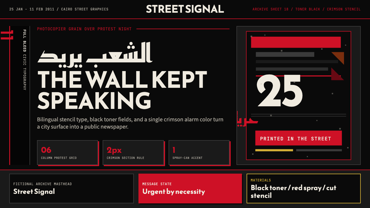 Tahrir Square 2011Civic signal, not polish. Photocopier black and crimson stencils on a hard gr…公民信号,不加修饰。复印黑与猩红模板压进硬网格。
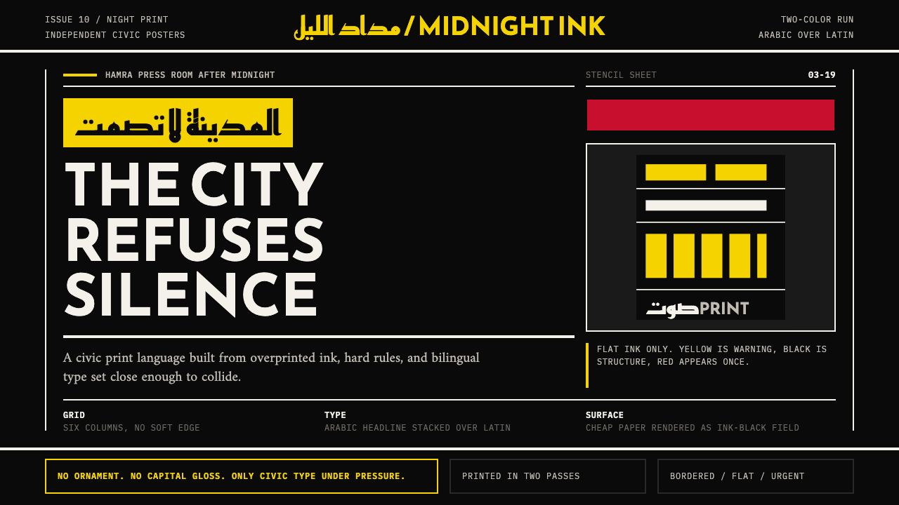 Beirut Indie Graphic DesignCivic type as protest. Sulfur yellow Arabic blocks collide with ink-black pos…公民字体即抗议:硫磺黄阿文块撞上墨黑海报网格。
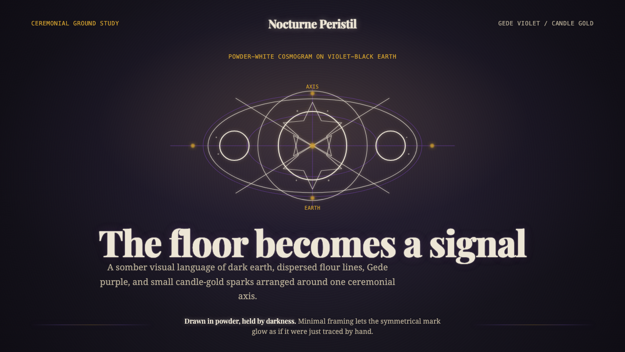 Haitian Vodou VèvèSomber ritual glow. Powder-white lines on violet-black earth, touched by cand…庄重的仪式微光:紫黑泥地上的粉白线条,烛金点亮。
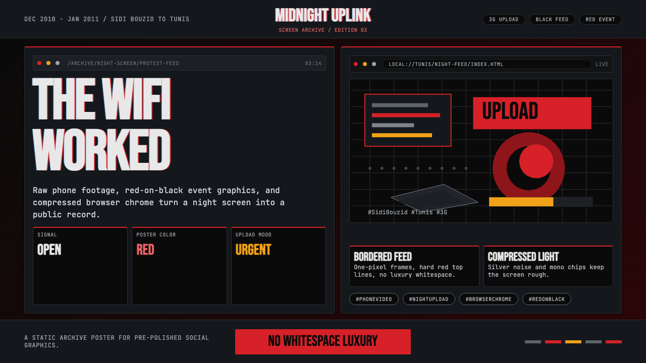 Tunisian Jasmine Revolution (2010)Raw urgency wins. Red browser grids and mono hashtags compress 3am protest in…原始紧迫感取胜:红色浏览器网格与等宽话题压缩凌晨抗议。
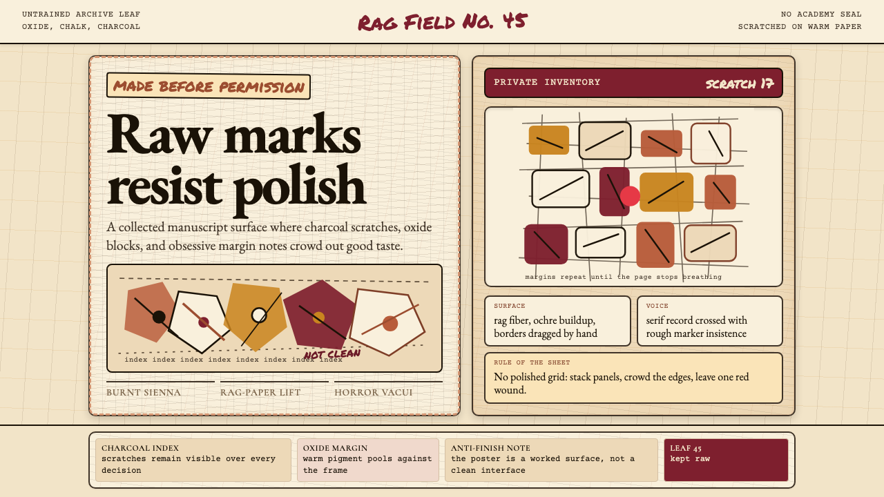 Art Brut (Dubuffet)Polish is refused. Bone-cream paper, earth pigments, scratched borders, dense…拒绝精致。骨白纸、大地颜料、刮痕边框和密集页边。
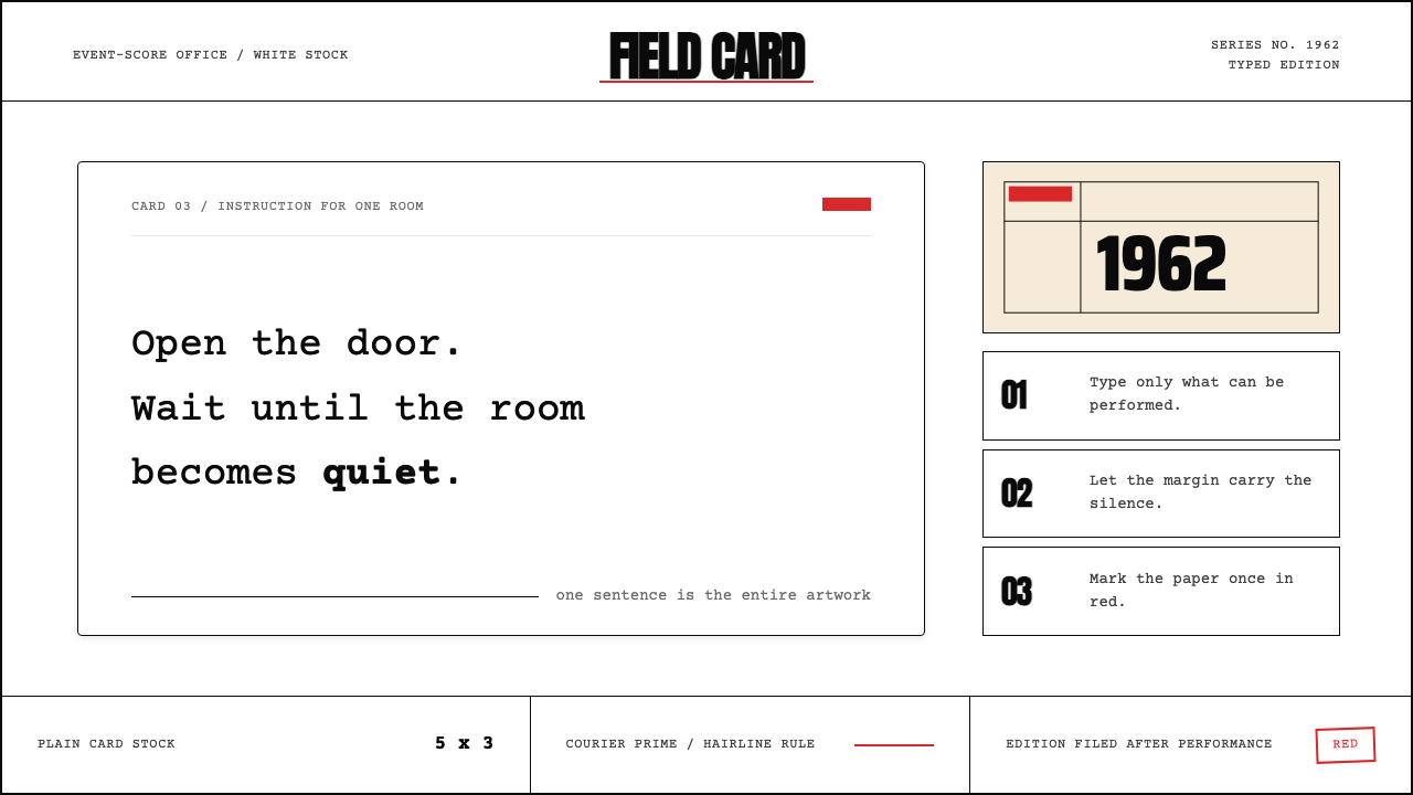 Fluxus Event Score (1962)Instruction becomes art. Courier on white card, hairline rules, one sharp red…指令即艺术:白卡上的Courier、细线框与一记红色标记。