What is Fluxus Event Score (1962)?什么是 Fluxus Event Score (1962)?
Fluxus reduced art to a single typewritten instruction — proof that a sentence on a white card could carry the full weight of an artwork.激浪派将艺术压缩为一行打字机指令——一张白卡上的一句话,足以承载一件完整作品的全部重量。
Fluxus Event Score (1962) in briefFluxus Event Score (1962) 速览
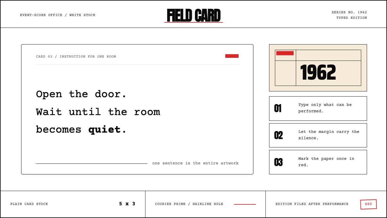
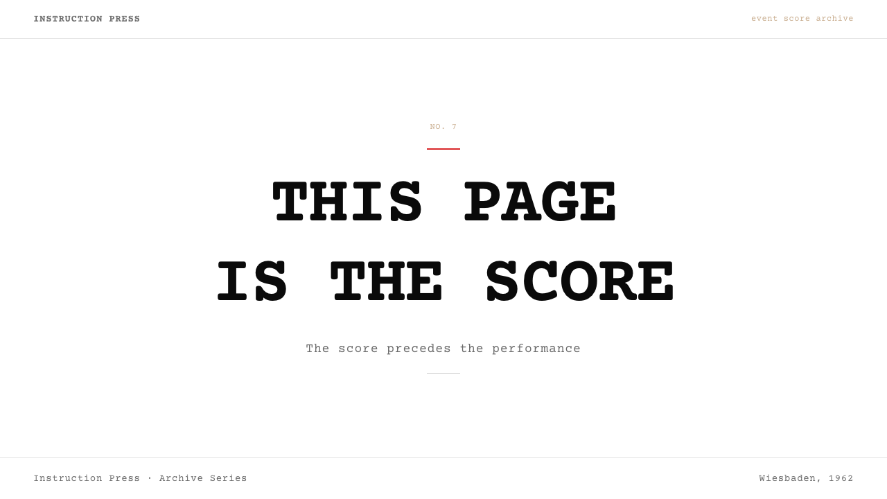
Fluxus Event Score is both a movement and a visual system born from the radical conviction that art needs no object, no gallery, no trained eye — only an instruction. An event score is typically a single sentence or short sequence of sentences typed in a monospaced typeface on a white index card or sheet of paper: 'Light a match. Watch it until it goes out.' The card is the work. The reading is the performance. The design system takes this irreducible format and transforms it into a transferable visual language.激浪派事件乐谱既是一场运动,也是一套视觉体系,根植于一种激进的信念:艺术不需要物品、不需要画廊、不需要受过训练的眼睛,只需要一条指令。事件乐谱通常是用等宽字体打印在白色索引卡或纸张上的一句话或一组短句:「划着一根火柴,注视它直到熄灭。」卡片本身就是作品,阅读就是演出。这套设计系统从这一不可化约的形式出发,将其转化为可移植的视觉语言。
The aesthetic vocabulary is deliberately minimal: monospaced type on white card stock, hairline rules to separate sections, generous margins on all sides, and an almost total restriction of color to black ink with rare, emphatic marks in a sharp, saturated red. There are no illustrations, no decorative borders, no gradation of tone. Every element on the page is functional — it is either language or structure, instruction or division. Anything that cannot justify its presence as one of these things does not appear.它的美学词汇刻意简洁:白色卡纸上的等宽字体,细线分隔各部分,四周宽裕留白,色彩几乎完全限于黑色油墨,偶有一记鲜明、饱满的红色标记作为强调。没有插图,没有装饰性边框,没有色调渐变。页面上的每个元素都是功能性的——它要么是语言,要么是结构;要么是指令,要么是划分。凡是无法以此证明自身存在合理性的元素,一律不出现。
What makes the Fluxus Event Score system distinctive is the weight it places on white space and the authority it gives to plainness. The monospaced typeface carries the deliberate impersonality of bureaucratic or scientific documents — yet in this context that impersonality becomes a form of radical democracy. No element asserts status above another. The instruction addresses anyone equally. The page withholds beauty in order to insist that the action described is itself the beautiful thing.激浪派事件乐谱系统的独特之处,在于它赋予留白的分量,以及它给予朴素本身的权威。等宽字体承载着官僚文件或科学报告的刻意非个人性——然而在这一语境中,这种非个人性却成为激进民主的一种形式。没有任何元素主张高于其他元素的地位,指令平等地面向任何人。页面克制美感,是为了坚持:被描述的那个行动本身,才是美丽的事物。
See the Fluxus Event Score (1962) design system查看 Fluxus Event Score (1962) 完整设计系统
Where does Fluxus Event Score (1962) come from?Fluxus Event Score (1962) 从何而来?
The Fluxus network was coined as a term in 1961 by Lithuanian-American artist and designer George Maciunas, who was living in New York and working as a graphic designer. He envisioned Fluxus not as a style but as a strategy: a collective of international artists, composers, and poets who would dissolve the boundaries between art forms and between art and everyday life. The word itself — from the Latin for flow, flux, and change — captured the movement's resistance to fixed categories. Maciunas's first major act was organizing the International Fluxus Festival in Wiesbaden, Germany, in September 1962, which is conventionally taken as the movement's public birth.激浪派这一名称由立陶宛裔美国艺术家兼设计师乔治·马修纳斯于1961年创造,当时他居住在纽约,以平面设计为业。他对激浪派的构想不是一种风格,而是一种策略:一个由国际艺术家、作曲家和诗人组成的集体,旨在消解艺术形式之间的边界,以及艺术与日常生活之间的边界。这个名称本身——源于拉丁语中表示流动、涌动与变化的词根——捕捉了运动对固定分类的抵制。马修纳斯的第一项重大行动是于1962年9月在德国威斯巴登组织了国际激浪派艺术节,这通常被视为该运动的公开诞生。
The event score as a format emerged directly from the influence of American composer John Cage, whose class at the New School for Social Research in New York between 1957 and 1959 became a crucible for what would become Fluxus. Cage's students — among them George Brecht, Allan Kaprow, and Dick Higgins — were taught to think of sound events as open instructions rather than fixed compositions. George Brecht began publishing his 'event scores' on small cards in the early 1960s: concise poetic instructions like 'Two signs. / Smell / No Smell.' Yoko Ono's 1964 book Grapefruit, composed entirely of instruction pieces, became perhaps the most famous product of this approach and helped introduce it to mass audiences.事件乐谱这一形式直接源于美国作曲家约翰·凯奇的影响。凯奇1957至1959年间在纽约社会研究新学院开设的课程,成为日后演变为激浪派的思想熔炉。他的学生——其中包括乔治·布莱希特、艾伦·卡普罗和迪克·希金斯——被教导将声音事件视为开放性指令而非固定乐谱。乔治·布莱希特在1960年代初开始将「事件乐谱」印在小卡片上出版:简洁而富有诗意的指令,如「两个标牌。/ 气味 / 无气味。」小野洋子1964年出版的《葡萄柚》全部由指令性作品构成,成为这一方式最广为人知的产物,并帮助将其介绍给大众。
Maciunas himself was the movement's primary typographer and graphic designer. His approach to layout was shaped by his commercial design training and by his interest in Soviet Constructivism and Dadaist typography. He designed the visual format — the Fluxus 'house style' — for the event score cards, publications, and multiples that the network produced throughout the 1960s and 1970s: Courier or another monospaced typeface, horizontal rules, white grounds, occasional red marks. This was not an arbitrary style choice but a philosophical one: the impersonal, clerical appearance of the typewriter was itself a statement against the precious, hand-crafted object of traditional art.马修纳斯本人是这场运动的首席字体设计师与平面设计师。他的版面处理方式受到其商业设计训练的塑造,也受到苏联构成主义和达达主义排版的影响。他为整个1960和1970年代激浪派网络出版的事件乐谱卡片、出版物与复数版本设计了视觉格式——激浪派的「统一风格」:Courier或其他等宽字体、水平线、白色底面、偶尔的红色标记。这不是任意的风格选择,而是哲学上的选择:打字机那种非个人化的、文书气质的外观,本身就是对传统艺术中珍贵手工作品的宣战。
The movement's centers shifted between New York, Wiesbaden, and Tokyo, and its participants included figures working in music, performance, film, and visual art across Europe, North America, and Japan. Alison Knowles contributed domestic event scores — instructions involving beans, sandwiches, and everyday household acts — that grounded the form in material life. Nam June Paik, later famous as a video artist, was present at the first Wiesbaden festival and contributed to the blurring of music, performance, and object. The movement remained active through the 1970s, and Maciunas continued producing Fluxus publications and editions until his death in 1978, after which the format passed into the broader history of conceptual art and intermedia practice.运动的中心在纽约、威斯巴登与东京之间转移,参与者包括跨越欧洲、北美与日本的音乐、表演、电影和视觉艺术工作者。艾利森·诺尔斯贡献了以豆子、三明治和日常家务行为为内容的家居事件乐谱,将这一形式锚定于物质生活。后来以录像艺术著名的白南准出席了第一届威斯巴登艺术节,并为音乐、表演与物件的界限消融做出了贡献。运动持续活跃至1970年代,马修纳斯坚持出版激浪派刊物与版本作品,直至1978年辞世。此后,这一形式进入了观念艺术与跨媒介实践的更广泛历史。
What defines the Fluxus Event Score (1962) look?Fluxus Event Score (1962) 的视觉特征是什么?
Monospaced Typography等宽字体排印
The defining typographic choice of the event score is the monospaced face — Courier being the canonical example — which carries the deliberate impersonality of the typewriter. Each character occupies the same horizontal width, producing an even, grid-like rhythm that resists expressiveness and signals that the text is instruction rather than authorial voice. Type size is modest and consistent; there is no headline hierarchy in the conventional sense, only the instruction itself, set at a single measured weight.事件乐谱最具决定性的排版选择是等宽字体——Courier是典型代表——它承载着打字机刻意的非个人性。每个字符占据相同的横向宽度,产生均匀的、网格式的节奏,抵制表达性,并示意这段文字是指令而非作者的声音。字号克制而统一;没有惯常意义上的标题层级,只有指令本身,以单一经过测量的字重排列。
White Ground and Generous Margins白色底面与宽裕留白
The page or card is white — not off-white or cream, but a clean, uncoated white that recalls clerical paper and index cards. Margins are deliberately wide relative to the text block, giving the instruction a quality of isolation that amplifies its weight. The white space is not empty but active: it is the silence before and after the instruction, the equivalent of the pause in a musical score. This use of space prevents the eye from treating the page as dense content and instead focuses attention on the single directive.页面或卡片是白色的——不是米白或奶油色,而是一种洁净的、无涂布的白,令人联想到文书用纸和索引卡。相对于文字区块,页边距刻意留得宽阔,赋予指令一种孤立感,从而放大其重量。留白不是空洞的,而是主动的:它是指令前后的静默,相当于乐谱中的停顿。这种对空间的运用使视线无法将页面当作密集内容来处理,而是将注意力聚焦于那条单一的命令。
Hairline Rules as Structural Division细线作为结构划分
Where division between sections is needed, the event score uses a hairline rule — the thinnest printed line possible — rather than any decorative separator. The rule is structural, not ornamental: it marks a boundary without adding visual weight. In multi-part scores, hairline rules separate individual instructions from titles, dates, or labels. Their fineness reinforces the economy of the entire system: every mark on the page is the minimum necessary mark.需要划分段落时,事件乐谱使用细线——印刷所能实现的最细线条——而非任何装饰性分隔符。细线是结构性的,而非装饰性的:它标记边界,但不增加视觉重量。在多段乐谱中,细线将各条指令与标题、日期或标签分开。其纤细程度强化了整套系统的经济原则:页面上的每一处标记,都是必要的最小标记。
Fluxus Red as the Single Accent激浪红作为唯一强调色
The palette is almost entirely achromatic — black type on white ground — with one exception: a sharp, saturated red that appears sparingly and with deliberate purpose. This red is not decorative but emphatic; it might mark a title, a number, a critical word, or a section divider. Its scarcity is what gives it force. Against the austerity of the black-and-white field, a single red mark reads as urgent, as an alarm, as the one moment when the instruction raises its voice. No other color appears.色调几乎完全是无彩色的——白底上的黑色文字——唯有一个例外:一记鲜明、饱满的红色,以克制且有明确目的的方式出现。这种红色不是装饰性的,而是强调性的;它可能标记标题、编号、关键词或段落分隔。正是它的稀缺性赋予了它力量。在黑白底面的简朴衬托下,一处红色标记读来如紧迫信号、如警报、如指令唯一一次提高声音的时刻。不出现其他颜色。
Instruction as the Sole Content指令作为唯一内容
No illustration, no photograph, no decorative device accompanies the text. The instruction is the entire content of the piece. This formal decision is also a philosophical statement: representation is unnecessary when the language is precise enough. The absence of imagery forces the reader to supply the scene mentally, transforming the score into a collaborative act. Any design application drawing on this system inherits that discipline — if an element does not contribute to the instructional function of the page, it does not belong.文字之外没有插图、没有摄影、没有装饰性装置。指令是作品的全部内容。这一形式上的决定同时也是一项哲学声明:当语言足够精确,再现便是多余的。图像的缺席迫使读者在脑中构建场景,将乐谱转化为一种协作行为。任何借鉴这套系统的设计应用都继承了这种自律——如果一个元素对页面的指令性功能没有贡献,它就不应存在。
Democratic Impersonality民主性的非个人化
The event score's format is deliberately impersonal: it looks like a memo, a label, a form. This impersonality is a political choice. Traditional fine art was marked by the artist's hand — brushwork, gesture, signature style — which conferred uniqueness and market value. The Fluxus score removes all of this. Any typewriter could have produced it; any person can perform it. The design system carries this democratic quality: no flourish signals the designer's presence, no craft element asserts specialness. The work belongs to whoever reads and enacts it.事件乐谱的格式刻意是非个人化的:它看起来像备忘录、标签或表格。这种非个人化是一种政治选择。传统纯艺术以艺术家之手为标志——笔触、姿态、个人风格——这赋予了作品唯一性与市场价值。激浪派乐谱去除了这一切。任何打字机都可能产生它;任何人都可以执行它。这套设计系统携带着这种民主品质:没有任何花饰示意设计师的在场,没有任何工艺元素主张其特殊性。作品属于阅读并付诸实施它的任何人。
Economy and Compression经济性与压缩感
The event score achieves its power through radical compression: a complete artwork contained in one to three sentences, an entire visual system expressed in fewer than five design decisions. This economy is not a limitation but a demonstration — proof that the smallest unit of language, presented with sufficient clarity and intention, can activate the imagination fully. In design terms, this means every decision is load-bearing. There is no background noise, no supporting cast, no ambient texture. What remains after compression is what matters.事件乐谱通过极度压缩实现其力量:一件完整的艺术作品浓缩于一到三句话,整套视觉系统以不超过五个设计决策来表达。这种经济性不是局限,而是一种示范——证明最小的语言单位,以足够的清晰度与意图呈现,能够充分激活想象力。在设计层面,这意味着每个决定都是承重的。没有背景噪音,没有配角,没有环境质感。压缩之后留下的,才是重要的。
See the Fluxus Event Score (1962) design system查看 Fluxus Event Score (1962) 完整设计系统
Who shaped Fluxus Event Score (1962)?谁塑造了 Fluxus Event Score (1962)?
Maciunas was the organizer, publisher, and graphic designer of Fluxus — the figure who gave the movement its name, its house style, and its institutional infrastructure. A trained architect and graphic designer, he developed the visual vocabulary of event score cards, Fluxus editions, and collective publications from 1961 until his death in 1978. His design decisions — monospaced type, white grounds, hairline rules, the occasional red mark — were not decorative preferences but philosophical positions about the relationship between art, labor, and everyday objects. He also organized or co-organized the major early Fluxus festivals in Wiesbaden, New York, and elsewhere, securing the network's international reach.马修纳斯是激浪派的组织者、出版人与平面设计师——正是他赋予了这场运动其名称、统一风格与机构架构。作为受过专业训练的建筑师与平面设计师,他从1961年至1978年辞世,持续为事件乐谱卡片、激浪派版本与集体出版物开发视觉词汇。他的设计决策——等宽字体、白色底面、细线、偶尔的红色标记——不是装饰性偏好,而是关于艺术、劳动与日常对象之间关系的哲学立场。他还组织或协同组织了威斯巴登、纽约等地的主要早期激浪派艺术节,确立了这一网络的国际影响力。
Brecht is credited with crystallizing the event score as a form. A former chemist turned artist, he attended John Cage's legendary New School class and began publishing his 'Water Yam' card scores in the early 1960s — concise printed cards containing minimal instructions for events, actions, and observations. His scores are models of compression: often a single word or phrase, a list of two or three items, or a simple binary ('on / off'). Brecht's approach established that the event score did not need to describe complex actions — the simplest possible instruction, presented with formal precision, was sufficient.布莱希特被认为是事件乐谱这一形式的结晶者。这位前化学家转型为艺术家后,修读了约翰·凯奇那堂传奇性的新学院课程,并在1960年代初开始出版他的「水山」卡片乐谱——印有简洁事件、行为与观察指令的极简卡片。他的乐谱是压缩性的典范:往往是一个词或短语、两到三项的列表,或简单的二元对立(「开/关」)。布莱希特的方式确立了一个原则:事件乐谱无需描述复杂的行动——以形式上的精确呈现最简单的可能指令,便已足够。
Ono's 1964 book Grapefruit, a collection of instruction pieces spanning music, painting, event, and film, became the most widely read artifact of the event score tradition and helped translate Fluxus sensibilities to a global audience. Her instructions range from the intimate ('Touch me somewhere' instructions for audience interaction) to the durational ('Carry a bag of peas. Leave a pea wherever you go.') to the cosmic ('Draw a map to get lost.'). Ono's work demonstrates the breadth of the form and its capacity to carry humor, tenderness, and political charge within the same minimal typographic container.小野洋子1964年出版的《葡萄柚》——一本涵盖音乐、绘画、事件与电影的指令作品集——成为事件乐谱传统中流传最广的文献,并帮助将激浪派的感性传递给全球受众。她的指令从亲密性的(邀请观众互动的「触碰我某处」指令)到持续性的(「带一袋豌豆,走到哪里就留下一颗」)再到宇宙性的(「画一张迷路用的地图」)。小野洋子的作品展示了这一形式的广度,以及它在同一简约字体容器内承载幽默、温柔与政治力量的能力。
Knowles was a founding member of Fluxus and one of the few women central to its early history. Her event scores focus on the domestic, the sensory, and the participatory — most famously her 'Make a Salad' (1962), which has been performed in concert halls, art spaces, and public squares worldwide for over six decades. Knowles grounds the event score in material reality, emphasizing texture, smell, and physical action as legitimate artistic content. Her work demonstrates that the Fluxus system is not cold or conceptually remote but capable of warmth, community, and shared experience.诺尔斯是激浪派的创始成员之一,也是少数几位在早期历史中居于核心的女性艺术家。她的事件乐谱聚焦于日常、感官与参与性——最著名的是1962年的《制作一份沙拉》,六十余年来已在音乐厅、艺术空间和公共广场全球各地演出。诺尔斯将事件乐谱锚定于物质现实,强调质感、气味与身体行为作为合法的艺术内容。她的作品证明了激浪派系统并非冷漠或观念上遥不可及,而是能够承载温暖、社群感与共同体验。
Though not formally a Fluxus member, Cage is the intellectual godfather of the event score. His classes at the New School for Social Research (1957–1959) and his theoretical writings — particularly 'Silence' (1961) — established the conceptual framework within which event scores became possible: that music is organized sound and silence, that chance operations are valid compositional tools, and that the boundary between art and life is arbitrary. His 4'33'' (1952), a silent composition consisting entirely of the instruction to not play for four minutes and thirty-three seconds, is the originating event score, predating Fluxus by nearly a decade.尽管并非正式的激浪派成员,凯奇却是事件乐谱的思想教父。他在社会研究新学院的课程(1957—1959年)及其理论著作——尤其是《沉默》(1961年)——建立了使事件乐谱得以成为可能的概念框架:音乐是组织化的声音与沉默;偶然性操作是合法的作曲工具;艺术与生活之间的边界是任意的。他的《4分33秒》(1952年)——一部完全由「不演奏四分三十三秒」这条指令构成的沉默乐曲——是最原初的事件乐谱,比激浪派的诞生早了将近十年。
How do you use Fluxus Event Score (1962) today?今天怎么用 Fluxus Event Score (1962)?
The Fluxus Event Score system is exceptionally well-suited to contexts where authority, precision, and conceptual clarity are the desired signals — and where conventional design 'richness' would undermine rather than support the message. Applying it correctly requires internalizing its core discipline: every element must justify its presence as either language or structure. If it is neither, it does not belong on the page.激浪派事件乐谱系统极为适合那些以权威性、精确性与观念清晰度为目标信号的语境——在这些语境中,惯常的设计「丰富性」会削弱而非支撑信息。正确应用它需要内化其核心自律:每个元素都必须将自身证明为语言或结构之一。若两者皆非,它便不属于这个页面。
For presentation slides, the system works best when the content itself is instruction-like: step-by-step processes, principles, frameworks, or rules. A cover slide in this style uses a large monospaced title on a white ground, optionally with a single hairline rule below it and a minimal date or category label. Content slides present one to three items per page, typeset in a monospaced or near-monospaced face, with generous surrounding white space. A single red mark — a number, a bullet, a line — can anchor the hierarchy without competing with the text. Data slides take on the quality of lab reports or research printouts: tabular, ruled, and achromatic except for one accent element that draws the eye to the key figure.对于演示文稿,这套系统在内容本身具有指令性时效果最佳:分步流程、原则、框架或规则。这种风格的封面页在白色底面上呈现一个大号等宽字体标题,可选地在其下方添加一条细线,以及简洁的日期或类别标签。内容页每页呈现一到三个条目,以等宽或近等宽字体排印,四周留有充裕的白色空间。一处红色标记——数字、项目符号或线条——可以锚定层级,而不与文字竞争。数据页呈现出实验报告或研究打印件的气质:表格化、有线条规划、无彩色,仅有一处强调元素将视线引向关键数据。
For web interfaces, this visual language is particularly powerful for products that want to communicate precision, methodology, or intellectual rigor — developer tools, research platforms, legal or compliance interfaces, and documentation systems. The approach: near-white or pure white background, a single monospaced or geometric typeface throughout, black for all body text, hairline borders on cards and input fields rather than soft shadows, and the saturated red reserved for alerts, required fields, or critical-path interactions. Navigation is typographic; icons, if any, are geometric and minimal. The absence of decorative imagery is a feature, not a gap.对于网页界面,这套视觉语言对于想要传递精确性、方法论或智识严谨性的产品特别有力——开发者工具、研究平台、法律或合规界面,以及文档系统。方法如下:近白或纯白背景,全程使用单一等宽或几何字体,所有正文用黑色,卡片与输入框使用细线边框而非柔和投影,饱满的红色保留用于警示、必填字段或关键路径交互。导航是字体性的;图标若有,也是几何而极简的。装饰性图像的缺席是一个特性,而非缺口。
For editorial and marketing work, the event score system excels when the message itself is the product — manifestos, principles pages, open letters, or any content where the words need to carry full weight without visual support. A Fluxus-derived editorial layout treats the page as a card: one instruction or argument per section, section breaks marked by a hairline rule, no pull-quote ornamentation, no sidebars filled with imagery. Marketing applications work when the brand is willing to let plainness be the provocation — a product page that offers a numbered list of commitments on white, with one red accent on the most important line, communicates a different kind of confidence than a richly visual brand page.对于编辑与营销内容,事件乐谱系统在信息本身就是产品时表现最佳——宣言、原则页、公开信,以及任何文字需要在不借助视觉支撑的情况下独自承担全部重量的内容。激浪派风格的编辑版面将页面当作卡片处理:每个段落只承载一条指令或论点,段落分隔以细线标记,无引文装饰,无充斥图像的侧边栏。当品牌愿意以朴素本身作为挑衅时,营销应用也能奏效——一个在白底上呈现编号承诺列表、以一处红色强调最重要那一行的产品页面,传递出与视觉丰富的品牌页面截然不同的自信。
A common mistake when applying this system is mistaking austerity for emptiness and filling the page with additional elements to compensate for the absence of decoration. The white space in event score design is not a problem to be solved — it is the solution. A second frequent error is using the monospaced typeface as a stylistic affectation while retaining conventional visual hierarchy signals: soft shadows, multiple colors, gradient fills. These undermine the system's logic entirely. The Fluxus aesthetic works only when the restraint is total: one typeface, one accent color, no gradients, no decoration. Half-measures produce pastiche.应用这套系统时最常见的错误,是将简朴误认为空洞,并用额外元素来填补缺少装饰的空间。事件乐谱设计中的留白不是需要解决的问题——它本身就是解决方案。第二个常见错误是将等宽字体作为风格性修辞使用,同时保留惯常的视觉层级信号:柔和投影、多种颜色、渐变填充。这些做法彻底破坏了系统的逻辑。激浪派美学只有在克制是全面的时候才能奏效:一种字体,一种强调色,无渐变,无装饰。半途而废只会产生拙劣的模仿。
See the Fluxus Event Score (1962) design system查看 Fluxus Event Score (1962) 完整设计系统
Fluxus Event Score (1962) — FAQFluxus Event Score (1962) · 常见问题
Is Fluxus Event Score the same as minimalism?激浪派事件乐谱与极简主义是同一回事吗?
They share a commitment to reduction but differ fundamentally in purpose. Minimalism as a visual style — in contemporary design or in the fine art movement of the 1960s — is concerned with the aesthetic experience of reduction itself: the satisfaction of the spare, the elegant, the carefully composed absence. Fluxus austerity is not aesthetic but ideological. The page is stripped because decoration is a lie — because the appearance of craft and luxury in art is a form of social gatekeeping. The minimal Fluxus page is not beautiful on purpose; it is impersonal on purpose. When applying the style, this distinction matters: a Fluxus-derived design that is too polished or too considered starts to look like minimalism, losing the democratic roughness that gives the original its charge.两者都致力于减法,但目的根本不同。作为视觉风格的极简主义——无论是在当代设计还是在1960年代的艺术运动中——关注的是减法本身的美学体验:稀疏、优雅、精心构建的缺席所带来的满足感。激浪派的简朴不是美学上的,而是意识形态上的。页面被剥光,是因为装饰是一种谎言——因为艺术中精工制作与奢华感的外观,是一种社会性的设门槛行为。激浪派的极简页面不是刻意美丽的;它是刻意非个人化的。在应用这种风格时,这一区分至关重要:一个过于精致或过于经过推敲的激浪派衍生设计会开始像极简主义,从而失去原作赋予其力量的那种民主性的粗粝感。
Can this system work in a color-forward brand context?这套系统能在色彩主导的品牌语境中运作吗?
The event score system depends on the near-total absence of color for its impact. Introducing a second or third accent color does not merely dilute the effect — it dismantles the logic entirely. The red mark reads as urgent precisely because nothing else on the page is red. If you add a blue and a green for secondary meanings, the red becomes just another color and the urgency disappears. A brand that requires a full color system should look elsewhere. However, the structural principles — monospaced type, white ground, hairline rules, generous margins, no decoration — can be applied as a typographic framework even if the accent color is drawn from the brand palette rather than Fluxus red. The key constraint is that there must be only one.事件乐谱系统的力量依赖于色彩的近乎完全缺席。引入第二或第三种强调色不仅仅会稀释效果——它会彻底瓦解系统的逻辑。红色标记之所以读来如紧迫信号,正是因为页面上没有其他任何东西是红色的。一旦你为次要含义添加蓝色和绿色,红色就只是另一种颜色,紧迫感随之消失。需要完整色彩系统的品牌应另寻其他风格。然而,结构性原则——等宽字体、白色底面、细线、宽裕留白、无装饰——即使将强调色替换为品牌色板中的颜色而非激浪红,也可以作为排版框架加以应用。关键约束是:强调色必须只有一种。
How do you handle imagery in this system?在这套系统中如何处理图像?
The canonical answer is: you do not. The event score is a text-only medium by design, and its power depends on that restriction. In practical design applications — where some imagery may be unavoidable — the closest equivalent is a high-contrast reproduction: a black-and-white photograph or diagram treated as a flat geometric element, cropped tightly, without soft vignettes or naturalistic gradients. The image should feel like a document scan or a technical illustration rather than an editorial photograph. What the system cannot accommodate is warm, atmospheric, or stylistically rich imagery — lifestyle photography, illustrated figures, or any image that competes with the text for emotional weight.经典答案是:不使用图像。事件乐谱从设计上就是纯文字媒介,其力量依赖于这种限制。在可能不可避免地需要某些图像的实际设计应用中,最接近的等价处理是高对比度复制:黑白照片或图表被当作平面几何元素处理,紧密裁切,没有柔和的晕影或自然主义渐变。图像应该感觉像文件扫描件或技术示意图,而非编辑摄影作品。这套系统无法容纳的,是温暖的、氛围性的或风格丰富的图像——生活方式摄影、插图人物,或任何在情感重量上与文字形成竞争的图像。
What kinds of products or contexts is this system poorly suited to?这套系统不适合哪类产品或语境?
The Fluxus Event Score aesthetic is a poor fit for any context where warmth, sensory pleasure, or visual accessibility are primary values. Consumer products aimed at broad audiences — food, wellness, fashion, entertainment, children's products — depend on imagery, color warmth, and the kinds of visual richness that this system explicitly refuses. The style can also read as cold, clinical, or exclusionary to audiences unfamiliar with conceptual art contexts, making it risky for consumer-facing emotional touchpoints. Additionally, the system's reliance on monospaced type creates legibility considerations at small sizes and on lower-resolution screens — it is a deliberate typographic constraint that rewards careful attention, which is an asset in some contexts and a liability in others.激浪派事件乐谱的美学不适合任何以温暖感、感官愉悦或视觉可及性为首要价值的语境。面向广泛受众的消费品——食品、健康、时尚、娱乐、儿童产品——依赖于图像、色彩温暖感,以及这套系统明确拒绝的那种视觉丰富性。这种风格对不熟悉观念艺术语境的受众来说,也可能显得冷漠、临床化或具有排他性,使其在面向消费者的情感触点上风险较高。此外,系统对等宽字体的依赖在小字号和低分辨率屏幕上带来易读性方面的考量——这是一种刻意的排版约束,奖励专注的注意力,在某些语境中是优势,在另一些语境中则是负担。
How does Fluxus Event Score relate to conceptual art more broadly?激浪派事件乐谱与更广泛的观念艺术有怎样的关联?
The Fluxus event score is one of the earliest and most direct expressions of the conceptual art proposition that the idea is the work — that physical execution is secondary or optional. Sol LeWitt's wall drawings, Lawrence Weiner's language pieces, and the entire tradition of instruction-based art that followed in the 1960s and 1970s are all in dialogue with the event score format. What distinguishes the Fluxus contribution is its emphasis on performance, participation, and humor — the instruction is meant to be enacted, often in public, often by non-specialists. Where later conceptual art often maintained the institutional frame of the gallery and the critical apparatus of the art world, Fluxus specifically worked to dismantle both. The visual system reflects this: the index card is available anywhere, printable by anyone, readable without training.激浪派事件乐谱是观念艺术命题——创意即作品,物理执行是次要的或可选的——最早期也最直接的表达之一。索尔·勒维特的墙面绘画、劳伦斯·韦纳的语言作品,以及1960和1970年代其后的整个指令性艺术传统,都与事件乐谱形式处于对话之中。激浪派贡献的独特之处在于其对表演、参与和幽默的强调——指令是为了被付诸实施而存在的,通常在公共场合,通常由非专业人士进行。后来的观念艺术往往维持着画廊的机构框架和艺术界的批评装置,而激浪派则明确致力于瓦解两者。这套视觉系统反映了这一点:索引卡随处可得,任何人都可以打印,无需训练即可阅读。
Related design styles相关设计风格
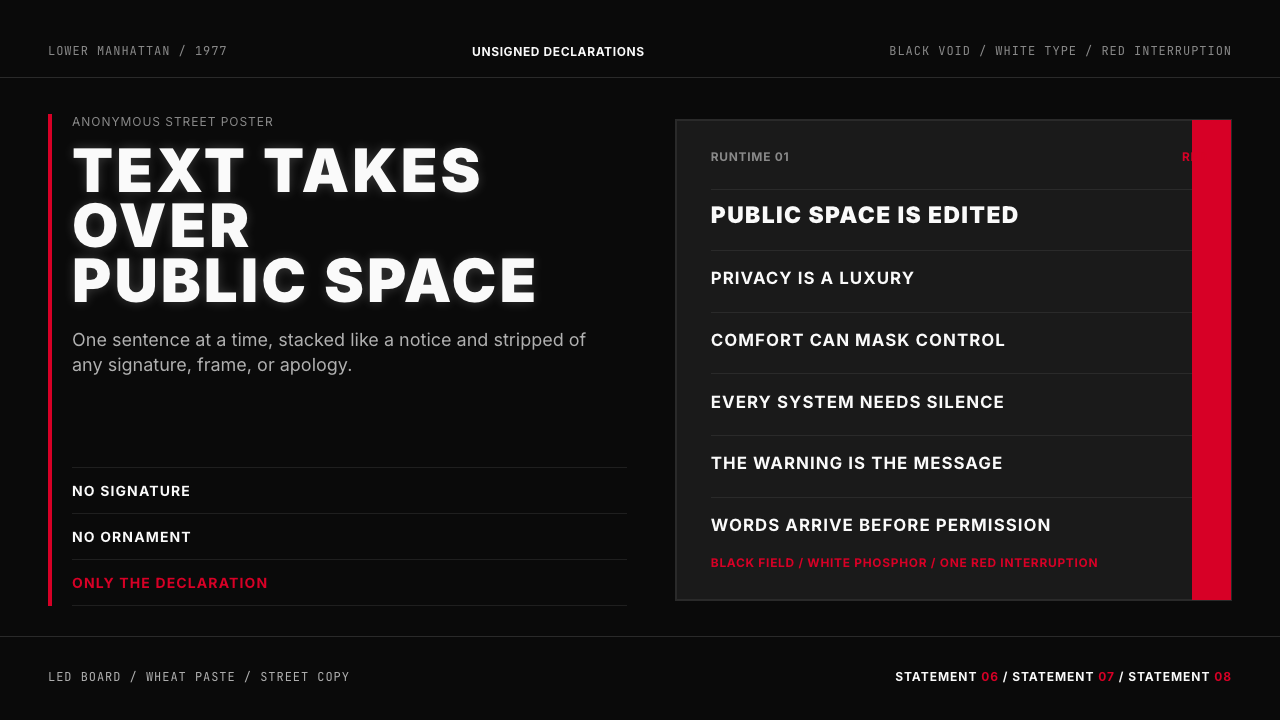 Jenny Holzer Truisms (1977)Austere declarations. White all-caps on black, cut by a single red warning.克制宣言。黑底白字,全大写排成LED板,红色只作警示。
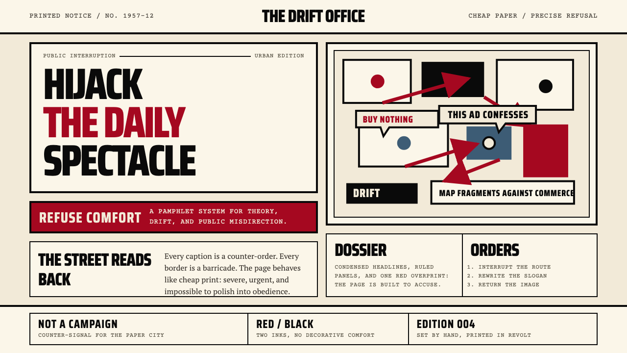 Situationist International (Debord, 1957)Agitation becomes structure. Red-black blocks and condensed type weaponize ne…煽动化为结构。红黑块面与压缩字体把新闻纸变成武器。
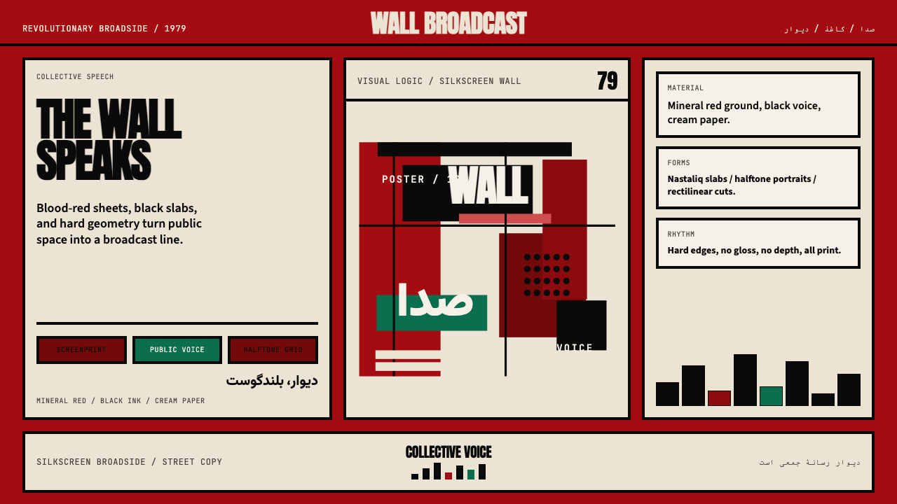 Iranian Revolution Poster (1979)Collective voice in ink. Blood red, black slabs, and hard screenprint geometr…集体之声凝成油墨海报。血红、黑色字块与硬边丝网几何。
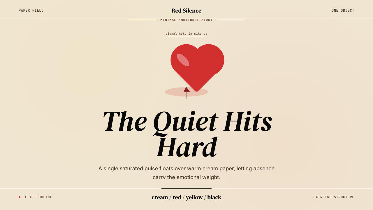 Kanye — 808s & HeartbreakGrief in restraint. Cream paper, one red heart, yellow heat, and a black hair…克制承载悲伤:奶油纸、红心、热黄与黑色细线。
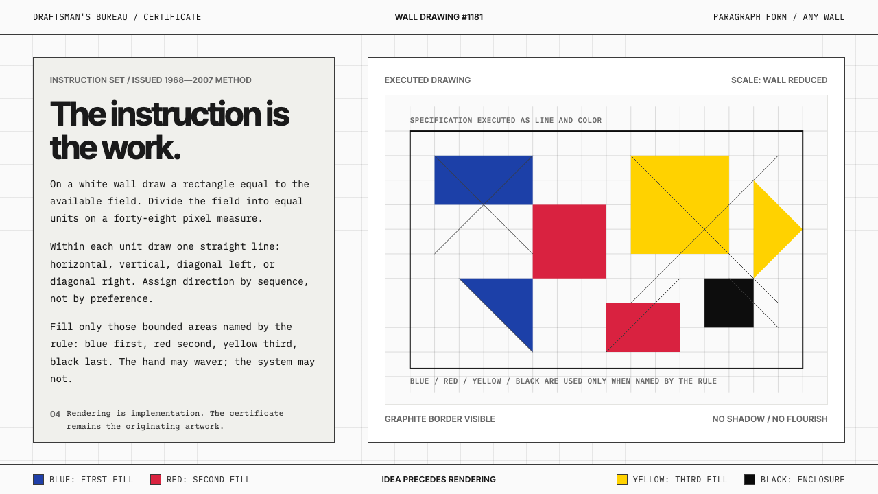 Sol LeWitt ConceptualInstruction becomes art. Mono certificates face wavering graphite grids in fo…指令即艺术:等宽证书对照颤动石墨网格与四色规则。
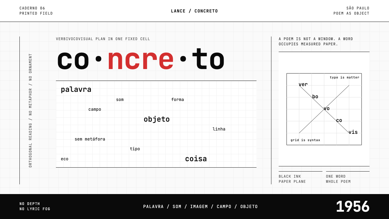 Brazilian Concrete PoetryWords become objects. Monospace cells, black-white paper, one cadmium red rup…字成为物。等宽格、黑白纸面,一处镉红断裂。