What is Iranian Revolution Poster (1979)?什么是 Iranian Revolution Poster (1979)?
Ink on walls, fists in the air — the Iranian Revolution poster turned Tehran's streets into a gallery of collective fury and faith.油墨印上城墙,拳头举向天空——伊朗革命海报将德黑兰的街道变成了集体愤怒与信仰的画廊。
Iranian Revolution Poster (1979) in briefIranian Revolution Poster (1979) 速览
The Iranian Revolution poster is a form of mass communication born from crisis. Between 1978 and 1979, as the Pahlavi monarchy collapsed and a new Islamic republic rose in its place, an urgent visual language spread across the walls of Tehran, Qom, Mashhad, and Isfahan. Silkscreened by the thousands, these broadsides fused Persian calligraphic tradition with the hard, flat geometry of Soviet Constructivism and Cuban revolutionary print culture. The result was something neither purely Eastern nor Western, but entirely its own — a system forged in the heat of political rupture.伊朗革命海报是一种诞生于危机之中的大众传播形式。1978至1979年间,巴列维王朝崩溃,新的伊斯兰共和国随之崛起,一种紧迫的视觉语言蔓延至德黑兰、库姆、马什哈德与伊斯法罕的城墙之上。这些以丝网印刷大量复制的传单,将波斯书法传统与苏联构成主义和古巴革命版画的硬朗几何熔为一体,催生出一种既非纯东方、也非纯西方的语言——完全属于自身,在政治断裂的熔炉中锻造而成。
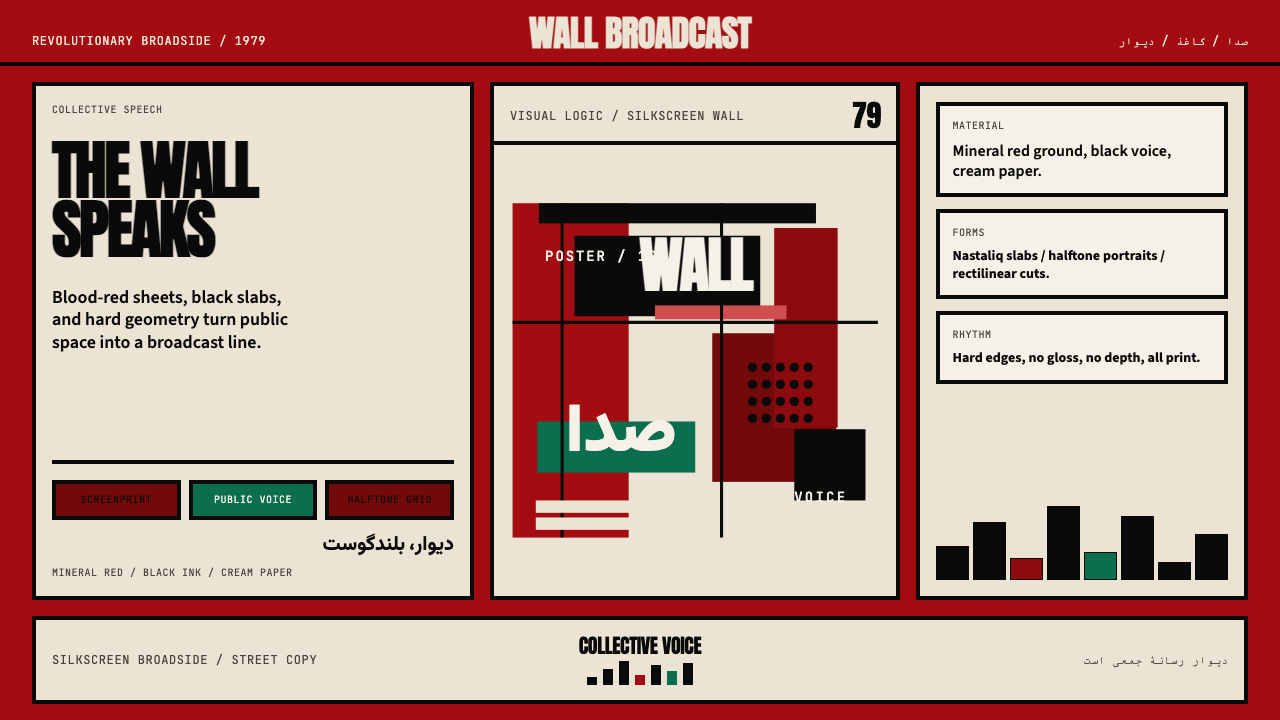
At its heart, the style is built on confrontation and clarity. The palette is restricted to a small number of charged colors: blood mineral red as the ground of sacrifice and revolution, deep black for declaration and mass, and a warm newsprint cream that reads as the material of the broadside itself. Color carries political weight here — each hue is not a design choice but a statement. Imagery is bold and halftone, drawn from the vocabulary of martyrdom: portrait silhouettes, clenched fists, rifles raised at angles that cut diagonally through the composition. Typography is equally declarative, using the sweeping angular rhythms of Nastaliq calligraphy as slabs of visual weight rather than as delicate ornament.从根本上说,这种风格建立于对抗与清晰之上。色板被限制在数种带有强烈情感负载的颜色之内:血矿红作为牺牲与革命的底色,深黑用于宣言与群众的力量,温暖的新闻纸米色则读作传单本身的物质肌理。色彩在这里承载政治分量——每种色调不是设计选择,而是一种表态。图像以粗犷的半色调呈现,来自殉道的视觉词汇:肖像剪影、握紧的拳头、以斜角切穿构图的举起的步枪。字体同样具有宣言性,将纳斯塔利格书法宽阔流动的笔势用作视觉重量的字块,而非精致的装饰。
What distinguishes this system from mere propaganda imagery is its formal discipline. The compositions are not chaotic; they are tightly organized around diagonal axes and geometric blocks. The influence of international revolutionary print culture — the Soviet poster, the Cuban OSPAAAL broadside — is visible in the confidence with which flat shapes are layered and in the way negative space is used as a weapon of emphasis. This is not accidental: Iran's designers in this period were deeply aware of global revolutionary aesthetics and absorbed them into a distinctly Persian visual grammar.使这套系统与单纯的宣传图像相区别的,是其形式上的自律。构图并非混乱的——它们被牢牢组织在对角轴线与几何块面之上。国际革命版画文化的影响——苏联海报、古巴OSPAAAL传单——在平面形体的叠压方式以及负空间作为强调武器的使用方式上清晰可见。这并非偶然:这一时期伊朗的设计师对全球革命美学有着深刻的自觉,并将其吸纳进一套鲜明的波斯视觉文法之中。
See the Iranian Revolution Poster (1979) design system查看 Iranian Revolution Poster (1979) 完整设计系统
Where does Iranian Revolution Poster (1979) come from?Iranian Revolution Poster (1979) 从何而来?
The visual culture of the 1979 Iranian Revolution did not emerge from nothing. Iran in the 1960s and 1970s had a vibrant, cosmopolitan design scene shaped by contact with European modernism and, from the late 1960s onward, by the global wave of protest graphics triggered by 1968. Iranian students studying abroad in Europe returned with exposure to the Swiss International Style and the radical poster culture of May 1968 Paris. At home, the fine arts faculties of Tehran University and the College of Decorative Arts produced a generation of designers fluent in both Persian classical tradition and international modernist vocabulary — a bilingual visual literacy that the revolution would put to work.1979年伊朗革命的视觉文化并非凭空而生。1960至70年代的伊朗拥有一个充满活力、兼容并蓄的设计圈,受到欧洲现代主义的浸润,并自1960年代末起被1968年全球抗议版画浪潮所激活。旅居欧洲的伊朗留学生带回了对瑞士国际风格与1968年五月巴黎激进海报文化的认知。在国内,德黑兰大学美术学院与装饰艺术学院培育了一代人——既精通波斯古典传统,又熟谙国际现代主义语汇——这种双语视觉素养,正是革命所需要的。
The immediate context was street politics. As protests against the Shah intensified through 1978, visual communication moved outdoors. Leaflets, stencils, and spray-painted slogans gave way to increasingly sophisticated silkscreened posters, which were cheaper to produce than offset lithography and fast enough to respond to events as they unfolded. The walls of Tehran became a running broadside — a daily newspaper of images. This production environment shaped the aesthetic: flat color (limited by the number of screens that could be registered and printed quickly), high contrast (for legibility at street distance and in poor light), and bold diagonal composition (for visual impact from a moving vantage point).直接的背景是街头政治。随着1978年反对国王的抗议愈演愈烈,视觉传播转向户外。传单、镂版印刷与喷涂的口号,逐渐让位于愈发精密的丝网印刷海报——其生产成本低于胶印,速度却足以追上事件展开的节奏。德黑兰的城墙成为一张流动的传单——一份每日更新的图像报纸。这种生产环境塑造了美学:平涂色块(受限于可快速套准印制的网数)、高对比度(确保在街道距离和弱光条件下的可读性)、大胆的斜向构图(对移动中的观看者具有视觉冲击力)。
Crucial to the visual output of the revolutionary period was the Howzeh Honari, or Islamic Art Center, which formalized and extended the poster tradition after 1979. This collective brought together designers, calligraphers, and printmakers under a shared organizational structure and a shared mission — to build a visual identity for the new Islamic Republic. The Howzeh became the institutional backbone of post-revolutionary graphic culture, producing work that navigated between Islamic iconographic tradition (calligraphy, geometric pattern, the arch and minaret as structural motifs) and the international revolutionary poster idiom. Its influence extended through the Iran-Iraq War of 1980 to 1988, when poster production intensified again around themes of martyrdom, national defense, and sacred duty.对革命时期视觉产出至关重要的是"艺术部"(Howzeh Honari,伊斯兰艺术中心),它在1979年之后将海报传统系统化并加以延伸。这个集体将设计师、书法家与版画家汇聚在共同的组织架构与使命之下——为新伊斯兰共和国建立视觉身份。"艺术部"成为后革命平面文化的机构骨干,其作品在伊斯兰图像传统(书法、几何纹样、拱门与宣礼塔作为结构母题)与国际革命海报语汇之间穿行。其影响延续至1980至1988年的两伊战争,海报生产在殉道、国家防御与神圣职责等主题的驱动下再度密集。
The style's two great formal debts are to Soviet Constructivism and to Cuban OSPAAAL poster design. From the Soviets, Iranian revolutionary designers took the diagonal composition, the flat primary palette, and the silhouetted heroic figure cropped hard against a charged ground. From the Cubans — whose Third World solidarity posters circulated widely in the 1970s — they took the use of rich, saturated color as political signal and the confidence of a poster culture that addressed an international audience. But these influences were filtered through a specifically Persian sensibility: Nastaliq calligraphy, which moves along a descending diagonal with thick and thin strokes that carry their own built-in dynamism, became the typographic spine of the entire system.这种风格在形式上的两大来源,是苏联构成主义与古巴OSPAAAL海报设计。伊朗革命设计师从苏联人那里汲取了斜向构图、平涂主色板与英雄人物剪影紧贴带电底色的裁切方式;从古巴人——其第三世界团结海报在1970年代广泛流传——那里汲取了以饱和色彩作为政治信号的底气,以及一种面向国际受众的海报文化自信。但这些影响经过了一种特定的波斯感性的过滤:纳斯塔利格书法以向下倾斜的对角线移动,笔画有着天然的粗细变化与内在动势,成为整个系统的字体脊梁。
What defines the Iranian Revolution Poster (1979) look?Iranian Revolution Poster (1979) 的视觉特征是什么?
Color色彩
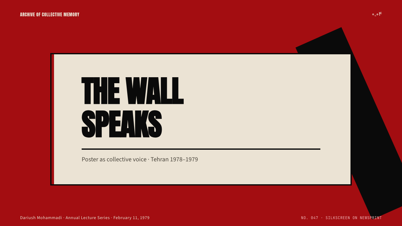
The palette is built on three charged tones: a deep mineral red that reads as blood, sacrifice, and revolutionary ground; an absolute black deployed for text, silhouette, and mass; and a warm, slightly yellowed cream that evokes the surface of newsprint and the age of the broadside. A muted olive or earth tone occasionally appears as a secondary ground for war-period work. Color is not decorative — each hue carries ideological weight. Red grounds the composition in urgency, black speaks with the authority of mass declaration, and cream locates the entire image in the material world of the printed sheet.色板建立在三种带电荷的色调之上:一种读来如血、如牺牲、如革命底色的深矿物红;一种绝对的黑,用于文字、剪影与群众的力量;以及一种温暖、略带黄意的米色,唤起新闻纸的质感与传单的历史感。战争时期的作品偶尔出现柔和的橄榄色或土色作为次级底色。色彩并非装饰性的——每种色调承载意识形态的重量。红色以紧迫感锚定构图,黑色以集体宣言的权威发声,米色将整幅图像置于印刷品的物质世界之中。
Typography字体排印
Nastaliq calligraphy is the typographic core of the system. Unlike upright scripts, Nastaliq moves along a descending diagonal from right to left, with strokes that swing from thick to thin in a rhythm that carries its own built-in visual dynamism. In revolutionary poster work, Nastaliq letterforms are treated as visual mass rather than as fine script — enlarged to occupy dominant areas of the composition, set in high contrast against the ground, and used as structural blocks that the eye reads as geometric form before it resolves into language. This dual legibility — as image and as text simultaneously — is one of the style's most distinctive qualities.纳斯塔利格书法是这套系统的字体核心。不同于竖直书写的字体,纳斯塔利格从右向左沿下降对角线移动,笔画由粗到细地摆动,具有内在的视觉动势。在革命海报作品中,纳斯塔利格字形被当作视觉质量块而非精致书法来处理——放大至占据构图的主导区域,以高对比度置于底色之上,作为结构性字块使用,眼睛在解读出语义之前先将其读作几何形态。这种双重可读性——同时作为图像与文字——是这种风格最鲜明的品质之一。
Halftone and Portrait半色调与肖像
The faces of martyrs, clerics, and revolutionary figures are reproduced in coarse halftone — dot patterns visible to the naked eye, like newsprint reproductions or offset-printed newspaper photographs. This is not a technical limitation treated as aesthetic; it is the aesthetic. The halftone grain communicates immediacy, mass reproduction, and the condition of being an image that exists in many places at once, pasted on walls across a city. Portraits are often cropped tightly, placing the face at the center of a flat geometric field, and silhouetted against the red or black ground without any atmospheric modeling.烈士、教士与革命人物的面孔以粗粒半色调再现——网点裸眼可见,如同新闻纸的图像复制或胶印报纸上的照片。这并非被当作美学处理的技术局限,而就是美学本身。半色调颗粒传递出即时性、大规模复制,以及一张图像同时存在于城市各处、张贴在千面墙壁上的状态。肖像往往被紧密裁切,将面孔置于平面几何场域的中心,在红色或黑色底色上做剪影处理,不带任何大气建模。
Diagonal Composition斜向构图
Diagonal axes are the primary organizing device. Figures lean forward, rifles are held at angles that slash across the picture plane, calligraphic text descends along its own natural diagonal, and geometric blocks are cut or positioned to reinforce directional energy rather than produce static balance. This is the composition of urgency — nothing sits level, nothing is at rest. The diagonal was common to Soviet Constructivist and Cuban poster traditions as well, and its presence in Iranian revolutionary work marks the conscious inheritance of that international grammar of political urgency.斜向轴线是主要的组织手段。人物向前倾斜,步枪以切穿画面的角度持握,书法文字沿其自然的对角线下降,几何块面被切割或定位以强化方向性能量,而非产生静态平衡。这是紧迫感的构图——没有任何东西是水平静止的。斜向构图在苏联构成主义与古巴海报传统中同样常见,它在伊朗革命作品中的存在,标志着对那套国际政治紧迫感语法的自觉继承。
Flat Geometry and Hard Edge平面几何与硬边
Shapes are flat and edges are absolute. There are no gradients, no soft shadows, no atmospheric haze between figure and ground. This flatness comes from the screenprint process itself — each pass of the squeegee deposits an even, opaque layer of ink — but it also reflects the aesthetic of the political broadside, which demands maximum contrast for street legibility and reproduction at variable quality. Where two shapes meet, they either overlap cleanly or sit against each other with a hard boundary. The effect is graphic in the most literal sense: everything reads as mark, not as illusion.形体是平面的,边缘是绝对的。没有渐变,没有柔和阴影,没有图形与底色之间的大气朦胧。这种平面性来自丝网印刷工艺本身——每次刮板刮过都会沉积一层均匀、不透明的油墨——但也反映了政治传单的美学:要求在街道距离和参差不齐的印刷质量下实现最大对比度。两个形体相遇时,要么干净叠压,要么以硬边相接。效果在最字面意义上是图形性的:一切都被读作标记,而非幻觉。
Symbolic Figuration象征性具象
Unlike abstract design movements, the Iranian Revolution poster is figurative — but its figures are archetypes, not individuals. The clenched fist, the raised rifle, the silhouetted marching crowd, the face of a martyr: these are not portraits of specific people so much as visual emblems of roles and forces. Even when a specific figure like Khomeini is depicted, the representation is often stripped back to a few high-contrast marks that function as icon rather than likeness. This symbolic figuration allows the imagery to scale across contexts, remain legible at distance, and accumulate meaning through repetition.与抽象设计运动不同,伊朗革命海报是具象的——但其形象是原型,而非个体。握紧的拳头、举起的步枪、游行人群的剪影、烈士的面孔:这些与其说是特定人物的肖像,不如说是角色与力量的视觉徽章。即使描绘霍梅尼这样的特定人物,再现往往也被剥离至少数几笔高对比度的标记,以图标而非肖像的方式发挥作用。这种象征性具象使图像能够跨越语境、在远处保持可读,并通过重复积累意义。
Wall Scale and Reproduction Logic墙面尺度与复制逻辑
The Iranian Revolution poster was designed for the wall, not for the gallery. Its visual decisions are calibrated for large-scale reproduction on rough surfaces, for viewing in motion and at distance, and for the degradation that comes with paste-up and weather. High contrast, bold outlines, and large typographic masses all serve legibility under these conditions. This origin in architectural-scale communication means the style translates naturally to formats that demand immediate impact: large-format slides, event posters, billboard-scale marketing, and full-bleed web banners where the viewer's attention must be captured in a fraction of a second.伊朗革命海报是为城墙而设计的,而非为画廊。其视觉决策被校准为适应在粗糙表面上的大尺度复制、在移动中与远距离观看,以及张贴和风化所带来的图像退化。高对比度、粗轮廓与大面积字块在这些条件下都服务于可读性。这种起源于建筑尺度传播的特质,意味着这种风格天然地适用于要求即时冲击的格式:大尺寸幻灯片、活动海报、广告牌级别的营销材料,以及观众注意力必须在零点几秒内被捕获的满幅网页横幅。
See the Iranian Revolution Poster (1979) design system查看 Iranian Revolution Poster (1979) 完整设计系统
Who shaped Iranian Revolution Poster (1979)?谁塑造了 Iranian Revolution Poster (1979)?
As the central symbolic figure of the revolution, Khomeini's face became the most reproduced image in Iranian poster culture of 1978 to 1979. His portrait — typically rendered in coarse halftone, set against a red or black ground, and cropped to foreground the eyes and beard — functioned as both political declaration and sacred icon. The visual treatment of his image drew on both the Persian tradition of devotional portraiture and the international grammar of revolutionary hero imagery. Whether or not he directed the visual apparatus, his face was the axis around which much of the poster tradition organized itself.作为革命的核心象征人物,霍梅尼的面孔成为1978至1979年伊朗海报文化中被复制最多的图像。他的肖像——通常以粗粒半色调呈现,置于红色或黑色底色上,裁切至突出双眼与胡须——既作政治宣言,也充当神圣图标。对其图像的视觉处理同时汲取了波斯的虔诚肖像传统与国际革命英雄图像语法。无论他是否直接主导视觉机器,他的面孔都是大量海报传统围绕其组织的轴心。
The Howzeh Honari — literally the Islamic Art Center, established as a cultural arm of the new Islamic Republic — was the primary institutional force behind the systematization and continuation of revolutionary visual culture after 1979. It operated not as a single designer but as a collective infrastructure: organizing workshops, coordinating calligraphers and printmakers, and establishing visual standards that could be applied consistently across the vast output of posters, murals, and printed materials the new state required. The Howzeh's most lasting contribution was integrating Nastaliq calligraphy into a legible, reproducible poster format that balanced Islamic cultural identity with the urgency of a political moment."艺术部"(Howzeh Honari,字面意为伊斯兰艺术中心,作为新伊斯兰共和国的文化部门建立)是1979年之后革命视觉文化系统化与延续的主要机构力量。它不以单一设计师的身份运作,而是作为一套集体基础设施:组织工作坊,协调书法家与版画家,建立可在新国家所需的海量海报、壁画与印刷品中一致应用的视觉标准。"艺术部"最持久的贡献,是将纳斯塔利格书法整合进一种可读、可复制的海报格式,在伊斯兰文化身份认同与政治时刻的紧迫性之间取得平衡。
Reza Abedini is the most internationally recognized figure to emerge from the tradition of Iranian revolutionary graphic design and to carry it into a global design conversation. Working from the 1990s onward, Abedini extended the visual language of the 1979 period — its bold Nastaliq typography, its hard geometric composition, its flat color fields — into contemporary poster and book design that earned him recognition at the most significant international design forums, including the International Poster Biennial in Warsaw and the Chaumont International Poster Festival. His work demonstrates that the Iranian revolutionary poster tradition was not a historical artifact but a living aesthetic with continuing expressive capacity.雷扎·阿贝迪尼是从伊朗革命平面设计传统中涌现、并将其带入全球设计对话中的最具国际知名度的人物。自1990年代起,阿贝迪尼将1979年时期的视觉语言——大胆的纳斯塔利格字体、硬朗的几何构图、平涂色块——延伸进当代海报与书籍设计,并在华沙国际海报双年展和肖蒙国际海报节等最重要的国际设计论坛上赢得认可。他的工作证明,伊朗革命海报传统并非历史遗物,而是具有持续表现力的活的美学。
Much of the visual output of the 1978 to 1979 period was produced anonymously — by printmakers, calligraphers, and graphic workers whose names were not attached to their work. This anonymity was partly political (attribution invited danger) and partly cultural: the revolutionary poster tradition understood itself as collective speech, not individual expression. The facelessness of the maker was part of the message. Recognizing this anonymity as a structural feature of the tradition is essential to understanding the style correctly — it was never about the genius of a single author but about a visual language held in common.1978至1979年时期大量视觉产出由匿名者完成——版画师、书法家与平面工作者,他们的名字从未附于作品之上。这种匿名性一半出于政治(署名招来危险),一半出于文化:革命海报传统将自身理解为集体的呐喊,而非个人的表达。创作者的无面性本身就是信息的一部分。将这种匿名性认作传统的结构性特征,对于正确理解这种风格至关重要——它从来不是关于某个单一作者的天才,而是关于一套共同持有的视觉语言。
How do you use Iranian Revolution Poster (1979) today?今天怎么用 Iranian Revolution Poster (1979)?
The Iranian Revolution poster is among the most immediately legible historical styles to import into contemporary design work, because its visual logic is inseparable from its communicative purpose: every formal decision — the high contrast, the diagonal composition, the bold typographic mass — exists to arrest attention at a distance and compel reading. This makes it particularly well-suited to contexts where the designer needs to cut through visual noise and create immediate impact. Applying it correctly means understanding what the system is doing structurally — creating urgency through diagonal tension, using color as declaration rather than decoration — rather than simply reproducing its surface markers.伊朗革命海报是最容易被引入当代设计实践的历史风格之一,因为其视觉逻辑与传播目的密不可分:每一个形式决定——高对比度、斜向构图、粗重的字块——都是为了在远处截停注意力、迫使观看。这使它特别适合设计师需要穿透视觉噪声、制造即时冲击的场景。正确应用它,意味着理解这套系统在结构上做什么——通过斜向张力制造紧迫感,将色彩用作宣言而非装饰——而非仅仅复制其表面标记。
For presentation slides, the style works best on title and section-break slides rather than on dense data slides. A cover page benefits from the full compositional force of the style: a large halftone or high-contrast image occupying most of the frame, with a bold typographic block — set in heavy, angular display type at a diagonal or near-diagonal — cutting across the lower third or upper corner. Section-break slides can use a single high-contrast color field with a large, declarative word or phrase. Content slides should simplify the treatment: maintain the high-contrast palette and bold typographic hierarchy, but reduce compositional complexity so that the information remains primary. Data slides work well when charts and graphs are treated as flat, high-contrast geometric objects — avoiding soft gradients and preferring solid fills in the palette's charged tones.在演示文稿中,这种风格最适合标题页与章节分隔页,而非密集的数据页。封面页适合发挥这种风格的完整构图力量:一张大尺寸半色调或高对比度图像占据画面大部分区域,一个粗重的字块——以大胆、带角度的展示字体斜向或近斜向排列——切过画面下三分之一或上角区域。章节分隔页可以使用单一高对比度色场配以一个大而宣言性的词或短语。内容页应简化处理:保持高对比度色板与粗重的字体层级,但减少构图复杂度,以确保信息内容保持主导地位。当图表被当作平面、高对比度的几何对象处理时——避免柔和渐变,优先使用色板中带电色调的实色填充——数据页的效果同样出色。
For web user interfaces, the style is best deployed selectively rather than applied wall-to-wall. Dashboards and marketing landing pages benefit most: a full-bleed hero section with a deep mineral-red or absolute-black ground, a single large typographic statement, and a high-contrast call-to-action element captures the style's communicative force without overwhelming the functional content below. Pricing pages can use the palette to differentiate tiers — one charged ground color per tier, with high-contrast type and bold rules marking boundaries. Navigation and supporting UI should be restrained: dark type on a cream or near-white ground, with the charged palette reserved for interactive states and primary actions. Avoid using the full poster intensity across every component — the style communicates through contrast, and contrast requires relief.对于网页用户界面,这种风格最好选择性部署而非全面铺开。仪表板与营销落地页受益最多:一个深矿物红或绝对黑底色的满幅英雄区,单个大尺寸字体宣言,以及高对比度的行动召唤元素,可以在不压制下方功能性内容的前提下捕捉这种风格的传播力量。定价页可以用色板区分等级——每个等级一种带电底色,高对比度字体与粗线条标记边界。导航与辅助界面应当克制:米色或近白色底面上的深色文字,将带电色板保留给交互状态与主要操作。避免在每个组件上都使用完整的海报强度——这种风格通过对比传达,而对比需要舒缓。
For editorial and marketing work, the Iranian Revolution poster tradition offers a powerful vocabulary for event promotion, political advocacy, cultural programming, and any context where urgency and moral weight are appropriate signals. Event posters translate most directly: the bold diagonal composition, the restricted palette, and the large typographic mass all serve the function of an event announcement. For editorial illustration and article headers, a cropped, halftone-treated image on a charged color ground — with a calligraphic or heavy display type headline — creates immediate visual authority. Marketing campaigns that carry a genuine sense of mission or collective purpose are natural fits; brands that wish to communicate bold values without irony can deploy the style's assertiveness directly.对于编辑与营销内容,伊朗革命海报传统为活动推广、政治倡导、文化项目,以及任何紧迫感与道德分量是恰当信号的场景提供了有力的视觉词汇。活动海报的转化最为直接:大胆的斜向构图、受限的色板与大面积字块都完美服务于活动通告的功能。对于编辑插图与文章头图,一张在带电色底上经过裁切、半色调处理的图像——配以书法感或粗重展示字体的标题——制造出即时的视觉权威。承载真实使命感或集体目标的营销活动天然契合这种风格;希望以不带讽刺意味的方式传达大胆价值观的品牌,可以直接部署这种风格的坚定性。
The most common mistake when applying this style is treating the charged palette as a decorative choice rather than a communicative one. The blood-red and absolute black of the Iranian revolutionary poster are not simply dramatic color selections — they carry specific cultural and political weight that the viewer brings to them. Used carelessly, the style risks feeling either exploitative of its historical context or generically confrontational without specific purpose. A related mistake is importing the style's surface markers — the halftone, the diagonal, the bold typography — without the compositional discipline that makes them cohere. Authentic work in this tradition organizes everything around a single dominant diagonal axis; a composition that scatters diagonals in multiple directions loses the urgency that makes the style effective.应用这种风格时最常见的错误,是将带电的色板当作装饰性选择而非传播性选择。伊朗革命海报的血红与绝对黑并非单纯的戏剧性色彩选择——它们承载着观看者带入的特定文化与政治分量。不加审慎地使用,这种风格有陷入两种风险的危险:要么显得对其历史语境有所剥削,要么在没有具体目的的情况下流于泛泛的对抗性。另一个相关错误是引入这种风格的表面标记——半色调、斜线、粗重排版——却缺乏使其凝聚的构图自律。这个传统中真正有效的作品,将一切围绕单一主导斜向轴线组织;一个将斜线分散在多个方向上的构图,会失去使这种风格有效的紧迫感。
See the Iranian Revolution Poster (1979) design system查看 Iranian Revolution Poster (1979) 完整设计系统
Iranian Revolution Poster (1979) — FAQIranian Revolution Poster (1979) · 常见问题
Is the Iranian Revolution poster style appropriate for commercial or brand design?伊朗革命海报风格适合用于商业或品牌设计吗?
It can be, with significant care. The style's visual force is genuine and transferable, but its historical context is specific and charged. Applying it to commercial work requires the designer to ask whether the product or message carries the kind of genuine urgency, collective purpose, or moral weight that the original context demanded — or whether the aesthetic is being borrowed purely for its dramatic intensity. For advocacy campaigns, cultural programming, political communications, and mission-driven organizations, the fit can be authentic. For consumer brands seeking drama without substance, the result is likely to read as exploitation or as empty posturing, both of which undermine the communication.可以,但需要相当审慎。这种风格的视觉力量是真实且可转移的,但其历史语境是特定且充满张力的。将其用于商业作品,要求设计师追问:这个产品或信息是否承载着原始语境所要求的那种真正的紧迫感、集体目标或道德分量——还是这种美学仅仅因其戏剧强度而被借用?对于倡导活动、文化项目、政治传播以及使命驱动型组织,契合可以是真实的。对于寻求戏剧性却缺乏内涵的消费品牌,结果很可能被读作剥削或空洞的姿态,两者都会损害传播效果。
How is the Iranian revolutionary poster different from Soviet Constructivist design?伊朗革命海报与苏联构成主义设计有何不同?
The formal debt is real and visible — both traditions share the diagonal axis, the flat primary palette, the silhouetted figure, and the composition of political urgency. But the differences are equally defining. Soviet Constructivism is fundamentally abstract in its approach to typography: it uses Latin or Cyrillic letterforms that are geometrically neutral, treated as block elements in the composition. Iranian revolutionary design makes calligraphy itself the primary visual force: Nastaliq type is not neutral — it carries its own diagonal rhythm, its own thickness variation, its own cultural weight as a specifically Persian and Islamic tradition. Additionally, Iranian work incorporates halftone portraiture and devotional figuration that Soviet Constructivism generally avoided, and its palette carries specific cultural meanings — the red of blood and martyrdom — that differ from the Constructivist use of red as pure structural signal.形式上的借鉴是真实且可见的——两种传统共享斜向轴线、平涂主色板、人物剪影以及政治紧迫感的构图。但两者的差异同样具有定义性。苏联构成主义在排版上本质上是抽象的:它使用几何中性的拉丁或西里尔字母,将其当作构图中的块面元素处理。伊朗革命设计则将书法本身作为主要视觉力量:纳斯塔利格字体并非中性——它携带自身的斜向节奏、自身的笔画粗细变化、自身作为特定波斯与伊斯兰传统的文化分量。此外,伊朗作品融入了苏联构成主义通常回避的半色调肖像与虔诚具象,其色板也承载着特定的文化含义——血与殉道的红色——与构成主义将红色用作纯粹结构信号的方式有所不同。
Can this style work in a light or neutral-background layout, or does it require a dark ground?这种风格能用于浅色或中性背景版面吗,还是必须依赖深色底面?
The canonical form is dark-ground: blood red or absolute black as the primary field, with lighter elements — cream typography, halftone highlights — reading against it. But the style does function on a warm cream or aged-paper ground, particularly for work that wants to emphasize the material quality of the broadside itself. What does not work well is a neutral modern white or a cool light gray, both of which strip the palette of the warmth and material urgency that the style depends on. If working light-ground, the designer should treat the cream as an active participant in the composition — a warm, slightly yellowed field that reads as paper rather than as emptiness — and ensure that the typographic and image elements are bold enough to carry the composition without the support of a dark surround.标准形式是深色底面:血红或绝对黑作为主场域,较浅的元素——米色文字、半色调高光——在其上读出。但这种风格在温暖的米色或陈旧纸张感的底面上同样有效,特别是对于想要强调传单本身物质品质的作品。不适用的是中性的现代白色或冷浅灰色——两者都会剥去这种风格所依赖的温度与物质紧迫感。若采用浅色底面,设计师应将米色当作构图的主动参与者——一个温暖、略带黄意、读来如纸而非空白的场域——并确保字体与图像元素足够大胆,能够在没有深色环境支撑的情况下独立撑起构图。
How should halftone imagery be used in contemporary applications of this style?在这种风格的当代应用中,应如何使用半色调图像?
Halftone in the original tradition was not decorative — it was the trace of a specific printing process applied to photographic source material. In contemporary applications, the designer has a choice: use actual halftone screening as a deliberate formal decision, or use high-contrast photography without halftone grain. Both are defensible, but the choice has consequences. Actual halftone adds material texture and communicates the broadside tradition directly; it also reduces detail and can look affectedly retro if not applied with restraint. High-contrast photography without halftone achieves the bold silhouette quality without the texture. What should be avoided in both cases is soft, fully-graduated photography — images with smooth tonal transitions are incompatible with the style's flat, declarative visual logic and will weaken the composition regardless of how well the other elements are handled.原始传统中的半色调并非装饰性的——它是将特定印刷工艺应用于摄影源材料所留下的痕迹。在当代应用中,设计师面临选择:将真实的半色调网屏作为刻意的形式决定使用,还是使用不带半色调颗粒的高对比度摄影。两种做法都可辩护,但选择有其后果。真实的半色调增加物质质感,直接传递传单传统;它也减少细节,若使用不够克制,可能显得刻意复古。不带半色调的高对比度摄影在没有质感的情况下实现了大胆的剪影品质。两种情况下都应避免的是柔和、过渡完整的摄影——色调过渡平滑的图像与这种风格平面、宣言性的视觉逻辑不相容,无论其他元素处理得多好,都会削弱构图。
What contexts are wrong fits for this style?哪些场景不适合使用这种风格?
Any context that requires warmth, softness, consumer comfort, or visual approachability is a poor fit. Children's products, food and wellness brands, hospitality design, luxury retail, and any application where the user relationship depends on trust built through warmth rather than through conviction — these contexts are poorly served by the style's intensity and confrontational authority. The Iranian Revolution poster speaks with the voice of the street and the wall; it does not whisper, negotiate, or accommodate. In commercial contexts that need to persuade through attraction rather than through assertion, the style's bluntness becomes a liability rather than an asset. Similarly, any context where the political weight of the source material could be read as appropriative or dissonant — such as using the visual language of revolutionary struggle to sell luxury goods — should be approached with great caution or avoided entirely.任何需要温暖感、柔软感、消费者舒适度或视觉亲和力的场景都是糟糕的契合。儿童产品、食品与健康品牌、酒店设计、奢侈品零售,以及任何用户关系依赖通过温度而非信念建立信任的应用——这些场景都难以容纳这种风格的强烈与对抗性权威。伊朗革命海报以街道与城墙的声音发言;它不轻声细语,不协商,也不妥协。在需要通过吸引力而非断言来说服的商业语境中,这种风格的直接性成为负担而非资产。同样,任何源材料的政治分量可能被读作剥削或不协调的语境——例如用革命斗争的视觉语言来销售奢侈品——都应以极大谨慎对待,或完全回避。
Related design styles相关设计风格
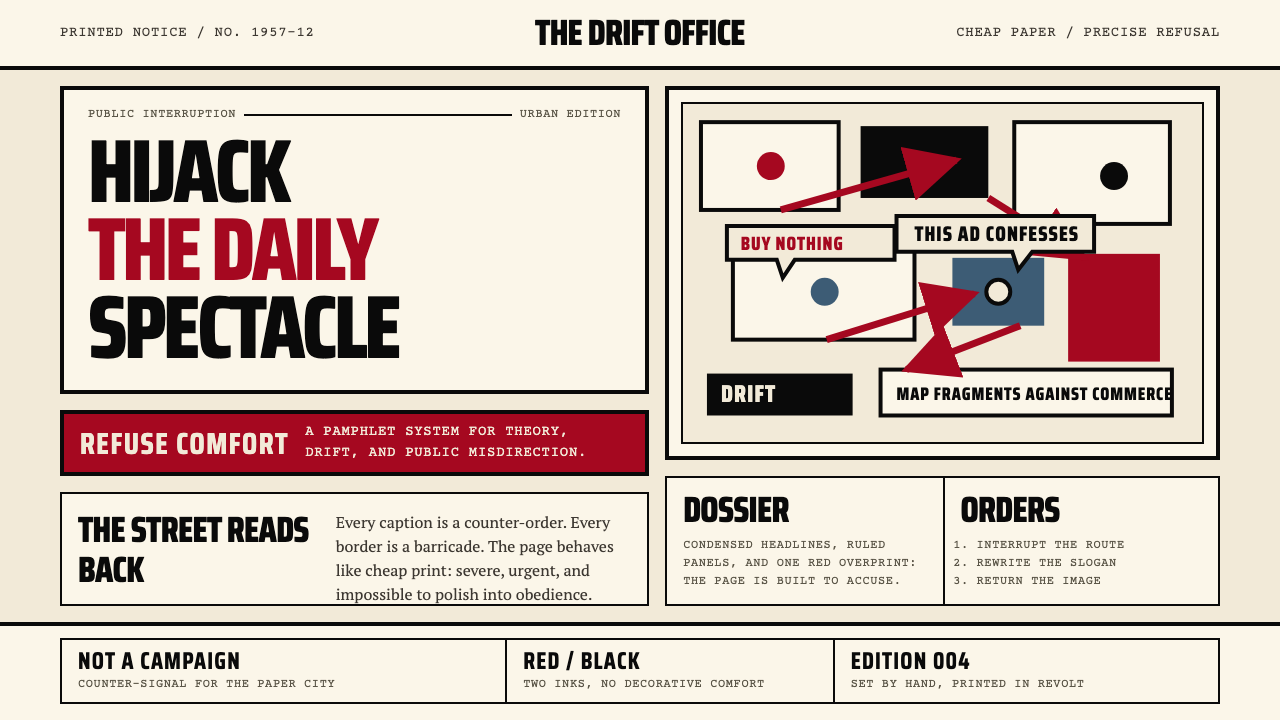 Situationist International (Debord, 1957)Agitation becomes structure. Red-black blocks and condensed type weaponize ne…煽动化为结构。红黑块面与压缩字体把新闻纸变成武器。
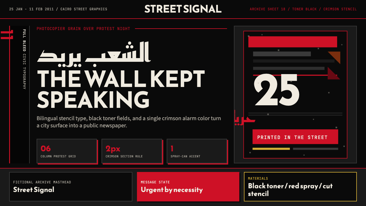 Tahrir Square 2011Civic signal, not polish. Photocopier black and crimson stencils on a hard gr…公民信号,不加修饰。复印黑与猩红模板压进硬网格。
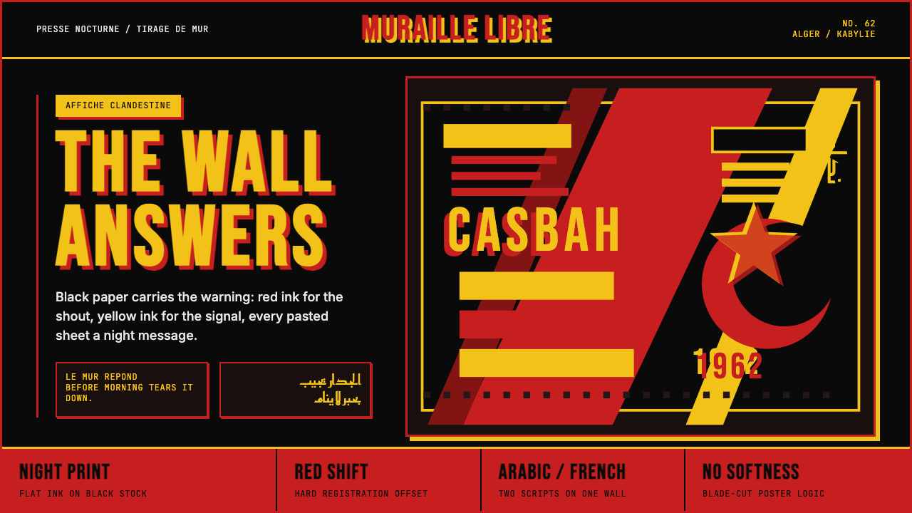 Algerian Casbah Poster (1954–1962)Every surface is a manifesto. Blood red, warning yellow, and stencil type hit…每个表面都是宣言:血红、警示黄与模板字撞上黑色新闻纸。
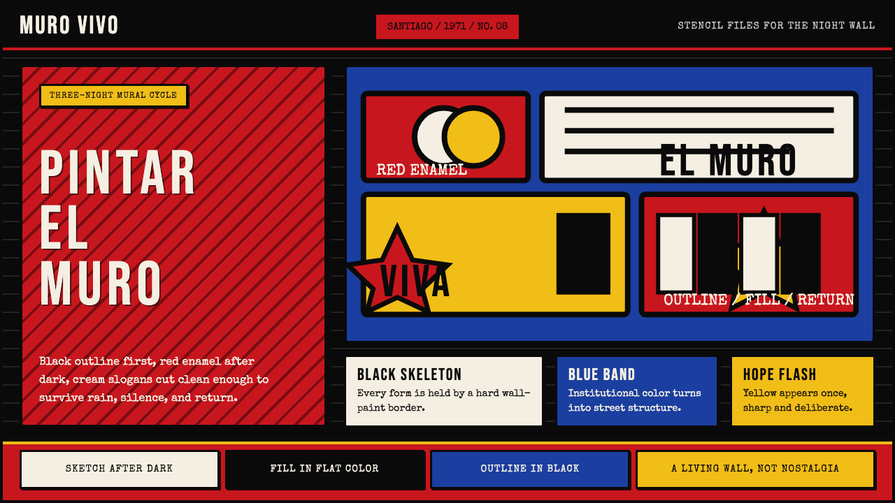 Chilean BRP Ramona Parra 1971Resistance stays alive. Blood red panels, black outlines, and stencil type re…抵抗仍在呼吸:血红墙面、粗黑轮廓与模板字重建街墙。
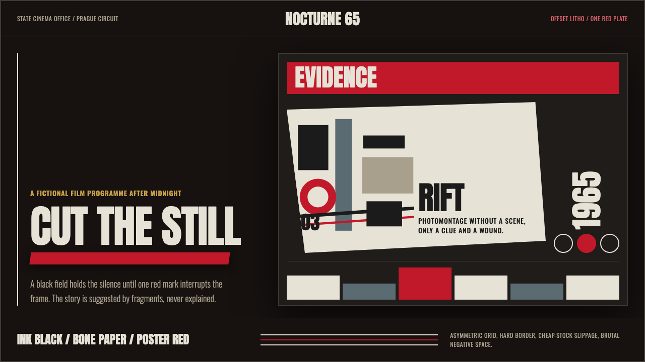 Czech New Wave PosterConcept before spectacle. Ink black, bone type and one poster-red incision fr…观念先于奇观。墨黑、骨白窄体与一道海报红切开网格。
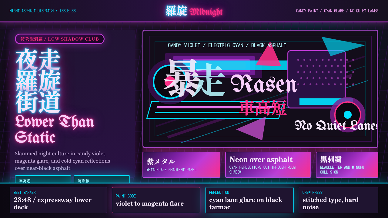 JDM BosozokuNight culture shouts. Candy violet, cyan neon, and stacked Mincho-blackletter…夜色里吼叫:糖果紫与电光青,明朝体和黑体叠满柏油。