What is Kanye — 808s & Heartbreak?什么是 Kanye — 808s & Heartbreak?
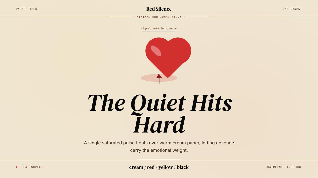
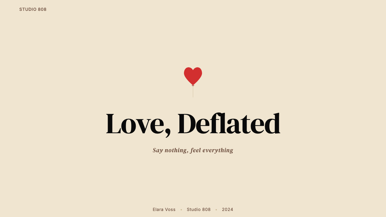
One deflated heart on cream paper — grief reduced to a single object, a single color, and an immensity of silence.一颗瘪掉的心形气球浮在奶油色纸面上——悲伤被压缩成一个物体、一种颜色,以及无边的沉默。
Kanye — 808s & Heartbreak in briefKanye — 808s & Heartbreak 速览
808s & Heartbreak is the visual and sonic identity Kanye West constructed around his 2008 album of the same name — a record that replaced hip-hop bravado with Auto-Tune vulnerability and conceptual-art restraint. The aesthetic takes its name and logic from the album cover: a single deflated red heart-balloon painted by New York artist KAWS (Brian Donnelly), floating against an expansive warm cream ground, bordered by a thin black hairline and punctuated by a stripe of hot yellow. Nothing else competes for attention. The composition is so bare that every element carries outsize emotional weight.《808s & Heartbreak》是 Kanye West 围绕其2008年同名专辑构建的视觉与声音身份体系——这张专辑以 Auto-Tune 的脆弱感和概念艺术的克制取代了嘻哈惯常的张扬。这套美学取名于专辑封面:纽约艺术家 KAWS(Brian Donnelly)绘制的一颗瘪掉的红色心形气球,悬浮在宽阔的温润奶油色底面上,由一道极细的黑色分割线框定,并以一条炽热的黄色收尾。没有任何其他元素争夺注意力。构图如此裸露,以至于每一个元素都承载着超出比例的情感重量。
The design language that emerges from this cover — and that has since been absorbed into a wide current of post-2008 rap, streetwear, and graphic design — is defined by monastic restraint. One saturated focal object. Vast negative space in a warm neutral tone. Generous letter-spacing applied to sparse type. An accent color so electric it reads as alarm rather than decoration. The result is an aesthetic of contained grief: the emotion is not performed through ornament or complexity but held at a distance inside enormous quiet.这张封面所呈现的设计语言——此后被广泛吸收进2008年后的说唱、街头服饰和平面设计的主流——以近乎清修的克制为核心。一个高饱和度的焦点物体。大片温润中性色调的留白。稀疏文字上宽松的字距。一种电击般的强调色,读来像警报而非装饰。结果是一种承载悲伤的美学:情绪不通过装饰或复杂性表演出来,而是在巨大的寂静中被远远地悬置。
What separates the 808s aesthetic from generic minimalism is its specific emotional register. This is not the cool neutrality of Swiss rationalism or the confident austerity of Bauhaus functionalism. The palette is warm rather than cold; the single object is figurative and universally legible rather than geometric and abstract; the emptiness is melancholic rather than efficient. It belongs to a tradition of conceptual album art — Warhol's Velvet Underground banana, Peter Saville's Joy Division topographies — but inflected through hip-hop's scale and mainstream reach.将808s美学与普通极简主义区分开来的,是其特定的情感音域。这既不是瑞士理性主义的冷静中立,也不是包豪斯功能主义的自信严峻。色板是温暖而非冷硬的;那个单一物体是具象且普遍可读的,而非几何与抽象的;那种空旷是忧郁的,而非高效的。它属于概念性唱片封面艺术的传统——沃霍尔的地下丝绒香蕉、彼得·塞维尔的欢乐分裂地形图——但经由嘻哈的体量与主流触达重新着色。
See the Kanye — 808s & Heartbreak design system查看 Kanye — 808s & Heartbreak 完整设计系统
Where does Kanye — 808s & Heartbreak come from?Kanye — 808s & Heartbreak 从何而来?
Kanye West entered the studio for 808s & Heartbreak in the autumn of 2008 under the compressive weight of two simultaneous losses: the death of his mother, Donda West, in November 2007 from post-operative complications, and the end of his engagement to fashion designer Alexis Phifer in early 2008. The album — recorded in Honolulu in a concentrated burst of weeks — discarded the maximalist production that had defined his previous three records in favor of an almost architectural sparseness. The Roland TR-808 drum machine, whose booming synthetic kick had defined a generation of southern hip-hop, was used not for energy but for melancholy: steady, mechanical, emotionally flat. Auto-Tune was applied to his vocals throughout, not as a corrective but as an aesthetic choice — distance, artificiality, and vulnerability at once.2008年秋,Kanye West 在双重丧失的重压下进入录音室录制《808s & Heartbreak》:其母 Donda West 于2007年11月因术后并发症去世,以及他与时装设计师 Alexis Phifer 的婚约于2008年初告终。这张专辑——在火奴鲁鲁以密集的数周时间录制完成——抛弃了前三张唱片标志性的最大化制作,转而采用近乎建筑式的简朴。Roland TR-808 鼓机——其轰鸣的合成底鼓曾定义了一代南方嘻哈——这次不是被用来制造能量,而是制造忧郁:稳定的、机械的、情感上平淡的。Auto-Tune 全程施加于他的人声,并非用于修正,而是作为一种美学选择——距离感、人工感与脆弱感同时并存。
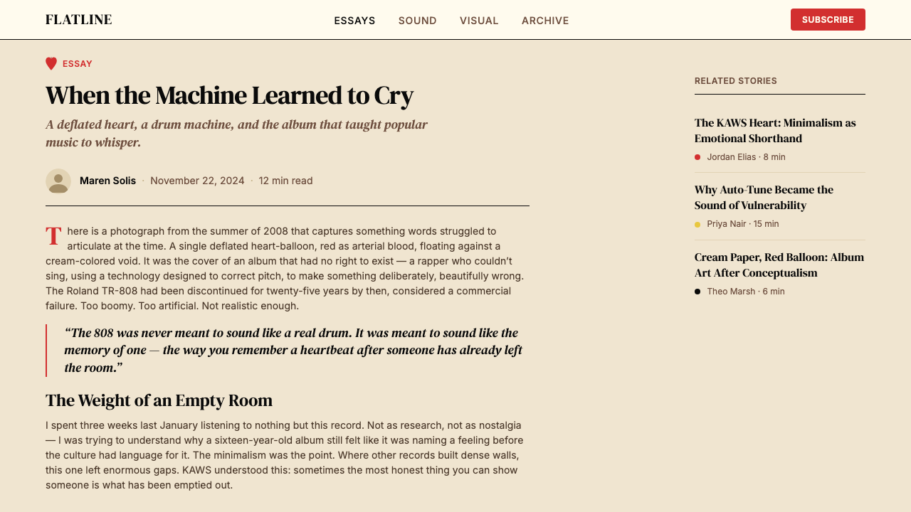
The cover commission went to KAWS, who by 2008 had already built a practice at the intersection of street art, fine art, and commercial product design. KAWS is best known for his subversive reworkings of cartoon imagery — replacing eyes with crossed-out X's, disrupting familiar characters with his own visual signatures. For 808s, he contributed a more restrained image: a single heart-balloon rendered with the simplified graphic clarity of illustration rather than the gestural energy of street painting. The balloon is deflated, its form collapsing, its surface retaining the shine and curve of an object that was once full of air. The KAWS attribution anchored the album's visual identity within the crossover zone between contemporary art collecting and streetwear — a cultural position Kanye had been building deliberately since at least 2007.封面委托给了 KAWS。到2008年,他已在街头艺术、纯艺术与商业产品设计的交叉地带建立了自己的实践。KAWS 以其对卡通形象的颠覆性再创作而闻名——用打叉的×号替换眼睛,以自己的视觉签名扰乱熟悉的角色。为《808s》,他贡献了一个更克制的图像:一颗心形气球,以插图而非街头绘画的笔触感呈现,具有简化的图形清晰度。气球是瘪的,形态正在塌陷,表面仍保留着曾经充满空气的物体的光泽与弧度。KAWS 的署名将专辑的视觉身份锚定于当代艺术收藏与街头服饰的交汇地带——这一文化位置是 Kanye 至少自2007年起便在刻意构建的。
The hot-yellow accent color that frames the cover — and that recurs across the album's visual rollout, merchandise, and stage design — connects the work to a broader visual language Kanye had been developing in collaboration with Virgil Abloh and other creative collaborators from his Chicago circle. This color, occupying a register between caution signage and neon warmth, functions as a kind of emotional alarm: it signals urgency without decoration, energy without celebration. It would recur across much of the subsequent creative output from this circle, eventually becoming a signature of the Abloh-era aesthetic that shaped streetwear and luxury fashion through the 2010s.那条框定封面的炽热黄色强调色——并在专辑的视觉推广、周边商品与舞台设计中反复出现——将这件作品与 Kanye 携手 Virgil Abloh 及其芝加哥圈子的其他创意合作者共同发展的更广泛视觉语言相连接。这种颜色,占据着警示标志色与霓虹温暖之间的音域,充当一种情感警报:它传递紧迫感,但不作装饰;传递能量,但不作庆典。它此后反复出现在这一圈子的大量创意产出中,最终成为 Abloh 时代美学的签名,在整个2010年代塑造了街头服饰与奢侈时尚。
808s & Heartbreak arrived at a specific cultural inflection point in hip-hop. The dominant aesthetic in 2008 was still oriented around maximalism — dense production, conspicuous display, layered signification. West's deliberate retreat from that visual and sonic grammar was widely read at the time as commercial risk; it subsequently proved enormously influential. The album gave aesthetic permission for vulnerability in mainstream rap and demonstrated that conceptual-art logic — including the logic of the deliberately empty, deliberately plain — could operate at pop scale. Artists including Drake, Kid Cudi, Frank Ocean, and later a generation of SoundCloud rap producers drew directly on the emotional and visual vocabulary 808s established.《808s & Heartbreak》在嘻哈的特定文化转折点登场。2008年的主流美学仍围绕最大化原则——密集制作、炫目展示、层层叠叠的意指。West 刻意从那套视觉与声音语法中后退,当时被普遍解读为商业冒险;事后证明它影响深远。这张专辑赋予了主流说唱中脆弱感以美学许可,并证明了概念艺术逻辑——包括刻意留空、刻意朴素的逻辑——可以在流行乐的规模上运作。Drake、Kid Cudi、Frank Ocean,以及后来一代 SoundCloud 说唱制作人,都直接汲取了《808s》所建立的情感与视觉词汇。
What defines the Kanye — 808s & Heartbreak look?Kanye — 808s & Heartbreak 的视觉特征是什么?
Color: Cream Ground色彩:奶油底色
The foundational color is not white but warm cream — the tone of aged paper or uncoated stock. This warmth prevents the palette from reading as clinical or sterile. It gives the negative space an organic quality, as if the surface itself has been through something. Against this ground, the single saturated focal object reads with the quiet force of a specimen on a slide: isolated, legible, complete.基础色并非白色,而是温润的奶油色——旧纸张或非涂布纸的色调。这种温度阻止了色板被解读为临床或无菌感。它赋予留白一种有机品质,仿佛这个表面本身经历了什么。在这个底色之上,那个单一的饱和焦点物体以标本在载玻片上的宁静力量呈现:孤立、清晰、完整。
Color: Single Saturated Accent色彩:单一饱和强调色
The primary saturated color — a deep, slightly cool red — is used on exactly one object, the heart. It does not recur as decoration, text color, or background fill. This extreme restraint in application gives the red an almost physical weight. The yellow accent, equally saturated, appears as a stripe or border element — not a competing focal point but a frame that heightens the tension the heart already generates.主要饱和色——一种深邃、略带冷调的红色——仅用于一个物体:那颗心。它不以装饰、文字颜色或背景填充的形式再现。这种极端克制的用法赋予了红色近乎物理的重量。同样饱和的黄色强调色以条纹或边框元素出现——不是与之竞争的焦点,而是一个强化心形气球已然产生的张力的框架。
The Central Object核心物体
The defining compositional move is the placement of a single figurative object at the center of enormous negative space. The object must be universally legible — a heart, not an abstraction — and must carry an immediate emotional charge. It is also specifically depicted in a state of diminishment: deflated, partially collapsed, past its fullness. The emotional content is encoded in the object's condition, not in surrounding context or text.决定性的构图手法是将单一具象物体置于巨大留白的中心。这个物体必须普遍可读——是一颗心,而非抽象形状——并且必须承载直接的情感冲击。它同时被具体描绘为一种减损状态:瘪掉的,部分塌陷的,已过盛满时刻的。情感内容被编码在物体的状态之中,而非周围语境或文字里。
Negative Space as Emotional Register留白作为情感音域
The most technically distinctive element of the aesthetic is the scale of the empty field relative to the focal object. The cream ground is not a neutral backdrop — it is an active presence. Grief, in this visual logic, is not depicted through expressionistic marks but through the absence of marks: silence rendered as space. The larger the empty field, the greater the felt weight of the lone object within it.这套美学技术上最鲜明的要素,是空旷底面相对于焦点物体的面积比例。奶油色底面并非中性背景——它是一种主动的存在。在这套视觉逻辑中,悲伤不通过表现主义笔触来描绘,而是通过笔触的缺席来呈现:寂静被渲染为空间。空旷底面越大,其中孤独物体的感受重量就越大。
Typography: Editorial Restraint字体排印:编辑克制
Type in this aesthetic is sparse, widely spaced, and set at a scale that does not compete with the image. Letter-spacing is generous to the point of near-dissolve — titles and credits breathe across the field rather than clustering. Typeface selection leans toward clean, unornamented letterforms. The typographic approach matches the visual system's core principle: the message is in what is absent, not in what is elaborated.这套美学中的文字稀少、字距宽大,设置在不与图像竞争的尺度上。字距之宽阔几乎令字母消散——标题与署名在画面中呼吸展开,而非聚集成团。字体选择倾向于干净、无装饰的字形。这种排版方法与视觉系统的核心原则相契合:信息在于缺席之处,而非在于精心展开的部分。
The Thin Black Hairline极细黑色分割线
A defining structural detail is the use of a hairline-thin black border or rule — appearing on the album cover as a framing device. This element performs two functions: it provides a precise geometric container that makes the warmth of the cream interior feel intentional and curated rather than undefined, and it introduces a note of editorial precision into what might otherwise read as purely emotional image-making. The hairline is a reminder that this restraint is controlled, not absent.一个决定性的结构细节是使用纤细如发的黑色边框或规尺线——在专辑封面上作为框架装置出现。这个元素执行两种功能:它提供了一个精确的几何容器,使奶油色内部的温度感觉是刻意的、经过策划的,而非模糊未定的;同时它将一种编辑精确性的音符引入了可能仅仅被解读为纯粹情感图像制作的内容之中。这条细线提醒观者:这种克制是被控制的,而非缺席的。
Flatness and Gloss平面性与光泽感
The 808s aesthetic does not commit to total flatness in the way Bauhaus or Swiss design does. The single focal object — the heart balloon — is rendered with surface gloss and volume, referencing KAWS's practice of translating cartoon-adjacent characters into sculptural or dimensional forms. This controlled introduction of depth, limited to the one object, intensifies its isolation against the flat cream field. The tension between the object's dimensionality and the ground's flatness is part of the aesthetic's emotional charge.808s美学并不像包豪斯或瑞士设计那样彻底承诺平面性。那个单一的焦点物体——心形气球——被赋予表面光泽和体积感,呼应 KAWS 将近卡通形象转化为雕塑或立体形态的实践。这种受控的深度引入仅限于那一个物体,强化了它在平面奶油色底面上的孤立感。物体的立体性与底面的平面性之间的张力,是这套美学情感张力的组成部分。
See the Kanye — 808s & Heartbreak design system查看 Kanye — 808s & Heartbreak 完整设计系统
Who shaped Kanye — 808s & Heartbreak?谁塑造了 Kanye — 808s & Heartbreak?
West conceived and directed the overall visual and sonic identity of 808s & Heartbreak, making the fundamental decisions — the sparse production palette, the use of Auto-Tune as aesthetic rather than corrective tool, the choice of KAWS as visual collaborator — that gave the project its specific emotional logic. His willingness to expose grief and artistic uncertainty at the height of his commercial power changed the terms on which emotional vulnerability was legible in mainstream hip-hop. The album's visual restraint reflects his deepening engagement with conceptual art and his ongoing relationships with figures from contemporary art and fashion.West 构思并主导了《808s & Heartbreak》的整体视觉与声音身份,做出了决定这个项目特定情感逻辑的根本决策——稀疏的制作色板、将 Auto-Tune 作为美学而非修正工具的用法、选择 KAWS 作为视觉合作者。他愿意在商业权力顶峰展露悲伤与艺术不确定性,改变了主流嘻哈中情感脆弱性的可见条件。专辑的视觉克制映射出他对概念艺术日益深入的介入,以及他与当代艺术和时尚界人士的持续关系。
KAWS is a New York-based artist whose practice spans painting, sculpture, and product design. Beginning in the late 1990s with unauthorized interventions into public advertising — replacing the faces of billboard characters with his signature crossed-out X eyes — he built a reputation straddling street culture and fine art collecting. His contribution to 808s is characteristically precise: the deflated heart retains the graphic simplicity of illustration while carrying the emotional specificity of sculpture. KAWS's crossover status — simultaneously collected by museums and sold in streetwear drops — perfectly matched the cultural position West was building for the album.KAWS 是一位纽约艺术家,其实践横跨绘画、雕塑与产品设计。从1990年代末对公共广告的未经授权干预开始——用他标志性的打叉×号替换广告牌人物的面孔——他建立了横跨街头文化与纯艺术收藏的声誉。他对《808s》的贡献具有他一贯的精确性:那颗瘪掉的心形气球保留了插图的图形简洁性,同时携带着雕塑的情感具体性。KAWS 的跨界地位——同时被博物馆收藏,又在街头服饰发售中售出——与 West 为这张专辑构建的文化位置完美契合。
Abloh, a close creative collaborator of West's from their shared Chicago roots, was involved in the broader visual direction and merchandise design that extended the 808s aesthetic beyond the album cover itself. His contribution to defining the hot-yellow accent color as a recurring signature — and his subsequent use of that color logic across his own fashion practice, most visibly in Off-White — demonstrates how the 808s visual vocabulary propagated through the creative network surrounding West. Abloh's later career as creative director at Louis Vuitton menswear amplified many of the same principles: bold graphic restraint, conceptual-art reference, and the legibility of a single strong visual statement.Abloh 是 West 来自芝加哥共同根基的亲密创意合作者,参与了将808s美学延伸至专辑封面之外的更广泛视觉方向与周边设计。他在将炽热黄色强调色确立为反复出现的签名方面所做的贡献——以及他此后在自己的时装实践中对那套色彩逻辑的运用,在 Off-White 中最为显著——展示了808s视觉词汇如何在围绕 West 的创意网络中传播。Abloh 后来担任路易威登男装创意总监的职业生涯放大了同样的许多原则:大胆的图形克制、概念艺术参照,以及单一强烈视觉陈述的可读性。
Kanye West's mother and most steadfast creative supporter, Donda West was a professor of English and chair of the English department at Chicago State University before devoting herself to managing her son's career. Her death in November 2007 at the age of 58 was the primary biographical catalyst for 808s & Heartbreak. Her presence — and its sudden removal — is the emotional substrate from which the album's aesthetic of contained grief is inseparable. The deflated heart on the cover has been widely understood as a direct visual encoding of this loss.Kanye West 的母亲与最坚定的创意支持者,Donda West 曾任芝加哥州立大学英语系教授兼系主任,后专心投入管理儿子的事业。她于2007年11月以58岁之龄辞世,是《808s & Heartbreak》主要的传记催化剂。她的存在——以及它的骤然消失——是这张专辑承载悲伤之美学不可分离的情感底层。封面上那颗瘪掉的心形气球被广泛理解为对这一失去的直接视觉编码。
How do you use Kanye — 808s & Heartbreak today?今天怎么用 Kanye — 808s & Heartbreak?
The 808s aesthetic translates effectively into contemporary design because its principles are emotional and compositional rather than period-specific. Applying it correctly requires internalizing its core logic: one dominant object, enormous breathing room, a warm neutral ground that is never pure white, a single saturated color used sparingly and always on the focal element, and a secondary accent color used as a structural or framing device rather than a mood fill. Understanding these rules before reaching for the palette is what separates a successful application from a superficial imitation.808s美学能有效转化为当代设计,因为它的原则是情感性与构图性的,而非特定时期的。正确应用它需要内化其核心逻辑:一个主导物体,巨大的呼吸空间,一个从不是纯白的温润中性底面,一种饱和色被节制地使用且始终用在焦点元素上,一种次级强调色用作结构或框架装置而非情绪填充。在动用色板之前理解这些规则,才是成功应用与表面模仿之间的分水岭。
For presentation slides, the style is particularly powerful in contexts where emotional weight or personal narrative is part of the message — keynotes, brand story decks, memorial or commemorative materials, or any presentation that needs to communicate vulnerability alongside authority. A cover slide in this aesthetic places a single image or icon at generous scale against a warm cream field, with the title set in widely spaced, unornamented type at a scale that does not compete with the image. Content slides carry the same logic: one organizing idea per slide, type set sparsely, data visualizations treated as lone objects in open space rather than dense information panels. The yellow accent, when used, marks emphasis points or section transitions — never background fills.对于演示文稿,这种风格在情感重量或个人叙事是信息组成部分的场景中尤为有力——主题演讲、品牌故事文稿、悼念或纪念材料,或任何需要在权威旁边传达脆弱感的演示。这套美学中的封面幻灯片将单一图像或图标以宽裕的尺度置于温润奶油色底面上,标题以宽字距、无装饰字体设置在不与图像竞争的尺寸上。内容幻灯片沿用同样的逻辑:每张幻灯片一个组织观念,文字稀疏排布,数据可视化被处理为开阔空间中的孤独对象,而非密集信息面板。黄色强调色在使用时标记重点或章节过渡——绝不用于背景填充。
For web interfaces and dashboards, the aesthetic suits editorial and content-forward contexts better than utility-dense products. A homepage or landing page in this mode commits to a single above-the-fold visual statement — one image, one headline, one call to action — with subsequent sections scrolling into generous white or cream space. The thin black hairline appears as a section divider or typographic rule rather than a decorative motif. Pricing pages work if the tiers are presented with extreme economy: number, label, and the most essential feature list, separated by open space rather than card containers. Navigation should be purely typographic with wide tracking.对于网页界面和仪表板,这套美学更适合编辑性和内容主导的场景,而非功能密集型产品。这种模式下的主页或落地页承诺一个首屏视觉陈述——一张图像、一个标题、一个行动号召——后续版块向下滚动进入宽裕的白色或奶油色空间。极细黑色线条作为版块分隔或排版规尺出现,而非装饰性母题。定价页面若呈现极度经济的层级设计则效果良好:数字、标签与最核心的功能列表,以开阔空间而非卡片容器分隔。导航应纯粹是字体性的,字距宽松。
For editorial and marketing work — social cards, campaign posters, album or event artwork — the style's poster-logic is directly applicable. The key constraint is the commitment to one primary image: a photograph cropped to isolate a single subject against open space, an icon rendered at large scale, or a typographic word treated as the object itself. The warm cream ground distinguishes this approach from generic minimalism; it should feel hand-touched rather than digital-blank. Yellow accent elements — a stripe, a rule, a thin border — provide the structural frame without becoming decorative.对于编辑与营销内容——社交卡片、活动海报、唱片或活动视觉——这种风格的海报逻辑可直接应用。关键约束是对单一主图的承诺:一张裁剪成在开放空间中隔离单一主体的照片,一个以大尺寸呈现的图标,或者一个被当作物体本身处理的排版词语。温润奶油色底面将这种方法与普通极简主义区分开来;它应该感觉是手工触碰的,而非数字式空白的。黄色强调元素——一条纹、一条规尺线、一道细边框——提供结构性框架,而不成为装饰。
The most common mistake when working in this aesthetic is filling the negative space. The emotional power of the 808s approach depends entirely on the scale of the empty field relative to the object within it. Designers trained in conventional layout logic often feel compelled to add a secondary image, a texture, a background pattern, or additional type to make a composition feel complete. In this system, the opposite is true: every element added reduces the felt weight of the central object. A second common error is using the yellow accent as a mood color — a warm highlight or background wash — rather than as a structural signal. When yellow occupies large areas of the composition, it loses its alarm quality and becomes decoration. It should be used in narrow bands, thin rules, or small indicators only.在这套美学中工作时最常见的错误是填充留白。808s方法的情感力量完全取决于空旷底面相对于其中物体的面积比例。受常规版面逻辑训练的设计师往往感到有必要添加次级图像、纹理、背景图案或额外文字,以使构图感觉完整。在这套系统中,恰恰相反:每增加一个元素,中央物体的感受重量就随之减少。另一个常见错误是将黄色强调色用作情绪色——温暖的高光或背景晕染——而非结构信号。当黄色占据构图的大面积时,它失去警报品质,成为装饰。它应仅用于窄条、细线或小型指示元素。
See the Kanye — 808s & Heartbreak design system查看 Kanye — 808s & Heartbreak 完整设计系统
Kanye — 808s & Heartbreak — FAQKanye — 808s & Heartbreak · 常见问题
How does the 808s aesthetic differ from generic minimalism?808s美学与普通极简主义有什么区别?
Generic minimalism typically commits to cold neutrality — pure white grounds, no emotional signaling through color temperature, geometric abstraction over figurative imagery. The 808s aesthetic is warm and figurative: the cream ground has an organic, aged quality; the central object is a heart, not a circle; the saturated red carries grief rather than structural meaning; the yellow accent signals urgency rather than hierarchy. The emptiness is melancholic rather than efficient. It is minimalism in service of a specific emotional state, not minimalism as a universally applicable design philosophy.普通极简主义通常承诺冷静的中立——纯白底面,不通过色温发出情感信号,几何抽象优先于具象图像。808s美学是温润而具象的:奶油色底面有一种有机的、陈年的品质;中央物体是一颗心,而非一个圆;饱和的红色承载悲伤而非结构意义;黄色强调色传递紧迫感而非层级关系。那种空旷是忧郁的,而非高效的。这是服务于特定情感状态的极简主义,而非普遍适用的设计哲学。
Can this aesthetic be applied to commercial products without feeling inappropriately sorrowful?这套美学能被应用于商业产品而不显得不恰当地哀伤吗?
Yes, with selective application. The emotional register of the 808s aesthetic comes specifically from the combination of a visibly diminished or vulnerable central object and the scale of the surrounding silence. Commercial applications can use the compositional logic — single object, warm neutral ground, extreme negative space, hot-yellow structural accent — without necessarily encoding grief. A product shot against cream with generous space reads as considered and premium; the sorrow is not inherent to the palette or the composition, but to the subject matter. Beauty, luxury, and commemorative contexts adapt most naturally. Fast-moving consumer goods and playful or youth-oriented products fit less well.可以,但需要选择性应用。808s美学的情感音域特别来自于一个明显减损或脆弱的中央物体与周围寂静的面积这两者的结合。商业应用可以使用构图逻辑——单一物体、温润中性底面、极致留白、热黄色结构强调——而不必然编码悲伤。产品在奶油色底面上以宽裕空间呈现,读来是经过考量的和高端的;哀愁并不内在于色板或构图,而在于主题内容。美妆、奢侈品与纪念性语境最自然地适应这种风格。快速消费品与轻松或年轻导向的产品则不太契合。
How should the yellow accent be used without it becoming distracting?如何使用黄色强调色而不使它变得令人分心?
The yellow in the 808s aesthetic functions as a structural signal, not a mood color — think of it as a warning stripe or a caution band rather than a warm wash. It should appear in narrow, linear applications: a thin border around the entire composition, a horizontal rule marking a section break, a small typographic indicator. The moment yellow fills a large area — a panel, a background block, a shape — it converts from accent to dominant color and the alarm quality dissolves into atmosphere. In practice, the yellow area should be small enough that the cream ground remains the dominant warm tone.808s美学中的黄色充当结构信号,而非情绪色——把它想成警示条纹或警戒带,而非温暖的晕染。它应以窄小的线性形式出现:围绕整个构图的细边框、标记章节断点的水平规尺线、小型排版指示元素。一旦黄色填满大面积——一个面板、一个背景块、一个形状——它就从强调色转变为主色,警报品质随之消解为氛围感。在实践中,黄色面积应小到足以让奶油色底面保持为主导的暖色调。
Does this aesthetic work in a dark-mode or dark-background context?这套美学在深色模式或深色背景下有效吗?
The 808s aesthetic is fundamentally a light-ground system — the warmth of the cream background is load-bearing, not incidental. A dark inversion strips out that warmth and with it much of the aesthetic's emotional specificity. That said, a dark variant is possible if the logic is maintained: a very dark warm ground (not pure black, but a deep, slightly warm near-black), a single luminous focal object retaining its saturation, and the yellow accent converted to its most electric register. The result will read differently — more nocturnal, more urban — but can preserve the core dynamic of one object in silence. The danger is that on a truly dark ground, yellow quickly becomes aggressive and the composition loses its quality of quiet.808s美学从根本上是一个浅色底面系统——奶油色背景的温度是承重性的,并非偶然。深色反转剥去了那种温度,随之剥去了这套美学的大部分情感特殊性。话虽如此,如果维持逻辑,深色变体是可能的:一个非常深的温润底面(不是纯黑,而是一种深邃、略带暖意的近黑),一个单一发光的焦点物体保留其饱和度,黄色强调色转换为其最电气化的音域。结果会呈现不同的气质——更夜间的、更都市的——但可以保留一个物体在寂静中的核心动态。危险在于,在真正深色的底面上,黄色很快变得具有攻击性,构图失去其静谧品质。
What kinds of projects or brands are poor fits for the 808s aesthetic?哪些类型的项目或品牌不适合808s美学?
The 808s aesthetic is a poor fit for contexts that require energy, density, or social warmth. Products that rely on visual abundance — food, travel, family-oriented services, celebration contexts — conflict with the system's fundamental logic of emptiness and diminishment. Information-dense products like financial dashboards or complex data tools need more visual grammar than the aesthetic provides. Brands that compete on playfulness, community, or sensory pleasure find the style too grave. The aesthetic is also poorly suited to contexts where diversity and inclusivity of visual representation are important, since its figurative vocabulary is narrow by design — one object, not many. Knowing this honestly is part of applying it well.808s美学不适合需要活力、密度或社交温度的场景。依赖视觉丰富性的产品——食品、旅行、家庭导向服务、庆典场景——与这套系统关于空旷和减损的根本逻辑相冲突。金融仪表板或复杂数据工具等信息密集型产品需要比这套美学所能提供的更多视觉语法。在趣味性、社区感或感官愉悦上竞争的品牌会发现这种风格过于庄重。这套美学也不适合视觉表达的多样性与包容性很重要的场景,因为它的具象词汇在设计上是狭窄的——一个物体,而非许多。坦诚地认识到这一点,是良好应用它的组成部分。
Related design styles相关设计风格
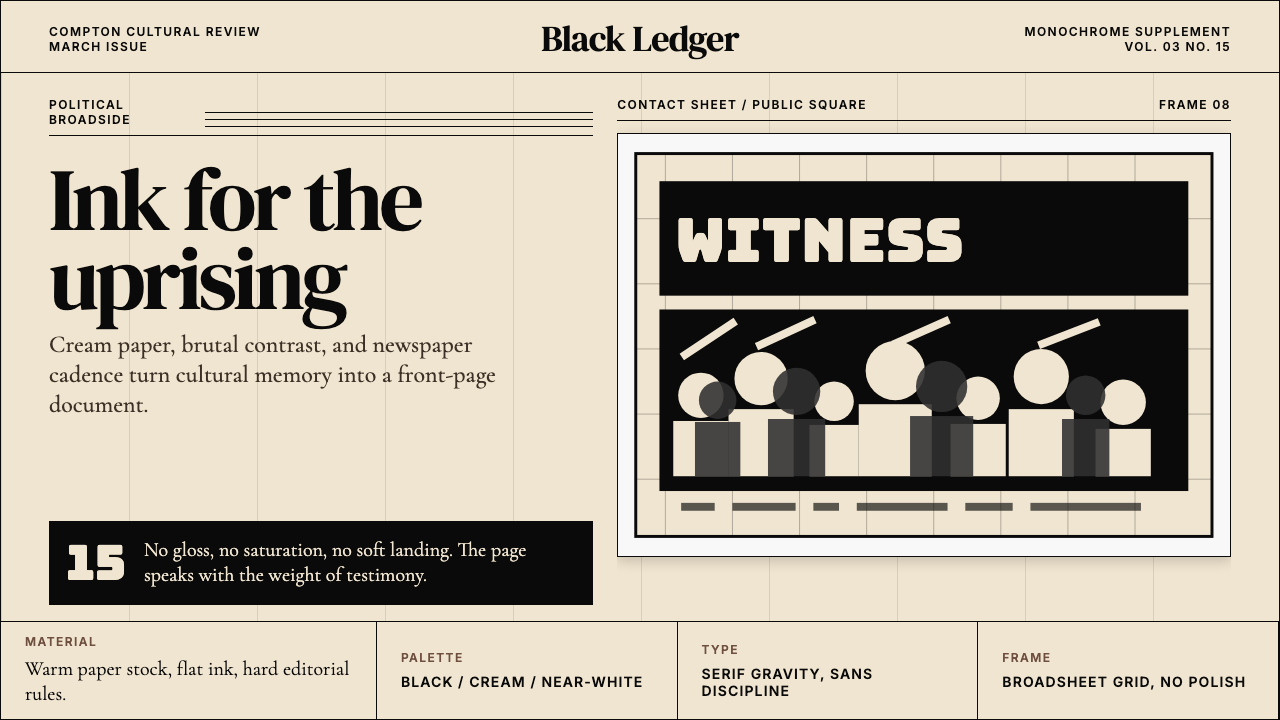 Kendrick — To Pimp a ButterflyPolitical weight, printed cold. Cream paper, hard serif type, monochrome crow…政治重量冷静落纸。米黄纸、硬衬线与黑白群像几何。
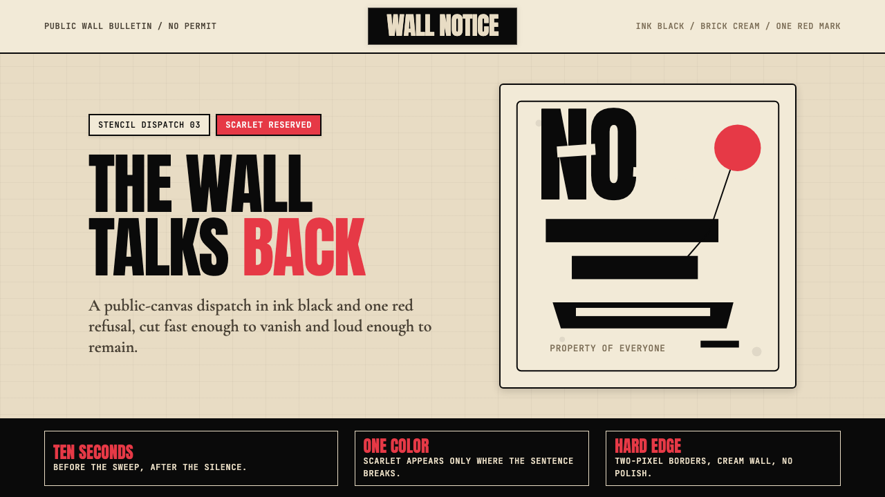 Banksy Stencil GraffitiProtest is reduced to a cut mark. Anton black on brick cream, one scarlet red…抗议被压成剪影。砖墙奶油底、Anton黑字,一点猩红打断。
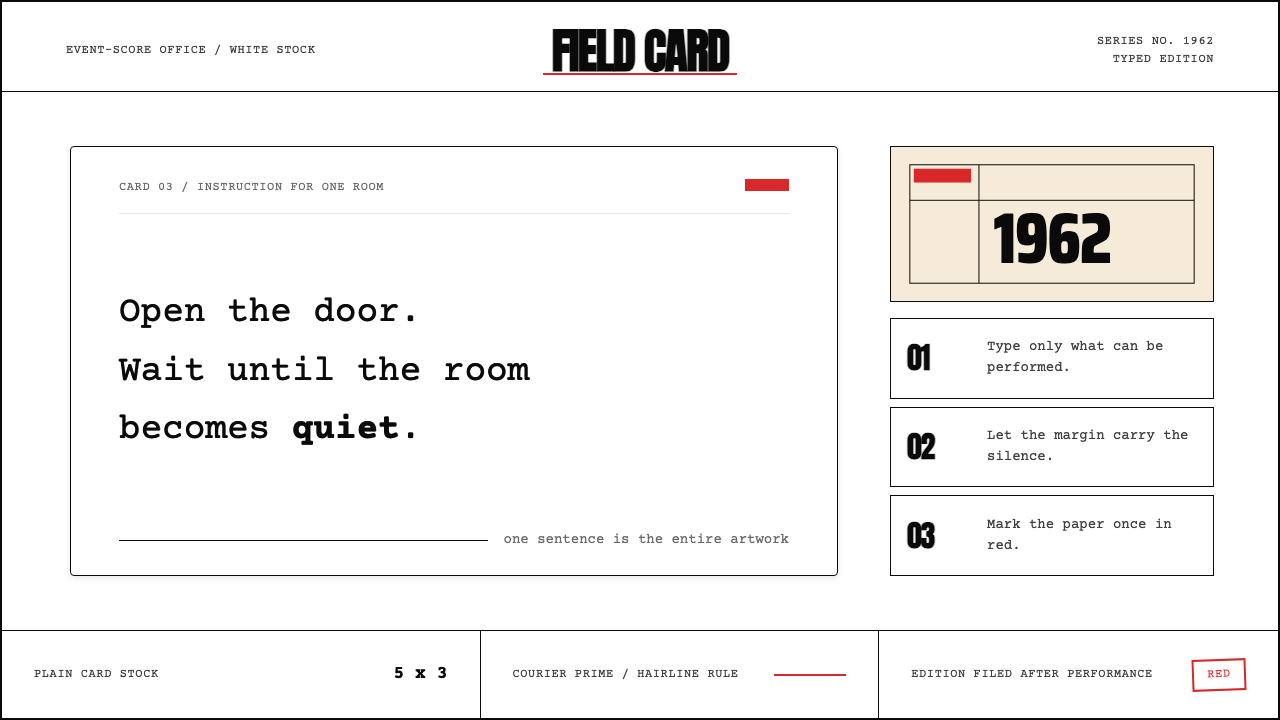 Fluxus Event Score (1962)Instruction becomes art. Courier on white card, hairline rules, one sharp red…指令即艺术:白卡上的Courier、细线框与一记红色标记。
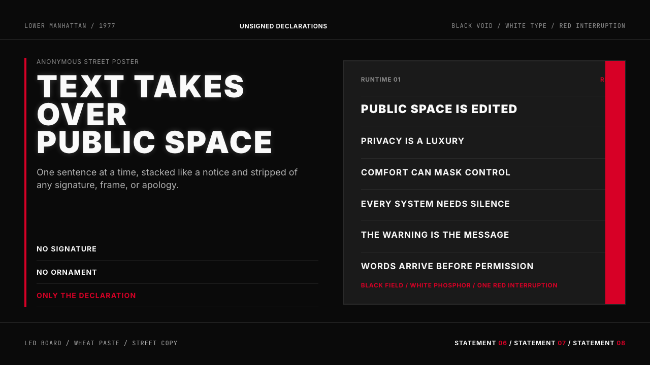 Jenny Holzer Truisms (1977)Austere declarations. White all-caps on black, cut by a single red warning.克制宣言。黑底白字,全大写排成LED板,红色只作警示。
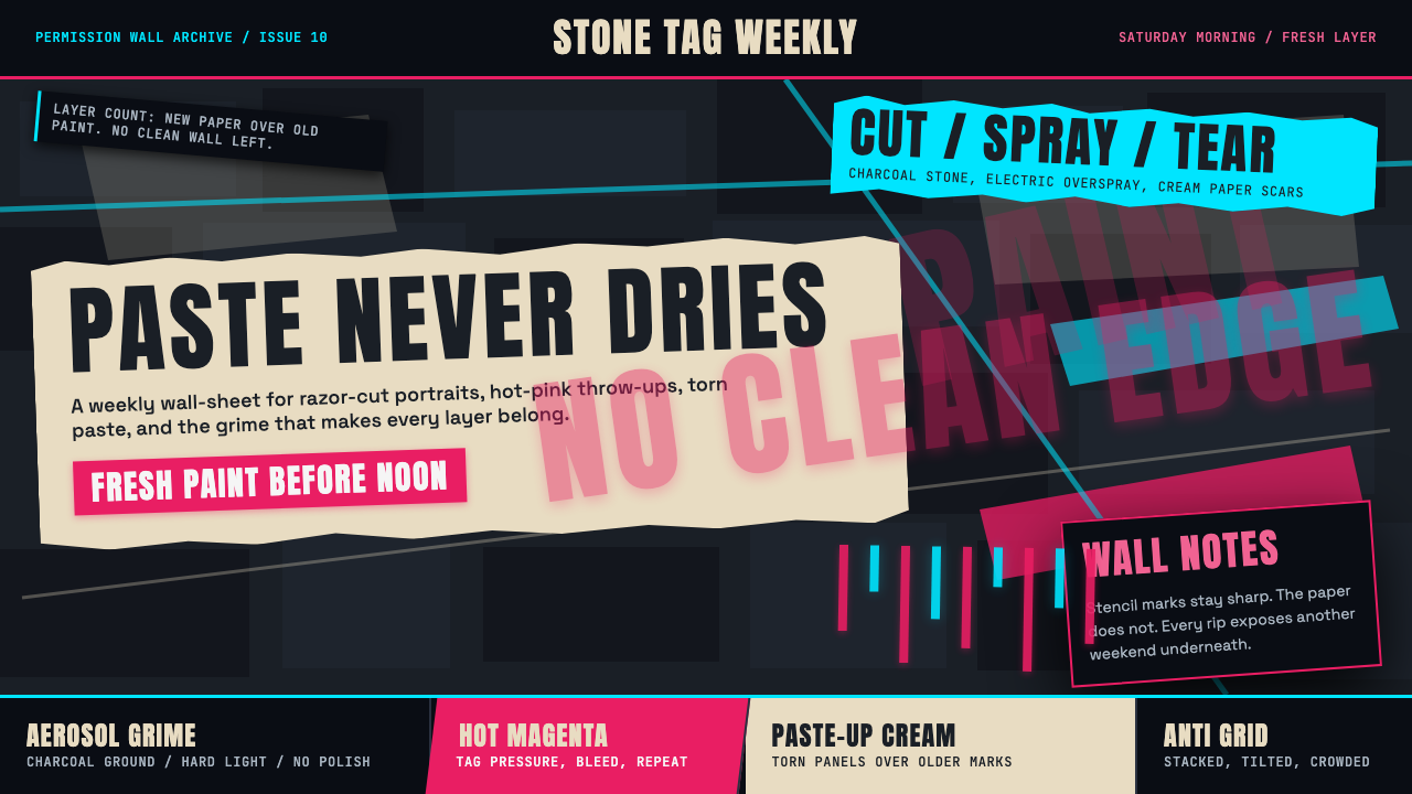 Melbourne Laneway Stencil (Hosier Lane)Permission-wall maximalism. Magenta tags slash charcoal bluestone and cream p…合法墙极繁主义:洋红标签划过炭黑青石与奶油贴纸。
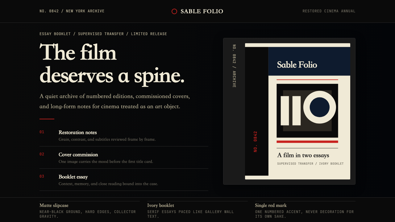 Criterion CollectionMuseum-grade cinema. Matte black, ivory serif, and one red numbered spine set…博物馆级电影感:哑黑底、象牙衬线与一枚红色编号书脊定调。