What is Banksy Stencil Graffiti?什么是 Banksy Stencil Graffiti?
Banksy reduced political rage to a stencil's edge — monochrome black silhouettes on brick-wall cream, with a single scarlet interruption that says everything the spray can cannot.班克西将政治愤怒压缩成模板的轮廓线——砖墙奶油底上的单色黑色剪影,一抹猩红打断沉默,道尽喷漆罐无从言说的一切。
Banksy Stencil Graffiti in briefBanksy Stencil Graffiti 速览
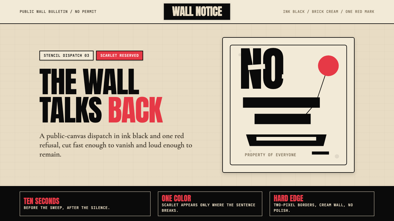
Banksy Stencil Graffiti is the most recognized street-art idiom on earth: black cut-cardboard silhouettes sprayed onto cream or aged plaster walls, punctuated by a single saturated accent — almost always a deep scarlet red — used with surgical restraint to mark the one object that carries the image's emotional payload. The palette is doctrinally limited. Black governs every contour and figure; the brick-wall ground does not compete; red appears once, and only once, per composition.班克西模板涂鸦是地球上辨识度最高的街头艺术符号:剪切纸板的黑色剪影喷涂在奶油色或陈旧灰泥墙面上,以一抹饱和强调色——几乎总是深猩红——作为唯一点缀,外科手术般精准地标记出承载整幅画面情感核心的那一个对象。色板教条般有限:黑色统摄所有轮廓与人物,砖墙底色不与之争竞,红色在每幅构图中出现且仅出现一次。
The system borrows the economics of protest printing. A stencil can be cut in an hour and deployed in ten seconds before dawn; the imagery must therefore communicate instantly, at reading distance, and again later in a photograph reproduced at thumbnail size. This constraint produces a visual language that is binary by necessity — ink or no ink, silhouette or void — and the discipline that follows from that binary turns out to be remarkable: nothing extraneous survives the cut.这套系统借用了抗议印刷的经济逻辑。一块模板可以在一小时内剪好,在黎明前十秒内完成喷涂;图像因此必须在近距离即时传达,并在之后被缩略图尺寸的照片二次传播时依然成立。这一约束催生了一种在本质上二元化的视觉语言——墨或无墨,轮廓或虚空——而由此产生的纪律惊人有效:凡是多余的,全部被刀刃裁去。
As an applied design aesthetic, the style translates a street-art practice into a graphic system governed by three rules: near-total monochrome, silhouette as the primary form-making tool, and a single saturated color used exclusively for emotional punctuation. The result is simultaneously austere and arresting — the visual equivalent of a sentence that ends with a word you did not expect.作为一套应用设计美学,这种风格将街头艺术实践转化为由三条规则支配的图形系统:近乎全程的单色调、作为主要造形工具的剪影,以及仅用于情感标点的单一饱和色。结果既朴素又摄人心魄——恰如一个以你未曾预料的词语收尾的句子。
See the Banksy Stencil Graffiti design system查看 Banksy Stencil Graffiti 完整设计系统
Where does Banksy Stencil Graffiti come from?Banksy Stencil Graffiti 从何而来?
Banksy emerged from the Bristol underground graffiti scene of the early 1990s, a city whose port geography — warehouses, railway arches, canal walls — offered abundant surfaces and whose art school culture provided a critical audience. Early Bristol graffiti was dominated by the American freehand wildstyle tradition: elaborate multicolor lettering produced with aerosol cans over many minutes in relative safety. Banksy, reportedly frustrated by the time exposure required and the risk of arrest that came with it, turned to stencils around 1992 after an incident in which he hid under a train for more than an hour to avoid police and noticed the stenciled lettering on the undercarriage. The practical solution became an aesthetic philosophy.班克西崛起于1990年代初布里斯托尔的地下涂鸦圈。这座城市的港口地理——仓库、铁路拱廊、运河墙壁——提供了充足的作画表面,而其艺术学院文化则提供了批判性受众。早期布里斯托尔涂鸦以美国自由手写的狂野风格为主:在相对安全的条件下,用喷漆罐耗费数分钟创作精繁的多色字体。据报道,班克西因暴露时间长、被捕风险高而深感挫败,约于1992年转向模板创作——起因是一次他在火车底部躲避警察超过一小时的经历,他注意到了车身底部模板印制的字样。这个实用的解决方案最终演变为一套美学哲学。
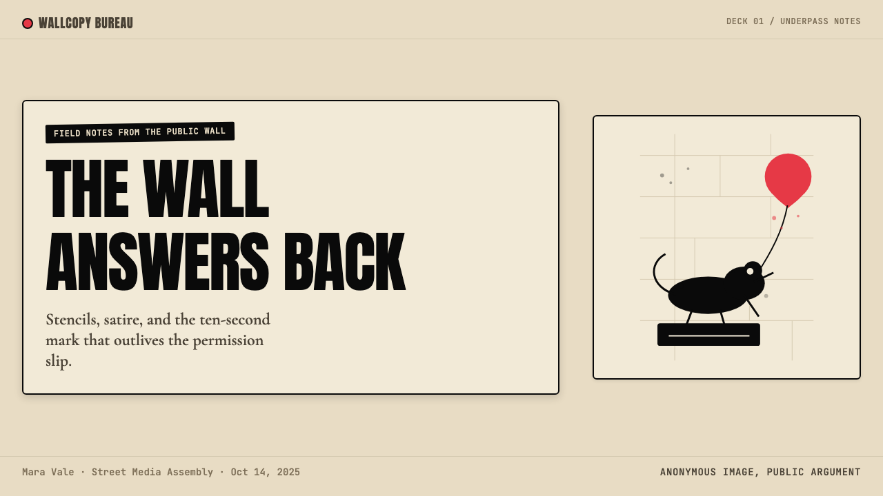
The formal lineage of stencil street art runs through Blek le Rat, the Paris-based French artist (born Xavier Prou) who began cutting and spraying figurative stencils on Parisian walls in 1981. Blek was the first to bring rats into the street-art vocabulary — anonymous, ubiquitous, ungovernable — and the first to treat the stencil not as a labeling device but as a medium for narrative imagery. Banksy has acknowledged Blek le Rat's influence directly, and the two share a commitment to the silhouette as a unit of meaning: a figure reduced to its essential shape communicates across languages and literacy levels in a way that no lettered slogan can.模板街头艺术的正式谱系可追溯至布莱克·勒·拉特——这位巴黎艺术家(本名泽维尔·普鲁)于1981年开始在巴黎街墙上剪切并喷涂具象模板。布莱克是第一个将老鼠引入街头艺术词汇的人——匿名、无处不在、难以管控——也是第一个将模板不再视为标签工具、而是视为叙事图像媒介的人。班克西曾直接承认布莱克·勒·拉特的影响,两者共享一种信念:将人物简化为其本质形状的剪影,能够以任何文字口号都无法企及的方式跨越语言与识字门槛进行传播。
The palette — monochrome black on aged wall, one scarlet accent — was not a branding decision but a production constraint that calcified into doctrine. Black aerosol on pale or cream masonry reads clearly in low light and photographs sharply in daylight. A second color, applied from a second can, doubles the time on the wall and doubles the risk. Banksy's red became his signature precisely because it was used so sparingly: the balloon in 'Girl with Balloon' (Waterloo Bridge, London, 2002), the flower bouquet held by the masked rioter in 'Flower Thrower' (Jerusalem, 2003), the bloodstained handprints. Each red element appears once per image, and it marks the hinge on which the work's meaning turns.那套色板——陈旧墙壁上的单色黑,加上一抹猩红强调——并非品牌决策,而是一种生产约束,后来固化为教条。黑色喷漆在浅色或奶油色砌体上低光下可清晰辨读,在日光下拍照锐利。第二种颜色需要第二支喷罐,墙上停留的时间翻倍,风险也翻倍。班克西的红色之所以成为他的标志,恰恰在于它使用得极为节制:《气球女孩》(2002年,伦敦滑铁卢桥)中的气球,《投掷鲜花者》(2003年,耶路撒冷)中蒙面暴动者手持的花束,血染的手印——每件作品中红色元素只出现一次,标记着作品意义的转轴所在。
By the mid-2000s, the style had migrated off walls entirely. Banksy's 2006 Los Angeles show 'Barely Legal' and his clandestine placement of modified artworks inside major museum collections — the British Museum, the Metropolitan Museum of Art, the Louvre — demonstrated that the visual grammar of street stencil could operate in any context, on any surface, including canvas and print. Steve Lazarides, who served as Banksy's agent and photographer through the early 2000s, documented and distributed the work globally, giving the stencil aesthetic its second life as a reproducible graphic system. The 2013 New York residency 'Better Out Than In' — one new piece per day for a month — cemented the visual language as an international idiom recognizable by audiences with no connection to graffiti culture.到2000年代中期,这种风格已完全脱离墙壁。班克西2006年洛杉矶展览《勉强合法》,以及他秘密将改造作品安置于大英博物馆、大都会艺术博物馆、卢浮宫等主要博物馆馆藏的行动,证明了街头模板的视觉语法能在任何语境、任何表面——包括画布与印刷品——上运作。史蒂夫·拉扎里迪斯在2000年代初担任班克西的经纪人兼摄影师,他对作品的全球记录与传播,赋予了这套模板美学作为可复制图形系统的第二次生命。2013年纽约驻留项目《户外更好》——在一个月内每天发布一件新作——将这套视觉语言巩固为国际通用符号,令没有任何涂鸦文化背景的观众也能识读。
The wider movement encompasses practitioners well beyond Banksy himself. King Robbo, whose Banksy-Robbo feud over a London canal wall became a defining episode in street-art history, represented the freehand aerosol tradition that stencil culture disrupted. Other artists working adjacent to Banksy's idiom — including Shepard Fairey with his OBEY campaign and JR with his large-scale photo-wheat-pastes — share the commitment to public space as medium and the monochrome-plus-accent color logic, even when their formal techniques differ. The stencil street-art movement is best understood not as a single artist's style but as a set of constraints — speed, reproducibility, limited materials, adversarial context — that shaped a visual grammar shared across a generation of practitioners.
What defines the Banksy Stencil Graffiti look?Banksy Stencil Graffiti 的视觉特征是什么?
Palette色板
The color system is one of the most restricted in applied design: near-black for all stencil forms, an aged cream or pale masonry tone for the ground, and a single deep saturated red reserved solely for the image's emotional focal point. No secondary colors, no gradients, no tints or shades between pure black and the ground tone. The palette does not describe a mood — it enforces one. The moment red appears, the eye goes there first and last.这是应用设计中约束最严格的色彩系统之一:近黑色用于所有模板形态,陈旧奶油或浅色砌体调性充当底色,唯一一抹深饱和红色专属于图像的情感焦点。无间色,无渐变,黑与底色之间无任何色调过渡。这套色板不是在描绘某种情绪——而是在强制施加一种情绪。红色出现的那一刻,目光便首先也最终落于那里。
Silhouette剪影
The silhouette is the fundamental unit of the visual language. Every figure — child, soldier, rat, riot policeman — is reduced to its most recognizable outline and filled with flat black, with no internal modeling, no crosshatching, no tonal variation. The discipline of silhouette forces the designer to retain only the features that are essential for identification; anything else is cut away. This reduction is also why the images survive at any scale, in any reproduction quality, on any surface.剪影是这套视觉语言的基本单位。每一个形象——儿童、士兵、老鼠、防暴警察——都被还原为其最可辨认的轮廓,以纯黑填充,无内部建模,无交叉排线,无色调变化。剪影的纪律迫使设计者只保留辨识所必需的特征;其余一切均被裁去。这种简化也正是这些图像能在任何尺寸、任何复制品质、任何表面上存活的原因。
Single Accent单点强调
The red accent — when present — is used exactly once per composition and applied to a single object that functions as the image's interpretive key. It is never used as decoration, pattern, or background wash. It is the comma or exclamation mark in a sentence otherwise written in black and white. Designs that use red twice, or use it for structural framing, violate the logic of the system and dilute the accent's communicative force.红色强调——当其出现时——在每幅构图中恰好使用一次,施加于充当图像解读钥匙的单一对象之上。它从不作为装饰、图案或底色使用。它是一句黑白书写的句子中的逗号或感叹号。在一幅设计中使用红色两次,或将其用于结构框架,便是违背了系统的逻辑,稀释了强调色的传达力量。
Texture and Ground肌理与底面
The background is not a clean white digital field. It carries the memory of its surface — rough plaster, aged brick, weathered concrete, yellowed paper. This texture is not decorative; it is the context that makes the stencil legible as a gesture of intervention rather than a packaged product. When the style is applied to screen or print, the ground should carry some organic quality: a slight grain, an uneven warmth, the suggestion of a surface that exists in the world rather than on a monitor.背景并非干净的数字白底。它承载着表面的记忆——粗糙的灰泥、陈旧的砖块、风化的混凝土、泛黄的纸张。这种肌理并非装饰;它是让模板作为干预姿态而非包装产品而得以被解读的语境。当这种风格应用于屏幕或印刷时,底面应带有某种有机品质:轻微的颗粒感,不均匀的温度,暗示一个存在于世界中而非显示器上的表面。
Typography字体排印
When text appears, it does so sparingly and with the same stencil-cut economy as the imagery. Type should look like it was cut from card stock or sprayed through a letterform mask — slightly irregular at the edges, never smooth or digitally precise. Condensed, heavy letterforms work best because they compress information efficiently and read at a distance. The message is always short: a slogan, a caption, a date, a location. Anything longer than a short phrase belongs to the photograph, not the stencil.当文字出现时,它以与图像相同的模板经济逻辑,克制地呈现。字体应看起来像是从硬纸板上剪出或通过字形掩膜喷涂而成——边缘略显不规则,从不光滑或数字精确。压缩粗重的字形效果最佳,因为它能高效压缩信息并在远处清晰阅读。信息始终简短:一句口号,一行说明,一个日期,一个地名。任何超过短语长度的内容属于照片,而非模板。
Composition and Irony构图与反讽
Banksy compositions are built on a single structural principle: juxtapose the familiar with the subversive to produce irony. A riot policeman holding a smiley-face balloon; a child flying a kite in the shape of a surveillance drone; a rat holding a paintbrush. The visual grammar requires that this juxtaposition be immediate and legible — the viewer must understand both elements and their collision in under three seconds. This means the two halves of the image must be visually distinct enough to register separately before the mind combines them.班克西的构图建立在一个核心结构原则上:将熟悉事物与颠覆性元素并置,以产生反讽。一名防暴警察举着笑脸气球;一个孩子放着监视无人机形状的风筝;一只老鼠举着画笔。这套视觉语法要求并置必须即时可读——观者必须在三秒内理解两个元素及其碰撞。这意味着图像的两个部分在视觉上必须足够鲜明,能够分别被识别,然后在头脑中合并。
Context as Material语境即材料
The wall is not neutral. Where the stencil is placed — on a bank, a detention center, a luxury hotel, a security barrier — is part of the image's meaning. This site-specificity translates into a design principle: the ground and context of a design are not passive backdrops but active participants. A scarlet accent on a cream ground means one thing; the same accent on a surface with a visible history or institutional association means something more complex. Applied design using this aesthetic should treat the surrounding context — a slide deck's surrounding content, a webpage's navigation and footer — as an element of the composition.墙壁并非中立。模板被放置的位置——银行外墙、拘留中心、豪华酒店、安全围障——是图像意义的组成部分。这种场所特殊性转化为一条设计原则:设计的底面与语境不是被动的背景,而是主动的参与者。奶油底上的猩红强调是一种意义;同样的强调色置于一个有可见历史或机构关联的表面上,意义则更为复杂。使用这套美学的应用设计,应将周围的语境——幻灯片周围的内容,网页的导航与页脚——视为构图的组成元素。
See the Banksy Stencil Graffiti design system查看 Banksy Stencil Graffiti 完整设计系统
Who shaped Banksy Stencil Graffiti?谁塑造了 Banksy Stencil Graffiti?
Banksy is an anonymous England-based street artist, political activist, and film director whose identity has never been officially confirmed. Emerging from Bristol's underground graffiti scene in the early 1990s, Banksy developed the stencil method as a practical response to the risk of arrest, then refined it into one of the most legible visual systems in contemporary art. Key works include 'Girl with Balloon' (2002), 'Flower Thrower' (2003), and the Walled Off Hotel in Bethlehem (2017). His 2013 New York residency 'Better Out Than In' produced one new public artwork per day for a month. The 2018 auction shredding of 'Girl with Balloon' — rigged inside the frame and triggered remotely at the moment the hammer fell — extended the stencil idiom into live performance and became one of the most discussed art events of the decade.班克西是一位身份从未被官方证实的英国匿名街头艺术家、政治活动家与电影导演。他从1990年代初布里斯托尔的地下涂鸦圈崛起,最初将模板方法作为规避被捕风险的实用手段,继而将其打磨为当代艺术中辨识度最高的视觉系统之一。代表作包括《气球女孩》(2002年)、《投掷鲜花者》(2003年),以及伯利恒的隔离墙酒店(2017年)。2013年纽约驻留项目《户外更好》在一个月内每天创作一件新的公共艺术作品。2018年拍卖会上《气球女孩》的碎纸机事件——装置预先隐藏在画框内,在拍槌落下一刻遥控触发——将模板语言延伸至现场表演,成为那十年间讨论最广泛的艺术事件之一。
Blek le Rat (Xavier Prou, born 1952 in Boulogne-Billancourt, France) is widely considered the originator of stencil street art as a figurative practice. Beginning in Paris in 1981, he introduced the rat as a recurring motif — a creature that, like the urban artist, moves unseen through official spaces — and developed the use of life-size human silhouettes as a form of spectral public presence. His work preceded Banksy's by over a decade and established the core grammar: figurative stencil, urban wall, no signature but the image itself. Banksy has said that 'every time I think I've painted something slightly original, I find out that Blek le Rat has done it as well, only twenty years earlier.'布莱克·勒·拉特(泽维尔·普鲁,1952年生于法国布洛涅-比扬古)被广泛认为是模板街头艺术具象实践的创始人。他自1981年在巴黎起步,将老鼠引入反复出现的母题——这种生物如同城市艺术家,在官方空间中不被察觉地穿行——并发展了以真人大小人体剪影作为一种幽灵般公共存在的手法。他的创作比班克西早十余年,确立了核心语法:具象模板、城市墙壁、没有签名只有图像本身。班克西曾说:「每次我以为自己画了某个略具原创性的东西,我都会发现布莱克·勒·拉特二十年前已经做过了。」
King Robbo (born Robert, died 2014) was one of the most respected figures in British graffiti culture, whose hand-painted work on a London canal wall in Camden dated to 1985 and was considered one of the oldest surviving pieces of graffiti in the city. When Banksy painted over Robbo's work in 2009 — replacing it with a stencil of a workman hanging wallpaper — it ignited a years-long public feud that crystallized the tension between the freehand aerosol tradition and stencil street art, between the graffiti writer's culture of individual reputation and the street artist's appropriation of public space for political imagery. The Robbo-Banksy conflict became the defining episode in the argument over what street art is for and who it belongs to.国王罗博(本名罗伯特,2014年逝世)是英国涂鸦文化中最受尊敬的人物之一。他在伦敦卡姆登运河墙壁上的手绘作品可追溯至1985年,被视为伦敦现存最古老的涂鸦之一。2009年,班克西在罗博作品上覆盖喷涂了一位糊墙纸工人的模板,由此引发了一场延续数年的公开争执。这场冲突将自由手写喷漆传统与模板街头艺术之间、涂鸦写手文化中的个人声誉与街头艺术家对公共空间的政治图像挪用之间的张力,推至台前。罗博与班克西的冲突成为关于街头艺术为何而存在、归属于谁这一争论的决定性章节。
Steve Lazarides served as Banksy's agent, photographer, and primary distributor from the late 1990s through 2008, a period that corresponds almost exactly with the stencil aesthetic's transition from local Bristol phenomenon to global visual language. Lazarides documented Banksy's street work systematically and sold limited print editions through his gallery operations, creating the commercial infrastructure that allowed the aesthetic to survive and propagate beyond the wall. His subsequent gallery, Lazarides Gallery (London, then international), represented a generation of artists working in dark, confrontational imagery — many of them using the stencil's economy of means — and was instrumental in legitimizing street-art aesthetics within the art market.史蒂夫·拉扎里迪斯从1990年代末至2008年担任班克西的经纪人、摄影师与主要发行人,这一时期几乎与模板美学从布里斯托尔地方现象转变为全球视觉语言的过程完全吻合。拉扎里迪斯系统性地记录班克西的街头创作,并通过其画廊运营销售限量印刷版本,构建起使这套美学得以在墙壁之外存活和传播的商业基础设施。他随后创立的拉扎里迪斯画廊(伦敦,后扩展至国际)代理了一代从事阴暗、对抗性图像创作的艺术家——其中许多人使用模板的经济手段——并在推动街头艺术美学在艺术市场合法化方面发挥了关键作用。
Shepard Fairey (born 1970 in Charleston, South Carolina) is an American street artist and graphic designer whose OBEY campaign — begun in 1989 with a sticker featuring the wrestler Andre the Giant — developed a visual language adjacent to Banksy's: bold flat forms, limited palette, reproducible stencil-and-screen-print aesthetics, and a critique of power embedded in the imagery itself. His 2008 'Hope' poster for Barack Obama's presidential campaign, reproduced in saturated red, white, and blue with a single dominant color plane per zone, demonstrated how stencil-derived graphic logic could operate at national scale. Fairey's practice illuminates the connection between street-stencil aesthetics and political poster design, a lineage that runs through Soviet Constructivism, Situationist détournement, and the Bristol underground.谢波德·费尔雷(1970年生于南卡罗来纳州查尔斯顿)是一位美国街头艺术家与平面设计师。他的OBEY运动——1989年以一张摔跤手安德烈·巨人贴纸为起点——发展出一套与班克西相邻的视觉语言:大胆的平面形态、有限的色板、可复制的模板与丝网印刷美学,以及嵌入图像本身的权力批判。他为巴拉克·奥巴马2008年总统竞选创作的《希望》海报,以饱和的红、白、蓝三色呈现,每个区域仅有单一主色平面,展示了模板衍生的图形逻辑如何能在全国规模上运作。费尔雷的实践揭示了街头模板美学与政治海报设计之间的联结——这条谱系贯穿苏联构成主义、情境主义者的挪用创作,以及布里斯托尔地下文化。
How do you use Banksy Stencil Graffiti today?今天怎么用 Banksy Stencil Graffiti?
Banksy Stencil Graffiti is among the most distinctive visual systems available to contemporary designers, and also among the most specific in its requirements. Applying it correctly means understanding that the style's power derives entirely from its constraints: the moment you add a third color, soften the ground, or use the red accent twice, the system loses its logic and becomes a generic dark aesthetic with protest overtones. The rules are not suggestions.班克西模板涂鸦是当代设计师可用的视觉系统中最具辨识度的之一,同时也对执行者的要求最为苛刻。正确应用它,意味着理解这种风格的力量完全来源于其约束:一旦你添加第三种颜色、柔化底面、或将红色强调使用两次,这套系统便失去其逻辑,沦为一种带有抗议韵味的通用暗色美学。这些规则不是建议。
For presentation slides, the style is most effective when the constraint becomes a compositional device rather than a limitation. A cover slide works best as a large, near-full-bleed silhouette of an image directly relevant to the talk's subject — a person, an object, a scenario — centered or slightly off-center on a cream or lightly textured ground, with the title in heavy condensed type below or beside the figure. The red accent should appear only if there is a single element that must carry the entire emotional weight of the slide; if every slide has a red element, the accent loses its function. Content slides should be treated as near-minimal: a strong typographic hierarchy using only black and the ground tone, with generous margins and a restrained use of ruled lines as structural dividers. Data slides gain unusual power in this aesthetic — bar charts become architectural silhouettes when rendered in flat black against cream, and a single red bar marking the data point that matters most lands with the same force as the balloon in 'Girl with Balloon'.对于演示文稿,这种风格在约束成为构图装置而非局限时最为有效。封面幻灯片最佳效果是:一个与演讲主题直接相关的大型近乎出血的图像剪影——一个人物、一件物品、一个场景——在奶油色或略带肌理的底面上居中或略偏,标题以粗重压缩字体置于图形下方或旁侧。红色强调应只在有单一元素必须承载整张幻灯片全部情感重量时出现;如果每张幻灯片都有红色元素,强调色便失去其功能。内容幻灯片应处理为近乎极简:仅使用黑色与底色的强劲字体层级,留有充裕边距,以克制的细线作为结构性分割线。数据幻灯片在这种美学下获得异乎寻常的力量——柱状图在奶油底上以纯黑渲染时成为建筑剪影,而标记最重要数据点的那一根单独红色柱条,具有与《气球女孩》中气球相同的冲击力。
For web interfaces, the aesthetic suits contexts where authority, directness, and a slight edge of confrontation are desirable — a portfolio site for a creative studio, a campaign landing page, a civic or advocacy organization's homepage. Dashboard applications can use the system by committing to a near-black typographic layer on a warm off-white ground, reserving deep red strictly for alert states or the one metric that the product considers most critical. Pricing pages work with a tier-differentiation approach: most tiers rendered in black and cream, the featured tier marked with a red accent element — a single horizontal rule, a badge, a border — that does not repeat anywhere else on the page. Navigation should be wordmark and label only; icon decoration undermines the stencil's economy of means.对于网页界面,这种美学适合权威性、直接性以及轻微对抗感受欢迎的场景——创意工作室的作品集网站、活动宣传落地页、公民或倡导组织的主页。仪表板应用可以这样运用这套系统:在温暖米白底面上构建近黑色字体层,将深红色严格保留给警示状态或产品认为最重要的单一指标。定价页面适合等级差异化方法:大多数等级以黑色和奶油色呈现,特色等级以一个红色强调元素标记——一条细横线、一枚徽章、一条边框——且在页面其他任何地方不再重复。导航应仅为文字标识与标签;图标装饰会破坏模板的经济手段。
For editorial and marketing work, the style functions as a short-range weapon: powerful at poster distance, demanding in its restraint, unsuited to long-form layouts where the viewer spends extended time with the page. A single-page editorial spread works well — a full-bleed silhouette image on one page, dense typographic text on the opposite page with the single red accent appearing in a pull quote or a chapter number. Marketing campaigns using this aesthetic should commit to a consistent single image per communication: one stencil, one moment, one red element, one message. The temptation to use more variety to fill campaign volume is precisely the temptation to resist.对于编辑与营销工作,这种风格如同一件近距武器:在海报距离上威力强大,在克制上要求严格,不适合观者在页面上停留较长时间的长篇版面。单页编辑跨页版效果良好——一页满版出血的剪影图像,对页以密集排印文字呈现,单一红色强调出现在引用文或章节编号中。使用这套美学的营销活动应坚守每则传播一个一致图像的原则:一个模板、一个时刻、一个红色元素、一条信息。用更多变化来填充活动体量的诱惑,正是必须抵抗的诱惑。
The most common mistake when applying this aesthetic is treating the black-and-cream palette as a style choice that can be blended with other elements. Soft drop shadows, gradient overlays, smooth rounded corners, photography used as a naturalistic window, and warm illustrative texture all belong to different visual systems; their presence in the same layout signals indecision rather than design. A second, more subtle mistake is using the red accent as a brand color — placing it in the logo, the navigation, the footer, and the call-to-action button simultaneously. That diffusion destroys the accent's entire communicative logic. The red must appear once, at the point of greatest emotional weight, and nowhere else.应用这套美学时最常见的错误,是将黑色与奶油色色板视为一种可以与其他元素融合的风格选择。柔和投影、渐变叠加、圆润的圆角、用作自然主义窗口的摄影,以及温暖的插图肌理,都属于不同的视觉系统;它们同时出现在一个版面中,传递的是设计上的优柔寡断,而非风格决策。第二种更隐蔽的错误是将红色强调用作品牌色——同时将其置于标志、导航、页脚和行动号召按钮之中。这种扩散彻底摧毁了强调色的全部传达逻辑。红色必须只出现一次,出现在情感重量最大的那个点,别无他处。
See the Banksy Stencil Graffiti design system查看 Banksy Stencil Graffiti 完整设计系统
Banksy Stencil Graffiti — FAQBanksy Stencil Graffiti · 常见问题
Can this style work on a digital interface, or is it inherently a print and wall medium?这种风格能用于数字界面吗,还是它本质上属于印刷与墙面媒介?
It works on digital surfaces, but it requires deliberate translation rather than direct transfer. The key adaptations are: replace the literal brick-wall texture with a warm, slightly irregular off-white ground that carries organic quality without being illustrative; render silhouette elements as flat vector forms rather than photographic cutouts; and treat interactive states — hover, active, focus — through scale or opacity change rather than color addition. The one thing that transfers perfectly is the single-accent logic: exactly one red element per screen or per major section. Digital interfaces that apply this style at its most faithful look like protest posters that happen to be interactive.它适用于数字表面,但需要刻意转译而非直接搬用。关键适配如下:以一种温暖、略显不规则的米白底面替代字面意义上的砖墙肌理,使其具有有机品质而不流于插图化;将剪影元素渲染为平面矢量形态而非照片裁切;通过缩放或透明度变化而非添加颜色来处理交互状态——悬停、激活、聚焦。完美移植的一点是单点强调逻辑:每个屏幕或每个主要区块中恰好一个红色元素。最忠实应用这种风格的数字界面,看起来就像碰巧可以交互的抗议海报。
Is the aged or textured background mandatory, or can the style work on a clean white ground?陈旧或带肌理的背景是必要条件,还是这种风格可以在干净白底上运作?
A clean white ground is possible but changes what the style communicates. The aged texture carries the implication of site — of a real surface in the world — which is what separates the aesthetic from a generic high-contrast graphic design. On a pure white ground, the stencil silhouette reads as illustration or icon design; on an organic ground, it reads as an act. For contexts where the street-art connotation must be explicit, preserve the textured ground. For contexts where the style is being used more abstractly — for its boldness and constraint — a warm near-white is acceptable as long as the cream tone remains visible rather than tipping into a neutral cool white.干净的白色底面是可行的,但会改变这种风格所传达的内容。陈旧肌理暗示了场所感——世界中一个真实表面的存在——这正是将这套美学与通用高对比度平面设计区分开来的关键。在纯白底面上,模板剪影读作插图或图标设计;在有机底面上,它读作一种行动。对于街头艺术内涵必须明确的场景,保留带肌理的底面。对于更抽象地使用这种风格的场景——为了其大胆性与约束性——温暖的近白色是可接受的,只要奶油调性保持可见,而不是倒向中性冷白。
How do you handle a project with multiple accent needs — for example, a data dashboard with four KPI states?如何处理有多个强调需求的项目——例如,一个有四种KPI状态的数据仪表板?
The single-accent rule is the most difficult constraint to adapt and also the most important. For multi-state applications, the honest answer is that strict Banksy aesthetics does not accommodate four simultaneously active accent states — and trying to force it produces incoherence. The practical approach is to treat red as the exclusive property of the one state that requires immediate action (critical alert, overdue item, target breached), and to handle all other states through typographic weight, scale contrast, and structural position within the black-and-cream system. A state that matters but does not require immediate action is conveyed by position and size, not color. If four genuinely critical simultaneous states are required, consider whether this aesthetic is the right system for the application.单点强调规则是最难适配也最重要的约束。对于多状态应用,诚实的答案是:严格的班克西美学无法容纳四种同时活跃的强调状态——强行为之只会产生混乱。实用的方法是:将红色作为唯一需要即时行动状态的专属标记(严重警报、逾期事项、目标突破),所有其他状态则通过字体字重、尺寸对比以及在黑色与奶油系统内的结构位置来处理。一个重要但不需要即时行动的状态,由位置和尺寸传达,而非颜色。如果确实需要四个同时存在的关键状态,应当考虑这套美学是否是该应用的正确系统。
Does the style carry political meaning that might be inappropriate for some clients?这种风格是否承载着可能对某些客户不合适的政治含义?
Yes, and this is worth discussing directly with clients before committing. The Banksy stencil aesthetic is inseparable from its origins in anti-establishment political street art — it signals critique, intervention, and a certain adversarial relationship with institutional authority. For brands or organizations that are themselves institutional authorities — banks, government agencies, large corporations in regulated industries, healthcare systems — the aesthetic is likely to generate dissonance: it will read as either satirical or incoherent rather than bold. The style is best suited to organizations that have a genuine ideological alignment with the aesthetic's values: advocacy groups, independent creative studios, challenger brands, cultural institutions with a critical public mission, and technology products positioning themselves against incumbents.是的,这值得在确定方向之前与客户直接讨论。班克西模板美学与其反建制政治街头艺术起源不可分割——它传递批判、干预,以及一种与机构权威的对抗关系。对于那些本身就是机构权威的品牌或组织——银行、政府机构、受监管行业的大型企业、医疗体系——这套美学很可能产生认知失调:它会被读作讽刺或语义不连贯,而非大胆。这种风格最适合与其价值观具有真正意识形态对齐的组织:倡导团体、独立创意工作室、挑战者品牌、具有批判性公共使命的文化机构,以及将自身定位为对抗既有势力的科技产品。
What is the difference between Banksy Stencil Graffiti and a generic dark poster aesthetic?班克西模板涂鸦与通用暗色海报美学有何区别?
The distinguishing features are three and all of them structural. First, the ground is organic and aged, not a designed dark background — the cream or plaster tone is a surface with history, not a brand color choice. Second, the imagery is silhouette rather than rendered illustration — flat black with no internal modeling, no shading, no line weight variation within a form. Third, the accent is singular and positional rather than decorative and repeated. A generic dark poster aesthetic might share some surface similarities — high contrast, limited palette, bold type — but it typically uses multiple accent colors, employs rendered or photographic imagery, and treats dark backgrounds as atmospheric choices rather than contextual facts. The simplest diagnostic: if the design would still make sense on a clean digital black background, it is probably not Banksy Stencil Graffiti — it is something else wearing its clothes.区别特征有三条,且都是结构性的。第一,底面是有机且陈旧的,而非设计过的深色背景——奶油色或灰泥调性是一个有历史的表面,而非品牌色彩选择。第二,图像是剪影而非渲染插图——纯黑内部无建模、无阴影、形体内无线条粗细变化。第三,强调色是单一且具有位置意义的,而非装饰性且反复出现的。通用暗色海报美学可能在表面上有若干相似之处——高对比度、有限色板、大胆字体——但它通常使用多种强调色,采用渲染或摄影图像,并将深色背景视为氛围选择而非语境事实。最简单的诊断方法是:如果这个设计在干净的数字黑底上依然成立,它很可能不是班克西模板涂鸦——而是穿着它衣服的其他东西。
Related design styles相关设计风格
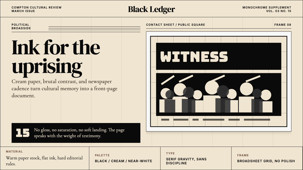 Kendrick — To Pimp a ButterflyPolitical weight, printed cold. Cream paper, hard serif type, monochrome crow…政治重量冷静落纸。米黄纸、硬衬线与黑白群像几何。
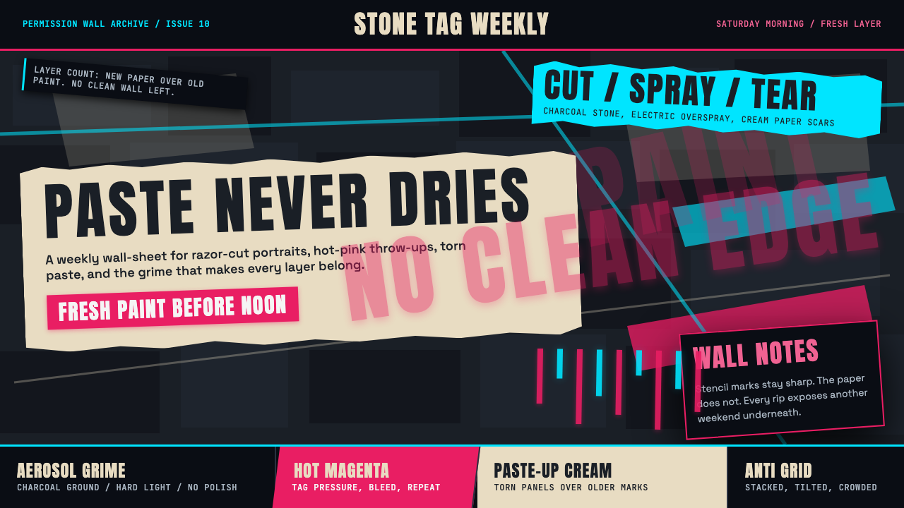 Melbourne Laneway Stencil (Hosier Lane)Permission-wall maximalism. Magenta tags slash charcoal bluestone and cream p…合法墙极繁主义:洋红标签划过炭黑青石与奶油贴纸。
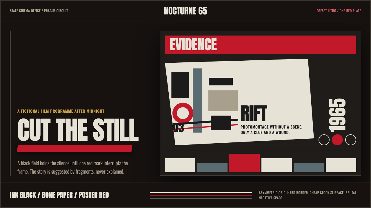 Czech New Wave PosterConcept before spectacle. Ink black, bone type and one poster-red incision fr…观念先于奇观。墨黑、骨白窄体与一道海报红切开网格。
 Red Bull Extreme SportsAdrenaline goes corporate. Navy chrome, condensed uppercase, yellow slashes a…肾上腺素也很企业。海军蓝金属面、压缩大写与黄色斜切加速。
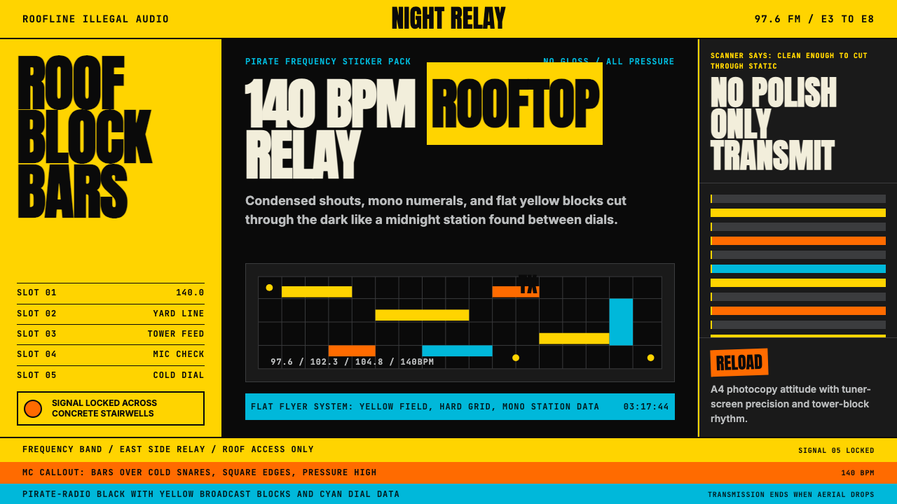 Grime London Pirate Radio (2003)Pirate signal, flat and urgent. Yellow blocks, mono FM numerals, hard flyer g…盗台信号,平面又急促。黄块、等宽频率字、硬网格成形。
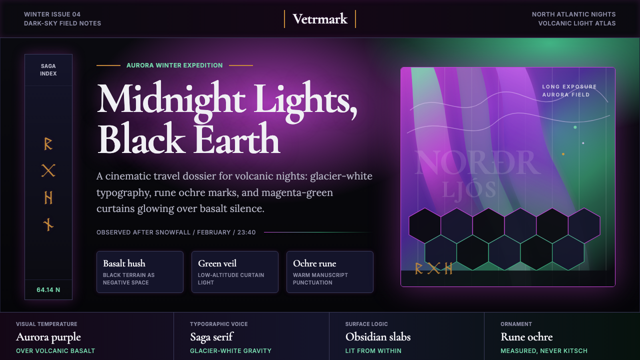 Icelandic Aurora TourismMidnight tourism turns mythic. Basalt black, aurora magenta-green, saga serif…午夜旅游变得神话。玄武岩黑、极光紫绿与萨迦衬线。