What is Kendrick — To Pimp a Butterfly?什么是 Kendrick — To Pimp a Butterfly?
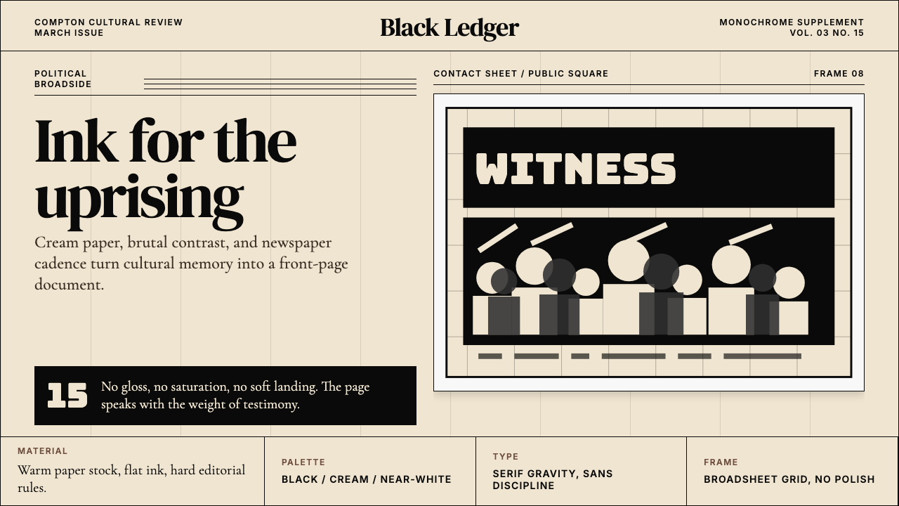
A chaotic celebration in front of the White House, distilled into cream paper, hard serif gravity, and the uncompromising monochrome of political conviction.白宫前的混乱狂欢,被提炼成米黄纸张、硬朗衬线的份量,以及政治信念毫不妥协的黑白。
Kendrick — To Pimp a Butterfly in briefKendrick — To Pimp a Butterfly 速览
Kendrick — To Pimp a Butterfly is a design language born from the visual universe of Kendrick Lamar's landmark 2015 album. Art-directed by Vlad Sepetov and photographed by Denis Rouvre, the album cover — a crowd of Black men celebrating on the White House lawn, rendered in stark monochrome — became one of the most politically charged images in contemporary popular culture. This design system translates that energy into a transferable visual grammar: strict monochrome discipline, the warmth of cream paper grounds, and the editorial gravitas of a political broadside.「Kendrick — To Pimp a Butterfly」是一套脱胎于 Kendrick Lamar 2015 年里程碑式专辑视觉宇宙的设计语言。艺术总监 Vlad Sepetov 与摄影师 Denis Rouvre 操刀的那张封面——一群黑人男性在白宫草坪上狂欢,以强烈的黑白影调呈现——成为当代流行文化中政治能量最为充沛的图像之一。这套设计系统将那种能量翻译成可移植的视觉语法:严格的黑白纪律、米黄纸张底面的温度,以及政治社论般的编辑份量。
The style speaks with the authority of conscious rap given form. It draws on newspaper typography, documentary-style photography treated as flat graphic mass, and a tonal restraint that refuses decoration. No saturated color intrudes, no cheerful gradient softens the edges. What remains is a high-contrast world of deep blacks, warm off-whites, and figures rendered as graphic silhouettes — a visual language that says something before a single word is read.这套风格以 conscious rap 赋予形式的权威感发言。它汲取报纸排版、以平面图形质感处理的纪实摄影,以及拒绝一切装饰的色调克制。没有饱和色彩的介入,没有令人愉悦的渐变柔化边缘。留下来的是一个高对比的世界:深沉的黑、温暖的近白,以及被转化为图形剪影的人物——一种在读到任何文字之前就已经在传达信息的视觉语言。
This is not minimalism for minimalism's sake. It is purposeful weight. Every element carries the density of a movement: the cream ground recalls printed matter with history behind it — pamphlets, manifestos, editorial pages — while the severe typographic contrast and monochrome imagery signal that the content means business. It is a style suited to creators and platforms that have something serious to say and want the design to earn that seriousness.这不是为极简而极简。这是有目的的重量。每个元素都承载着一种运动的密度:米黄底面唤起有历史沉淀的印刷物——小册子、宣言、编辑版面——而严峻的排版对比与黑白影像则在宣告:这里的内容是认真的。这是一种适合那些有严肃话语要说、并希望设计本身能配得上这份严肃性的创作者与平台的风格。
See the Kendrick — To Pimp a Butterfly design system查看 Kendrick — To Pimp a Butterfly 完整设计系统
Where does Kendrick — To Pimp a Butterfly come from?Kendrick — To Pimp a Butterfly 从何而来?
To Pimp a Butterfly was released on March 15, 2015, arriving at a moment of acute political tension in the United States. The period between Trayvon Martin's shooting in 2012 and the album's release had seen the emergence of the Black Lives Matter movement, a profound national conversation about race, policing, and systemic inequality. Kendrick Lamar, who had grown up in Compton, California — a city marked by cycles of poverty, gang violence, and police brutality — channeled these realities into the most politically ambitious album of his career. The record was not merely a commercial release; it was a cultural document.《To Pimp a Butterfly》于2015年3月15日发行,正值美国政治张力最为尖锐的时刻。从2012年 Trayvon Martin 被枪杀到专辑发行,其间诞生了「Black Lives Matter」运动,全国范围内关于种族、警察执法与系统性不平等的深刻对话正在进行。Kendrick Lamar 成长于加州康普顿——一座被贫困循环、帮派暴力与警察暴力所标记的城市——他将这些现实导入了自己职业生涯中政治雄心最为宏大的专辑。这张唱片不仅仅是一次商业发行,它是一份文化档案。
The album cover's composition was a deliberate provocation. Denis Rouvre's photograph placed a crowd of Black men — some gleeful, some stoic, all alive with presence — on the lawn of the White House, the symbolic center of American political power, posed beside the corpse of a suited white man and a defaced currency note. A judge in judicial robes stands to the side. The image collapsed celebration and indictment into a single frame, demanding that the viewer hold both simultaneously. Vlad Sepetov's art direction rendered this scene in severe black and white, stripping away any chromatic comfort and forcing the drama to live entirely in tonal contrast and body language.专辑封面的构图是一次蓄意的挑衅。Denis Rouvre 的照片将一群黑人男性——有的欢腾,有的沉默,所有人都充满存在感——置于白宫草坪,美国政治权力的象征性中心,他们站在一具西装革履的白人男性尸体旁,旁边是被涂改的货币。一位法官袍加身的人物站在一侧。这张图像将庆典与控诉折叠进同一帧,要求观看者同时容纳两者。Vlad Sepetov 的艺术总监工作以严峻的黑白处理这一场景,剥去一切色彩上的慰藉,迫使全部戏剧性只能活在色调对比与身体语言之中。
Kendrick himself had been building toward this visual register since his 2012 breakthrough good kid, m.A.A.d city. That album used street documentary aesthetics — grainy photography, hand-written notes, VHS-quality memory — to ground its narrative in the specific textures of Compton. To Pimp a Butterfly elevated that approach into something more overtly political and formally self-conscious, drawing on the visual traditions of the Black American political canon: protest photography, radical magazine layouts from the era of the Black Panther Party newspaper, and the Cold War-era graphic tradition of the political broadside.Kendrick 本人自2012年突破性的《good kid, m.A.A.d city》起就在构建这种视觉表达体系。那张专辑以街头纪录片美学——粒状摄影、手写便条、录像带质感的记忆——将其叙事锚定于康普顿的特定肌理之中。《To Pimp a Butterfly》将这一方式提升为更加公开的政治表达与形式上的自我意识,汲取了黑人美国政治传统的视觉遗产:抗议摄影、黑豹党报纸时代的激进杂志版面,以及政治宣传品的冷战时期图形传统。
The movements that converge in this visual system span decades. Conscious rap — with its roots in the late 1980s and early 1990s work of artists like Public Enemy, A Tribe Called Quest, and Mos Def — had always demanded a visual counterpart as serious as its lyrical content. Post-Trayvon visual culture gave that demand new urgency. Top Dawg Entertainment, the independent Compton-based label that released the album, had cultivated a visual identity that refused commercial slickness in favor of rawness and authenticity. The design system that emerged from TPAB synthesized all of these threads: the editorial gravity of the Black American press tradition, the confrontational geometry of political poster art, and the documentary honesty of monochrome photography.汇聚在这套视觉系统中的运动跨越了数十年。Conscious rap——其根源在于1980年代末、1990年代初 Public Enemy、A Tribe Called Quest 和 Mos Def 等艺术家的工作——始终需要一个与其歌词内容同样严肃的视觉对应物。后特雷沃·马丁时代的视觉文化赋予了这一需求新的紧迫性。康普顿的独立厂牌 Top Dawg Entertainment 培育了一种拒绝商业光滑、偏爱粗粝与真实的视觉身份。从《TPAB》中升华而出的设计系统综合了所有这些线索:黑人美国新闻传统的编辑份量、政治海报艺术的对抗性几何,以及黑白摄影的纪录片诚实。
What defines the Kendrick — To Pimp a Butterfly look?Kendrick — To Pimp a Butterfly 的视觉特征是什么?
Monochrome Discipline黑白纪律
The palette is built on a strict axis of deep black and warm off-white, with no chromatic color permitted to enter. Where a tonal range appears, it reads as the natural grain of documentary photography — silver gelatin depth — rather than as designed gradation. The monochrome is not cold or clinical; the off-white anchor gives it the warmth of aged newsprint or cream card stock, lending the system its characteristic sense of weight with history.色板建立在深黑与温暖近白的严格轴线上,不允许任何有彩色介入。若有色调层次出现,它读起来像纪录片摄影天然的颗粒感——银盐相纸的深度——而非设计性的渐变。这套黑白并不冷漠也不临床;近白的锚底赋予它陈年新闻纸或米色卡纸的温度,使这套系统呈现出那种带有历史重量的特质气息。
Editorial Typography社论式排印
Serif letterforms carry the typographic work — specifically the kind of high-contrast serif associated with the print tradition of newspapers and literary journals, where thick strokes anchor headlines and thin strokes carry body text. Type is set with stark scale contrast: a headline commands the composition at outsized weight while secondary text pulls back. There is no decorative letterwork, no script, no playful mixing — the type speaks with the directness of a printed statement.衬线字体承担排版工作——特别是那种与报纸、文学期刊印刷传统相关联的高对比衬线,粗笔画锚定标题,细笔画承载正文。排版以强烈的尺度对比呈现:标题以超大字重主宰构图,而次级文字收缩退让。没有装饰性字形,没有手写体,没有戏谑性的混搭——字体以印刷声明的直接性发言。
Documentary Photography as Flat Mass纪录片摄影作为平面图形质量
Photography in this system functions not as a window but as a graphic element with tonal weight. Images are treated with high contrast — shadows pushed to near-black, highlights held near-white — so that human figures read as dense graphic silhouettes against their ground. The effect collapses depth: figures become monolithic masses, crowds become textured geometry. This approach is drawn directly from the tradition of documentary and protest photography, where the image must communicate its argument even in low-fidelity reproduction.这套系统中的摄影不作为窗口,而是作为带有色调重量的图形元素运作。图像以高对比度处理——阴影压至近黑,高光保持近白——使人物以浓密的图形剪影形态从底面读出。效果折叠了深度:人物成为整体性的块面,人群成为带有肌理的几何体。这种方式直接取法于纪录片与抗议摄影的传统,在那里,图像必须即便在低保真度的复制环境下也能传达其论点。
Confrontational Composition对抗性构图
Layouts place mass directly against the viewer — subjects face outward, text anchors forward, negative space is used not to create calm but to create pressure. The composition has a broadside quality: elements are arranged to be read quickly and felt immediately, without the invitation of gentle hierarchy. A single dominant image or text block arrests the eye before any secondary reading path begins. This is design that demands, rather than invites.版面将质量直接抵向观看者——主体朝外,文字向前锚定,留白不是为了制造平静而是为了制造压迫感。构图具有宣传单的品质:元素被安排为能被快速阅读、立即感受,没有温柔层级的邀请。单一的主导图像或文字块在任何次级阅读路径开始之前先行捕获眼球。这是要求式的设计,而非邀请式的。
Cream-Ground Warmth米黄底面的温度
The ground is never pure white. An off-white — warm, slightly yellowed, reminiscent of aged print stock or uncoated paper — underlies all compositions. This warmth prevents the high-contrast monochrome from reading as sterile or digital. It places the design in the tradition of printed political and cultural documents: pamphlets, literary journals, album liner notes. The cream ground is the system's connective tissue between the archive and the present.底面从不是纯白。一种近白——温暖、略带黄调,令人联想到陈年印刷用纸或非涂布纸——衬托所有构图。这种温度防止高对比黑白被解读为无菌或数字化。它将设计置于印刷政治与文化文件的传统中:小册子、文学期刊、专辑内页说明。米黄底面是这套系统连接档案与当下的结缔组织。
Conscious-Weight Restraint清醒克制的重量
Nothing decorative is permitted. No ornamental borders, no illustrative flourishes, no chromatic accent colors introduced for visual relief. The restraint is not a passive minimalism but an active refusal — the system withholds visual pleasure as a political and rhetorical act. Decoration would dilute the weight. What remains after all decoration is removed is not emptiness but pressure: the pressure of information that considers itself too important to be made pretty.不允许任何装饰性元素。没有装饰边框,没有插图花饰,没有为了视觉缓和而引入的彩色强调色。这种克制不是被动的极简主义,而是主动的拒绝——这套系统将视觉愉悦作为政治与修辞行为加以扣押。装饰会稀释重量。去除所有装饰之后留下的不是空洞而是压力:一种认为自己重要到不需要被美化的信息的压力。
Crowd-as-Geometry人群即几何
Groups of figures, when they appear, are not presented as individuals but as collective form — dense, interlocking, read as texture rather than portraiture. This treatment echoes both the album cover's mass of celebrants and the visual tradition of protest and documentary imagery, where the crowd itself is the argument. In designed contexts, this principle translates to: multiple images or elements arranged in tight, repeating grids that create textural mass rather than orderly separation.人物群体出现时,不以个体呈现,而是作为集体形态——密集、相互交织,被解读为肌理而非肖像。这种处理方式同时回应了专辑封面上的狂欢人群,以及抗议和纪录片影像的视觉传统,在那里,人群本身就是论点。在设计语境中,这一原则转化为:多个图像或元素以紧凑、重复的网格排列,制造肌理性的质量而非有序的分离。
See the Kendrick — To Pimp a Butterfly design system查看 Kendrick — To Pimp a Butterfly 完整设计系统
Who shaped Kendrick — To Pimp a Butterfly?谁塑造了 Kendrick — To Pimp a Butterfly?
Born in Compton, California, Kendrick Lamar grew from a street-level chronicler on good kid, m.A.A.d city (2012) to the most politically ambitious voice in American rap on To Pimp a Butterfly (2015). The album drew on jazz, funk, spoken-word poetry, and the intellectual tradition of Black American political thought. In 2018 he became the first rapper to win the Pulitzer Prize for Music, awarded for his 2017 album DAMN. The visual language of TPAB — monochrome severity, cream warmth, editorial confrontation — is inseparable from the density of the lyrical content it was designed to carry.成长于加州康普顿,Kendrick Lamar 从《good kid, m.A.A.d city》(2012年)中的街头编年史作者,成长为《To Pimp a Butterfly》(2015年)中美国说唱界政治雄心最为宏大的声音。这张专辑汲取了爵士、放克、口语诗歌,以及黑人美国政治思想的知识传统。2018年,他以2017年专辑《DAMN.》获得普利策音乐奖,成为首位获此殊荣的说唱艺术家。《TPAB》的视觉语言——黑白严峻、米黄温度、社论式对抗——与它所承载的歌词密度不可分割。
Vlad Sepetov served as art director for the To Pimp a Butterfly cover, making the central aesthetic decisions that shaped the album's visual identity: the monochrome treatment, the White House setting as backdrop, and the formal arrangement of the crowd. His choices transformed Denis Rouvre's documentary photography into a political image that reads simultaneously as celebration and indictment. Sepetov's art direction is the bridge between the raw photographic material and the finished visual statement.Vlad Sepetov 担任《To Pimp a Butterfly》封面的艺术总监,做出了塑造专辑视觉身份的核心美学决定:黑白处理方式、以白宫为背景的场景选择,以及人群的正式排布。他的选择将 Denis Rouvre 的纪录片摄影转化为一张同时作为庆典与控诉可被解读的政治图像。Sepetov 的艺术总监工作是原始摄影素材与最终视觉声明之间的桥梁。
Denis Rouvre is a French documentary and portrait photographer whose practice centers on unflinching, high-contrast portraiture of human subjects in extreme or politically charged circumstances. His photographic eye — building scenes with dense tonal contrast and a directness that refuses sentimentality — gave the TPAB cover its documentary credibility. The photograph works because it does not look staged in the conventional sense; it looks witnessed. That documentary quality is foundational to the design system.Denis Rouvre 是一位法国纪录片与肖像摄影师,其创作核心是对极端或政治充盈环境中人类主体的毫不退缩、高对比度肖像拍摄。他的摄影眼光——以浓密色调对比和拒绝感伤主义的直接性构建场景——赋予了《TPAB》封面以纪录片的可信度。这张照片之所以有效,是因为它看起来并非常规意义上的摆拍,而是被目击到的。这种纪录片品质是这套设计系统的基础。
Founded in Compton in 2004, Top Dawg Entertainment built its identity around independence, authenticity, and a refusal of the visual slickness associated with major-label releases. TDE's visual philosophy — raw over polished, specific over generic, heavy over light — provided the institutional context in which the TPAB visual system could be conceived. The label's consistent commitment to design that reflects rather than softens its artists' realities is a significant reason why the album cover retains its force years after release.2004年创立于康普顿的 Top Dawg Entertainment 围绕独立性、真实性,以及对大厂牌发行所关联的视觉光滑感的拒绝,构建了自己的身份。TDE 的视觉哲学——粗粝胜于精致,具体胜于通用,厚重胜于轻盈——提供了《TPAB》视觉系统得以构想的机构语境。这个厂牌对能够反映而非柔化其艺术家现实的设计的一贯承诺,是专辑封面在发行多年后依然保有其力量的重要原因。
The design system draws on a longer visual lineage than the album alone: the graphic tradition of Black American political publishing, which runs from abolitionist pamphlets through the Harlem Renaissance literary journals, the Black Panther Party newspaper (published 1967–1980), and the design sensibility of civil rights-era documentary photography. This tradition favored high-contrast print aesthetics, editorial seriousness, and the use of typography and image as instruments of political argument rather than aesthetic pleasure. TPAB locates itself explicitly within this lineage.这套设计系统汲取了比这张专辑更长的视觉谱系:黑人美国政治出版的图形传统,从废奴主义小册子,经由哈莱姆文艺复兴时代的文学期刊、黑豹党报纸(1967—1980年出版),到民权运动时代纪录片摄影的设计感性。这一传统偏爱高对比度的印刷美学、编辑性的严肃态度,以及将排版与图像用作政治论证而非美学享受的工具。《TPAB》明确将自身定位于这一谱系之中。
How do you use Kendrick — To Pimp a Butterfly today?今天怎么用 Kendrick — To Pimp a Butterfly?
Kendrick — To Pimp a Butterfly is a style for content that takes itself seriously and wants the design to make that legible before the first line is read. It works when the material has weight — political, cultural, intellectual — and when that weight should be felt immediately upon encountering the page or screen. It does not work as decoration for content that lacks this seriousness; applied to lightweight or commercial material, it reads as pretension rather than conviction.「Kendrick — To Pimp a Butterfly」是一种适合那些认真对待自身内容、并希望设计在第一行文字被阅读之前就使这份认真可见的风格。当素材拥有重量——政治的、文化的、知识的——且这种重量应当在接触到页面或屏幕的瞬间立即被感受时,它才有效。它不适合作为缺乏这种严肃性的内容的装饰;应用于轻量或商业性素材时,它读起来像矫揉造作而非信念。
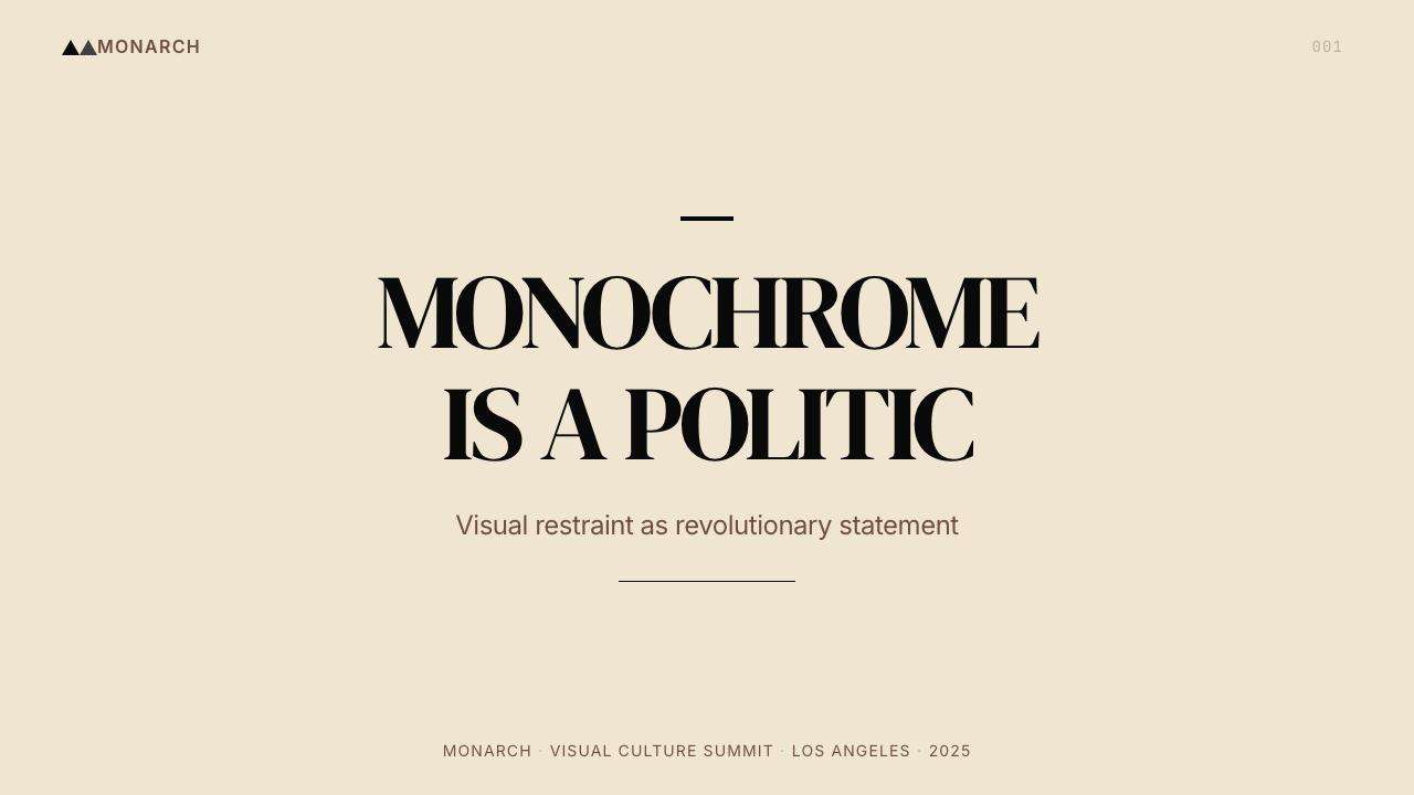
For presentation slides, the style works best when the content demands authority: keynote addresses, research findings, policy documents, cultural criticism. A cover slide benefits from the full confrontational treatment — a high-contrast monochrome photograph of a person or scene, occupying most of the frame, with the title set in heavy editorial serif type at large scale against a cream ground. Content slides should be treated as single-subject spreads: one dominant element per slide, generous vertical rhythm, body text set in a readable serif at modest size, section breaks marked by a bold rule rather than a decorative ornament. Data slides can adopt the crowd-as-geometry principle: grid arrangements of small charts or figures that read as textured mass before they are read individually.对于演示文稿,这套风格在内容需要权威感时最为有效:主题演讲、研究发现、政策文件、文化批评。封面幻灯片适合完整的对抗性处理——一张人物或场景的高对比黑白照片占据画面大部分,标题以粗重社论衬线字体在米黄底面上大尺度呈现。内容幻灯片应当被当作单主题跨页处理:每张幻灯片一个主导元素,充裕的垂直节奏,正文以可读衬线字体设置于适中尺寸,段落分隔以粗线条而非装饰元素标记。数据幻灯片可以采用「人群即几何」原则:小图表或数字的网格排列,在被逐个阅读之前先以整体性的肌理质量读出。
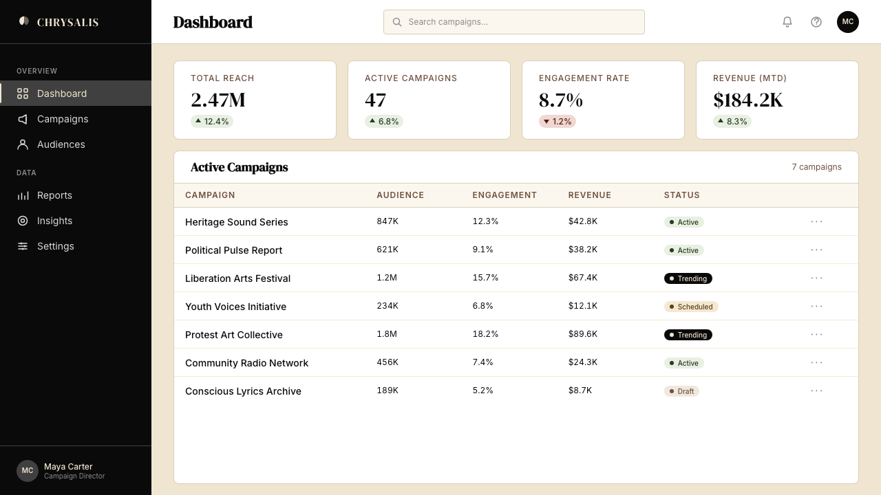
For web interfaces, the system suits editorial sites, cultural platforms, independent journalism, and any dashboard where the data is serious enough to be treated with the same gravity as a printed report. On a dashboard, this means a cream or very warm near-white background, deep black for all labeling and body text, hard-edged card components with no soft shadows, and monochrome data visualizations that rely on tonal contrast — lighter and darker values — rather than color coding for differentiation. For pricing or feature pages, the confrontational composition principle applies: large, direct type at each tier heading, no icon illustration as a substitute for prose, and clear differentiation between tiers through scale and contrast rather than color.对于网页界面,这套系统适合编辑类网站、文化平台、独立新闻,以及任何数据足够严肃到应当以印刷报告同等庄重感对待的仪表板。在仪表板中,这意味着米黄或非常温暖的近白背景,所有标签与正文使用深黑,卡片组件使用硬边无柔和阴影,数据可视化使用单色并依靠色调对比——更浅与更深的值——而非色彩编码来进行区分。对于定价或功能页面,对抗性构图原则同样适用:每个层级标题使用大而直接的文字,不以图标插图替代散文,层级之间通过尺度与对比——而非色彩——进行清晰区分。
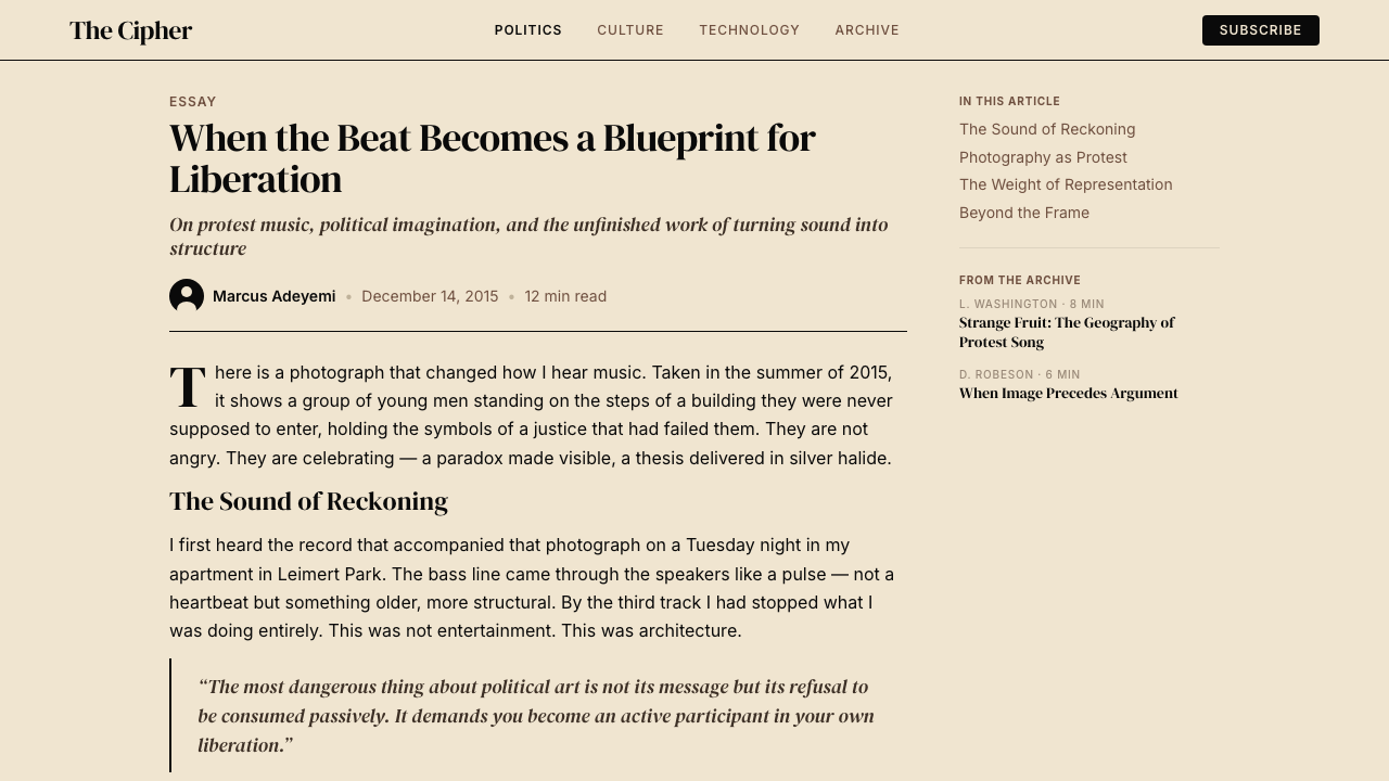
For editorial and marketing work, the style excels at hero sections, table-of-contents spreads, and interview layouts. A hero section structured in this system places a high-contrast portrait or crowd photograph in a dominant position, with a headline set at substantial scale in editorial serif, the whole composition on a cream ground with deep black type. Marketing pages benefit from the broadside quality: alternating full-width sections that shift between deep-black grounds with cream type and cream grounds with deep-black type, using scale and contrast — not chromatic color — to maintain visual momentum. Pull-quotes and call-outs should be set large and bold, treated as graphic masses rather than styled text.对于编辑与营销工作,这套风格在英雄区块、目录页面展开与访谈版面上表现突出。在这套系统中构建的英雄区块将高对比肖像或人群照片置于主导位置,标题以社论衬线字体大尺度呈现,整体构图在米黄底面上使用深黑文字。营销页面从宣传单的品质中受益:交替的全宽区块在深黑底面配米黄文字与米黄底面配深黑文字之间转换,以尺度与对比——而非有彩色——维持视觉动势。引用语与呼叫框应当设置得大而粗重,被当作图形质量而非样式化文本处理。
A common mistake is introducing chromatic color to relieve the severity — adding a single saturated accent to a button or header, reasoning that pure monochrome is too austere for a screen product. This undermines the system's entire logic: the absence of color is not an omission but the argument itself. A second mistake is using photographic imagery with too much tonal range and too little contrast, resulting in images that look gray and underpowered rather than the graphic monoliths the system requires. If photography is not available, dense typographic composition — large-scale text treated as visual mass — is a stronger substitute than low-contrast imagery.一个常见错误是引入有彩色来缓解严峻感——在按钮或标题上添加单个饱和强调色,理由是纯黑白对于屏幕产品过于朴素。这破坏了系统的整体逻辑:色彩的缺席不是遗漏,而是论点本身。第二个错误是使用色调层次过多、对比过低的摄影图像,导致图像看起来灰暗无力,而非这套系统所需要的图形性整体质量。如果没有摄影素材可用,密集的排版构图——以大尺度文字作为视觉质量处理——是比低对比图像更强的替代选择。
See the Kendrick — To Pimp a Butterfly design system查看 Kendrick — To Pimp a Butterfly 完整设计系统
Kendrick — To Pimp a Butterfly — FAQKendrick — To Pimp a Butterfly · 常见问题
Is this style limited to music or cultural content?这套风格仅限于音乐或文化内容吗?
No — its applicability is determined by the weight and seriousness of the content, not by its genre. The visual system translates well to political journalism, academic publishing, activist organizations, human rights documentation, and any platform whose content engages with social, ethical, or political questions. It also works for premium brand contexts where the brand wants to position itself as substantive and unconventional rather than polished and commercial. What the style cannot carry is content that is fundamentally light, playful, or pleasure-driven — for those contexts, the severity reads as mismatch.不——它的适用性由内容的重量与严肃性决定,而非由其类型决定。这套视觉系统可以很好地迁移到政治新闻、学术出版、活动组织、人权文献记录,以及任何内容涉及社会、伦理或政治问题的平台。它也适用于希望将自身定位为有实质内容、非常规而非精致商业化的高端品牌语境。这套风格无法承载的是本质上轻盈、戏谑或以享乐为驱动的内容——在那些语境中,严峻感会被解读为不匹配。
How do I handle color when the brand absolutely requires one brand color?当品牌绝对要求使用一种品牌色时,该如何处理色彩?
The system can accommodate a single chromatic color, used with extreme restraint — as a single accent on one interactive element, a single line weight in a data chart, or a single tonal field in an otherwise monochrome composition. The key discipline is that the chromatic color must feel earned rather than decorative: it should mark something functionally significant, not appear as relief from the monochrome. Think of it as a redaction marker on a document — present because it must be, not because it looks appealing. If the brand color is warm (amber, brick, rust), it integrates naturally with the cream ground; if it is cool or saturated, use it more sparingly.这套系统可以容纳单一有彩色,以极度克制的方式使用——作为单个交互元素上的单一强调色、数据图表中的单一线条色,或在其余皆为黑白构图中的单一色调色域。关键的纪律是:有彩色必须显得是被赢得的而非装饰性的——它应当标记某个功能上具有重要意义的东西,而非作为对黑白的缓和而出现。将它想象为文件上的删改标记——出现是因为必须,而非因为它看起来吸引人。如果品牌色是暖色(琥珀、砖红、锈色),它能与米黄底面自然融合;若是冷色或高饱和色,则应更为保守地使用。
Can this work as a dark-mode design?这套设计可以做成深色模式吗?
A dark inversion is possible but requires reconsidering the system's logic at its root. In the standard version, the cream ground does significant work: it provides warmth, historicity, and the sense that the content is printed matter with substance. On a dark ground, this warmth disappears and the composition becomes colder and more confrontational in a different way — less political broadside, more noir. If you commit to a dark version, replace cream with a near-black that retains some warmth (slightly brown-toned rather than pure digital black), use near-white rather than pure white for body text to avoid harshness, and treat photography with even higher contrast to maintain graphic mass. The result is a valid variant, but a different emotional register.深色反转是可行的,但需要从根本上重新审视这套系统的逻辑。在标准版本中,米黄底面承担了大量工作:提供温度、历史感,以及内容是有实质的印刷物的感觉。在深色底面上,这种温度消失,构图以不同方式变得更冷、更具对抗性——少了政治宣传品的气质,多了黑色电影的意味。如果你决定做深色版本,用保留一些温度的近黑替代米黄(略带棕调而非纯粹的数字黑),用近白而非纯白作为正文以避免刺目,并以更高的对比度处理摄影以维持图形性的整体质量。结果是一个有效的变体,但情感频率不同。
How does this style handle illustration or iconography?这套风格如何处理插图或图标?
The system has almost no native space for conventional illustration or icon-based UI patterns. Figurative illustration is antithetical to the documentary directness the style depends on — a drawn character introduces a layer of mediation that the style's use of photography deliberately refuses. If iconic marks are needed, they should be purely typographic or geometric: a dash, a slash, a circle used as a bullet point, a bold rule used as a section marker. Avoid pictogram-style icons entirely. Where data needs visual encoding, use geometric shapes — squares, bars, circles — treated as graphic mass rather than decorative infographic elements.这套系统几乎没有给常规插图或基于图标的界面模式留下原生空间。具象插图与这套风格所依赖的纪录片直接性是对立的——绘制的人物形象引入了一层中介性,而这套风格对摄影的使用方式正是刻意拒绝这种中介性。如果需要标志性符号,它们应当是纯排版性或几何性的:破折号、斜线、用作项目符号的圆圈、用作段落标记的粗线条。完全避免象形图式图标。当数据需要视觉编码时,使用几何形状——方形、条形、圆形——以图形质量而非装饰性信息图形元素处理。
Is TPAB the same as general monochrome design?《TPAB》风格与一般黑白设计是同一回事吗?
No — general monochrome design can be minimal, luxurious, clinical, or editorial depending on how typography, texture, and negative space are handled. The TPAB system is specifically monochrome with editorial weight: the type is heavy and contrast-driven, the photography is dense and confrontational, the ground is warm rather than cool, and the overall effect is of something that has been printed rather than displayed. Monochrome luxury design (as found in high-fashion contexts) typically uses cool white grounds, generous negative space, and refined typography. TPAB is the opposite — it is dense, pressured, and insistently warm. The difference is in the grain and the weight, not simply the absence of color.不——一般的黑白设计可以根据排版、肌理与留白的处理方式而呈现为极简、奢华、临床或社论风格。《TPAB》系统特定地是带有编辑重量的黑白:字体粗重且对比驱动,摄影密集且具有对抗性,底面温暖而非冷漠,整体效果是某种被印刷出来而非被显示出来的东西。黑白奢侈设计(见于高级时装语境)通常使用冷白底面、充裕的留白与精细的排版。《TPAB》风格是相反的——它密集、有压迫感,且顽固地温暖。差异在于颗粒感与重量,而非仅仅是色彩的缺席。
Related design styles相关设计风格
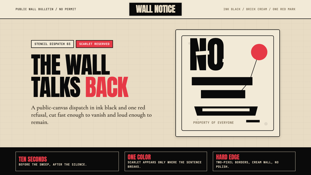 Banksy Stencil GraffitiProtest is reduced to a cut mark. Anton black on brick cream, one scarlet red…抗议被压成剪影。砖墙奶油底、Anton黑字,一点猩红打断。
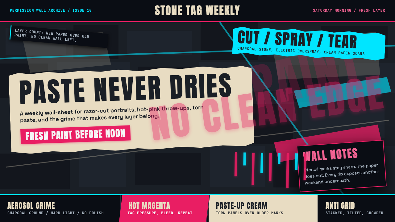 Melbourne Laneway Stencil (Hosier Lane)Permission-wall maximalism. Magenta tags slash charcoal bluestone and cream p…合法墙极繁主义:洋红标签划过炭黑青石与奶油贴纸。
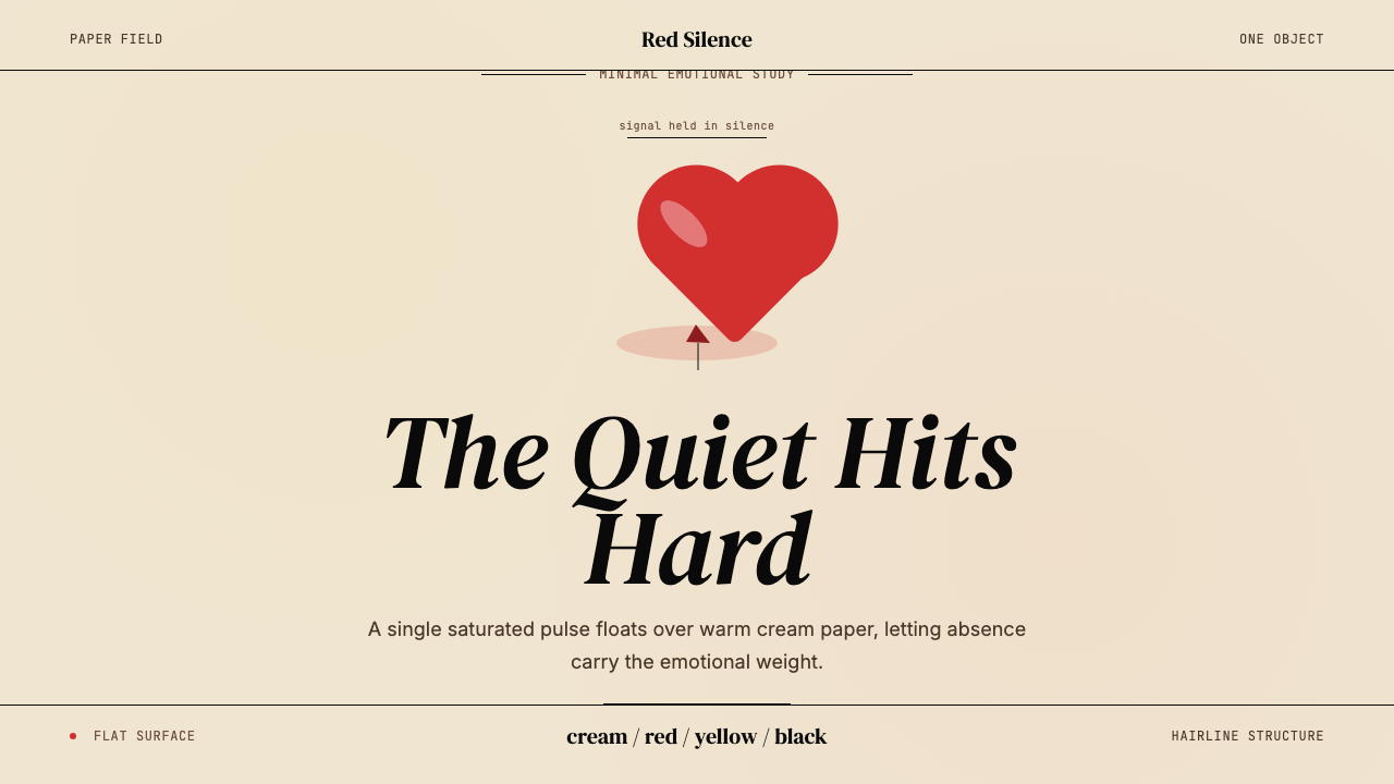 Kanye — 808s & HeartbreakGrief in restraint. Cream paper, one red heart, yellow heat, and a black hair…克制承载悲伤:奶油纸、红心、热黄与黑色细线。
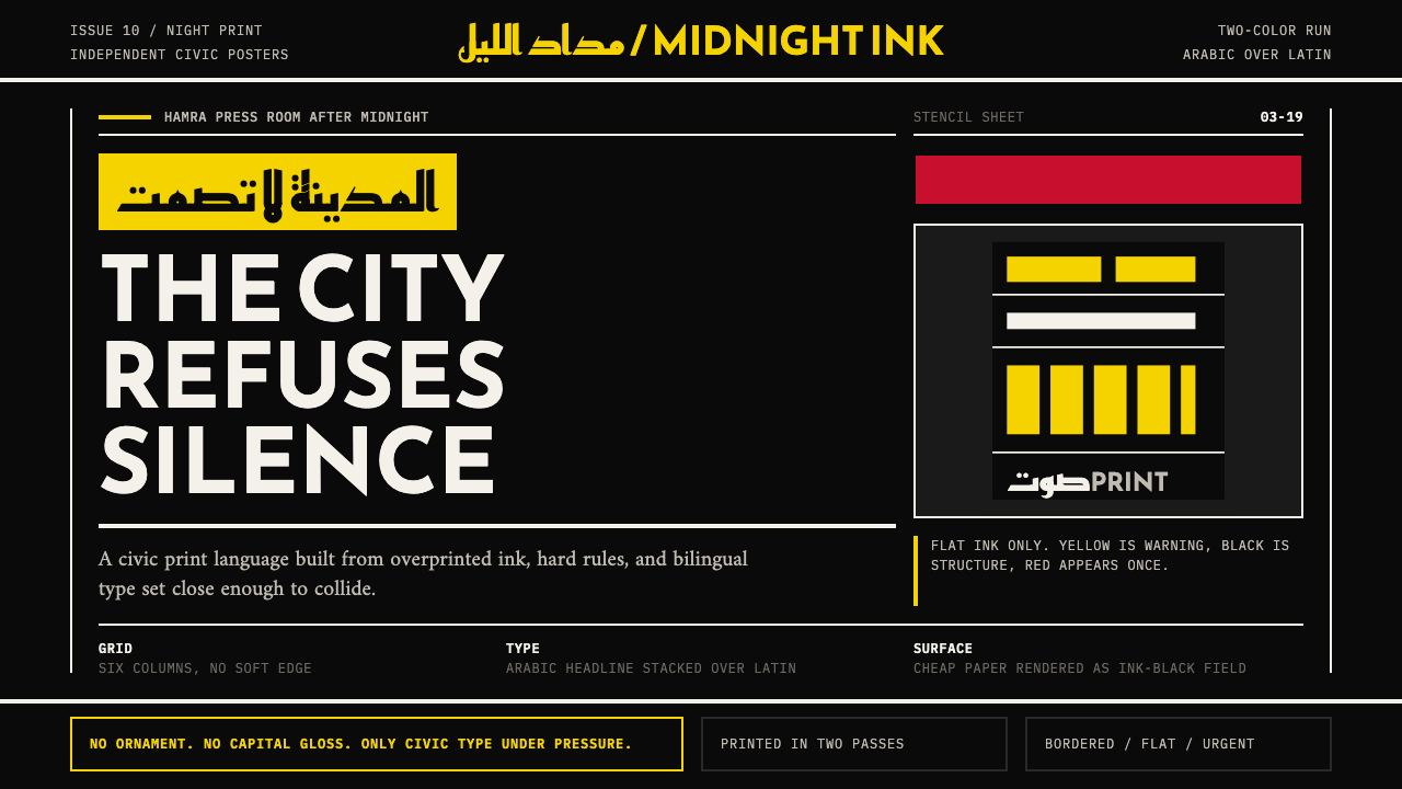 Beirut Indie Graphic DesignCivic type as protest. Sulfur yellow Arabic blocks collide with ink-black pos…公民字体即抗议:硫磺黄阿文块撞上墨黑海报网格。
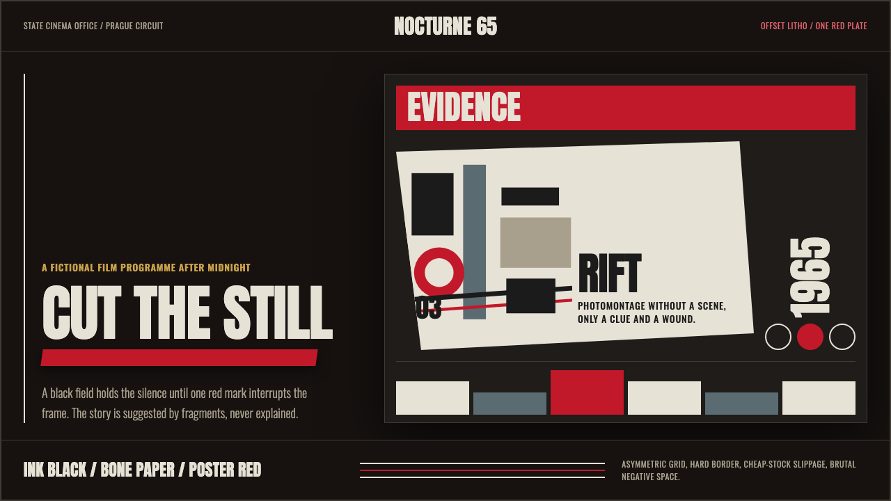 Czech New Wave PosterConcept before spectacle. Ink black, bone type and one poster-red incision fr…观念先于奇观。墨黑、骨白窄体与一道海报红切开网格。
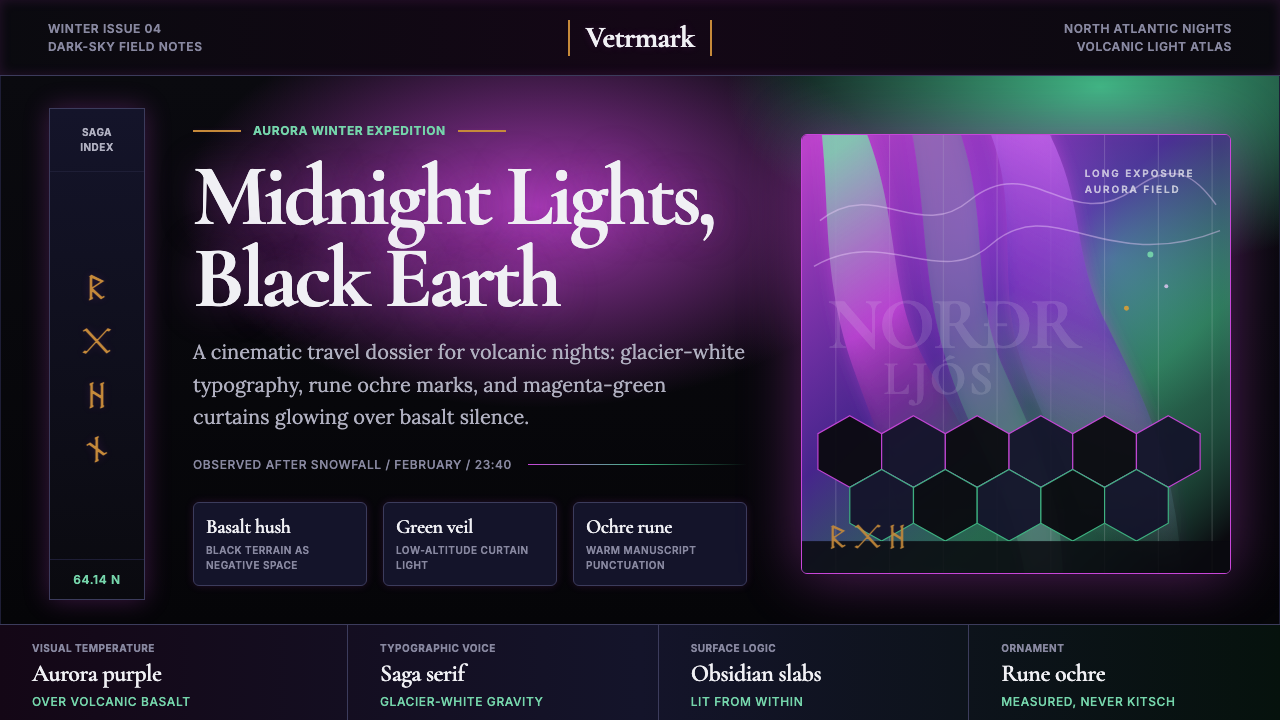 Icelandic Aurora TourismMidnight tourism turns mythic. Basalt black, aurora magenta-green, saga serif…午夜旅游变得神话。玄武岩黑、极光紫绿与萨迦衬线。