Design style guide设计风格指南
What is Grime London Pirate Radio (2003)?什么是 Grime London Pirate Radio (2003)?
From East London rooftops to album sleeves, Grime's visual language turns pirate-radio urgency into a design system built on saturated yellow, compressed type, and the unapologetic flatness of a photocopied flyer.从东伦敦楼顶天线到专辑封面,Grime 的视觉语言把盗版电台的紧迫感变成了一套设计系统——饱和黄、压缩字体,以及复印传单那种毫不掩饰的平面性。
Grime London Pirate Radio (2003) in briefGrime London Pirate Radio (2003) 速览
Grime London Pirate Radio (2003) is a visual design style rooted in the music and street culture that erupted from East London's council estates in the early 2000s. It draws its aesthetic vocabulary from four overlapping sources: the frequency stickers and handwritten schedules of illegal FM pirate stations; the photocopied A4 rave flyers distributed in Hackney and Bow; the monochrome LCD readouts of Roland drum machines and early digital audio workstations; and the album artwork that crystallised the movement for a wider audience, most famously Dizzee Rascal's debut sleeve.Grime 伦敦盗版电台(2003)是一种视觉设计风格,根植于二十一世纪初在东伦敦市政公屋区爆发的音乐与街头文化。它的美学词汇来自四个相互交叠的源头:非法 FM 盗版电台的频率贴纸与手写播表;在哈克尼和弓区散发的 A4 复印锐舞传单;Roland 鼓机和早期数字音频工作站的单色液晶屏;以及将这个流派带给更广泛受众的专辑封面——其中最具代表性的是 Dizzee Rascal 的首张专辑封套。
The resulting visual language is deliberately raw and confrontational. It operates through maximum contrast — a single saturated colour, almost always a punishing yellow or electric green, detonating against near-total black. Typography is condensed, uppercase, and set at extreme scale differentials: the headline screams while secondary information is compressed into dense blocks of monospace text that recalls FM frequency readouts and equipment specifications. Nothing is polished. Nothing aspires to finish. The aesthetic celebrates the lo-fi broadcast condition itself as a form of authenticity.这套视觉语言是刻意粗糙且具有对抗性的。它依靠最大化对比运作——一种饱和色彩,几乎总是刺目的黄色或电光绿,在近乎全黑的背景上引爆。字体是压缩的、全大写的,并以极端的尺度差并置:标题在嘶吼,而次要信息被压缩进密集的等宽文字块,让人想起 FM 频率标记和设备规格说明。没有打磨,没有对完成感的追求。这套美学把低保真广播状态本身视为一种真实性的形式来加以颂扬。
Unlike many historical styles that soften over time into decorative nostalgia, Grime's visual logic remains structurally coherent and practically applicable. Its principles — signal strength over refinement, flat colour over photographic texture, compressed information over editorial breathing room — translate cleanly into contemporary screen contexts, particularly where urgency, directness, and subcultural credibility are the intended message.与许多历史风格随时间推移软化为装饰性怀旧不同,Grime 的视觉逻辑在结构上依然连贯,在实践上依然可用。它的原则——信号强度胜于精致度,平面色彩胜于摄影质感,压缩信息胜于编辑留白——能够清晰地转化到当代屏幕语境中,尤其适用于那些以紧迫感、直接性和亚文化可信度为目标信息的场合。
See the Grime London Pirate Radio (2003) design system →查看 Grime London Pirate Radio (2003) 完整设计系统 →
Where does Grime London Pirate Radio (2003) come from?Grime London Pirate Radio (2003) 从何而来?
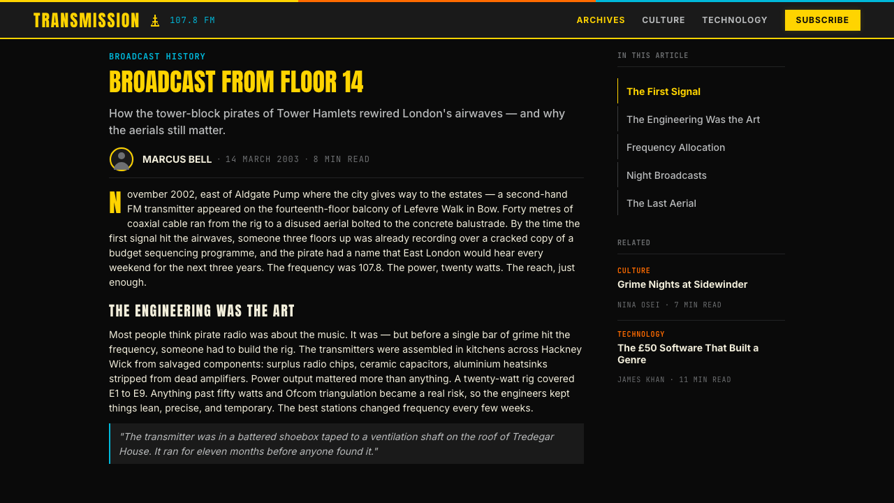
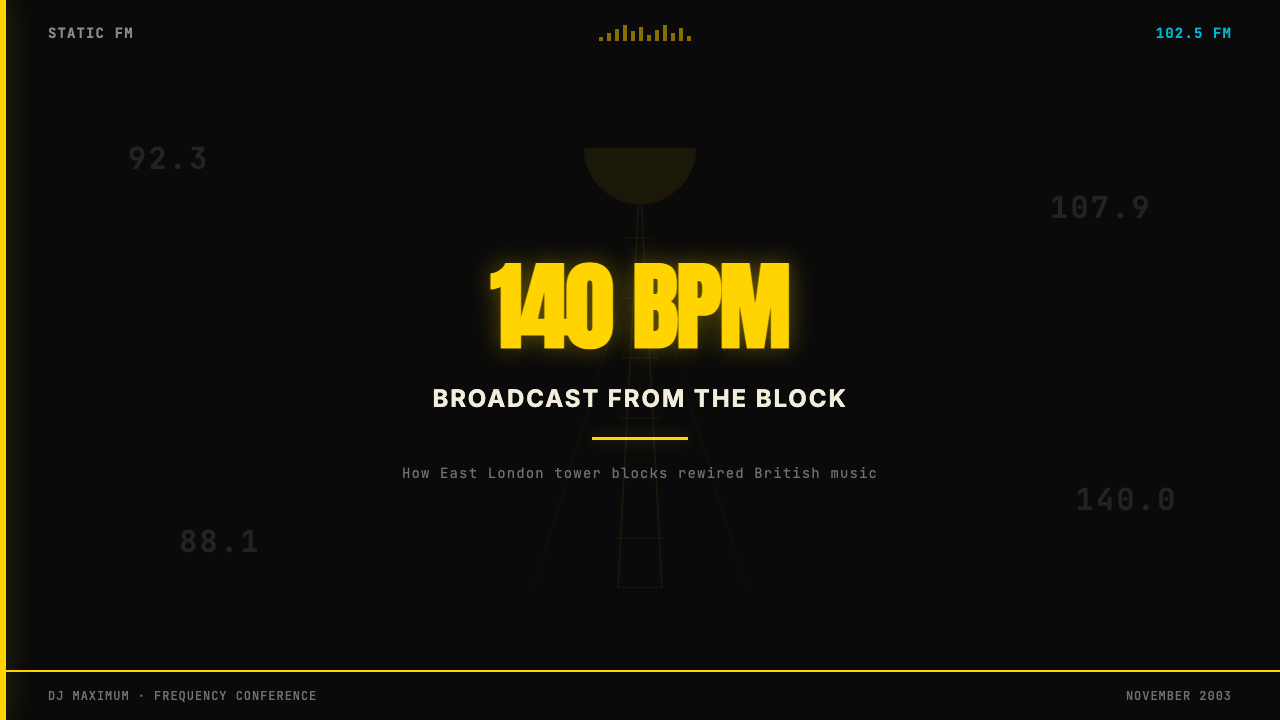
Grime as a music genre emerged from the collision of UK garage, dancehall, and the faster, more abrasive sounds coming from US hip-hop and drum and bass. In 2002 and 2003, a generation of MCs in East London — centred on Bow E3, Hackney E8, and the surrounding Tower Hamlets boroughs — were writing over beats running at around 140 beats per minute, a tempo deliberately faster and more aggressive than the 130bpm swing of UK garage. The beats were produced on cheap software, often FruityLoops (now FL Studio), running on budget desktop computers in council flat bedrooms. The output was broadcast on pirate FM stations operating from rooftop aerials, reaching listeners across East London without any commercial infrastructure.Grime 作为一种音乐流派,诞生于英国车库音乐、丹斯豪尔,以及来自美国嘻哈和鼓打贝斯的更快、更粗粝的声音之间的碰撞。2002至2003年间,东伦敦一代 MC——以弓区 E3、哈克尼 E8 及周边塔村区为中心——在约 140 拍每分钟的节拍上写词,这一速度刻意比英国车库音乐 130 拍的摇摆节奏更快、更具攻击性。节拍在廉价软件上制作,通常是运行在市政公寓卧室里的预算台式电脑上的 FruityLoops(现名 FL Studio)。成品通过安装在楼顶天线上的盗版 FM 电台广播出去,在没有任何商业基础设施的情况下覆盖整个东伦敦。
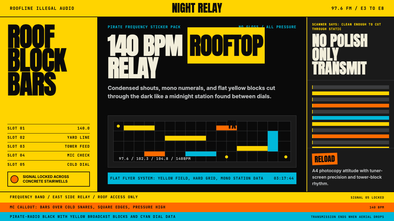
The visual identity of early Grime was shaped by scarcity and urgency. Pirate radio stations needed call-sign art, frequency identifiers, and schedule cards — all produced cheaply, often on domestic inkjet printers or photocopiers. The flyer culture inherited from rave and jungle music pushed designers toward maximum legibility at small size: a single bold colour, a station name in the largest possible type, a frequency in monospace numerals so listeners could dial in. This forced economy of means — one colour, one typeface, one central piece of information — became the aesthetic core of the style.早期 Grime 的视觉身份由匮乏与紧迫共同塑造。盗版电台需要呼号图案、频率标识和播表卡片——全都以低成本生产,通常用家用喷墨打印机或复印机。从锐舞和丛林音乐传承下来的传单文化迫使设计师追求小尺寸下的最大可读性:一种大胆的单色、最大号字体呈现的电台名称、以等宽数字印出的频率供听众调台。这种被迫的手段经济性——一种颜色、一种字体、一条核心信息——成为这种风格的美学内核。
The movement's visual crystallisation arrived with the release of Dizzee Rascal's debut album, Boy in da Corner, in 2003, which won the Mercury Prize that same year and brought Grime national attention. Tom Hingston Studio designed the sleeve: a hooded figure photographed dead-on by Dean Chalkley against a field of pure, saturated yellow. The design made explicit what pirate flyer culture had been doing implicitly — colour as signal, the face as direct address, no background narrative, no environmental context, just the subject isolated against a single blazing tone. The album's commercial and critical success embedded this visual grammar in the collective memory of British design.这个运动的视觉结晶随 Dizzee Rascal 首张专辑《Boy in da Corner》于2003年发行而到来,该专辑同年获得水星音乐奖,将 Grime 带入全国视野。Tom Hingston 工作室设计了封套:Dean Chalkley 拍摄的一个戴帽衫的少年正面直视镜头,背景是一片纯粹的、饱和的黄色。这个设计将盗版传单文化一直在隐性做的事明确化了——色彩即信号,面孔即直接对话,无背景叙事,无环境语境,只是主体孤立在一片灼热的单色之上。这张专辑的商业与批评双线成功,将这套视觉语法嵌入了英国设计的集体记忆。
A second wave of cultural visibility came between 2015 and 2017, as artists including Skepta, Stormzy, and AJ Tracey achieved mainstream chart success and major brand partnerships. This revival brought Grime aesthetics into contact with high-budget creative production, and designers began applying the style's principles — the saturated colour field, the monospace numeral, the compressed condensed headline — with greater intentionality and wider application. The pirate-radio vernacular, once born of necessity, was now a recognisable and deliberate visual register.第二波文化能见度在2015至2017年间到来,Skepta、Stormzy 和 AJ Tracey 等艺人进入主流榜单并获得主要品牌合作。这次复兴使 Grime 美学与高预算创意制作相遇,设计师们开始以更强的意图和更广泛的应用来运用这种风格的原则——饱和色彩底面、等宽数字、压缩的紧缩标题。曾经由必要性催生的盗版电台语汇,如今已成为一种可辨识的、刻意为之的视觉语域。
What defines the Grime London Pirate Radio (2003) look?Grime London Pirate Radio (2003) 的视觉特征是什么?
Signal Colour信号色彩
The palette is built around one dominant high-intensity colour deployed against deep black. Dizzee yellow — a near-fluorescent warm yellow — is the archetype, but electric green and urgent red occupy the same structural role in different executions. The key is monochromaticism: one accent, one background, with no secondary colours diluting the impact. The chosen colour functions less as decoration than as a broadcast signal — it is meant to stop the eye the way a pirate station's frequency burst stops the radio dial.色板围绕一种主导的高强度色彩构建,与深黑形成对抗。Dizzee 黄——一种近乎荧光的暖黄——是原型,但电光绿和紧迫红在不同执行中占据同样的结构角色。关键在于单色性:一种强调色,一种背景,没有任何二级色彩稀释冲击力。所选色彩的功能与其说是装饰,不如说是广播信号——它的目的是像盗版电台的频率爆破声停住收音机旋钮那样,停住观者的目光。
Condensed Uppercase Typography压缩大写字体
Headlines are set in condensed or extra-condensed sans-serif letterforms, always uppercase, always at extreme scale. The compression allows more words per line at a larger point size — a legacy of flyer design where the station name needed to fill the page at maximum visual impact. Secondary text shifts register entirely: dense monospace type in a smaller weight recalls equipment readouts and printed schedules, creating a stark scale contrast that organises the composition without requiring colour differentiation.标题采用压缩或超压缩无衬线字体,始终全大写,始终处于极端尺度。压缩使得在更大字号下每行能容纳更多文字——这是传单设计的遗产,电台名称需要以最大视觉冲击力填满页面。次要文字则完全切换语域:密集的等宽小字重文本让人想起设备读数和印刷播表,制造出鲜明的尺度对比,无需借助色彩差异就能组织构图。
Monospace Numerals等宽数字
Monospace type carries specific cultural weight in this system. FM frequency numbers — 88.1, 96.4, 106.8 — were the primary identifying information on pirate station materials, and their fixed-width rendering in dot-matrix or LCD-style typefaces became inseparable from the aesthetic. In contemporary applications, monospace numerals signal data, technicality, and authenticity simultaneously. They appear in track listings, timestamps, stat displays, and anywhere numerical information needs to feel archival and unadorned rather than designed.等宽字体在这套系统中承载着特定的文化分量。FM 频率数字——88.1、96.4、106.8——是盗版电台材料上的主要识别信息,它们以点阵或液晶风格字体呈现的固定宽度排列,与这套美学变得不可分割。在当代应用中,等宽数字同时传递数据感、技术感和真实性。它们出现在曲目列表、时间戳、统计展示,以及任何需要让数字信息感觉档案式、不加修饰而非刻意设计的地方。
Flat Photographic Treatment平面化摄影处理
When photography appears in Grime-inflected design, it is treated as a flat element rather than a window into space. The approach favours dead-on frontal shots against monochrome grounds, high-contrast duotone reductions, or heavy crops that reduce a subject to silhouette. The Boy in da Corner sleeve established the template: a human figure as a flat shape against a colour field, no depth cue, no environmental light, just form against tone. This flatness allies photography with the graphic elements around it rather than creating a hierarchy between photographic realism and flat design.当摄影出现在 Grime 风格设计中时,它被当作平面元素而非空间窗口处理。这种方法偏好在单色背景前正面直拍的照片、高对比度双色调简化,或将主体压缩为剪影的大幅裁切。《Boy in da Corner》封套确立了模板:人物作为平面形状对抗色彩底面,无纵深暗示,无环境光线,只是形态与色调的对照。这种平面性使摄影与周围的图形元素结成同盟,而非在摄影写实主义和平面设计之间制造层级。
Grid Rigidity网格刚性
Layouts are structured around hard vertical columns and horizontal baselines that echo the grid-like information architecture of pirate-station schedules and equipment rack panels. Elements align to implicit or explicit column divisions; nothing floats freely. This rigidity is not minimalist refinement — it is the grid of necessity, the visual logic of a photocopier's A4 sheet divided into maximum-information zones. The resulting layouts feel dense and intentional, with every square unit accounted for.版面围绕硬直的竖向分栏和水平基线构建,呼应盗版电台节目表和设备机架面板的网格式信息架构。元素对齐隐性或显性的分栏;没有任何元素自由漂浮。这种刚性不是极简主义的精炼——它是必要性的网格,是一张 A4 复印纸被划分为最大信息区域的视觉逻辑。由此产生的版面感觉密集而有意图,每一个面积单元都各司其职。
Texture Through Lo-Fi Means低保真手段带来的质感
Where texture appears, it references analogue broadcast degradation rather than natural materials. Scan lines, dot-matrix grain, halftone patterns from cheap photocopying, and the visual noise of a poorly received FM signal are all legitimate textural elements. These are not applied decoratively as a retro aesthetic exercise — they evoke the specific material conditions of production: a signal transmitted from a rooftop aerial, a flyer pulled through a photocopier at maximum contrast. The texture carries documentary weight.质感出现时,它引用的是模拟广播退化,而非自然材质。扫描线、点阵颗粒、廉价复印产生的网点图案,以及 FM 接收不良时的视觉噪点,都是合法的质感元素。这些并非作为复古美学练习而装饰性地施加——它们唤起的是特定的生产物质条件:从楼顶天线发出的信号,被以最大对比度拉过复印机的传单。这种质感承载着纪录片式的分量。
No-Polish Directness无打磨的直接性
The defining negative principle of the style is the deliberate refusal of finish. Drop shadows are absent or hard-edged. Gradients do not appear. Colours do not blend. Type is not kerned to refinement. The roughness is not accidental — it is ideological. Pirate radio culture operated outside the sanctioned channels of the music industry, and its visual identity needed to signal that outsider status. Polish and production value were markers of commercial compromise; rawness was authenticity. Contemporary applications of the style inherit this principle whether or not they intend its original political charge.这种风格的决定性否定原则,是对完成感的刻意拒绝。投影缺席或为硬边。渐变不出现。色彩不混融。字体间距不经精细调整。粗糙不是偶然——它是意识形态。盗版电台文化在音乐工业的正式渠道之外运作,其视觉身份需要传递局外人的身份。打磨和制作价值是商业妥协的标记;粗糙是真实性。这种风格的当代应用继承了这一原则,无论是否有意承担其原有的政治电荷。
See the Grime London Pirate Radio (2003) design system →查看 Grime London Pirate Radio (2003) 完整设计系统 →
Who shaped Grime London Pirate Radio (2003)?谁塑造了 Grime London Pirate Radio (2003)?
Born Dylan Kwabena Mills in Bow, East London, Dizzee Rascal was seventeen when he completed Boy in da Corner, the album whose Mercury Prize win in 2003 brought Grime to national consciousness. As the style's most visible early figure, his visual presentation — the hooded standoff of the debut sleeve, the council-estate setting of early music videos — established the iconographic template that defined Grime's aesthetic for designers and audiences alike. His subsequent commercial success meant that the style's visual grammar was exposed to mainstream design culture without being diluted by it.本名 Dylan Kwabena Mills,出生于东伦敦弓区。Dizzee Rascal 完成《Boy in da Corner》时年仅十七岁,这张专辑于2003年赢得水星音乐奖,将 Grime 带入全国视野。作为这种风格最具知名度的早期人物,他的视觉呈现——首张专辑封套上的帽衫对峙,早期音乐录像中的市政公屋场景——确立了为设计师和观众共同定义 Grime 美学的图像学模板。其后来的商业成功意味着这套风格的视觉语法进入了主流设计文化的视野,却未被其稀释。
Richard Cowie, known as Wiley, is widely credited as the founding architect of Grime as a musical form, developing the eski beat sound from which the genre grew. As a prolific early presence on pirate stations including Rinse FM and Deja Vu FM, Wiley shaped the broadcast culture from which Grime's visual language emerged. His influence operated more at the infrastructural level — building the scene's network and vocabulary — than through any single iconic visual artefact, making him the genre's unseen structural force.本名 Richard Cowie,艺名 Wiley,被广泛誉为 Grime 作为一种音乐形式的奠基设计师,他开发了这个流派由此生长出来的 eski 节拍声响。作为 Rinse FM 和 Deja Vu FM 等盗版电台上多产的早期存在,Wiley 塑造了 Grime 视觉语言得以从中涌现的广播文化。他的影响更多运作在基础设施层面——建立场景的网络与词汇——而非通过任何单一标志性视觉作品,使他成为这个流派看不见的结构性力量。
Tom Hingston Studio designed the artwork for Boy in da Corner, creating the image that fixed Grime's visual identity in cultural memory. Hingston had previously worked with Nick Cave, Massive Attack, and Robbie Williams, and brought a graphic design rigour to Grime's raw materials — the saturated field, the frontal figure, the absence of environmental context — that transformed an emergent street aesthetic into a codified visual system. The sleeve remains one of the most reproduced and referenced pieces of British graphic design of the 2000s.Tom Hingston 工作室设计了《Boy in da Corner》的封套,创造了将 Grime 视觉身份固定在文化记忆中的那幅图像。Hingston 此前曾与 Nick Cave、Massive Attack 和 Robbie Williams 合作,他将平面设计的严谨性带入 Grime 的原始材料——饱和底面、正面人物、环境语境的缺席——将一种新兴的街头美学转化为一套经过编码的视觉系统。这张封套至今仍是2000年代最被复制和引用的英国平面设计作品之一。
The photographer whose lens captured the Boy in da Corner cover image, Dean Chalkley developed a documentary approach to Grime's early scene, photographing MCs and soundsystems in the environments — stairwells, rooftops, high-street corners — that defined the culture's geography. His work established the photographic grammar of Grime portraiture: frontal address, harsh available light, no styling artifice, the subject as directly present as a pirate station's FM signal. His documentary archive of early Grime remains a primary visual record of the scene.拍摄《Boy in da Corner》封面图像的摄影师 Dean Chalkley,对 Grime 早期场景发展出一种纪录片式的拍摄方式,在界定这种文化地理的环境中——楼梯间、楼顶、高街街角——拍摄 MC 们和音响系统。他的工作确立了 Grime 肖像摄影的语法:正面对视,刺目的现有光源,无造型加工,主体的在场如同盗版电台 FM 信号般直接。他的早期 Grime 纪录档案至今仍是这个场景的首要视觉记录。
Joseph Junior Adenuga Jr., known as Skepta, was central to Grime's commercial and critical revival between 2015 and 2017. His Mercury Prize-winning album Konnichiwa (2016) and collaborations with brands including Nike and Moncler brought Grime's visual vocabulary into high-production commercial contexts. Skepta's own visual direction — sparse monochrome, compressed type, Japanese and Nigerian references — demonstrated that Grime's aesthetic principles could absorb outside influences while retaining their structural logic, expanding the style's range without dissolving its identity.本名 Joseph Junior Adenuga Jr.,艺名 Skepta,是2015至2017年间 Grime 商业与批评复兴的核心人物。他获得水星音乐奖的专辑《Konnichiwa》(2016年)以及与 Nike 和 Moncler 等品牌的合作,将 Grime 的视觉词汇带入了高制作成本的商业语境。Skepta 自身的视觉方向——稀疏的单色、压缩字体、日本和尼日利亚元素的引用——证明了 Grime 的美学原则能够在保留结构逻辑的同时吸收外部影响,在不消解身份的情况下扩展这种风格的范围。
How do you use Grime London Pirate Radio (2003) today?今天怎么用 Grime London Pirate Radio (2003)?
Grime's visual language is highly transferable to contemporary screen design when its structural logic — not just its surface textures — is understood. The style excels in contexts where the communication needs to feel urgent, unmediated, and subcultural: music and entertainment platforms, streetwear and sneaker brands, youth-facing event promotion, limited-edition product drops, and any digital surface where the brand's credibility depends on feeling genuinely connected to grassroots culture rather than manufactured to simulate it.当理解 Grime 视觉语言的结构逻辑——而非仅仅是其表面质感——时,它对当代屏幕设计具有极强的可移植性。这种风格在传播需要感觉紧迫、不加过滤和具有亚文化属性的语境中表现突出:音乐和娱乐平台、街头服饰和球鞋品牌、面向年轻人的活动推广、限量产品发售,以及任何品牌可信度依赖于与草根文化真实连接而非模拟制造的数字界面。
For presentation slides, Grime works most powerfully on cover and section-break pages. A cover built in this style uses a single saturated colour to claim the entire background, with the title set in condensed uppercase at maximum scale — no tagline, no decorative frame, no environmental image. The name alone, the colour alone. Section breaks follow the same logic: one stark accent colour, one headline, nothing else. Content slides should abandon the style's rawness in favour of legibility — use the monospace numeral motif for data points and statistics, the tight column grid for text, but allow adequate contrast and spacing for reading comprehension.对于演示文稿,Grime 在封面和章节分隔页上最具力量。以这种风格构建的封面用单一饱和色占据整个背景,标题以最大尺度的压缩大写字体设置——无副标题,无装饰框架,无环境图像。只有名称,只有颜色。章节分隔页遵循同样的逻辑:一种刺目的强调色,一条标题,别无其他。内容页应当放弃这种风格的粗糙感,转而追求可读性——将等宽数字母题用于数据点和统计数字,将紧密的分栏网格用于文字,但允许足够的对比度和间距以保障阅读理解。
For web interfaces and dashboards, Grime principles work best in hero sections, loading states, and notification components where high-contrast immediacy is the goal. A dark background with a single high-intensity accent colour — used for active states, alerts, and primary calls to action — captures the aesthetic's energy without making an entire interface hostile to extended use. Navigation and data display should be typographically disciplined: condensed labels, monospace counters, strict alignment. Avoid applying the style to form fields, body text, or any component requiring sustained reading.对于网页界面和仪表板,Grime 原则最适用于英雄区块、加载状态和通知组件——那些以高对比度即时性为目标的地方。深色背景搭配单一高强度强调色——用于激活状态、警示和主要行动号召——能捕捉这套美学的能量,而不使整个界面在长时间使用中令人不适。导航和数据展示应当在字体上保持纪律:压缩标签,等宽计数器,严格对齐。避免将这种风格应用于表单字段、正文,或任何需要持续阅读的组件。
For editorial and marketing applications, the style's poster-logic translates directly to full-bleed section headers, campaign key visuals, and social media content where a single frame needs to arrest attention in a high-velocity feed. The approach: one colour field, one subject, one headline — no layering, no supporting imagery, no softening elements. Marketing copy should match the visual register: direct, imperative, single-sentence statements. The style struggles with long-form editorial content, nuanced brand storytelling, or any context requiring warmth, approachability, or visual hospitality.对于编辑和营销应用,这种风格的海报逻辑直接转化为全出血的章节标题、活动主视觉,以及需要在高速信息流中一格定格的社交媒体内容。方法:一片色彩底面,一个主体,一条标题——不叠加,不添加辅助图像,不加软化元素。营销文案应当与视觉语域相匹配:直接的、命令式的、单句陈述。这种风格在长篇编辑内容、细腻的品牌叙事,或任何需要温暖感、亲切感或视觉待客之道的语境中则力不从心。
A common mistake when applying this style is treating the saturated accent colour as a secondary element rather than the structural foundation. In authentic Grime design, the colour field is primary — the typography sits inside it, not beside it. Equally damaging is the impulse to soften the contrast through gradients, semi-transparent overlays, or blended transitions. Each of these moves dilutes the signal-strength quality that defines the aesthetic. If an execution feels aggressive, the instinct should be to commit further rather than to moderate — the style's power comes precisely from its refusal to accommodate.应用这种风格时最常见的错误,是将饱和强调色当作次要元素而非结构基础。在真实的 Grime 设计中,色彩底面是主体——字体坐落其中,而非并列其旁。同样有害的冲动是通过渐变、半透明叠加或混融过渡来柔化对比度。这些操作中的每一个都会稀释定义这套美学的信号强度品质。如果一个执行感觉太具攻击性,本能应该是进一步投入,而非适度收敛——这种风格的力量恰恰来自它拒绝妥协的姿态。
See the Grime London Pirate Radio (2003) design system →查看 Grime London Pirate Radio (2003) 完整设计系统 →
Grime London Pirate Radio (2003) — FAQGrime London Pirate Radio (2003) · 常见问题
Is Grime design only appropriate for music and entertainment brands?Grime 设计只适合音乐和娱乐品牌吗?
No, but its cultural specificity means the context of application matters greatly. The style's structural principles — high contrast, compressed typography, monochrome foundation with a single saturated accent — are applicable across many sectors. Where it fails is in contexts where the brand's values are warmth, gentleness, or long-established tradition: healthcare, financial services, heritage food brands, children's products. Where it succeeds beyond music is in any field where urgency, directness, and anti-establishment credibility are genuine brand values — technology platforms positioning against incumbents, sportswear drops, activist campaigns, urban culture institutions.不,但它的文化特殊性意味着应用语境至关重要。这种风格的结构原则——高对比度、压缩字体、以单一饱和强调色为基础的单色底面——可以跨越许多行业应用。它失效的地方,是品牌价值为温暖、温柔或悠久传统的语境:医疗健康、金融服务、传统食品品牌、儿童产品。它在音乐之外成功的地方,是任何紧迫感、直接性和反建制可信度是真实品牌价值的领域——定位于挑战在位者的科技平台、运动服饰限量发售、行动主义活动、城市文化机构。
How does Grime visual design differ from generic dark-mode UI design?Grime 视觉设计与通用的深色模式 UI 设计有何区别?
Dark-mode UI design is a functional response to screen ergonomics — it reduces glare, conserves battery, and creates visual comfort for extended use. Grime design is a cultural stance. The black field in Grime work is not a comfortable dark surface; it is a transmission medium, and the accent colour that fires against it is not a considered UI affordance but a signal burst. In practice: dark-mode UI typically uses multiple greys to create depth and hierarchy, softened shadows to separate layers, and muted accent colours for secondary actions. Grime design uses one pure black, one pure accent, hard edges, and a refusal of depth. The two can be combined, but only if the designer is clear about which logic is governing which component.深色模式 UI 设计是对屏幕人体工程学的功能性回应——它减少眩光,节省电量,为长时间使用创造视觉舒适感。Grime 设计是一种文化立场。Grime 作品中的黑色底面不是舒适的深色表面;它是一种传输介质,在其上引爆的强调色不是经过考量的 UI 可供性,而是信号爆破。在实践中:深色模式 UI 通常使用多种灰度来创造纵深和层级,使用柔化阴影来分隔图层,并使用柔和的强调色用于次要操作。Grime 设计使用一种纯黑、一种纯强调色、硬边,以及对纵深感的拒绝。两者可以结合,但前提是设计师清楚地知道哪种逻辑在支配哪个组件。
Can the style work without the yellow colour specifically?这种风格可以不使用黄色来实现吗?
Yes. Yellow is the archetype because it is the colour most associated with the foundational album artwork and with the flyer culture of the 2002–2005 peak period. But the structural role is one of maximum luminance contrast against black — any colour that achieves that contrast can fulfil the same function. Electric green, high-key red, and bright white have all been used in Grime-adjacent visual work with full fidelity to the style's logic. What matters is not the hue but the relationship: the accent must be capable of punching through the black with the force of a broadcast signal. Colours that are muted, desaturated, or medium-dark lose the essential quality regardless of their hue.可以。黄色是原型,因为它是与奠基性专辑封套以及2002至2005年鼎盛期传单文化关联最紧密的颜色。但其结构角色是在黑色背景上实现最大亮度对比——任何能实现这种对比的颜色都能完成同样的功能。电光绿、高调红和亮白都曾在与 Grime 相邻的视觉作品中被使用,同样忠实于这种风格的逻辑。重要的不是色相,而是关系:强调色必须能以广播信号的力量穿透黑色。无论色相如何,柔和的、低饱和度的或中深度的颜色都会丧失这种本质特质。
How should texture be handled — should every execution include scan-line grain?质感应该如何处理——每个执行都需要包含扫描线颗粒吗?
No. Texture in this style is a reference to production conditions, not a mandatory surface treatment. Clean, flat executions without any grain or noise can be entirely authentic to the style — the flat colour and compressed typography carry the aesthetic without textural support. Texture should be added only when it serves a specific communicative purpose: evoking the material conditions of pirate broadcasting, referencing the photocopier culture of flyer production, or creating a deliberate analogue feel that contrasts with the digital context in which the work appears. Applied generically as decoration, scan-line effects and halftone grain quickly become retro pastiche rather than authentic cultural reference.不需要。这种风格中的质感是对生产条件的引用,而非强制性的表面处理。干净的、无颗粒或噪点的平面执行完全可以对这种风格保持真实——平面色彩和压缩字体无需质感支撑即可承载美学。只有当质感服务于特定的传播目的时才应添加:唤起盗版广播的物质条件,引用传单生产的复印机文化,或制造一种刻意的模拟感以对比作品所在的数字语境。当扫描线效果和网点颗粒被泛泛地当作装饰施加时,它们很快就变成复古仿制品而非真实的文化引用。
Does the style work in print as well as on screen?这种风格在印刷上和屏幕上同样有效吗?
The style was born in print — pirate radio flyers, photocopied schedules, physical album sleeves — and its principles are inherently print-compatible. High-contrast flat colour reproduces well across most printing conditions, including budget offset and digital on uncoated stock. The monochrome foundation means the design remains coherent even in single-colour printing. On screen, the style gains from backlighting, which intensifies the luminance of accent colours and gives the black field a depth unavailable in print. The main print consideration is that very condensed typefaces can fill or lose crispness at small sizes on absorbent papers — the style's scale-dominant approach works best when the headline is given enough physical size to hold its letterform quality.这种风格诞生于印刷——盗版电台传单、复印播表、实体专辑封套——其原则天然与印刷兼容。高对比度平面色彩在大多数印刷条件下都能良好再现,包括预算胶印和在非涂布纸上的数字印刷。单色基础意味着设计即使在单色印刷中也能保持连贯性。在屏幕上,这种风格受益于背光,背光强化了强调色的亮度,赋予黑色底面一种印刷中无法获得的深度。主要的印刷注意事项是,非常紧凑的字体在吸水性纸张的小尺寸下可能填充或失去清晰度——这种风格的尺度主导方式,在标题有足够的物理尺寸以保持字形品质时效果最佳。
Related design styles相关设计风格
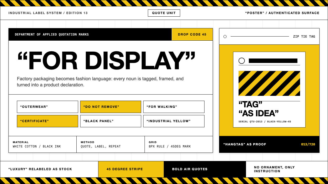 Off-White (Virgil Abloh era)Industrial irony, labeled. Yellow stripes and Helvetica quotes turn luxury in…工业反讽标签化:黄黑斜纹与粗黑无衬线引号,把奢侈变成工厂库存。
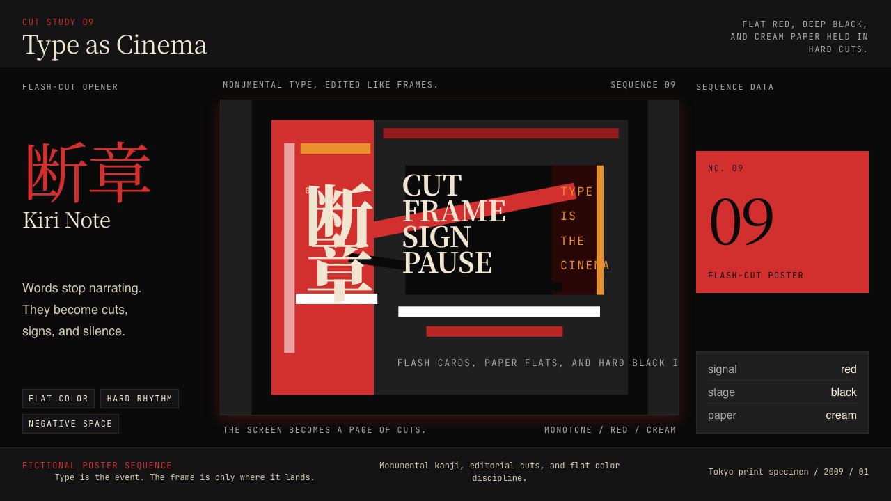 SHAFT Monogatari TypographyType becomes cinema. Red cuts, black flats, and monumental kanji steer the fr…文字变成电影。红黑平涂与巨字闪切主导画面。
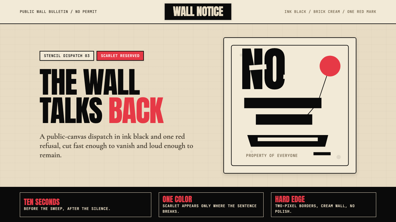 Banksy Stencil GraffitiProtest is reduced to a cut mark. Anton black on brick cream, one scarlet red…抗议被压成剪影。砖墙奶油底、Anton黑字,一点猩红打断。
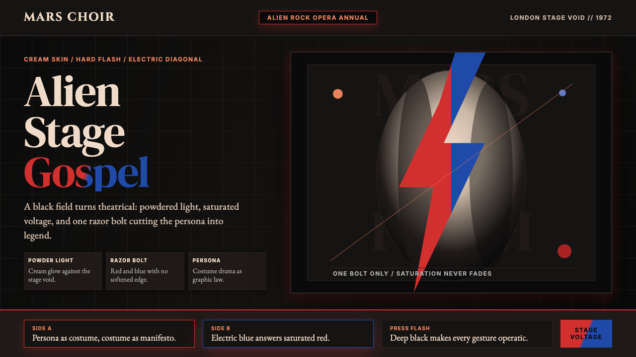 Bowie — Ziggy StardustTheater at full voltage. Cream-on-black portrait cut by one red and electric-…满电压的剧场感:黑底奶油肖像,被红与电蓝闪电劈开。
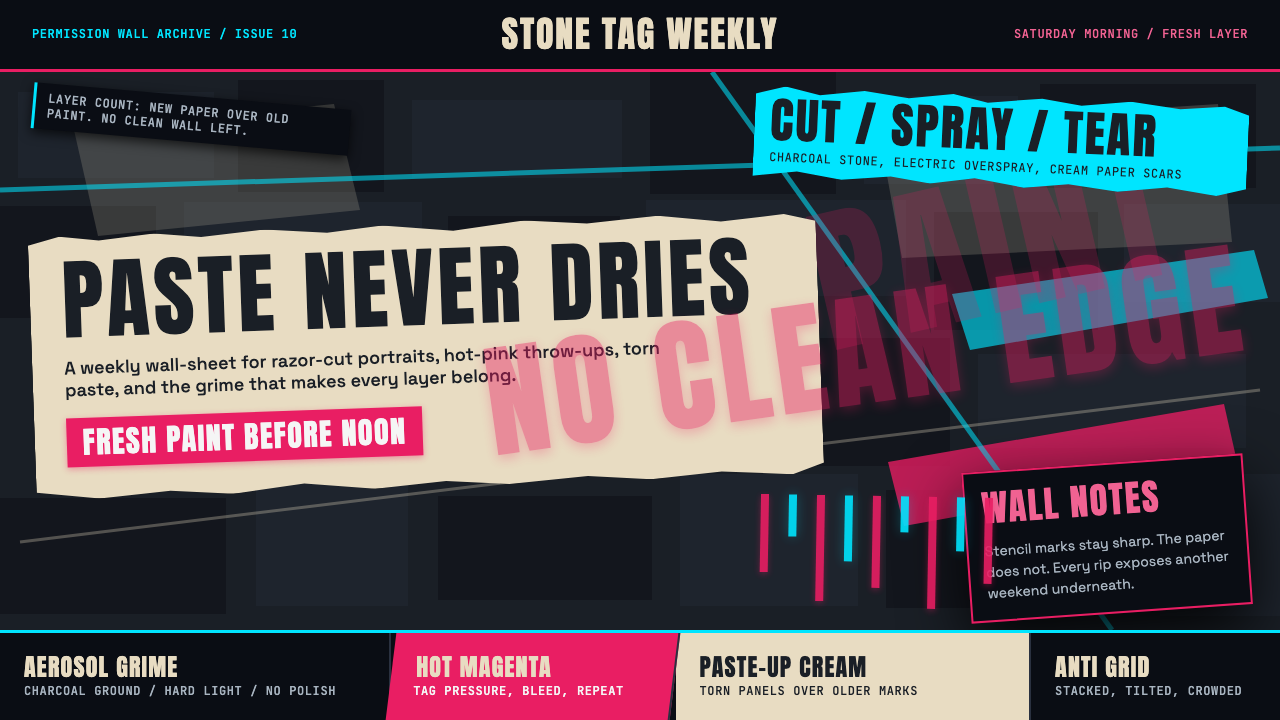 Melbourne Laneway Stencil (Hosier Lane)Permission-wall maximalism. Magenta tags slash charcoal bluestone and cream p…合法墙极繁主义:洋红标签划过炭黑青石与奶油贴纸。
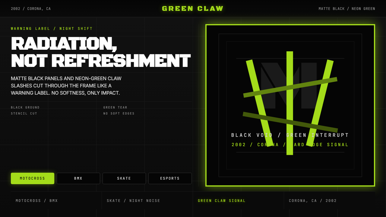 Monster Energy Claw (2002)Aggression, not refreshment. Matte black and neon-green claw slashes cut the…不是清爽,是冲击。哑黑底与霓绿爪痕撕裂画面。