What is SHAFT Monogatari Typography?什么是 SHAFT Monogatari Typography?
SHAFT's Monogatari series turned anime into a moving typography poster — where kanji slam across black frames and silence is cut by a flash of red.SHAFT 的《物语》系列将动画变成了一张会动的排版海报——汉字猛地横扫黑色画面,沉默被一道红光切断。
SHAFT Monogatari Typography in briefSHAFT Monogatari Typography 速览
SHAFT Monogatari Typography is the visual grammar that anime studio SHAFT and director Akiyuki Shinbo invented for Bakemonogatari in 2009 and refined across the entire Monogatari franchise through the following decade and beyond. Its signature moves are simple and radical: saturated red against a field of deep black, monumental Japanese kanji slammed across the frame as flash-cuts lasting fractions of a second, and a minimalist flat-color composition that reduces characters and environments to silhouette and solid plane.SHAFT Monogatari 字体美学是动画工作室 SHAFT 与导演新房昭之为 2009 年的《化物语》发明、并在整个《物语》系列的十余年间不断精炼的视觉语法。它的核心手法简单而激进:深黑底面上的饱和正红,以闪切方式横扫画面的巨大汉字(停留时间仅有几分之一秒),以及将人物与环境压缩为剪影和纯色平涂的极简构图。
The system treats type as cinematic material. In most animation and graphic design, text is information support — labels, captions, dialogue. In the Monogatari visual language, text is architecture. Individual kanji become structural masses the same weight as a character's body or a background wall. Negative space is not emptiness; it is pressure. The ratio of dark ground to glowing red stroke to white blank creates a tension that a fully illustrated frame could not achieve.这套系统把文字当成电影材料来处理。在大多数动画与平面设计中,文字是信息的附属——标签、说明、对白。而在《物语》的视觉语言里,文字是建筑。单个汉字成为与角色躯体或背景墙壁同等分量的结构性质块。留白不是空洞,是压力。深色底面、发光红色笔画与白色空白之间的比例关系,制造出满画幅描绘所无法达到的张力。
Though it emerged from a specific anime production context, the aesthetic has since migrated widely into poster design, title sequences, editorial covers, and digital interface work wherever designers want to communicate intensity, narrative compression, and a Japanese avant-garde sensibility. It is one of the few contemporary design languages that is simultaneously cinematic, literary, and architectural.尽管它诞生于特定的动画制作语境,这套美学此后已大量迁移至海报设计、片名序列、编辑封面和数字界面设计领域——凡是设计师想要传达强度、叙事压缩感与日本先锋气质的地方。它是为数不多同时具备电影性、文学性与建筑性的当代设计语言之一。
See the SHAFT Monogatari Typography design system查看 SHAFT Monogatari Typography 完整设计系统
Where does SHAFT Monogatari Typography come from?SHAFT Monogatari Typography 从何而来?
Studio SHAFT was founded in Tokyo in 1975 as a small subcontracting animation house with no particular visual identity. The transformation that produced the Monogatari aesthetic began in 2004 when director Akiyuki Shinbo joined the studio and began applying his distinctive directorial approach — unconventional camera angles, static compositions that deliberately break the illusion of movement, and aggressive use of flat graphic inserts — to a series of projects that earned the approach the nickname 'Shinbo-cut.' These techniques were not invented wholesale: Shinbo drew on avant-garde animation traditions, manga graphic ambiguity, and the general climate of early-2000s experimental anime.SHAFT 工作室于 1975 年在东京成立,最初是一家没有特定视觉风格的小型外包动画公司。产生《物语》美学的那场转变始于 2004 年——导演新房昭之加入工作室,开始将他独特的导演手法运用于一系列项目:非常规的镜头角度、刻意打破运动幻觉的静态构图、以及激进地插入平面图形。这套手法被粉丝称为「新房切」。这些技术并非凭空而生:新房昭之从先锋动画传统、漫画的图形歧义性以及 2000 年代初实验动画的整体氛围中汲取养分。
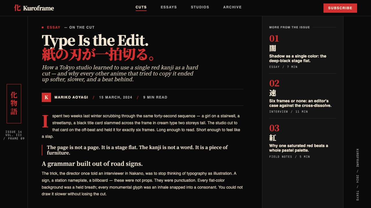
The decisive moment came with Bakemonogatari in 2009, an adaptation of Nisio Isin's light novel series about supernatural encounters in contemporary Japan. The source material was emphatically literary — long monologues, wordplay, and internal dialogue that resisted conventional anime dramatization. Shinbo and the SHAFT team responded by making the words themselves into images. Rather than animate the novels' verbal texture, they exteriorized it: kanji phrases flash on screen as editorial interruptions, title cards function as full compositional statements, and the visual rhythm of cuts mirrors the staccato syntax of Nisio Isin's prose.决定性的时刻出现在 2009 年的《化物语》——西尾维新以当代日本为背景、讲述超自然遭遇的轻小说系列的动画改编。原著在文学性上极为突出:长篇独白、文字游戏与内心对话,这些内容抗拒传统动画的戏剧化处理。新房昭之与 SHAFT 团队的回应是:把文字本身变成图像。他们不去动画化小说的语言质感,而是将其外化——汉字短语以剪辑性的打断形式在画面上一闪而过,字幕卡作为完整的构图陈述发挥功能,剪切的视觉节奏折射出西尾维新散文中断奏式的句法。
The palette chosen for this system — deep black grounds, saturated red accents, white and off-white negative space, with occasional cream or muted-color environmental passages — was neither arbitrary nor purely aesthetic. Black-and-red is a classical Japanese design pairing with roots in lacquerware, woodblock printing, and theatrical costume. SHAFT's version strips away the craft associations and intensifies the contrast to near-maximum, making the combination feel simultaneously ancient and hypermodern. The flat color approach also answered a production reality: the studio was working under tight schedules and budgets, and abstract typographic compositions with minimal animation were a creative solution that turned constraint into signature.这套系统所选择的色板——深黑底面、饱和红色强调、白色与近白色负空间,偶尔穿插奶油色或低纯度的环境段落——既非任意为之,也非纯粹的审美选择。黑与红是日本经典的设计组合,根植于漆器、木版印刷与戏剧服装传统。SHAFT 的版本剥去了工艺联想,将对比度推至接近极限,使这一组合同时呈现出古老与超现代的气质。平涂色块的处理方式也回应了制作现实:工作室在紧张的排期与预算下工作,动画量极少的抽象排版构图是一种将限制转化为标志的创意解法。
Bakemonogatari became a critical and commercial success that transformed SHAFT from a mid-tier subcontractor into a flagship creative studio. The sequels — Nisemonogatari, Kabukimonogatari, Owarimonogatari, and more than a dozen other entries — each retained the core visual grammar while expanding its range: more varied color temperatures in some arcs, denser typographic layering in others, and an increasingly confident use of architectural and environmental graphic abstraction. By the 2010s, the Monogatari visual identity was recognized internationally as one of the defining aesthetic contributions of twenty-first-century anime, and its influence had spread well beyond animation into adjacent visual culture.《化物语》的批评与商业双重成功,将 SHAFT 从二线外包工厂变成了旗舰创意工作室。系列续作——《偽物語》《傾物語》《終物語》以及十余部其他作品——在保留核心视觉语法的同时各有拓展:某些弧线使用了更丰富的色温变化,另一些则有着更密集的排版层叠,整体上对建筑与环境图形抽象的运用也越来越自信。到 2010 年代,《物语》视觉识别已被国际认可为二十一世纪动画最具代表性的美学贡献之一,其影响力早已越出动画领域,渗透进周边视觉文化的各个角落。
What defines the SHAFT Monogatari Typography look?SHAFT Monogatari Typography 的视觉特征是什么?
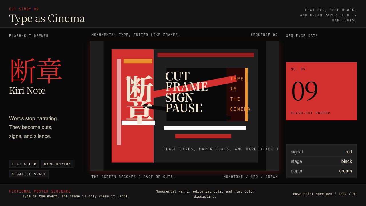
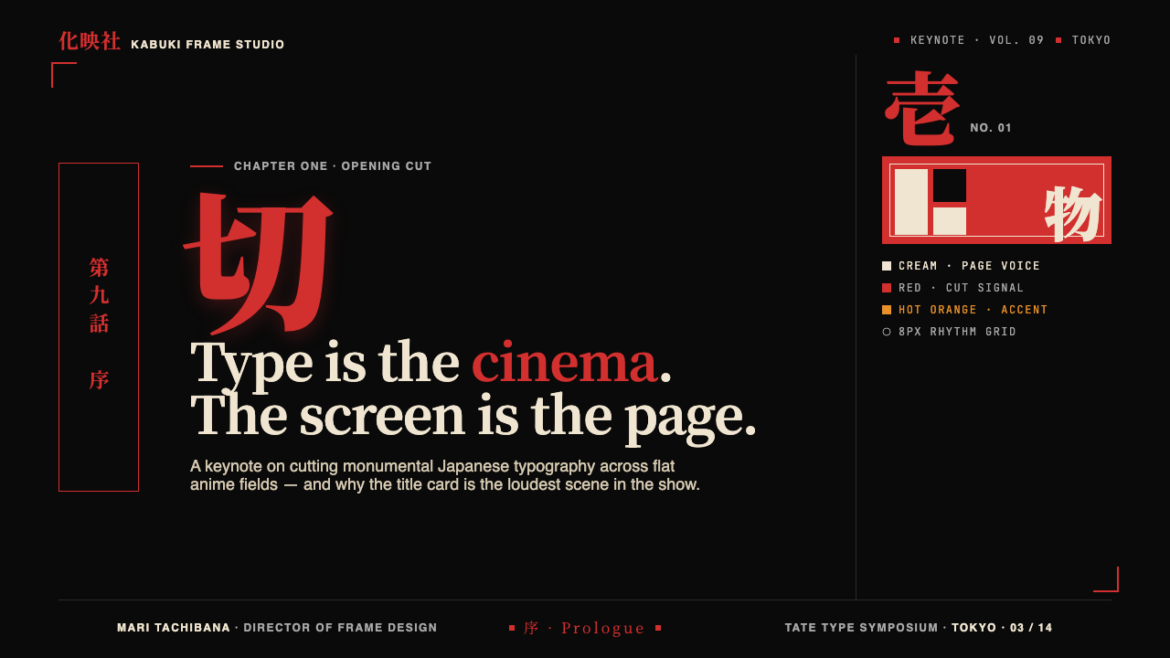
Flash Typography闪切排版
The defining technique: single kanji or short phrases occupy the entire frame for a fraction of a second before cutting away. These are not subtitles or captions — they are editorial statements, functioning like a film cut that happens to be made of type. The glyphs are set at maximal scale, pushing into the edges of the frame or cropping beyond them, and the flash duration is calibrated to be perceptible but not fully readable on first viewing. Repeated watching reveals additional layers of text.这是最核心的技法:单个汉字或短句在整个画面中停留几分之一秒,随即被切走。这些不是字幕或说明——它们是编辑性的陈述,功能如同一个恰好由文字构成的电影剪切。字形以最大尺度排布,向画面边缘推进甚至超出画框,停留时长被精确校准为可感知但无法在初次观看时完整阅读的程度。反复观看才能发现额外的文字层次。
Restricted Palette受限色板
The core palette holds to deep black, saturated red, and near-white, with cream and pale neutrals used in more environmental or interior sequences. Color temperature is deliberately constrained: warm and cool tones rarely coexist in a single composition. Red is structural — it marks titles, emphatic phrases, and alert-level information. Black provides mass and weight. White and near-white supply negative space that makes the other two readable at high contrast. When additional colors appear, they function as location or mood signals rather than graphic decoration.核心色板严格限于深黑、饱和红与近白,奶油色和浅中性色在更具环境感或室内感的段落中出现。色温被刻意限制:暖调与冷调很少在同一构图中共存。红色是结构性的——用于标记标题、强调性短语和警示级别的信息。黑色提供质量与重量。白色与近白色提供负空间,使另外两者在高对比下得以清晰呈现。当其他颜色出现时,它们作为地点或情绪的信号发挥作用,而非图形装饰。
Silhouette and Flat Plane剪影与平涂平面
Characters and environments are frequently reduced to solid-color silhouettes or flat planes with hard contour edges, eliminating modeling, shading, and the conventional anime vocabulary of highlight and shadow. This is not a cost-cutting shortcut but a compositional decision: the silhouette makes the figure read as shape rather than person, allowing it to function as a graphic element on the same plane as the typographic masses beside it. The human form becomes another geometric event in the composition.人物与环境经常被简化为纯色剪影或具有硬轮廓边缘的平涂平面,消除了建模、阴影以及传统动画高光与阴影的惯用词汇。这不是节省成本的捷径,而是一种构图决策:剪影使人物作为形状而非人物被解读,从而使其能够作为图形元素在与旁边排版质块相同的平面上发挥功能。人体形态成为构图中的又一个几何事件。
Radical Negative Space激进的负空间
A large proportion of many frames is simply empty — black or near-white ground with nothing in it. This negative space is not a background waiting to be filled; it is load-bearing. It gives the isolated glyph or figure its monumental quality and creates the perceptual compression that makes the flash-cut feel violent. Compositions regularly place a single element at extreme position — far left, far right, top corner — and leave the remainder of the frame deliberately bare. The emptiness is doing structural work.许多画面中有相当大的比例是纯粹空白的——黑色或近白色的底面,其中什么都没有。这种负空间不是等待被填充的背景,而是承重结构。它赋予被孤立的字形或人物以纪念碑式的品质,并创造出使闪切感觉充满冲击力的感知压缩。构图经常将单一元素置于极端位置——画面最左、最右或顶角——并刻意将画面其余部分留空。那片空旷正在承担结构性的工作。
Architectural Type Scale建筑式字体尺度
When type appears in compositional rather than subtitle function, it is set at a scale that treats the letterform or kanji as an architectural element — as large as a building facade in relation to the frame, often larger than any figure present. The stroke weight of a single character may occupy more visual mass than an entire character's silhouette. This scale inversion — type larger than person — produces the distinctively monumental quality of the style and reinforces the Monogatari franchise's literary premise that language is the primary reality.当文字以构图而非字幕的功能出现时,它以一种将字形或汉字视为建筑元素的尺度排布——相对于画面如同建筑立面一般巨大,往往大于画面中出现的任何人物。单个字符的笔画重量所占据的视觉质量可能超过一整个人物剪影。这种尺度倒置——文字大于人物——产生了这种风格标志性的纪念碑感,并强化了《物语》系列的文学前提:语言是首要的现实。
Hard Contour, No Ambient Blur硬边轮廓,无环境模糊
Every element in the system has a hard, precise edge. There are no soft shadows, no glow effects, no out-of-focus backgrounds, no anti-aliased blur between figure and ground. This hardness is perceptually aggressive — it demands that the eye make a binary decision at every boundary. The absence of atmospheric diffusion means that spatial depth, where it exists at all, is created by layering flat planes of different tones rather than by simulating air or distance. The result is a space that feels like edited paper rather than inhabited world.系统中的每一个元素都具有精确的硬边。没有柔和阴影,没有发光效果,没有失焦背景,没有人物与底面之间的抗锯齿模糊。这种硬边在感知上具有攻击性——它要求眼睛在每一条边界处做出非此即彼的判断。大气漫射的缺失意味着:空间深度(如果存在的话)是通过叠压不同色调的平面来创造的,而非通过模拟空气或距离。由此产生的空间感觉像被剪辑过的纸张,而非可供居住的世界。
Editorial Cut Logic剪辑逻辑
The typography system is inseparable from the editing. Visual statements are made through sequence: a black frame, then a red-on-black kanji flash, then a silhouette, then white title text — each lasting a distinct duration calibrated to cumulative effect. This is design that only makes complete sense in time, understood as a kind of scored sequence rather than a static composition. Translating the style into still media requires preserving this sense of compression and sequence by treating each layout as one frame in a larger edited flow.排版系统与剪辑逻辑密不可分。视觉陈述通过序列完成:一个黑场,随即是红底黑字(或黑底红字)的汉字闪光,随即是一个剪影,随即是白色标题文字——每一帧停留不同的时长,被精确校准以产生累积效果。这是一种只有在时间中才得以完整表意的设计,应当被理解为一种被谱写好的序列,而非静态构图。将这种风格转化为静态媒介时,需要通过把每一个版面视为一个更大剪辑流程中的某一帧来保留这种压缩与序列感。
See the SHAFT Monogatari Typography design system查看 SHAFT Monogatari Typography 完整设计系统
Who shaped SHAFT Monogatari Typography?谁塑造了 SHAFT Monogatari Typography?
Shinbo joined SHAFT in 2004 and became the primary architect of the studio's visual identity. His directorial approach — radical camera angles, interruption of conventional animation flow with graphic inserts, and the decisive stripping-away of representational detail — gave the studio's work a confrontational quality that distinguished it sharply from mainstream anime production. His collaboration with SHAFT on the Monogatari franchise beginning in 2009 produced the most internationally recognized expression of this aesthetic. Shinbo's influence extends across nearly every significant SHAFT production, from Puella Magi Madoka Magica to the Monogatari continuations, making him the single most important individual in establishing the studio's global reputation.新房昭之于 2004 年加入 SHAFT,成为工作室视觉风格的首要构建者。他的导演手法——激进的镜头角度、以图形插入打断传统动画的流程、以及果断剥除具象细节——赋予了工作室作品一种强烈的对抗性,使其与主流动画制作截然不同。从 2009 年开始,他与 SHAFT 在《物语》系列上的合作,产出了这套美学被国际认可的最重要表达。新房昭之的影响几乎涵盖 SHAFT 所有重要作品,从《魔法少女小圆》到《物语》系列续作,使他成为确立工作室全球声誉最重要的个人。
Nisio Isin is the novelist and screenwriter whose Monogatari light novel series provided both the narrative material and the literary sensibility that the visual system was invented to serve. His prose style — hyperverbal, self-referential, saturated with wordplay and puns that only function in Japanese — cannot be conventionally dramatized. It was precisely this literary untranslatability that pushed the SHAFT team to make the words themselves visual. Nisio Isin also wrote the scripts for the anime adaptations, maintaining unusually tight authorial control over the transition from page to screen and ensuring that the verbal texture and the typographic system remained in correspondence.西尾维新是小说家兼剧本作家,他的《物语》系列轻小说提供了叙事素材和文学感性——正是为了服务于这种感性,这套视觉系统才被发明出来。他的散文风格——极度语言性、自我指涉、充满只有日语才能运作的文字游戏与双关——无法被传统地戏剧化。正是这种文学上的不可翻译性,推动 SHAFT 团队将文字本身变为视觉。西尾维新还亲自撰写动画改编的脚本,对从纸面到画面的转化保持着异乎寻常的作者控制,确保语言质感与排版系统始终保持对应关系。
The Monogatari visual language was not the work of any single credited art director but emerged from the collective practice of SHAFT's production teams working under consistent directorial direction. The studio's in-house approach to animation direction — accepting unconventional compositions, treating graphic interruption as a legitimate storytelling tool, and allowing aesthetic risk — created the conditions for the visual grammar to develop and stabilize across multiple productions. The studio culture valued formal experimentation within genre constraints in a way that distinguished SHAFT from studios that prioritized technical polish over visual invention.《物语》视觉语言并非任何单一署名美术指导的作品,而是 SHAFT 制作团队在一贯导演指引下集体实践的产物。工作室在动画导演上的内部方式——接受非常规构图、将图形打断视为合法的叙事工具、允许审美冒险——创造了视觉语法得以在多部作品间发展并稳定下来的条件。工作室文化在类型约束内珍视形式实验,这使 SHAFT 有别于那些将技术精湛置于视觉发明之上的工作室。
Oishi served as series director for Bakemonogatari and was a key creative figure in translating the source material's literary texture into screen grammar. His directorial decisions in the early episodes of the series established the foundational vocabulary — the flash-cut typography, the silhouette compositions, the use of architectural flat color — that subsequent installments built upon. His background in experimental music video and short-form visual work informed his comfort with non-narrative graphic sequences and his willingness to let purely visual rhythm carry scenes where conventional anime direction would deploy dialogue or action.大石守作为《化物语》的系列导演,是将原著文学质感转化为银幕语法的关键创作人物。他在系列早期集数中的导演决策确立了核心视觉词汇——闪切排版、剪影构图、建筑式平涂色块——后续作品正是在这一基础上发展而来。他在实验音乐影像和短片视觉领域的背景,培养了他对非叙事图形序列的驾驭能力,以及他在传统动画导演会诉诸对白或动作的场景中,让纯粹的视觉节奏来承担叙事的意愿。
How do you use SHAFT Monogatari Typography today?今天怎么用 SHAFT Monogatari Typography?
SHAFT Monogatari Typography is a high-intensity style that rewards restraint in application. Its effect depends on contrast — not just the contrast between red and black, but the contrast between density and emptiness, between explosive typographic moments and flat, silent passages. Applying it correctly means accepting that most of the surface should be bare, most of the time, so that the moments of typographic energy register as events rather than as wallpaper.SHAFT Monogatari 字体美学是一种高强度风格,在应用上以克制取胜。它的效果依赖于对比——不仅是红与黑之间的对比,更是密集与空旷之间、爆发性排版时刻与平静、沉默段落之间的对比。正确应用它意味着接受这样一个事实:大多数时候,大多数画面应该是空白的,这样排版能量迸发的时刻才会作为事件被感知,而非沦为壁纸。
For presentation slides, the style is most effective when treated as a sequence of poster-like frames. Cover slides benefit from a single monumental typographic element — a word or short phrase in the dominant display weight, positioned asymmetrically, against a black or deep-neutral ground, with a minimal red accent used for a subtitle or year marker. Content slides should be radically simple: one data point or one assertion per frame, with all supporting text reduced to a single tight cluster. Do not fill the slide. Data visualization in this aesthetic works best as isolated graphic objects with hard-edge bars or lines in the primary palette, no chart borders, and a white or near-white ground. The data becomes a typographic object.对于演示文稿,这种风格在被视为一系列海报式画面的序列时最为有效。封面幻灯片适合使用单一的纪念碑式排版元素——在主展示字重下排布的一个词或短语,非对称置于黑色或深中性底面,以极简的红色强调用于副标题或年份标记。内容幻灯片应当彻底简约:每页一个数据点或一个论断,所有辅助文字压缩为单一紧密组团。不要填满幻灯片。在这套美学中,数据可视化作为孤立的图形对象效果最好——以主色板呈现硬边条形或折线,无图表边框,白色或近白色底面。数据由此变成排版对象。
For web user interfaces, the style suits dark-mode dashboards, analytics surfaces, media player interfaces, and any context where content is consumed in focused sessions rather than casual browsing. The key structural choices: a near-black or pure-black background as the base layer, body text in near-white or light neutral, interactive accent elements in saturated red, and hard-edge component borders with no shadow softening. Cards and panels should have definite, architectural boundaries. Navigation and labeling should be typographic rather than icon-heavy. On pricing or plan-selection pages, the style's poster-like boldness makes tier differentiation very clear when each plan is treated as a self-contained typographic block.对于网页用户界面,这种风格适合深色模式仪表板、数据分析界面、媒体播放器界面,以及任何内容在专注会话而非随意浏览中被消费的场景。关键结构选择:以近黑或纯黑背景作为基础层,正文用近白或浅中性色,交互强调元素用饱和红,组件边框为硬边且无阴影柔化。卡片与面板应有明确的建筑式边界。导航与标注应以排版为主,而非倚重图标。在定价或方案选择页面上,当每个套餐被视为一个独立的排版块时,这种风格的海报式大胆感使层级区分非常清晰。
For editorial work and marketing materials — event posters, journal covers, feature article headers, promotional cards — the Monogatari aesthetic has the most direct fit. An event poster in this style places the event name at architectural scale, positions supporting information in a contrasting weight cluster, and uses the red accent for the single most important call to action: the date, the venue, the ticket link. The composition leaves significant bare area as a deliberate choice. For longer editorial layouts, the style works well as a contrast rhythm device: open sections with a full-bleed typographic title frame, then transition into a more neutral content zone, then punctuate with another flash moment at section breaks.对于编辑类内容和营销材料——活动海报、期刊封面、特稿标题、推广卡片——《物语》美学的契合度最为直接。这种风格的活动海报将活动名称以建筑级尺度排布,辅助信息以对比字重聚合,红色强调留给最重要的一个行动号召:日期、场地、购票链接。构图刻意保留大面积空白区域。对于篇幅较长的编辑版式,这种风格作为对比节奏装置效果良好:以出血版排版标题帧开启段落,随后过渡到更中性的内容区,再在段落转接处以另一个闪光时刻作为标点。
A persistent mistake in applying this style outside its original context is confusing visual aggression with visual complexity. The Monogatari visual system is aggressive in contrast and pacing but structurally sparse. Designers who try to import the red-black palette and the large kanji but then fill the remaining surface with additional elements, soft textures, or decorative motifs produce work that looks cluttered and confused rather than intense. The style's power is inseparable from its emptiness. A second common error is applying the flash-typography logic to static media without adjusting for the absence of time: in motion, a word needs only a fraction of a second because the cut does the work; in a static composition, the same degree of scale and isolation must be calibrated so the element is legible and compositionally stable rather than simply enormous.在将这种风格应用于原始语境之外时,一个持久性的错误是将视觉攻击性与视觉复杂性相混淆。《物语》视觉系统在对比与节奏上具有攻击性,但在结构上是稀疏的。设计师如果试图引入红黑色板和巨大汉字,却用更多元素、柔和纹理或装饰母题填满剩余画面,产出的作品看起来会杂乱而迷茫,而非强烈。这种风格的力量与它的空旷不可分割。第二个常见错误是在将闪切排版逻辑应用于静态媒介时没有针对时间维度的缺失作出调整:在运动影像中,一个词只需几分之一秒,因为剪切本身完成了工作;而在静态构图中,同等程度的尺度与孤立感必须被校准,使该元素在版面上清晰可读且构图稳定,而非仅仅是巨大。
See the SHAFT Monogatari Typography design system查看 SHAFT Monogatari Typography 完整设计系统
SHAFT Monogatari Typography — FAQSHAFT Monogatari Typography · 常见问题
Is this style only suited to dark backgrounds, or can it work on light grounds?这种风格只适合深色背景吗,还是也能在浅色底面上使用?
The canonical Monogatari palette is deep black as the base, and the visual system's most characteristic effects — the sense of a glyph burning through darkness, the near-violence of a red cut — depend on that darkness. A light-ground version is possible but requires significant recalibration. On a white or cream background, the dominant color logic inverts: type must be dark and heavy to achieve the same monumental quality, and red shifts from a blazing accent to a structural marker. The most common light-ground application is a cream field with very dark, near-black type at architectural scale and red used only for a single title element or date marker. The emptiness principle remains essential.《物语》的经典色板以深黑为基础,这套视觉系统最具特征的效果——字形燃烧穿越黑暗的感觉、红色剪切的近乎暴力——都依赖于那片黑暗。浅色底面的版本是可行的,但需要大幅重新校准。在白色或奶油色背景上,主导色彩逻辑发生反转:文字必须足够深且沉重才能达到相同的纪念碑式品质,而红色从燃烧的强调转变为结构性标记。最常见的浅色底面应用是奶油色底面配以建筑尺度的极深近黑色文字,红色仅用于单一标题元素或日期标记。空旷原则依然是核心。
How does this style differ from other Japanese design traditions like the International Japanese style or Muji minimalism?这种风格与其他日本设计传统(如国际日本风格或无印良品式极简主义)有何不同?
The Monogatari aesthetic is confrontational where those traditions are serene. International Japanese graphic style — associated with designers like Ikko Tanaka and Yusaku Kamekura — shares some structural elements: the importance of negative space, the willingness to use kanji as a graphic element, the flat-color approach. But that tradition is concerned with balance, harmony, and a quiet authority. Muji minimalism is about reduction to the essential without agitation — warmth through removal. The Monogatari system is deliberately agitating: the flash-cut is a jolt, the scale of the type is confrontational, the palette is high-tension. It draws on avant-garde energy rather than classical restraint, and its effect is cinematic urgency rather than contemplative stillness.《物语》美学是对抗性的,而那些传统是宁静的。与田中一光、龟仓雄策等设计师相关联的国际日本平面风格,共享一些结构性元素:负空间的重要性、将汉字作为图形元素的意愿、平涂色块的处理方式。但那一传统关注的是平衡、和谐与一种安静的权威感。无印良品式极简主义是关于在不引发焦虑的情况下还原至本质——通过减法获得温暖。《物语》系统是刻意制造焦虑的:闪切是一种冲击,文字的尺度是对抗性的,色板是高张力的。它汲取的是先锋能量而非古典克制,它的效果是电影式的紧迫感而非冥想式的静止。
Can this aesthetic work for brands and products outside entertainment and media?这套美学能在娱乐和媒体领域之外的品牌和产品中发挥作用吗?
Yes, with careful positioning. The style communicates intensity, narrative depth, and a certain fearlessness that translates beyond anime into any context where those qualities are valued. Security and threat intelligence platforms, performance sports brands, independent music labels, and high-end gaming peripherals have all successfully used the visual grammar of stark contrast, typographic monumentality, and severe negative space. The limitation is warmth and approachability: the style is essentially cold and demanding. Consumer goods that depend on emotional warmth, convenience, or accessibility — family products, health and wellness, food — are poor fits. The test is whether the brand values include intensity or confrontation as desirable qualities.可以,但需要仔细定位。这种风格传递的是强度、叙事深度以及某种无所畏惧的气质,这些品质可以从动画跨越到任何重视它们的场景。安全与威胁情报平台、竞技运动品牌、独立音乐厂牌以及高端游戏外设,都曾成功运用极端对比、排版纪念碑感和严峻负空间的视觉语法。局限在于温暖感与亲和力:这种风格本质上是冷峻而要求苛刻的。依赖情感温暖、便利性或亲和力的消费品——家庭类产品、健康与养生、食品——与其不匹配。判断标准是:品牌价值观是否将强度或对抗性视为可取的品质。
The flash-cuts are so short they are almost subliminal. Is that an intentional reading experience?那些闪切停留时间极短,几乎是潜意识级别的。这是一种刻意设计的阅读体验吗?
Yes, and this is one of the most distinctive aspects of the Monogatari system's design logic. The flash-cuts are calibrated so that a careful first-time viewer might catch the general shape or emotional tone of the text without reading it word for word. A second or third viewing reveals additional layers. This creates a viewing experience that rewards re-watching — which aligns directly with the franchise's literary source material, which is itself heavily layered and self-referential. In Nisio Isin's novels, information is often buried in parenthetical asides, footnotes, and running commentary that require rereading to fully absorb. The flash-cut system is the visual translation of that reading experience: depth revealed through repetition, not through a single linear pass.是的,这是《物语》系统设计逻辑最具特色的方面之一。闪切被精确校准,使认真的初次观众可能捕捉到文字的大致形态或情感基调,但无法逐字阅读。第二次、第三次观看才能揭示额外的层次。这创造了一种奖励反复观看的观赏体验——与系列的文学原著直接契合,原著本身也是高度分层且自我指涉的。在西尾维新的小说中,信息往往被埋藏在括号旁注、脚注和流动评论中,需要重读才能完全吸收。闪切系统是对这种阅读体验的视觉转化:深度通过重复而非单次线性浏览来揭示。
Does the style require Japanese characters, or does it translate to Latin-script typography?这种风格必须使用日文汉字吗,还是可以转化为拉丁字母排版?
The original system is inseparable from kanji because the visual weight and density of Japanese ideographic characters is fundamental to the compositional logic — a single character can carry the mass and presence of an entire word or phrase in Latin letters. Translating the aesthetic to Latin scripts requires heavier-weight letterforms, condensed or ultra-condensed proportions, and a willingness to treat single words rather than single characters as the base compositional unit. The underlying principles — extreme scale contrast, hard-edge definition, restricted palette, architectural negative space — transfer fully. What changes is the grain: Latin typography at this scale tends to read as shouting in a way that kanji monumentality does not, because Western audiences are conditioned to read large type as emphasis rather than as graphic mass. Awareness of this cultural difference allows for successful adaptation.原始系统与汉字不可分割,因为日语表意文字的视觉重量与密度是构图逻辑的基础——单个字符在拉丁字母中可以承载整个词或短语的质量与存在感。将这套美学转化为拉丁字母排版,需要更重的字重、窄体或超窄体的比例,以及将单个词(而非单个字符)作为基本构图单位的意愿。底层原则——极端的尺度对比、硬边定义、受限色板、建筑式负空间——可以完整转化。变化的是颗粒度:以这种尺度排布的拉丁排版往往被解读为吼叫,而汉字的纪念碑感却不会,因为西方受众习惯于将大号文字解读为强调而非图形质量。意识到这种文化差异,才能实现成功的改编。
Related design styles相关设计风格
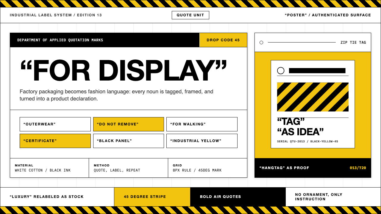 Off-White (Virgil Abloh era)Industrial irony, labeled. Yellow stripes and Helvetica quotes turn luxury in…工业反讽标签化:黄黑斜纹与粗黑无衬线引号,把奢侈变成工厂库存。
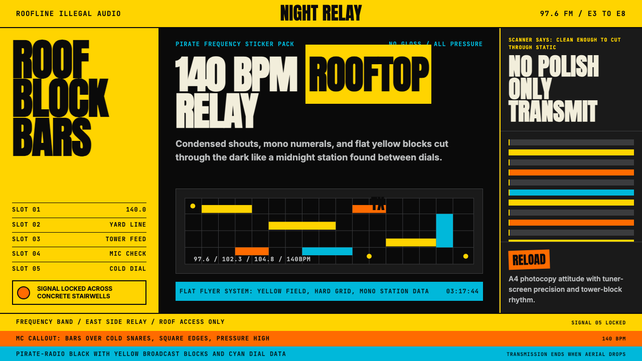 Grime London Pirate Radio (2003)Pirate signal, flat and urgent. Yellow blocks, mono FM numerals, hard flyer g…盗台信号,平面又急促。黄块、等宽频率字、硬网格成形。
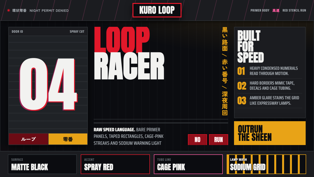 Kanjōzoku Loop RacerSpeed as contraband. Hot red numbers slice black tarmac with amber grid glare.速度像违禁品。黑色沥青上,火红数字与琥珀网格切开夜色。
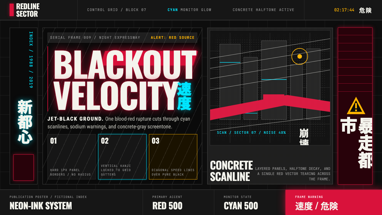 Akira (Otomo)Cyberpunk at impact. Kaneda red, cyan kanji, halftone concrete, and diagonal…冲击式赛博朋克:金田红、青色汉字、混凝土网点与斜向速度线。
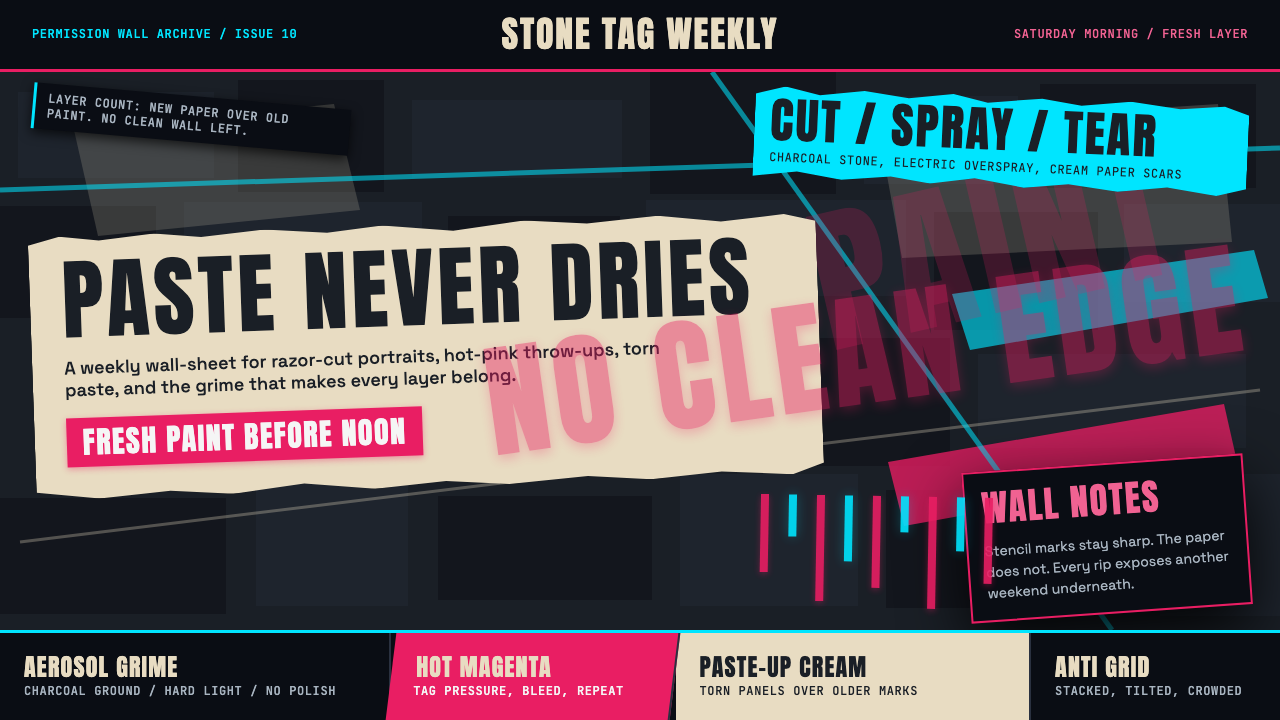 Melbourne Laneway Stencil (Hosier Lane)Permission-wall maximalism. Magenta tags slash charcoal bluestone and cream p…合法墙极繁主义:洋红标签划过炭黑青石与奶油贴纸。
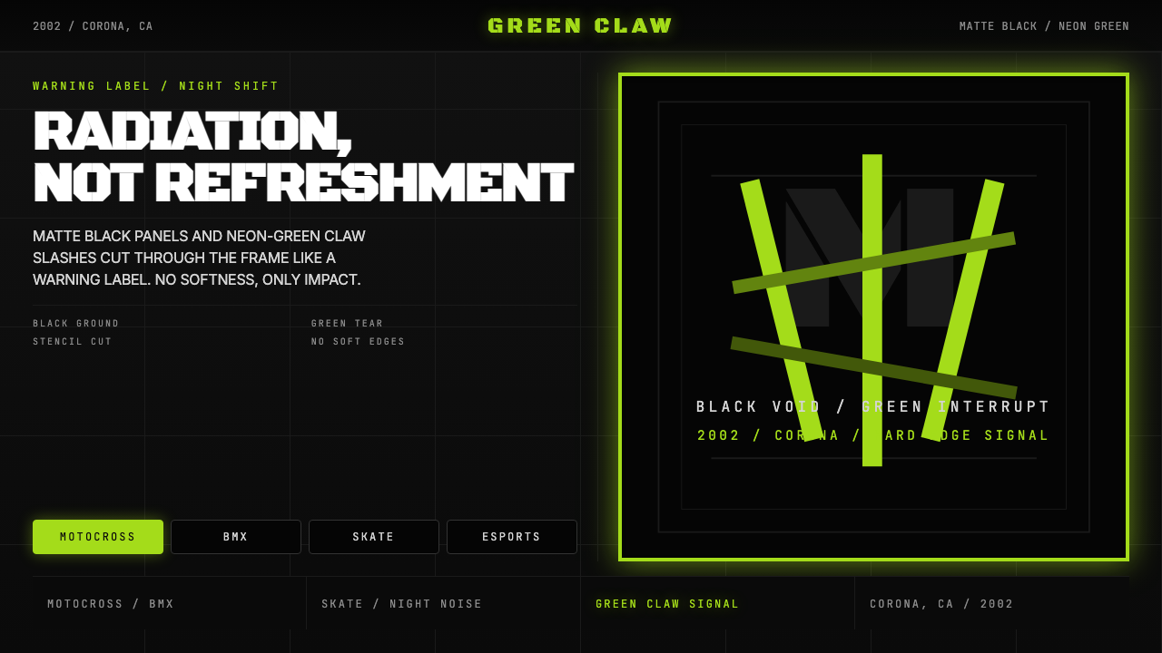 Monster Energy Claw (2002)Aggression, not refreshment. Matte black and neon-green claw slashes cut the…不是清爽,是冲击。哑黑底与霓绿爪痕撕裂画面。