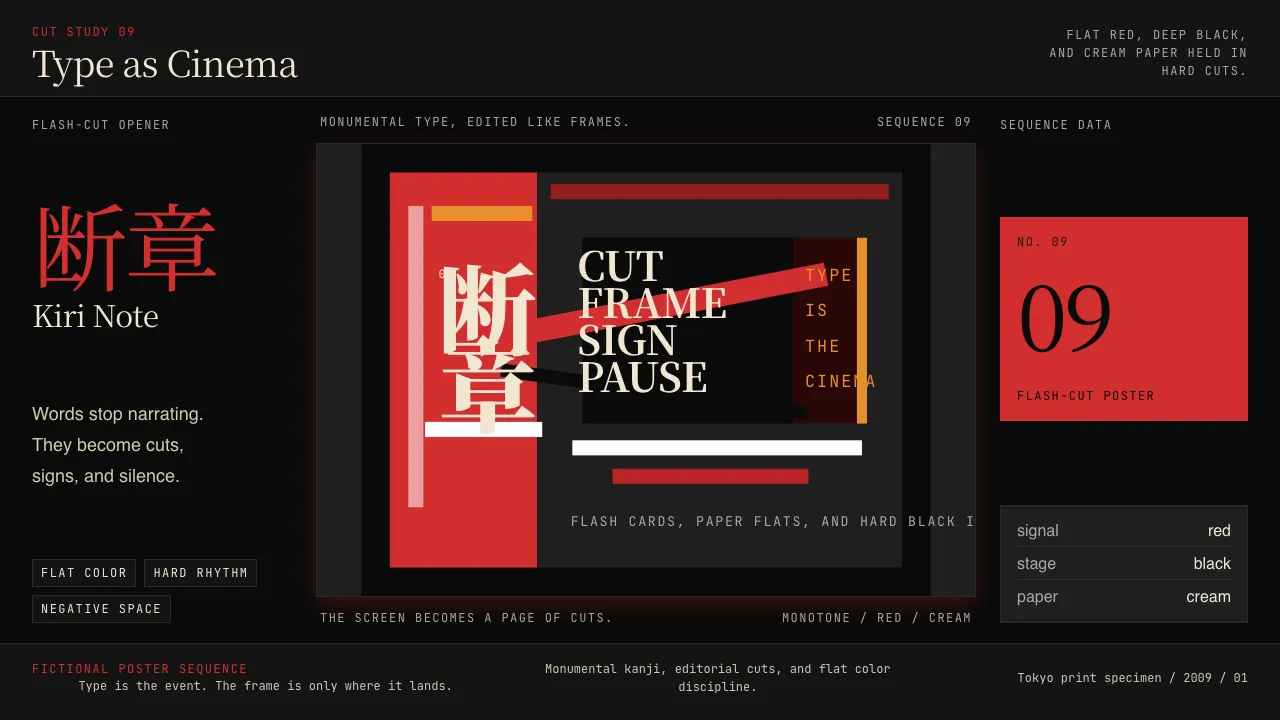
About SHAFT Monogatari Typography
SHAFT Monogatari Typography is the visual grammar Studio SHAFT and director Akiyuki Shinbo invented for Bakemonogatari in 2009: saturated red against deep black, monumental Japanese kanji slammed across the frame as flash-cuts, and minimalist flat-color anime composition stripped down to silhouette.
The system treats type as cinema. Words become buildings, signs become punctuation, and the screen itself becomes a sequence of edited posters. Negative space carries as much weight as the giant glyphs cutting through it.
- Origin
- Tokyo, Japan
- Era
- SHAFT studio founded 1975; Akiyuki Shinbo joined SHAFT 2004; Bakemonogatari 2009; ongoing through 2024+
- Key figures
- Akiyuki Shinbo · Nisio Isin · SHAFT studio team
- Movements
- Avant-garde anime typography · Shinbo-cut minimalist anime · Monogatari narrative-typography
SHAFT Monogatari Typography design spec
Colors
Typography
The other 11 sections — buttons, cards, spacing, motion, techniques and more — open once you unlock. Download the DESIGN.md or send it to your AI in one click. Unlock once, yours forever.
Sign up nowStyles similar to SHAFT Monogatari Typography
Also inspired by film, games & music, with a close feel.
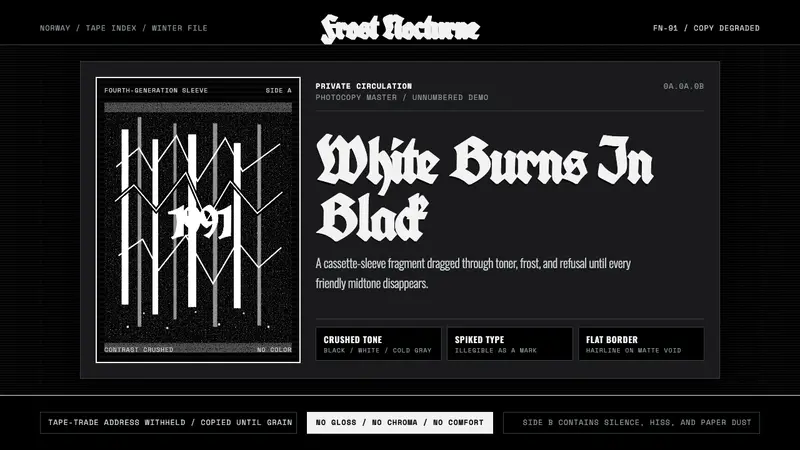 Nordic Black MetalUncompromising monochrome. Blackletter, hairline frames, and xerox grain crush the page.
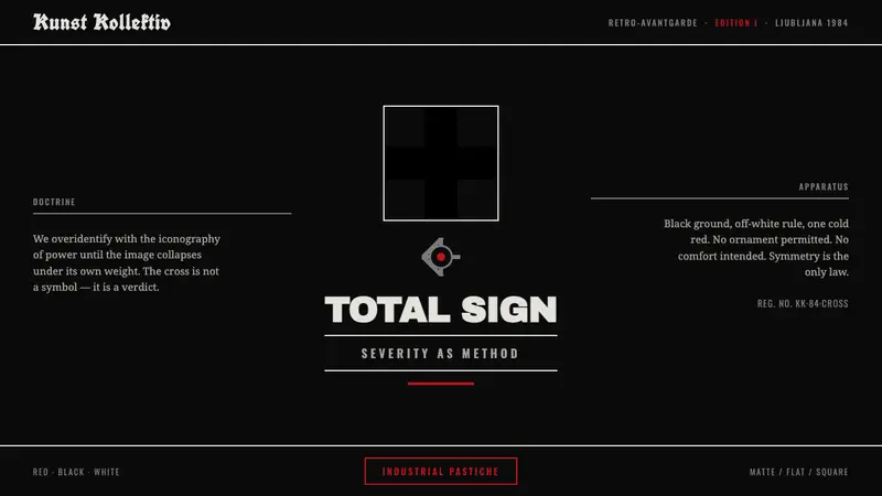 NSK / Laibach Retro-AvantgardePower's iconography turned into critique. Malevich black cross on matte black, struck with cold blood-red.
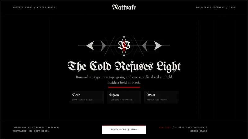 Norwegian Black Metal (1992)Ritual severity. Bone-white blackletter cuts through black grain with one blood-red mark.
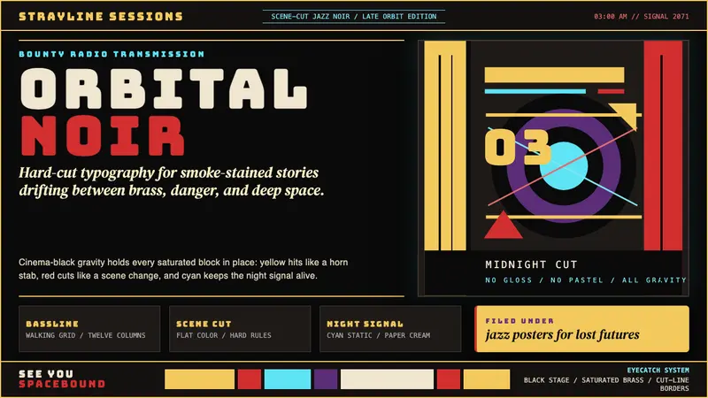 Cowboy Bebop Jazz-NoirCool at 3 AM. Bungee type, jazz yellow, red cuts, and cyan rules hit deep black.