About Norwegian Black Metal (1992)
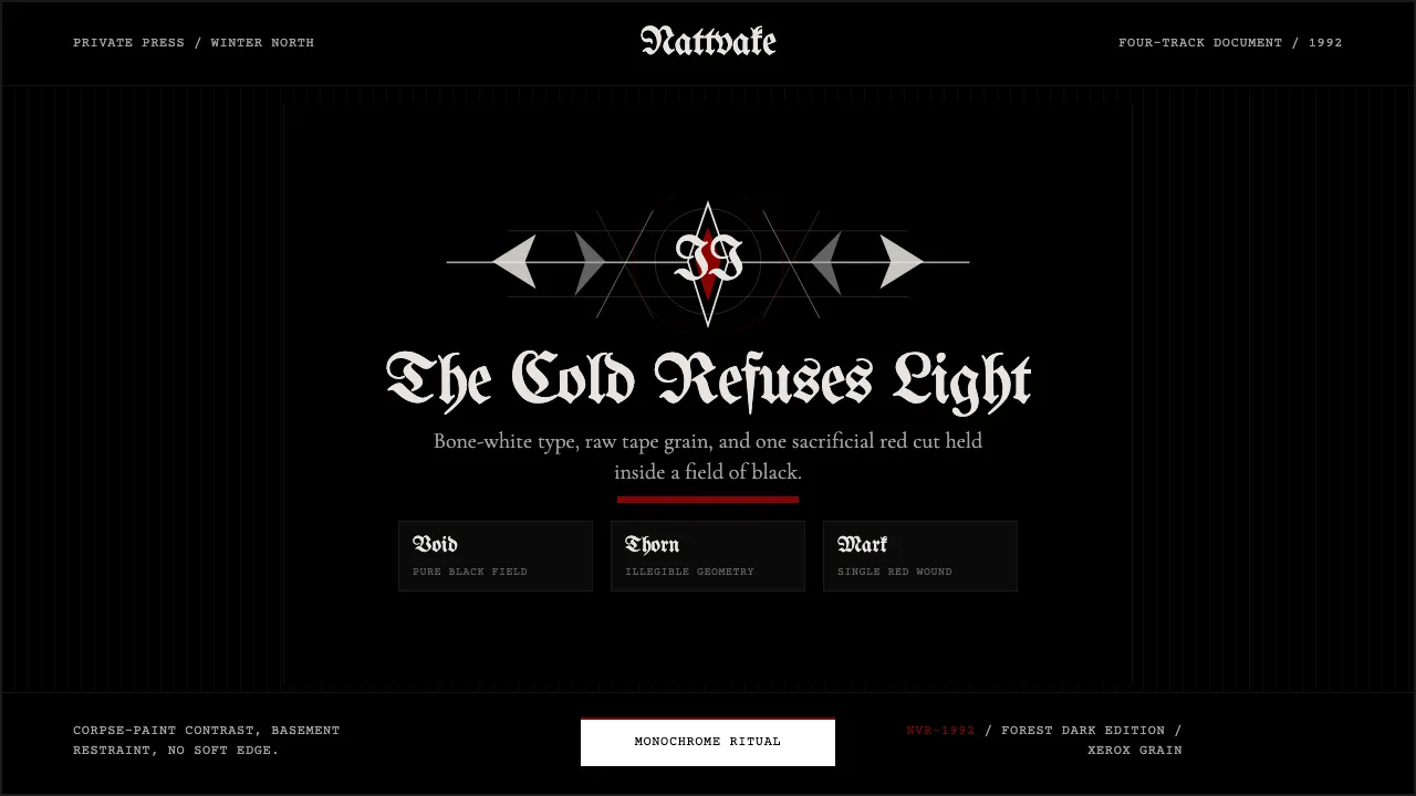
Norwegian Black Metal emerged between 1991 and 1994 from a tiny circle of teenagers in Oslo and Bergen who created the most visually severe aesthetic in music history. Armed with corpse-paint, four-track cassette recorders, and hand-drawn spike-and-thorn logos of deliberate illegibility, bands like Mayhem, Darkthrone, Burzum, and Emperor produced album sleeves of unrelenting monochrome — stark black-and-white forest photography, single blood-red accents, and blackletter typography pushed to fractal extremity.
This design system channels that ritual severity: pure black backgrounds, bone-white text, zero color except a single sacrificial red. Every surface is raw — high-contrast grain, inked edges, no softness. The typography moves between ornate blackletter display faces and restrained serif body text, mirroring the scene's tension between medieval theatricality and basement minimalism.
- Origin
- Norway — Oslo and Bergen
- Era
- 1991–1994
- Key figures
- Euronymous (Øystein Aarseth) · Fenriz · Varg Vikernes · Christophe Szpajdel
- Movements
- Norwegian Black Metal · Second Wave Black Metal · Northern European Extreme Metal
Norwegian Black Metal (1992) design spec
Colors
Typography
The other 11 sections — buttons, cards, spacing, motion, techniques and more — open once you unlock. Download the DESIGN.md or send it to your AI in one click. Unlock once, yours forever.
Sign up nowStyles similar to Norwegian Black Metal (1992)
Also inspired by film, games & music, with a close feel.
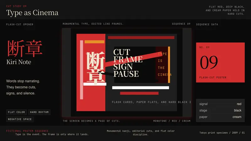 SHAFT Monogatari TypographyType becomes cinema. Red cuts, black flats, and monumental kanji steer the frame.
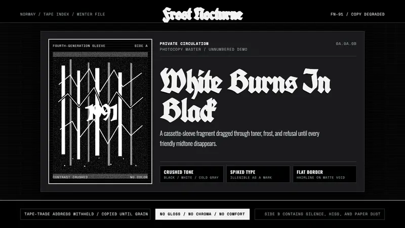 Nordic Black MetalUncompromising monochrome. Blackletter, hairline frames, and xerox grain crush the page.
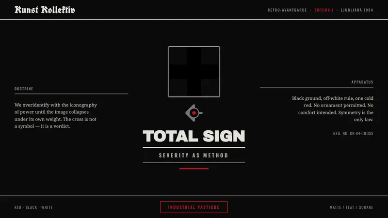 NSK / Laibach Retro-AvantgardePower's iconography turned into critique. Malevich black cross on matte black, struck with cold blood-red.
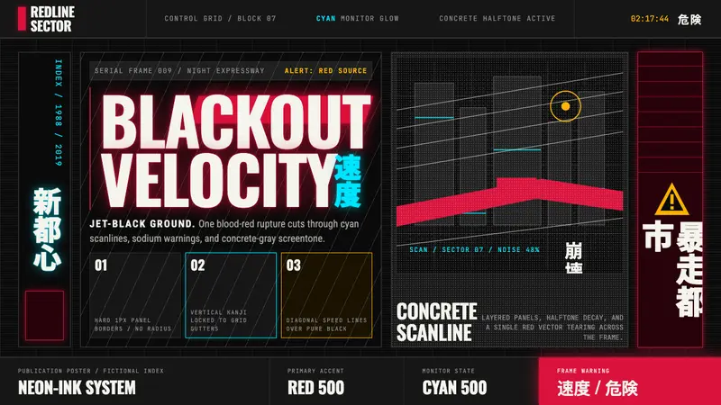 Akira (Otomo)Cyberpunk at impact. Kaneda red, cyan kanji, halftone concrete, and diagonal speed lines.