What is Haitian Vodou Vèvè?
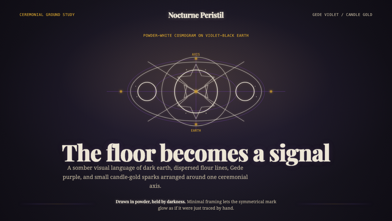
Vèvè are sacred ground-drawings, sprinkled by hand in flour and cornmeal onto a temple floor — a cosmogram in candlelight, standing for a devotional gravity no vector tool can fake.
Haitian Vodou Vèvè in brief
Haitian Vodou vèvè are ceremonial line-drawings traced directly onto bare earth, each one a geometric signature for a specific lwa — a spirit invoked during ritual. A houngan or mambo (priest or priestess) drips powder from a closed fist in a slow, continuous motion, building symmetrical patterns of crosses, hearts, stars, coffins, and serpents that a congregation will dance across before the ground-drawing is trampled back into dust by the ceremony's end. The vèvè is never meant to last; its disappearance is part of its function.
Translated into a design system, the aesthetic is somber, ceremonial, and nocturnal: a near-black canvas with a violet undertone stands in for the temple floor, powder-white line-art stands in for the flour, a deep purple associated with the Gede family of spirits carries the brand's voice, and small, disciplined bursts of candlelight gold mark the moments a design wants to feel lit rather than merely colored. Nothing here is bright by daylight logic — everything is judged by how it would look under a single flame in a dark room.
The defining tension is between rigor and imperfection. The symbols are exactingly symmetrical, built from repeating geometric units — but the line quality is soft, granular, slightly uneven, because it was made by falling powder, not a pen. A design honoring this style holds both truths: structured composition, unstructured mark-making.
Where does Haitian Vodou Vèvè come from?
Vèvè belong to Haitian Vodou, a religion forged in the crucible of colonial Saint-Domingue — the French colony that, through the only successful slave revolt in history, became independent Haiti in 1804. Enslaved Africans transported to the colony came primarily from Fon-speaking Dahomey (in present-day Benin) and from Kongo-speaking Central Africa, and they carried with them distinct but related traditions of spirit veneration, ancestor communication, and cosmogram drawing. Forced conversion to Catholicism under French colonial law did not erase these traditions; it fused with them, producing a syncretic religious system in which Catholic saints became masks worn by African lwa.
The vèvè itself descends most directly from Kongo cosmogram traditions — diagrams that mapped the boundary between the world of the living and the world of the dead, often drawn as a cross inscribed in a circle representing the sun's rising, midday, setting, and midnight position. Fon-derived practice contributed the specific iconography of individual spirits and the ritual technique of ground-drawing as an act of invitation rather than mere illustration: the drawing does not depict the lwa, it calls the lwa into the room. Catholic contribution came largely through visual borrowing — chromolithographs of saints were pinned above altars and cross-mapped onto lwa who shared some attribute with the saint, a practice that let enslaved and later free Haitians practice their ancestral religion under the cover of an imposed one.
By the early twentieth century — the period this style draws its visual register from — Vodou had become a fully formed national religion, practiced openly in rural temples (houmforts) and privately in cities, organized around families of spirits with distinct personalities, colors, and appetites. The Gede family, spirits of death and of the cemetery who are also, paradoxically, spirits of sexuality, humor, and unstoppable vitality, are presided over by Baron Samedi, typically depicted in top hat and tailcoat, and Papa Legba, the guardian of crossroads and gates who must be greeted first in any ceremony because he alone can open the door between the human world and the world of the lwa.
Vodou has been persistently misrepresented outside Haiti — reduced in American popular culture to zombies and pins-in-dolls, a caricature with little relationship to the religion's actual theology or its ongoing role in Haitian life. The vèvè tradition survived decades of both foreign mockery and domestic political suppression, and its persistence is part of what a design drawing on it should carry: gravity earned by endurance, not novelty invented for effect.
What defines the Haitian Vodou Vèvè look?
Ground and Atmosphere
The base surface reads as packed earth rather than a clean digital canvas: a near-black ground carrying a violet undertone, uneven in the way that trodden dirt is uneven, never a flat uniform black. This is the single most important departure from typical dark-mode design — the darkness here has temperature and texture, not just low luminance.
Line Quality
Every mark carries the soft dispersion of powder falling from a hand rather than the crispness of a drawn vector line. Edges are slightly diffused rather than hard-edged; a line thickens and thins along its length the way a trail of flour would under an unsteady hand. Perfectly uniform stroke-weight vector art betrays the style immediately — the imperfection is not a flaw to be smoothed out, it is the evidence of the hand that made it.
Symmetry and Cosmogram Structure
Beneath the loose line quality sits a rigorously symmetrical armature — most vèvè are organized around a central vertical or radial axis, built from repeating geometric units (crosses, stars, interlocking curves) rather than free-form gesture. A design in this register should feel like it was constructed from a small set of repeated elements around a clear center, never asymmetric in the loose, editorial sense.
Color Discipline
Powder-white for the line-art, a deep Gede purple as the dominant accent, and candlelight gold used sparingly, almost as punctuation, for a single highlight, an active state, or a moment meant to feel illuminated rather than merely colored. Saturated, varied color is foreign to the style — restraint in hue count is what keeps the ceremonial mood intact.
Iconographic Vocabulary
Crosses, hearts, stars, coffins, serpents, and interlaced curves recur across individual vèvè, each combination specific to a lwa's identity and attributes. Borrowing this vocabulary respectfully means treating these as a closed, meaningful set rather than generic occult clip-art — the shapes are signatures, not decoration, and a design should use a small, coherent selection rather than scattering unrelated symbols for atmosphere.
Candlelight as Light Source
Where highlights or glow effects appear, they should behave like a single small flame in a dark room rather than an even studio wash — a warm, localized point of brightness that falls off quickly into the surrounding dark, rather than a broad soft glow spread evenly across a surface. This governs how any interactive or focal element should be lit within the system.
Hand-Drawn Over Vector-Clean
The single governing discipline across every other characteristic: this style actively resists the crispness that most digital design defaults to. Anti-aliasing, grain, and slightly irregular repetition of otherwise-symmetrical units are not bugs to fix but the whole point — a vèvè-derived design that looks too clean has lost the ritual hand that makes the style legible as itself.

Who shaped Haitian Vodou Vèvè?
Papa Legba is the guardian of crossroads, gates, and thresholds, and by tradition must be saluted first in any Vodou ceremony because he alone opens the door between the human world and the world of the lwa. His vèvè typically incorporates a cane or crutch and a crossroads motif, reflecting his role as the spirit of passage and communication — an apt reference point for any design element that functions as an entry point or gateway.
Baron Samedi leads the Gede family of spirits associated with death, the cemetery, and — paradoxically — sexual humor and unstoppable vitality. He is conventionally depicted in a black top hat, tailcoat, and dark glasses, smoking a cigar, an image that has been widely (and often crudely) borrowed by outside media. Within the tradition, he represents the idea that death and life-force are not opposites but two faces of the same spirit family.
Vodou priests (houngan) and priestesses (mambo) draw vèvè by hand, dripping powder from a closed fist in a slow, deliberate motion to construct each cosmogram before a ceremony. Their skill passes down through apprenticeship rather than formal schooling, and the precision of a well-executed vèvè — symmetrical despite being drawn freehand onto uneven ground — is itself a mark of standing within their community.
The vèvè's structural logic — the cosmogram as a diagram of the boundary between the living and the dead — descends most directly from Kongo cosmogram practice, while much of the specific spirit iconography and the ground-drawing ritual technique trace to Fon-speaking Dahomey. These two distinct African traditions, carried by enslaved people to colonial Saint-Domingue, merged into a single visual and theological system rather than remaining separate practices.
How do you use Haitian Vodou Vèvè today?
Applying this style well requires treating it as a devotional register, not a spooky or exotic decoration — the aesthetic earns its gravity from ritual practice, and design work that borrows it should aim for the same somber seriousness rather than a Halloween or horror-genre reading.
For presentation cover slides, the style calls for a large, centered, symmetrical line-drawn motif on the near-black violet ground, with the title set in restrained powder-white type and a single small gold accent marking one focal point — never scattered across the composition. Content and data slides should keep the same disciplined palette but lower the visual intensity of the line-art to a supporting role: thin powder-white rules organize the grid, gold is reserved for the one number or callout that most needs emphasis, and charts read as quiet diagrams on dark ground rather than bright infographics.
For web UI, dashboards benefit from the style's inherent hierarchy discipline — the near-black ground with violet undertone works well as a base surface, powder-white for primary text and structural lines, purple for secondary UI chrome, and gold reserved strictly for active states, alerts, or a single call-to-action per view. Pricing pages should resist the temptation to make every tier gold; gold should mark only the recommended or active tier, with the rest rendered in the quieter purple-and-white register so the accent retains its meaning.
For editorial and marketing contexts, the style suits content that itself carries weight — cultural features, ritual or heritage storytelling, nocturnal or atmospheric brand positioning. Section breaks work well as thin symmetrical line motifs rather than plain rules, and pull-quotes can borrow the candlelight treatment: a small warm highlight against the dark ground, used once per section rather than throughout.
The most common mistake is treating the style as generic 'dark mode plus mystical symbols' — flattening the violet undertone to plain black, over-using gold until it stops reading as candlelight, or replacing the soft, hand-drawn line quality with crisp vector icons that could belong to any occult-themed template. A second common mistake is symbol misuse: inventing generic pentagram-adjacent iconography instead of respecting that vèvè-derived marks are meaningful signatures, not decorative filler, and should be used sparingly and specifically rather than repeated as an all-over pattern.
Haitian Vodou Vèvè — FAQ
Is it disrespectful to use a Vodou-derived aesthetic in commercial design?
It depends entirely on register. Treating the aesthetic with the same somber seriousness it holds in ritual practice — restrained color, meaningful rather than invented symbols, no horror-genre framing — is a defensible design choice that draws on a real and rich visual tradition. Using it for Halloween-style horror branding, or flattening its specific iconography into generic 'voodoo doll' clichés, repeats exactly the caricature that has long misrepresented the religion in popular media. The safest practice is to treat the source material the way this style guide does: as a devotional aesthetic with real theological content, not exotic set dressing.
Why is the ground violet-black rather than plain black?
Plain, neutral black reads as a generic dark-mode background — it carries no atmosphere. The violet undertone is what signals a specific place and time: a packed-earth temple floor under low, warm candlelight, which naturally tints deep shadow toward violet rather than a cool, neutral black. Flattening this to pure black is the single fastest way to lose the style's ceremonial specificity and have it collapse into any other dark theme.
How much gold is too much gold?
Gold should behave like the light from a single candle in an otherwise dark room — a small, localized highlight that marks one important thing per view: one active state, one call-to-action, one number that matters most. Once gold starts appearing on multiple elements simultaneously at similar intensity, it stops reading as candlelight and starts reading as a generic accent color, which flattens the entire ceremonial mood the style depends on.
Can this style work in a light, high-key layout?
Not faithfully. The entire visual logic depends on darkness as the ceremonial condition — vèvè are performed in candlelight precisely because the contrast between pale powder and dark earth is what makes the drawing legible and numinous. A light-background adaptation would have to abandon the candlelight-in-darkness premise entirely and would read as a different, much weaker aesthetic. This is a style built around night, not one that happens to use dark colors by preference.
What kinds of products or brands does this style suit?
It suits contexts where solemnity, ritual, or nocturnal atmosphere are genuine brand values: cultural and heritage platforms, storytelling or documentary projects, wellness or introspective products that want to feel grave rather than breezy, and any brand willing to commit to a hand-made, imperfect mark-making quality over slick vector polish. It is a poor fit for cheerful consumer products, children's brands, or anything that needs to read as light, fast, or playful — the style's entire register works against those goals.
Related design styles
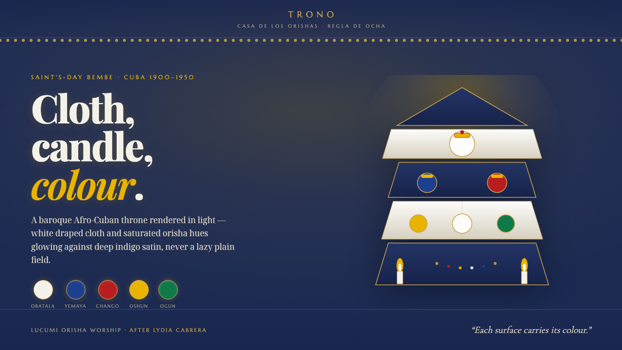 Santeria Altar BembeBaroque Afro-Cuban orisha throne. Saturated hues and white cloth glow on indi…
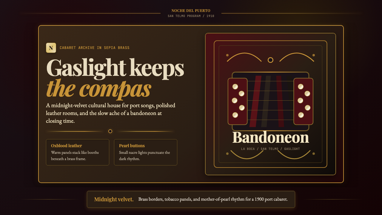 Argentine Bandoneón 1900 (Tango)Gaslit tango luxury. Midnight velvet, brass fileteado, and pearl-button geome…
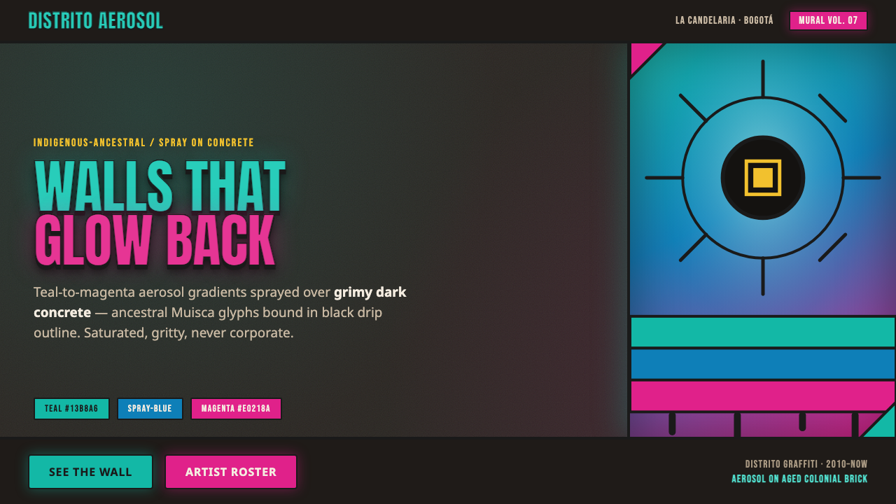 Bogotá Street MuralismNeon spray glowing off the wall. Teal-to-magenta aerosol on grimy concrete, i…
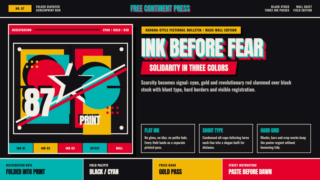 Cuban OSPAAAL Tricontinental PosterUrgency from scarcity. Cyan, gold and red slam over black in blunt silkscreen…
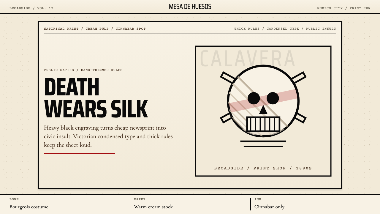 José Guadalupe Posada CalaveraDeath turns civic. Heavy black engravings on cream pulp, with cinnabar red.
 Levantine Keffiyeh Black & WhitePolitical textile, not ornament. Cotton type and fishnet lattice cut through…