What is Oracle Bone 甲骨文?
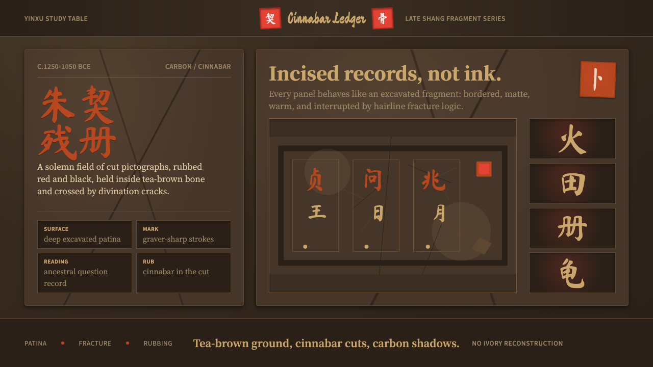
Oracle Bone turns the ledger of Shang-dynasty divination into a design system — cinnabar glyphs incised into ox bone and turtle shell, aged to a deep tea-brown patina and read alongside the crack-lines that once answered the king's questions.
Oracle Bone 甲骨文 in brief
Oracle Bone is a design system built entirely from jiaguwen (甲骨文), the earliest known systematic form of Chinese writing. Every visual cue in the system points back to a single physical object: a cleaned ox scapula or turtle plastron, incised with a bronze graver, and rubbed with pigment so the marks could be read against the bone's own surface. The system does not try to make that object look pristine or ceremonial in a polished sense — it makes it look excavated, the way it actually arrives in a museum case three thousand years later.
The palette follows the object rather than any decorative theory. A deep, warm tea-brown stands in for the bone or shell itself, aged and mineral-stained after millennia in the ground. Cinnabar red and carbon black carry the script and the structural lines, echoing the two pigments diviners actually rubbed into fresh incisions to make faint cuts legible. Nothing in the system is bright in the modern sense; every color reads as something that has weathered.
The glyphs themselves are angular and pictographic — early Chinese characters still visibly derived from the shapes of the things they name: a sun as a circle with a dot, a person as a bent figure in profile, a house as a peaked roof over walls. Because the source medium was carved with a blade rather than drawn with a brush, strokes are straight, thin, and decisive, meeting at sharp corners instead of the curved, tapered strokes of later brush calligraphy. Hairline crack-lines, the traces of heat-induced fractures used in the original divination, run across panels as a secondary graphic layer — not decoration, but a literal remnant of how the object was used.
Where does Oracle Bone 甲骨文 come from?
Oracle bone script belongs to the late Shang dynasty, roughly 1250 to 1050 BCE, and its purpose was neither art nor record-keeping in the ordinary sense — it was a technology of communication with ancestors and gods. Diviners at the royal court would take a prepared ox scapula or turtle plastron, drill or chisel a series of shallow hollows into its back, and apply intense heat to those hollows with a hot poker or brand. The heat caused the bone to crack audibly on the front face, and the diviner read the shape and direction of those cracks as the answer to a question posed on the king's behalf — about harvests, hunts, military campaigns, the health of royalty, or the correct rituals to perform.
After the cracking, the questions themselves — and sometimes the outcomes — were incised into the bone's surface in the angular script that gives the style its name, often with pigment rubbed into the grooves to keep the text legible. Thousands of these inscribed bones and shells accumulated at the Shang capital near modern Anyang before the dynasty fell, and they were then buried, forgotten, and left undisturbed for roughly three thousand years.
Their rediscovery is a documented event with a specific date. In 1899, the Qing dynasty scholar and official Wang Yirong is credited with recognizing that strange incised marks on bone fragments being sold in Beijing pharmacies as a medicinal ingredient called 'dragon bones' were in fact an ancient form of writing. His colleague Liu E acquired many of these fragments and in 1903 published the first book of oracle-bone rubbings, bringing the script to wider scholarly attention. Scholars Luo Zhenyu and Wang Guowei subsequently identified the site of origin as Yinxu, near Anyang in central China, and began the philological work of matching oracle-bone characters to their later forms in bronze inscriptions and classical texts.
Systematic scientific excavation of Yinxu began in 1928 under the Academia Sinica, and the archaeologist Dong Zuobin became one of the leading figures in that work, developing a chronological framework for dating oracle-bone inscriptions by cross-referencing the diviners named within them. The excavations eventually recovered well over one hundred thousand inscribed fragments, confirming oracle bone script as the direct ancestor of the Chinese writing system still in use today — the oldest continuously legible link in one of the world's oldest living scripts.
What defines the Oracle Bone 甲骨文 look?
Color
The system is built on a mineral, weathered palette: a deep tea-brown ground standing in for aged bone or shell, cinnabar red for the incised script and ceremonial markings, and carbon black for structural lines and secondary text. There is no bright or saturated color anywhere — every hue reads as something oxidized by three thousand years underground rather than freshly applied.
Glyph Form
Characters are angular, pictographic, and carved rather than brushed — straight strokes meeting at sharp corners, with none of the tapering curves that later brush calligraphy introduced. Many glyphs still visibly resemble the object or action they represent, giving the script a diagrammatic, almost primitive-technical quality rather than a purely decorative one.
Surface and Patina
Every panel is treated as an aged physical artifact rather than a clean digital plane. The surface carries subtle variation and warmth consistent with millennia of burial and oxidation, avoiding the flat uniformity of a printed or painted background. This patina is what separates an archaeological reading from a merely 'ancient-looking' decorative one.
Crack-Line Motif
Hairline fracture lines, echoing the heat-induced cracks diviners actually read as omens, appear as a secondary graphic layer across the system. They are never purely ornamental flourishes; they run with the irregular, branching logic of a real fracture, giving structure and division to a panel the way a fault line divides terrain.
Composition
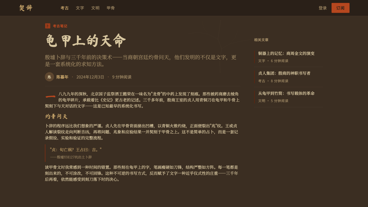
Layout favors discrete rectangular panels reminiscent of a bone or shell fragment laid flat under museum glass, each carrying its own cluster of script and crack-lines. Text runs in the vertical columns characteristic of early Chinese writing, read top to bottom, giving the whole system a quiet, inscriptional rhythm rather than a horizontal, scanning one.
Restraint
Despite its archaeological richness, the system stays visually quiet: two accent colors against one dominant ground, no gradients, no polish. The severity is deliberate — it is meant to feel unearthed and read by lamplight or firelight, a record rather than a display, closer to a museum artifact than a themed decoration.
Who shaped Oracle Bone 甲骨文?
A Qing-dynasty scholar and official credited with first recognizing, in 1899, that the incised bone fragments sold in Beijing pharmacies as the medicinal ingredient 'dragon bones' actually bore an ancient form of writing. His identification is conventionally treated as the founding moment of oracle-bone studies as a scholarly field.
A collector and novelist who acquired large numbers of inscribed oracle bones from dealers and, in 1903, published the first book of oracle-bone rubbings, making the script's existence known to a much wider circle of scholars beyond the small group who had first handled the fragments.
A scholar who helped trace the origin of the oracle bones being sold on the antiques market back to a specific archaeological site near Anyang, and who compiled and published extensive collections of oracle-bone inscriptions, laying groundwork for treating the script as a legitimate object of systematic study.
An archaeologist central to the systematic excavation of Yinxu beginning in 1928, who developed a method for dating oracle-bone inscriptions by cross-referencing the diviners named within the texts themselves, turning the script from a curiosity into a datable historical record.
How do you use Oracle Bone 甲骨文 today?
Oracle Bone reads as an archaeological find rather than a themed skin, and applying it well means preserving that quality of discovery rather than decorating a surface with 'ancient Chinese' motifs. Every element should feel like it was there before the viewer arrived — incised, aged, and waiting to be read — not applied afterward for effect.
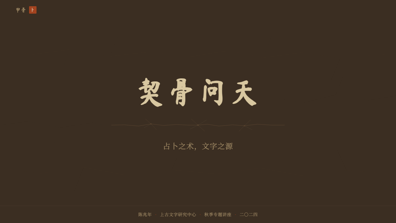
On presentation slide covers, the style works best as a single large panel treated like a museum specimen: a tea-brown ground, a cluster of script-like marks and crack-lines positioned off-center rather than symmetrically, and a title set quietly rather than boldly. Content slides should keep panels distinct and rectangular, each with its own patina, avoiding a single continuous background that would flatten the archaeological feel into wallpaper. Data visuals suit the style surprisingly well when treated as fragments themselves — a bar chart or timeline can sit inside its own bone-colored panel, bordered by a hairline crack rather than a modern rule.
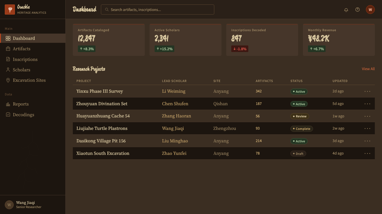
For web interfaces, the palette and restraint translate cleanly to dashboards and documentation-style pages that want to feel weighty and considered rather than playful: a warm dark ground, cinnabar used sparingly for the single most important action or alert on a screen, and carbon black for body text and structural dividers. Because the system depends on restraint, it does not suit dense, colorful data-heavy interfaces — it wants one accent doing one job.
In editorial and marketing contexts, Oracle Bone is well suited to material about heritage, archaeology, craft, or deep history, where the reader should feel they are handling something old rather than reading a modern summary of it. Long-form articles benefit from vertical rhythm and generous space around each block of text, echoing the isolated panels of an actual bone fragment; marketing pages should resist the temptation to fill every surface, since the system's power comes from what is left bare.
The most common mistake is treating the cinnabar red and tea-brown as a generic 'oriental' color scheme and pairing it with modern rounded typefaces, gradients, or bright accent colors — this collapses the archaeological specificity into a costume. The system only works when every element can be justified by the physical object it is drawn from: if a mark could not plausibly have been carved, rubbed, or cracked into bone, it does not belong.
Oracle Bone 甲骨文 — FAQ
Is Oracle Bone the same as generic 'ancient Chinese' design themes?
No. Generic ancient-Chinese themes typically borrow from imperial court aesthetics — red lacquer, dragon motifs, gold ornamentation — drawn from many different dynasties and centuries. Oracle Bone is narrower and earlier: it is drawn specifically from Shang-dynasty divination bones and the pictographic script incised into them, more than a thousand years before the imperial aesthetics most 'ancient Chinese' themes reference. Its palette is mineral and weathered rather than lacquered and gilded, and its typography is angular and carved rather than brushed.
Why does the system use crack-lines as a design element rather than just decoration?
Because the cracks were the actual mechanism of the divination the bones were used for — heat applied to a drilled hollow caused the bone to fracture, and the diviner read the resulting pattern as the answer from ancestors or gods. Including crack-lines is therefore not an aesthetic flourish but a reference to how the object functioned. A version of the style without crack-lines would keep the script but lose the reason the bones existed in the first place.
Can this style work in a light, high-key layout instead of a dark one?
The style is conceived as dark by nature, because the entire visual premise is an aged, oxidized surface — bone or shell that has spent three millennia underground reads as deep tea-brown, not pale ivory. A high-key inversion undercuts that premise directly; it would look closer to a fresh, unweathered object, which contradicts the archaeological reading the system depends on. Where more light is genuinely needed, it is better achieved by reducing panel size or increasing negative space around a still-dark ground, rather than by lightening the ground itself.
What kind of products or content should avoid this style?
Oracle Bone is a poor fit for anything that needs to read as playful, fast-moving, or contemporary — children's products, casual consumer apps, or brands built around speed and lightness will feel contradicted by the style's deliberate weight and archaeological stillness. It also struggles wherever dense, colorful information needs to be scanned quickly, since its restrained two-accent palette is not built to carry heavy data. It suits products and content built around heritage, history, craftsmanship, or scholarly depth far better than it suits anything meant to feel new.
Related design styles
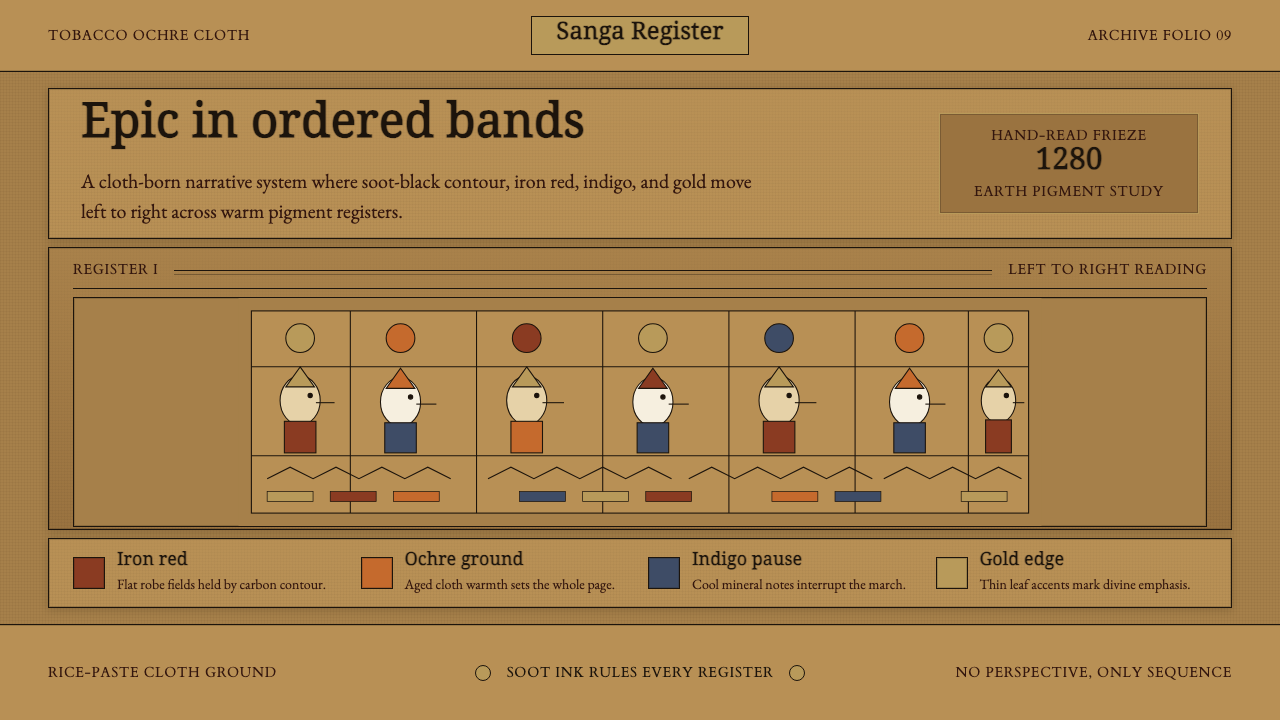 Balinese Kamasan PaintingAncient cloth, ordered as story. Ochre bands, soot outlines, indigo and gold…
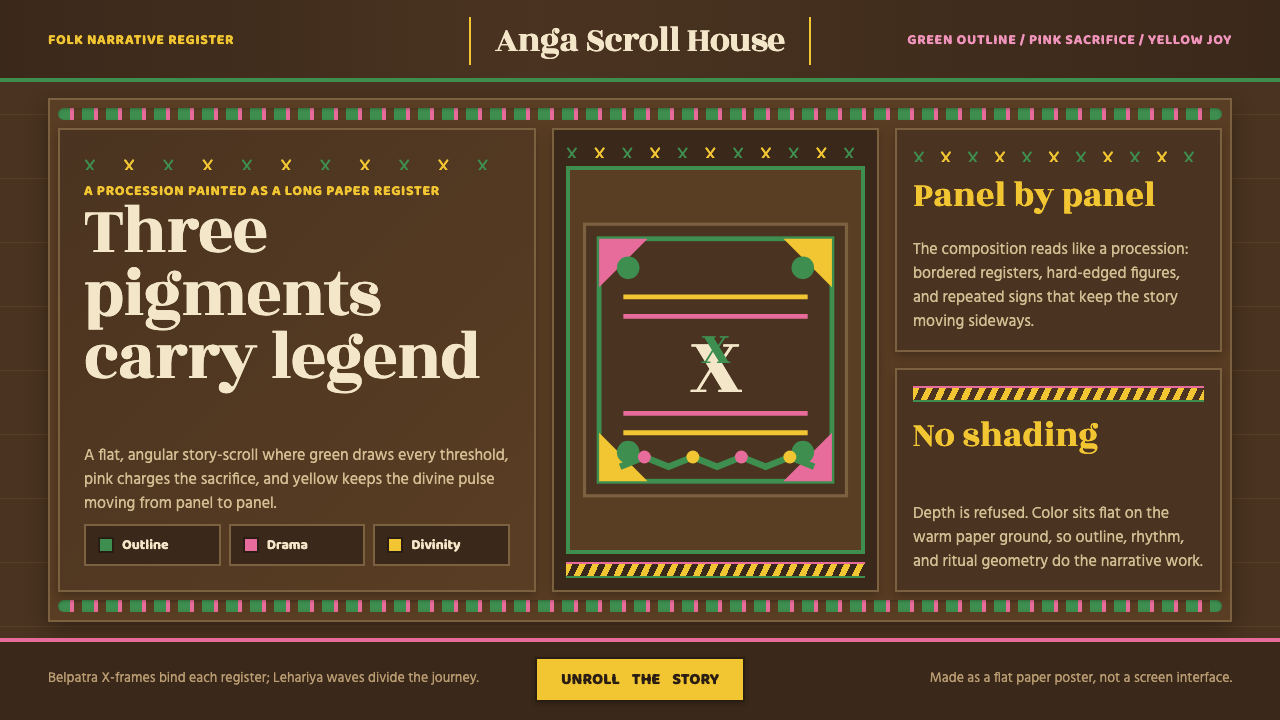 Manjusha Anga Snake-ScrollLegend moves in three pigments. Green outline, pink drama, yellow divinity on…
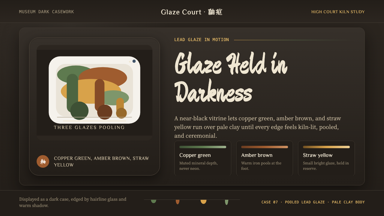 Tang Sancai 唐三彩Museum-dark and molten. Copper green, amber, and straw pools glow in bordered…
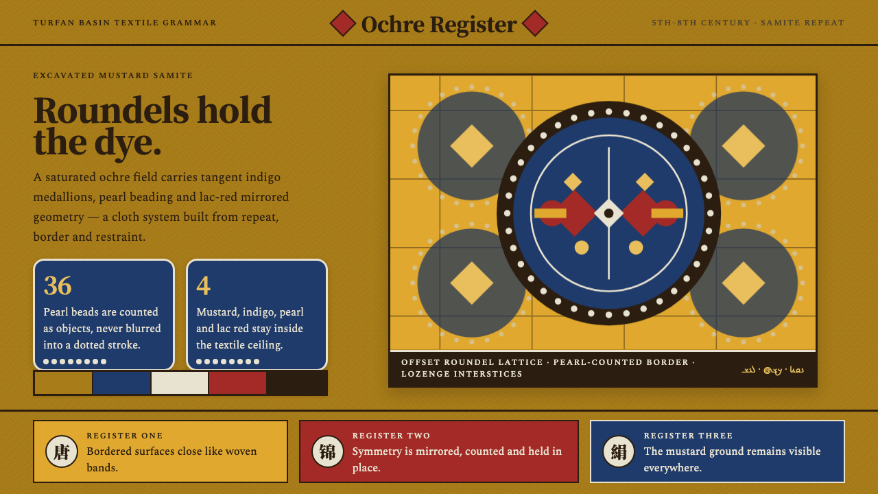 Astana Tomb SilksDye survives as structure. Mustard ground, indigo roundels and pearl beads lo…
 Baybayin ScriptCarved, not written. Curvilinear baybayin ash-rubbed into tobacco-brown bambo…
 Bhutanese Tiger's Nest Cliff MonasterySacred altitude, mineral-dark. Cinnabar tiers and bronze rules climb charcoal…