Design style guide设计风格指南
What is Arte Povera (Merz, 1968)?什么是 Arte Povera (Merz, 1968)?
Arte Povera declared that dirt, burlap, and neon tubing were as legitimate as marble — and built a design language from that refusal to polish.贫穷艺术宣告:泥土、麻布与霓虹灯管与大理石同样合法——并从这份拒绝抛光的立场中,构建出一套设计语言。
Arte Povera (Merz, 1968) in briefArte Povera (Merz, 1968) 速览
Arte Povera — Italian for 'poor art' — was a movement born in the late 1960s among a generation of Italian artists who rejected the slick, commodified aesthetics of consumer culture and the art market alike. The critic Germano Celant coined the term in 1967, grouping together artists who worked with raw, humble, and unstable materials: dirt, felt, charcoal, glass, wax, live animals, and the industrial detritus of everyday urban life. The result was not a unified style so much as a shared stance — a conviction that art's raw material should feel genuinely unmediated, as though caught mid-process.「贫穷艺术」(Arte Povera)——意大利语,字面意思即「穷人的艺术」——是1960年代末诞生于意大利的一场运动,参与者是一代拒绝消费文化与艺术市场双重光鲜美学的艺术家。评论家杰尔马诺·切兰特于1967年创造了这一术语,将一批以原始、朴素、不稳定材料进行创作的艺术家归为一类:泥土、毛毡、木炭、玻璃、蜡、活体动物,以及城市日常生活中的工业废料。结果并非一种统一的风格,更像是一种共同的立场——一种信念:艺术的原材料应当给人真正未经中介的感受,仿佛被捕捉于进行中的过程之间。
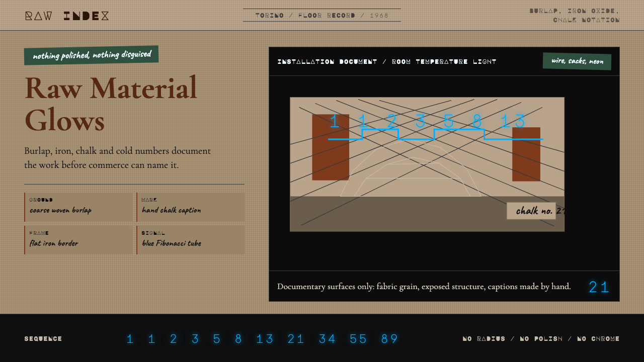
Translated into a design system, Arte Povera becomes something specific and recognizable: earth-toned surfaces that carry the visual memory of raw linen or aged iron; type that suggests chalk or pencil rather than digital precision; and sudden, cold eruptions of neon blue-green that interrupt the warmth like a Fibonacci sequence inscribed in light. The system is held together by a deliberate tension between the ancient and the industrial, the hand-hewn and the algorithmic.转化为设计体系,贫穷艺术呈现出某种特定而可辨认的面貌:承载原始亚麻或老铁视觉记忆的大地色调界面;令人联想到粉笔或铅笔而非数字精度的字体;以及突然迸发的冷色霓虹蓝绿,如同用光刻写的斐波那契数列,打断整体的温暖基调。这套系统由古老与工业、手工打凿与算法精密之间刻意维持的张力所凝聚。
What distinguishes Arte Povera from mere rusticity is this tension. The movement was never pastoral — it was urban, theoretical, and confrontational. Mario Merz's wire-mesh igloos were not cottages; they were structural diagrams of a mathematical sequence rendered in cold light. The design aesthetic that follows from this is not simply rough or aged, but rather rough-and-wired: organic surfaces punctuated by precise, almost clinical accents.将贫穷艺术与单纯的粗粝乡土风格区别开来的,正是这种张力。这场运动从来不是田园式的——它是都市的、理论性的、对抗性的。马里奥·梅尔兹的铁丝网冰屋不是村舍,而是用冷光渲染出的数学序列结构图。从中衍生的设计美学,不只是粗糙或老旧,而是「粗糙加连线」:有机表面被精准、几近临床的点缀所穿透。
See the Arte Povera (Merz, 1968) design system →查看 Arte Povera (Merz, 1968) 完整设计系统 →
Where does Arte Povera (Merz, 1968) come from?Arte Povera (Merz, 1968) 从何而来?
The movement emerged from the specific cultural climate of late 1960s Italy — a period of intense political ferment, student uprisings, and a deep suspicion of institutional authority. Turin, the industrial capital of the north, was its epicenter. Artists there had watched Minimalism harden into a kind of corporate aesthetic in America, and they responded with something deliberately anti-institutional: sculpture made from materials that could not be easily commodified, shown in ways that challenged the gallery's commercial function.这场运动诞生于1960年代末意大利特定的文化气候——政治骚动、学生运动与对建制权威深度怀疑交织的年代。北部工业首都都灵是其震中。那里的艺术家目睹了极简主义在美国如何硬化为一种企业美学,并以某种刻意反建制的东西作为回应:用难以被商品化的材料创作雕塑,以挑战画廊商业功能的方式展出作品。
Germano Celant's September 1967 manifesto and accompanying exhibition gave the loose constellation of artists a name and a framework. He included Mario Merz, Jannis Kounellis, Michelangelo Pistoletto, Giovanni Anselmo, Gilberto Zorio, Giuseppe Penone, and Luciano Fabro. Their materials and methods differed, but they shared a commitment to what Celant called a direct relationship between the work and the world — bypassing the refined, mediated object in favor of something that retained the trace of its making.杰尔马诺·切兰特1967年9月的宣言与随附展览,为这一松散的艺术家星座赋予了名称与框架。他将马里奥·梅尔兹、雅尼斯·库内利斯、米开朗基罗·皮斯托莱托、乔瓦尼·安塞尔莫、吉尔贝托·佐里奥、朱塞佩·佩诺内与卢恰诺·法布罗纳入其中。他们的材料与方法各异,却共同恪守切兰特所说的「作品与世界的直接关系」——绕开精致、被中介化的对象,转向仍保留制作痕迹的东西。
Mario Merz became the movement's most distinctive visual signature. His obsession with the Fibonacci sequence — the mathematical progression in which each number is the sum of the two preceding it — led him to inscribe these numbers in neon tubing across his sculptures, photographs, and installations. Merz saw Fibonacci as a natural law connecting organic growth, architecture, and the cosmos. When rendered in cold blue or white neon against a rusted steel surface or a burlap ground, the sequence created an electric tension between the archaic and the technoscientific that became the movement's visual keynote.马里奥·梅尔兹成为这场运动最具辨识度的视觉标志。他对斐波那契数列——每个数字都是前两个数之和的数学递进——的迷恋,驱使他将这些数字以霓虹灯管的形式铭刻在雕塑、照片与装置之上。梅尔兹将斐波那契视为连接有机生长、建筑与宇宙的自然法则。冷蓝或白色的霓虹数列被置于锈钢表面或麻布底面之上时,在古老与技术-科学之间制造出一种电流般的张力——这成为整场运动的视觉基调。
The movement reached its peak intensity between 1967 and 1972, with landmark exhibitions in Turin, Rome, and Amalfi. By the mid-1970s, many artists had moved into related but distinct practices. However, Arte Povera's influence persisted and deepened over subsequent decades. The 1980s neo-expressionist turn in painting drew from its embrace of raw material; the 1990s interest in process and installation art owed direct debts to its methods. In design, the aesthetic re-emerged in the early 2000s as a counterpoint to the ubiquitous digital-clean minimalism of the period, valued for exactly what it refused to do: smooth over, clean up, or pretend that making is effortless.运动的高峰期在1967至1972年间,在都灵、罗马与阿马尔菲举办了多场里程碑式展览。到1970年代中期,许多艺术家已转向相关但各自独立的实践。然而,贫穷艺术的影响力在此后数十年中持续深化。1980年代绘画的新表现主义转向,从它对原始材料的接纳中汲取养分;1990年代对过程与装置艺术的兴趣,直接承继了它的方法。在设计领域,这种美学在2000年代初重新浮现,作为那个时期无处不在的数字清洁极简风格的对立面——被珍视的,恰恰是它拒绝做的事:抹平、整洁,或假装制作毫不费力。
What defines the Arte Povera (Merz, 1968) look?Arte Povera (Merz, 1968) 的视觉特征是什么?
Earth Tones and Material Color大地色调与材料本色
The palette draws directly from the materials themselves: raw linen and burlap contribute warm beige and ochre grounds; iron and rusted steel provide deep oxide browns and muted terracottas; charcoal and soot introduce near-blacks that are warmer and less neutral than a printed black. These tones are never artificially brightened or saturated — they read as the residue of process rather than chosen colors, as though the surface has earned its hue through exposure and use.色板直接源于材料本身:原色亚麻与麻布提供温暖的米色与赭黄色底面;铁与锈钢贡献深邃的氧化棕与低饱和陶土红;木炭与烟灰引入近乎黑色的暗调,比印刷黑更温暖、更少中性。这些色调从不经过人工提亮或饱和处理——它们读起来像过程的残余,而非选择的颜色,仿佛表面通过暴露与使用获得了自己的色泽。
Cold Neon Accent冷光霓虹强调色
Against warm, aged grounds, Arte Povera-derived design uses cold neon accents — a blue-green or icy white that reads as electric and industrial. These accents are sparse: a single sequence of numerals, a line, a word. The contrast between the tactile warmth of the base surface and the artificial coldness of the neon is the system's central visual drama. The accent should feel like it has been added by a different kind of intelligence than the one that made the ground.在温暖、老旧的底面映衬下,贫穷艺术衍生的设计使用冷光霓虹强调色——一种蓝绿色或冰白色,读起来充满电气感与工业性。这些强调色是稀疏的:一串数字序列、一条线、一个词。底面触感温度的温暖与霓虹人工冷度之间的对比,是整套系统的核心视觉张力。强调色应当给人一种感觉:它由与制造底面截然不同的另一种智能所添加。
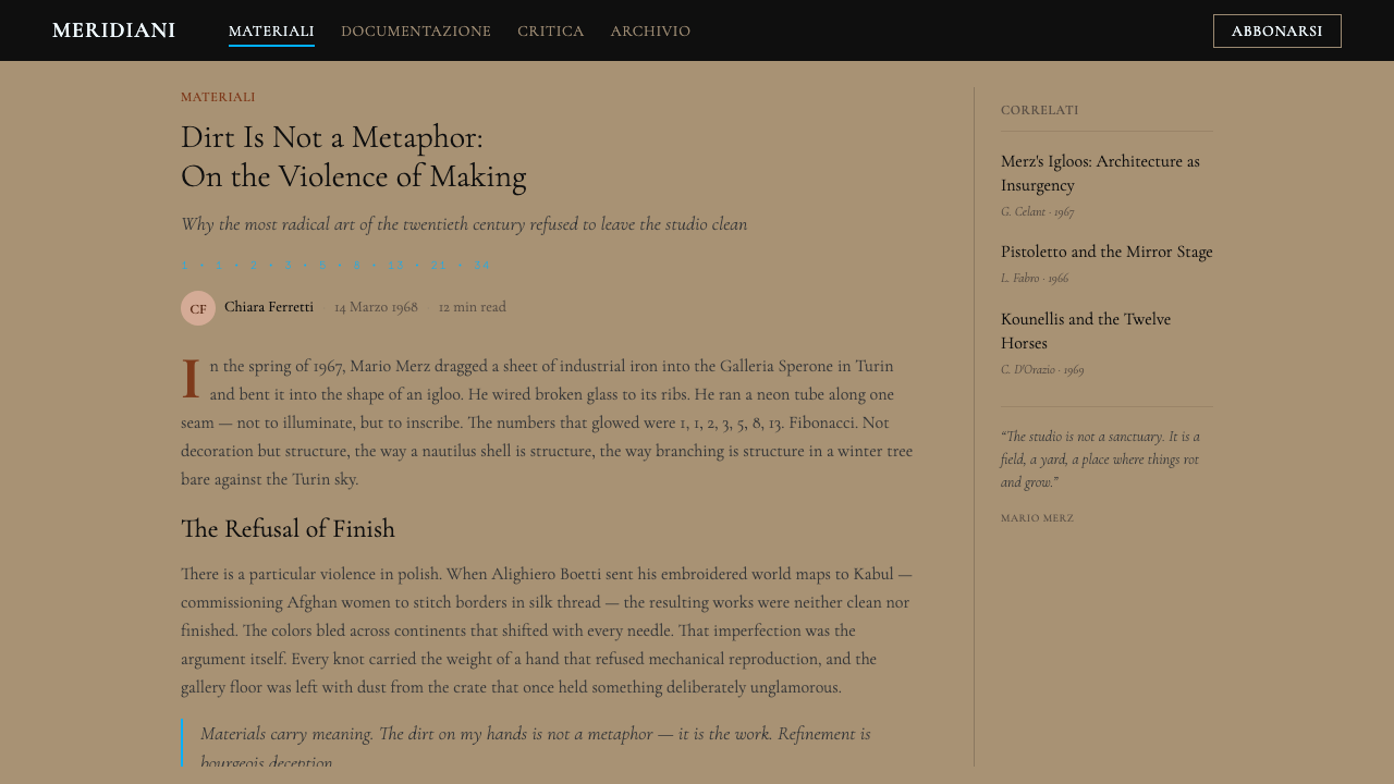
Handwritten and Chalk-Like Type手写与粉笔质感的字体
Typography in this aesthetic registers as provisional and manual — letterforms that suggest chalk on blackboard, graphite on newsprint, or stencil spray. Captions, annotations, and secondary labels are treated as though written on the surface rather than designed into it. Where serif type appears, it tends toward the worn and archaic — the kind of letterform that has existed long enough to seem undesigned. This typographic approach reinforces the system's central claim that the work is not finished, not packaged, not ready for market.这种美学中的字体排印呈现为临时性与手工性——字形令人联想到黑板上的粉笔、新闻纸上的铅笔,或模板喷涂。说明文字、注释与次级标签被处理为写在表面之上,而非设计进去的。出现衬线字体时,它倾向于磨损与古旧——那种经历了足够长时间、以至于看起来未经设计的字形。这种排印方式强化了整套系统的核心主张:作品尚未完成,未经包装,尚未准备好面向市场。
Fibonacci and Mathematical Annotation斐波那契与数学标注
One of the movement's most distinctive design inheritances is the use of numerical sequences — particularly the Fibonacci progression — as both structural device and visual motif. Numbers are not labels or data; they are objects in the composition, rendered at scale, arrayed across surfaces, or used to regulate intervals and proportions. This introduces a kind of legible logic to layouts that would otherwise read as purely intuitive, creating a tension between organic and mathematical ordering that is central to the style's identity.这场运动最具辨识度的设计遗产之一,是将数字序列——尤其是斐波那契递进——用作结构装置与视觉母题。数字不是标签或数据,而是构图中的对象,以一定尺度渲染、阵列于表面之上,或用于调节间距与比例关系。这为版面引入了一种可读的逻辑,使原本看似纯粹直觉的编排变得可解析,在有机秩序与数学秩序之间制造出一种张力——这对这种风格的身份认同至关重要。
Textural Density and Process Marks质感密度与过程痕迹
Arte Povera-derived layouts embrace surface irregularity as information. A background might carry the grain of burlap, the stain of charcoal, or the oxidation patterns of raw metal — not as decorative textures applied atop a neutral ground, but as the ground itself. Edges are left ragged; marks accumulate rather than being erased. The aesthetic is cumulative and archaeological: the final state carries evidence of the intermediate states, and this evidence is part of the meaning.贫穷艺术衍生的版面将表面不规则性视为信息加以接纳。背景可能承载麻布的肌理、木炭的污迹,或原始金属的氧化图案——不是叠加在中性底面上的装饰纹理,而是底面本身。边缘保持参差;痕迹叠积而非被抹除。这种美学是累积性与考古性的:最终状态承载着中间状态的证据,而这些证据本身就是意义的一部分。
Structural Rawness, Not Decorative Roughness结构性的原生感,而非装饰性的粗糙
The most important distinction in working with this aesthetic is between rawness that is structural and roughness that is merely decorative. Arte Povera's rough surfaces were not applied finishes — they were the actual material of the work. In a design context, this means that textural and hand-made qualities should determine the system's proportions, layout logic, and typographic relationships, not simply be sprinkled over a conventionally structured layout. The rawness should affect the grid, not just the background.使用这种美学时最重要的区分,在于结构性的原生感与单纯装饰性的粗糙之间的差别。贫穷艺术的粗糙表面不是后期处理——而是作品的实际材料。在设计语境中,这意味着质感与手工品质应当决定系统的比例、版面逻辑与字体排印关系,而不只是撒在传统结构的版面之上。原生感应当影响网格,而不只是背景。
Tension Between Archive and Live Signal档案感与活跃信号之间的张力
A defining quality of the Arte Povera aesthetic is the coexistence of elements that read as very old and elements that read as very new — the effect is neither nostalgic nor futurist, but suspended between the two. In design terms, this tension is typically achieved by pairing aged, warm, analogue-feeling surfaces with sharp, cold, digital-feeling accents. The aged surface should feel genuinely historical, not retro-styled; the sharp accent should feel genuinely live, not merely decorative.贫穷艺术美学的决定性品质,在于读起来非常古老的元素与读起来非常新鲜的元素共存——效果既不怀旧也不未来主义,而是悬于两者之间。在设计语汇中,这种张力通常通过将老旧、温暖、模拟感的表面与锐利、冷静、数字感的强调色并置来实现。老旧的表面应当给人真实的历史感,而非复古风格;锐利的强调色应当给人真实的当下感,而非单纯的装饰性。
See the Arte Povera (Merz, 1968) design system →查看 Arte Povera (Merz, 1968) 完整设计系统 →
Who shaped Arte Povera (Merz, 1968)?谁塑造了 Arte Povera (Merz, 1968)?
Celant was the critic and curator who named and theorized Arte Povera in his September 1967 manifesto and accompanying exhibition in Genoa. He drew on the work of theater director Jerzy Grotowski — who had spoken of a 'poor theater' stripped of all artifice — to articulate what the Italian artists were doing with material. Celant continued to write about and curate Arte Povera throughout his career, cementing the movement's historical status through exhibitions at major international institutions and establishing the critical vocabulary that designers still use when referencing the aesthetic.切兰特是命名并理论化了贫穷艺术的评论家与策展人,他于1967年9月在热那亚的宣言与随附展览中完成了这一工作。他借鉴戏剧导演耶日·格罗托夫斯基——后者曾谈及剥除一切矫饰的「贫穷戏剧」——来阐明意大利艺术家对材料所做之事。切兰特在其整个职业生涯中持续撰写关于贫穷艺术的文章并策划相关展览,通过在国际主要机构举办展览,巩固了这场运动的历史地位,并建立起设计师至今在引用这种美学时仍在使用的批评词汇。
Merz is the central figure for anyone working with the Arte Povera design aesthetic specifically. His igloo structures — frameworks of metal tubing or glass, sometimes covered with mud, sometimes with newspapers, always inscribed with Fibonacci numbers in neon — became the movement's most recognized image. Merz saw the igloo as a universal shelter form, timeless across cultures, and the Fibonacci sequence as a natural law underlying all growth. The combination of these two obsessions — the archaic and the mathematical — is the direct source of the design system's defining visual tension.梅尔兹是所有专注于贫穷艺术设计美学者的核心人物。他的冰屋结构——金属管或玻璃骨架,有时覆以泥土,有时覆以报纸,始终以霓虹数字铭刻斐波那契数列——成为这场运动最广为人知的形象。梅尔兹将冰屋视为跨越文化、超越时间的普遍庇护所形态,将斐波那契数列视为支撑一切生长的自然法则。这两种痴迷的结合——古老与数学——是设计系统决定性视觉张力的直接来源。
Kounellis, Greek-born but based in Rome, pushed Arte Povera's engagement with live and raw material to its most confrontational extreme. His 1969 installation at Galleria L'Attico in Rome — twelve live horses tethered in the gallery — became one of the most discussed works in postwar art history, not because of its shock value but because of the absolute directness of its statement: the living animal, requiring breath and space and feeding, was more real than any representation of nature could be. For designers, Kounellis's work is a reminder that the aesthetic's power comes from the genuine presence of material, not from its simulation.库内利斯出生于希腊,长居罗马,将贫穷艺术与活体及原始材料的交涉推至最具对抗性的极端。他1969年在罗马L'Attico画廊创作的装置——十二匹活马被拴在画廊里——成为战后艺术史上被讨论最多的作品之一,不是因为其震撼性,而是因为其陈述的绝对直接性:需要呼吸、空间与饲养的活体动物,比任何对自然的再现都更真实。对设计师而言,库内利斯的作品提醒我们:这种美学的力量来自材料的真实在场,而非对它的模拟。
Pistoletto's contribution to Arte Povera was the mirror painting — large polished steel sheets that reflected the viewer back into the work, making the gallery space and the people in it part of the composition at all times. His later rag ball sculpture, made from the discarded clothes of hundreds of people bound together, extended this democratic impulse into three dimensions. For design, Pistoletto is the Arte Povera artist who most directly interrogates the boundary between the artwork and its context — a concern that translates, in layout terms, into the question of how a design element relates to the space around it rather than asserting itself against it.皮斯托莱托对贫穷艺术的贡献是镜面绘画——大幅抛光钢板将观者反射回作品之中,使画廊空间与其中的人始终成为构图的组成部分。他后来的布球雕塑——由数百人丢弃的衣物捆绑而成——将这种民主冲动延伸至三维空间。对设计而言,皮斯托莱托是最直接质问作品与其语境边界的贫穷艺术艺术家——这一关切在版面语汇中转化为:一个设计元素如何与周围空间发生关系,而非对抗它、凌驾于其上。
How do you use Arte Povera (Merz, 1968) today?今天怎么用 Arte Povera (Merz, 1968)?
Arte Povera is among the more demanding historical aesthetics to translate faithfully into contemporary design, because its power depends entirely on the authenticity of its rawness. If the textural and material qualities are applied as surface decoration over a conventionally polished structure, the result is a pastiche — it will look artfully distressed rather than genuinely rough. The system works only when the aesthetic logic of material honesty reaches all the way down into the structural decisions: the grid, the spacing, the typographic hierarchy.贫穷艺术是历史美学中转化为当代设计时要求最为苛刻的之一,因为它的力量完全取决于原生感的真实性。如果质感与材料品质只是作为表面装饰叠加在传统精抛光结构之上,结果只是一种仿制——看起来是刻意做旧,而非真实的粗糙。这套系统只有在材料诚实的美学逻辑渗透至结构性决策——网格、间距、字体排印层级——时才真正有效。
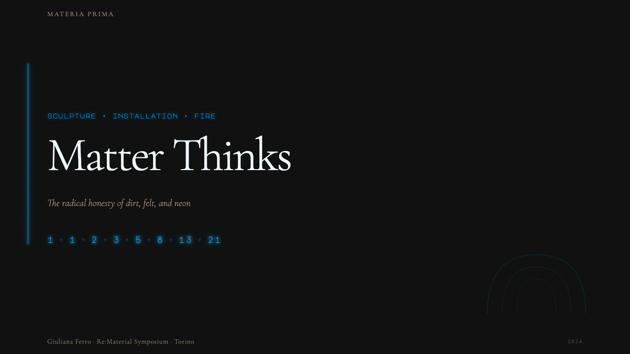
For presentation slides, the style works best on thematic or introductory material where the content warrants a certain weight and historical resonance. A cover page built around this aesthetic might use a full-bleed warm ground — a tone that reads as aged linen or oxidized paper — with a sparse title set in a worn serif or hand-pressured letterform, and a single cold neon accent line or numeral sequence positioned as though stenciled or chalked across the surface. Content slides should resist the temptation to fill: use generous margins, let type sit alone against a textured field, and annotate with handwritten-style secondary labels rather than styled callout boxes. Data visualizations can take on an archaeological quality when axes and data marks are treated as process notations rather than digital chart elements.对于演示文稿,这种风格最适合主题性或导入性材料,这类内容本身需要一定的分量与历史共鸣。以这种美学构建的封面页,可以使用全出血的温暖底面——一种读起来像老旧亚麻或氧化纸张的色调——搭配用磨损衬线或施压手工字形排设的稀疏标题,以及一条单独的冷光霓虹强调线或数字序列,仿佛用模板或粉笔划过表面。内容页应当抵制填满的诱惑:使用宽裕的边距,让文字独立置于质感底面之上,以手写风格的次级标签注释内容,而非使用样式化的引用框。当坐标轴与数据标记被当作过程性标注而非数字图表元素处理时,数据可视化能够呈现出一种考古性品质。
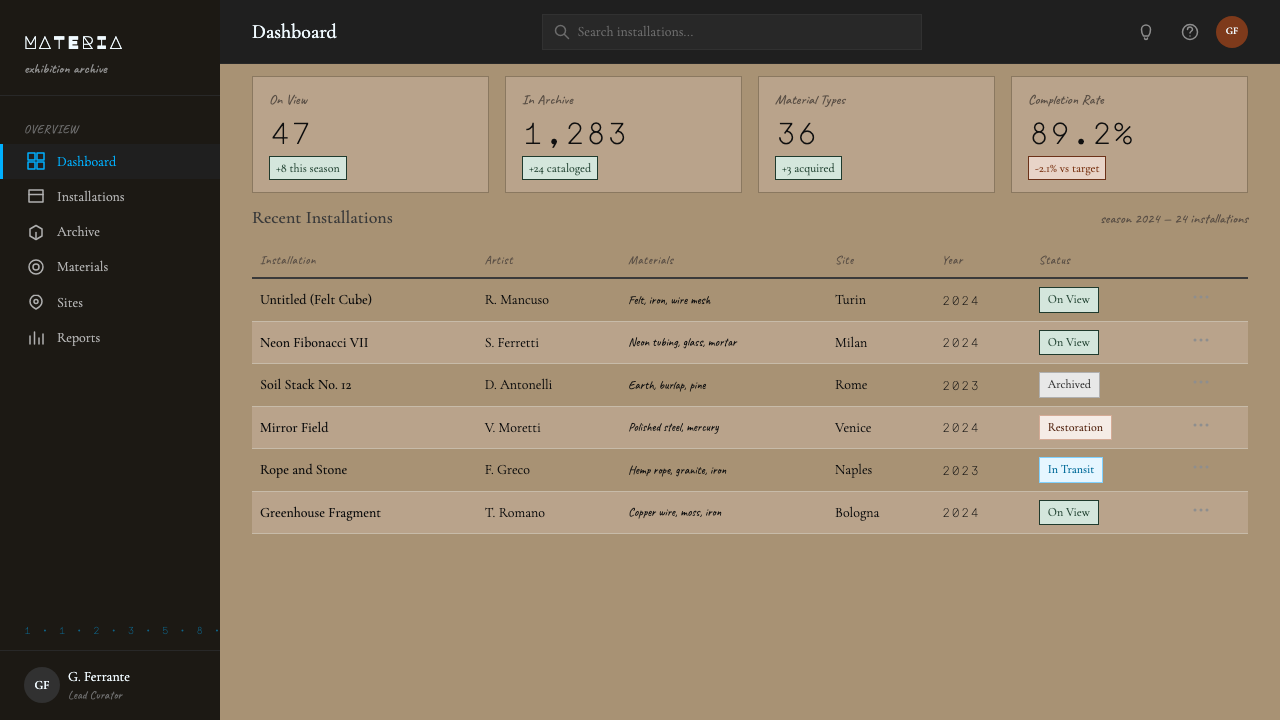
For web interfaces, Arte Povera's aesthetic is suited to contexts where authenticity, depth, and the sense of something genuinely made are brand values — editorial platforms, cultural institutions, independent studios, and craft-forward product brands. A dashboard built in this register might use an off-white or warm cream background with iron-toned borders and typographic navigation rather than icon-driven menus. Interactive states are marked not by color fills but by a cold neon underline or a typographic shift in weight. Pricing or feature comparison pages benefit from the style's capacity to make information feel considered rather than generated — long-form copy with annotated footnotes reads better in this aesthetic than a conventional feature grid.对于网页界面,贫穷艺术的美学适合真实性、深度与「真正被制作出来」的感受是品牌价值的语境——编辑平台、文化机构、独立工作室与手工前置的产品品牌。以这种基调构建的仪表板,可以使用米白或暖奶油色背景,配以铁色调边框与字体排印式导航,而非图标驱动的菜单。交互状态不以色彩填充标记,而以冷光霓虹下划线或字重的字体变化来标示。定价或功能对比页受益于这种风格使信息呈现出「经过思考」而非「被生成」的质感——带注脚注释的长文比传统的功能网格更契合这种美学。
For editorial and marketing work, Arte Povera offers a powerful counterpoint to the prevailing digital-native aesthetic of brightness and saturation. Magazine-style layouts built in this register use wide outer margins for handwritten-style annotations and source citations; headlines set in worn or archaic serif forms; and body text on a warm ground rather than pure white. The cold neon accent, used sparingly, can serve as a visual anchor for chapter breaks or key data points. Marketing pages for cultural projects — film, publishing, music, performance — benefit especially from the style's capacity to suggest both depth of craft and a refusal to pander.对于编辑与营销内容,贫穷艺术提供了一种强有力的对位,抗衡当下数字原生美学对亮度与饱和度的普遍偏好。以这种基调构建的杂志风版面,在宽阔的外边距中放置手写风格的注释与来源引用;标题以磨损或古旧衬线字形排设;正文置于温暖底面而非纯白之上。冷光霓虹强调色——克制使用——可作为章节分隔或关键数据点的视觉锚点。文化项目的营销页面——电影、出版、音乐、表演——尤其受益于这种风格同时暗示手工深度与拒绝迎合的能力。
A common failure mode when applying this aesthetic is mistaking roughness for the point. The Arte Povera design system is not about distressing things — it is about making the logic of material and process legible. When every element is equally textured, equally aged, equally rough, the system collapses into undifferentiated noise. The neon accent exists precisely to interrupt the warmth with something cold and precise; the Fibonacci sequence exists to introduce mathematical order into organic material. Without these counterpoints, the aesthetic becomes a mood board rather than a system. Restraint in applying the signature elements — very few neon accents, very few numerical sequences, very few handwritten notes — is what keeps the system coherent.应用这种美学时常见的失败,是将粗糙误认为目的本身。贫穷艺术设计系统不是为了做旧而做旧——而是让材料与过程的逻辑清晰可读。当所有元素同等粗糙、同等老旧、同等质感时,系统崩解为无差别的噪音。冷光霓虹强调色的存在,恰恰是为了用某种冷峻精准的东西打断整体的温暖;斐波那契数列的存在,是为了在有机材料中引入数学秩序。没有这些对位,美学就成了情绪板而非系统。在应用标志性元素时保持克制——极少的霓虹强调、极少的数字序列、极少的手写标注——是维持系统连贯的关键。
See the Arte Povera (Merz, 1968) design system →查看 Arte Povera (Merz, 1968) 完整设计系统 →
Arte Povera (Merz, 1968) — FAQArte Povera (Merz, 1968) · 常见问题
How is Arte Povera different from other rough or vintage-inspired aesthetics?贫穷艺术与其他粗糙或复古风格的美学有何不同?
The key difference is the presence of cold, precise, mathematical counterpoints. Most vintage or distressed aesthetics aim for a consistent warmth and organic feel throughout — they evoke nostalgia or artisanal craft. Arte Povera specifically requires the interruption of that warmth with something genuinely alien to it: a cold neon accent, a mathematical sequence, an industrial element that cannot be absorbed into the nostalgic register. Without this tension, what you have is a rustic or retro aesthetic, not Arte Povera. The movement was explicitly anti-nostalgic — it used archaic materials not to evoke the past but to make the present feel more real.关键区别在于冷静、精准、数学性对位元素的存在。大多数复古或做旧美学追求贯穿始终的温暖与有机感——它们唤起怀旧情绪或手工艺质感。贫穷艺术特别要求以真正与温暖格格不入的东西来打断它:冷光霓虹强调色、数学序列、无法被吸收进怀旧语域的工业元素。没有这种张力,你得到的是乡村风或复古美学,而非贫穷艺术。这场运动是明确反怀旧的——它使用古旧材料,不是为了唤起过去,而是为了让当下感觉更真实。
Can this aesthetic work in a light, modern digital product context?这种美学能在轻盈、现代的数字产品语境中发挥作用吗?
Yes, but it requires selective application rather than full immersion. In a contemporary digital product, the Arte Povera aesthetic is most usefully deployed as a tonal counterpoint within an otherwise clean system — a warmly textured hero section against a white-ground content area, or a neon-accented data annotation within a conventional chart layout. Full application — rough grounds throughout, handwritten type everywhere, accumulated process marks across all surfaces — would conflict with the usability demands of a complex interface. The style works well at the level of brand expression, campaign materials, and feature showcases, where the user's task is aesthetic engagement rather than efficient information processing.可以,但这需要选择性应用,而非全面沉浸。在当代数字产品中,贫穷艺术美学最有效的部署方式,是作为基调上的对位存在于一个其他方面保持整洁的系统之中——白色底面内容区域中的温暖质感主视觉区块,或传统图表版面内的霓虹强调数据注释。全面应用——到处是粗糙底面、随处可见手写字体、所有表面积累了过程痕迹——将与复杂界面的可用性要求产生冲突。这种风格在品牌表达、营销活动材料与功能展示层面效果出色,在这些场合,用户的任务是审美参与而非高效的信息处理。
What role do numbers and sequences play in the layout system?数字与序列在版面系统中扮演什么角色?
Numbers in the Arte Povera tradition — and particularly Fibonacci sequences, which Merz used obsessively — function simultaneously as content and as structure. In a design context, this means that numerical sequences can be used to regulate proportions and spacing: the intervals between sections, the scale relationships between typographic elements, or the sizing of image crops. This is not numerology — it is a way of making the structural logic of a layout visible and legible, rather than hiding it. When the sequence is also rendered as a visual element — large numerals floating in a composition — it serves both purposes at once.在贫穷艺术传统中,数字——尤其是梅尔兹痴迷使用的斐波那契数列——同时作为内容与结构发挥功能。在设计语境中,这意味着数字序列可用于调节比例与间距:段落之间的间隔、字体元素之间的尺度关系,或图像裁切的尺寸。这不是数字玄学——而是一种将版面结构逻辑可见化、可读化的方式,而非将其隐藏起来。当数列同时被渲染为视觉元素——大型数字漂浮于构图之中——时,它同时兼顾两种功能。
Is Arte Povera appropriate for brand identity, or mainly for editorial and campaign work?贫穷艺术适合品牌识别系统,还是主要适用于编辑与活动项目?
It is more naturally suited to campaign and editorial work, where it can be deployed at its full intensity for specific periods and contexts. As a permanent brand identity system, it carries significant risk: the aesthetic's deliberate roughness and anti-commercial stance can be difficult to maintain coherently across all brand touchpoints, and it can read as self-consciously art-world in contexts where the brand needs to communicate warmth or accessibility. It works well for brands whose identity is explicitly rooted in craft, cultural authority, or critical stance — independent publishers, art institutions, architectural and design studios, and certain categories of material goods where provenance and making process are part of the product's value.它更自然地适合活动与编辑项目,在这类场合可以在特定时段与语境中以完整强度部署。作为永久性品牌识别系统,它承载着相当大的风险:这种美学刻意的粗糙感与反商业立场,难以在所有品牌接触点上连贯维持,在品牌需要传递温暖或亲近感的语境中,可能读起来像刻意标榜艺术圈身份。它适合身份认同明确根植于手工、文化权威或批判立场的品牌——独立出版商、艺术机构、建筑与设计工作室,以及某些物质商品类别中产地来源与制作过程本身就是产品价值一部分的情形。
How do you avoid the aesthetic feeling gimmicky or costume-like?如何避免这种美学显得噱头十足或像穿着戏服?
The test is whether the rough, material-honest qualities are structural or merely decorative. If the texture is only on the background while everything else — the grid, the type hierarchy, the spacing logic — follows conventional digital design norms, it reads as costume. The aesthetic is structural when the same logic that makes the surface feel raw also determines the proportions of the layout: irregular but intentional margins, type that is deliberately not optically corrected, spacing that refers to the Fibonacci-derived intervals rather than an even eight-point grid. The cold neon accent being rare rather than frequent is another test: if every interactive element glows blue-green, the accent has become decoration. One or two precisely placed neon marks across an entire spread is Arte Povera; a system full of glowing elements is something else entirely.检验标准是:粗糙、材料诚实的品质是结构性的还是单纯装饰性的。如果质感只出现在背景上,而其他一切——网格、字体层级、间距逻辑——都遵循传统数字设计规范,读起来就是在穿戏服。当同样的逻辑既让表面感觉原生,又决定版面的比例关系时,美学才是结构性的:不规则但有意的边距,刻意不做视觉矫正的字体,参照斐波那契衍生间距而非均等网格的空白关系。冷光霓虹强调色的稀少而非频繁,是另一个检验标准:如果每个交互元素都发出蓝绿色光芒,强调色就已沦为装饰。在整个版面上精准放置一两处霓虹标记,是贫穷艺术;充满发光元素的系统则完全是另一回事。
Related design styles相关设计风格
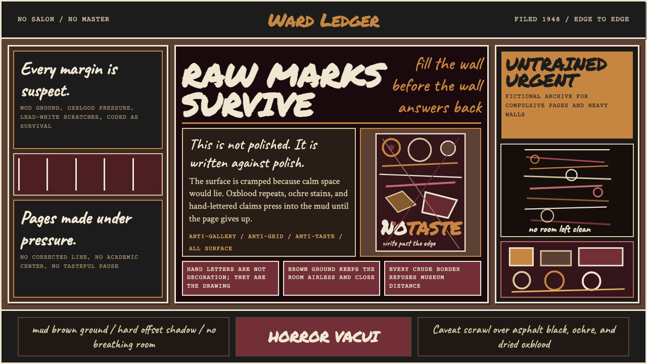 Art Brut (Dubuffet, 1948)Rawness crowds the frame. Mud brown, oxblood marks, and hand scrawl erase the…粗粝填满画面:泥棕底、牛血红刻痕与手写体挤压边缘。
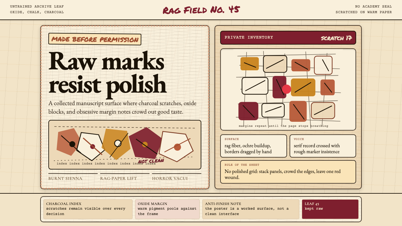 Art Brut (Dubuffet)Polish is refused. Bone-cream paper, earth pigments, scratched borders, dense…拒绝精致。骨白纸、大地颜料、刮痕边框和密集页边。
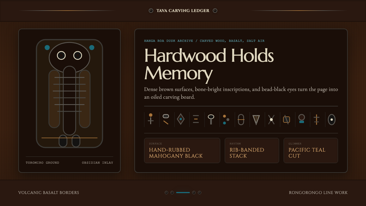 Chilean Rapa Nui Toromiro (Easter Island)Ancient weight, dusk-lit. Toromiro brown, Cinzel capitals, rib bands, obsidia…古老而沉重:托罗米罗褐、Cinzel碑文体、肋骨横带与黑曜石珠。
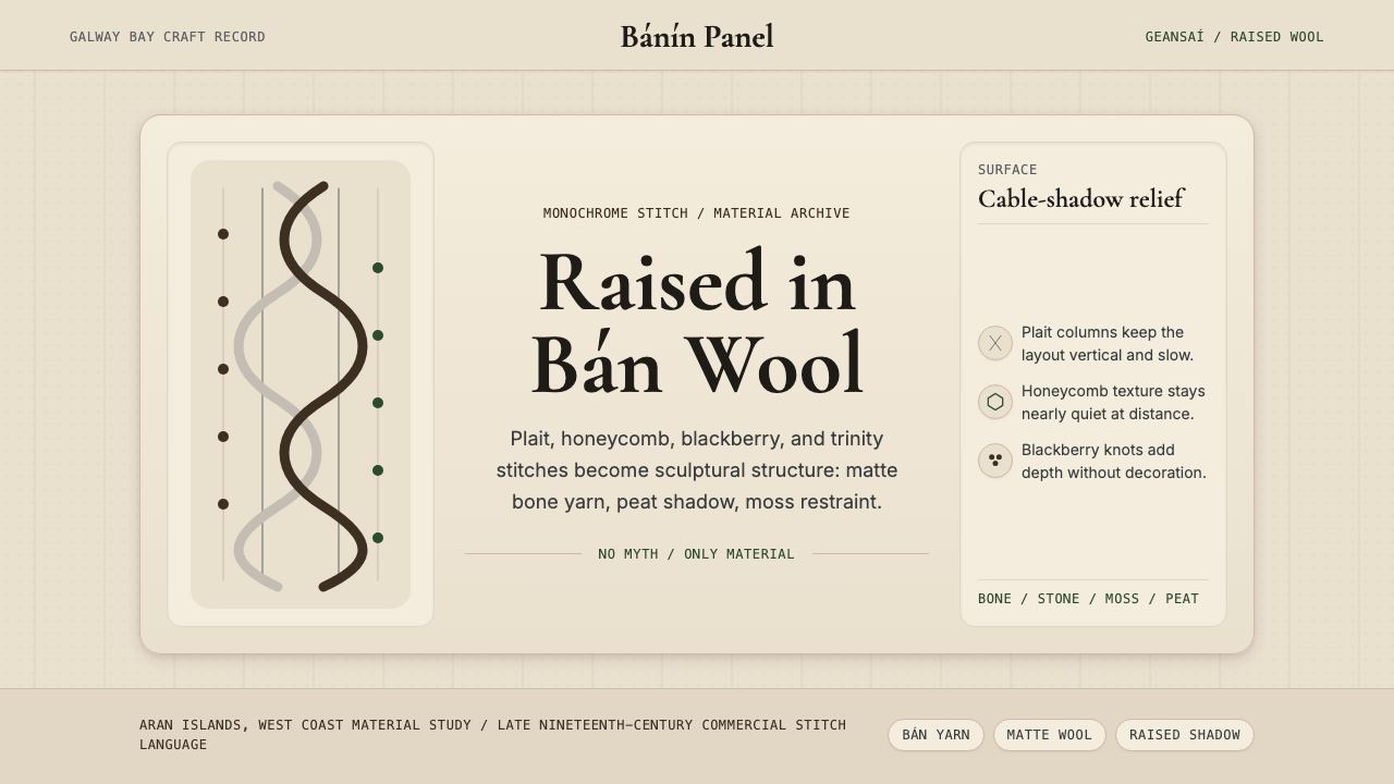 Irish Aran Island Cable KnitMaterial honesty raised in wool. Bone ground, moss ink, and cable columns cas…材料诚实成形:骨白底、苔绿字与绞花柱投下静影。
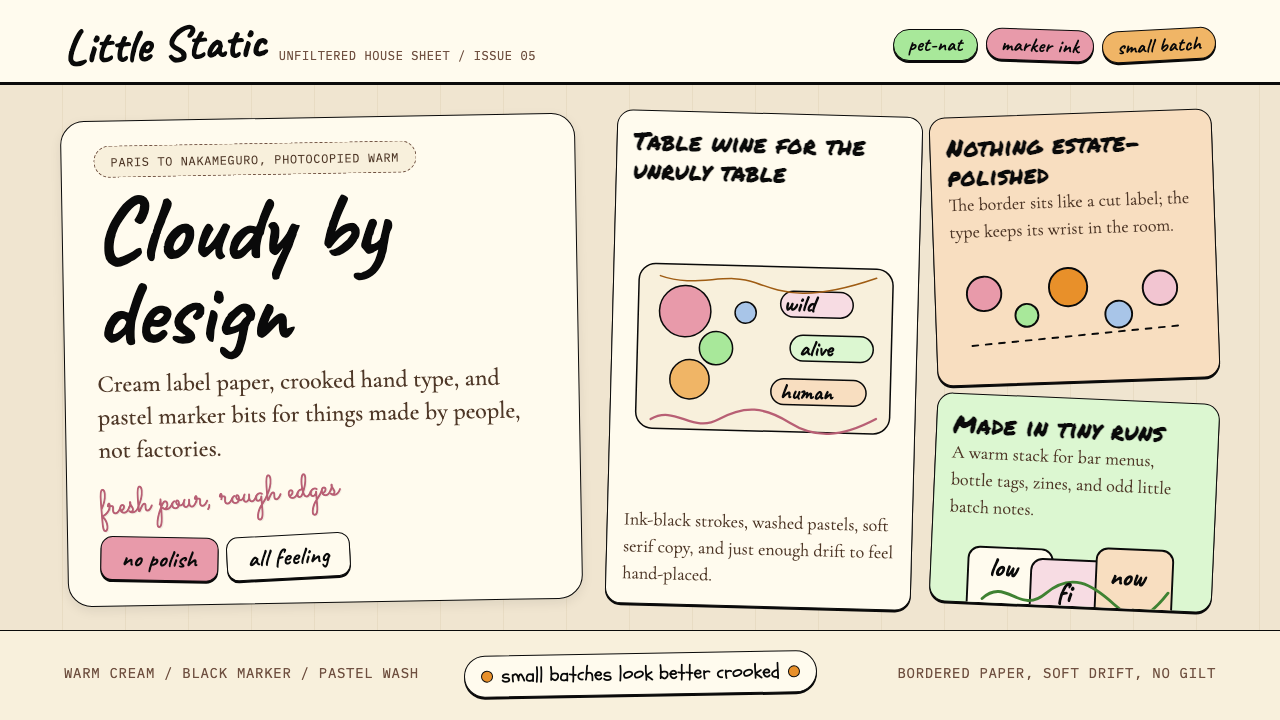 Natural Wine Low-FiWarm, scrappy, human. Cream paper, Caveat marker type, and pastel sticker geo…温暖、粗粝、有人味:奶油纸、Caveat 手写体与粉彩贴纸几何。
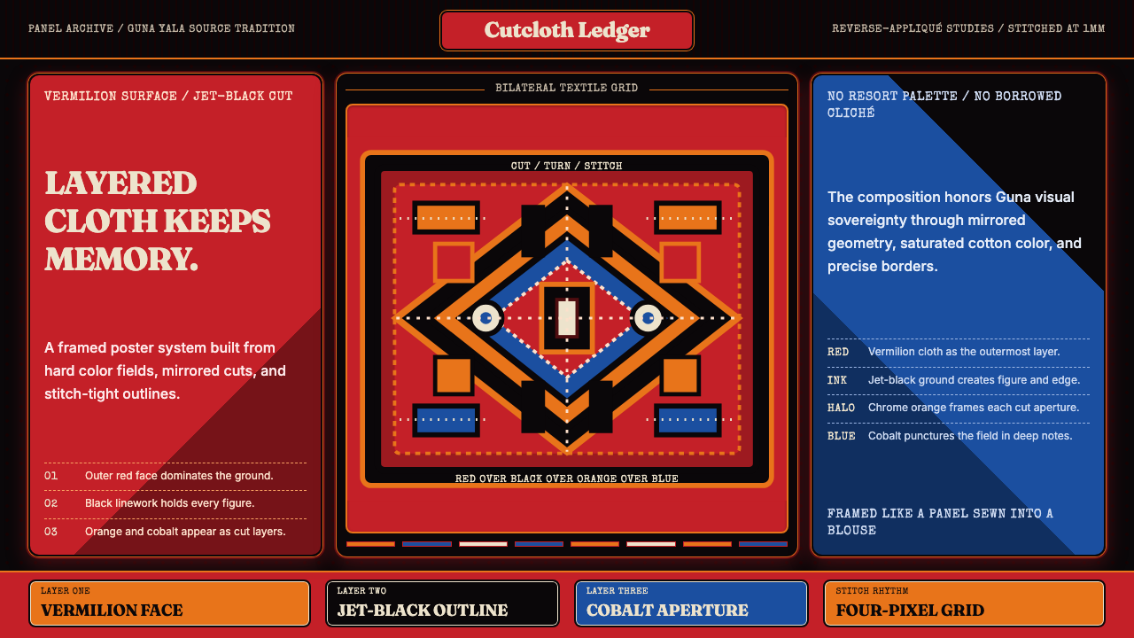 Panamanian Mola Kuna AppliquéSewn sovereignty. Vermilion panels reveal black, orange, and cobalt stitch-gr…缝出的主权。朱红面板切开黑、橙、钴蓝层与针脚网格。